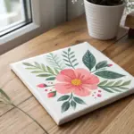
If you’ve been craving fresh flower oil painting ideas, you’re in the right headspace—flowers are basically the perfect excuse to play with color, edges, and juicy paint texture. Here are my favorite floral concepts, starting with the classic go-to compositions and drifting into more playful, unexpected approaches.
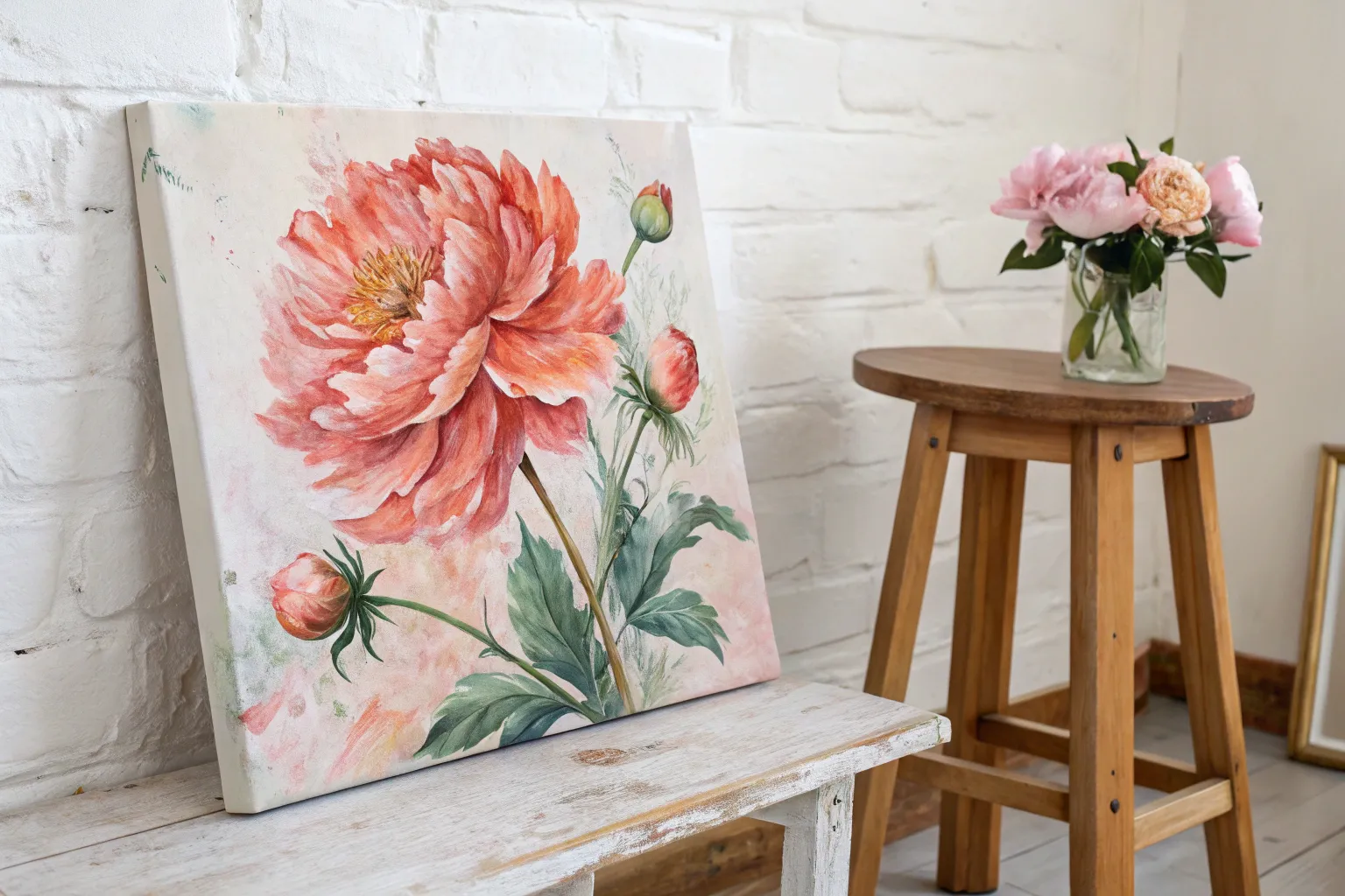
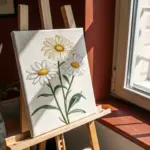
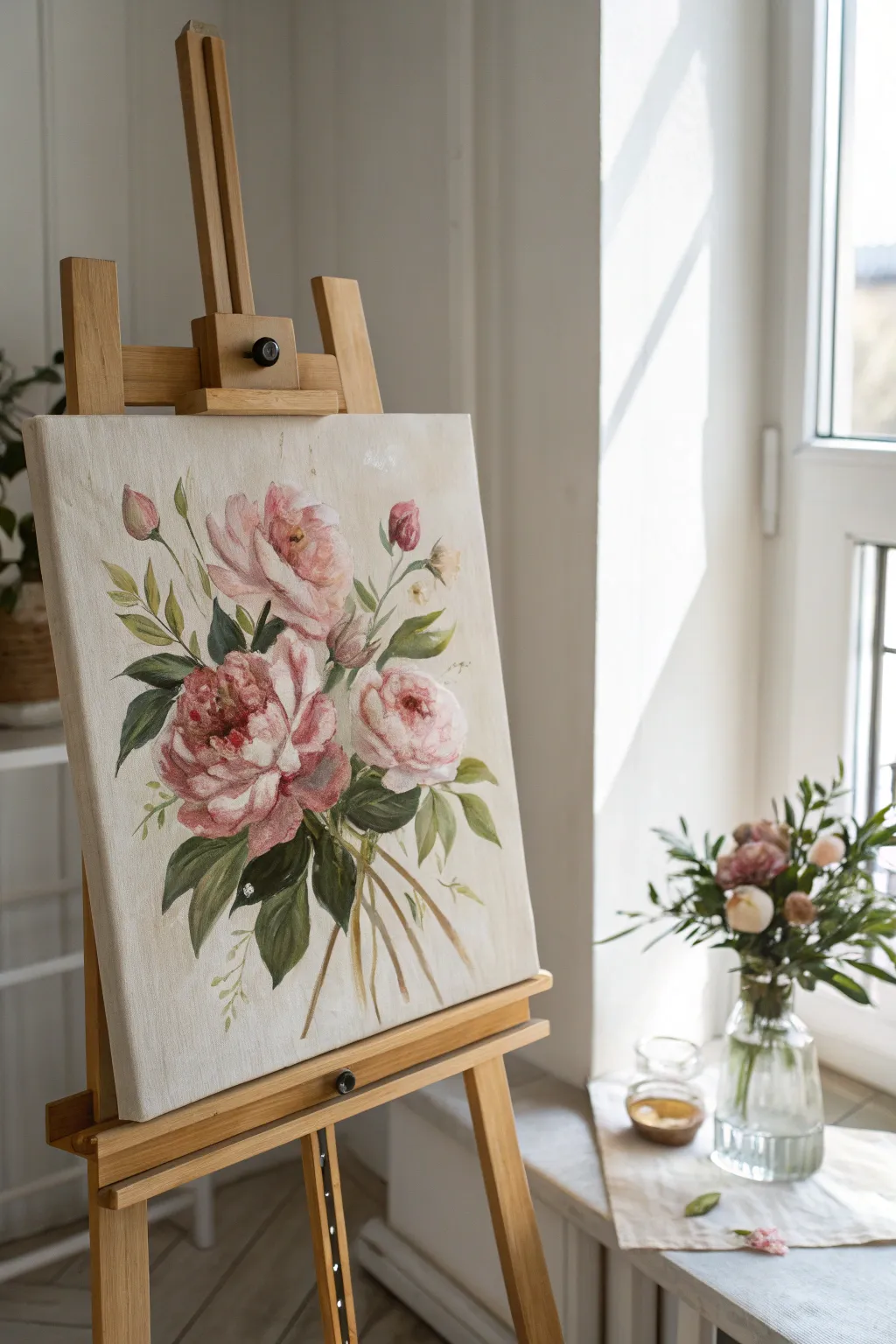
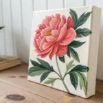
Peony Close-Up Petal Swirls
Capture the delicate drama of a peony in full bloom with this large-scale close-up study. The composition focuses intently on the swirling spiral of petals, using soft pinks, creamy whites, and deep rosy hues to create a sense of movement and volume.
Step-by-Step Tutorial
Materials
- Large stretched canvas (e.g., 24×30 inches or larger)
- Oil paints: Titanium White, Alizarin Crimson, Quinacridone Magenta, Yellow Ochre, Cadmium Yellow, Raw Umber
- Odorless mineral spirits or turpentine
- Refined linseed oil or painting medium
- Large flat brushes (Hog bristle)
- Medium filbert brushes
- Small round brushes for detailing
- Palette knife
- Palette (wood or glass)
- Easel
- Rags or paper towels
Step 1: Underpainting and Structure
-
Map the center:
Begin by observing the flower’s geometry. Locate the very center of the peony slightly off-center on your canvas to create a dynamic composition. Sketch a small, tight circle here using a thin wash of Alizarin Crimson and spirits. -
Sketch the spiral:
Drawing outwards from your center point, sketch loose, spiraling lines that define the major layers of petals. Think of this like a whirlpool; the petals should fan out and grow larger as they reach the canvas edges. -
Apply the background wash:
Mix a very pale, warm wash using Titanium White and a tiny touch of Yellow Ochre and spirits. Scrub this loosely into the negative spaces around the outer petals to kill the white of the canvas. -
Block in shadow values:
Identify the deepest shadows between the petals. Mix Alizarin Crimson with a touch of Quinacridone Magenta and place these darks deep within the recesses of the flower’s center and under the heavy outer petals. -
Establish the light source:
Determine where your light is coming from (likely top-left in this reference). Mark the highlights on the petal tips with a slightly thicker application of white paint to secure your value map early on.
Step 2: Building Form and Color
-
Mix your middle tones:
Prepare a range of three main pinks on your palette: a cool shadowy pink (Crimson + White), a warm mid-tone pink (Magenta + White + touch of Yellow Ochre), and a very pale, creamy pink. -
Paint the outer petals:
Start with the largest petals at the periphery. Use a large filbert brush to apply the cool shadow pinks at the base of these petals, blending outward toward the lighter tips. -
Develop the petal curves:
Switch to your warm mid-tone pink. Paint the curved bodies of the petals, following the direction of growth. Use long, sweeping brushstrokes to mimic the silky texture of the flower. -
Create the ‘cupped’ effect:
For the petals nearer the center that are cupping upwards, pay attention to the transition. Paint the outside of the cup lighter and the inside slightly darker to show dimension. -
Refine the center density:
The center is a tightly packed cluster. Use smaller brushes here, dabbing thicker paint to suggest many small, crinkled petal edges without painting every single one individually. -
Add the stamen glow:
Deep in the center, mix a warm orange using Cadmium Yellow and a bit of Crimson. Dab this into the very heart of the flower to suggest the hidden stamens, creating a warm inner glow.
Muddy colors?
If your pinks look dull, stop blending wet-into-wet immediately. Scrape off the muddy area, wipe the canvas, and re-apply fresh, clean paint. Clean brushes often.
Step 3: Refining and detailing
-
Blend the transitions:
Using a clean, dry filbert brush, gently soften the edges where your shadows meet your mid-tones. I find that careful blending here is what gives the petals their softness, but be careful not to over-blend into mud. -
Carve the edges:
Mix a thick, heavy body of Titanium White with a tiny hint of Alizarin. Use a round brush or the edge of a flat brush to crisp up the very tips of the petals where they catch the most light. -
Add striations:
Peonies often have subtle veins. Mix a slightly darker pink and, using a fine liner brush, drag very faint lines from the base of the petals upward, fading them out before they reach the white tips. -
Deepen the contrast:
Go back with your darkest red-purple mix (Alizarin + Raw Umber). Reinforce the deepest crevices, especially those directly beneath the brightest white petals, to make the lighter colors pop forward. -
Glaze for warmth (optional):
If the painting looks too cool after drying for a few days, you can apply a very thin glaze of Yellow Ochre mixed with medium over the sunlit areas to unify the lighting. -
Final highlights:
Load your smallest brush with pure Titanium White. Apply tiny, impasto dots or dashes on the most prominent petal ridges in the center and the nearest outer edges for texture.
Level Up: Texture
Use a palette knife for the final white highlights on the outer petals. The thick, physical ridge of paint will catch actual room light, adding a 3D effect.
Step back and enjoy the soft, unfolding drama of your floral masterpiece.


Poppies With Translucent Petals
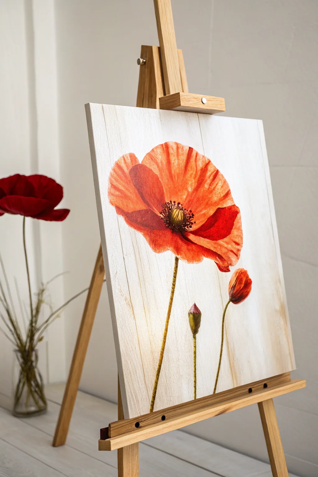
Capture the delicate translucency of poppy petals with this luminous oil painting project. The unique vertical wood-grain background adds a subtle rustic texture that contrasts beautifully with the flower’s vibrant orange and red hues.
Step-by-Step Tutorial
Materials
- Stretched canvas or canvas board (square or rectangular)
- Oil paints: Cadmium Red, Alizarin Crimson, Cadmium Yellow, Titanium White, Raw Umber, Sap Green, Burnt Sienna
- Paint thinner (odorless mineral spirits) or turpentine
- Linseed oil or painting medium
- Flat bristle brushes (large and medium)
- Round synthetic sable brushes (small for details)
- Palette knife
- Palette
- Lint-free rags or paper towels
Step 1: Preparing the Faux-Wood Background
-
Base Coat Application:
Mix a large amount of Titanium White with a tiny touch of Burnt Sienna to create a warm, creamy off-white. Cover the entire canvas with this mixture using a large flat brush. Ensure the coverage is solid and opaque. -
Creating the Grain Texture:
While the base coat is still wet, dip the very tip of a clean flat brush into a small amount of pure Burnt Sienna or Raw Umber. Lightly drag the brush vertically from the top edge to the bottom edge in a single, unwavering stroke to simulate wood grain. -
Refining the Planks:
Repeat the vertical dragging process across the canvas, leaving varying spaces between streaks. To create the look of individual wooden planks, use a slightly darker mix of Raw Umber and trace vertical lines every few inches, keeping them straight. -
Drying Time:
Allow this background layer to dry completely. Since the next steps involve glazing for translucency, the background must be touch-dry, which may take a few days depending on your paint thickness.
Muddy Colors?
Poppies rely on clean, bright warmth. If your reds start turning brown, clean your brush thoroughly and stop mixing green into your red on the palette. Let layers dry between warm and cool colors.
Step 2: Designing the Poppy
-
Initial Sketching:
Once the background is dry, use a thin round brush with diluted Raw Umber to very faintly outline the large poppy head, a smaller bud below it, and a side bud. -
Blocking the Petal Shapes:
Mix Cadmium Red with a touch of Cadmium Yellow for a bright orange-red. Using a medium filbert or flat brush, block in the main petal shapes. Keep the paint layer heavily thinned with medium to maintain transparency. -
Adding Depth:
Identify the shadowed areas where the petals overlap or curve inward. Mix Alizarin Crimson into your red base and apply this darker tone to the shadowed crevices and the base of the petals near the center. -
Creating Translucency:
For the outer edges of the petals where sunlight would pass through, use a clean brush to gently lift off some pigment or add a glaze of yellow-orange. This mimics the delicate, paper-thin nature of poppy petals. -
Highlighting Edges:
Mix Titanium White with Cadmium Yellow. Carefully paint the very rim of the upper petals to simulate bright sunlight catching the thin edge.
Step 3: Stems and Buds
-
Painting the Stems:
Mix Sap Green with a little Raw Umber for a natural, earthy green. Using a rigger or small round brush, paint the stems. I find it helps to start from the flower base and pull the brush down in one confident stroke to avoid wobbles. -
Adding Texture to Stems:
Poppy stems are hairy. Once the green stem layer is tacky, take a small brush with a lighter yellow-green mix and dab tiny, short strokes along the sides of the stem to suggest texture. -
Painting the Buds:
Fill in the unopened buds with your green mixture. Use the red-orange mix to add a hint of color at the very tip of the bursting bud, showing the petals trying to break through.
Level Up: Texture Gel
Before painting the color, mix a clear impasto gel into your background white. Use a stiff comb or fork to physically carve the wood grain grooves for a tactile, realistic finish.
Step 4: The Center & Final Details
-
Deepening the Center:
Mix Alizarin Crimson and Raw Umber to create a near-black tone. Paint the very center of the open poppy distinctively dark to anchor the flower. -
Adding Stamens:
Use a fine detail brush with a lighter yellow-green or cream color. Dot tiny stamens in a ring around the dark center button. -
Pollen Specks:
With a dotting tool or the tip of a small brush, add tiny specks of dark brown or black on the ends of the stamens for the pollen. -
Final Glazing:
Assess the vibrancy. If the petals need more punch, wait for the paint to dry and apply a thin glaze of pure Alizarin Crimson over the shadow areas to enrich the color without losing the drawing underneath. -
Wood Grain Touch-ups:
If any background grain was accidentally covered too heavily by opaque paint, carefully re-establish those vertical lines around the flower using a fine brush and thin paint.
Step back and admire the warm, translucent glow of your floral masterpiece.

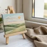
Wildflower Meadow, Loose and Dreamy
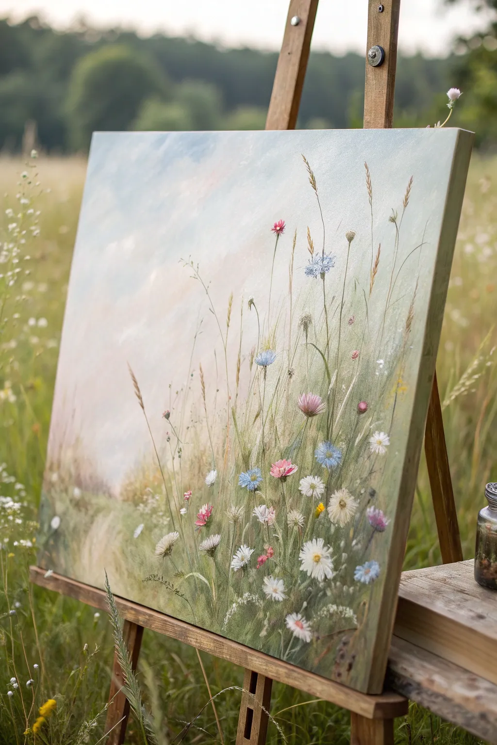
Capture the airy freedom of a summer field with this loose and dreamy oil painting tutorial. You will learn to layer soft atmospheric backgrounds with crisp foreground details to create a sense of depth and movement among the grasses.
How-To Guide
Materials
- Stretched canvas (approx. 18×24 inches)
- Oil paints: Titanium White, Ultramarine Blue, Cerulean Blue, Sap Green, Olive Green, Yellow Ochre, Alizarin Crimson, Burnt Sienna
- Large flat brush (size 10 or 12)
- Medium filbert brush (size 6)
- Small round or rigger brush (size 0 or 1)
- Palette knife
- Odorless mineral spirits or turpentine
- Linseed oil medium
- Paper towels or rags
- Palette
Step 1: Setting the Atmospheric Stage
-
Prime the canvas:
Begin by applying a very thin wash of diluted Burnt Sienna or Yellow Ochre over the entire canvas to kill the stark white. Wipe most of it off with a rag so you’re left with a warm, faint glow. -
Mix the sky gradient:
Prepare a large pile of Titanium White with a touch of Cerulean Blue for the upper sky. For the lower horizon area, mix White with a tiny hint of Alizarin Crimson and Yellow Ochre to create a warm, pearly pink-grey. -
Paint the sky:
Using your large flat brush, apply the blue mix at the top left, sweeping diagonally downwards. Blend in the warmer pink-grey mix towards the bottom right and the horizon line, keeping the strokes loose and clouded. -
Indicate distant foliage:
While the sky layer is still tacky, mix a very desaturated, pale green using Sap Green, White, and a touch of the sky color to push it back. Scumble this loosely along the bottom third to suggest distant hills or a blurry field edge.
Use a Rigger Brush
For those impossibly thin, waving grass stems, use a ‘rigger’ or ‘liner’ brush with thinned paint. Hold it by the end of the handle for looser lines.
Step 2: Building the Grassy Mid-Ground
-
Lay in the base greens:
Switch to the medium filbert brush. Mix Olive Green with a little Yellow Ochre and White. Apply vertical, sweeping strokes starting from the bottom of the canvas, fading them out as you reach the middle height of the painting. -
Add color variation:
Introduce some brownish hues by mixing Burnt Sienna with your green. Paint sporadic patches in the lower section to represent dried grasses and earth peeking through the verdant growth. -
Create soft texture:
Use a clean, dry brush to gently feather the tops of these grass strokes into the background sky. This wet-in-wet technique creates that dreamy, out-of-focus look essential for the background layers.
Step 3: Painting the Flowers & Details
-
Sketch the main stems:
Mix a darker green using Sap Green and a touch of Ultramarine Blue with a little linseed oil for flow. Using a rigger brush or the edge of a palette knife, draw thin, waving lines for the tallest flower stems reaching high into the sky. -
Add wheat and tall grasses:
Mix Yellow Ochre and Titanium White. Using the tip of your rigger brush, flick upward delicate, thin lines to create tall, dry grass stalks that tower over the green field, particularly on the right side. -
Paint the cornflowers:
Mix Cerulean Blue with a touch of White. Identify 3-4 spots for your blue flowers. Dab the paint on loosely, not worrying about perfect petals yet, to establish their position. -
Add pink wildflowers:
Using Alizarin Crimson and White, dot in small clusters of pink flowers. Vary the size—some should be just tiny specks in the distance, while foreground blooms are larger and more distinct. -
Create the white daisies:
With thick Titanium White on a small round brush, paint the daisy petals in the lower right foreground. Press the brush down and pull toward the center for a petal shape. Texture is good here, so don’t thin the paint too much. -
Detail the flower centers:
Add small dots of Yellow Ochre or dark brown to the centers of your daisies and cornflowers. I find that placing these slightly off-center makes the flowers look like they are facing different directions. -
Refine the foreground grasses:
Mix a vibrant, lighter green (Sap Green + Yellow). Paint distinct, sharp blades of grass in the immediate foreground (bottom edge) that overlap the stems of the flowers you just painted. -
Add highlights and movement:
Take pure White with a tiny bit of yellow. Add highlights to the tips of the tallest grasses and the edges of the flower petals where the light would hit. -
Splatter for spontaneity:
Dilute a little white or pale yellow paint with solvent until it’s inky. Tap the brush handle against a stick to splatter tiny droplets over the field, mimicking pollen or small buds catching the light.
Muddy Greens?
If your greens look dull, stop mixing them all on the palette. Let the yellow and blue mix partially on the canvas instead to keep vibrancy alive.
Step back and admire your serene meadow, letting the loose strokes bring a breath of fresh air to your space
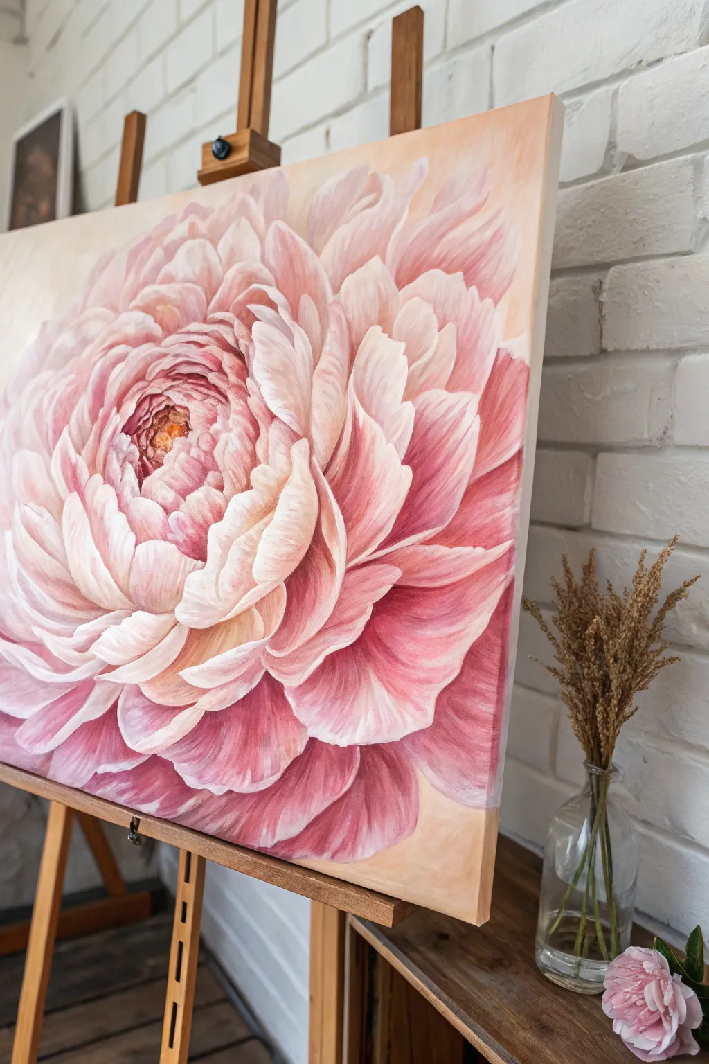
Alla Prima Floral Study in One Sitting
Capture the delicate beauty of a peony bouquet with this gentle alla prima oil study. By working on a creamy, neutral background, you’ll learn to build soft pink blooms and lush greens that feel fresh and light.
Step-by-Step
Materials
- Stretched canvas (rectangular portrait format)
- Oil paints: Titanium White, Alizarin Crimson, Cadmium Red Light, Sap Green, Ultramarine Blue, Yellow Ochre, Burnt Umber
- Odorless mineral spirits or turpentine
- Linseed oil medium
- Hog bristle brushes (filbert sizes 6 and 8, round size 4)
- Soft synthetic rigger or liner brush
- Wooden palette
- Palette knife
- Rag or paper towels
Step 1: Preparation and Background
-
Tone the canvas:
Begin by covering your entire white canvas with a very thin wash of Yellow Ochre and a touch of Titanium White. Dilute it heavily with spirits so it dries quickly to a matte finish. This warmth will glow through later layers. -
Mix the background color:
Create a creamy off-white mixture using a large amount of Titanium White with a tiny speck of Yellow Ochre and the smallest hint of Burnt Umber. It should look like warm parchment. -
Apply the background field:
Using a large filbert brush, paint this creamy color loosely over the canvas, but leave the center area—where the flowers will go—somewhat thin and transparent. Keep the strokes visible but blended. -
Sketch the composition:
With a round brush and thinned Burnt Umber, lightly map out the main shapes. Draw three large circles for the main blooms and smaller ovals for the buds. Indicate the sweeping lines of the stems gathering at the bottom.
Muddy Colors?
If your pinks are turning brown while blending, stop and clean your brush thoroughly. Wet-on-wet painting requires a pristine brush for highlights to sit cleanly on top of shadow layers.
Step 2: Establishing the Blooms
-
Mix your pink values:
Prepare three piles of pink on your palette: a dark shadow pink (Alizarin Crimson + touch of Green), a mid-tone pink (Alizarin + Cadmium Red + White), and a highlight pink (mostly White + tiny dot of Red). -
Block in the shadows:
Start with the darkest pink mixture. Identify the deep centers of the open peonies and the shadowed undersides of the petals. Apply this paint boldly in the center of your sketched circles. -
Construct the mid-tones:
Using the mid-tone pink, paint the main body of the petals surrounding the dark centers. Use curved strokes that mimic the cupping shape of a peony petal. -
Add the lightest petals:
Load a clean filbert brush with your lightest pink mixture. Lay in the outer edges of the petals and the tops of the buds. Let the brush ‘dance’ a bit to create ruffled edges rather than perfect circles. -
Create the white rose:
For the bottom-right flower, use a mixture that is almost pure white with a drop of crimson. Paint the rounded shape, keeping the center slightly warmer and darker to show depth.
Step 3: Leaves and Foliage
-
Mix varied greens:
Don’t just use tube green. Mix Sap Green with a little Red to dull it down for shadows, and Sap Green with Yellow Ochre for fresh, new leaves. I like to keep a bit of Blue handy for the coolest shadows. -
Paint the dark leaves first:
Tuck dark green leaves underneath and behind the pink flowers. This negative painting technique pop the light pink petals forward without outlining them. -
Add lighter foliage:
Using the yellow-green mix, paint the smaller, sharper leaves extending outward. Use the tip of the brush to create the pointed shapes typical of rose or peony leaves. -
Connect the stems:
With a thin round brush and a mix of Green and Burnt Umber, draw the stems gathered at the bottom. Allow lines to cross naturally, fading them out near the bottom edge for a vignette look. -
Add floating leaves:
Paint a few faint, ghost-like leaves in the background using a pale, milky green. This adds atmospheric depth, making the bouquet feel like it exists in 3D space.
Level Up: Texture
Use a palette knife to apply the final white highlights on the petals. This physical texture catches the light and mimics the waxy, thick feel of real peony petals.
Step 4: Refining and Detail
-
High-contrast definition:
Go back into the very center of the main pink peony with pure Alizarin Crimson to deepen the contrast. This anchors the flower. -
Highlighting the petals:
Take pure Titanium White on a small brush and add the final touches of light hitting the curled edges of the petals. Use thick, impasto paint here. -
Delicate stems and buds:
Use the rigger brush to add very thin, wandering stems for the smallest buds at the top. These lines should be graceful and slightly broken. -
Soften edges:
Use a clean, dry soft brush to very gently feather the edges of the background leaves into the cream canvas. Keep the focal flowers sharp, but let the periphery blur slightly. -
Final texture check:
Review the painting from a distance. If the background looks too flat, scumble a little bit of the flower colors (pale pink or green) into the cream background to harmonize the palette.
Step back and admire how the softness of the background creates a perfect stage for your floral arrangement
BRUSH GUIDE
The Right Brush for Every Stroke
From clean lines to bold texture — master brush choice, stroke control, and essential techniques.
Explore the Full Guide
Limited-Palette Flowers for Instant Harmony
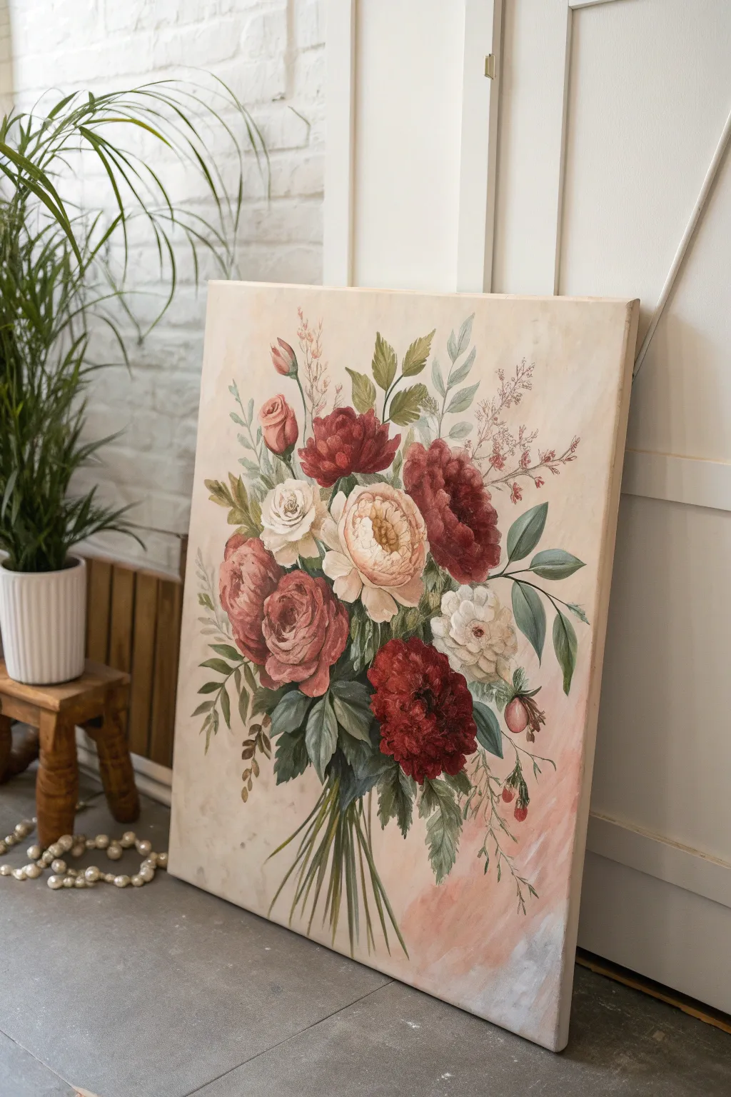
This elegant oil painting captures the romance of a vintage floral illustration using a restrained, harmonious palette. By focusing on soft peaches, deep burgundies, and muted greens against a wash of cream, you’ll create a timeless piece that feels cohesive and expertly composed.
Step-by-Step Guide
Materials
- Large stretched canvas (24×36 or similar)
- Oil paints: Titanium White, Yellow Ochre, Burnt Sienna, Alizarin Crimson, Sap Green, Ultramarine Blue, Raw Umber
- Gesso (if canvas isn’t pre-primed)
- Odorless mineral spirits
- Flat bristle brushes (large and medium)
- Round synthetic brushes (sizes 4, 6, and 8)
- Liner brush (size 0 or 1)
- Palette knife
- Paper towels or rags
- Easel or wall support
Step 1: Background & Underpainting
-
Prepare the muted background:
Mix a large amount of Titanium White with a tiny touch of Yellow Ochre and a speck of Burnt Sienna. Using a large flat brush, cover the entire canvas. The goal is a warm, creamy off-white tone rather than a stark white. -
Add the vintage wash:
While the background is still wet, mix a thin glaze of Burnt Sienna and mineral spirits. Loosely brush this into the corners and randomly across the center to create an aged, parchment-like texture. -
Introduce the pink haze:
In the lower right quadrant, blend in a very soft mix of Alizarin Crimson and White. Feather the edges so it melts seamlessly into the cream background, providing a soft foundation for the lower flowers. -
Sketch the composition:
Using a small round brush dipped in thinned Raw Umber, sketch the basic oval shape of the bouquet. Mark the locations of the three main large blooms first to anchor your composition.
Step 2: Blocking in the Blooms
-
Block in the deep reds:
Mix Alizarin Crimson with a touch of Sap Green to deepen it without making it black. Use a medium flat brush to block in the silhouette of the dark red peonies at the bottom and top center. -
Establish the peach tones:
Combine Titanium White, Yellow Ochre, and a hint of Alizarin Crimson to create a soft peach color. Paint the large central rose and the smaller bud in the upper left, focusing on their overall round shapes. -
Paint the white flowers:
Where the white roses will be, apply a mix of White with a drop of Raw Umber for a warm grey shadow base. Do not use pure white yet; save that for the final highlights. -
Lay down the greenery:
Mix Sap Green with Ultramarine Blue for cool dark leaves, and Sap Green with Yellow Ochre for warmer highlights. Block in the leaf shapes surrounding the flowers, ensuring they tuck behind the petals.
Color Harmony Tip
To maintain the ‘limited palette’ look, mix a tiny amount of your background cream color into every single flower and leaf color. This acts as a unifying agent instantly.
Step 3: Detailing & Refinement
-
Technique: Building rose petals:
Work wet-into-wet on the peach rose. Load a filbert brush with a lighter peach tone and press the brush down and pull inward to create the cupped outer petals. Add darker peach shadows in the very center. -
Refine the burgundy blooms:
Take the dark red base you created earlier and mix a lighter, rosier red (Alizarin + White). Dab this onto the top edges of the dark peony petals to indicate where the light hits the ruffles. -
Sculpt the white roses:
Using pure Titanium White, paint the highlighted tips of the white rose petals on top of the grey base. Keep your strokes loose and curved to mimic the unfolding layers of the flower. -
Add the leafy stems:
Using a size 6 round brush and thinned green paint, create the flowing stems. Notice how the leaves in the reference image vary—some are broad and olive-toned, while others are slender and sage-colored. -
Create the delicate filler:
Mix a very pale pinkish-brown using White, Burnt Sienna, and Crimson. Use the tip of a small round brush to dab tiny dots for the heather-like sprays extending from the top right. -
Detail the stems:
For the bottom bunch of stems, use confident, straight strokes with a liner brush and thinned distinct green mix. Make sure they converge logically at a single binding point, even if the binding isn’t visible.
Level Up: Texture Play
Use a palette knife to apply the final highlights on the central peach rose petals. The thick impasto paint will physically catch the light, adding a 3D element to the focal point.
Step 4: Final Touches
-
Deepen the contrast:
Mix a small amount of your darkest green (Sap Green + Blue + a touch of Crimson). Carefully paint into the deepest crevices between the flowers to make the lighter petals pop forward. -
Add airy wisps:
With your liner brush and very thin pale green paint, add the fine, fern-like fronds and thin stems that shoot out from the main bouquet to give it movement and airiness. -
Floating petals and buds:
Add the small hanging berry-like buds on the right side using a mix of dull red and brown. Keep the edges soft so they don’t distract from the main focal point. -
Final highlight check:
Step back from the painting. Apply the absolute brightest highlights of thick Titanium White to just a few key petals on the central peach and white roses to catch the light.
Allow your painting to dry for several weeks before varnishing to protect those rich, romantic hues.
Toned Canvas Underpainting for Warm Glow
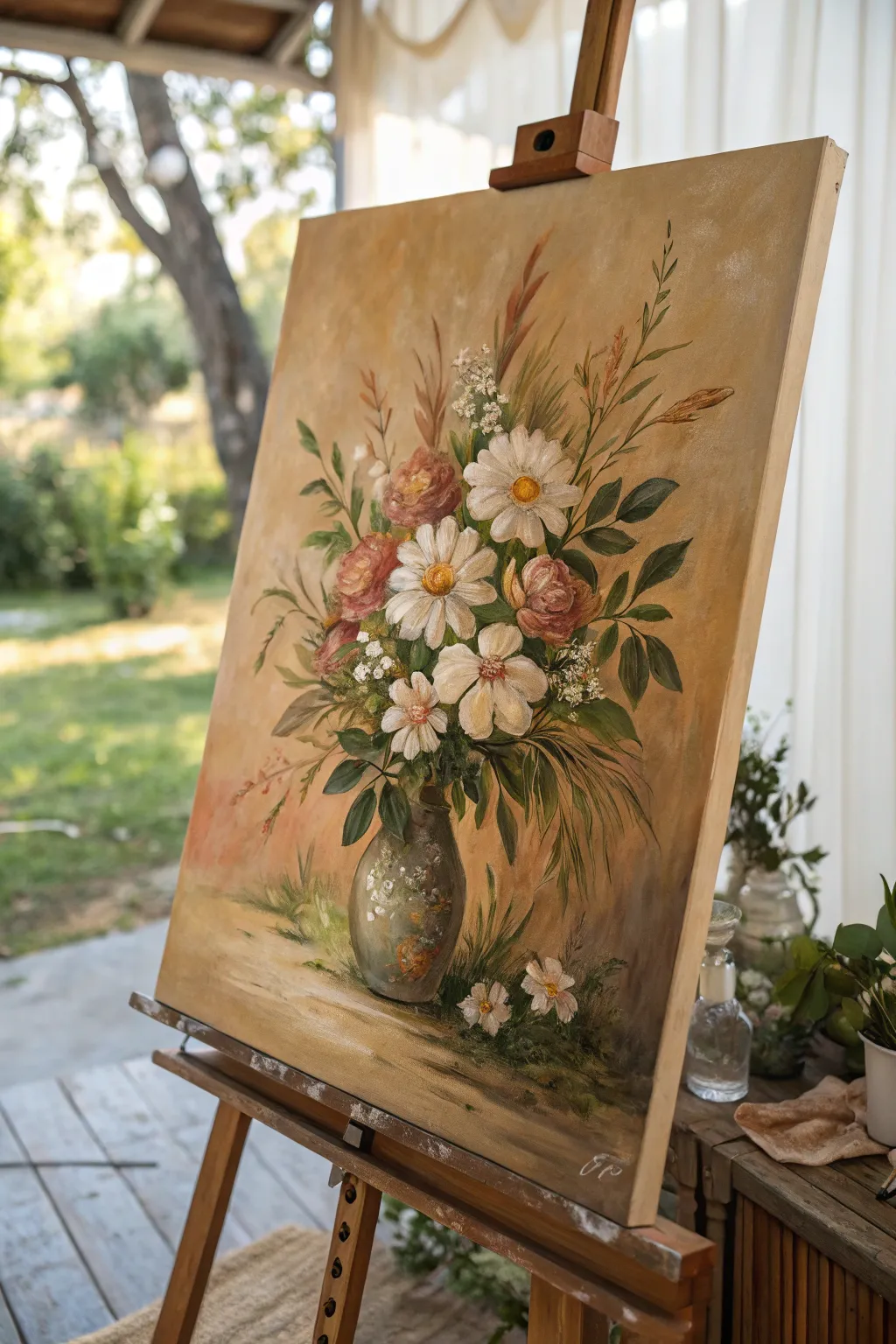
Capture the warmth of a late summer afternoon with this glowing floral still life, built upon a rich, earthy underpainting. The toned canvas technique allows light to emanate from within the bouquet, giving your daisies and roses a classic, harmonious feel.
Step-by-Step Tutorial
Materials
- Stretched cotton canvas (approx 16×20 inches)
- Oil paints: Yellow Ochre, Burnt Umber, Titanium White, Cadmium Yellow, Alizarin Crimson, Sap Green, Ultramarine Blue
- Odorless mineral spirits or turpentine
- Linseed oil medium
- Large flat bristle brush (2-inch)
- Assorted filbert brushes (sizes 4, 8, and 12)
- Small round detail brush (size 1 or 2)
- Clean rags or paper towels
- Palette knife
Step 1: Preparing the Toned Ground
-
Mix the toning wash:
Start by squeezing out a generous amount of Yellow Ochre and a touch of Burnt Umber. Mix these with a liberal amount of odorless mineral spirits to create a thin, fluid wash. -
Apply the tone:
Using your large 2-inch flat brush, cover the entire white canvas with this golden-brown mixture. Work quickly and loosely; you want a warm, uneven glow, not a flat wall of color. -
Wipe back highlights:
While the wash is still wet, take a rag and gently wipe away the paint in the center-left area where the bouquet will sit. This reveals the lighter canvas underneath, creating an instant spotlight effect for where your flowers will bloom. -
Dry the layer:
Allow this toned layer to dry completely. Since you used mostly solvent, it should be touch-dry within an hour or two, but waiting overnight is safest for proper adhesion.
Step 2: Blocking and Composition
-
Sketch the composition:
Using a small round brush dipped in thinned Burnt Umber, loosely sketch the oval shape of the vase near the bottom and the general directional lines of the stems and flower heads. -
Paint the background depth:
Mix Burnt Umber with a little Sap Green and no solvent. Scumble this darker shadow mixture around the edges of the canvas and behind where the leaves will be, deepening the atmosphere. -
Block in greens:
Mix Sap Green with a touch of Ultramarine Blue for deep foliage shadows. Use a size 12 filbert to lay in the dark leafy shapes around the bouquet’s core, preserving the warm toned background in the negative spaces.
Muddy Colors?
If your white petals turn pink or green instantly, your brush isn’t clean enough. Wipe your brush thoroughly between every color change, or keep a separate brush dedicated solely to the pure white mix.
Step 3: Rendering the Flowers
-
Block in the roses:
Mix Alizarin Crimson, White, and a hint of Yellow Ochre to get a dusty rose color. Paint the round forms of the pink flowers roughly. Don’t worry about petals yet; just establish the darker sphere shapes. -
Establish the daisies:
For the white daisies, mix Titanium White with a tiny speck of Yellow Ochre to warm it up. Use a size 8 filbert to pull paint from the outside of the flower toward the center, creating petal shapes. Leave the centers empty for now. -
Define rose petals:
Add more White to your rose mixture. Use the side of a filbert brush to lay in curved, C-shaped strokes on the lit side of the roses to suggest unfolding petals. -
Daisy centers:
Mix Cadmium Yellow with a spot of Burnt Umber. Paint the button centers of the daisies, dabbing the brush to create texture. Add a tiny highlight of pure yellow on top. -
Layering whites:
Go back to the daisies with pure Titanium White on a clean brush. Add a second layer of impasto strokes on the petals catching the most light, letting the textured paint physically stand out.
Level Up: Texture
For the centers of the daisies, use a palette knife to apply thick, gritty paint. This physical texture creates a realistic 3D effect that contrasts beautifully with the smooth background.
Step 4: Vase and Details
-
Paint the vase base:
Mix a grey-green using your Sap Green, White, and a touch of Burnt Umber. Fill in the vase shape, keeping the edges soft so it feels round. -
Add vase highlights:
Add a crisp stroke of white on the shoulder of the pot to show glossiness, and darken the right side with Umber to ground it. -
Baby’s breath filler:
Use a small detail brush or the tip of a palette knife to dot in clusters of tiny white flowers around the main blooms. Keep these irregular and airy. -
Fallen blooms:
Paint two small white flowers at the base of the vase on the ‘table’ surface to connect the subject to the ground. -
Refine stems:
Using thin, fluid paint and a rigger or liner brush, add graceful, arching lines for the grass-like foliage extending outward. I prefer to do this quickly to keep the movement fluid. -
Final highlights:
Step back and assess. Add touches of the lightest yellow and white to the tips of the leaves and the brightest petals to make the painting pop against the warm background.
Allow your painting to dry in a dust-free area for several days before varnishing to protect that glowing finish

PENCIL GUIDE
Understanding Pencil Grades from H to B
From first sketch to finished drawing — learn pencil grades, line control, and shading techniques.
Explore the Full Guide
Night Garden Florals on Deep Blue
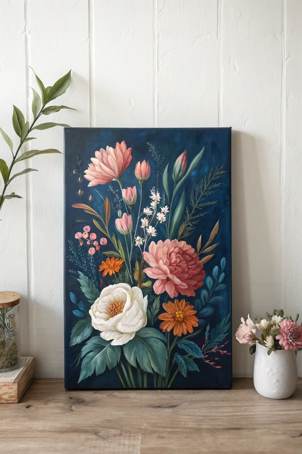
Capture the moody elegance of a midnight garden with this rich oil painting tutorial. You’ll learn how to build luminous floral forms against a dramatic, deep blue background for a striking contrast that makes every petal pop.
Detailed Instructions
Materials
- Stretched canvas (18×24 inches or similar vertical format)
- Oil paints: Prussian Blue, Phthalo Blue, Titanium White, Alizarin Crimson, Cadmium Red, Cadmium Yellow, Sap Green, Burnt Umber, Yellow Ochre
- Brushes: Large flat wash brush, filbert brushes (nos. 4, 6, 8), round liner brush (no. 1 or 2)
- Palette knife for mixing
- Palette (wooden or glass)
- Odorless mineral spirits or turpentine
- Linseed oil medium
- Paper towels or rags
- Easel
Step 1: Setting the Midnight Stage
-
Mix the background color:
Start by creating a deep, complex blue. Mix a large amount of Prussian Blue with a touch of Phthalo Blue and a tiny bit of Burnt Umber to deepen it without making it black. It should feel like a clear night sky. -
Apply the base coat:
Using your large flat wash brush, cover the entire canvas with this dark mixture. Use broad, sweeping vertical strokes. Don’t worry if it’s not perfectly even; subtle variations add atmosphere. -
Create a focal glow:
While the background is still wet, mix a slightly lighter blue using Phthalo Blue and a speck of White. Gently blend this into the center area where the main bouquet will sit to create a subtle halo effect. -
Rough sketch with paint:
Switch to a small round brush with thinned white paint (or a light grey mix). Very lightly sketch the main stems and positions of the major flower heads—the large white bloom at the bottom, the pink peony in the middle, and the taller stems reaching up.
Step 2: Blocking in Blooms
-
Base layer for leaves:
Mix Sap Green with a touch of Prussian Blue for deep shadows. Block in the large bottom leaves and the slender stems reaching upward. Keep the paint relatively thin here. -
Underpainting the white rose:
For the large bottom flower, mix Titanium White with a tiny bit of Yellow Ochre. Paint the general round shape, focusing on the outer petals first. -
Underpainting pink blooms:
Mix Alizarin Crimson with White for a cool pink base. Block in the large central peony and the upper tulip-like buds. Don’t worry about individual petals yet; just capture the mass and volume. -
Orange accents:
Using Cadmium Orange (or Red mixed with Yellow), block in the small daisy near the white rose and the smaller accent flowers tucked among the greenery.
Fat Over Lean
Remember the golden rule of oils: paint ‘fat over lean.’ Start with thinner paint (mixed with spirits) for early layers and use oilier, thicker paint for the final details to prevent cracking.
Step 3: Developing Form and Detail
-
Defining the white rose petals:
Load a filbert brush with pure Titanium White. Layer thick strokes on top of your ochre base to define the curved edges of the white petals. Leave the center slightly darker to create depth. -
Adding the rose center:
Mix Burnt Umber with Yellow Ochre and stipple the center of the white flower. Add tiny dots of pure White and Yellow on top for pollen texture. -
Sculpting the pink peony:
Take your pink mixture and add more White for highlights, and a touch of Cadmium Red for warmth. Paint individual petals starting from the outside edge and moving inward, curving your strokes toward the flower’s center. -
Refining the upper buds:
For the tall pink buds, add vertical streaks of lighter pink on one side to indicate a light source. Keep the base of the buds darker. -
Detailing the orange daisy:
Use a small filbert brush with a vibrant orange-yellow mix to paint distinct, radiating petals on the lower orange flower. Add a darker orange shadow at the base of each petal.
Glaze Meaning into it
Once fully dry, apply a transparent glaze of Phthalo Blue mixed with medium over the entire background (avoiding flowers) to deepen the shadows and unify the darkness.
Step 4: Atmosphere and Fine Textures
-
Highlighting foliage:
Mix Sap Green with Yellow Ochre and White. Paint veins and highlighted edges on the large bottom leaves. Use a flicking motion for the tall, grass-like leaves to make them look sharp and slender. -
Adding blue foliage elements:
Mix a ‘ghost’ blue using Cobalt or Phthalo Blue with White. Paint the fern-like leaves on the right side and background foliage on the left. These cooler tones help push these elements into the distance. -
Baby’s breath details:
Using a liner brush and pure, thick White, dot clusters of tiny flowers on the thin stems in the upper center. Group them irregularly so they look natural. -
Final highlights:
Step back and assess your contrast. Add the brightest highlights now—pure white on the tips of the rose, the peony petals, and the glossiest parts of the leaves. -
Softening edges:
I find it helpful to take a clean, dry brush and very gently graze over any background leaves that look too sharp, blurring them slightly into the deep blue void.
Allow your painting to dry in a dust-free area for several weeks before varnishing to protect those deep, rich colors.
Botanical Cut-Flower Portrait With Negative Space
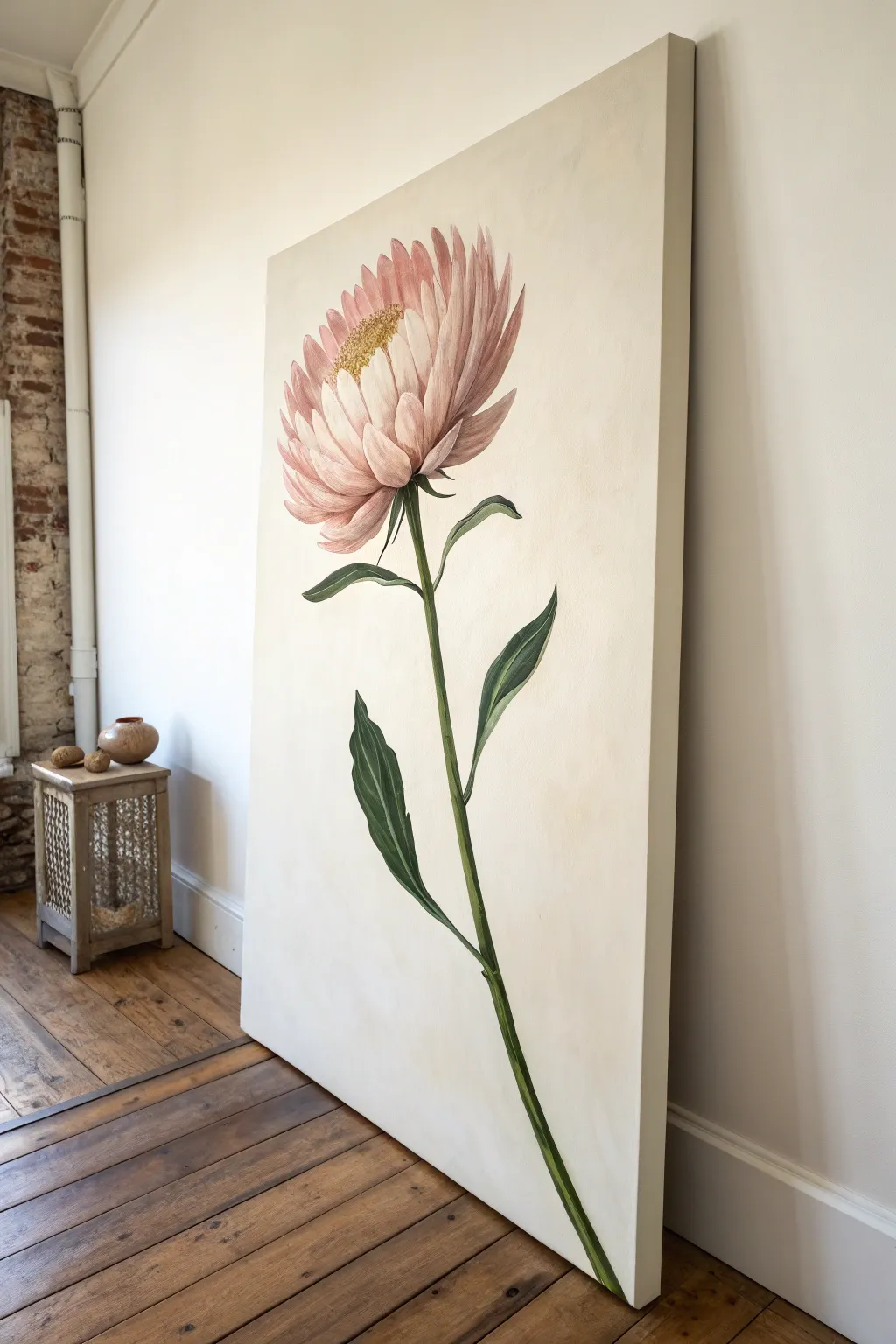
Capture the elegant simplicity of a single stem with this large-scale botanical portrait. By utilizing ample negative space and soft, creamy tones, you will create a striking focal point that feels both scientific and wonderfully artistic.
Step-by-Step Guide
Materials
- Large vertical stretched canvas (approx. 36×60 inches)
- Oil paints: Titanium White, Yellow Ochre, Alizarin Crimson, Sap Green, Burnt Umber, Raw Sienna
- Gesso (if canvas is unprimed)
- Assorted flat and filbert brushes (specifically sizes 8, 12, and a large 2-inch brush for background)
- Fine liner brush (size 0 or 00) for details
- Odorless mineral spirits or turpentine
- Lint-free rags
- Palette knife
- Easel (sturdy enough for a large canvas)
Step 1: Preparation and Background
-
Prime and tone the background:
Mix a large volume of Titanium White with a tiny touch of Yellow Ochre and a whisper of Raw Sienna. You want a warm, creamy off-white, almost like old parchment. Apply this evenly across the entire canvas using your large 2-inch brush to create a smooth, consistent field. -
Establish the composition:
Wait until the background is tacky but not fully dry so you can wipe away mistakes easily. Using a brush thinned with mineral spirits and a light wash of Sap Green, sketch the long, curving stem line. Start from the bottom right corner and curve gently upward toward the upper center. -
Rough in the flower head:
At the top of your stem line, sketch an oval shape to represent the bloom. Ensure it is angled slightly upward and to the left, mimicking the reference. Add rough indications for the main leaves along the stem.
Muddy Petals?
If your pinks are turning grey or muddy, stop blending wet-into-wet. Let the bottom layer dry to the touch (1-2 days) before adding shadows or highlights on top.
Step 2: Underpainting the Anatomy
-
Block in the stem color:
Mix Sap Green with a little Burnt Umber to dull it down. Paint the entire length of the stem using a flat brush. Keep the edges relatively crisp. -
Define the leaf shapes:
Using the same green mixture, fill in the large leaves. Note the twisting perspective on the lower leaf; paint the shape flat for now, focusing just on the silhouette against the creamy background. -
Base coat the petals:
Mix Titanium White with Alizarin Crimson and a touch of Yellow Ochre to get a dusty pink. Apply this as a base layer for the outer petals. For the inner petals closer to the center, add more White to lighten the value significantly. -
Establish the center:
For the pollen-heavy center, dab in a mixture of Yellow Ochre and Raw Sienna. Use a stippling motion with an old, stiff brush to suggest texture right from the start.
Step 3: Building Form and Depth
-
Shadowing the stem:
Deepen your green mix with more Burnt Umber and a touch of Alizarin Crimson (to make a deep brownish-green). Paint a shadow line along the right side of the stem to give it cylindrical volume. -
Detailing the leaves:
On the leaves, paint the veins using a lighter green (Sap Green + White). Add the dark green shadow mix to the undersides of the twisted leaves to distinguish the front face from the back. -
Sculpting the outer petals:
I like to work from back to front on flowers. Take your dusty pink mix and darken it slightly. Paint the shadows at the base of the outer petals where they attach to the stem. Use a filbert brush to pull the paint outward, following the curve of each petal. -
Highlighting petal tips:
Clean your brush thoroughly. Mix a pale, almost white pink. Apply this to the tips and upper edges of the petals to catch the ‘light.’ Blend softly into the mid-tone pink body of the petal. -
Refining the inner petals:
The petals near the center are upright and tightly packed. Use a smaller flat brush to paint these as vertical strokes, using a very pale cream-pink. Leave small gaps of shadow between them to define individual petals. -
Connecting the bloom:
Paint the small, leaf-like bracts (sepals) underneath the flower head where it meets the stem. These should be a transition color—a mix of the stem green and the petal pink.
Go Big
Scale is key here. Painting this flower 3x larger than life creates a modern, architectural feel. Don’t shrink your subject; let it dominate the vertical space.
Step 4: Fine Details and Finish
-
Texturing the center:
Return to the yellow center. Use a small round brush to dot focused spots of pure Yellow Ochre and tiny specks of white highlight. This creates the granular look of the pollen. -
Add petal striations:
Mix a thin glaze of Alizarin Crimson. Using a fine liner brush, gently drag very faint lines from the base of the petals upward. This mimics the natural veining and texture found in strawflowers. -
Sharpening edges:
Check the silhouette of the entire plant. If paint has smudged onto the background, use your original background cream color to cut back in and sharpen the edges of the stem and leaves. -
Final shading pass:
Add the darkest darks now. Place tiny accents of deep green/black in the deepest crevices where the leaves meet the stem and right under the flower head to maximize contrast.
Allow the painting to dry in a dust-free area for several weeks before varnishing to protect that creamy background.


Color-Blocked Abstract Florals
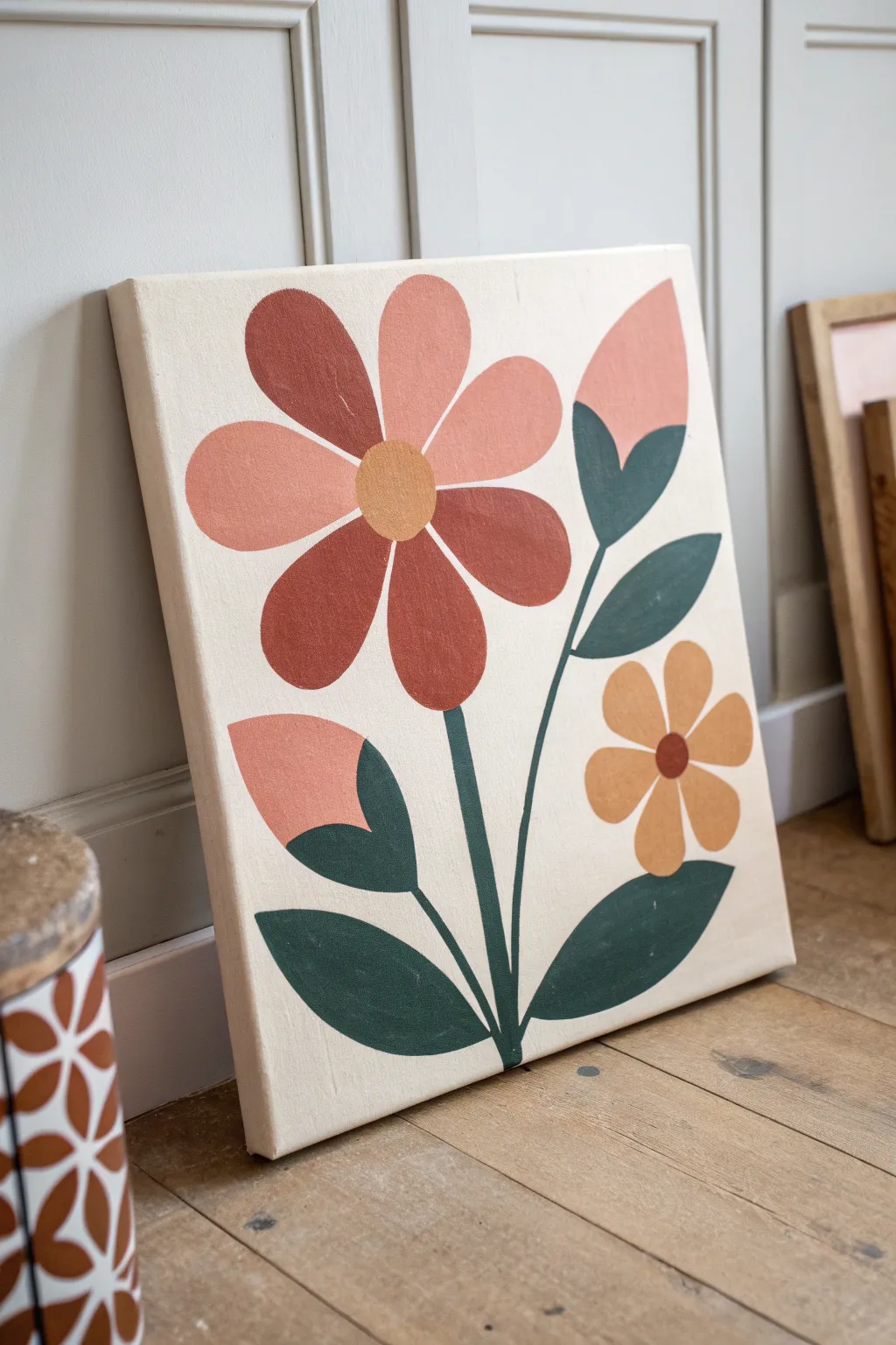
Embrace the charm of mid-century aesthetics with this bold color-blocked floral painting. Its warm, earthy palette and simplified shapes create a striking piece of wall art that feels both vintage and modern.
How-To Guide
Materials
- Rectangular stretched canvas (e.g., 16×20 inches)
- Acrylic or oil paints (Cream, Terracotta, Blush Pink, Mustard Yellow, Forest Green, Burnt Sienna)
- Flat shader brushes (medium and large sizes)
- Small round detail brush
- Pencil for sketching
- Eraser
- Palette for mixing
- Jar of water (for acrylics) or solvent (for oils)
- Paper towels
Step 1: Planning and Sketching
-
Prepare the Background:
Begin by painting the entire canvas with a creamy off-white shade. Use a large flat brush for broad, even strokes. This neutral base ensures your warm colors will pop later. -
Wait for the Base to Dry:
Allow the background layer to dry completely. If you are using oils, this might take a day or two; acrylics will be ready in about 20 minutes. -
Outline the Main Stems:
Using a pencil, lightly sketch three main curved lines stemming from the bottom center. The central line should be the tallest for the main flower, with one shorter curve branching to the right and another to the left. -
Sketch the Large Flower:
At the top of the central stem, draw a simple circle for the flower center. Around this, sketch seven broad, petal shapes. Don’t worry about perfect symmetry; a slightly organic look is better. -
Add Side Elements:
Draw the smaller five-petaled flower on the right stem. Sketch tulip-shaped buds on the upper right and lower left. -
Add Leaves:
Fill in the rest of the composition by sketching almond-shaped leaves attached to the stems. Vary the sizes to keep the composition dynamic.
Crisp Edge Secret
For ultra-sharp lines between colors, lightly sketch your shapes and apply masking tape or painter’s tape along the pencil lines before painting.
Step 2: Painting the Blooms
-
Block in the Large Petals:
Mix a warm terracotta and a softer blush pink. I like to alternate these shades on the large flower petals to create depth. Paint four petals in the darker terracotta and three in the lighter blush. -
Refine Edges:
Use the edge of a flat shader brush to get crisp, clean lines on your petals. The distinct separation between shapes is key to the color-blocked look. -
Paint the Smaller Flower:
Switch to a mustard yellow or ochre shade for the smaller flower on the right. Paint the petals carefully, leaving the center circle blank for now. -
Fill the Flower Centers:
Once the petals are tacky or dry, paint the center of the large flower with the mustard yellow. Use a deep burnt sienna or rust color for the center of the smaller yellow flower. -
Paint the Buds:
Use the blush pink shade for the rounded top part of the two buds. This connects them visually to the large central flower.
Step 3: Greenery and Finishing Touches
-
Paint the Stems:
Load a small round brush with forest green paint. Carefully trace over your pencil lines for the stems. Keep the pressure steady to maintain an even line thickness. -
Fill in the Leaves:
Switch back to a medium flat brush and fill in the leaf shapes with the same forest green. Paint from the base of the leaf outward to the tip for a smooth finish. -
Add Bud Leaves:
Paint the cupped leaves that hold the bottom of the pink buds using the forest green. Ensure the green slightly overlaps the bottom of the pink area for a seamless join. -
Check for Opacity:
Look over your work. The shapes should be solid opaque blocks of color. If the background shows through, apply a second coat to those specific areas. -
Clean Up Lines:
If any paint went outside the lines, use a small brush with your cream background color to tidy up the edges of the petals and leaves. -
Final Polish:
Erase any remaining visible pencil marks gently once the paint is fully dry to cure, leaving you with a pristine graphic finish.
Uneven Coverage?
If your lighter colors (like blush or yellow) look streaky over the cream background, mix a tiny amount of white paint into them to boost opacity.
Hang your new masterpiece in a spot that needs a splash of warmth and enjoy the retro vibes
Floral With Subtle Metallic Accents
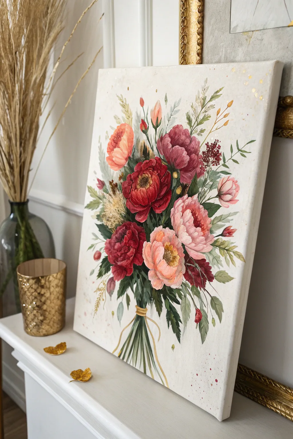
This elegant painting captures a loose, botanical-style bouquet of peonies and wildflowers, elevated by delicate metallic splatters. The soft yet vibrant palette creates a romantic atmosphere, perfect for adding a touch of sophisticated nature to a mantelpiece or gallery wall.
Step-by-Step Guide
Materials
- Stretched canvas (rectangular format, e.g., 16×20 inches)
- Acrylic or Oil paints (Titanium White, Alizarin Crimson, Cadmium Red, Olive Green, Sap Green, Yellow Ochre, Burnt Sienna, Peach/Coral, Mauve)
- Set of brushes: Flats (size 8-10), Rounds (size 4-6), and fine Liners (size 0-1)
- Liquid gold leaf or metallic gold acrylic paint
- Palette knife
- Water cup and palette
- Old toothbrush (for splatter effects)
- Pencil for sketching
- Easel or flat working surface
Step 1: Preparation and Sketching
-
Prime the Surface:
If your canvas isn’t pre-primed, apply two coats of gesso. For the specific look in the photo, mix a tiny drop of Yellow Ochre and a lot of Titanium White to create a warm, creamy off-white background color. Paint the entire canvas and let it dry completely. -
Map the Bouquet:
Using a pencil, lightly sketch the general ‘kite’ shape of the bouquet. Draw a central circle for the main red peony, and smaller circles around it for the supporting blooms. Mark the focal point slightly off-center for a natural look. -
Draft the Stems:
Draw the stems converging at the bottom center. They should look bound together. Sketch loose, radiating lines extending outward from the flowers to indicate where leaves and taller sprigs will go.
Pro Tip: Loose Edges
Don’t paint every petal perfectly. Let the outer edges of the bouquet fade slightly into the background or remain sketchy. This keeps the painting looking modern and airy rather than stiff.
Step 2: Painting the Blooms
-
Block in Base Colors:
Start with the main flowers. Fill the shapes with their darkest base tones—deep crimson for the center peony, mauve for the top right bloom, and a darker coral for the peach ones. Apply the paint thinly here. -
Layer Mid-Tones:
Mix white with your base colors to create mid-tones. Using a filbert or round brush, start making curved, petal-shaped strokes over the dark bases. Work from the outside of the flower inward, leaving the dark base visible in the deepest crevices. -
Highlighting Petals:
Mix your lightest tints (mostly white with a hint of color). Apply these to the very tips of the petals that would catch the light. Precise strokes are key here to give the peonies their fluffy, layered appearance. -
Painting the Centers:
For the open blooms (like the bottom peach one and the central red one), dab a mix of Yellow Ochre and Burnt Sienna in the very center. Use small, stippling motions with a small brush to create a textured, pollen-like effect.
Step 3: Greenery and Fillers
-
Deep Green Leaves:
Mix Sap Green with a touch of red or brown to deepen it. Paint the leaves that sit closest to the flower heads. Use a pointed round brush, pressing down to widen the stroke and lifting up to create sharp tips. -
Light Foliage:
Mix Olive Green with white. Paint softer, lighter leaves extending further out. Vary your greens to create depth—some cooler (more blue), some warmer (more yellow). -
Adding Textural Fillers:
Using a liner brush or a fan brush turned sideways, paint the wheat-colored stalks and fuzzy textures. Use a mix of Yellow Ochre and White. Use quick, flicking motions to mimic dried grass or pampas. -
Delicate Berry Sprigs:
With your fine liner brush, paint thin brown stems shooting out from the bouquet. Add tiny dots of red or dark pink for berries or buds at the ends of these delicate twigs.
Level Up: 3D Texture
Mix modeling paste into your acrylic paint for the flower petals. Use a palette knife to apply this thick mixture, creating actual physical ridges that catch the light.
Step 4: The Bow and Stems
-
Painting the Stems:
Paint the bundled stems at the bottom using various shades of green. Keep the lines relatively straight but organic, showing how they gather at the binding point. -
The Gold Ribbon:
Paint a simple horizontal band where the stems meet using Yellow Ochre as a base. Add two flowing lines downward for the ribbon tails. Once the base is dry, go over this with your metallic gold paint for a literal shine.
Step 5: Final Details and Metallic Accents
-
Refining Edges:
Step back from the canvas. If any flower edges look too sharp against the background, glaze a tiny bit of the background cream color over the edge to soften it. -
Detailing Flower Centers:
Go back to the flower centers. Add tiny dots of pure white or pale yellow to the stippled areas to make the pollen really pop. -
Gold Splatter:
This is the magical step. Dilute a small amount of gold paint or liquid gold leaf with a drop of water. Dip an old toothbrush into it, and flick the bristles with your thumb to spray fine gold specks around the top edges of the canvas. -
Strategic Gold Leaf:
I like to take a tiny brush with the metallic gold and add just 3-4 random dots or small strokes slightly separated from the main bouquet, mimicking floating pollen or fireflies. -
Varnish:
Allow the painting to cure completely (drying time depends on oil vs. acrylic). Once dry, apply a satin varnish to protect the colors and unify the sheen.
Now you have a stunning, romantic floral piece that looks beautiful standing on a mantel or hung in a bright room

Have a question or want to share your own experience? I'd love to hear from you in the comments below!