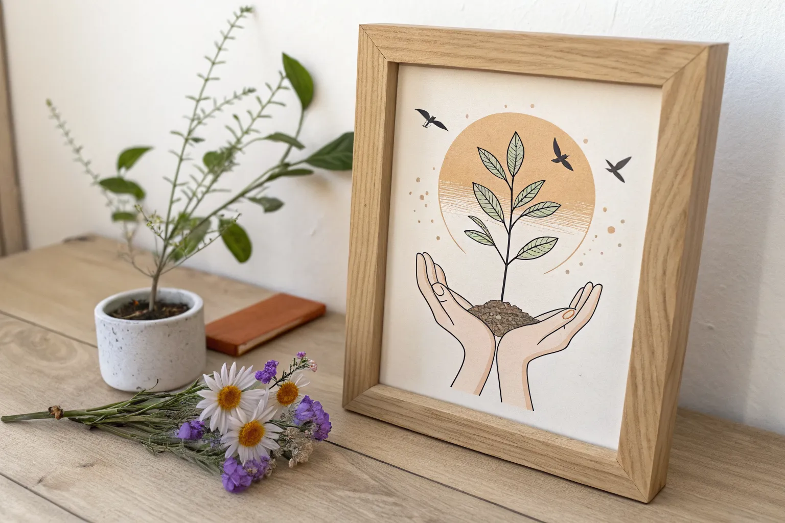
When I’m making art about hope, I always look for simple symbols that feel true—light after darkness, small signs of growth, and that steady pull upward. Here are some hope art ideas you can paint or draw in your own style, whether you want something soothing and gentle or bold and triumphant.
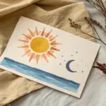
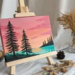
Sunrise Over a Quiet Horizon
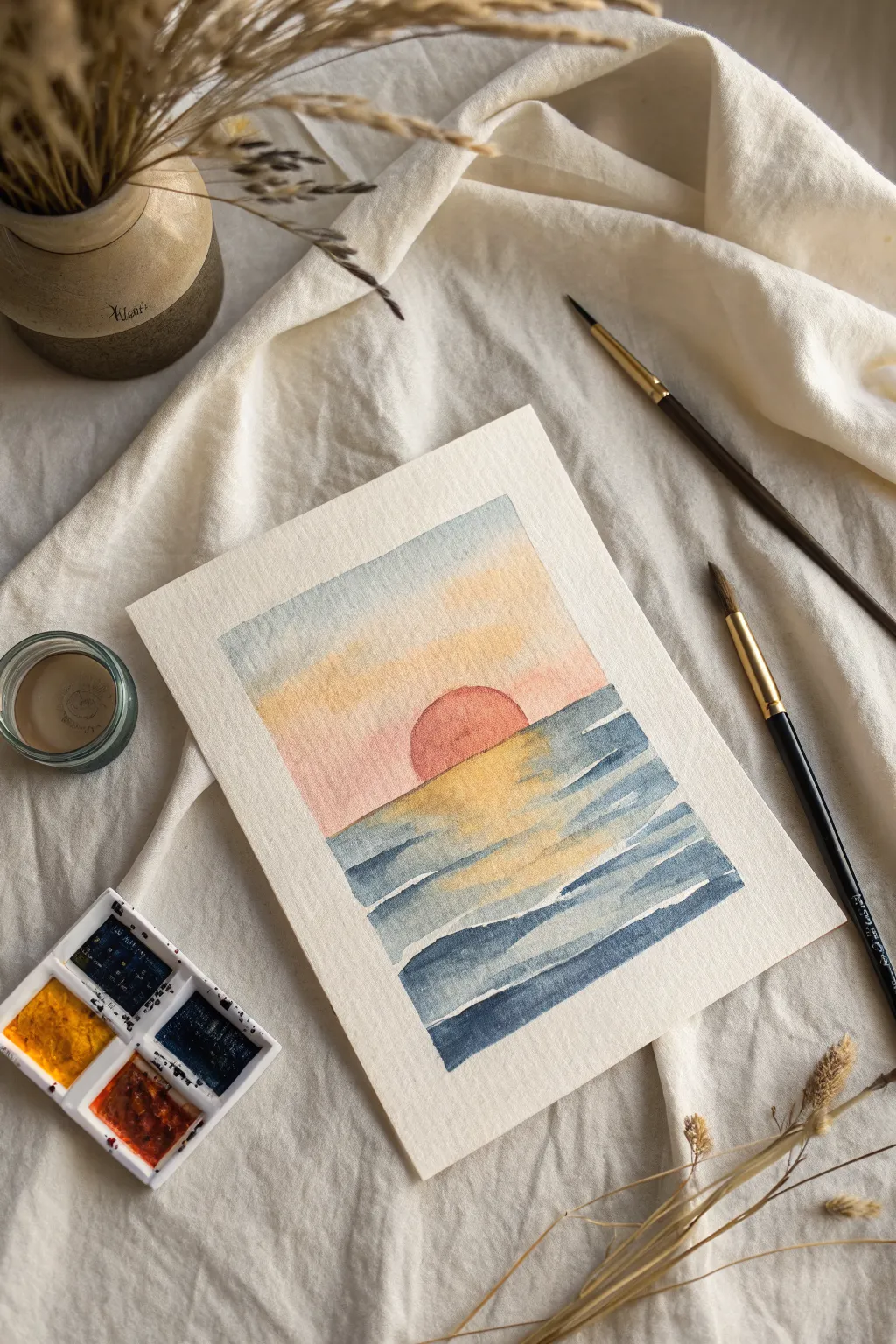
Capture the peaceful promise of a new day with this soft, radiant watercolor landscape. This project uses wet-on-wet techniques to create gentle gradients in the sky, contrasted with defined, rhythmic brushstrokes for the ocean waves.
Step-by-Step Tutorial
Materials
- Cold press watercolor paper (approx. 5×7 inches)
- Watercolor paints (Cerulean or Prussian Blue, Lemon Yellow, Cadmium Red/Orange)
- Masking tape or painter’s tape
- Flat shader brush (size 1/2 inch or similar)
- Round brush (size 4 or 6)
- Jar of clean water
- Paper towel or rag
- Mixing palette
Step 1: Preparation and Sky Gradient
-
Secure the borders:
Begin by taping down all four edges of your watercolor paper to a board or table. Press the tape firmly to ensure clean, crisp edges when you peel it off later. -
Pre-wet the sky area:
Using your flat brush and clean water, gently wet the top half of the paper where the sky will be. You want the paper damp and glistening, but not soaking wet with puddles. -
Apply the upper blue:
Load your flat brush with a diluted, watery mix of blue paint. Start at the very top edge and paint horizontally across, letting the color fade naturally as you move downward. -
Blend in the yellow:
Rinse your brush thoroughly. Pick up a light wash of yellow. Start painting just below the blue, allowing the wet edges to touch and bleed slightly into a soft green where they meet, blending downwards. -
Add the horizon warmth:
While the paper is still damp, introduce a very pale wash of red or pink at the horizon line. Blend this upward into the yellow to create a warm, peachy glow found just before sunrise. -
Let the sky dry completely:
This is crucial—wait for the sky section to be bone dry. If you paint the sun now, it will bleed into the sky and lose its shape.
Wet-on-Wet Magic
For the softest sky gradients, tilt your paper board slightly. Gravity pulls the wet pigment down, helping the colors blend seamlessly without harsh lines.
Step 2: The Sun and Sea
-
Paint the rising sun:
Using a round brush and a more saturated mix of red with a touch of orange, carefully paint a semi-circle sitting right on the horizon line. Keep the edges neat. -
Establish the reflection zone:
Directly beneath the sun, paint a vertical column of zig-zagging yellow strokes. Leave small gaps of white paper between some strokes to represent sparkling light. -
Prepare the ocean blue:
Mix a medium-strength blue on your palette. You want this to be darker than your sky color to give the water visual weight. -
Paint the background waves:
Starting at the horizon line on either side of the sun, paint horizontal strokes of blue. Keep these strokes thin and close together to imply distance. -
Work around the reflection:
As you bring the blue strokes toward the center, carefully paint up to the edges of your yellow reflection strokes, but try not to overlap them entirely. I find blending the edges slightly while wet creates a glow. -
Deepen the foreground:
As you move down the paper, make your blue mix slightly darker and more intense. Use broader, wavier strokes to represent the larger swells of water closer to the viewer. -
Add wave separation:
Leave narrow strips of unpainted white paper between the rows of blue waves. These white ‘resist’ lines act as the foam or light catching the tops of the waves. -
Refine the reflection:
Using a very small amount of diluted red or orange, lightly glaze over a few distinctive yellow reflection spots in the water to tie the color of the sun into the sea. -
Final dry and reveal:
Allow the entire painting to dry completely. Once dry to the touch, slowly peel the tape away at a 45-degree angle to reveal your crisp white border.
Blooms in the Sky?
If cauliflower-like blooms appear in your sky, you likely added water to semi-dry paint. Let it dry completely, then lightly glaze over it to smooth it out.
Now you have a tranquil moment of morning light captured forever on paper


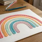
Rainbow Breakthrough Wash
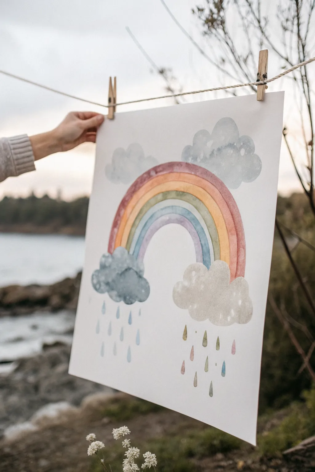
Capturing the serene feeling of a storm clearing, this watercolor project combines soft, muted rainbow tones with whimsical rain clouds. The gentle washes and playful raindrops create a piece that feels both hopeful and grounding.
Detailed Instructions
Materials
- High-quality watercolor paper (cold press, at least 140lb)
- Watercolor paints (muted palette: earthy red, ochre, sage green, indigo/payne’s gray, dusty pink)
- Round watercolor brushes (size 6 and size 2 for details)
- Pencil for sketching
- Eraser
- Two jars of water
- Paper towels
- Masking tape (optional, for securing paper)
Step 1: Sketching the Foundations
-
Outline the arc:
Begin by lightly sketching the main rainbow arc in the center of your paper. Draw five concentric semi-circles, leaving enough space between them for your paint strokes. -
Add floating clouds:
Sketch two fluffy cloud shapes sitting directly at the base of the rainbow’s legs. Make the left one slightly larger and lumpier to represent a storm cloud. -
Position upper clouds:
Draw two additional cloud shapes hovering behind the top of the rainbow arc. These don’t need to be perfectly symmetrical; organic shapes look best. -
Refine the lines:
Gently erase your pencil lines until they are barely visible, just enough to guide your brush without showing through the translucent paint.
Wet-on-Wet Wonder
For fluffier clouds, wet just the cloud shape with clean water first, then drop pigment in. The paint will bloom naturally to soft edges.
Step 2: Painting the Rainbow & Clouds
-
The first red band:
Load your size 6 brush with a watered-down earthy red or terracotta color. Paint the outermost band of the rainbow, keeping the edges soft. -
Layering warmth:
Move inward to the next stripe using a golden ochre or soft orange. Be careful not to let the wet paint touch the red band yet if you want crisp lines, or let them touch slightly for a bleed effect. -
Cooler tones:
Paint the middle band with a muted sage or olive green. Follow the curve carefully, maintaining a consistent width. -
The inner arches:
Complete the rainbow with a stripe of dusty blue followed by a final inner arch of soft violet or indigo. -
Upper clouds base:
While the rainbow dries, wash the upper clouds with a very pale, diluted cool blue-grey. Keep this layer specifically light and airy. -
Storm cloud definition:
Paint the bottom-left cloud with a deeper, moodier indigo or Payne’s gray. Dab in concentrated pigment while it’s wet to create texture and depth. -
Light cloud details:
For the bottom-right cloud, use a warm beige or very light grey wash. Keep this one significantly lighter than its stormy neighbor.
Metallic Magic
Once the painting is completely dry, use metallic gold watercolor or a gold paint pen to trace a thin outline on one side of the rainbow stripes.
Step 3: Atmospheric Details
-
Adding cloud volume:
Once the initial cloud layers are semi-dry, use a smaller brush to add shadows to the bottom edges of the upper clouds to give them dimension. -
White highlights:
I like to lift a little pigment out of the wet clouds with a thirsty brush or clean paper towel to create soft, white highlights. -
Left side rain:
Using your size 2 brush and the blue-grey mix, paint simple teardrop shapes falling from the dark storm cloud on the left. -
Right side colorful rain:
beneath the lighter right-hand cloud, paint raindrops using the various colors from your rainbow—pink, ochre, green, and blue droplets falling together. -
Softening edges:
Check the intersections where the clouds meet the rainbow. If the lines are too harsh, soften them with a slightly damp brush to blend the elements. -
Final touches:
Step back and assess your color balance. If the rainbow looks too pale, add a second glaze of color over the dry stripes to boost vibrancy.
Let your unique weather system dry completely before framing or hanging it up to brighten a room

Heart Beacon With Radiating Rays
This uplifting project combines the rustic charm of textured handmade paper with a modern sunburst design. By layering cut strips of paper, you’ll create a dimensional ‘Heart Beacon’ that radiates warmth and positivity from any shelf.
Detailed Instructions
Materials
- Various sheets of handmade or seed paper (white, yellow, orange, pink, red)
- White textured cardstock (for the background)
- White or cream picture frame (approx. 8×10 inches) with mount
- Pencil
- Ruler
- Craft knife or scalpel
- Cutting mat
- Scissors
- PVA glue or tacky craft glue
- Fine paintbrush (for glue application)
- Round object (for tracing the sun disk)
Step 1: Planning and Preparation
-
Prepare the Background:
Cut your white textured cardstock to fit the frame opening. Place the frame’s mount over your cardstock lightly to mark the visible area with a pencil, giving you clear boundaries for your design. -
Mark the Focal Point:
Find the horizontal center of your workspace near the bottom edge. Mark a spot slightly above the visual bottom of the frame opening; this will be the center of your sun disk. -
Draft the Heart:
Sketch a simple, symmetrical heart shape on a piece of scrap paper first to get the size right—it should be large enough to be the focal point but leave room for the rays. Once happy, trace it onto your white handmade paper but don’t cut it yet. -
Plan the Rays:
Using a ruler, lightly draw lines radiating from your sun’s center point outward to the edges of your background. vary the width of these sections slightly to create a dynamic ‘burst’ effect.
Step 2: Cutting the Components
-
Trace Ray Segments:
I find it easiest to tracing paper to copy the exact shape of each ray segment you just drew. This creates accurate templates for your colored paper. -
Cut Colored Rays:
Using your templates, cut the ray shapes from your various colored handmade papers. Alternate colors—yellows, soft oranges, muted reds, and pinks—to create a warm gradient. -
Create the Sun Disk:
Find a small round object (like a coin or bottle cap) and trace a circle onto yellow handmade paper. Cut this out carefully with scissors. -
Cut the Heart:
Cut out the white heart shape you traced earlier. Handmade paper can be fibrous, so distinct, sharp scissor cuts work better than dragging a knife through it.
Tearing vs. Cutting
For a softer, organic look, try tearing the paper edges against a ruler instead of cutting them. This exposes the fibers and adds texture.
Step 3: Assembling the Design
-
Dry Fit the Rays:
Before gluing, lay all your colored ray strips onto the background to ensure they fit snugly next to each other without leaving unintentional gaps. -
Glue the Rays:
Lift one strip at a time, apply a thin layer of PVA glue to the back using a brush, and press it firmly into place. Work from the center outward to keep things symmetrical. -
Trim Overhang:
If your paper strips extend past your penciled border, use your craft knife and ruler to trim them flush so the mount will sit flat later. -
Attach the Sun:
Adhere the yellow sun disk at the convergence point of all the rays at the bottom. This covers the messy points where all the strips meet. -
Mount the Heart:
Apply glue to the back of your white heart. Position it centrally within the rays, slightly floating above the sun disk but not touching the top edge. -
Press and Dry:
Place a clean sheet of paper over your artwork and weigh it down with a heavy book for about 30 minutes. This prevents the textured paper from curling as the glue dries.
Make it Grow
Use plantable seed paper for the heart and rays. If you ever tire of the art, you can plant the paper in soil to grow wildflowers.
Step 4: Final Framing
-
Clean the Glass:
While the art dries, clean the inside of your frame’s glass thoroughly to remove any dust or fingerprints. -
Insert Artwork:
Place the mount over your artwork, then secure it into the frame. Check that the sunburst is centered nicely within the window. -
Final Inspection:
Look closely for any stray paper fibers caught between the glass and the mount, removing them before closing up the back of the frame.
Hang your finished piece in a spot that catches the morning light to highlight the lovely texture of the paper
One Word “Hope” in Bold Lettering
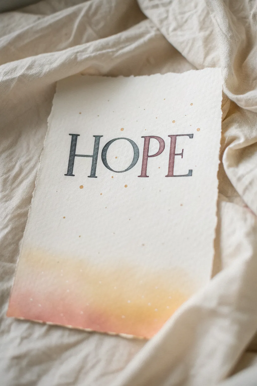
This project combines the rustic charm of deckled-edge paper with elegant, gradient lettering for a minimalist piece of art. The soft watercolor wash at the bottom adds a sunrise-like warmth that perfectly complements the hopeful message.
Step-by-Step
Materials
- Heavyweight cold-press watercolor paper (or handmade cotton paper with deckled edges)
- Pencil (HB or 2H)
- Ruler
- Eraser (kneaded)
- Black waterproof fine liner pen (01 or 03 size)
- Watercolor paints (Payne’s gray, dusty rose/mauve, warm yellow, peach)
- Small round brushes (size 2 and 4)
- Gold metallic watercolor or ink
- Paper towel
- Water cups
Step 1: Preparation and Layout
-
Prepare the paper:
If you aren’t using pre-deckled paper, tear the edges of your watercolor paper against a ruler to create a soft, ragged edge on all four sides. -
Mark guidelines:
Using a ruler and a very light pencil touch, draw a horizontal baseline about one-third of the way down from the top edge. Draw a cap-height line approximately 1.5 inches above that. -
Sketch the letters:
Lightly sketch the word ‘HOPE’ in a serif typeface. Focus on evenly spacing the letters, keeping the serifs sharp and the vertical strokes slightly thicker than the horizontal ones. -
Refine the shapes:
Go back over your sketch to thicken the downstrokes, creating a faux-calligraphy look where the vertical lines have weight and the crossbars remain thin.
Clean Edges Trick
Work slowly on serif corners. If paint bleeds outside the line, quickly dab it with a clean, dry corner of a paper towel to lift the mistake.
Step 2: Painting the Lettering
-
Mix your colors:
Prepare two puddles of watercolor on your palette: a diluted Payne’s gray (or teal-grey) and a soft dusty rose mixed with a touch of brown. -
Start the gradient:
With a damp size 2 brush, pick up the gray pigment. Start painting the top half of the ‘H’, carefully staying within your pencil lines. -
Blend the transition:
While the gray is still wet, rinse your brush, pick up the dusty rose, and paint the bottom half of the letter, letting the two colors touch and bleed into each other in the middle. -
Continue the process:
Repeat this wet-on-wet gradient technique for ‘O’, ‘P’, and ‘E’. Ensure the transition point is roughly at the same height across all letters. -
Let it dry completely:
Allow the lettering to dry fully. If you work too soon, the next steps might smudge your crisp edges.
Step 3: Background Ambience
-
Outline the text:
Once the paint is bone dry, carefully outline the letters with a very fine waterproof black pen to give them definition and correct any uneven paint edges. -
Prepare the bottom wash:
Mix a watery wash of peach and warm yellow. Saturate the bottom inch of the paper with clean water first. -
Apply the sunrise gradient:
Drop the peach color into the very bottom edge and the yellow just above it, letting them diffuse upward into the white paper. Keep this wash soft and concentrated only at the bottom. -
Add texture:
Load a brush with gold metallic paint or ink. Hold it over the paper and tap the handle against another brush to splatter fine gold specks across the word and the white space. -
Erase guidelines:
Wait until everything is absolutely dry, then gently use a kneaded eraser to lift any visible pencil guidelines without damaging the paper surface.
Add Dimension
Use a light gray marker to add a very subtle drop shadow to the right of each letter for a 3D effect that pops off the page.
Display your finished piece in a floating frame to show off those beautiful deckled edges
BRUSH GUIDE
The Right Brush for Every Stroke
From clean lines to bold texture — master brush choice, stroke control, and essential techniques.
Explore the Full Guide
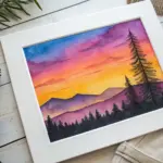
Hope Postcards to Send Out
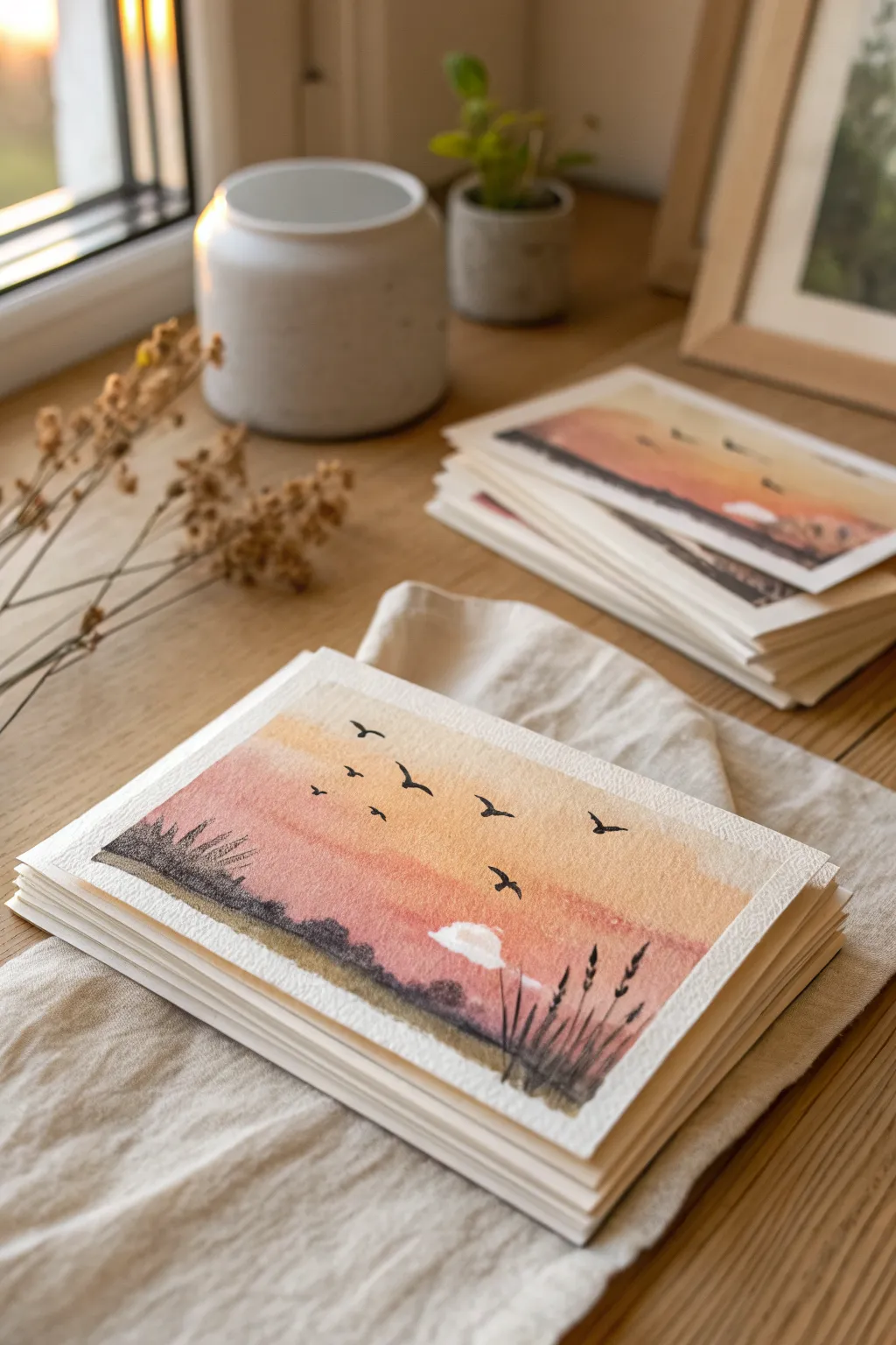
These peaceful postcards capture the quiet promise of a new day with a soft, glowing gradient sky and delicate silhouettes. Perfect for mailing messages of hope, these simple yet beautiful cards rely on easy wet-on-wet techniques and striking contrast.
Detailed Instructions
Materials
- Cold press watercolor paper (300 gsm)
- Watercolor paints (Peach, Rose Madder, Yellow Ochre, Burnt Umber, Payne’s Gray or Black)
- White gouache or white gel pen
- Masking tape
- Flat wash brush (¾ inch)
- Small round detail brush (size 1 or 2)
- Jar of clean water
- Palette for mixing
- Paper towels
Step 1: Preparing the Base
-
Format your paper:
Cut your watercolor paper into postcard-sized rectangles (typically 4×6 inches). If you want that rustic, handmade look shown in the inspiration, carefully tear the edges against a ruler instead of cutting them. -
Secure the surface:
Tape your paper down to a hard board. This prevents the paper from buckling when we add the wet washes in the next steps. -
Pre-wet the sky:
Using your flat brush and clean water, apply a thin, even glaze of water to the top two-thirds of the paper. You want it shiny but not pooling.
Step 2: Painting the Gradient Sky
-
Apply the warm horizon:
Load your brush with a watery mix of Peach or diluted Rose Madder. Swipe this across the middle of the paper where the horizon will be, letting the color bloom into the wet surface. -
Add golden tones:
While the first stripe is still wet, introduce some Yellow Ochre just above the pink tones. Allow the colors to bleed into each other naturally for a soft transition. -
Create the upper sky:
Towards the top of the paper, you can fade the color out to white or add a very faint touch of blue-grey for a morning mist effect. Keep the strokes horizontal and fluid. -
Form the ground layer:
While the sky dries slightly, mix a darker, muddy purple using Rose Madder and a touch of Payne’s Gray. Paint a hazy, soft strip at the very bottom for the distant land, letting the top edge blur upward slightly. -
Let it dry completely:
This is crucial. The paper must be bone dry before adding sharp details. If you touch it and it feels cool, it’s not ready yet.
Soften the Sun
To make the white sun/cloud look glowing rather than pasted on, lightly dampen the paper around the white paint and gently blur the edges into the pink sky.
Step 3: Adding Silhouettes and Details
-
Mix the silhouette color:
Create a rich, dark color for the foreground elements. I prefer mixing Burnt Umber with Payne’s Gray rather than using straight black, as it gives a softer, organic look. -
Paint the horizon line:
Using a smaller brush, paint an uneven, organic line across the lower third of the card to establish the ground. Keep it textured to suggest low bushes or terrain. -
Add distant shrubbery:
Stipple your brush along the horizon line to create the look of distant bushes. Keep these shapes low and somewhat connected. -
Paint foreground grasses:
Switch to your smallest detail brush. In the bottom right corner, flick the brush upward quickly to create thin, tapering blades of grass. Vary their heights significantly for realism. -
Add seed heads:
Dot the tops of a few grass blades to create seed pods or wheat-like textures. Don’t overdo it—just a few clusters add nice interest. -
Create the flock:
Using the very tip of your detail brush and the dark silhouette mix, paint small ‘V’ or ‘M’ shapes scattered across the upper sky. Vary the size to show depth—smaller birds look further away. -
Refine bird shapes:
Make sure the wings taper to points. A common mistake is making them too thick; keep a light hand.
Add Metallic Magic
Once the paint is dry, use a gold pen to trace the upper edge of the cloud or add tiny specks of dust in the air for a magical, shimmering finish.
Step 4: Final Touches
-
Add the cloud:
Take a tiny amount of white gouache. Paint a small, low cloud near the horizon. Soften the bottom edge with a damp brush so it blends into the sunset colors. -
Check contrast:
Step back and look at your card. If the foreground grasses dried too light, go over them again with a second layer of the dark mix to ensure they pop against the sunset. -
Remove tape:
Once everything is absolutely dry, peel your masking tape away slowly at a 45-degree angle to reveal crisp borders (if you didn’t tear the edges) or just to release the paper.
Now you have a stack of serene landscapes ready to carry your words of hope to friends and family
Collage of Future Dreams and Goals
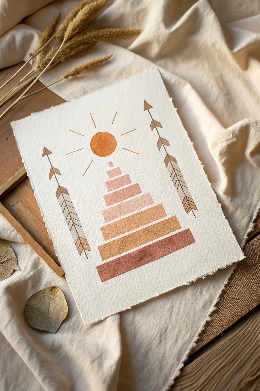
This serene, geometric artwork combines the warmth of earthy gradients with crisp tribal motifs to create a symbol of rising hope. It features a stylized sun rising over a terraced pyramid, flanked by decorative arrows, all painted on high-quality deckle-edge paper for a rustic, artisanal feel.
Step-by-Step Tutorial
Materials
- Heavyweight watercolor paper (300gsm, cold press)
- Watercolor or gouache paints (burnt sienna, ochre, terracotta, dusty pink)
- Flat shader brush (size 6 or 8)
- Fine liner brush (size 0 or 1)
- Ruler
- Pencil (HB or lighter)
- Clean water jar
- Paper towel
- T-square (optional for aligning lines)
- Paper tearing ruler (optional for deckled edges)
Step 1: Preparation and Sketching
-
Prepare the paper edge:
Before you begin painting, give your paper that beautiful, torn ‘deckled’ edge. Lay a metal ruler flat against the edge of your watercolor paper and tear the paper upward against the ruler to create a rough, ragged texture. -
Map the center axis:
Find the vertical center of your paper. Lightly sketch a faint vertical line with your ruler to serve as a guide for the central pyramid and sun, ensuring everything stays symmetrical. -
Sketch the pyramid tiers:
Draw the stacked rectangular shapes for the central pyramid. Start with the widest rectangle at the bottom and work your way up, making each tier slightly narrower and taller as you ascend. -
Outline the sun:
Use a compass or trace a small circular object to draw a perfect circle hovering slightly above the top tier of your pyramid. -
Mark the arrows:
On the left and right sides of your composition, draw two long vertical lines for the arrow shafts. Sketch the triangular tips at the top and the fletching (feathers) patterns further down the shaft.
Uneven Edges?
If your rectangle edges look wobbly, use washi tape or low-tack painter’s tape to mask off the boundaries. Peel it away gently while the paint is still damp for clean lines.
Step 2: Painting the Gradient Pyramid
-
Mix your palette:
Prepare four or five distinct shades ranging from a dark rust/terracotta to a light dusty pink. I prefer mixing gouache for this as it gives that lovely opaque, matte finish seen in the original. -
Paint the base tier:
Using your flat shader brush, load it with the darkest rust color. Carefully fill in the bottom-most rectangle, keeping your edges crisp and straight against your pencil lines. -
Paint the middle tiers:
Move to the next tier up, switching to a slightly lighter ochre-orange shade. Paint this rectangle, leaving a tiny gap of white space between it and the bottom tier to define the separation. -
Complete the upper tiers:
Continue painting upward, lightening your color mixture for each step. The top few blocks should be a soft, pale peach or dusty pink tone. -
Fill the sun:
Clean your brush thoroughly. Mix a vibrant, warm orange—perhaps blending your ochre with a touch of the rust tone. Paint the circular sun carefully, making it the focal point of warmth.
Pro Tip: Color Harmony
To keep the palette cohesive, mix a tiny dot of your darkest base color into every other color you create. This unifies the tones and prevents any single color from looking out of place.
Step 3: Adding Details
-
Paint the sun’s rays:
Switch to your fine liner brush. Using the same orange mix as the sun, paint thin, straight lines radiating outward. Alternate between shorter and longer lines for a dynamic effect. -
Define the arrow shafts:
Using a dark brown or deep taupe shade, carefully paint the long vertical lines for the arrow shafts on both sides. Use a ruler as a guide for your brush if you don’t trust your steady hand. -
Paint the arrowheads:
Fill in the triangular tips of the arrows. Ensure the points are sharp and directed upward. -
Detail the first fletching section:
Move down the shaft to the upper section of feathers. Paint small, angled strokes (chevrons) pointing downward. Keep the spacing consistent to mimic the look of feathers. -
Detail the lower fletching:
Paint the lower section of fletching with larger, broader angled strokes. You can slightly vary the color intensity here, perhaps watering down the paint for a semi-transparent look. -
Erase guide lines:
Once the paint is completely bone-dry (give it at least 20 minutes), gently erase any visible pencil marks, being careful not to rub the painted areas too vigorously.
Frame your geometric sunrise in a natural wood shadow box to complement those lovely raw edges you created.

PENCIL GUIDE
Understanding Pencil Grades from H to B
From first sketch to finished drawing — learn pencil grades, line control, and shading techniques.
Explore the Full Guide
Many Hands Reaching Toward Light

This inspiring watercolor piece symbolizes hope and unity as a diverse array of hands stretch upward toward a glowing sun. The soft, layered washes and gently textured paper create a warm, inviting atmosphere perfect for an art corner or gratitude journal.
Detailed Instructions
Materials
- Cold-press watercolor paper (300 gsm or heavier)
- Watercolor paints (Yellow Orche, Burnt Sienna, Burnt Umber, Payne’s Grey, Teal/Turquoise)
- Round brushes (sizes 4 and 8)
- Pencil (HB or lighter)
- Kneaded eraser
- Jar of clean water
- Paper towels
- Palette
Step 1: Sketching the Composition
-
Establish the sun:
Begin by lightly sketching a circle in the upper center of your paper, roughly 2 inches in diameter. Draw a slightly larger concentric circle around it to mark the sun’s outer halo. -
Map out the arms:
Lightly sketch vertical and diagonal lines reaching up from the bottom edge of the paper. Vary the heights; some hands should reach almost to the sun, while others stay lower. Aim for about 8-10 arms. -
Refine the hand shapes:
Flesh out the sketches into arm and hand shapes. Keep the style simple and silhouette-like rather than anatomical. Ensure fingers are spread slightly to suggest reaching and openness. -
Clean up the sketch:
Use your kneaded eraser to lift most of the graphite, leaving only the faintest ghost lines to guide your painting. Dark pencil lines can show through watercolor and look messy.
Wet-on-Dry Precision
Wait for paint to dry fully before painting adjacent shapes. This ‘wet-on-dry’ technique ensures crisp edges between the hands.
Step 2: Painting the Sun
-
Paint the core:
Mix a warm Yellow Ochre. Using your size 8 brush, fill in the inner circle of the sun. While it’s still wet, I like to drop in a tiny touch of Burnt Sienna near the bottom edge for a shadow effect. -
Create the halo:
Dilute your Yellow Ochre with plenty of water to make a tea-like wash. Paint the outer ring around the sun, leaving a hairline gap of dry paper between the core and the halo to prevent them from bleeding together. -
Add the rays:
Switch to a smaller brush (size 4). Mix varied diluted shades of faint teal, muted orange, and yellow. Paint small dashes radiating outward from the sun’s halo, alternating colors randomly.
Step 3: Painting the Hands
-
Mix your palette:
Prepare puddles of your distinct colors: deep teal (Payne’s Grey + Teal), warm tan (diluted Burnt Sienna), deep brown (Burnt Umber), and terracotta (Burnt Sienna + Red). You want a nice variety of earth tones and cool contrasts. -
Start with non-touching arms:
Select an arm on the far left. Fill it in with a teal wash. Then, skip the arm directly next to it and paint the third arm with a warm tan. Painting non-adjacent areas first prevents wet colors from bleeding into each other. -
Continue the pattern:
Work your way across the page, painting every other arm with different colors from your palette. Let these dry completely before moving to the next step. -
Fill the gaps:
Once the first set of arms is bone dry to the touch, paint the remaining arms in the gaps. Use darker browns or distinct colors for overlapping arms to help them stand out visually. -
Add subtle gradients:
For visual interest, you can drop clean water or a slightly darker pigment into the bottom of the wet arms (near the paper edge) to create a soft gradient as the paint dries.
Make it Metallic
Once the watercolor is dry, use gold ink or a metallic gel pen to outline the sun or add shimmer to the radiating sun dashes.
Step 4: Final Touches
-
Assess the balance:
Look at your composition. If the bottom feels too heavy, you might add one or two subtle, lighter-colored arms in the background layers, painted with a very watery wash. -
Strengthen the sun:
If the sun has dried too pale, add a second layer of Yellow Ochre to the center to make it pop against the colorful hands. -
Let it cure:
Allow the entire piece to dry flat for several hours. This prevents the heavy paper from buckling further.
Display your finished piece in a sunny spot to remind yourself of the power of reaching out and hoping
Have a question or want to share your own experience? I'd love to hear from you in the comments below!