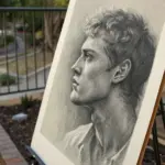
If you’ve got the basics down and you’re craving that next little leap, intermediate painting ideas are where things get really fun. I’m talking projects that build depth, light, and texture—challenging enough to grow your skills, but still totally doable in a cozy weekend session.
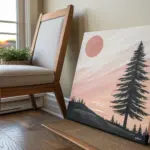
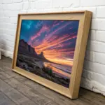
Sunset Sky Gradient Study
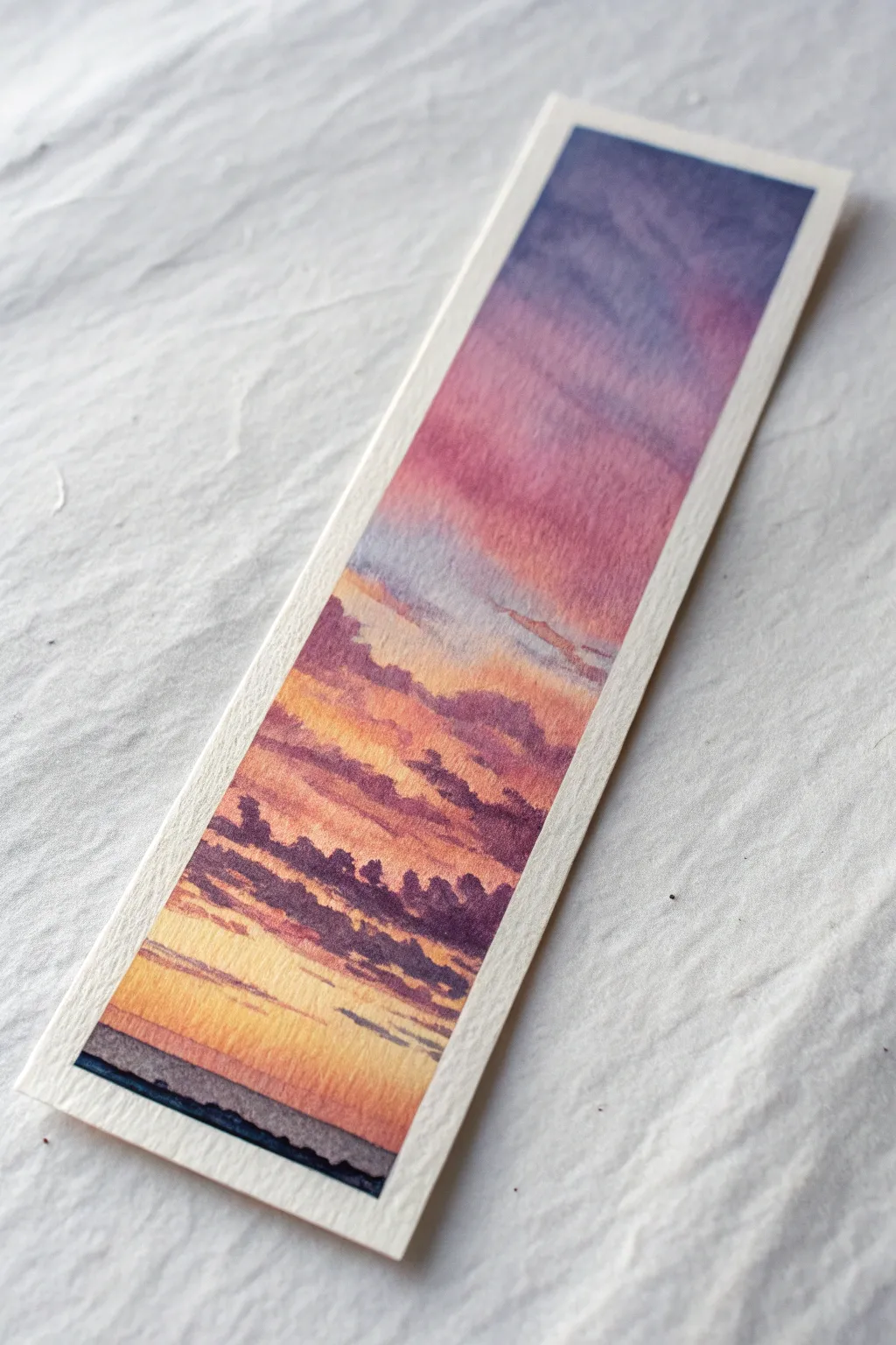
Capture the fleeting beauty of twilight with this vertical watercolor study, perfect for turning scrap paper into a functional piece of art. The project focuses on mastering a smooth wet-on-wet gradient that transitions from deep indigo to warm gold, punctuated by soft, layered clouds.
Detailed Instructions
Materials
- Cold press watercolor paper (cut to 2″ x 7″ strip)
- Artist grade watercolor paints (Indigo, Alizarin Crimson, Cadmium Yellow, Burnt Umber)
- Painter’s tape or masking tape
- Flat wash brush (1/2 or 3/4 inch)
- Round brush (size 4 or 6)
- Rigid board or table surface
- Two jars of water
- Paper towels
Step 1: Preparation and Base Wash
-
Tape the edges:
Begin by taping down all four sides of your watercolor paper strip to a rigid board. Ensure the tape overlaps the paper by about 1/4 inch to create a crisp, clean border once finished. -
Pre-wet the paper:
Using your flat brush and clean water, apply an even coat of water across the entire surface of the paper. You want a glisten, not a puddle. -
Mix your gradients:
While the paper absorbs the water slightly, quickly prepare three puddles on your palette: a deep Indigo mixed with a touch of purple, a watery Alizarin Crimson (pink), and a bright Cadmium Yellow. -
Apply the top layer:
Load your flat brush with the Indigo mix. Start at the very top edge and pull the color down about one-third of the way. Let gravity help pull the pigment down if you tilt your board slightly. -
Transition to pink:
Rinse your brush quickly or switch to a clean one. Pick up the Alizarin Crimson and apply it just below the blue, allowing the wet edges to touch and bleed into each other naturally to create a violet transition. -
Finish with yellow:
Clean the brush again and load up the yellow. Paint the bottom third, blending it upward into the pink to create soft orange tones. Keep the yellow purest near the bottom horizon line. -
Refine the blend:
If the transitions look too harsh, dry your brush on a paper towel and gently run it horizontally across the meeting points of the colors to soften them. Be careful not to overwork it. -
Initial drying:
Allow this initial gradient wash to dry completely. The paper must be bone dry before adding clouds, or they will blur into an unrecognizable smudge.
Gravity is Your Friend
Tilt your drawing board about 15-20 degrees while painting the initial gradient. This encourages the pigments to flow downward and blend seamlessly without harsh lines.
Step 2: Adding Clouds and Horizon
-
Mix cloud color:
Create a ‘bruised’ purple-grey color by mixing Alizarin Crimson with Indigo, and perhaps a tiny touch of Burnt Umber to desaturate it. The mixture should be thicker than your base wash—think milk or light cream consistency. -
Paint upper wisps:
Switch to your round brush. I like to start in the pink section, painting thin, broken horizontal lines to represent high-altitude clouds. Keep these marks light and feathery. -
Form the middle clouds:
Moving down into the orange section, paint slightly thicker cloud shapes. Use the belly of the brush to press down and create organic, irregular shapes, narrower at the ends and thicker in the middle. -
Layering density:
As you move lower toward the horizon, group the clouds closer together. The clouds near the bottom should look flatter and more horizontal due to perspective. -
Soften edges:
While the cloud paint is still damp, rinse your brush, bolt it just until damp, and gently touch the bottom edge of some larger clouds to soften them into the background sky. -
Add the horizon line:
Mix a very dark, concentrated black-blue using Indigo and Burnt Umber. With the tip of your round brush, paint a thin, slightly uneven line across the very bottom to represent a distant landmass or ocean. -
Final dark accents:
Add a few tiny, dark slivers of cloud just above the horizon line using the same dark mixture to create depth and contrast against the bright yellow sky. -
The reveal:
Wait for every layer to be completely dry—warm to the touch. Carefully peel away the painter’s tape at a 45-degree angle, pulling away from the painting to reveal the crisp white edges.
Backruns & Blooms
If you see cauliflower-like textures forming, you likely introduced water into a drying area. Wait for it to dry completely, then gently glaze over it to hide the texture.
Once dry, this miniature sky study is ready to mark your place in your next reading adventure
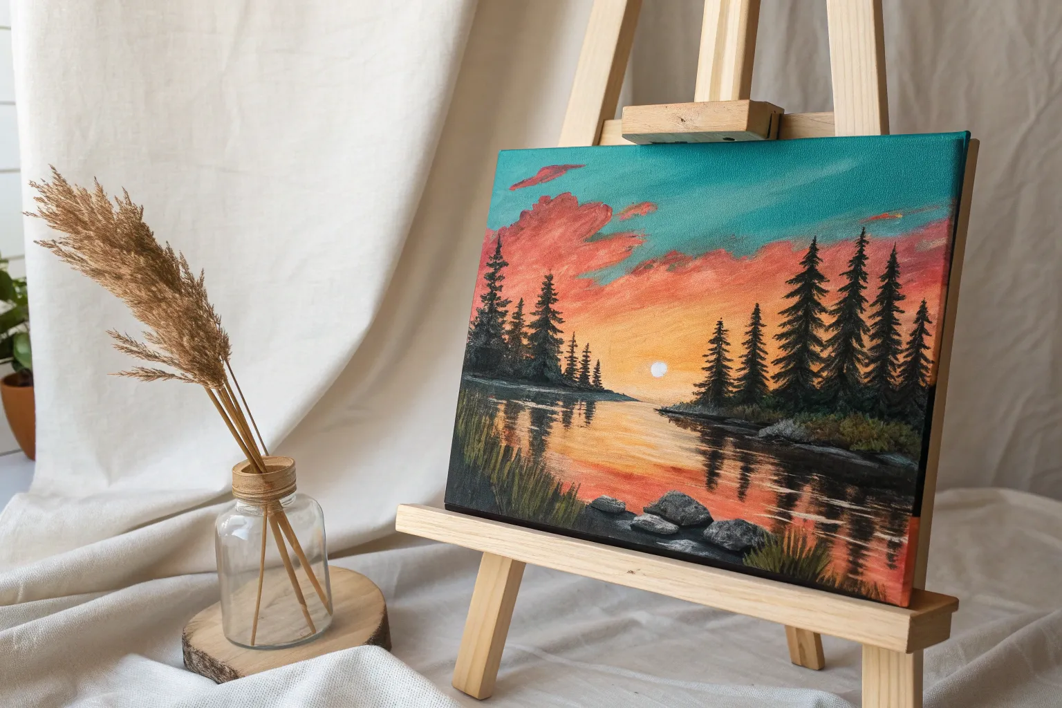
Lake Reflections With Ripples
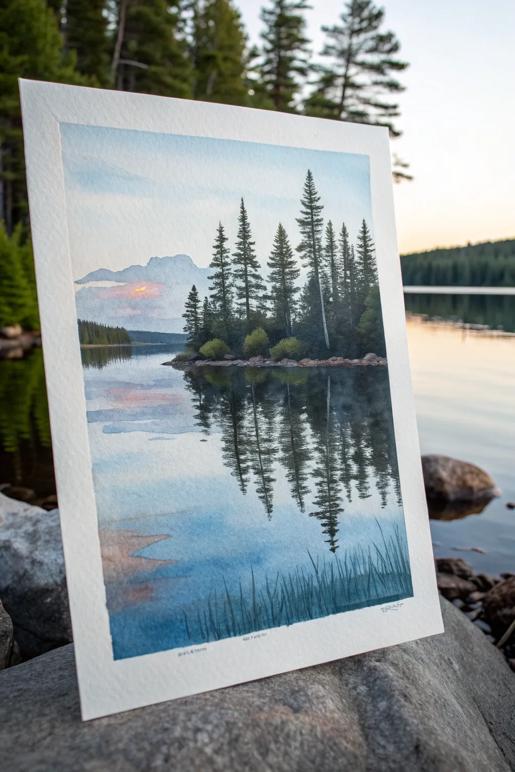
Capture the peaceful stillness of twilight in this intermediate watercolor project. You will paint a glassy lake mirroring a stand of pine trees, using wet-on-wet techniques to create soft ripples and a glowing horizon.
Step-by-Step
Materials
- Cold press watercolor paper (300 gsm / 140 lb or heavier)
- Watercolor paints (Indigo, Payne’s Grey, Sap Green, Burnt Umber, Alizarin Crimson, Cadmium Yellow, Cerulean Blue)
- Flat wash brush (1 inch)
- Round brushes (size 4, 8, and 12)
- Masking tape or gummed tape
- Mixing palette
- Two jars of water
- Paper towels
Step 1: Setting the Scene
-
Tape and sketch:
Begin by taping down all four edges of your paper to a board to prevent buckling. Lightly sketch the horizon line about one-third of the way down the paper. Outline the distant mountain range and the silhouette of the central island with its trees, keeping the pencil lines extremely faint so they vanish under the paint. -
Sky wash:
Wet the entire sky area above the horizon line with clean water. While wet, drop in diluted Cerulean Blue near the top, fading it out as you move down. -
Sunset glow:
Near the horizon and mountain line, introduce a soft blend of Alizarin Crimson and Cadmium Yellow to create a pale peach sunset glow. Let these warm colors bleed slightly into the blue sky above for a natural transition. -
Distant mountains:
While the sky is damp but not soaking, mix a very pale, watery wash of Payne’s Grey and Indigo. Paint the distant mountain range. The damp paper will give the mountains soft edges, making them look far away. Allow this entire upper section to dry completely.
Control Your Bloom
For the water, wait until the paper sheen is dull (satin finish) before adding the dark tree reflections. If it’s too wet, the trees will explode into a blob; too dry, and they won’t fuzz.
Step 2: The Water and Reflection Base
-
Water wash:
Wet the lake area below the tree line with clean water. Mirror the sky colors upside down: start with the peach/pink tones just below the island, transitioning into the light blue near the bottom of the page. -
Adding texture:
While the water wash is still wet, use a clean, slightly damp brush to lift out horizontal streaks of paint near the bottom. This suggests the glassy surface of the water and soft ripples. Let the background wash dry completely before moving on. -
Island landmass:
Mix Burnt Umber with a touch of Payne’s Grey. Using a size 8 round brush, paint the rocky strip of land for the island. Keep the top edge crisp against the sky, but soften the bottom edge slightly where it meets the water.
Muddy Reflections?
If your reflections look muddy, you likely overworked the paint while it was drying. Place the dark vertical stroke once and leave it alone. Let the water do the blending work for you.
Step 3: Pine Trees and Deep Shadows
-
Mixing greens:
Create a dark, rich forest green by mixing Sap Green with Indigo and a touch of Burnt Umber. You want a value that is much darker than anything else on the page so far. -
Painting the trees:
Using the tip of a size 4 or small rigger brush, paint the pine trees on the island. Start with a vertical line for the trunk, then dab irregular, downward-sloping branches. Vary the heights, making the tallest tree stand out off-center. -
Island foliage:
Use a slightly lighter, warmer green (more Sap Green) to paint small bushes at the base of the trees. Dab the paint on to create a puffy texture. -
Reflection setup:
Re-wet the water section directly under the island very carefully with clear water. You want the paper damp, but not puddling.
Step 4: Reflections and Ripples
-
Dropping in reflection:
Load your brush with the same dark green mixture used for the trees. Touch the wet paper directly under the island, pulling the color downwards in vertical strokes. The wet paper will fuzz the edges, mimicking a reflection. -
Elongating the shapes:
Drag the reflection down further than the actual trees are tall. Reflections often appear elongated. Let the paint bleed naturally, but guide it vertically. -
Creating ripples:
While the reflection paint is still wet, use a dry, clean flat brush or a stiff tool to horizontally cut through the vertical reflections. This ‘lifts’ the dark paint, creating the illusion of ripples breaking the surface. -
Foreground grasses:
Once the water layer is fully dry, mix a watery blue-grey. Take your finest brush and paint thin, vertical reeds or grasses in the immediate foreground at the bottom right. Keep them translucent to maintain depth. -
Left bank reflection:
Don’t forget the small reflection on the left side. Paint a dark strip of coastline and drag a blurry reflection straight down into the water, keeping the edges soft. -
Final adjustments:
Evaluate the contrast. If the trees need more definition, add a second layer of indigo-green to the shadowed sides of the pines. Ensure your horizon line is level.
Peel off the tape carefully to reveal those crisp white borders on your tranquil landscape
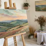

Atmospheric Mountain Layers
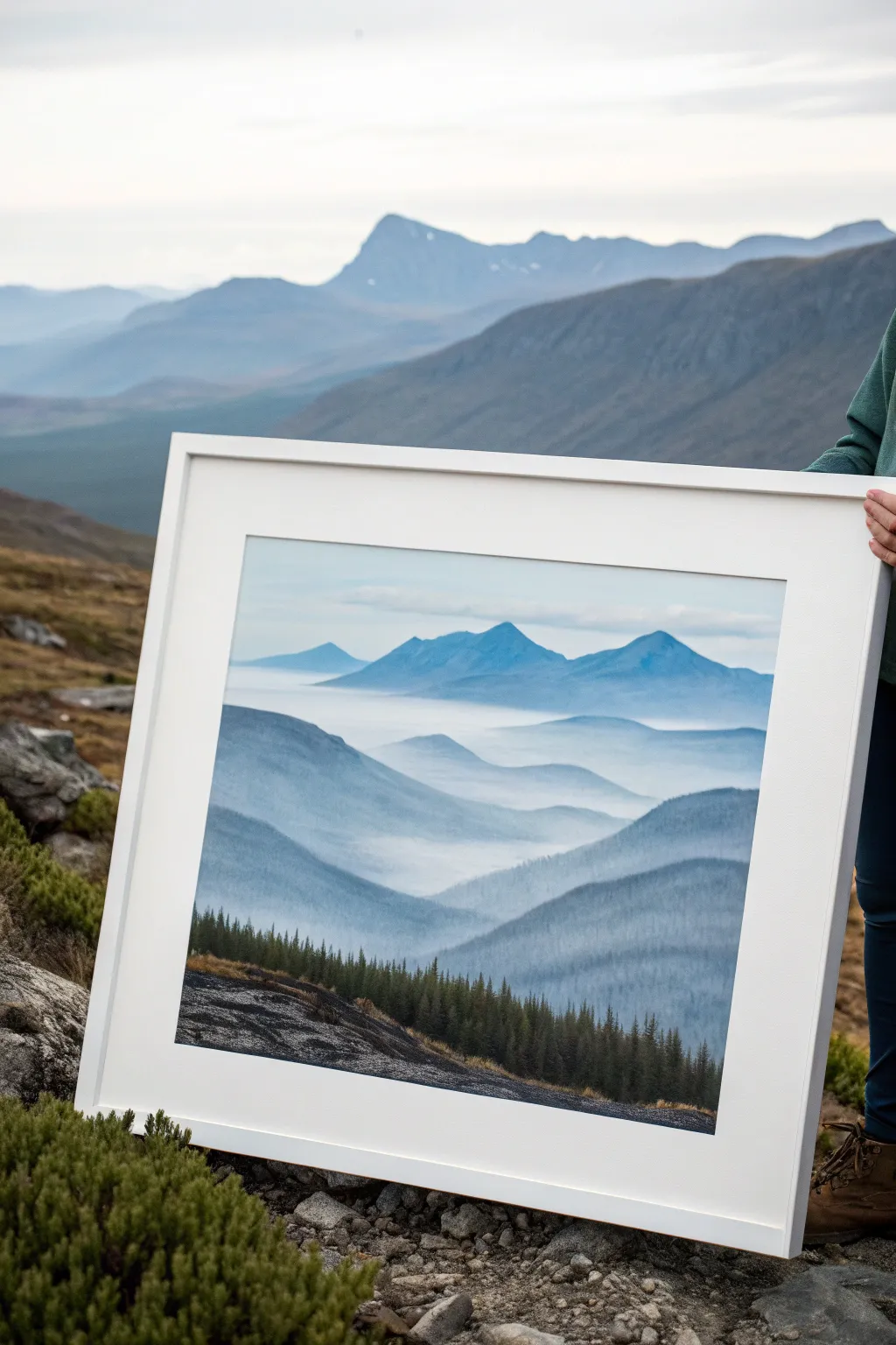
Master the art of atmospheric perspective with this specialized landscape study that creates immense depth using receding values of blue. You will learn to layer mountains from light to dark to simulate distance and mist.
Detailed Instructions
Materials
- Canvas or primed panel (16×20 inches recommended)
- Acrylic paints: Phthalo Blue, Ultramarine Blue, Titanium White, Mars Black, Burnt Umber
- Large flat brush (2 inch)
- Medium flat brush (1 inch)
- Small round brush (size 2 or 4)
- Detail liner brush
- Slow-drying mediums or retarder (optional)
- Palette and water cups
- Paper towels
Step 1: Planning the Layers
-
Sketch the Horizon Lines:
Begin by lightly sketching undulating lines across your canvas to mark the peaks of each mountain range. Start high for the distant mountains and work your way down, overlapping the shapes. -
Mix the Sky Gradient:
Prepare a very pale blue by mixing a tiny dot of Phthalo Blue with Titanium White. It should be barely tinted. -
Paint the Sky:
Using your large flat brush, paint the upper third of the canvas with this pale mix. While wet, blend in pure white near the horizon line of the furthest mountains to create a hazy glow.
Fog Warning
If your mist looks too harsh or streaks like stripes, your paint is likely too dry. Use a glazing medium or a mist of water to keep the blending soft and seamless.
Step 2: Atmospheric Layers
-
First Mountain Range:
Mix a color slightly darker than your sky using Phthalo Blue and a touch of white. Paint the most distant peaks, keeping the edges soft. -
Create the Mist:
While the paint is still wet, drag a mostly dry brush dipped in Titanium White along the bottom edge of these peaks to simulate fog settling in the valleys. -
Second Layer Strength:
Mix a slightly stronger blue for the next range forward. Add a tiny hint of Ultramarine to warm it up. -
Shape the Middle Grounds:
Paint the next layer of mountains, ensuring specific peaks overlap the layer behind them. This overlap is crucial for the illusion of depth. -
Soften the Valleys:
Use a clean, damp brush to gently glaze over the base of this new layer, blending it into the white mist you established earlier. -
Third Layer Intensity:
For the closer mid-ground mountains, mix a deeper blue, adding a very small touch of black to desaturate the color. -
Refining the Silhouette:
Paint this layer with sharper top edges than the previous ones. The closer mountains should look less fuzzy and more distinct.
Step 3: Foreground Details
-
Mix the Darkest Value:
Create a deep, dark grey-green by mixing Phthalo Blue, Mars Black, and a touch of Burnt Umber. It should be almost black but still hold color. -
Block in Foreground Slope:
Paint the solid dark hill in the immediate foreground at the bottom left, angling it upwards towards the right. -
Texture the Rocks:
While the dark paint is tacky, scumble some lighter grey-blue over the rocky areas to suggest texture and form without painting every stone. -
Start the Tree Line:
Switch to your small round brush or liner brush. Load it with the dark mixture and begin painting vertical lines for the pine tree trunks along the ridge. -
Dabbing Pine Texture:
Use the tip of the brush to dab foliage onto the trees. Keep the tops pointed and let the base of the trees be wider and denser. -
Varying Tree Heights:
Ensure the trees are not all the same height; vary them significantly to make the forest look natural and organic. -
Highlighting the Foliage:
I like to mix a slightly lighter olive-green tone and dab it onto the sun-facing side of the closest trees to give them volume. -
Final Grass Accents:
Using the liner brush, add tiny flicks of ochre or light brown along the very edge of the foreground slope to suggest dry grass.
Pro Tip: Edges Matter
Keep distant mountain edges soft and blurry, while making foreground edges crisp and sharp. This mimics how camera lenses focus and boosts the 3D effect.
Step back and admire how simple layers of blue have transformed into a deep, breathable landscape

Textured Palette-Knife Landscape
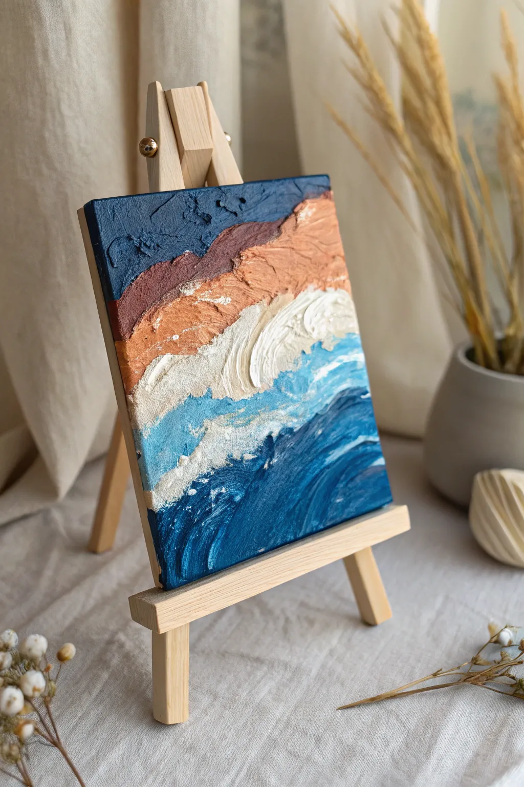
Capture the raw energy of where land meets sea with this highly textured palette knife painting. Using heavy body acrylics and modeling paste, you will create a tactile, three-dimensional landscape that pops right off the canvas with distinct color zones.
Step-by-Step
Materials
- Small square canvas (e.g., 6×6 or 8×8 inches)
- Acrylic paints (Navy Blue, Ultramarine Blue, Burnt Umber, Burnt Sienna, Titanium White, Teal/Turquoise)
- Modeling paste or heavy gel medium
- Palette knives (assorted sizes, including a trowel shape)
- Palette or mixing plate
- Paper towels for wiping knives
- Small wooden easel for display (optional)
Step 1: Preparation & Sky
-
Prepare your mixtures:
Before touching the canvas, mix your acrylic colors with modeling paste on your palette. Aim for a 50/50 ratio to ensure the paint holds its peaks. You will need a dark navy, a reddish-brown, a lighter tan, pure white, and a bright ocean turquoise. -
Establish the sky:
Start at the very top of the canvas. Load your palette knife with the dark navy mixture. Apply it with horizontal strokes, pressing firmly but leaving texture behind. -
Refine the top edge:
Ensure the navy color wraps around the top and side edges of the canvas for a finished look. Use the flat side of the knife to clean up any ridges that are too sharp, but keep the surface uneven.
Muddy colors?
If your colors are turning gray or muddy where they meet, wipe your palette knife completely clean between every single stroke. Crisp colors rely on clean tools.
Step 2: Land & Sand Formation
-
Add the distant mountains:
Directly below the navy sky, apply a band of the dark reddish-brown (Burnt Umber mixed with a touch of Burnt Sienna). Use the tip of your knife to create jagged upper edges that overlap the sky slightly, simulating a distant, rocky horizon. -
Transition to earth tones:
Mix a lighter tan shade by adding white to your Burnt Sienna mix. Apply this directly below the dark brown band. -
Blend the transition:
While the paint is still wet, gently drag your knife between the dark brown and tan sections to softly merge them, creating a natural gradient of color. -
Create the shoreline:
Below the tan section, introduce a creamy off-white mixture. Apply this with sweeping, diagonal strokes that slant downwards from left to right, mimicking the slope of a sandy beach.
Peak perfection
For sharper, higher peaks in your waves, let the modeling paste sit on your palette for 10-15 minutes before applying. It will stiffen slightly for better hold.
Step 3: Ocean & Waves
-
Lay the turquoise base:
Beneath the creamy sand layer, apply your bright turquoise mixture. This represents the shallow water. Don’t smooth it out; let the paste build up ridges that catch the light. -
Sculpt the crashing wave:
Load a clean knife generously with pure white modeling paste mixture. Apply a thick, curving stroke right over the transition between the sand and the turquoise. -
Add movement to the foam:
Use the edge of your knife to pull the white paint downward into the blue, creating the look of foaming water crashing onto the shore. -
Deepen the ocean:
For the bottom section, switch to a deep Ultramarine blue mixed with a little Teal. Apply this freely at the bottom of the canvas, using broad, aggressive strokes to simulate deep, churning water. -
Connect the water layers:
Where the deep blue meets the turquoise, use a clean knife to marble the colors slightly. I like to do this with a light touch so the colors swirl rather than turn muddy. -
Detail the wave crests:
Pick up a tiny amount of pure white on the very tip of a small knife. Dab this onto the deep blue section to create highlights and smaller whitecaps in the open water. -
Final texture check:
Look at the painting from the side. If any area looks too flat, add a dollop of the appropriate color mix to build up the height variation.
Let your finished piece dry flat for at least 24 hours to ensure the thick peaks set completely hard
BRUSH GUIDE
The Right Brush for Every Stroke
From clean lines to bold texture — master brush choice, stroke control, and essential techniques.
Explore the Full Guide
Lily Pads and Sparkling Water
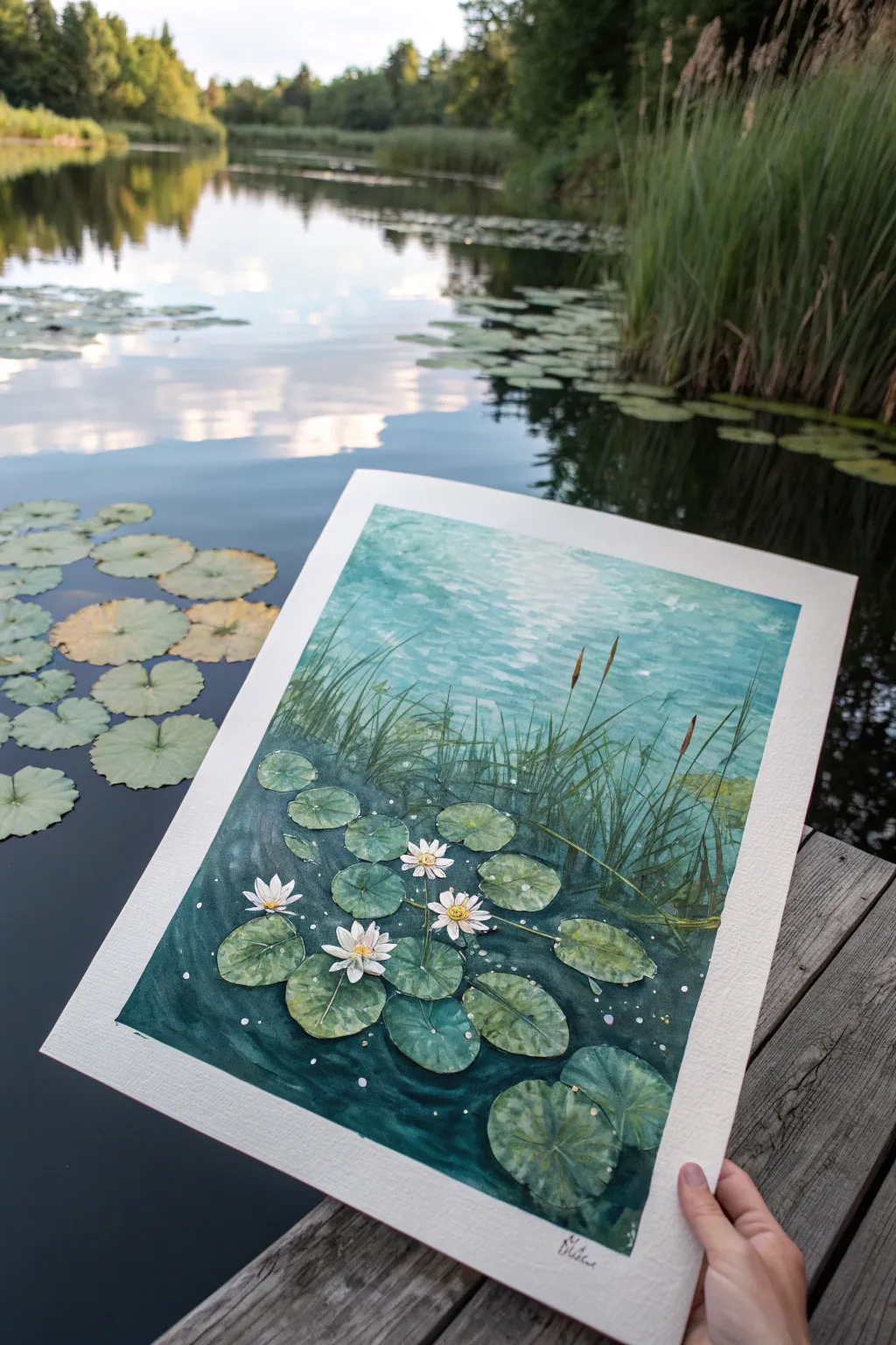
Capture the serenity of a hidden pond with this watercolor study of lily pads and shimmering light. You will layer rich teal gradients and crisp details to create a scene that feels deep and tranquil.
Detailed Instructions
Materials
- High-quality watercolor paper (cold press, 300 gsm or heavier)
- Watercolor paints: Phthalo Green, Prussian Blue, Turquoise, Sap Green, Lemon Yellow, Payne’s Gray, and faint White Gouache
- Masking fluid
- Round brushes (sizes 8, 4, and 0 for details)
- Flat wash brush (1/2 inch)
- Palette for mixing
- Two jars of water
- Paper towels
- Pencil and eraser
Step 1: Preparation and Initial Wash
-
Sketch the layout:
Begin by lightly sketching the placement of your main lily pads near the bottom third of the paper. Add vertical lines for the reeds and grasses in the mid-ground. Keep the pencil pressure extremely light. -
Mask the highlights:
Apply masking fluid carefully over the white blooms of the water lilies and the brightest spots where sunlight hits the water surface near the top. This preserves the pure white of the paper. -
Mix upper water colors:
Prepare a very watery mix of Turquoise and a touch of Lemon Yellow. The top half of the painting relies on transparency to mimic sunlit water. -
Paint the upper gradient:
Using your flat wash brush, lay down a wet-on-wet wash starting from the top. Let the color ripple and remain lighter in the center, simulating the reflection of the sky. -
Deepen the bottom water:
While the paper is still slightly damp but not soaking, mix Phthalo Green with Payne’s Gray. Paint around the lily pad shapes at the bottom, creating the deep, shadowy depths of the pond. -
Blend the transition:
Use a clean, damp round brush to soften the edge where the dark bottom water meets the lighter upper water, creating a smooth visual path from depth to surface.
Keep it Fluid
Don’t overwork the water. Let the pigments bloom and settle naturally on the paper to create realistic aquatic textures.
Step 2: Reeds and Vegetation
-
Establish the grass base:
Once the background is completely dry, mix Sap Green with a little Turquoise. Using a size 4 brush, paint the thicker bases of the reeds emerging from the mid-ground water. -
Flick the fine grasses:
Switch to a size 0 or rigger brush. With a quick, upward flicking motion, paint the thin blades of grass. Vary the heights and angles so they look organic rather than uniform. -
Add the cattails:
Mix Burnt Sienna or a warm brown. Paint small, cigar-shaped tops on a few of the tallest stalks to represent cattails or seed heads. -
Reflect the reeds:
Dilute your green mix significantly. Paint faint, upside-down versions of the grasses directly beneath them in the water to create subtle reflections.
Step 3: Lily Pads and Flowers
-
Base coat the pads:
Mix varied shades of green for the lily pads—some more yellow-green, others blue-green. Paint the pads, leaving a tiny sliver of unpainted paper for the central vein notch. -
Add leaf details:
When the pads are dry, use a darker green mix to paint the radiating veins. I find that lifting a little color with a damp brush between the veins helps them look slightly convex. -
Remove masking:
Gently rub away the dried masking fluid to reveal the crisp white paper underneath. -
Detail the flowers:
Use a very pale grey-blue wash to add tiny shadows to the white petals, giving them separation and form. Paint the centers with a vibrant yellow. -
Final ripples and sparkles:
Using white gouache or a gel pen, add tiny dots and horizontal dashes across the water surface to emphasize the sparkling light and water movement.
Add Metallic Glint
Mix a tiny amount of iridescent medium into your top water wash for a literal shimmer when the light hits your painting.
Frame your finished piece with a wide white mat to emphasize the refreshing teal tones
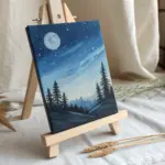
Night Sky With Glow Effects
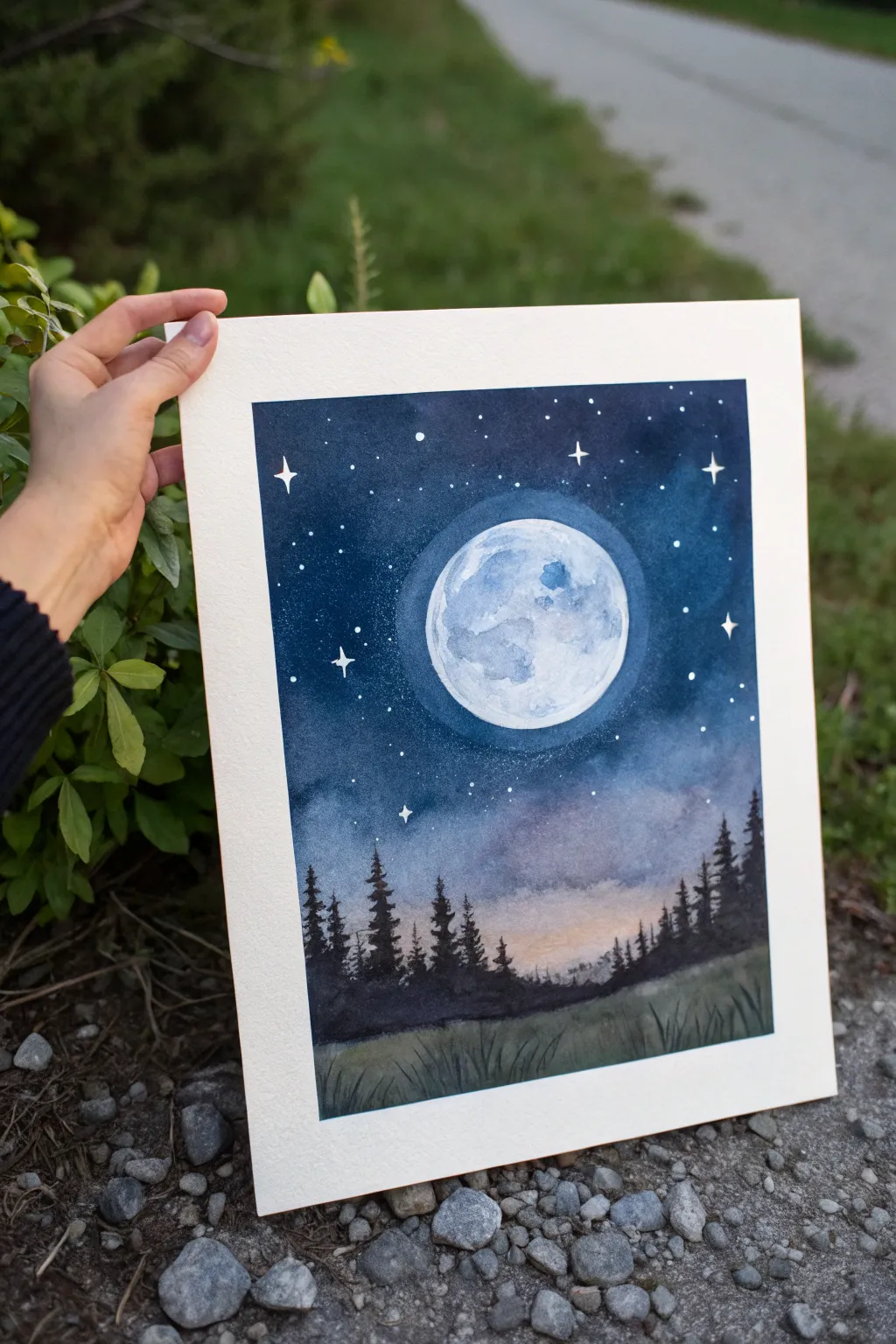
Capture the serene magic of a moonlit night with this watercolor project that focuses on mastering atmospheric glow. You will learn to build up deep, rich indigo skies while preserving the luminous quality of a detailed cratered moon.
Step-by-Step
Materials
- Cold Press Watercolor Paper (140lb/300gsm)
- Painter’s Tape and Drawing Board
- Watercolor Paints (Indigo, Prussian Blue, Paynes Gray, Alizarin Crimson, Lamp Black, Yellow Ochre)
- White Gouache or Bleed-proof White
- Round Brushes (Sizes 2, 6, and 10)
- Masking Fluid (optional but recommended)
- Pencil and Compass (or circular object to trace)
- Two Water Jars
- Paper Towels
- Salt (optional for texture)
Step 1: Planning and Protection
-
Prepare your surface:
Begin by taping the edges of your watercolor paper down to a board. Use painter’s tape to create a crisp white border, pressing down firmly to prevent paint from seeping underneath later. -
Sketch the composition:
Using a compass or a small bowl, lightly trace a circle in the upper center of the page for the moon. Very faintly sketch a rough horizon line about a quarter of the way up from the bottom. -
Preserve the whites:
If you have masking fluid, apply it carefully inside the moon circle to protect the white paper. If not, you will need to paint very carefully around this circle in the next phase.
Pro Tip: Soft Glows
To get a truly soft glow around the moon, lift pigment out with a clean, damp brush or ‘thirsty brush’ technique immediately after painting the dark sky while it’s still wet.
Step 2: Painting the Mood
-
mix your night sky colors:
Prepare a large puddle of dark blue mix. I like to combine Indigo with a touch of Paynes Gray for depth. In a separate spot, mix a lighter, watery wash of Prussian Blue for the halo area. -
Create the moon’s halo:
Wet the paper around the moon with clean water. Drop in the lighter Prussian Blue wash immediately around the moon circle, letting it fade outwards into the wet paper to create a soft, glowing ring. -
Apply the deep sky:
While the paper is still damp (but not soaking), start applying your darkest Indigo mix at the top corners. Work your way down, letting the dark blue blend softly into the lighter halo area you just painted. -
Add warmth near the horizon:
As you reach the bottom of the sky area (just above the tree line), rinse your brush and introduce a very faint touch of Alizarin Crimson or even a tiny bit of Yellow Ochre to simulate the last light of dusk or atmospheric haze. -
Let it dry completely:
This is crucial. The paper must be bone dry before moving on. If you used masking fluid, now is the time to gently rub it away to reveal the crisp white circle.
Step 3: The Moon and Stars
-
Texture the moon:
Mix a very watery, pale gray-blue. Blot most of the moisture off your brush and gently dap random shapes inside the moon to create craters and maria. Leave plenty of pure white paper showing for high brightness. -
Add moon shadows:
Deepen your gray mix slightly and add darker shadows to the right side of the craters to give the moon three-dimensional form. -
Create the starry field:
Load a toothbrush or stiff brush with white gouache. Shield the bottom of your painting with a scrap paper, then flick the bristles to spray fine white stars across the dark upper sky. -
Paint prominent stars:
Using a size 2 brush and white gouache, manually paint a few larger, four-pointed stars. Place them strategically around the moon to balance the composition.
Level Up: Galaxy Effect
Before the dark sky dries, drop in tiny spots of teal or violet watercolor and let them bloom into the indigo. This creates a subtle nebula effect behind the stars.
Step 4: Silhouettes and Foreground
-
Mix the forest color:
Create a dense, nearly black mixture using Lamp Black and Indigo. It needs to be opaque enough to cover the sky background completely. -
Paint the tree line:
Using the tip of a detailing brush, paint vertical lines for tree trunks. Then, use a stippling motion to dab on evergreen branches, keeping the tops pointy and the bottoms wider. -
Vary the heights:
Make sure your trees aren’t all the same height. Create a natural rhythm by grouping taller trees together and leaving some lower areas. -
Paint the grassy foreground:
Fill the bottom section gently with a dark, wash-y gray-green. While it’s still wet, stroke in some darker grass blades using your fine liner brush to imply texture in the meadow. -
Final touches:
Once everything is dry, remove the tape carefully at an angle. Assess the moon; if it needs more glow, you can lightly glaze a very translucent circle of white gouache over the surrounding blue.
Now you have a tranquil night scene ready to frame or gift to a stargazer

PENCIL GUIDE
Understanding Pencil Grades from H to B
From first sketch to finished drawing — learn pencil grades, line control, and shading techniques.
Explore the Full Guide
Moody Monochrome Landscape
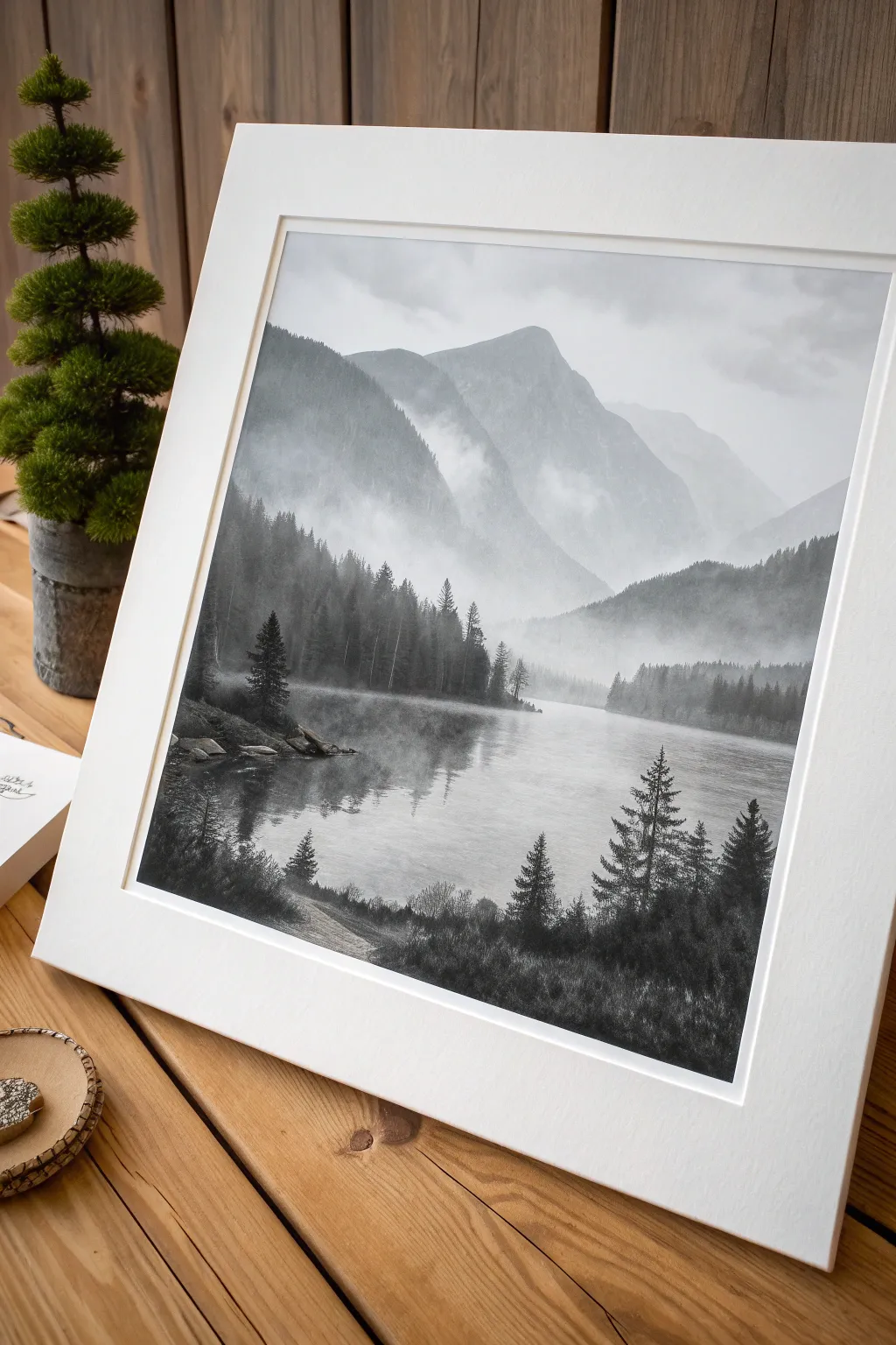
Capture the serene silence of a fog-laden valley using a limited palette of black, white, and gray tones. This intermediate tutorial explores atmospheric perspective and soft blending techniques to create depth and mystery in a landscape.
Step-by-Step Tutorial
Materials
- Heavyweight watercolor paper or mixed media paper (cold press)
- Black acrylic paint or gouache
- White acrylic paint or gouache
- Set of soft synthetic brushes (large flat brush, medium round, fine liner)
- Palette for mixing gray values
- Two jars of water
- Paper towels
- Painters tape
- Pencil for sketching
Step 1: Preparation and Sketching
-
Secure the edges:
Begin by taping the edges of your paper to a hard board using painter’s tape. This not only keeps the paper flat while painting but creates a crisp, clean border around your finished work. -
Establish the horizon:
Lightly sketch a horizontal line roughly one-third up from the bottom of the page to mark your water level. Keep this line extremely faint. -
Outline the peaks:
Sketch the large mountain shapes in the background. Focus on the large central peak and the sloping hills on either side. Don’t worry about tiny details; just get the major triangular forms in place. -
Mark the tree line:
Indicate where the dense forest meets the water on the left and right sides. Drawing faint vertical guides for the tallest pine trees in the foreground can be helpful for later.
Fixing Hard Edges
If your background mountains look too sharp and cut-out, scrub the edge with a damp, clean brush while the paint is drying to soften and blur the line back into the mist.
Step 2: Painting the Sky and Background
-
Mix your lightest gray:
On your palette, mix a large amount of white with a tiny dot of black to create a very pale, misty gray. This will be your sky color. -
Wash the sky:
Using your large flat brush, apply this pale gray to the upper portion of the paper. Use horizontal strokes and keep the paint fairly wet to encourage a smooth gradient. -
Paint the distant mountains:
Mix a slightly darker gray value. While the sky is still barely damp, paint in the furthest mountain peaks. The slight dampness will create soft, fuzzy edges that suggest distance and fog. -
Layer the mid-ground:
Create a medium-gray tone. Paint the secondary mountain shapes that sit in front of the distant peaks. Allow the bottom edges of these shapes to fade out by adding a little water, simulating mist settling in the valley.
Step 3: Creating the Misty Lake
-
Lay the water base:
Using the same pale gray from the sky, fill in the lake area. Ensure your brushstrokes are perfectly horizontal to mimic the calm surface of water. -
Add soft reflections:
While the lake base is wet, drop in hints of the medium gray directly below where the mountains sit. Drag your brush gently side-to-side to blur these reflections, making them appear indistinct. -
Establish the fog line:
I like to use a nearly dry brush with pure white paint to scumble lightly along the base of the mountains where they meet the water. This creates that thick ‘soup’ of fog hovering over the surface.
Level Up: Tinted Atmosphere
Instead of pure black and white, mix a tiny dot of Phthalo Blue or Burnt Umber into your blacks. This subtlety gives the monochrome scene a cold or warm atmospheric mood.
Step 4: The Forest Layer
-
Mix dark charcoal:
Mix a dark gray—almost black, but not quite definitive yet. This is for the distant treeline across the lake. -
Stipple the distant trees:
Using a medium round brush, stipple or tap vertical shapes along the shoreline. These should look like a dense wall of trees. Let the bottoms of these trees blur slightly into the water. -
Define the shoreline:
Use a darker value to underscore the land masses on the left and right, grounding the trees.
Step 5: Foreground Details
-
Paint the hero trees:
Switch to pure black paint. Using your fine liner or the tip of a round brush, paint the vertical trunks of the large pine trees in the immediate foreground on the right and bottom left. -
Add pine texture:
Use a tapping or dabbing motion to add pine needles to the branches. Start narrow at the top of the tree and get wider towards the base, leaving gaps so the background shows through. -
Create water ripple details:
With a diluted dark gray and a steady hand, add very thin, short horizontal lines in the water near the foreground shore. This suggests gentle movement. -
Enhance the grass:
Use quick, upward flicking motions with your smallest brush to create grassy textures along the very bottom edge of the painting in solid black. -
Final highlights:
If needed, add tiny touches of white to the water’s surface for sparkle, or add a final glaze of white wash over areas that need more mist. -
Reveal the border:
Wait until the painting is completely bone-dry. Carefully peel away the painter’s tape at a 45-degree angle to reveal your clean, crisp edges.
Frame your moody landscape in a wide white mat to emphasize the depth and contrast you’ve created


Have a question or want to share your own experience? I'd love to hear from you in the comments below!