Whenever I feel stuck, a good painting challenge is my favorite way to get my hands moving without overthinking it. Here are a bunch of painting challenge ideas you can jump into today, each built around clear daily prompts and simple rules that keep things fun.
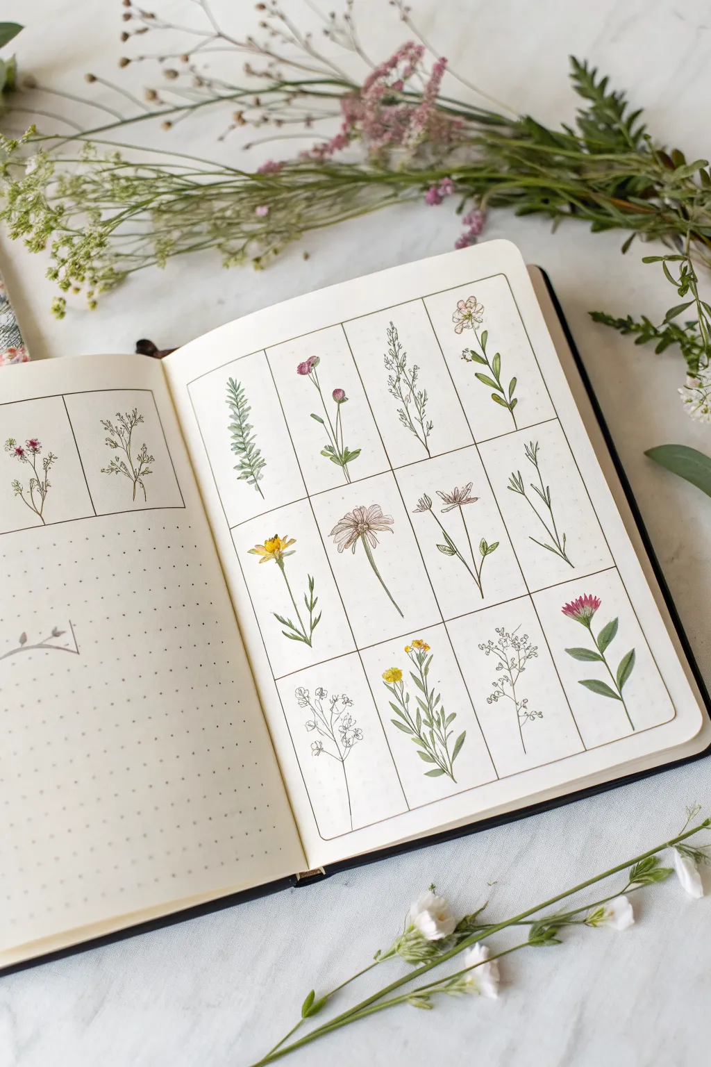
30-Day Everyday Objects Challenge
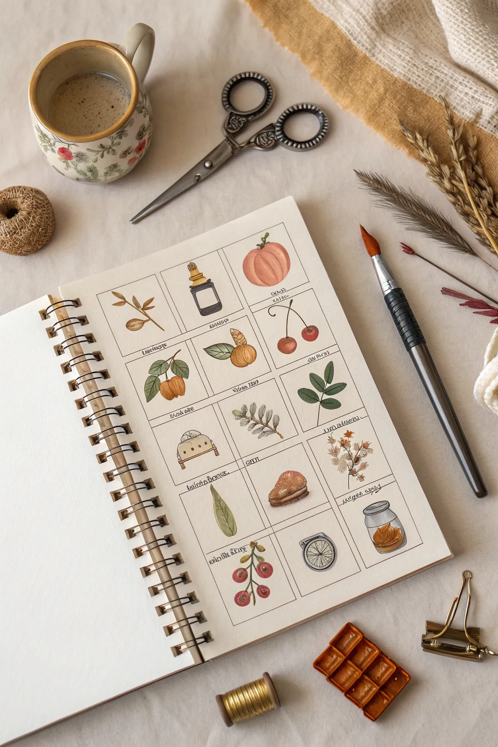
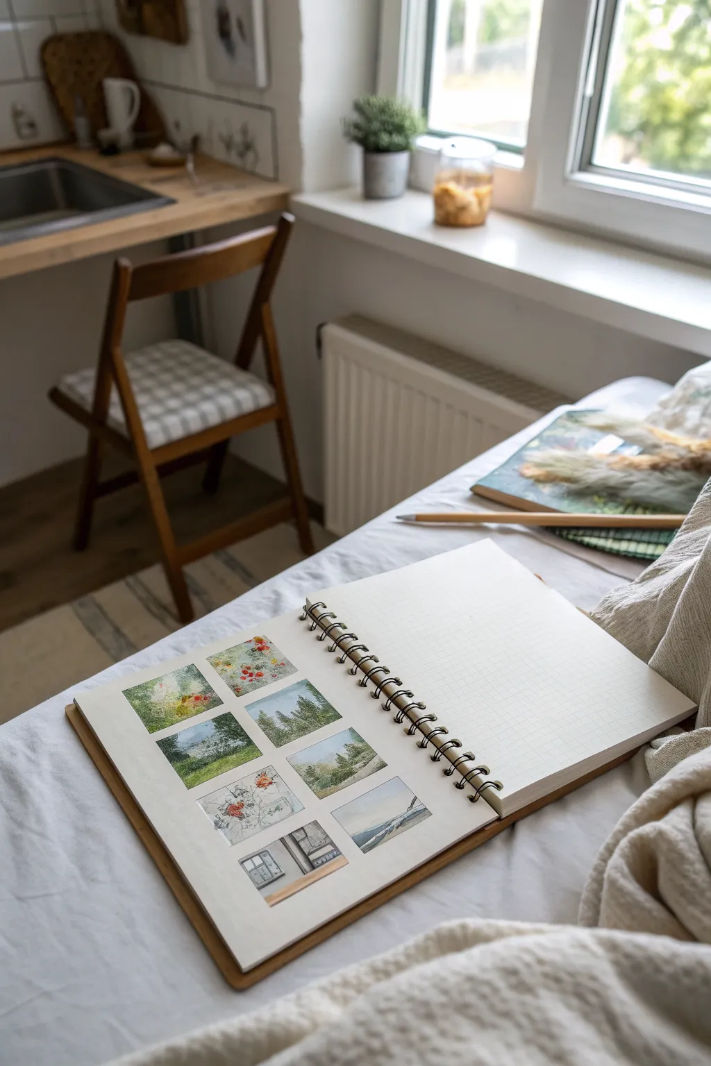
This charming project challenges you to capture tiny, everyday wonders within a structured grid, creating a beautiful catalog of natural forms and small objects. Using delicate watercolor washes and fine ink details, you’ll practice observation skills while filling a page with a harmonious collection of miniatures.
How-To Guide
Materials
- Spiral-bound sketchbook (heavyweight paper suitable for watercolor)
- Watercolors (pan set in earth tones, greens, reds, and ochres)
- Fine liner pen (waterproof, 0.1 or 0.3mm, black or sepia)
- Round watercolor brush (size 2 or 4)
- Pencil (HB)
- Ruler
- Eraser
- Jar of water
- Paper towel
Step 1: Drawing the Grid & Sketching
-
Map out your grid:
Begin by measuring your sketchbook page. Using a ruler and a light pencil touch, draw a grid of rectangles. The example uses a 3×5 layout (three columns, five rows). Leave even spacing between each box for a clean, organized look. -
Select your subjects:
Choose 15 simple, organic subjects. The goal is variety: think autumn leaves, small glass bottles, cherries, pumpkins, nuts, or feathers. Keep the theme natural and rustic. -
Lightly sketch the outlines:
Inside each grid box, lightly sketch the contour of one object. Center them well but allow some organic movement—like a stem curving slightly toward a corner. Keep pencil lines very faint so they won’t show through the paint. -
Refine the shapes:
Go back over your initial sketches to define key details, such as the ridges on a pumpkin or the stopper on a bottle, but avoid shading with the pencil.
Bleeding Lines?
If your ink bleeds when you apply paint or vice versa, ensure your pen is fully waterproof, or switch your order: paint first, let dry completely, then ink.
Step 2: Watercolor Washes
-
Mix your palette:
Prepare your colors on a mixing surface. Stick to a muted, vintage-inspired palette: burnt sienna, olive green, ochre white (or diluted yellow ochre), and alizarin crimson. Having these ready helps maintain color harmony across the page. -
Base layers for fruit and veg:
Start with the rounder, organic shapes like the pumpkin and cherries. Apply a light wash of color—orange for the pumpkin, red for cherries. Use a ‘wet-on-dry’ technique to keep the edges crisp. -
Painting the leaves:
For the various sprigs and leaves, load your brush with sap green or olive. Paint the leaves with single, confident strokes, pressing down to widen the brush belly and lifting to create a point. -
Adding gradients:
While the base layers are still damp on objects like the pumpkin or fruit, drop in a slightly darker pigment on the shadowed side for instant volume. I find this creates a lovely soft blending effect without overworking the paper. -
Transparent glass effect:
For the bottles or jars, use very watered-down grey or blue. Paint specific sections rather than filling the whole outline, leaving white paper for highlights to simulate glass reflection. -
Painting details:
Once the main shapes are dry, paint smaller elements like stems, bottle corks, or the gills of a mushroom using a finer tip and more saturated paint (less water).
Step 3: Inking & Finishing
-
Outline the grid:
Using your ruler and the fine liner pen, carefully trace over your grid lines. This frames the artwork and gives it that scientific illustration aesthetic. Ensure your hand is steady. -
Define the botanical shapes:
With the same pen, outline your painted subjects. Don’t trace perfectly; broken lines or loose strokes often look more artistic and lively than a rigid outline. -
Add texture marks:
Use the pen to add small details that paint couldn’t capture: tiny veins in the leaves, speckles on the fruit, or wood grain on stems. Keep these marks light and quick. -
Label your specimens:
At the bottom or top of each small grid box, write a name for the object in a small, neat script. You can use real names or playful invented classifications. -
Erase pencil marks:
Wait until the ink is completely dry—this is crucial to avoid smearing. Gently erase any visible pencil guidelines from your initial grid and sketches.
Theme It Up
Try a cohesive theme for your next grid, such as ‘contents of my pockets,’ ‘bakery items,’ or a ‘monochrome study’ using only shades of blue indigo.
Now you have a stunning visual collection that turns simple observations into a work of art to treasure


30-Day Nature and Seasons Challenge
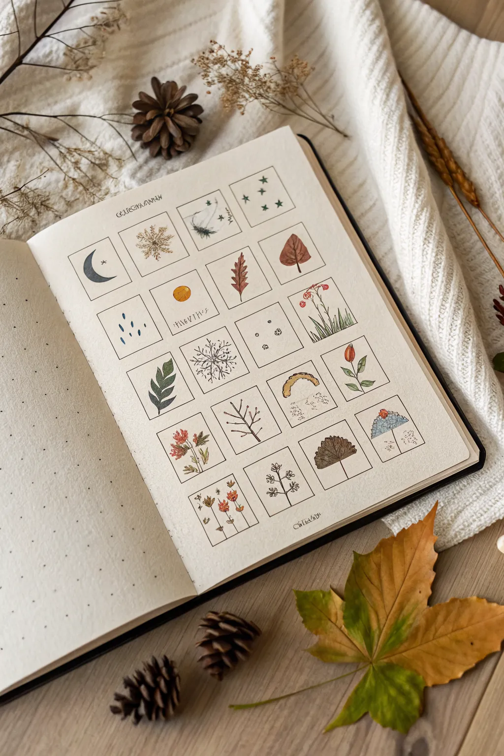
Capture the essence of the changing seasons with this beautifully structured nature grid. This project combines the organization of a bullet journal with delicate, miniature watercolor illustrations to create a serene visual diary of natural elements.
Step-by-Step Tutorial
Materials
- A5 dotted notebook or mixed media sketchbook
- Pencil (HB or H)
- Ruler
- Fine liner pen (0.1mm and 0.3mm, black waterproof)
- Watercolor paints (pan set preferred)
- Small round brushes (size 0 and 2)
- Jar of water
- Paper towel
Step 1: Setting the Structure
-
Map the grid:
Begin by counting the dots on your page to determine the spacing. You’ll need a 4×5 layout (four columns, five rows). Lightly mark the corners of each square with a pencil. -
Draw the boxes:
Using your ruler and a 0.1mm fine liner, draw the 20 distinct squares. Aim for squares that are roughly 3×3 cm or 4×4 cm, leaving a small, consistent gap between each one for a breathable layout. -
Add header spacing:
Leave about an inch of space at the top of the page. You can add a decorative title like ‘Current Season’ or the name of the month in a faux-calligraphy style using the 0.3mm pen. -
Erase guidelines:
Once the ink is completely dry—give it a full minute—gently erase any visible pencil marks from your measuring process so the grid looks crisp.
Bleed-through Blues?
Does your paper buckle or bleed? If not using watercolor paper, switch to colored pencils or very
Step 2: Sketching the Elements
-
Draft the icons:
Lightly sketch a different nature element in each box with a pencil. Think of a progression: celestial bodies (moons, stars), weather (rain, sun), foliage (leaves, pine branches), and seasonal blooms. -
Vary the composition:
Try to balance the visual weight. If you draw a heavy leaf in one box, place a lighter, airier element like falling seeds or distant stars in the adjacent box. -
Define the outlines:
Go over your pencil sketches with the 0.1mm fine liner. For organic items like leaves and petals, use a slightly shaky or broken line to mimic natural texture rather than a perfect, rigid stroke.
Step 3: Adding Color
-
Prepare your palette:
Mix a muted, earthy color palette. You’ll need muted greens (sap green mixed with a touch of red), warm ochres, burnt sienna, and a soft indigo for the sky elements. -
First wash:
Apply thin, watery washes of color to the illustrations. I prefer to leave tiny slivers of white paper showing on the leaves and petals to act as natural highlights. -
Layering details:
Once the first layer is dry, come back with a slightly more saturated version of the same color to add shadows. For example, add a darker red to the center of the autumn leaf or the bottom of the flower buds. -
Painting weather elements:
For items like the rain or snowflakes, use a very dilute blue-grey. These should be subtle so they don’t overpower the delicate line work.
Make it Personal
Turn this into a habit tracker! Color in one nature icon each day you complete a specific goal, like drinking water or walking outside.
Step 4: Final Touches
-
Enhance contrast:
If any illustrations look too flat after the paint dries, use the 0.1mm pen to add tiny stippling dots or hatching lines for extra shadow. -
Add script details:
Optionally, you can add tiny, cryptic looking script or ‘Latin names’ underneath specific specimens to enhance the botanical study aesthetic. -
Clean up:
Give the page one final check for stray pencil marks and erase them carefully, ensuring the watercolor is bone dry to avoid smearing.
Now you have a charming collection of miniature art pieces that celebrate the beauty of the natural world

30-Day Flowers and Botanicals Challenge
This project transforms a simple sketchbook spread into a botanical study by organizing delicate wildflower miniatures into a neat, gridded layout. The combination of precise pen lines and soft watercolor washes creates a charming, scientific-illustration aesthetic perfect for daily practice.
Step-by-Step Guide
Materials
- Dot grid notebook or sketchbook
- Fine liner pens (0.1mm and 0.3mm, waterproof)
- Watercolor set (pan or tube)
- Small round watercolor brush (size 2 or 4)
- Ruler
- Pencil and eraser
- Jar of clean water
- Paper towel
Step 1: Setting the Structure
-
Measure the margins:
Begin by deciding on the margin size for your page. Using a ruler and pencil, lightly mark a 1-inch border around the edges of the right-hand page to center your composition. -
Grid calculation:
Count the number of dots or measure the usable space inside your margins. You need to create a grid of twelve equal rectangles (3 across, 4 down) relative to the page dimensions. -
Drafting the grid:
Lightly sketch the grid lines with your pencil. Ensure the internal spacing between the boxes is consistent; a single dot-grid space often works well as a separator. -
Inking the frames:
Once you are happy with the layout, retrace the box outlines using a 0.3mm fine liner pen. Use your ruler for crisp, unwavering lines, but be careful not to smudge the fresh ink against the ruler’s edge. -
Left page layout:
On the left page, create a smaller row of two or three frames near the top to mirror the style of the main page, leaving the rest of the dotted space open for notes or swatches.
Bleed-Through Blues?
If your markers or paints bleed through the page, stick two pages together with glue tape before starting. This doubles the thickness instantly.
Step 2: Sketching the Flora
-
Pencil planning:
Lightly sketch a different flower or botanical stem in the center of each box. Vary the heights and curvatures—have some leaning left and others right to create a dynamic flow across the grid. -
Refining leaves and petals:
Add details to your sketches. For the rosemary-like sprig (top left), draw small needle clusters. For the daisy shapes, define the individual petals radiating from the center. -
Inking the botanicals:
Switch to your finer 0.1mm pen. Trace over your pencil sketches with delicate, broken lines to suggest texture. Don’t worry about closing every shape perfectly; slight gaps add an organic feel. -
Erase guidelines:
Wait until the ink is completely dry—I usually give it at least 5 minutes to be safe—then gently erase all remaining pencil marks from the grid and the flowers.
Latin Labels
Use the empty space at the bottom of each grid box to write the common or Latin name of the plant in small, neat script for a true botanical vibe.
Step 3: Adding Color
-
Preparing the palette:
Mix a few watered-down shades of sage green, olive, and forest green for variety in the foliage. Avoid using straight tube greens; mixing in a touch of red or brown makes them look more natural. -
Painting stems and leaves:
Using the tip of your small round brush, paint the stems and leaves. Apply the paint loosely; it’s okay if the color goes slightly outside the inked lines, as this contributes to the sketchbook aesthetic. -
Floral accents:
Clean your brush and pick up your floral colors—muted pinks, yellows, and faint purples work best here. Dab color onto the petals, keeping the application sheer and translucent. -
Adding depth:
While the first layer is still slightly damp, drop a tiny amount of a darker, more saturated version of the same color into the base of the petals or the bottom of the leaves to create instant shadow. -
Coloring the un-inked sketches:
For the bottom row where you have lighter sketches (like the baby’s breath), use very pale washes of gray or blue-gray to define the shapes without heavy outlines.
Step 4: Final Touches
-
Reviewing contrast:
Once the watercolor is fully dry, assess the drawings. If some details got lost under the paint, re-emphasize them with the 0.1mm pen. -
Adding stamen details:
Use the pen to add tiny dots or hatched lines to the centers of flowers like the pink cornflower or the yellow daisy to give them texture and focus. -
Flattening the page:
If the watercolor has caused the paper to buckle slightly, close the book and place a heavy object on top overnight to smooth it out.
Enjoy flipping through your completed grid of miniature garden studies


30-Day Animals and Pets Challenge
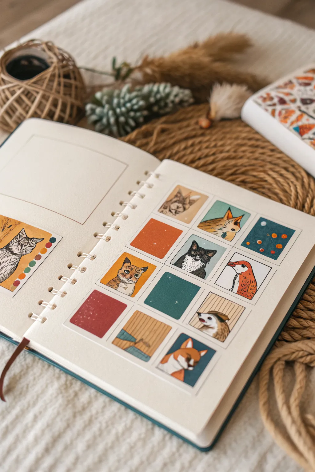
Embrace the charm of working small with this structured sketchbook spread, featuring miniature portraits of pets and animals alongside simple color swatches. This project uses gouache to create opaque, matte illustrations that pop against the cream paper, perfect for building a consistent daily painting habit without the pressure of a full page.
Step-by-Step
Materials
- Spiral-bound sketchbook (heavyweight mixed media or watercolor paper)
- Gouache paints (tube or pan set)
- Set of small brushes (round size 0, 2, and a small flat brush)
- Pencil (HB or H)
- Ruler
- Washi tape or masking tape (low tack)
- Mixing palette
- Water jar and paper towels
- Fine liner pen (optional for details)
Step 1: Planning the Layout
-
Measure the grid:
On the right-hand page of your sketchbook, use your ruler to measure out a 3×4 grid of squares. A size of 1.5 to 2 inches per square works best for this level of detail. -
Draw the boundaries:
Lightly sketch the squares with a hard pencil like an H lead so the graphite specific doesn’t smudge later. Leave consistent gutters (spaces) between the squares to create a clean, frame-like effect. -
Sketch the subjects:
Lightly sketch your animal subjects inside random squares. Don’t fill every single one; leave some blank for color blocks or abstract textures. Reference photos of cats, foxes, and birds are great starting points. -
Masking (optional):
If you want extremely crisp edges, carefully apply low-tack tape around the outside of your grid area, though painting freehand within the lines adds a charming, organic feel.
Step 2: Base Layers and Blocking
-
Mix base tones:
Prepare a palette of warm earth tones, oranges, and a cool teal. Gouache dries quickly, so squeeze out fresh paint as needed or keep a spray bottle handy to keep it moist. -
Paint abstract squares:
Start with the non-animal squares. Fill one with a solid rust orange and another with a deep teal. Use a small flat brush to get nice straight edges on these simple blocks. -
Block in animal shapes:
For the animal portraits, lay down the main fur colors first. Don’t worry about texture yet; just fill the shape of the cat’s head or the bird’s body with a solid, opaque wash of color. -
Create texture blocks:
I love adding visual interest by filling one of the empty squares with a simple pattern, like vertical stripes or a flat color with subtle splatter, to break up the illustrations.
Consistency is Key
To get that creamy, matte finish, mix your gouache to the consistency of heavy cream. Too watery and it will streak; too thick and it may crack.
Step 3: Adding Detail and Personality
-
Layering fur textures:
Once the base coat is bone dry, use your size 0 round brush to add fur texture. Use a slightly lighter or darker shade than the base to create little strokes for the cat’s ears or the fox’s ruff. -
Facial features:
Carefully paint the eyes, noses, and beaks. High-contrast colors work best here—bright yellow eyes against black fur, or a dark nose on a white muzzle. -
Refining the bird:
For the bird illustration, use distinct brush strokes to suggest wing feathers rather than painting every single filament. -
Abstract accents:
Return to your solid color blocks. On the teal square, add small dots of orange and white to create a starry or patterned effect. Add white speckles to the red square for texture. -
The black cat:
When painting the black cat, mix a dark charcoal grey rather than pure black for the highlighted areas, then use pure black for the deepest shadows to define the form.
Fixing Smudges
If you accidentally paint over a grid line, don’t panic. Wait for the paint to dry completely, then gently redefine the edge with a bit of opaque white paint.
Step 4: Left Page Feature
-
Create the larger frame:
On the facing left page, draw a larger rectangular frame and a color palette strip. -
Paint the feature portrait:
Choose your favorite animal from the grid (or a new one) and paint a more detailed version here. I recommend a side profile of a tabby cat to practice detailed line work. -
Color swatching:
Along the side of the larger portrait, paint small circles of the main colors you used in the grid to tie the two pages together visually.
Step back and admire your colorful menagerie of mini-masterpieces
BRUSH GUIDE
The Right Brush for Every Stroke
From clean lines to bold texture — master brush choice, stroke control, and essential techniques.
Explore the Full Guide
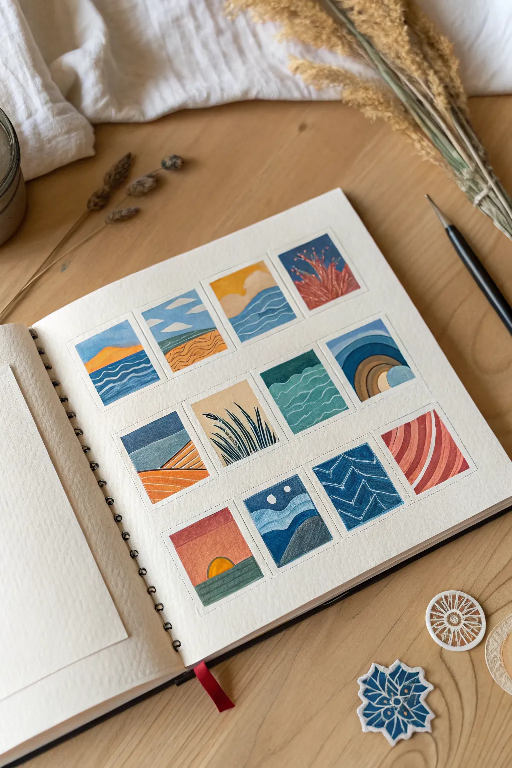
30-Day Mini Landscapes Challenge
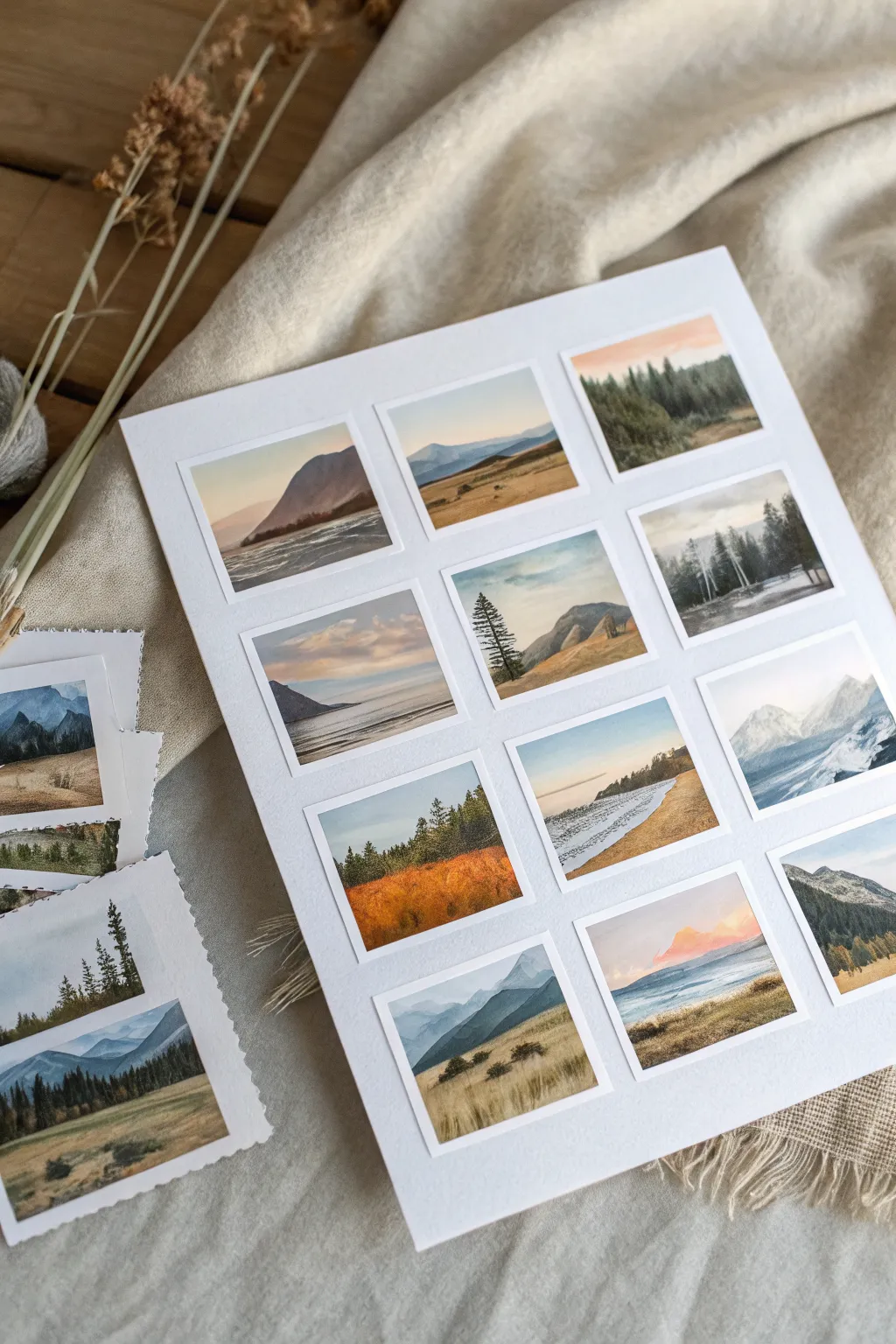
Capture the essence of vast landscapes in bite-sized portions with this grid of twelve miniature paintings. This project creates a stunning collection of tiny, polaroid-style scenes on a single sheet, perfect for practicing atmospheric perspective and color palettes.
Step-by-Step Guide
Materials
- High-quality watercolor paper (140lb/300gsm, cold press, approximately 9×12 inches)
- Artist masking tape or washi tape (1/4 inch width is ideal)
- Watercolor paints (pan sets or tubes)
- Small round brushes (sizes 0, 2, and 4)
- Flat brush (small, for washes)
- Pencil and ruler
- Jar of water
- Paper towels
- Mixing palette
- White gouache (optional, for highlights)
Step 1: Grid Preparation
-
Measure and mark:
Begin with a large rectangular sheet of watercolor paper. Use a ruler to lightly mark out a grid of twelve squares or small rectangles. Leave about a half-inch of space between each square to create the classic photo border look. -
Tape boundaries:
Carefully apply masking tape along your pencil lines to define the borders of each miniature painting. Press the edges of the tape down firmly with your fingernail or a bone folder to prevent paint from bleeding underneath. -
Plan your seasons:
Before painting, lightly sketch a horizon line in each box. Vary the height—some high, some low—and decide on a rough theme for each row or column (e.g., snowy peaks, autumnal fields, or misty lakes) to ensure variety.
Crisp Tape Lines
Before painting, run a slightly damp brush over the tape edges (without paint). This activates the adhesive and creates a tighter seal, preventing paint seep.
Step 2: Sky and Atmosphere
-
Wet-on-wet skies:
Working on one square at a time, dampen the sky area with clean water. Drop in diluted blues, soft pinks, or peaches near the horizon. Let the colors bleed naturally to create soft gradients. -
Cloud formations:
While the paper is still damp, lift out pigment with a clean, thirsty brush to suggest soft clouds, or drop in slightly darker greys for stormy moods in a few squares. -
Distant mountains:
Once the sky is matte-dry (no longer shiny), mix a pale, watery blue-grey. Paint the silhouettes of distant mountain ranges. Keep the edges soft and the values light to push them into the background. -
Dry time:
Allow these background layers to dry completely. If you rush this steps, the next layers will bloom into your sky.
Step 3: Middle Ground and Scenery
-
Mid-ground layers:
Mix slightly more saturated greens, earthy ochres, or browns. Paint the rolling hills or foothills that sit in front of the mountains. I like to overlap the mountain base slightly to create depth. -
Water features:
For lake scenes, mirror the sky colors in the bottom section of the square. Add horizontal strokes of darker blue or grey to suggest ripples or calm currents. -
Forest blocks:
Using the side of a size 4 brush, tap in irregular shapes of dark green to represent dense pine forests in the middle distance. Don’t worry about individual trees yet; focus on the mass. -
Golden fields:
For grassland scenes, apply a wash of yellow ochre or burnt sienna. While wet, drop in burnt umber to create texture and shadow within the tall grasses.
Seasonal Variation
Create a gradient of seasons across the grid! Start the top row with spring greens, move to summer yellows, fall oranges, and finally winter blues and whites.
Step 4: Foreground Details
-
Darkest values:
Mix your strongest colors now—deep indigo, dark sap green, or sepia. Use your smallest brush (size 0 or 2) to paint foreground elements like prominent pine trees or rocky outcrops. -
Tree definition:
Paint the trunks of distinct trees with fine vertical lines. Add branches with quick, flicking motions, keeping the foliage sparse at the top and fuller at the bottom for realistic conifers. -
Grassy texture:
For the immediate foreground, use dry-brush techniques. Remove most water from your brush and drag it swiftly upwards to create sharp, grassy textures that catch the grain of the paper. -
Highlights:
If needed, use a tiny amount of opaque white gouache to add snow on mountain peaks, foam on waves, or bright highlights on the water’s surface.
Step 5: The Reveal
-
Final dry:
Ensure every single square is bone dry. Touch the paper lightly with the back of your hand to check for coldness; if it’s cold, it’s still damp. -
Remove tape:
Peel the tape off slowly at a 45-degree angle, pulling away from the painted area. This motion helps prevent the tape from ripping the paper surface. -
Clean up edges:
Inspect your crisp white borders. If any paint has bled through, you can gently scrape it away with a craft knife or cover it with a touch of white gouache.
Now you have a gallery of tiny worlds to admire, all perfectly framed on a single page.
14-Day Color Mixing Challenge
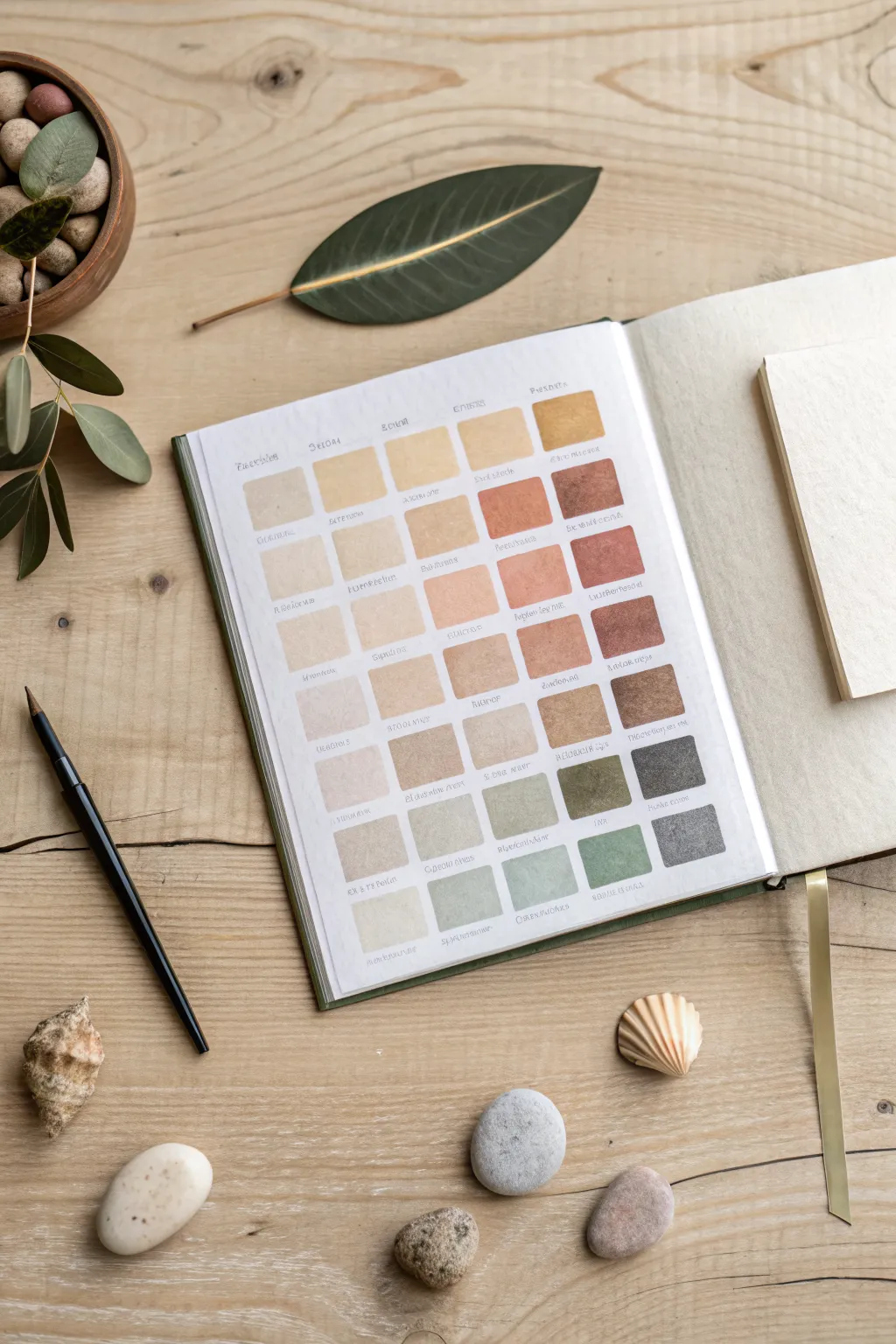
This project is a soothing exploration of natural color mixing, resulting in a beautiful reference grid of earthy hues. You will create a structured chart of custom-mixed tones, ranging from warm sands and clays to cool sage greens and river stone greys.
Step-by-Step
Materials
- Watercolor or gouache sketchbook (hot press or mixed media paper preferred)
- Pencil
- Ruler
- Watercolor or gouache paints (primary set + burnt sienna/ochre)
- Small flat brush (size 4 or 6)
- Fine liner pen or dip pen with ink
- Mixing palette
- Water jar
- Paper towels
Step 1: Grid Preparation
-
Measure the page:
Start by measuring the usable space on your sketchbook page. Leave a generous margin of about 1 inch on the top, bottom, and outer edge, and slightly less near the binding to ensure the paint doesn’t pool in the crease. -
Calculate swatch sizes:
Plan for a grid that is 5 columns wide and 8 rows high. Aim for square swatches, approximately 1 inch by 1 inch, with a small gap (about 0.25 inches) between each square. -
Draw the grid:
Using your pencil and ruler, lightly sketch the grid onto the paper. Keep your lines very faint so they can be erased later or easily covered by the paint.
Fixing Uneven Washes
If your squares dry with harsh ‘blooms’ or watermarks, your brush was too wet. Use a slightly drier mix next time, or lift excess water with a thirsty, clean brush while wet.
Step 2: Mixing & Painting Warm Tones
-
Mix the base cream:
On your palette, create a large pool of a very dilute wash. Mix white (if using gouache) or water (if watercolor) with a tiny touch of yellow ochre or raw sienna to create a pale sandy color. -
Apply the first row:
Paint the top row of squares with this lightest tone. Use your flat brush to create crisp edges, pulling the paint smoothly across the square. -
Deepen with yellow:
For the second and third rows, add slightly more pigment to your base mix. I like to introduce a touch of raw umber here to tone down the yellow, creating warm biscuit and wheat colors. -
Transition to terracotta:
As you move to the fourth and fifth rows, begin mixing in burnt sienna or a light red oxide. These swatches should resemble terra cotta, clay, or brick dust. -
Create reddish-browns:
For the right side of the middle rows, deepen the red tones by adding a tiny dot of black or dark brown to your reddish mix. This creates structured, rich mahogany tones.
Step 3: Cool Tones & Finishing
-
Mix neutral greys:
Clean your palette area or start a new puddle. Mix ultramarine blue with burnt sienna to create a neutral grey. Adjust the ratio to lean slightly warmer (more brown) for the lower-middle rows. -
Paint the stone colors:
Apply these browny-greys to the sixth row. These should look like dry river stones or taupe fabric. -
Introduce sap green:
For the bottom left squares, mix a sap green or olive green with a lot of white/water. This creates a pale lichen color. -
Deepen the greens:
For the final bottom right squares, mix your green with a touch of the grey you made earlier. This desaturates the green, turning it into a slate or sage hue. -
Erase pencil lines:
Allow the paint to dry completely—give it at least 20 minutes. Once dry, gently erase your visible pencil grid lines. -
Label the swatches:
Using a fine liner or a dip pen, write the evocative name of the color or the pigment mix ratio underneath each square. Keep your handwriting small and delicate to match the aesthetic.
Pro Tip: Consistency
To get those crisp square edges without tape, load your flat brush fully but wipe one side on the palette rim. Use the sharp, wiped edge to cut the outer lines of the square.
Now you have a serene, organized reference page that serves as inspiration for future landscape paintings

PENCIL GUIDE
Understanding Pencil Grades from H to B
From first sketch to finished drawing — learn pencil grades, line control, and shading techniques.
Explore the Full Guide
10-Day Monochrome Mood Challenge
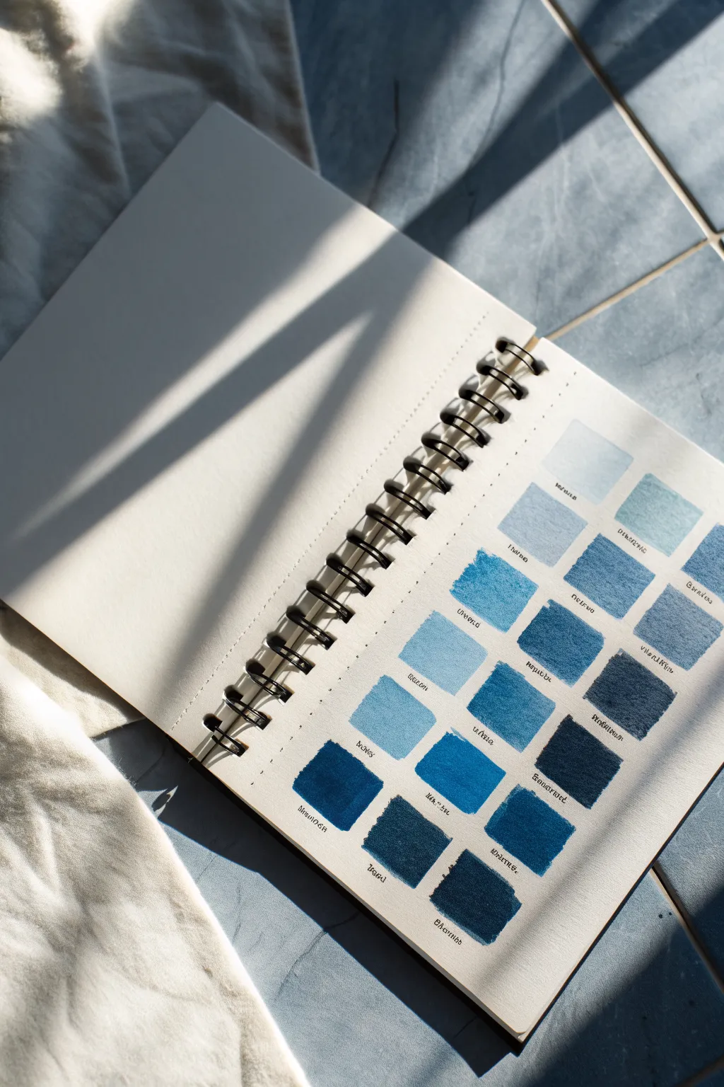
This soothing project explores the incredible depth of a single color family through a structured grid of swatches. By testing various shades of blue from light washes to deep indigo, you create not just a reference guide, but a satisfying piece of minimalist art.
Step-by-Step Guide
Materials
- Spiral-bound watercolor journal or mixed media sketchbook
- Watercolor paints (various blue tubes or pans: Ultramarine, Prussian Blue, Cerulean, Indigo, Phthalo)
- Flat shader brush (size 6 or 8) for square shapes
- Fine liner pen (waterproof, black or dark grey)
- Ruler
- Pencil and eraser
- Mixing palette
- Two jars of water
- Paper towel
Step 1: Preparation & Layout
-
Prepare your workspace:
Since this project relies on clean edges and consistent shapes, ensure you have a flat, well-lit surface. Clear away clutter so you can rotate your sketchbook comfortably. -
Grid measurements:
Open your sketchbook to a fresh right-hand page. Measure the usable area and decide on a grid layout. The example uses a 4-column layout, but 3 or 5 works depending on page size. -
Marking the grid:
Using your ruler and a light pencil touch, mark dots where the corners of your squares will be. You don’t need to draw the full lines if you want a cleaner look, but light guides help keep things straight. -
Adding text guides:
Pencil in faintly ruled lines about 1/4 inch below each row of squares. This ensures your handwriting stays straight later.
Step 2: Painting the Swatches
-
Mixing the lightest wash:
Start with your lightest blue, perhaps a diluted Cerulean or watered-down Ultramarine. Load your flat brush with plenty of water and just a touch of pigment. -
Painting the first square:
Touch the flat edge of your brush to the top pencil mark of the first square. Drag the brush down to create a clean shape. Rely on the brush’s natural width to help form the square edges. -
Creating gradients:
For the next few squares, slightly increase the pigment-to-water ratio. I find it helpful to mix three shades at a time on the palette to see how they relate to one another before committing to paper. -
Mid-tone application:
As you move to the middle rows, switch to medium blues like Cobalt or cooler Phthalo Blue. These should be less watery; aim for a creamy consistency that appears opaque but still luminous. -
Managing wet edges:
If a puddle forms at the bottom of a square, gently lift the excess water with the corner of a clean, thirsty brush or paper towel to prevent ‘blooming’ as it dries. -
Mixing deep shades:
For the bottom rows, use your darkest pigments: Prussian Blue, Indigo, or Payne’s Gray. Use very little water here to achieve that rich, velvet-like density. -
Granulation check:
Some blues (like Ultramarine) naturally granulate, leaving texture. Allow this to happen for visual interest—don’t overwork the paint trying to smooth it out perfectly. -
Dry time is crucial:
Let the page dry completely. If you are impatient, a hairdryer on a low, cool setting can speed this up, but air drying usually yields flatter paper.
Uneven Edges?
If your hand is shaky, use low-tack artist tape or washi tape to mask off the grid before painting. Peel it off carefully once the paint is fully dry for crisp, perfect squares.
Step 3: Final Details
-
Labeling technique:
Once the paper is bone dry, take your waterproof fine liner pen. Write the name of the color or the specific mix underneath each square using the pencil guides you made earlier. -
Adding style:
To match the reference, use a slightly stylized, narrow print handwriting. Keep the letters small and centered under the swatches. -
Review and erase:
Check the grid for any jarring pencil marks. Gently erase the guide lines, being careful not to rub over the painted areas which might smudge or lift slightly.
Level Up: Texture
Add variety by sprinkling a tiny pinch of table salt onto a few wet squares. Brush it off when dry to reveal unique, starry textures in the pigment.
Now you have a beautiful reference page that celebrates the versatility of the color blue
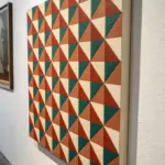
No-Sketch, Brush-First Challenge
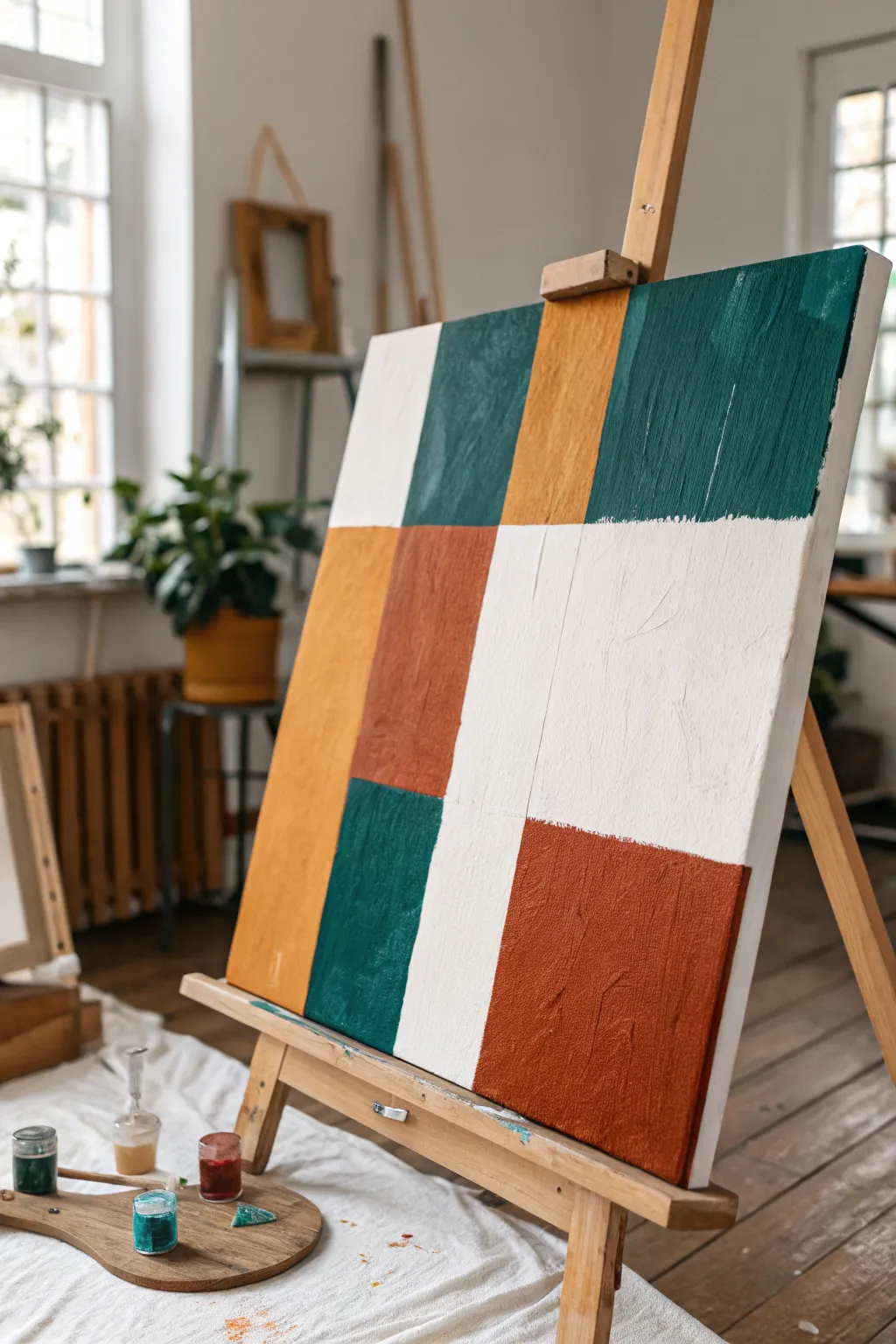
Embrace the freedom of working directly with the brush in this geometric abstract painting that relies on instinct over precision. Featuring rich earth tones of terracotta, ochre, and deep teal alongside crisp white, this piece builds structure through confident color blocking.
How-To Guide
Materials
- Stretched canvas (16×20 or similar size)
- Heavy body acrylic paints (Terracotta, Yellow Ochre, Phthalo Green, Titanium White, Raw Umber)
- Large flat brush (1-inch width)
- Medium filbert brush
- Palette knife (optional for mixing)
- Water cup and paper towels
- Easel
Step 1: Planning the Layout
-
Visualize the Grid:
Since this is a no-sketch challenge, look at your blank canvas and mentally divide it into an uneven 3×3 or 4×3 grid. You aren’t aiming for perfect squares; you want elongated rectangles and varying block sizes to create visual interest. -
Mix the Deep Teal:
Combine Phthalo Green with a small touch of Raw Umber to deepen it. If it feels too vivid, add a tiny dot of red or terracotta to desaturate the green into that rich, forest-like teal shade seen in the top right. -
Establish the Anchors:
Using your large flat brush, paint the first major block—the large teal rectangle in the upper right quadrant. Let the brushstrokes show vertical movement to give the block texture. -
Add the Upper Left:
Mix a warm ochre shade. Use this color to paint the vertical stripe just to the left of your teal block. Let these initial shapes determine the scale for the rest of the canvas.
Visible Brushwork
Don’t over-smooth your paint. Use a stiff bristle brush rather than a soft synthetic one to leave visible tracks in the paint, adding crucial texture to the flat fields of color.
Step 2: Blocking in Warmth
-
Create the Terracotta:
Mix a rusty red-orange using your Terracotta paint. If needed, warm it up with a little yellow or cool it down with a touch of umber. This needs to be an opaque, earthy mix. -
Paint the Central Block:
Directly below the white space on the left, paint a sturdy rectangular block of this terracotta color. Don’t worry if the edges touch or slightly overlap neighboring sections; that organic edge is part of the charm. -
Balance the Bottom Right:
Using the same terracotta mixture, paint a large, square-ish block in the bottom right corner. I usually apply the paint quite thickly here so the brush texture catches the light. -
Insert the Golden Tone:
Clean your brush thoroughly. Paint a long vertical strip of Yellow Ochre on the far left side, extending from the middle section down to the bottom edge.
Step 3: Refining and Filling
-
Mix the Lower Teal:
Return to your dark teal mixture. Paint a vertical rectangle in the bottom left quadrant, nestled between the ochre strip and the central area. -
Observe the Negative Space:
Step back and look at the remaining white canvas. These unpainted areas are just as important as the colored ones. Ensure you have a large ‘L’ shape of white space dominating the middle right. -
Paint the ‘White’:
Even though the canvas is white, use Titanium White paint to fill in the negative spaces. This ensures the texture (sheen and brushstrokes) is consistent across the whole piece, rather than having flat raw canvas next to glossy paint. -
Blend the White Edges:
Carefully paint the white up to the edges of your colored blocks. You don’t need a ruler; a slightly wobbly, hand-painted line feels more authentic to this style.
Palette Knife Scrape
For a grittier modern look, gently scrape a palette knife over semi-dry blocks. It drags the top color and reveals hints of canvas or underpainting for a distressed finish.
Step 4: Texture and Conclusion
-
Second Layer for Opacity:
Acrylics can be translucent. Once the first layer is touch-dry, go back over the ochre and terracotta sections with a second coat to make the colors solid and rich. -
Enhance Brushstrokes:
Load your brush with a little extra paint and drag it vertically through the still-wet top layers. This emphasizes the vertical grain that unifies the composition. -
Clean Up Edges:
If any color block looks too messy, use the white paint to cut back into the shape and tidy the line, essentially ‘erasing’ with paint. -
Paint the Sides:
Don’t forget the sides of your canvas. Extend the lines of the color blocks around the edges for a gallery-wrapped look that doesn’t require a frame.
Step back and admire how these simple shapes come together to form a bold, balanced composition


Room-by-Room Home Scene Challenge
Capture the cozy corners of your home through a grid of tiny, delicate paintings on a single sketchbook page. This challenge encourages observation and simplification, turning everyday domestic scenes into a collection of precious miniature artworks.
Step-by-Step Tutorial
Materials
- Spiral-bound sketchbook (heavyweight mixed media or watercolor paper)
- Watercolor paint set
- Fine liner pen (waterproof, 0.1mm or 0.05mm)
- Small round brushes (size 0 and 2)
- Ruler
- Pencil (HB or 2B)
- Eraser
- Jar of water
- Paper towel
Step 1: Grid Preparation
-
Map out the grid:
Begin by lightly measuring a 2×4 grid on the left-hand page of your sketchbook. Leave a generous margin around the edges and equal spacing between each small rectangle to create a clean, gallery-like layout. -
Draft the borders:
Use your ruler and pencil to draw the rectangular frames defined in the previous step. Keep your lines incredibly faint so they can guide your painting without showing through the final layers. -
Scout your subjects:
Walk through your home and identify eight distinct corners or views. Look for simple compositions: a kitchen window, a stack of books, a plant on a sill, or an unmade bed. Take quick reference photos if you can’t paint on location.
Step 2: Sketching the Scenes
-
Simplify the geometry:
In the first rectangle, lightly sketch the main structural lines of your first scene. Focus on the big shapest—window frames, table edges, and wall corners—rather than tiny details. -
Add key objects:
Place the main focal points, such as a potted plant or a chair, within the structural lines. Keep these sketches loose and minimal; they are just anchors for the watercolor. -
Repeat the process:
Move through the remaining seven rectangles, sketching a different room view in each. Vary the scale, zooming in on a single object for one and capturing a wider room angle for another.
Tape it Down
For crisp, professional edges, use 1/4 inch artist tape or washi tape to mask off the borders of each small rectangle before painting. Peel it off slowly at an angle for a satisfying reveal.
Step 3: Watercolor Layers
-
First wash: Atmosphere:
Start with the first vignette. distinct from the others, mix a very watery, pale wash for the walls or background sky. Apply this quickly to establish the light source and mood. -
Building local color:
Once the first wash is damp-dry, drop in specific colors for furniture and plants. I like to keep the paint fairly wet here to allow colors to bleed slightly, creating a soft, dreamy effect. -
Shadows and depth:
Mix a cool grey or violet tone. Paint the shadows under chairs, inside window frames, and behind objects to give the flat shapes dimension. Be brave with contrast; tiny paintings need strong values to pop. -
Working across the page:
While one vignette dries, move to the next. This rotation prevents smudging wet paint with your hand and keeps your workflow fluid across the grid. -
Refining greenery:
For plant-heavy scenes, use the tip of your size 0 brush to stipple various shades of green, mimicking leaves without drawing every single one. -
Adding texture:
Use a nearly dry brush to suggest textures like wood grain on a floor or the weave of a rug. Subtle scumbling adds richness without overwhelming the small space.
Seasonal Variation
Repeat this project once every season to capture how the light and decor in your home changes throughout the year, creating a cronological home record.
Step 4: Definition and Layout
-
Ink outlining:
Once all paint is thoroughly dry, take your fine liner pen and selectively outline key elements. Don’t outline everything; broken lines often look more artistic and suggest light hitting an edge. -
Detail work:
Add tiny details with the pen that were too small for the brush, such as drawer handles, window latches, or patterns on a cushion. -
Erase guidelines:
Gently erase any visible pencil lines from your initial grid and sketch. Be careful not to rub too hard over the painted areas to preserve the paper’s surface. -
Date and label:
Underneath the grid or on the facing page, you might want to jot down the date or the name of the room depicted, turning the page into a true visual diary entry.
Now you have a charming collection of home memories preserved in miniature
Abstract Word-of-the-Day Challenge

Transform a single sketchbook page into a gallery of tiny worlds with this grid-based painting challenge. Using a harmonious palette of gouache or acrylics, you’ll create twelve unique, semi-abstract vignettes that explore simple shapes and fluid lines.
Step-by-Step Guide
Materials
- Heavyweight sketchbook (cold press watercolor paper ideal)
- Painter’s tape or masking tape (low tack)
- Gouache or acrylic paints (primary palette plus white)
- Small flat brush (size 2 or 4)
- Fine liner brush (size 0 or 00)
- Ruler
- Pencil
- Water jar and palette
Step 1: Preparation and Layout
-
Tape the margins:
Begin by taping off a clean border around the entire page of your sketchbook to create a crisp outer edge for the final composition. -
Measure the grid:
Using a ruler and light pencil marks, divide the interior space into a 3×4 grid. Ensure the twelve squares are evenly spaced with consistent gutters between them. -
Tape the gutters:
Carefully apply narrow strips of tape over your pencil grid lines to separate the boxes. If you don’t have narrow tape, you can either cut wider tape down or carefully paint within penciled boundaries. -
Plan your palette:
Mix your core colors before starting. Prepare a spectrum of oceanic blues (teal, navy, sky blue) and warm earth tones (burnt orange, rust, cream, and mustard yellow).
Sticky Situation?
If your tape is tearing the paper upon removal, heat it briefly with a hairdryer first to loosen the adhesive, or stick the tape to your clothes before applying it to reduce tack.
Step 2: Painting the Base Layers
-
Block in horizons:
For the landscape squares, paint the background sky first using flat washes of light blue or soft cream. Let these dry completely. -
Establish landforms:
Paint the major shapes in each square. Use solid blocks of burnt orange for sand dunes or hills, and deep teal for water masses. Keep shapes simple and graphic. -
Create gradients:
In the abstract wave squares, layer bands of color from dark to light. For example, start with a navy curve at the bottom and transition to a lighter blue above it. -
Add focal circles:
Paint the suns or abstract circular elements using bright yellow or orange. Place them carefully—some rising from the horizon, others fully floating in the sky. -
Let it set:
Allow all base layers to dry fully. Usually, gouache dries quickly, but ensure there is no sheen left on the surface before adding details.
Pro Tip: Consistency
Limit your palette to just 4-5 core colors used across all 12 squares. This repetition ties the disparate scenes together into a cohesive collection.
Step 3: Detailing and Pattern
-
Add wave lines:
Using your finest liner brush and white or very light blue paint, add wavy texture lines over the darker water sections. -
Paint organic textures:
In the desert-themed squares, use brown or dark orange to paint flowing lines that mimic the contours of sand dunes. -
Insert botanical elements:
Select one or two squares to feature plant life. Paint silhouetted grass blades or abstract leafy shapes in dark teal or black for contrast. -
Create geometric patterns:
For the more abstract squares, like the bottom right, paint bold, sweeping stripes of alternating reds and creams. -
Add celestial details:
Dot in tiny stars or moons in the night-sky squares using pure white paint.
Step 4: Finishing Touches
-
Refine edges:
Check the corners of each miniature painting. If paint has bled slightly under the tape, you can touch it up with opaque white (if painting on white paper) later. -
The reveal:
Once the paint is bone dry, slowly peel away the tape. Pull at a 45-degree angle away from the painted area to prevent tearing. -
Erase guidelines:
Gently erase any visible pencil marks left in the white gutters between the paintings.
Fill the rest of the page with the date or small notes about your inspiration for a finished journaling spread


Have a question or want to share your own experience? I'd love to hear from you in the comments below!