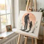
If you’re craving police painting ideas that feel meaningful and visually striking, you’ve got so many directions you can go—from classic portraits to symbolic tributes. I pulled together a mix of approachable, paintable concepts you can make your own, whether you’re working in watercolor, acrylic, or pencil.
Classic Police Officer Portrait
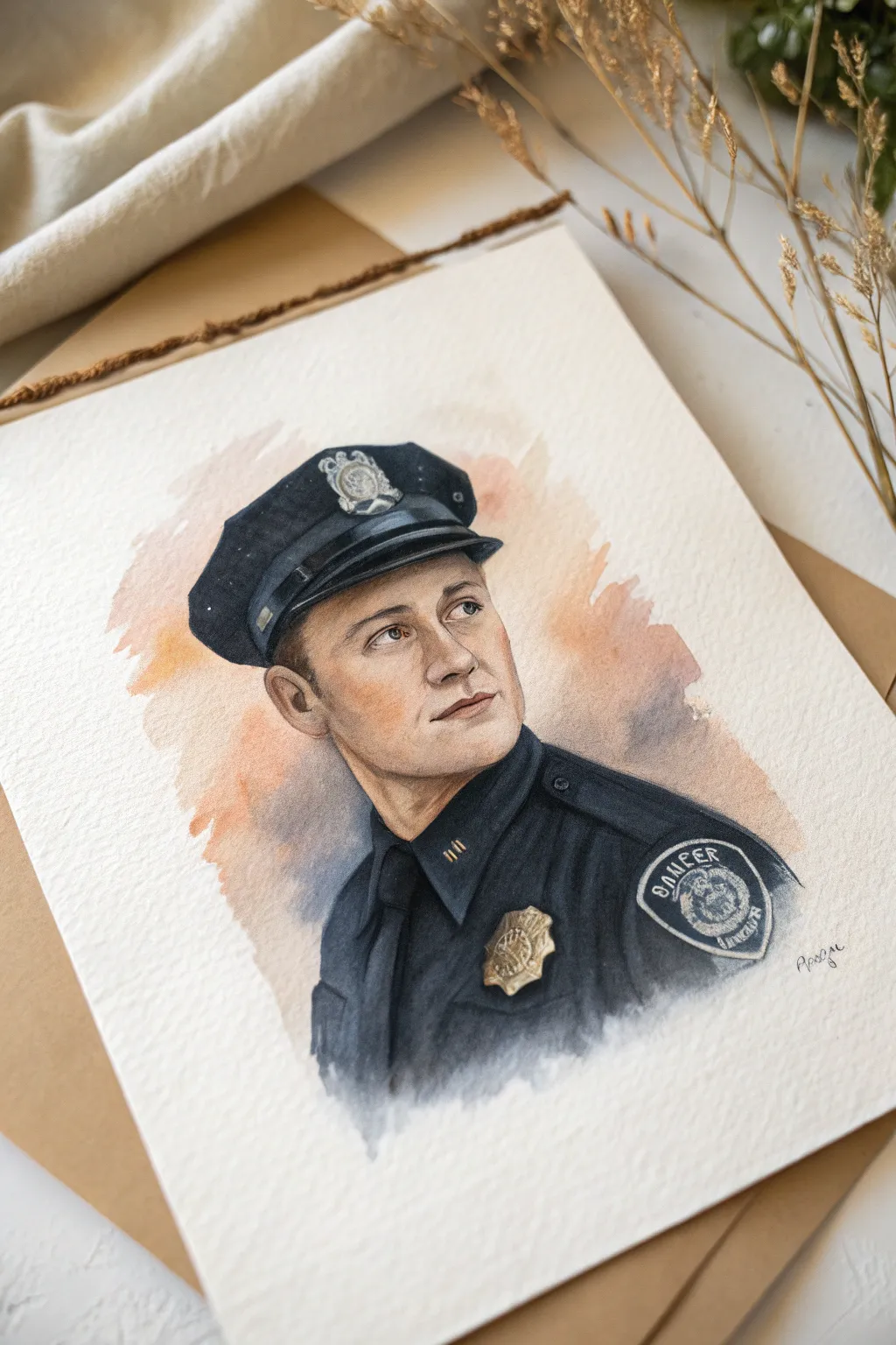
This project captures the quiet dignity of a police officer using the delicate washes of watercolor. By balancing precise details in the uniform with a loose, atmospheric background, you’ll create a timeless and respectful tribute.
Step-by-Step Tutorial
Materials
- Cold press watercolor paper (140lb/300gsm)
- HB or 2B graphite pencil
- Kneaded eraser
- Watercolor paints (Ultramarine Blue, Burnt Umber, Payne’s Grey, Yellow Ochre, Alizarin Crimson, Burnt Sienna)
- Round brushes (sizes 2, 6, and 10)
- Masking fluid (optional)
- Palette for mixing
- Two jars of water
- Paper towels
Step 1: Drafting the Foundation
-
Establish the Head Shape:
Begin with a light pencil sketch. Draw an oval for the head, marking guidelines for the eyes (halfway down), nose, and mouth. The figure in the reference is looking slightly up and to the right, so angle your center line accordingly. -
Map the Cap:
Situate the peaked cap firmly on the head. Pay close attention to the perspective of the brim—it curves around the forehead. Sketch the badge shape on the front of the cap now, but keep details minimal. -
Outline the Uniform:
Draw the collar and shoulders. The collar stands up slightly against the neck. Verify the proportions of the shoulder patch and metal badge on the chest; getting these shapes right early is crucial for realism. -
Refine Facial Features:
Tighten up the eyes, nose, and lips. I like to keep my pencil lines very faint here so graphite doesn’t muddy the watercolor later. Use a kneaded eraser to lift up any heavy sketch lines.
Step 2: Flesh Tones and Base Washes
-
Mix Skin Tones:
Create a pale wash using Yellow Ochre and a tiny touch of Alizarin Crimson. Test the color on a scrap piece of paper to ensure it isn’t too saturated. -
Apply First Skin Glaze:
Using a size 6 brush, wet the face area slightly with clean water (wet-on-wet) and drop in your skin tone mix. Leave the whites of the eyes and any high points on the nose or cheeks unpainted for highlights. -
Build Facial Structure:
While the first layer is damp but not soaking, mix a slightly darker shadow tone by adding a bit of Burnt Sienna or faint trace of Blue to your skin mix. Apply this under the cap brim, under the nose, and along the jawline to create volume. -
Background Wash:
Prepare a loose mix of Burnt Sienna and a touch of Ultramarine for the background. With a size 10 brush and plenty of water, paint a loose, abstract shape behind the head. Let the edges remain rough and uneven for that artistic, vignette look.
Muddy Uniform?
If your dark blues turn muddy or opaque, you likely used too much Burnt Umber or mixed too many colors. Let it dry completely, then glaze over with pure Ultramarine Blue to restore vibrancy.
Step 3: The Uniform and Cap
-
Deep Blue Mix:
Mix a substantial amount of dark navy. Combine Ultramarine Blue with Payne’s Grey and a little Burnt Umber to deepen it without making it dead black. It needs to look like dark wool fabric. -
Block in the Uniform:
Using the size 6 round brush, paint the main body of the uniform and the cap. Be careful to paint *around* the badges, collar pins, and buttons—leave those white paper for now. -
Fabric Folds and Shadows:
While the blue wash is settling, drop in a more concentrated version of your dark mix into the creases of the sleeves and under the collar. This wet-in-wet technique creates soft, natural-looking shadows in the fabric. -
Cap Details:
Paint the shiny brim of the cap. Use the dark mix but leave distinct, hard-edged white strip to represent the reflection of light on the glossy surface.
Silver or Gold?
Customize the badge color based on rank. For silver badges, use diluted Payne’s Grey and leave more white paper. For gold, lean into Yellow Ochre and Burnt Sienna mixes.
Step 4: Refining Details
-
Badge and Metadata:
Mix a metallic tone using Yellow Ochre and a bit of Burnt Umber. Using your smallest size 2 brush, carefully fill in the badge and collar pins. Don’t paint them solid; create small variations to suggest embossed metal. -
Eye Detail:
Return to the face, which should be dry. Paint the irises with a detailed touch, leaving a tiny speck of white paper for the catchlight. Darken the lash line and define the eyebrows with careful, hair-like strokes. -
Patch Work:
Paint the shoulder patch. Use a steady hand to outline the text or symbol. You don’t need to write every letter perfectly; suggestion often works better than precision at this scale. Use a dark grey for the background of the patch. -
Deepen Contrast:
Look at the whole painting. I usually find I need to go darker in the deepest shadows—under the collar, the pupil of the eye, and the darkest folds of the shirt. Adding these final darks makes the form pop. -
Softening Edges:
Finally, inspect the bottom edge of the uniform where it fades into the paper. If the hard edge looks distracting, take a clean, damp brush and gently scrub the edge to soften it into a fade-out effect.
Once the paint is fully dry, erase any visible pencil marks to reveal your respectful and artistic portrait

Patrol Car at Golden Hour
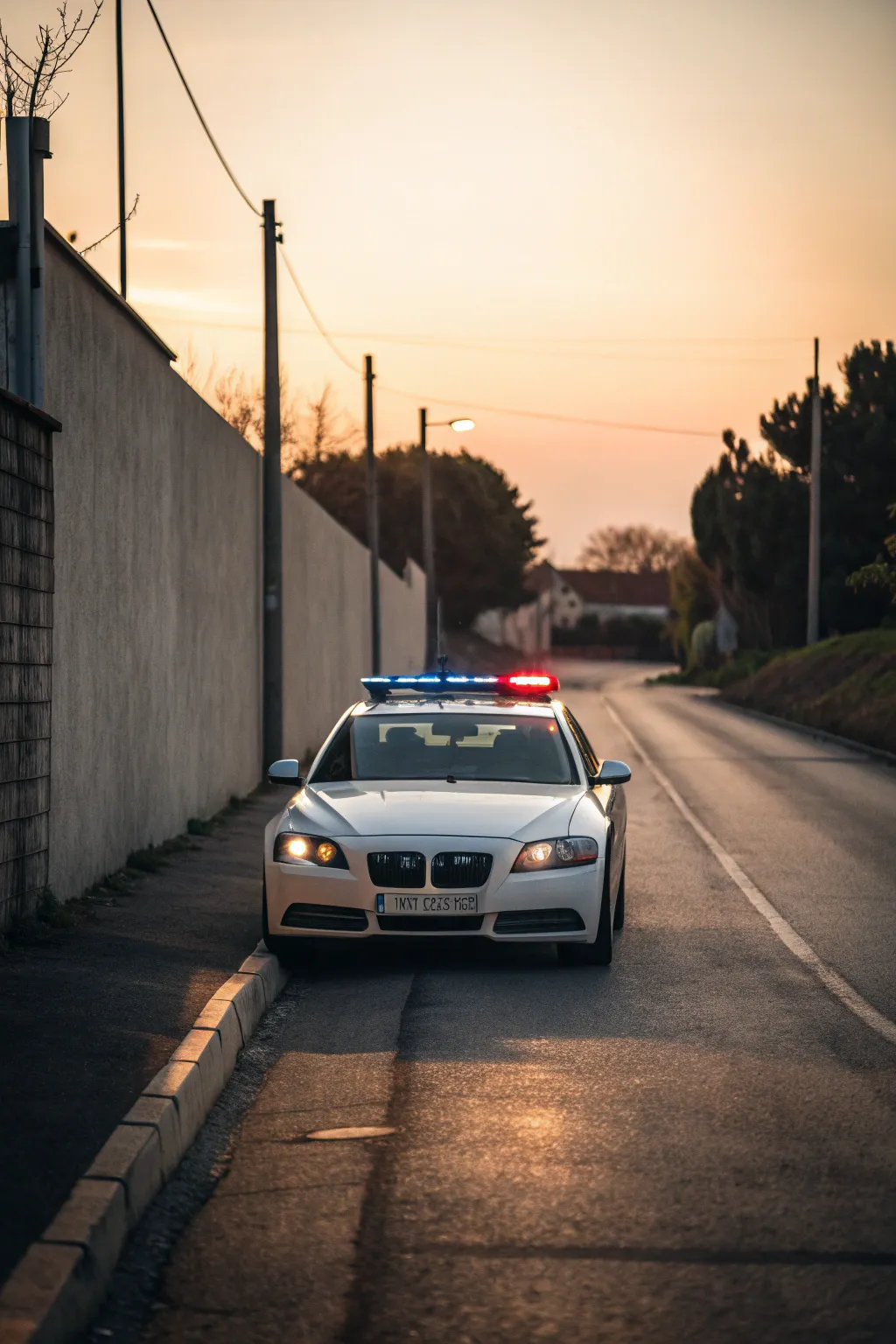
This project captures the serene yet alert presence of a sleek white patrol car during the magical golden hour. By balancing warm sunset hues with the cool mechanics of the vehicle, you’ll create a painting that feels both cinematic and grounded.
How-To Guide
Materials
- Canvas (16×20 inches or similar vertical format)
- Acrylic paints: Titanium White, Mars Black, Burnt Sienna, Yellow Ochre, Cadmium Red, Phthalo Blue
- Flat shader brushes (sizes 8 and 12)
- Small round detail brushes (sizes 0 and 2)
- Painting medium or water for blending
- Palette knife for mixing
- Ruler or straight edge
- Pencil for sketching
Step 1: Blocking the Composition
-
Establish the horizon line:
Begin by lightly sketching your horizon line about two-thirds up the canvas. This lowered perspective gives prominence to the road and the car. -
Sketch the perspective lines:
Draw the converging lines of the road and the wall on the left. The wall should start high on the left edge and angle sharply down toward the vanishing point near the horizon. -
Outline the vehicle:
Sketch the basic shape of the car in the center foreground. Focus on the wide stance and the distinct kidney grilles. Don’t worry about details yet, just get the proportions right relative to the road width. -
Place surrounding elements:
Lightly indicate the vertical poles along the wall and the tree line on the right side. These vertical elements will frame your central subject nicely.
Muddy Sunset?
If your sky colors turn muddy where they meet the trees, let the sky layer dry completely before painting the dark foliage over it.
Step 2: Painting the Atmosphere
-
Mix your sunset gradient:
Prepare a gradient on your palette ranging from a warm Yellow Ochre and White mix for the horizon to a slightly cooler, muted blue-grey for the upper sky. -
Apply the sky:
Paint the sky using horizontal strokes, blending the warm yellow up into the cooler tone. Keep the horizon area brightest to simulate that golden hour glow. -
Paint the background wall:
Mix a light grey with a touch of Burnt Sienna. Paint the large wall on the left, making it slightly darker as it recedes into the distance to enhance depth. -
Lay in the road base:
Cover the road area with a dark, warm grey. I usually add a tiny bit of purple to my grey mix here to complement the yellow sunlight. -
Add the tree line:
Stipple in the trees on the right using a dark mix of Phthalo Blue and Burnt Sienna (creating a deep green-black). Keep the edges soft against the sunset sky.
Glow Like a Pro
To make the headlights really shine, apply a very thin glaze of yellow around the outside of the painted light on the dry canvas.
Step 3: Defining the Patrol Car
-
Base coat the car body:
Paint the body of the car with Titanium White, but tone it down slightly with a drop of blue-grey so it isn’t stark white yet. Leave the window areas empty. -
Paint the windshield:
Fill the windshield area with a dark, reflective grey. While wet, streak in a hint of the sky color to suggest reflection on the glass. -
Define the front details:
Using a small flat brush and Mars Black, carefully paint the grille, the lower bumper vents, and the tires. Keep your edges crisp. -
Add the light bar:
Paint the light bar structure on the roof. Use pure Cadmium Red for the right side and Phthalo Blue mixed with white for the left side to show the emergency lights are active. -
Enhance the headlights:
Paint the headlight shapes with a pale yellow. Add a central dot of almost pure white in each to simulate the bulb’s intensity.
Step 4: Lighting and Refinements
-
Cast the long shadows:
Mix a transparent dark glaze and paint the shadows stretching from the car and the wall poles across the road. Ensure the angle matches your light source. -
Highlight the glimmer:
Using your smallest round brush and pure Titanium White, add sharp highlights to the car’s hood, the rim of the grille, and any chrome details to make them sparkle. -
Create the road texture:
Dry brush some lighter warm grey horizontally across the road surface. This mimics asphalt texture catching the low evening light. -
Intensify the emergency lights:
Glaze a little neon-brightness (or mixed bright red/blue) around the light bar to create a subtle glow effect on the roof. -
Detail the license plate:
Rectilinear strokes simulate the text on the license plate without needing to be legible—just suggest shapes and spacing. -
Final curb check:
Paint the curb on the left with alternating light and shadow planes to show its blocky structure running alongside the car.
Step back and admire how the warm light transforms a standard patrol scene into something atmospheric and striking

K-9 Partner Portrait
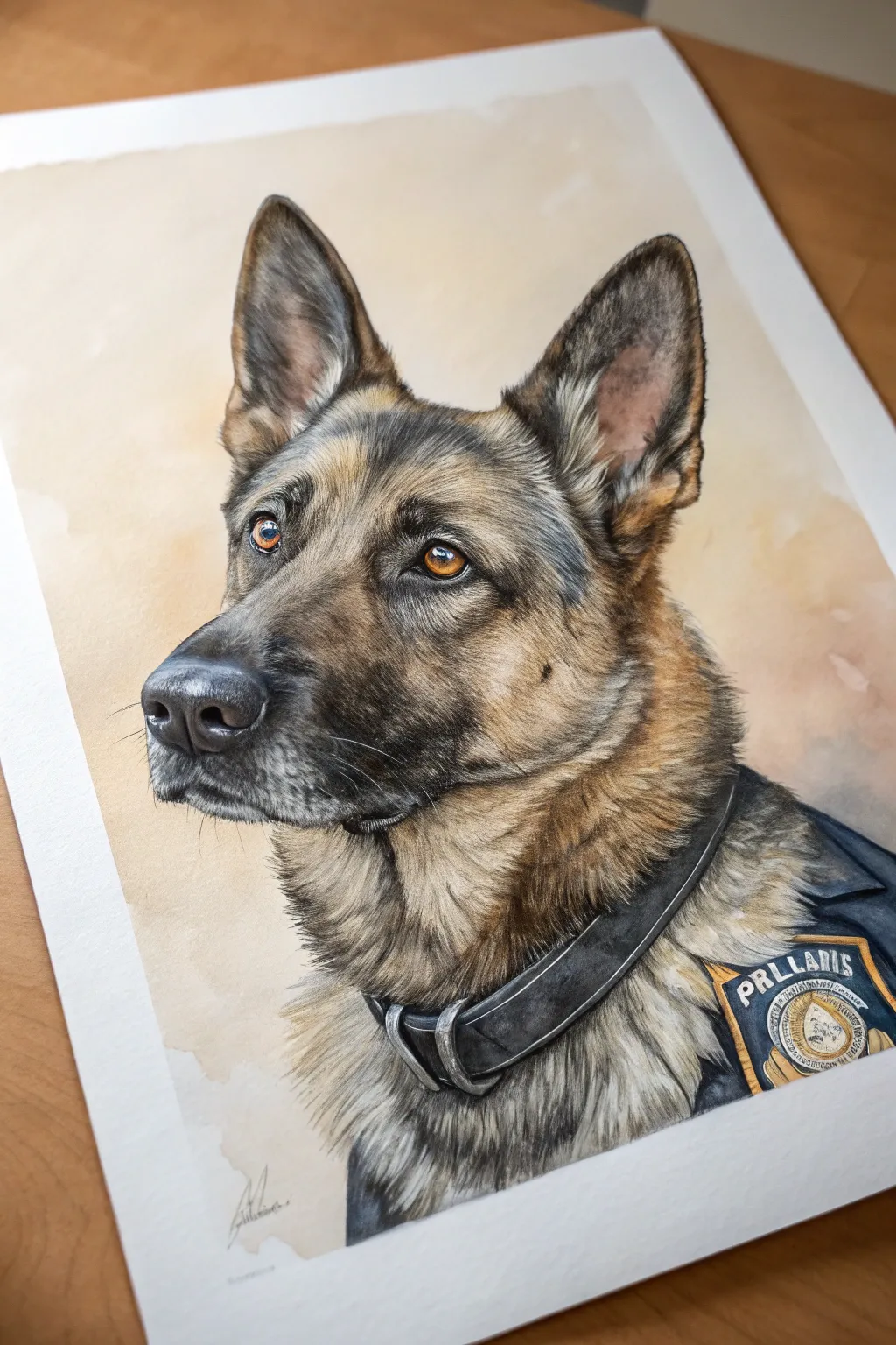
Immortalize the bravery and loyalty of a K-9 partner with this detailed watercolor and pencil portrait. By layering translucent washes with fine pencil strokes, you’ll capture the soulful gaze and intricate fur texture that makes this German Shepherd sc attentive and lifelike.
Detailed Instructions
Materials
- Heavyweight watercolor paper (300gsm, hot press for detail)
- H and HB graphite pencils for sketching
- Watercolor paints (Burnt Sienna, Raw Umber, Yellow Ochre, Payne’s Grey, Mars Black, Ultramarine)
- Colored pencils (polychromos or wax-based) in browns, tans, blacks, and greys for detailing
- White gel pen or gouache for highlights
- Synthetic round brushes (sizes 2, 4, and 00 for fine lines)
- Masking fluid (optional)
- Kneaded eraser
Step 1: Structural Sketching
-
Establish the framework:
Begin with a light graphite sketch on your hot press paper. Use simple geometric shapes to map out the head—a circle for the skull and a rectangular block for the snout. -
Refine the features:
Carefully draw the almond shapes of the eyes, positioning the pupils to look off to the left. Sketch the large, triangular ears, ensuring the inner ear structure is visible. -
Mark the gear:
Lightly outline the collar and the vest area on the dog’s shoulder. Don’t worry about the text on the patch yet; just establish the shape of the badge and the fabric folds.
Step 2: Watercolor Washes
-
Base coat warmth:
Mix a very dilute wash of Yellow Ochre and Burnt Sienna. Apply this to the tan areas of the face—the snout, around the eyes, and inner ears—to establish a glowing underlayer. -
Define the darks:
While the first layer is dry, mix a sheer wash of Payne’s Grey and Mars Black. Map out the saddle area, the dark muzzle, and the outer edges of the ears, keeping the edges soft. -
Paint the eyes:
Using a size 2 brush, paint the iris with a rich amber tone (Burnt Sienna mixed with a touch of red). Leave a tiny spot of white paper for the catchlight, or mask it off beforehand. -
Vest foundation:
Lay down a solid, deep blue wash (Ultramarine and Black) for the police vest and a dark grey for the collar leather, letting it dry completely before adding any details. -
Deepen shadows:
Add a second, slightly more concentrated layer of dark brown to the depths of the fur and under the chin to create volume.
Muddy Fur?
If fur colors look muddy, you likely layered wet wash over wet wash. Let the watercolor bone-dry before adding colored pencil strokes to keep crisp texture.
Step 3: Refining Texture
-
Start the fur texture:
Switch to your colored pencils. Start with lighter browns and tans, using short, directional strokes that follow the natural growth pattern of the dog’s coat. -
Layering dark fur:
Use black and dark grey pencils to draw the coarser guard hairs on the back of the neck and the muzzle. I find pushing a bit harder here creates that necessary contrast against the watercolor base. -
Detailing the snout:
On the muzzle, use stippling (small dots) and very short strokes with a black pencil to create the texture of the nose leather and the whisker pads. -
Ear complexities:
Inside the ears, mix pinkish-tan pencil strokes with grey fluff to separate the smooth skin from the inner tufts of hair. -
Enhancing the eyes:
Outline the eyes with a sharp black pencil to create the rim. Darken the pupil significantly, ensuring it contrasts with the amber iris.
Eye Depth Pro Tip
Add a tiny touch of blue to the white catchlight in the eye. It reflects the sky and makes the eye look wet and round rather than flat.
Step 4: Uniform and Final Touches
-
Leather and hardware:
Use a white or light grey pencil to draw highlights on the metal D-rings of the collar to make them look metallic. Add darker shading under the collar to show weight. -
Patchwork precision:
Carefully draw the lettering on the patch using a sharp pencil or a fine liner pen. Fill in the yellow background of the badge area carefully. -
Whiskers and highlights:
Use a white gel pen or fine brush with white gouache to add the long, thin whiskers on the muzzle. Add a final sharp highlight to the eyes. -
Final assessment:
Step back and check your values. Add a wash of soft brown background if desired to make the portrait pop, or leave it white for a clean look.
Sign your artwork near the bottom and frame it as a tribute to these loyal guardians
Motor Officer on a City Street
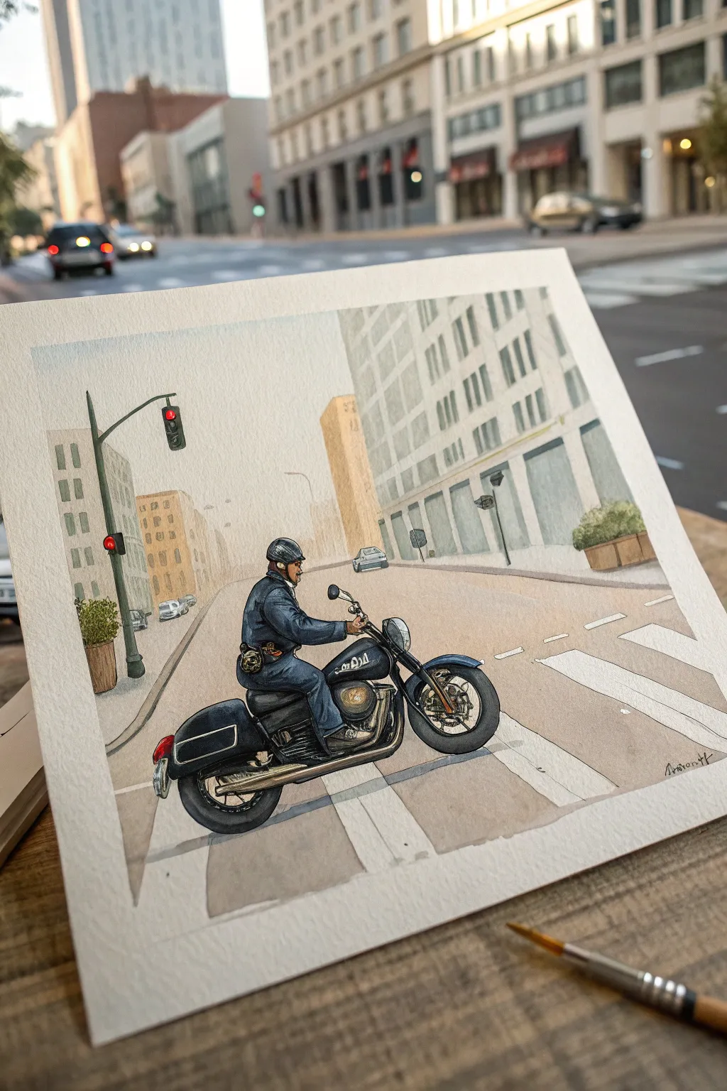
Capture the quiet authority of a motor officer navigating city streets with this detailed watercolor and ink illustration. The project combines soft, architectural washes with crisp line work for a striking urban composition.
Step-by-Step Guide
Materials
- Cold press watercolor paper (140 lb/300 gsm)
- Pencil (HB or 2H)
- Waterproof fine liner pens (0.1mm, 0.3mm, 0.5mm)
- Watercolor paints (Ultramarine Blue, Burnt Sienna, Yellow Ochre, Paynes Grey, Sepia)
- Round watercolor brushes (Size 2, 6, and 10)
- Masking fluid (optional)
- White gel pen or gouache
Step 1: Planning and Sketching
-
Establish the Horizon:
Begin by lightly drawing a horizon line about one-third up from the bottom of your sheet. This will anchor your perspective. -
Block in Perspective Lines:
Using a ruler, lightly sketch lines converging towards a vanishing point near the center. These will define the street curbs, crosswalks, and building angles. -
Sketch the Main Buildings:
Draft the tall buildings in the background. Keep them geometric and simple; you don’t need every window yet, just the main vertical rectangles to form the city canyon. -
Position the Motorcycle:
Place the motorcycle in the foreground, slightly off-center to the left. Start with two circles for the wheels to get the spacing right, then connect the frame. -
Refine the Officer Figure:
Sketch the officer seated on the bike. Focus on the posture—upright but relaxed—and add details like the helmet, uniform folds, and the side saddlebags. -
Add Street Details:
Pencil in the traffic light pole on the left, the crosswalk stripes, and supporting elements like the planter boxes and distant cars.
Muddy Washes?
If your grey buildings look muddy, your water is likely dirty. Change your rinse water frequently, especially when switching between the dark blues of the uniform and the light tints of the background.
Step 2: Inking the Scene
-
Outline the Subject:
Using a 0.3mm waterproof pen, carefully ink the motorcycle and officer. Use broken lines for fabric folds to keep them looking soft. -
Ink the Architecture:
Switch to a finer 0.1mm pen for the background buildings. Keep these lines lighter and less continuous to suggest distance and atmospheric depth. -
Detail the Bike:
Use a 0.5mm pen to darken the tires and the deepest shadows under the fender and engine block, giving the vehicle visual weight. -
Erase Pencil Lines:
Wait until the ink is completely dry, then gently erase all visible pencil marks to clean up the paper surface.
Atmospheric Depth
To push the background further back, do a final glaze of very watery white gouache over the furthest buildings. This mimics the haze of a city street and makes the foreground officer pop.
Step 3: Painting the Cityscape
-
Wash the Sky:
With a large size 10 brush, apply a very pale wash of diluted blue for the sky. Fade it out as it descends toward the horizon line to mimic urban haze. -
Tint the Buildings:
Mix a watery grey using Ultramarine and a touch of Burnt Sienna. Paint the buildings, keeping the tone light. I like to leave some paper white for sunlit facades. -
Paint the Road Surface:
Apply a wash of diluted Yellow Ochre mixed with a tiny bit of violet to the street. While wet, lift out pigment where the white crosswalk stripes should be. -
Add Building Shadows:
Once the first layer is dry, add vertical strokes of slightly darker grey to create the windows and architectural recesses on the buildings.
Step 4: Painting the Subject
-
Color the Uniform:
Paint the officer’s uniform with a mix of Indigo or heavy Ultramarine. Let the paint pool slightly in the creases for natural shading. -
Detail the Motorcycle:
Use Payne’s Grey and Sepia for the dark parts of the bike. Avoid solid black; varied dark tones look more realistic and interesting. -
Paint the Metal Accents:
Use a mix of Yellow Ochre and Sepia for the metallic engine parts and exhaust. Keep these washes loose to suggest reflection. -
Final Touches:
Add small splashes of red for the traffic light and taillight. Use a white gel pen to add highlights to the helmet and chrome parts.
Allow the entire piece to dry completely before framing your urban scene
BRUSH GUIDE
The Right Brush for Every Stroke
From clean lines to bold texture — master brush choice, stroke control, and essential techniques.
Explore the Full Guide
Police Station Exterior Sketch
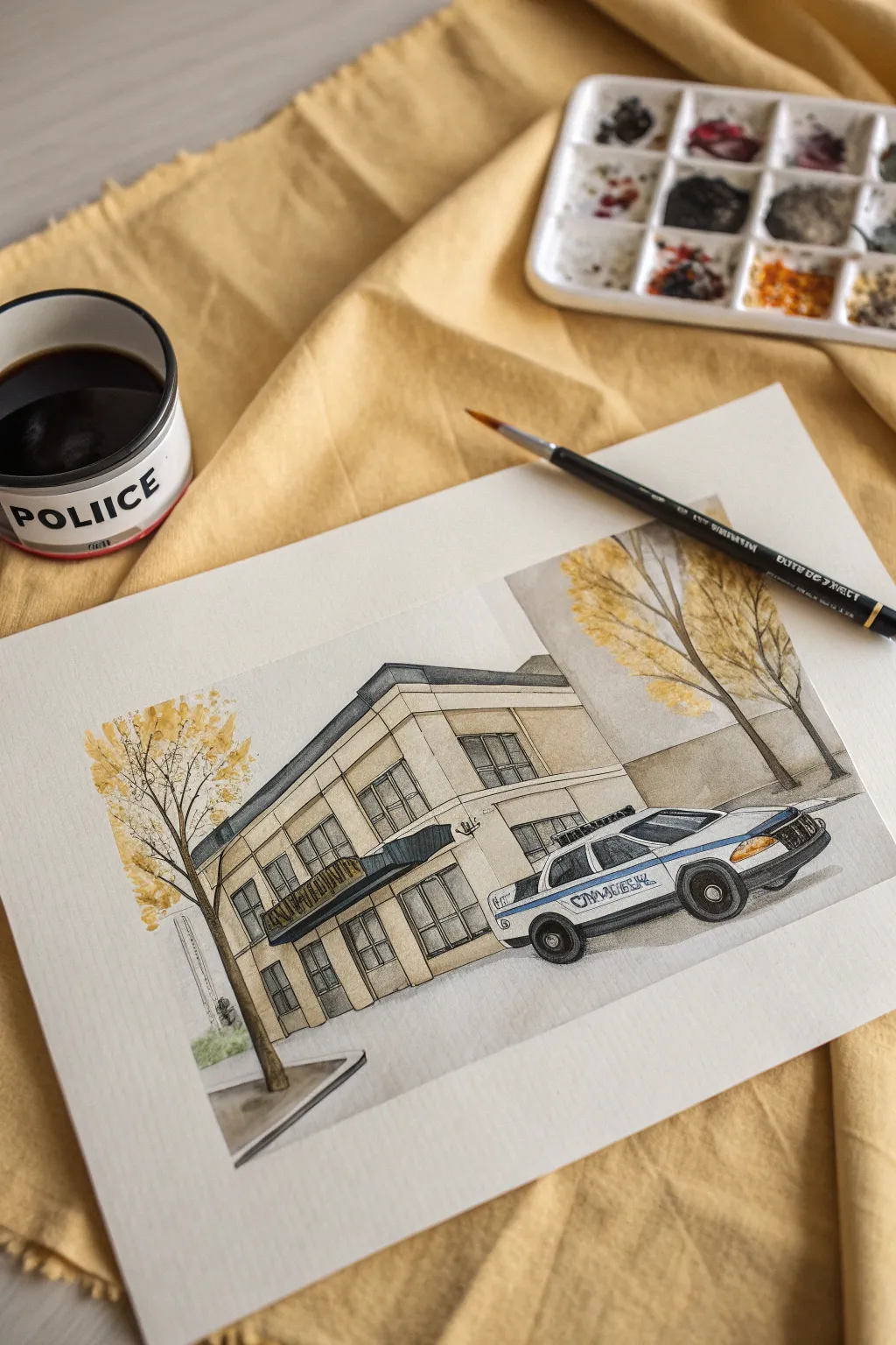
Capture the classic architecture of a local precinct with this mixed-media illustration that combines precise ink lines with loose, autumnal watercolor washes. The finished piece has a charming, storybook quality perfect for an urban sketching portfolio.
Step-by-Step Tutorial
Materials
- Cold press watercolor paper (140lb/300gsm)
- Pencil (HB) and eraser
- Waterproof fine liner pens (sizes 0.1, 0.3, and 0.5)
- Watercolor paint set
- Synthetic round brushes (sizes 4 and 8)
- Ruler (optional)
- Cup of clean water
- Paper towels
Step 1: Pencil Sketching
-
Block in the main structure:
Start by lightly sketching the large rectangle of the police station building. Use two-point perspective if you’re comfortable, or stick to a flat frontal view. Position the building slightly off-center to leave room for the trees. -
Define the windows and entrance:
Divide the facade into a grid to place the windows evenly across the two visible floors. Sketch the entrance awning jutting out above the front door. -
Add the police car:
Sketch the police car in the foreground on the right side. Focus on the main shapes first—the body, the wheels, and the light bar—before worrying about small details. -
Place the trees:
Sketch the trunks of two trees, one on the far left and one on the right behind the car. Keep the branches loose and organic to contrast with the rigid building lines.
Smudged Ink?
If your waterproof pen smears when you paint over it, it wasn’t fully dry. Blot immediately with a tissue. Next time, wait 20 minutes or blast it with a hairdryer before painting.
Step 2: Inking the Lines
-
Outline the building:
Using a 0.3 pen, go over your pencil lines for the building’s main structure. You don’t need a ruler here; a slightly wavering hand-drawn line adds character to the illustration. -
Detail the windows:
Switch to a finer 0.1 pen to draw the window panes and frames. This thinner line weight helps the windows look recessed. -
Ink the vehicle:
carefully outline the car using the 0.3 pen. Pay attention to the curves of the wheel wells and the sleek roofline. Use the 0.5 pen to fill in the dark tires completely. -
Add nature elements:
Ink the tree trunks and main branches with the 0.3 pen. Use flicking motions for the smaller twigs to keep them looking natural. -
Erase pencil marks:
Wait at least five minutes to ensure the ink is completely dry, then gently erase all visible pencil sketches to prepare for painting.
Step 3: Watercolor Washes
-
Paint the building façade:
Mix a diluted wash of yellow ochre and a tiny touch of brown. Apply this pale beige color to the building walls, avoiding the windows and the white strip near the roof line. -
Shadowing the architecture:
While the beige is still slightly damp, add a slightly darker mix of the same color under the roof overhang and the window sills to create instant depth. -
Paint the awning:
Use a dark blue or gray-blue to fill in the entrance awning. Because this is a small area, use the size 4 brush for better control. -
Color the windows:
Mix a very watery grey-blue. Paint the glass panes loosely. I like to leave small white gaps in the paint to represent reflections on the glass. -
Add autumn foliage:
Mix a vibrant yellow-orange. Using the side of your size 8 brush, dab irregular shapes around the tree branches. Don’t paint individual leaves; think of them as clusters of color. -
Deepen the foliage:
Drop a little burnt sienna or darker orange into the wet yellow paint on the trees, specifically near the bottom of the leaf clusters, to create volume. -
Paint the car details:
Add a stripe of blue along the side of the police car. Use a light grey for the windows and a touch of orange for the turn signal. -
Ground the scene:
Mix a neutral grey wash for the sidewalk and road. Paint horizontal strokes under the building and car to anchor them to the ground. -
Final shadows:
Once everything is dry, mix a transparent purple-grey. Paint a cast shadow under the car and the tree trunks to really make the objects pop off the page.
Level Up: Texture
Use a white gel pen after the paint dries to add highlights to the car’s chrome bumper, the light bar, and the sharpest edges of the windows for extra sparkle.
Sign your name in the corner and enjoy your beautifully captured urban scene
Pop Art Police Hero Panels
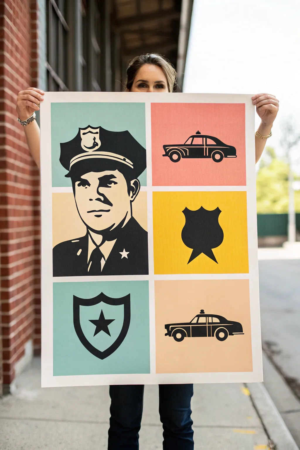
Celebrate law enforcement heroes with this bold, Andy Warhol-inspired poster that combines striking silhouettes with a nostalgic color palette. The clean lines and retro vibe make for a standout piece of wall art that balances modern design with classic imagery.
Step-by-Step
Materials
- Large heavyweight mixed media paper or canvas (approx. 24×36 inches)
- Acrylic paints (Teal, Coral/Salmon, Mustard Yellow, Pale Cream, Black)
- Painter’s tape or masking tape (1 inch width)
- Pencil and eraser
- Ruler or T-square
- Reference images (Police officer portrait, vintage cruiser, badge shapes)
- Flat paintbrushes (various sizes)
- Fine liner brush for details
- Carbon transfer paper (optional)
- Black Posca paint pen (optional)
Step 1: Planning the Layout
-
Grid creation:
Begin by measuring your large paper or canvas. You’ll need to divide the space into a grid that accommodates one large portrait on the left (taking up two vertical block spaces) and smaller square panels on the right. -
Marking the lines:
Use a light pencil touch and your ruler to draw the dividing lines. Create a 2-inch border of white space around the entire edge and between each panel to get that clean gallery look. -
Tape masking:
Apply painter’s tape firmly over your pencil border lines. Rub the edges of the tape down securely so paint won’t bleed underneath later.
Stencil Secret
Print your reference photos on cardstock and cut out the black shapes with an X-Acto knife. Use this as a stencil to sponge on the black paint for perfect uniformity.
Step 2: Color Blocking
-
Mixing the palette:
Squeeze out your acrylics. You want a retro feel, so tone down bright primaries. Mix a little white into your teal and coral, and perhaps a touch of ochre into the yellow. -
Painting the background panels:
Start painting the background rectangles. Paint the large vertical rectangle on the left with a split design—teal on top, cream on the bottom. Paint the top right panel coral, the middle yellow, and the bottom cream. -
Second coat application:
Let the first layer dry completely. Apply a second coat to ensure the color is opaque and solid, leaving no visible brushstrokes. -
Tape removal:
Once the paint is tacky but not fully dry, carefully peel back the tape at a sharp angle to reveal crisp white borders.
Level Up: Texture
Add subtle Ben-Day dots (comic book style dots) to the background colors using bubble wrap dipped in a slightly lighter shade of paint before adding the black silhouettes.
Step 3: Drafting the Design
-
Sourcing references:
Find high-contrast images of a vintage police officer, a badge, a shield, and a patrol car. Convert these images to black and white on your computer or phone to see the shadows clearly. -
Transferring the image:
Sketch the outlines lightly onto your painted color blocks. If you aren’t confident drawing freehand, place carbon paper over the canvas and trace your printed reference images directly onto the surface. -
Refining the portrait:
Pay special attention to the officer’s face on the large left panel. Simplify the features into shapes of light and shadow rather than individual hairs or wrinkles.
Step 4: Inking the Shadows
-
Filling the blacks:
Using a medium flat brush and heavy body black acrylic, start filling in the darkest areas of your silhouettes. I find it easiest to start with the simple shapes like the shield and car before tackling the face. -
Officer’s uniform:
Paint the solid black mass of the officer’s uniform. Leave specific negative spaces unpainted to suggest lapels, buttons, and the star badge. -
Facial features:
Switch to a smaller round brush. Carefully paint the shadows of the eyes, nose, and jawline. Remember, in pop art, less is often more—let the background color do the work for the highlighted skin. -
Vehicle details:
For the cars in the side panels, use long, confident strokes to create the sleek body shape. Use a fine liner brush for the window dividers and wheel details. -
Badge icons:
Paint the badge silhouettes in the remaining panels. Keep the edges sharp; if your brush wobbles, let it dry and touch it up with the background color.
Step 5: Finishing Touches
-
Edging check:
Inspect all your black lines. If any edges look fuzzy, go over them with a black Posca paint pen for a razor-sharp finish. -
Erasing guides:
Once the painting is 100% dry (give it a few hours), gently erase any remaining pencil marks visible in the unpainted borders. -
Sealing the work:
Apply a clear matte spray varnish to protect the surface and unify the sheen of the different paint layers.
Hang this striking tribute piece in an entryway or office to add a splash of color and respect

PENCIL GUIDE
Understanding Pencil Grades from H to B
From first sketch to finished drawing — learn pencil grades, line control, and shading techniques.
Explore the Full Guide
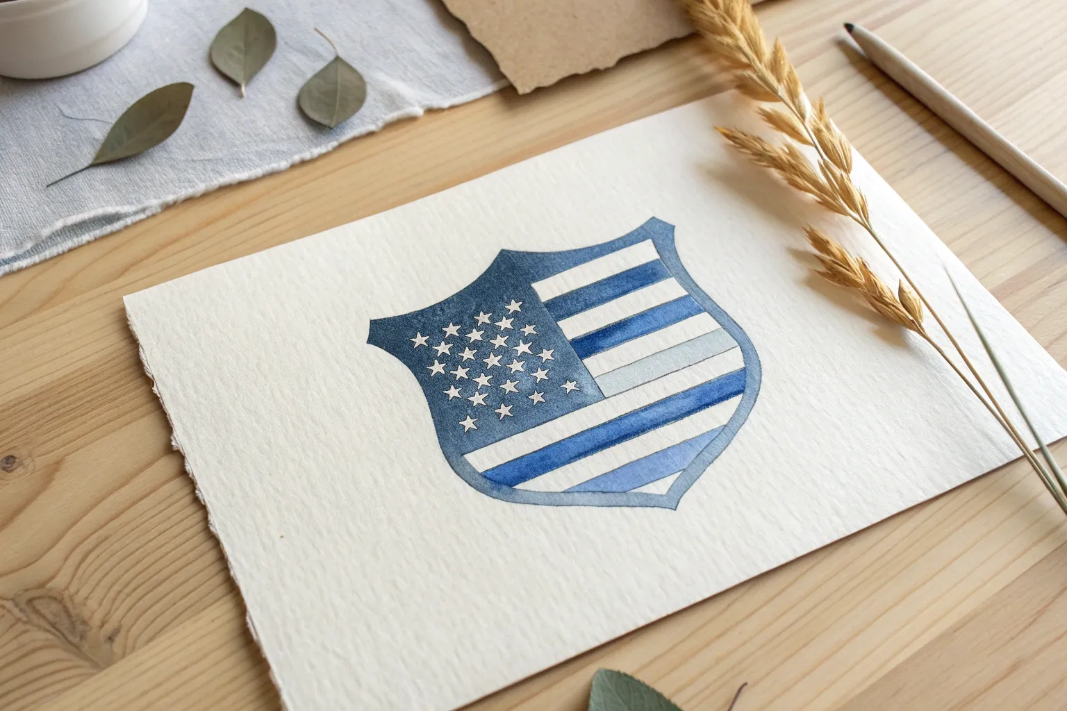
Abstract Badge Made From City Map Shapes
This unique watercolor and ink project reimagines a classic police badge silhouette as a stylized map of the city it protects. Combining architectural sketches with abstract cartography, you’ll create a sophisticated tribute piece that feels personal and grounded.
Detailed Instructions
Materials
- Cold press watercolor paper (140lb/300gsm)
- HB pencil and eraser
- Waterproof fine liner pens (0.1mm, 0.3mm, 0.5mm) in black and blue-grey
- Watercolor paint set (focus on burnt sienna, yellow ochre, payne’s grey, indigo)
- Small round brushes (size 0 and size 2)
- Ruler
- Reference photo of a police shield/badge outline
- Masking tape (optional for securing paper)
Step 1: Drafting the Structure
-
Establish the silhouette:
Begin by lightly sketching the outline of a police shield or badge in the center of your paper. Focus on symmetry; drawing a faint vertical centerline first can help you mirror the curves accurately. -
Create the inner heraldry:
Draw a smaller, more traditional shield shape floating in the center of your badge outline. Divide this inner shield into four quadrants using a cross shape. -
Map the streets:
Fill the space between the outer badge edge and the inner shield with random geometric polygons. These shapes should look like city blocks on a map—irregular quadrilaterals and triangles separated by narrow ‘street’ channels.
Clean Edges Upgrade
Use liquid frisket (masking fluid) on the white ‘street’ lines before painting. This lets you paint the map blocks loosely without worrying about ruining the white gaps.
Step 2: Architectural Details
-
Sketch the quadrants:
In the inner shield, sketch architectural elements relevant to the precinct or city. In the top left, draw rows of arched windows; in the top right, perhaps a perspective view of a building facade. -
Add modern elements:
For the bottom left quadrant, sketch a modern skyscraper grid pattern to contrast with the classical architecture above. -
Insert the text badge:
In the final bottom right quadrant, draw a small, rounded badge shape containing text like a precinct number or city initials. Keep the lettering simple and blocky. -
Ink the outlines:
Using your 0.3mm waterproof pen, carefully trace over your pencil lines. Use a steady hand for the straight architectural lines, and perhaps a slightly thinner 0.1mm pen for the intricate window details. Erase the pencil marks once the ink is totally dry.
Step 3: Watercolor Application
-
Paint the map blocks:
Mix a palette of muted urban tones: soft peach (very watered down burnt sienna), beige (yellow ochre with plenty of water), and light grey. Paint the ‘map’ blocks surrounding the center shield. -
Vary the tones:
Alternate colors for adjacent blocks so no two touching shapes are the same color. Leave the narrow ‘streets’ between them unpainted white paper for clear separation. -
Texture the map:
While some blocks are still slightly damp, I like to drop in a tiny dot of darker pigment to create a textured, stony look. Let this layer dry completely. -
Base coat the inner shield:
Paint the architectural quadrants. Use a warm beige for the stone buildings and a cool blue-grey for the modern glass building section. -
Add depth with shadows:
Mix a darker Indigo or Payne’s Grey. Paint the recesses of the windows and the shadowed sides of the buildings to give them three-dimensional form.
Metallic Accent
Trace the primary badge outline or the inner shield border with a gold or silver gel pen. This adds a subtle shimmer that mimics a real metal badge.
Step 4: Finishing Touches
-
Detail the map texture:
Once the map blocks are dry, use a very fine 0.1mm pen or a dry brush with grey paint to add tiny hatch marks, lines, or dots to some of the colored blocks, mimicking the look of printed maps. -
Enhance text legibility:
Darken the background around your text in the bottom right quadrant so the letters pop out negatively, or carefully fill the letters themselves with dark ink. -
Final border:
Paint a thin, steady line of blue-grey watercolor or ink roughly 1/8th inch outside the entire badge shape to give it a finished, sticker-like border.
Allow the entire piece to dry flat overnight to ensure the paper settles perfectly before framing


Have a question or want to share your own experience? I'd love to hear from you in the comments below!