
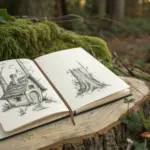
When my brain goes blank, I don’t try to “think harder” — I reach for an art ideas generator that makes decisions for me. These prompt systems are basically structured play: a little randomness plus a few rules, and suddenly you’ve got something real to draw.
Prompt Wheel Subject Spinner
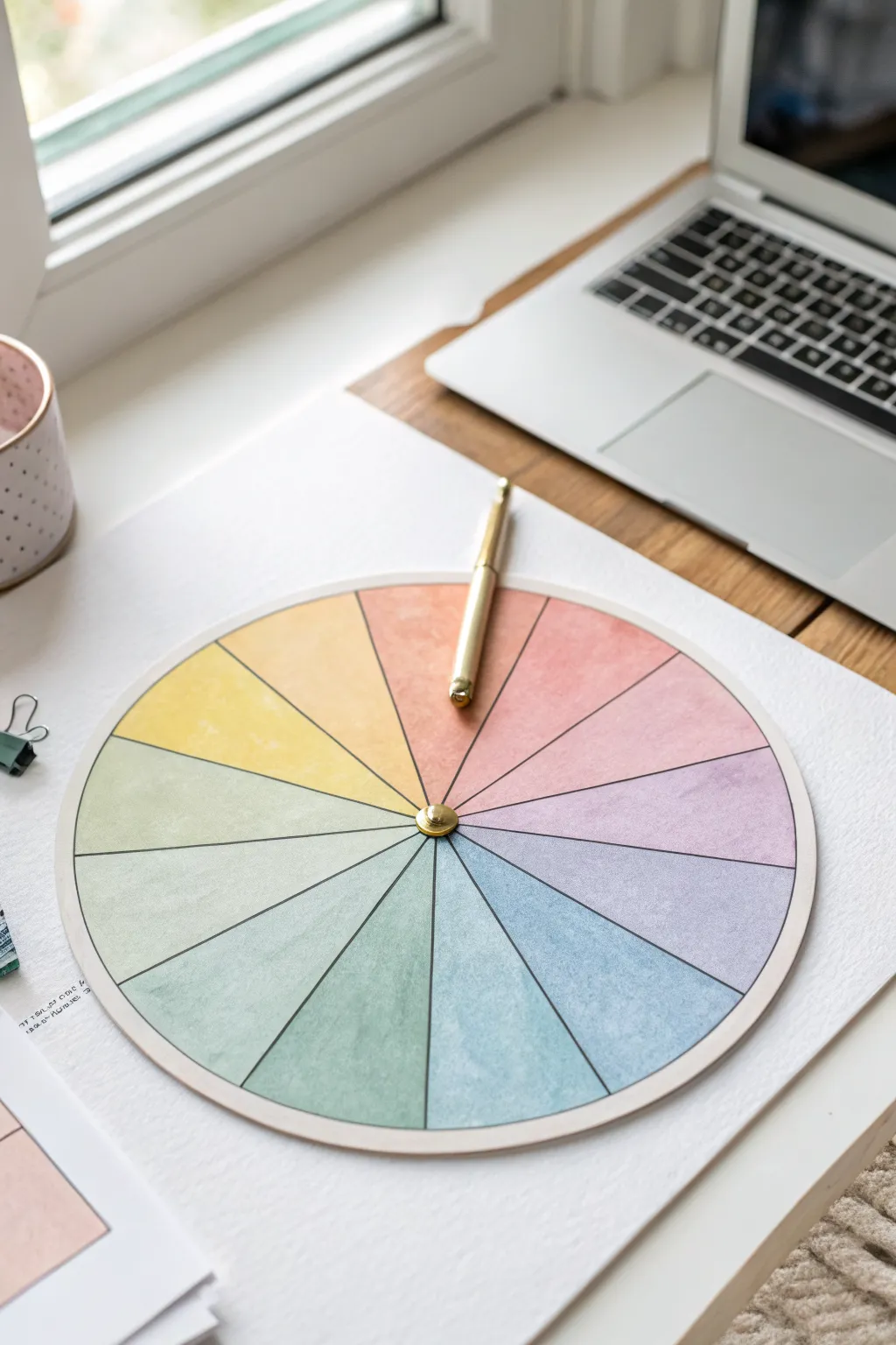
Beat creative block with this elegant, interactive prompt generator featuring soft watercolor textures and a satisfying spinning mechanism. This tactile tool turns decision paralysis into a fun game, offering a beautiful addition to your desk setup that is both functional and inspiring.
Detailed Instructions
Materials
- Heavyweight watercolor paper (300gsm)
- Watercolor paints (pan set or tubes)
- Round watercolor brush (size 6 or 8)
- Pencil and eraser
- Compass or round object for tracing (approx. 6-8 inches diameter)
- Ruler or straight edge
- Protractor (optional)
- Fine liner pen (black or dark grey)
- Gold split pin (brad)
- Scissors or craft knife
- Cutting mat (if using craft knife)
- Needle or push pin
- Gold pen or pointer object (optional for spinner)
Step 1: Planning and Layout
-
Draw the main circle:
Start by clearing a flat workspace. Place your heavyweight watercolor paper down and use a compass to draw a perfect circle in the center. A diameter of about 6 to 8 inches works well for visibility and desk space. -
Mark the center:
Make sure to keep the center point marked clearly where the compass needle sat, as you will need this precise spot for the spinning mechanism later. -
Divide the circle:
Using a ruler, draw a vertical line through the center point, then a horizontal one to create four equal quadrants. Draw very lightly with your pencil so the graphite doesn’t smudge into the paint. -
Create the segments:
Divide each quadrant into smaller slices. In the example, there are 16 total segments. A protractor helps here—each segment should be 22.5 degrees—or you can eyeball it by dividing each quarter in half, and then in half again.
Clean Edges Trick
To keep colors from bleeding into adjacent wedges, paint non-touching segments first (e.g., every other wedge). Let them dry, then fill in the gaps.
Step 2: Painting the Gradient
-
Prepare your palette:
Mix your watercolor paints to create a soft, muted rainbow spectrum. You’ll want pastel versions of red, orange, yellow, green, blue, indigo, and violet. Dilute the pigments with plenty of water to achieve that transparent, airy look. -
Paint the first segment:
Start at the top with a soft coral or salmon pink. Fill the wedge carefully, staying just inside your pencil lines. I like to keep the edges slightly crisp but the center of the fill uniform. -
Create the transition:
Move clockwise to the next segment. Mix a little bit of your next color (orange) into your coral mix on the palette. Paint the second wedge with this transitional hue. -
Continue the spectrum:
Work your way around the wheel, gradually shifting from warm yellows to cool greens and blues. Rinse your brush thoroughly between major color shifts to keep the hues clean and distinct. -
Finish the cooler tones:
Complete the circle by painting the violets and purples, ensuring the final segment blends harmoniously back toward the starting pink tone. -
Let it dry completely:
Step away and let the paper dry fully. If you rush this part, the paper might tear or warp during the cutting phase. It should be dry to the touch and flat.
Step 3: Assembly and Finishing
-
Define the lines:
Once bone dry, take a ruler and a fine liner pen. distinctively trace over your pencil lines to separate the colored wedges. A thin black or dark grey line gives it a polished, graphic look. -
Outline the perimeter:
Carefully trace the outer circle with your pen to enclose the color wheel. This visually contains the watercolor work and sharpens the edge. -
Cut out the wheel:
Use sharp scissors or a craft knife on a cutting mat to cut along the outer edge of your circle. Smooth out any jagged edges with a fine sandpaper block if needed. -
Create the pivot hole:
Use a thick needle or a push pin to pre-poke a hole directly through the center mark you preserved in the beginning. This prevents the paper from crumpling when you insert the larger brad. -
Prepare the pointer (Option A):
If you want a built-in arrow, cut a separate arrow shape from cardstock, paint it gold or a contrasting color, and punch a hole in its base. -
Install the spinner:
Insert the gold split pin through the center of your pointer (if using one) and then through the color wheel. Flatten the legs of the brad on the back side of the paper. -
Alternative spinner method:
As seen in the image, you can simply place a sleek gold pen on top and spin it physically with your hand for a more casual, minimalist approach. -
Mount (Optional):
For extra durability, you can glue the finished watercolor circle onto a piece of foam board or mat board before inserting the brad.
Make It Modular
Don’t write directly on the wheel! Instead, assign a number to each color wedge and keep a separate list of prompts you can update or swap out anytime.
Give your new wheel a spin and let fate decide your next artistic endeavor.

Dice Roll Prompt Table
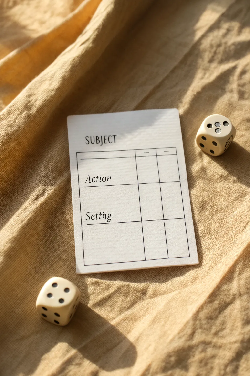
Beat creative block with this elegant, minimalist prompt card designed to gamify your brainstorming process. This project creates a reusable, clean-lined template that pairs perfectly with dice to randomly generate subjects, actions, and settings for your next artwork.
How-To Guide
Materials
- Heavyweight cardstock (white or cream)
- Ruler
- Fine-point black pen or pigment liner (0.3mm or 0.5mm)
- Pencil
- Eraser
- Paper trimmer or scissors
- Computer and printer (optional alternative to hand-drawing)
Step 1: Planning and Layout
-
Define the dimensions:
Start by deciding the size of your card. A standard playing card size (2.5 x 3.5 inches) or slightly larger index card size works well. Mark these boundaries lightly with a pencil on your cardstock. -
Sketch the grid:
Using your ruler and pencil, lightly draft a rectangular box that will serve as the main frame. Leave a generous margin at the top for the title and comfortable margins on the sides. -
Create the headers:
Divide your main rectangle into three horizontal sections. The top section is for ‘Subject’, the middle for ‘Action’, and the bottom for ‘Setting’. Draw horizontal lines to separate them. -
Add column dividers:
To the right of your text area, draw two vertical lines to create small check-boxes or scorekeeping columns. This gives the card that organized, ledger-like aesthetic seen in the image. -
Draft the text:
Lightly letter in your headers. Place ‘SUBJECT’ in all caps at the very top outside the grid. Inside the grid sections, write ‘Action’ and ‘Setting’ in a serif or italicized script style.
Straight & Steady
If you struggle with hand-lettering, print the text directly onto the cardstock first, then draw the grid lines by hand to keep that authentic DIY charm.
Step 2: Inking and Finalizing
-
Ink the main frame:
Take your fine-point black pen and carefully trace over your pencil grid lines. Use the ruler to ensure your lines are crisp and straight. This outer box frames the functional area. -
Ink the details:
Trace the internal horizontal dividers and the vertical column lines. Keep a steady hand to maintain a consistent line weight throughout. -
Letter the main title:
Ink the word ‘SUBJECT’ at the top. Use a simple, clean serif font, keeping the letters upright and widely spaced for a modern look. -
Letter the sub-headers:
For ‘Action’ and ‘Setting’, switch to a slightly slanted, italic serif style. This contrast in typography adds visual interest. I find that practicing the lettering on a scrap piece of paper first helps prevent mistakes. -
Add subtle markers:
In the small header row of the columns, draw tiny dashes or symbols to indicate their purpose (like +/- or checkmarks) if desired. -
Let the ink settle:
Allow the ink to dry completely. Smudging is the enemy here, so give it a few minutes before touching the surface. -
Erase guidelines:
Gently erase all underlying pencil marks. Hold the paper taut so it doesn’t crinkle under the eraser. -
Trim the card:
Using a paper trimmer or sharp scissors, cut the card out along your initial boundary lines. Rounded corners can be added with a corner punch for a professional playing-card feel.
Step 3: Setting the Scene
-
Soften the edges:
If your cardstock edges feel sharp or unfinished, you can lightly run a bone folder or the back of a spoon along them to smooth them down. -
Prepare your dice:
Select two six-sided dice to accompany your card. These are essential for the ‘random’ aspect of the generator. -
Create a companion list:
On a separate sheet or the back of the card, create a numbered list (1-6) corresponding to different subjects, actions, and settings so you can use the dice to pick them.
Laminate for Longevity
Cover the card surface with clear packing tape or run it through a laminator. This lets you use dry-erase markers to check off boxes and wipe them clean later.
Now you have a stylish tool to break through art block whenever it strikes


Mix-and-Match Character Builder Grid
Transform a simple notebook spread into a dynamic brainstorming tool for character design. This crisp, grid-based layout allows you to roll dice or choose attributes at random to generate unique art prompts, blending structure with creative chaos.
Step-by-Step Guide
Materials
- A4 spiral-bound sketchbook or dot-grid journal
- Fine-liner pens (0.3mm and 0.5mm, black)
- Ruler or straight edge
- Pencil (HB)
- Eraser
- Dark green colored pencil or marker
- Calligraphy pen or brush pen (optional for headers)
Step 1: Planning the Layout
-
Define the spread:
Open your sketchbook to a fresh two-page spread. We will use the right side for the main grid and the left side for detailed attribute lists. -
Measure the grid area:
On the right page, measure a large rectangle that leaves about a 1-inch margin on all sides. This will be your main matrix. -
Calculate cell sizes:
Divide your rectangle width by 5 and height by 6 (or customize based on how many categories you want). Mark these intervals lightly with a pencil tick mark.
Smudge Control
If your ruler drags ink across the page, stick a few layers of masking tape to the underside of the ruler. This lifts the edge slightly off the paper.
Step 2: Drafting the Grid
-
Draw vertical lines:
Using your ruler and a pencil, lightly draw the vertical lines connecting your top and bottom tick marks. -
Draw horizontal lines:
Connect the side tick marks to create your horizontal rows. You should now have a clean grid of 30 squares. -
Ink the grid:
Switch to your 0.5mm fine-liner. Trace over your pencil lines carefully. I find it helpful to lift the pen slightly at intersections to prevent ink bleeding, keeping the corners crisp. -
Add column headers:
Leave a small gap above the grid. Sketch in header titles for character archetypes or categories (e.g., ‘Mage’, ‘Rogue’, ‘Sci-Fi’) using a stylized script or faux-calligraphy style.
Gamify It
Number the rows 1-6 and columns 1-5. Use a six-sided die (d6) to roll coordinates and force yourself to combine random elements from the grid.
Step 3: Creating Attribute Lists
-
Setup the left page:
Move to the left page. You’ll need several distinct rectangular boxes to house specific traits like ‘Inventory’, ‘Personality’, or ‘Color Palette’. -
Draw the trait boxes:
Draft 6-8 rectangular boxes stacked in two columns. Keep the spacing consistent with the grid on the facing page for visual harmony. -
Add writing lines:
Inside each box, use a ruler to draw 3-4 distinct horizontal lines for writing text. Switch to the thinner 0.3mm pen here so the lines don’t overpower your handwriting later. -
Ink the borders:
Go over the outer box borders with the 0.5mm pen to make them pop against the finer internal lines.
Step 4: Filling and Finishing
-
Erase guidelines:
Wait until the ink is completely dry—smudges are the enemy here. Gently erase all pencil marks from both pages. -
Populate the matrix:
In the right-hand grid, you can either leave squares blank to fill in later or pre-fill them with drawing prompts. For a mix-and-match builder, write a specific visual element in each box (e.g., ‘Robot Arm’, ‘Top Hat’, ‘Scar’). -
Add category labels:
On the left page, write clear, small caps headers above each box (e.g., WEAPON, BACKSTORY, ACCESSORY). -
Stylize the title:
At the very top of the right page, add a large, flowing title like ‘Character Builder’ or ‘Idea Generator’ using a brush pen or thickened script. -
Add an accent tool:
Place a dark green pencil or pen on the page as a visual prop—or use it to color-code specific squares if you are actively using the generator.
Now you have a structured playground ready to spark your next dozen character designs

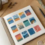
Mood + Palette Generator
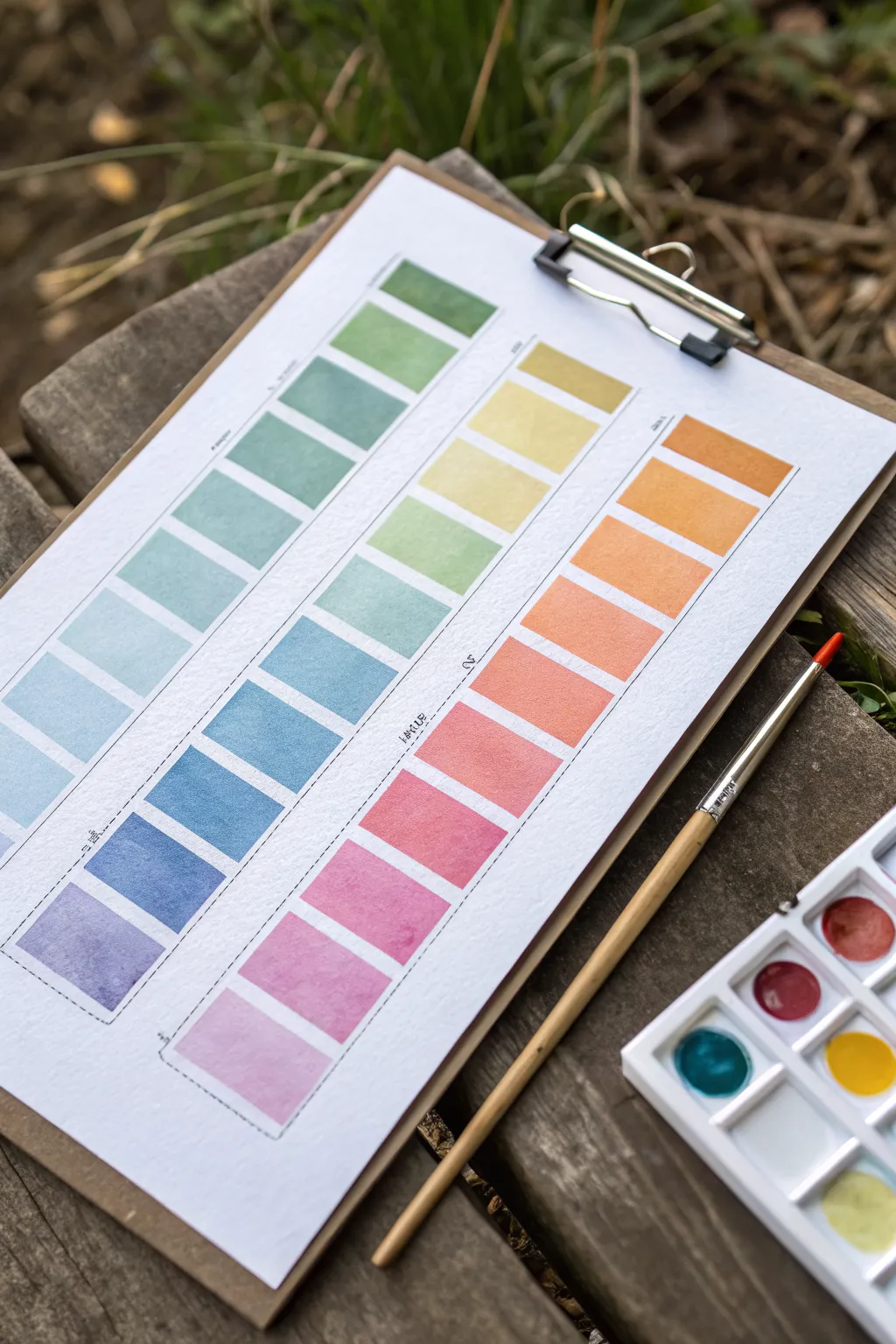
Learn to create a beautifully structured watercolor gradient chart that serves as both a reference tool and a piece of art. This project explores color transitions through neat, rectangular swatches, perfect for understanding how your paints blend and interact on paper.
Step-by-Step
Materials
- Cold press watercolor paper (A4 or similar size)
- Watercolor paints (pan set or tubes)
- Round watercolor brush (size 4 or 6)
- Flat watercolor brush (optional, size 6 or 8 for cleaner edges)
- Ruler
- Pencil (HB or similar)
- Masking tape or Washi tape (optional)
- Jar of clean water
- Paper towel or rag
- Wooden clipboard (for mounting)
Step 1: Preparation & Grid Layout
-
Set up your workspace:
Begin by securing your watercolor paper to a clipboard or a flat, hard surface. This prevents the paper from buckling too much when you apply wet washes. -
Design the columns:
Using a ruler and a light pencil touch, draw three tall, vertical columns evenly spaced across the page. Leave a generous margin at the top and bottom of the page for titles or notes. -
Mark the rows:
Within each column, mark out horizontal divisions to create individual rectangular cells. Aim for about 10-12 rectangles per column. Keep the spacing consistent, leaving a small gap (about 2-3mm) between each rectangle to separate the colors distinctly. -
Define the boundaries:
You can lightly outline each rectangle in pencil if you want very sharp guides, or just mark the corners if you prefer a freer hand. I sometimes use a dashed line along the side of the columns to indicate where color families will shift.
Clean Edges Trick
For super crisp rectangles without taping each one, use a flat brush just slightly smaller than the width of your box. One stroke down, one stroke across.
Step 2: Painting the Gradients
-
Plan your color story:
Decide on three distinct color progressions. The image shows a cool spectrum (violates to greens), a warm spectrum (pinks to yellows), and an earth/citrus spectrum (oranges to olives). Arrange your palette accordingly. -
Start the first swatch:
Begin at the bottom of the left column with a deep violet or purple. Load your brush with plenty of pigment and water, creating a juicy, saturated wash. Fill the bottom rectangle carefully. -
Transitioning hues:
For the next rectangle up, mix a slightly bluer hue into your violet. Paint this new shade into the second box. The goal is a subtle shift, not a jump. -
Continuing the gradient:
Continue moving up the column, step-by-step adding more blue, then teal, and finally green. Rinse your brush slightly between colors to keep the transition clean. -
Managing water control:
Keep your brush damp but not dripping. If a puddle forms in a rectangle, dry your brush on a paper towel and touch the tip to the puddle to lift the excess water. -
Painting the middle column:
Start the middle ‘warm’ column. Begin at the bottom with a soft pink or rose. As you move up, transition into coral, then orange, and finally a sunny yellow at the top. -
Painting the right column:
For the final column, explore earthy or secondary tones. Start with a terracotta or deep orange at the bottom, moving into golden ochres, and finishing with fresh leaf greens at the top.
Step 3: Finishing Touches
-
Let it dry completely:
Wait for all the swatches to be bone dry. Watercolor often dries lighter than it looks when wet, so be patient to see the true colors emerge. -
Add separation lines:
Once dry, use a fine tip pen or a sharpened pencil to draw faint dashed lines between the columns or alongside specific color groups if you want to categorize them, as seen in the reference. -
Label your colors:
Write small notes next to each swatch or column indicating the pigments used (e.g., ‘Ultramarine + Sap Green’). This turns your art piece into a functional reference chart for future paintings. -
Clean up edges:
If any pencil lines are still visible and unwanted, gently erase them now, being careful not to rub the painted areas too vigorously.
Fixing Blooms
If ‘cauliflower’ backruns appear in your drying swatches, you added water to a drying wash. Let it dry completely, then glaze over with a light, even layer.
Now you have a stunning, organized reference sheet that celebrates the subtle beauty of color mixing.
BRUSH GUIDE
The Right Brush for Every Stroke
From clean lines to bold texture — master brush choice, stroke control, and essential techniques.
Explore the Full Guide
Medium Switch Shuffle
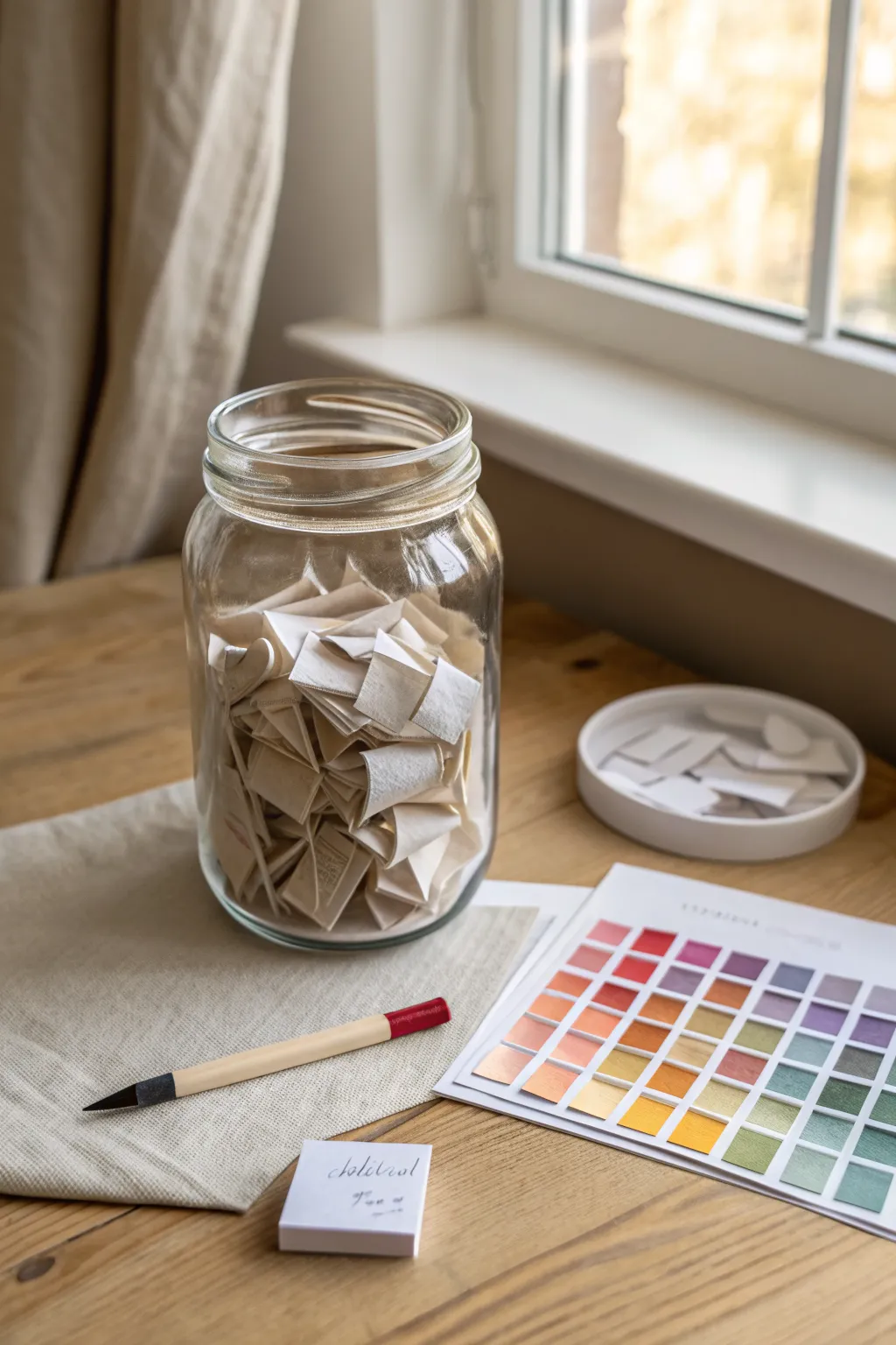
Break out of your creative rut with this tangible randomization tool that helps you explore new artistic mediums. This project creates an aesthetically pleasing jar filled with prompts that will challenge you to switch up your usual materials and color palettes.
How-To Guide
Materials
- Large clear glass jar (mason jar or similar)
- Cream or off-white textured paper (cotton or linen finish)
- Ruler
- Scissors or a paper trimmer
- Fine-tip black pen or marker
- Small notepad (optional)
- Small ceramic dish or lid (for discard pile)
- Printed or hand-painted color swatch chart (for reference)
Step 1: Planning the Content
-
Brainstorming mediums:
Sit down with a notepad and list every art medium you own or want to try. Think beyond the basics: charcoal, gouache, digital, collage, ink wash, oil pastel, and coffee painting. -
Adding constraints:
To make the shuffle more interesting, create a second list of constraints or styles. Ideas like ‘blind contour,’ ‘monochrome,’ ‘pointillism,’ or ‘non-dominant hand’ work well. -
Selecting color palettes:
Using your color chart as inspiration, write down specific color combinations on your list. You might include ‘warm tones only,’ ‘teal and orange,’ or ‘split-complementary.’
Mix It Up
Don’t just write mediums! Include slips for time limits (e.g., ’10 minutes only’) or emotional themes to add extra layers of challenge to your randomization.
Step 2: Creating the Prompts
-
Measuring the strips:
Take your textured paper and use a ruler to mark out strips. I find that strips about 1 inch wide and 3 inches long are the perfect size for folding. -
Cutting the paper:
Cut your paper into consistent strips using scissors or a paper trimmer for cleaner lines. You will need roughly 30-50 strips to fill a medium-sized jar. -
Writing the prompts:
On each strip, write one item from your brainstorming lists. Write clearly in the center of the strip so it’s legible when unfolded later. -
Categorizing (Optional):
If you want to be organized, you can use subtle color-coding (like a small dot on the back) to distinguish between mediums, styles, and colors.
Jar Aesthetics
Dip the edges of your paper strips in coffee or tea before writing on them to give the contents a vintage, aged look that makes the jar a beautiful decor piece.
Step 3: Folding and Assembly
-
The initial fold:
Take a strip and fold it in half crosswise. Crease it sharply with your fingernail or a bone folder. -
The double fold:
Fold the paper in half again to create a small, dense square or rectangle. This prevents the text from being seen through the paper and adds volume to the jar. -
Repeating the process:
Continue folding until all your prompt strips are compact little packets. Consistent folding makes the jar look much tidier. -
Filling the jar:
Drop the folded papers into your clean glass jar. Give the jar a gentle shake to settle them and mix up the categories. -
Setting the scene:
Place the jar on your desk alongside your color chart and a blank notepad. This creates an inviting ‘station’ that encourages you to draw a slip whenever you feel stuck. -
Using the system:
When you’re ready to create, close your eyes, reach in, and pull out one or two slips. Commit to using whatever medium or constraint you selected for your next sketch.
Now you have a perpetual source of inspiration sitting right on your desk, ready to challenge your creativity
Composition Thumbnails Generator
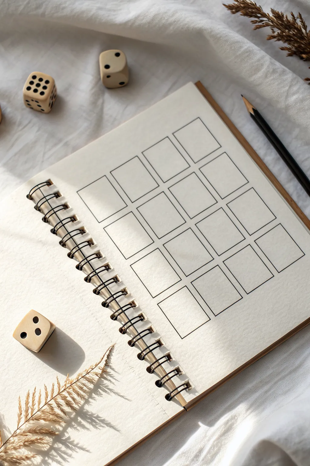
This project creates a structured template for brainstorming multiple composition ideas or capturing small daily moments. By drawing a neat grid of rectangles in a sketchbook, you set the stage for disciplined practice or sequential storytelling in a clean, minimalist layout.
Detailed Instructions
Materials
- Spiral-bound sketchbook (cream or off-white paper preferred)
- Ruler (clear acrylic or metal)
- Fine liner pen (0.3mm or 0.5mm, black)
- Graphite pencil (HB for initial layout)
- Eraser (kneaded or vinyl)
- Calculator (optional, for precise measurements)
Step 1: Planning and Layout
-
Measure the page:
Start by measuring the usable width and height of your sketchbook page, excluding the spiral binding area. -
Determine grid size:
Decide on a 4×4 or 3×5 grid depending on your page proportions. Aim for rectangles that are roughly 1.5 to 2 inches tall. -
Calculate spacing:
Subtract the total width of your desired columns from the page width. Divide the remaining space by the number of gaps (columns + 1) to determine the margin size that will keep everything centered. -
Mark vertical guides:
Using your ruler and pencil, lightly mark the vertical start and end points for each column at the top and bottom of the page. -
Mark horizontal guides:
Repeat the process for the rows, marking light ticks on the left and right edges of the page to establish consistent row heights and gaps.
Smudge Prevention
If your ruler drags ink across the paper, tape a few pennies to the underside of the ruler. This lifts the edge slightly off the paper to prevent smearing.
Step 2: Drafting the Grid
-
Connect the dots:
With a very light hand, use your ruler to connect your tick marks, creating a faint pencil grid across the entire page. -
Review proportions:
Step back and look at your pencil grid. Ensure the boxes look uniform and the margins feel balanced before committing with ink.
Interactive Grid
Number the boxes 1-6 or 1-12 and use the dice shown in the photo to randomize which box you draw in next, turning practice into a game.
Step 3: Inking the Structure
-
Begin inking:
Take your fine liner pen and place the ruler along the first vertical pencil line. Draw the vertical segments of the boxes, lifting the pen over the gaps between rows. -
Complete verticals:
Work your way across the page, inking all the vertical lines first to maintain a consistent flow and rhythm. -
Ink horizontals:
Rotate your book or ruler and ink the horizontal top and bottom lines for each box. I find it helpful to wipe the ruler edge occasionally to prevent ink smudging. -
Check corners:
Look closely at where your lines meet. If any corners adhere to gaps, carefully extend the lines just enough to close the box perfectly.
Step 4: Finishing Touches
-
Let it dry:
Allow the ink to sit for at least 15 minutes to fully cure, especially if you used a juicy pen on smooth paper. -
Erase guidelines:
Gently rub your eraser over the entire grid to remove the initial pencil guides and marks. -
Clean up:
Brush away the eraser shavings with a soft brush or your hand, ensuring no graphite residue remains on the cream paper. -
Set the scene:
For a bit of inspiration, scatter a few dice or dried botanicals nearby to invite creativity for your first session.
Now you have a clean slate ready for storyboards, color testing, or daily doodles

PENCIL GUIDE
Understanding Pencil Grades from H to B
From first sketch to finished drawing — learn pencil grades, line control, and shading techniques.
Explore the Full Guide
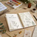
Art Style Swap Picker
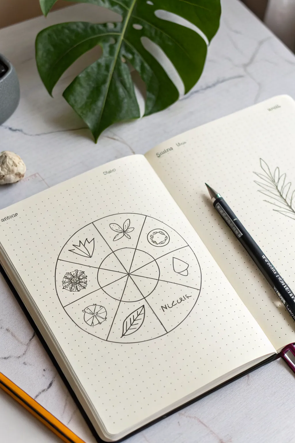
This elegant bullet journal spread features a circular tracker or ‘style swap’ wheel adorned with minimalist botanical doodles. It’s a perfect way to practice different drawing styles or track habits in a clean, nature-inspired layout.
Step-by-Step
Materials
- A5 dot grid notebook
- Compass or circular object (approx. 3-4 inches diameter)
- Ruler
- HB pencil
- Eraser
- Fine liner pen (0.3mm or 0.5mm, black)
- Reference images of leaves/flowers (optional)
Step 1: Planning and Layout
-
Center the wheel:
Find the general center of your page. Using a compass or a round object like a jar lid as a stencil, draw a light circle in pencil. -
Create the inner hub:
Draw a smaller, concentric circle inside the first one. This inner circle should be about one-third the diameter of the larger one. -
Divide the wheel:
Use your ruler to divide the circle into eight equal wedges. Draw lines passing through the center point, extending from the outer edge to the inner circle’s edge, creating a pie chart effect. -
Extend the spokes:
Continue these lines lightly into the center hub so you can see the segments clearly, forming the ‘spokes’ of your wheel. -
Ink the structure:
Once satisfied with the symmetry, trace over your main structural lines (the two circles and the dividing spokes) with your fine liner pen. Use a steady hand or the ruler for the straight lines.
Uneven Circles?
If you lack a compass, trace a mug or small bowl. For the divisions, think of it like slicing a pizza: cut in half, then quarters, then eighths for symmetry.
Step 2: Adding the Botanical Elements
-
Sketch the first element:
In the top-left wedge, lightly pencil a geometric flower shape using angular petals. -
Add a classic bloom:
Moving clockwise, sketch a simple four-petaled flower with a central cross shape in the next wedge. -
Draw a mushroom cap:
In the next section, draw a top-down view of a mushroom cap or cut fruit slice, adding small circles inside for texture. -
Create a seed pod:
Sketch a simple acorn or seed pod shape in the wedge following the mushroom. -
Add text:
Skip the bottom-right wedge for now. In the next one, write the word ‘NATURE’ (or your chosen theme) in a loose, capitalized hand-writing style. -
Sketch a leaf:
In the bottom wedge, draw a simple, pointed leaf with clear veins. -
Add a round bloom:
Draw a circular flower head or dandelion puff properly centered in its wedge. -
Finish with a complex flower:
In the final remaining wedge on the left, sketch a more detailed, spiky succulent or chrysanthemum shape.
Step 3: Inking and Refinement
-
Ink the doodles:
carefully go over your penciled botanical drawings with the fine liner. I like to keep the line weight consistent here to match the minimalist vibe. -
Add textural details:
Add tiny stippling dots or extra vein lines to the leaves and flowers to give them depth without shading. -
Erase guidelines:
Wait for the ink to dry completely to avoid smudging. Then, gently erase all remaining pencil marks. -
Decorative lettering:
At the top of the page, add small headers in a decorative font if you wish, such as ‘Style’ or the month name. -
Optional embellishment:
Draw a loose fern branch on the opposing page to balance the composition, as seen in the reference image.
Theme Ideas
Swap the botanical doodles for crystals, celestial bodies, or geometric shapes to change the theme while keeping the layout identical.
Now you have a beautifully organized wheel ready to inspire your next creative session
Reverse Prompt Finish-First Generator
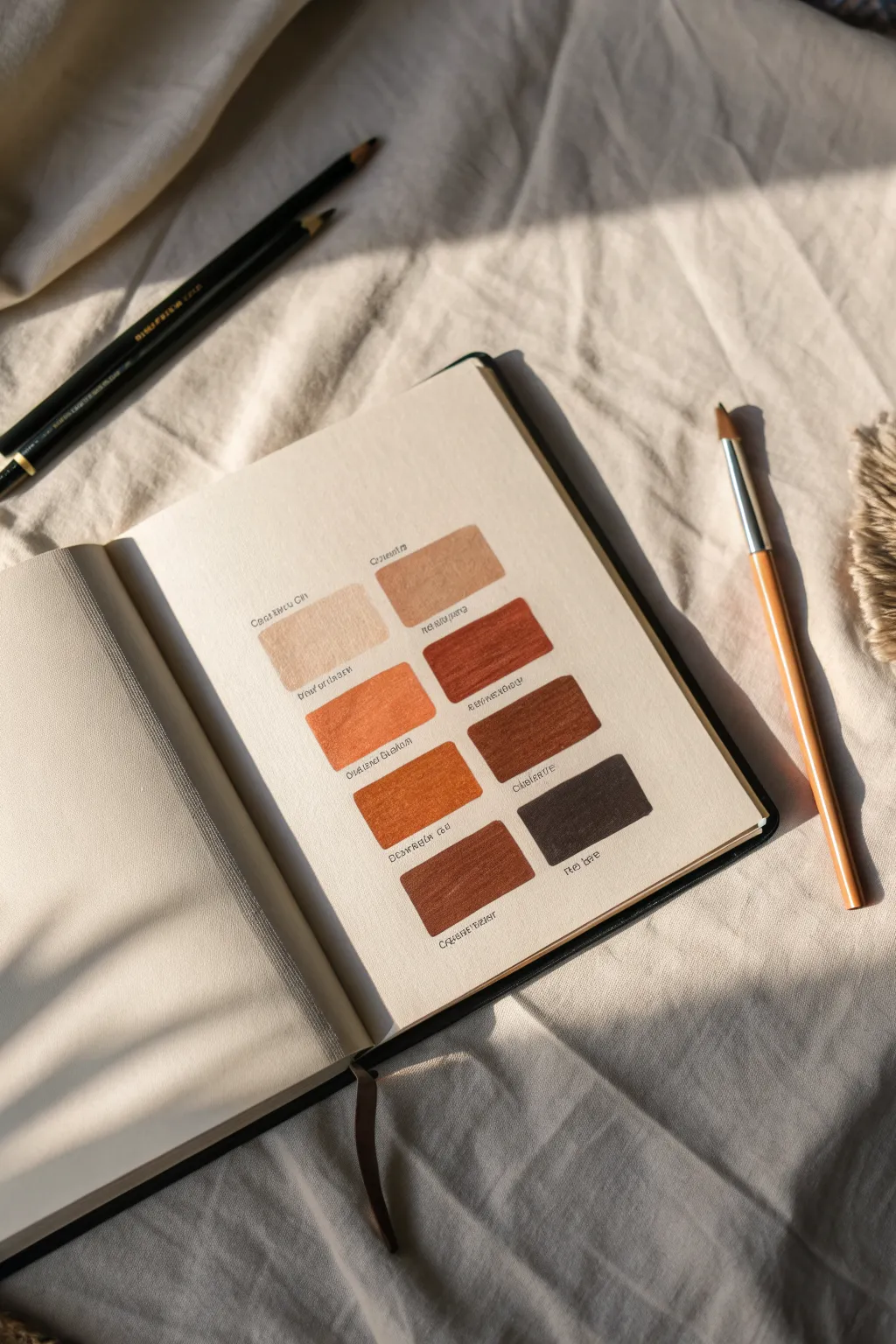
Capture the warmth of your favorite palette with this minimalist swatch page. This project focuses on neat, organized color sampling of soft beiges, burnt siennas, and deep chocolates to serve as a handy reference.
Detailed Instructions
Materials
- Hardcover sketchbook (cream or off-white paper preferred)
- Set of earth-tone brush pens or watercolor markers
- Fine-liner pen (black or very dark brown, size 0.1 or 0.3)
- Ruler
- Pencil (HB)
- Eraser
- Scrap paper for testing
Step 1: Layout & Preparation
-
Brainstorm the palette:
Before touching your journal, grab a scrap piece of paper. Test your pens or markers to choose a cohesive group of 8 earth tones, ranging from lightest beige to darkest coffee. -
Measure the page center:
Using your ruler, lightly find the vertical center of your journal page. This axis will help you keep the two columns of swatches perfectly balanced. -
Draft the grid:
Lightly sketch out 8 rectangles in pencil. Aim for two columns of four rows. Leave a comfortable gap between the two columns (about 1 inch) and even spacing between the rows. -
Check alignment:
Step back and look at your pencil grid. Ensure the left column mirrors the right column exactly so the final page feels intentional and structured.
Bleeding Lines?
If your marker is bleeding outside the rectangle, try outlining the box with the marker tip first, then fill the center. This creates a barrier.
Step 2: Applying Color
-
Start with the lightest tone:
Begin filling the top-left rectangle with your lightest beige or sand color. Use horizontal strokes to keep the texture uniform. -
Fill the top-right block:
Move to the top right and fill it with your next lightest shade, perhaps a slightly warmer tan. This side-by-side comparison helps you check value steps. -
Work downwards:
Continue filling the grid row by row, gradually moving to darker, richer colors like terracotta or burnt sienna. -
Handle the darkest shades:
For the bottom row, use your deepest browns or umbers. Be careful with these dark markers, as they can sometimes bleed more easily; apply with a light touch. -
Avoid over-saturation:
Don’t go over the same spot too many times while the paper is wet, or you might cause pilling. Single, confident layers look best. -
Let it dry completely:
Wait at least 15 minutes for the ink to fully settle into the paper before adding any text or erasing pencil lines.
Level Up: Texture
For a vintage look, choose a paper with a slight tooth or grain. The marker will skim over the texture, leaving tiny white specks for visual interest.
Step 3: Labeling & Details
-
Draft label placement:
Lightly pencil a straight guideline just underneath each colored rectangle. This ensures your writing won’t slant. -
Pencil in the names:
I always write the color names in pencil first to check the spacing. Center the text under each block. -
Ink the labels:
Using your fine-liner pen, trace over your penciled text. Use a small, neat print font to match the clean aesthetic of the swatches. -
Add numbering (optional):
If you want to reference these colors precisely later, add a tiny code or number next to the name corresponding to your marker set. -
Wait for ink to set:
Give the fine-liner ink a moment to dry to avoid any tragic smudges during the final step. -
Final Cleanup:
Gently erase all remaining pencil grid lines and text guidelines. Brush away the eraser crumbs carefully to leave a pristine page.
Now you have a serene, organized reference page ready for your next art session


Have a question or want to share your own experience? I'd love to hear from you in the comments below!