
Sometimes you don’t want to wrestle with proportions—you just want a satisfying set of lines you can follow and learn from. These drawings to trace are all about crisp black-and-white line art with clear boundaries, so you can practice hand control, build confidence, and still end up with something cute.
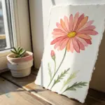
Simple Flower Outlines
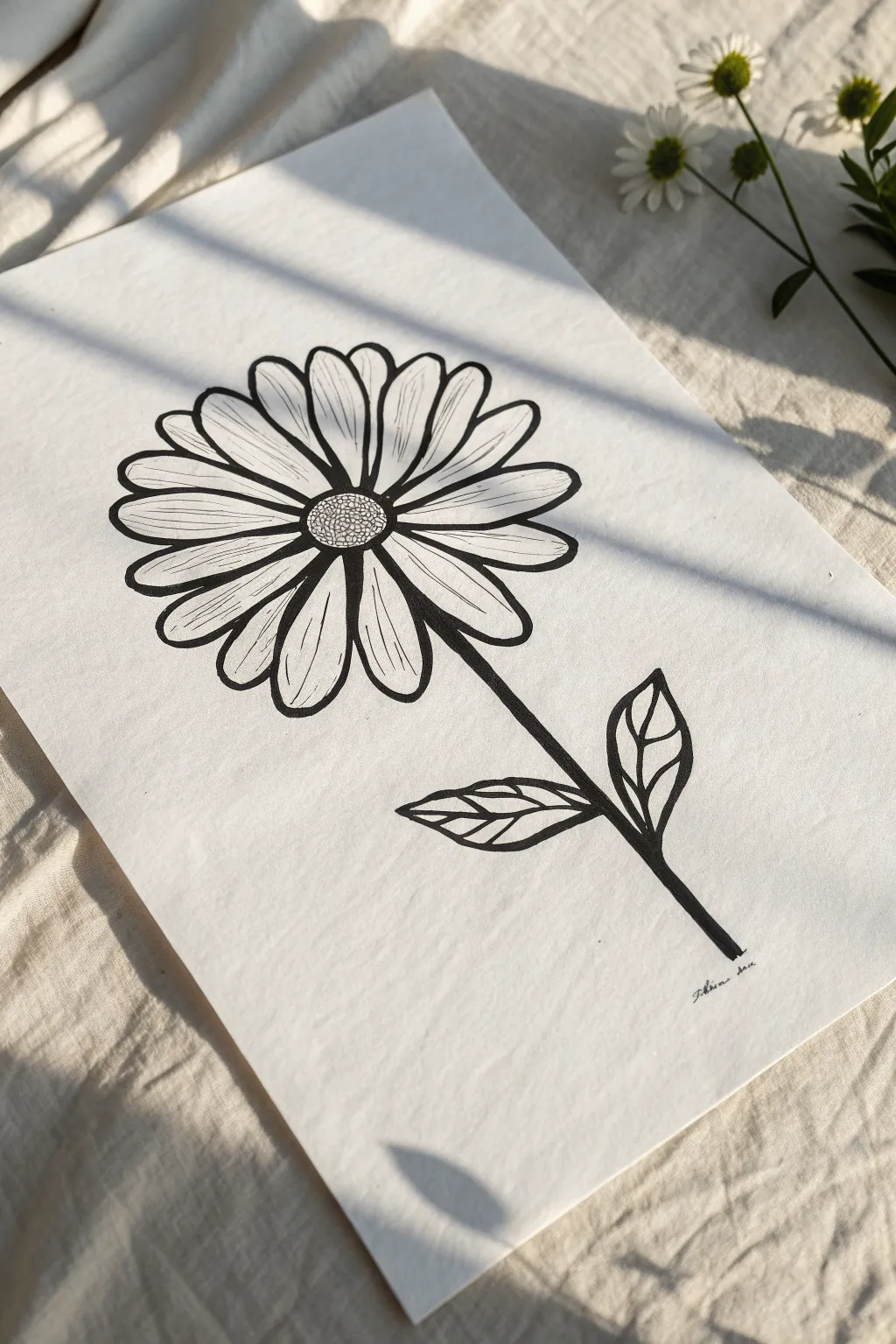
This charming, bold line drawing captures the simple beauty of a daisy with striking contrast and clean curves. It’s an accessible project perfect for practicing line work, petal symmetry, and confident inking strokes.
Step-by-Step Guide
Materials
- High-quality white drawing paper (heavyweight or cardstock preferred)
- HB Drawing pencil
- Eraser (kneaded or white vinyl)
- Black fineliner (0.5mm)
- Black brush pen or thick marker (for bolder lines)
- Ruler (optional)
Step 1: Planning the Structure
-
Establish the stem line:
Begin lightly with your pencil. Draw a vertical line that leans slightly to the right to act as your stem axis, leaving plenty of room at the top for the bloom. -
Mark the center:
Draw a small, slightly flattened circle near the top of your stem line. This will be the disk (the yellow center) of your daisy. It should be roughly the size of a coin. -
Sketch petal guides:
Lightly sketch a large circle around the center disk to define the outer boundary of your petals. This ensures your flower stays round and prominent.
Wobbly Lines?
If your long stem lines look shaky, try moving your arm from the shoulder rather than just moving your wrist. This creates smoother, straighter strokes.
Step 2: Drafting the Petals
-
Draw the cardinal petals:
Sketch four main petals first: top, bottom, left, and right. Make them reach from the center disk all the way to your outer guide circle. -
Fill the gaps:
Draw two to three petals in the spaces between your cardinal petals. Keep the widths generally consistent, but allow slight variations for a natural look. -
Add layering:
Sketch the tips of ‘peeking’ petals behind the main layer. These small curves in the gaps between full petals add depth and volume to the bloom. -
Refine petal shapes:
I like to go back and soften the tips of the petals now, making sure they have a gentle, rounded point rather than a sharp triangle shape.
Step 3: Detailing the Stem and Leaves
-
Thicken the stem sketch:
Draw parallel lines alongside your initial stem axis to give it thickness. The stem should connect centrally to the flower head. -
Add leaf guidelines:
Sketch two leaf shapes branching off the lower stem—one pointing left and one pointing right. Keep them relatively simple and oval-pointed. -
Draw leaf interior:
Sketch a central vein line down the middle of each leaf.
Level Up: Color Pop
Use a yellow watercolor wash or marker just on the center disk, leaving the rest black and white for a striking, modern minimalist effect.
Step 4: Inking the Outline
-
Ink the center disk:
Switch to your black marker. Carefully trace the center circle, keeping the line weight consistent. -
Ink the petals:
Trace your penciled petals. Use confident, smooth strokes. When lines meet near the center, make sure they don’t overlap messy; keep the connections clean. -
Ink the stem:
Draw the long lines of the stem. Try to do this in one or two long, steady motions rather than short, scratchy strokes to keep it smooth. -
Define the leaves:
Outline the leaf shapes. Instead of a single straight line for the inside vein, draw the vein segments slightly separated to create a stylized, segmented look.
Step 5: Texture and Finishing
-
Center texture:
Using a finer pen (like the 0.5mm), fill the center disk with tiny, tight stippling dots or small circles to mimic the texture of pollen. -
Petal veins:
Add very thin, delicate lines inside the petals. Start from the center and flick outward, lifting your pen at the end so the line tapers off about halfway up the petal. -
Thicken key lines:
Go over the outer edges of the main petals and the stem one more time to create a bold, graphic weight that pops against the white paper. -
Erase pencil marks:
Wait until the ink is completely dry to avoid smudging. Gently rub your eraser over the entire drawing to remove the graphite guidelines. -
Add signature:
Sign your name small at the bottom right near the stem.
Pin up your bold floral drawing to add a touch of nature to your workspace

Rose Cluster Line Drawing
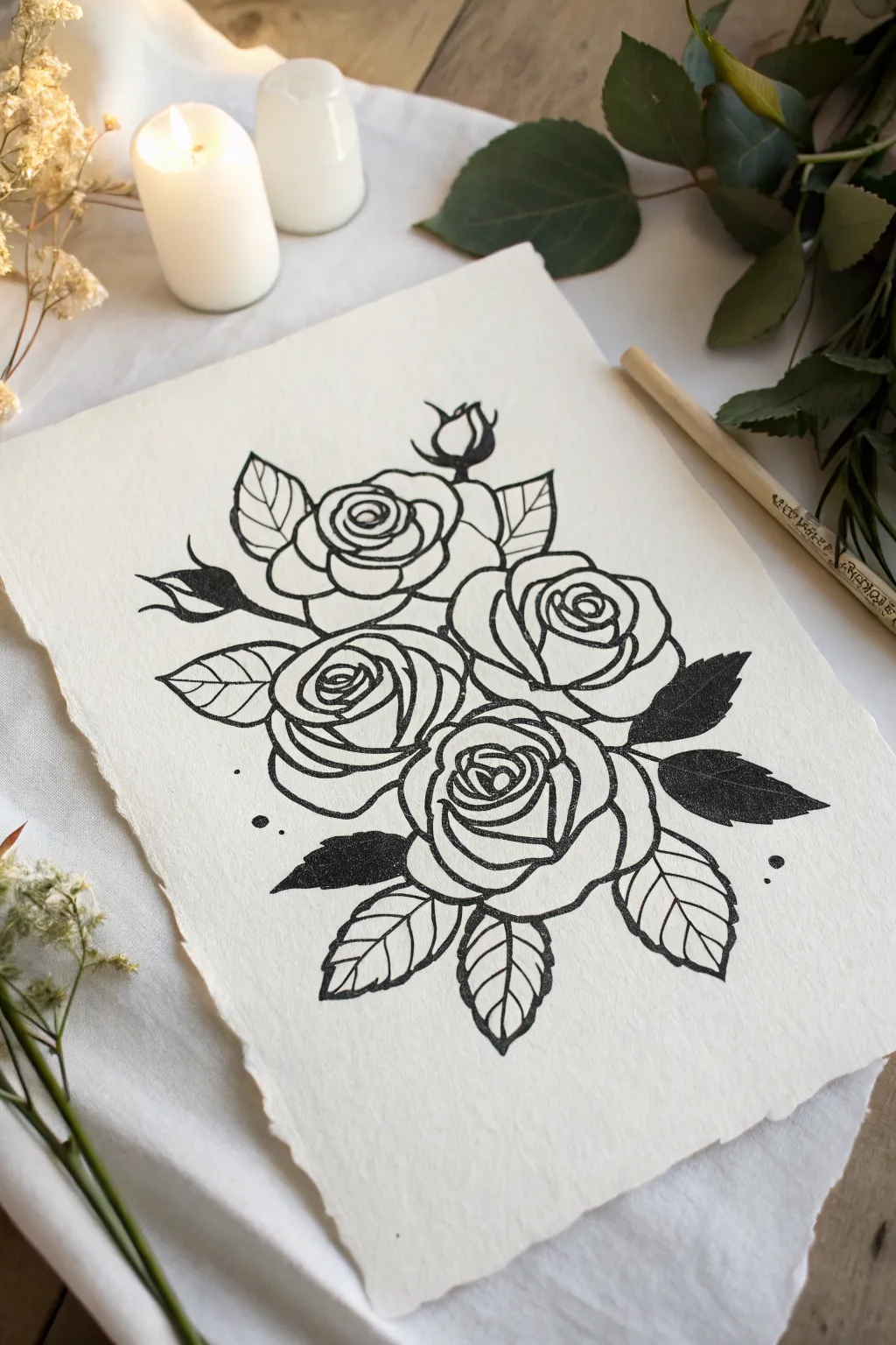
Capture the timeless elegance of a rose bouquet with this bold, tattoo-style line drawing. Using thick, confident strokes on textured paper creates a striking contrast that feels both classic and handcrafted.
Step-by-Step
Materials
- Heavyweight textured paper (cotton rag or cold press watercolor paper)
- Pencil (HB or 2B)
- Kneaded eraser
- Fine liner pen (0.3mm or 0.5mm)
- Thick marker or brush pen (black)
- Tracing light box (optional)
Step 1: Planning and Sketching
-
Establish the composition:
Begin by lightly marking the positions of the four main rose blooms. Draw four rough circles in a diamond-like cluster to ensure the arrangement feels balanced before adding details. -
Sketch the center spirals:
Inside each circle, lightly pencil the tight, spiraling center of the rose. These don’t need to be perfect yet; just indicate the direction the petals will unfurl. -
Define the petals:
Working outward from each center spiral, draw overlapping curved shapes to form the larger petals. Keep the lines somewhat jagged or organic rather than perfectly smooth circles to mimic natural petal edges. -
Add the foliage fundamentals:
Pencil in the leafy shapes tucking out from behind the roses. Place larger leaves at the bottom and sides to frame the bouquet. -
Include buds and fillers:
Draw the two small rosebuds extending from the top left. Add simple stems connecting them back to the main cluster.
Confident Curves
When drawing petals, pull the pen toward you in a single, confident stroke rather than sketching with short, feathery lines. This keeps the ink bold and clean.
Step 2: Inking the Outlines
-
Start with the main lines:
Switch to your thick marker or brush pen. Begin tracing over your pencil lines for the outer petals of the central roses. Use a deliberate, consistent pressure to get that bold, graphic look. -
Refine the centers:
As you move into the tight spirals of the rose centers, switch to a slightly thinner nib if necessary to keep the lines from bleeding together, though a consistent weight works well for this specific style. -
Outline the leaves:
Ink the outlines of the leaves. I find it helpful to rotate the paper as I go to maintain a comfortable hand position for the serrated edges. -
Draw leaf veins:
Add the central vein line to each leaf. For the side veins, keep them simple and symmetrical. -
Connect the buds:
Ink the stems and the buds at the top. Ensure the connection points to the main cluster look seamless and natural.
Vintage Tea Stain
Before drawing, lightly brush your paper with strong black tea and let it dry. This gives the paper an aged, parchment look that complements the classic ink style.
Step 3: Review and Solid Blackwork
-
Identify solid black areas:
Look at the reference image to spot the leaves that are completely filled in with black ink. These are crucial for creating high contrast. -
Fill the dark leaves:
Carefully fill in the selected leaves—specifically the ones on the right side and the lower left tucked under the main blooms. Work slowly near the edges to keep them crisp. -
Add texture to solid areas:
To mimic the print-like texture seen in the photo, you don’t have to fill the black areas perfectly. Leaving tiny specks of white paper showing through can add a lovely vintage character. -
Check line weights:
Go back over any main outline curves that feel too thin. The aesthetic relies on clarity, so don’t be afraid to thicken a line to separate a petal from a leaf.
Step 4: Finishing Touches
-
Erase pencil guides:
Wait until the ink is completely dry—give it a few extra minutes to be safe—and then gently erase all visible pencil marks with a kneaded eraser to avoid damaging the paper texture. -
Stipple details:
Using your finest pen, add tiny stippling dots inside the curves of the petals to suggest shadow and depth without using harsh lines. -
Add floating accents:
Place a few small, solid black dots around the perimeter of the drawing. These little ‘splatters’ help break up the negative space. -
Deckle the edges (optional):
If you are using a standard sheet, you can tear the edges against a ruler to create the soft, deckled edge look shown in the reference photo.
Now you have a stunning botanical illustration ready to be framed or gifted


Leaf and Fern Tracing Sheets
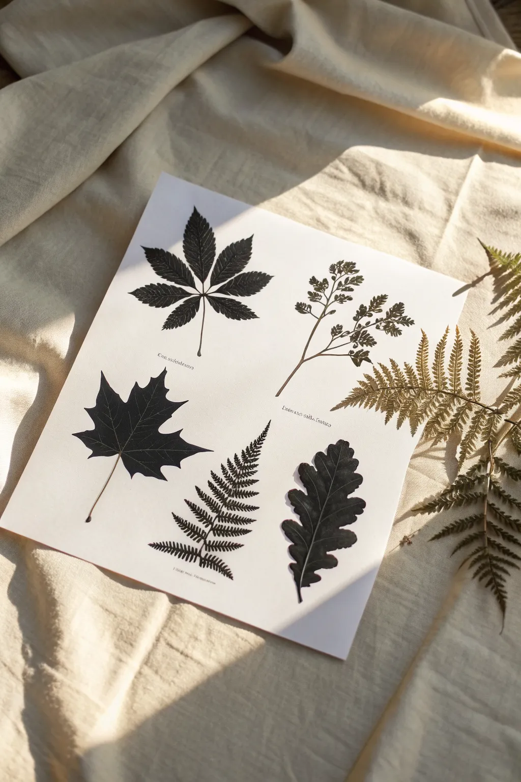
Create a stunning reference sheet of high-contrast botanical silhouettes perfect for tracing practice or framing as minimalist art. This project captures the delicate veins and serrated edges of nature in bold black ink, providing a crisp master copy for future creative endeavors.
Step-by-Step Guide
Materials
- High-quality smooth bristol board or hot-press watercolor paper (A4 size)
- Black waterproof Indian ink or archival fine liner pens (0.1, 0.3, and 0.5mm)
- Brush pen (black) for filling large areas
- Light box or sunny window (optional)
- Graphite pencil (HB or H)
- Kneaded eraser
- Real pressed leaves (chestnut, maple, oak, fern) or high-resolution reference photos
Step 1: Preparation & Layout
-
Gather your specimens:
Collect five distinct botanical specimens. Aim for variety in shape: a palmate leaf like a chestnut or maple using a five-point structure, a simple lobed leaf like oak, and a complex frond like a fern. -
Plan the composition:
Arrange your real leaves or reference photos on your paper to find a balanced layout. Ensure there is ample negative space between each specimen so they don’t feel crowded. -
Lightly sketch the spines:
Using your H pencil, draw the central vein or spine for each leaf. This provides the skeletal structure and ensures the angle of each leaf looks natural on the page. -
Outline the shapes:
Draw the perimeter of each leaf very lightly. Focus on the main shapes first—drawing a general mitten shape for the maple leaf before worrying about the sharp points.
Smudge Prevention
Place a scrap piece of paper under your sketching hand while you work. This prevents oils from your skin transferring to the paper and stops you from accidentally smearing wet ink.
Step 2: Detailing the Forms
-
Refine the serrations:
Go back over your outlines and add the specific edge details. For the fern, draw the individual pinnae; for the maple and chestnut, sharpen the jagged teeth along the edges. -
Map the veins:
Sketch the internal vein network. Since this will be a silhouette style, you need to decide if the veins will be drawn as white negative space (left uncolored) or if you will draw around them. -
Clean up the sketch:
Gently roll a kneaded eraser over your pencil lines to lift excess graphite, leaving just faint ghost lines to guide your inking.
Digital Hybrid
Scan your finished drawing at 600dpi. In Photoshop, invert the colors to white-on-black for a moody print, or use the high-contrast scan to create custom digital brushes.
Step 3: Inking the Silhouettes
-
Outline delicate edges:
Use a 0.1mm fine liner to trace the extremely fine serrated edges of the leaves. This creates a crisp barrier for the heavier ink you’ll add later. -
Define the negative space veins:
With a 0.3mm pen, carefully draw the thin lines that represent the veins. You are actually outlining the vein itself, creating a channel that you will *not* color in. -
Start the fill:
Switch to a brush pen or a thicker marker. Begin filling in the leaf shapes, working from the center outward toward your delicate outline. -
Navigate the veins:
I find it helpful to slow down significantly when approaching the vein lines. Carefully ink up to the edge of your 0.3mm vein channels, preserving that thin strip of white paper. -
Detail the fern:
The fern requires patience. Instead of a solid fill, use the 0.3mm pen to draw the individual leaflets, perhaps leaving tiny gaps between them to suggest light filtering through. -
Ink stems and stalks:
Draw the main stems with a steady hand. Vary the pressure on your pen to make the stem slightly thicker at the base and thinner as it reaches the leaf tip.
Step 4: Finishing Touches
-
Add texture marks:
If a leaf looks too flat, use your finest 0.05mm or 0.1mm pen to add tiny stippling dots or hatching near the veins to suggest curvature, merging into the solid black. -
Label (Optional):
For a scientific aesthetic, use a small nib pen to write the Latin names of the plants in a small, serif font near the base of each stem. -
Final erase:
Wait at least 30 minutes for the ink to cure completely. Then, vigorously destroy any remaining pencil marks with your eraser to clarify the high contrast. -
Inspect contrast:
Hold the paper at arm’s length. If the blacks look patchy or gray, apply a second layer of ink to make the silhouettes truly opaque.
Your finished sheet is now ready to be used as a master template for tracing onto watercolor paper or fabric

Butterfly Symmetry Outlines
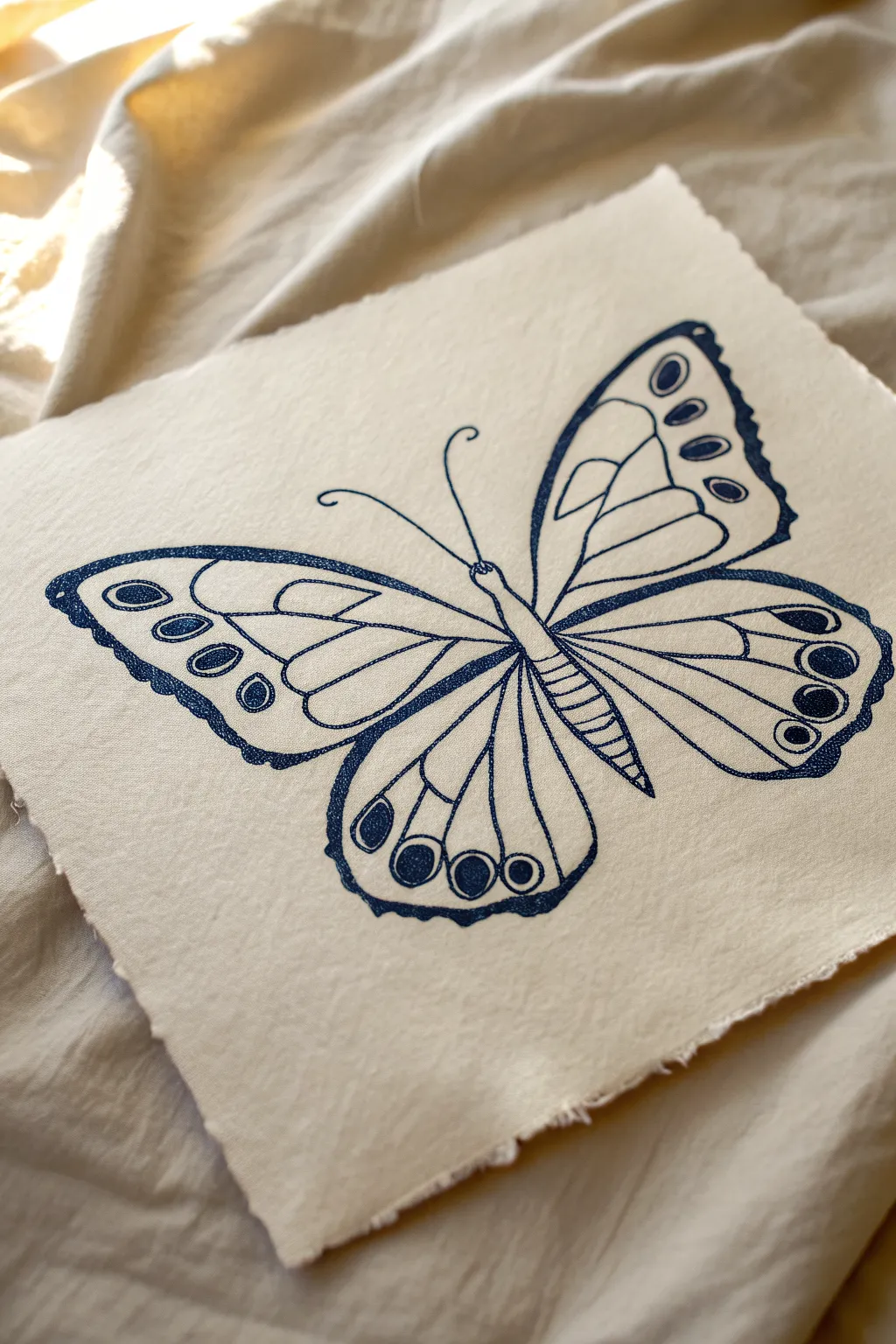
Capture the delicate beauty of a butterfly illustration on rustic, handmade paper. This project combines the precision of fine-line symmetry with the organic texture of deckled edges for a timeless, sketchbook aesthetic.
Detailed Instructions
Materials
- Heavyweight textured paper (cotton rag or handmade paper with deckled edges)
- Fine-tip ink pens (Navy blue or deeply saturated blue)
- Pencil (HB or 2H)
- Light table or bright window (optional for tracing)
- Kneaded eraser
- Ruler
Step 1: Preparing the Foundation
-
Select the perfect paper:
Choose a heavyweight paper that has visible texture and a deckled (rough/torn) edge. This unrefined border is crucial for achieving that authentic, vintage art-supply look shown in the reference. -
Establish the centerline:
Using your pencil lightly, find the center of your paper and draw a faint vertical axis line. Tilt this axis slightly to the right to match the dynamic angle seen in the example, rather than making it perfectly straight up and down. -
Sketch the body segments:
Along your tilted axis, lightly sketch the butterfly’s abdomen and thorax. The abdomen should look like a segmented, tapered cylinder, and the thorax slightly thicker where the wings will attach.
Smudge Prevention
On textured paper, ink sits on the surface longer. Place a scrap piece of paper under your drawing hand to protect your work while you ink avoiding oils and smears.
Step 2: Drafting the Wings
-
Map the upper wings:
Sketch the large, triangular forewings first. Start from the thorax and extend outward. Keep the top edge curved slightly downward at the tip. Aim for rough symmetry, but don’t worry if they aren’t mathematically perfect—nature rarely is. -
Outline the lower wings:
Draw the hindwings below the forewings. These should be more rounded, almost like teardrops that tuck underneath the top wings. Ensure the curves feel continuous and graceful. -
Sketch internal veins:
Lightly map out the ‘cells’ inside the wings. Draw a large central cell near the body on each wing, then radiate lines outward toward the edges to create the distinct sections where the patterns will go. -
Add pattern placeholders:
Sketch the oval and circle shapes near the outer margins of the wings. Place larger ovals on the upper wings and a series of graduating circles on the lower wing edges.
Line Variance
Don’t aim for a majestic, uniform line. Varying your pressure creates thick and thin spots that mimic vintage lithographs and make the insect feel organic.
Step 3: Inking the Outlines
-
Begin the final lines:
Switch to your blue fine-tip pen. I find it helpful to start with the center body to anchor the drawing. Outline the abdomen, adding small horizontal stripes for the segments. -
Ink the main wing shape:
Go over your pencil perimeter lines with a confident, continuous stroke. Let the pen nipple catch slightly on the paper’s texture; this creates a lovely, slightly broken line character that adds to the handmade feel. -
Thicken the outer border:
Go back over the very outer edge of the wings a second time to thicken the line weight. This makes the butterfly pop against the creamy paper background. -
Draw the antennae:
add two long, slender antennae extending from the head. Curve the left one gently outward and the right one slightly straighter, ending each with a tiny curl or bulb.
Step 4: Detailing and Texture
-
Define the veins:
Ink the internal structural lines you sketched earlier. Keep these lines slightly thinner than your outer border to maintain visual hierarchy. -
Fill the pattern spots:
Ink the ovals and circles near the wing tips. Instead of filling them completely solid, use a tight stippling or scribbling motion to fill them, leaving tiny specks of white paper showing through for texture. -
Add the scalloped edges:
Along the bottom edges of the hindwings, draw a scalloped or wavy line just inside the thick border. Fill the space between this wave and the edge with your blue ink to create a dark, decorative rim. -
Stipple the body:
Add tiny dots (stippling) along the sides of the butterfly’s body to give it three-dimensional form and shadow. -
Refine the dark areas:
Look for areas where lines converge, particularly near the body. Deepen the ink there to suggest shadow and depth. -
Erase and clean up:
Allow the ink to dry completely—give it at least 20 minutes to prevent smearing. Gently rub your kneaded eraser over the entire drawing to lift the initial graphite sketch.
Display your beautiful specimen on a wall or desk to admire the delicate contrast of blue ink on rustic paper

PENCIL GUIDE
Understanding Pencil Grades from H to B
From first sketch to finished drawing — learn pencil grades, line control, and shading techniques.
Explore the Full Guide
Cute Animal Faces in Clean Lines
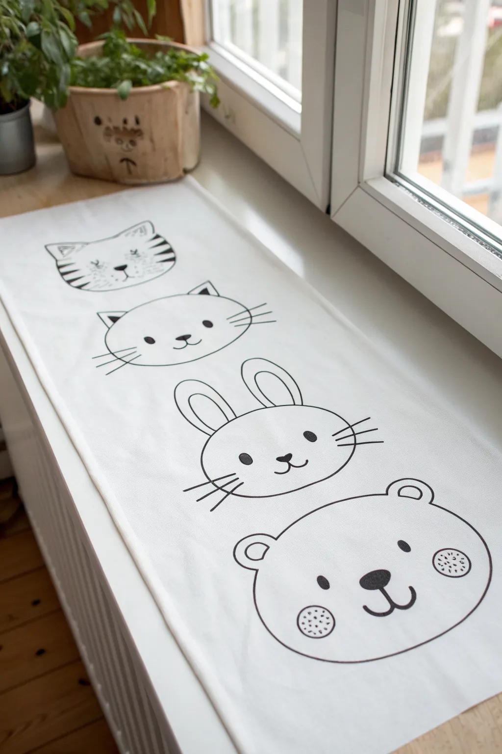
Brighten up your window nook with this charming fabric runner adorned with minimalist animal friends. Using fabric markers or paint, you’ll create crisp, clean lines to bring a tiger, cat, bunny, and bear to life in a neatly vertically stacked design.
How-To Guide
Materials
- White cotton or canvas fabric runner (custom cut to your window sill dimensions)
- Black fabric marker (fine tip for details)
- Black fabric marker (medium/brush tip for thicker outlines)
- Pencil (HB or lighter)
- Eraser
- Ruler or measuring tape
- Iron and ironing board
- Paper for sketching/tracing (optional)
Step 1: Preparation & Layout
-
Prepare the fabric:
Begin by washing, drying, and thoroughly ironing your white fabric runner. This ensures the material is preshrunk and provides a perfectly smooth surface for drawing without wrinkles distorting your lines. -
Measure the spacing:
Lay the runner flat on a hard surface. Measure the total length and lightly mark four equal sections with a pencil to ensure each animal face has its own dedicated space. -
Define the center line:
Use your ruler to faintly mark a vertical center line down the runner. This guide is crucial for keeping the faces—especially that tall bunny—symmetrical and aligned.
Bleeding Lines?
If ink bleeds into the fabric grain, stop immediately. Iron a piece of freezer paper (shiny side up) onto the back of the sketching area to stabilize it before continuing.
Step 2: Sketching the Shapes
-
Sketch the Tiger (Top):
Starting at the top section, lightly sketch a wide oval. Add pointed ears on top, striped markings on the cheeks, and a small, triangular nose. Keep the pencil pressure extremely light so it’s easy to erase later. -
Sketch the Cat:
Below the tiger, draw a slightly wider, flatter oval for the cat. Add two triangular ears and simple dot eyes. Sketch the whiskers extending outward to preview their length. -
Sketch the Rabbit:
For the third face, draw a rounder circle. The defining feature here is the long, oval ears standing straight up. Ensure the ears are symmetrical around your center guide line. -
Sketch the Bear (Bottom):
At the bottom, draw a large, chubby oval for the bear’s head. Add two small semi-circles for ears. Place the nose lower on the face to give it that cute, teddy-bear proportion. -
Add facial details:
Go back through all four animals and lightly pencil in the finer details: the rosiness on the bear’s cheeks, the pupils in the rabbit’s eyes, and the mouth curves.
Add Pop of Color
Use a pale pink fabric pastel or diluted fabric paint to add soft, real blushing cheeks to the animals for a mix-media look that stays subtle.
Step 3: Inking the Designs
-
Test your marker:
Before touching the final fabric, test your black fabric marker on a scrap piece of the same material to check for bleeding. If the ink spreads too much, move the marker faster. -
Outline the head shapes:
Using the medium-tip marker, trace the main outer contour of the Tiger’s head first. Use confident, continuous strokes rather than short sketching motions to keep the line clean. -
Ink the facial features:
Switch to a fine-tip marker for the eyes and noses. For solid black areas like the eyes or noses, outline the shape first, then fill it in carefully. -
Draw the whiskers:
For the cat and rabbit whiskers, use a quick, flicking motion with your wrist to taper the lines at the ends, making them look natural rather than stiff. -
Detail the Tiger:
Fill in the stripes on the tiger’s cheeks and forehead. I find it helpful to rotate the fabric for these angles so my hand stays in a comfortable position. -
Detail the Bear:
For the bear’s cheeks, draw small circles and stipple tiny dots inside them using the very tip of your fine marker to create a textured blush effect. -
Let the ink set:
Allow the ink to dry completely according to the manufacturer’s instructions. This usually takes at least a few hours to ensure no smudging occurs.
Step 4: Finishing Up
-
Erase pencil guides:
Once you are 100% certain the ink is dry, gently erase any visible pencil lines. Hold the fabric taut with one hand while erasing to prevent bunching. -
Heat set the design:
To make the runner washable, heat set the ink. Place a thin cloth over the drawings and iron on a high, dry heat setting for several minutes.
Place your new runner on the sill and enjoy the friendly faces greeting you every time you look out the window.
Cartoon-Style Character Bases
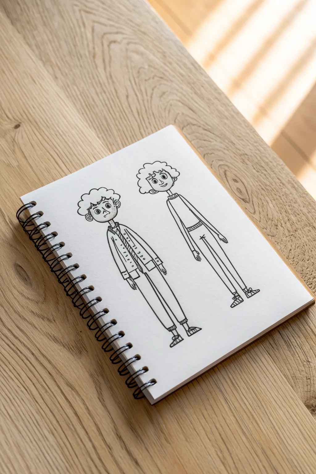
Learn to sketch two quirky, elongated cartoon characters with distinctive features and playful proportions. This project focuses on clean linework and mastering a unique, stylized aesthetic directly in your sketchbook.
Step-by-Step Guide
Materials
- Sketchbook or drawing paper (heavyweight preferred)
- HB or 2B pencil for rough sketching
- Soft drawing eraser
- Fine liner pen (black, 0.3mm or 0.5mm)
- Ruler (optional for alignment)
Step 1: Planning the Proportions
-
Establish the Head Shapes:
Begin by lightly sketching two circular shapes near the top of your page using your pencil. Keep them roughly the same size and leave enough space between them for comfortable drawing. -
Map Out Vertical Guidelines:
Draw faint vertical lines extending downward from the center of each head circle. These will act as the spine and center of balance for your figures, helping to maintain their elongated posture. -
Define the Torsos:
Sketch narrow, rectangular shapes for the torsos. The figure on the left will wear a jacket, so make its torso slightly boxier, while the figure on the right needs a very slender, almost tubular torso shape. -
Sketch the Leg Lengths:
Extend long, straight lines downward for the legs. The style here relies on exaggerated length, so make the legs nearly twice the length of the torso. Keep the stance narrow for both characters. -
Place Key Joints:
Mark the location of elbows and knees with tiny circles. Notice that the arms hang quite low in this style, with fingertips reaching well past where pockets would be.
Keep It Loose
Don’t connect every single line perfectly. Leaving tiny gaps, especially in the hair or clothing folds, adds to the breezy, hand-drawn character charm.
Step 2: Refining the Characters
-
Left Figure: Jacket Details:
On the left character, draft the lapels of the jacket using triangular shapes near the chest. Add a vertical line for the button placket and sketch sleeves that end in slightly boxy cuffs. -
Right Figure: Sweater & Sleeves:
For the right character, keep the clothing simpler. Draw a straight hemline for a sweater and extend the sleeves to be long and fitted, ending in small, simple hands. -
Constructing the Pants:
Thicken the leg guidelines into pant shapes. The left figure gets slightly baggy trousers that taper at the ankle, while the right figure wears very skinny, straight-leg pants. -
Adding Feet and Shoes:
Sketch triangular shapes for the feet at the bottom. Detail them into sneakers—add laces and soles with simple geometric lines. -
Drafting Facial Features:
Inside the head circles, place the eyes wide apart. Use large circles with small dots for pupils. Add small, curved noses and simple straight lines for mouths to create a neutral expression. -
Developing the Hairstyles:
Draw the contour of the hair. Use bumpy, cloud-like curves to create a curly texture. The left figure has a more contained afro shape, while the right figure’s hair is wider and looser.
Accessorize
Give them personality! Add round glasses, a beanie, or a patterned scarf to change the vibe without altering the base body shape.
Step 3: Inking and Final Polish
-
Outline the Heads:
Switch to your fine liner pen. Carefully trace the curly hair outlines and the shape of the face. Ink the ears as simple ‘C’ shapes on the sides of the head. -
Ink the Faces:
Go over the eyes, nose, and mouth. I like to thicken the upper eyelid line slightly to give the eyes more definition without adding lashes. -
Inking the Left Outfit:
Trace the jacket, paying attention to the overlap of the lapels. Add small dots for buttons and short dash marks on the chest to suggest texture or a shirt underneath. -
Inking the Right Outfit:
Ink the sweater and skinny jeans with long, confident strokes. Add a ribbed texture to the waistband using tiny vertical hatch marks. -
Finalizing Hands and Shoes:
Ink the shoes, adding the crisscross detail for laces. Trace the hands carefully; keep the fingers simple and graphic rather than anatomically perfect. -
Erase Sketches:
Wait several minutes for the ink to dry completely. Gently erase all the underlying pencil graphite to reveal the clean, sharp line art.
Now you have a pair of stylized character bases ready to be customized or colored
BRUSH GUIDE
The Right Brush for Every Stroke
From clean lines to bold texture — master brush choice, stroke control, and essential techniques.
Explore the Full Guide
Side-Profile Face Outline Practice
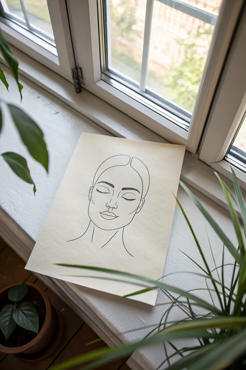
Capture the essence of calm with this elegant, single-line style portrait drawing. Using simple, flowing contours on cream-colored paper creates a modern, minimalist aesthetic perfect for framing or casual display.
How-To Guide
Materials
- Cream or off-white cardstock (A4 or similar size)
- HB pencil (for sketching)
- Soft eraser
- Fine liner pen (black, 0.5mm or 0.8mm)
- Ruler (optional, for centering)
Step 1: Planning and Sketching
-
Prepare your workspace:
Clear a flat surface near a window if possible for natural light. Tape down the corners of your cream cardstock with masking tape if you want to ensure it doesn’t shift while drawing. -
Establish the centerline:
Lightly draw a vertical line down the center of the paper using your HB pencil. This will help you keep the facial features symmetrical. -
Outline the head shape:
Sketch a soft oval shape for the face, leaving the top open where the hair will be. Mark horizontal guides for where the eyes, nose, and mouth will sit. -
Map the hair parting:
Draw the center part of the hair at the top of the head. Create two sweeping curves moving outward and down to frame the forehead, resembling curtains. -
Sketch the eyebrows:
Place the eyebrows slightly below the hair line. Draw them as thick, arched shapes to give the face character, but keep the pencil strokes light for now. -
Position the closed eyes:
Draw two U-shaped curves for the eyelids. Since the eyes are closed, focus on the curve of the lash line rather than an open eye shape. Add tiny flicks for lashes. -
Define the nose:
Instead of drawing the entire bridge, focus on the bottom of the nose. Sketch the nostrils and the central tip using small, curved lines. -
Shape the lips:
Draw the mouth with a defined cupid’s bow on the top lip. Keep the bottom lip fuller. Ensure the corners of the mouth align roughly with the centers of the eyes. -
Add the neck and ears:
Sketch simple curved lines extending down from the jawline to form the neck. Add small indications for ears on the sides of the head, aligned with the eyes and nose.
Loose Wrist Technique
Don’t plant your palm firmly. Keep your wrist and hand loose while drawing the long curves of the face to prevent shaky, jagged lines.
Step 2: Inking and Refining
-
Test your pen:
Scribble on a scrap piece of paper with your fine liner to ensure the ink is flowing smoothly and consistent in thickness. -
Trace the hair and face shape:
Begin inking the outer contour. Use a confident, steady hand to trace over your pencil lines for the hair and jawline. Try to lift your pen as little as possible for a fluid look. -
Ink the eyebrows:
Instead of outlining the brows, use short, directional strokes to fill them in, mimicking the texture of hair. This adds a nice contrast to the clean lines elsewhere. -
Detail the eyes:
Carefully go over the eyelid curves. I find that thickening the line slightly in the center of the eyelid adds a sense of weight and tranquility to the expression. -
Refine the nose and mouth:
Trace the nose and lip lines. Keep the nose minimal—sometimes less is more here. Ensure the lips connect smoothly to keep the soft expression intact. -
Connect the neck lines:
Draw the final lines for the neck, letting them trail off at the bottom rather than closing the shape, suggesting the drawing continues downward invisibly. -
Let the ink dry:
Wait at least 5 to 10 minutes to ensure the ink is completely dry. Smudging your crisp lines at this stage is the last thing you want. -
Erase pencil guides:
Gently rub your soft eraser over the entire drawing to remove the underlying pencil sketch and guidelines. -
Final assessment:
Look at your drawing from a distance. If any lines look too thin or disconnected, carefully touch them up with the pen to unify the weight of the illustration.
Level Up: Watercolor Splash
Add a single, organic wash of watercolor behind the drawing in a muted tone like sage green or dusty pink to make the black lines pop.
Now you have a tranquil piece of art ready to be placed on a sunny windowsill or gifted to a friend
Front-Facing Facial Feature Maps
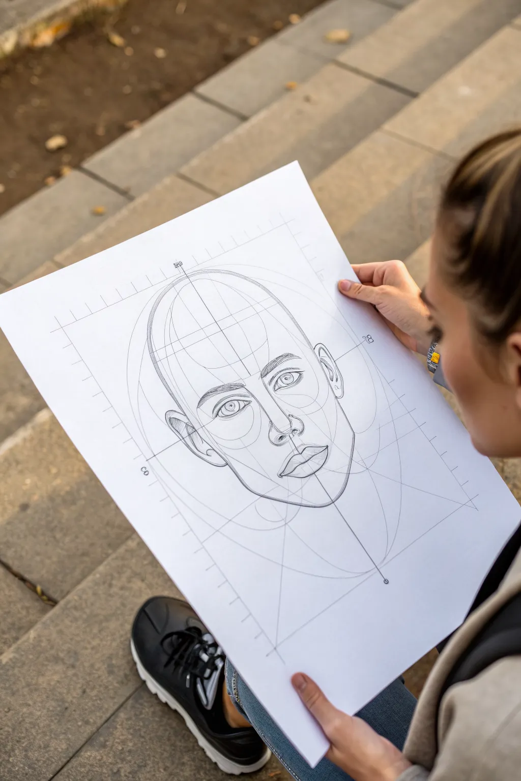
Master the art of facial proportions with this structured drawing exercise that breaks down complex features into manageable geometric forms. You’ll create a clean, blueprint-style portrait that reveals the underlying anatomy through precise guidelines and shapes.
Step-by-Step Guide
Materials
- Large sheet of smooth drawing paper (A3 or 11×17 inch)
- HB graphite pencil for initial layout
- 2B or 4B pencil for shading and final lines
- Fine-liner pen (0.5mm, black) – optional for final inking
- Large ruler or T-square
- Compass for drawing circles
- Kneaded eraser
- Blending stump (optional)
Step 1: Setting the Blueprint Grid
-
Establish the central axis:
Begin by drawing a straight vertical line down the center of your paper using your ruler. This will be the line of symmetry for the face. -
Mark the primary boundaries:
Draw a large rectangle centered on your axis line. This box defines the outer limits of the head. Add ruler tick marks along the top and left edges to create a measurement scale, giving it that technical ‘blueprint’ aesthetic. -
Draw the cranial sphere:
Using your compass, draw a large circle in the upper portion of your rectangle. This represents the cranium. The center of this circle should align with your vertical axis. -
Define the jawline structure:
Beneath the circle, draw a U-shaped curve that connects to the sides of the circle. This forms the jaw and chin area, extending the head shape into an egg-like oval. -
Map horizontal guidelines:
Divide the face oval horizontally. Draw a line halfway down for the eyes, halfway between the eyes and chin for the nose base, and one-third down from the nose for the mouth.
Pro Tip: Line Quality
Vary your pressure. Use faint, hard lines for the grid and ‘wireframe’ elements, but switch to darker, softer strokes for organic features like eyes and lips.
Step 2: Constructing the Features
-
Block in the eye sockets:
Sketch two smaller circles on the eye line, spaced about one eye-width apart. These will serve as the orbital cavities for the eyes. -
Draft the nose pyramid:
Draw a light triangle or trapezoid starting from the brow line down to the nose mark. Keep this geometric for now; we just need the planes of the nose. -
Place the ears:
Sketch tall, narrow ovals on the outer sides of the head. The top of the ears should align roughly with the brow line, and the bottom with the base of the nose. -
Refine the eyebrows:
Above the eye sockets, sketch the arch of the eyebrows. Use the underlying circle as a guide for the curve of the brow bone. -
Detail the eyes:
Inside your socket circles, draw the almond shapes of the eyelids. Add the circular irises, making sure they are looking straight forward. I find it helpful to draw the pupil immediately to anchor the gaze.
Step 3: Defining Planes and Lines
-
Sculpt the nose:
Darken the nostrils and the outer curves of the nose wings (alae). Suggest the bridge of the nose with light, vertical strokes rather than hard outlines. -
Shape the lips:
Draw the cupid’s bow on the upper lip and the curve of the lower lip. Use the centerline to ensure symmetry. Keep the corners of the mouth aligned with the pupils (or slightly inward depending on the expression). -
Carve the cheekbones:
Draw diagonal lines from the outer corner of the eyes down towards the jaw. These represent the zygomatic arches and help give the face 3D structure. -
Refine the jaw and chin:
Go over your initial U-shape with a more confident line. Add a small cleft or curve to the chin if desired, and sharpen the angle where the jaw turns upward toward the ears. -
Add constructive curves:
Draw light, sweeping curves that wrap around the forehead and cheeks, mimicking wireframe mesh lines. These emphasize the volume of the head.
Troubleshooting: Asymmetry
If the eyes look uneven, turn your drawing upside down or look at it in a mirror. This fresh perspective instantly reveals skew issues you can fix.
Step 4: Final Polish
-
Strengthen the outlines:
Switch to your softer 2B or 4B pencil creating variable line weight. Make the outer contours thicker and the inner detail lines thinner. -
Hatch shading:
Add light diagonal hatching to the shadowed side of the nose, under the eyebrows, and beneath the lower lip to imply depth. -
Clean up guidelines:
Don’t erase your construction lines completely! The charm of this style is visible process. Just lighten any stray marks that distract from the main features. -
Add technical notations:
Draw small arrows or lines extending from key points (like the ear top or chin) to the outer grid, mimicking an architectural draft.
Step back and admire how the technical guidelines blend with organic forms to create a strikingly modern portrait structure.


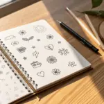
Lips and Expression Tracing Set
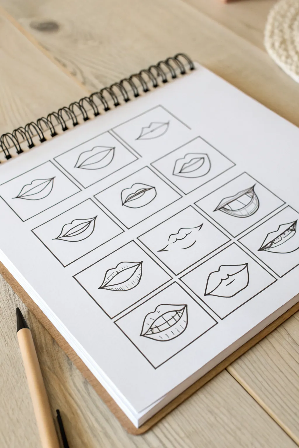
Master the subtleties of human emotion with this structured grid of lip illustrations ranging from subtle smiles to open grins. This clean, minimalist pen-and-ink study serves as both a warm-up exercise and a reference guide for drawing facial features.
Step-by-Step
Materials
- Spiral-bound sketchbook (A4 or similar size)
- Pencil (HB or H for sketching)
- Ruler
- Eraser
- Fine liner pen (0.3mm or 0.5mm, black ink)
- Clean workspace
Step 1: Setting the Grid Structure
-
Prepare the page:
Open your sketchbook to a fresh, clean page. Ensure the paper is flat and ready for drafting. -
Measure the margins:
Using your ruler and pencil, lightly mark out even margins from the top, bottom, and sides of the page to center your work area. -
Draft the grid layout:
Draw four large rectangles, spaced evenly. Divide these horizontally to create space for twelve total boxes (3 columns by 4 rows) or adjust depending on your page size to fit about 10-12 distinct frames. -
Refine the frames:
Go over your pencil grid lines with your fine liner pen to create permanent, crisp borders for each drawing box. Let the ink dry completely. -
Erase guidelines:
Once the ink is dry, gently erase the initial pencil marks to reveal clean, empty frames.
Wobbly Lines?
If your hand shakes while inking long curves, try locking your wrist and moving your entire arm from the elbow instead. This creates smoother, more consistent arcs.
Step 2: Sketching the Shapes
-
Start with simple curves:
In the top row, lightly sketch three basic closed-mouth shapes with your pencil. Focus on the ‘Cupid’s bow’ dip in the upper lip and the gentle curve of the bottom lip. -
Add slight openings:
Move to the second row. Sketch mouths that are slightly parted. Draw the outer contour first, then add the inner separation line to indicate breath or speech. -
Introduce teeth sketches:
For the middle sections, sketch wider smiles. Lightly indicate the position of the upper teeth without drawing every single vertical line hard—just suggest the shape. -
Draft complex expressions:
In the lower boxes, sketch more dynamic expressions: a bitten lip, a smirk (higher on one side), and a full open-mouthed grin showing both rows of teeth. -
Vary the angles:
Ensure some mouths are viewed straight-on, while one or two constitute a slight three-quarter turn to practice perspective.
Add Dimension
Use a light grey marker or watered-down ink wash to add simple shadows under the bottom lip and inside the mouth cavity for instant 3D depth.
Step 3: Inking and Detailing
-
Outline the contours:
Switch back to your fine liner. Starting from the top left, carefully trace over your pencil outlines. Use confident, single strokes rather than feathery lines. -
Define the corners:
Darken the corners of the mouth slightly more than the center. This adds depth and shows where the lips tuck into the cheeks. -
Detailing teeth:
When inking teeth, don’t draw harsh outlines between every tooth. Instead, suggest the separation with small ticks near the gumline or bottom edge to keep the look natural. -
Add texture lines:
On the fuller bottom lips, add tiny, vertical hatching marks. I prefer to keep these minimal—just a few lines to suggest the curved volume and texture of the skin. -
Enhance dramatic expressions:
For the biting lip drawing, clearly define where the teeth press into the lower lip flesh. A slight curve downwards around the teeth helps sell the pressure. -
Final clean up:
Wait at least 5-10 minutes for all ink to fully set. Take your eraser and thoroughly remove all underlying pencil sketches.
You have now created a valuable reference sheet that captures the versatility of human expression through simple linework
Hands in Easy Poses to Trace
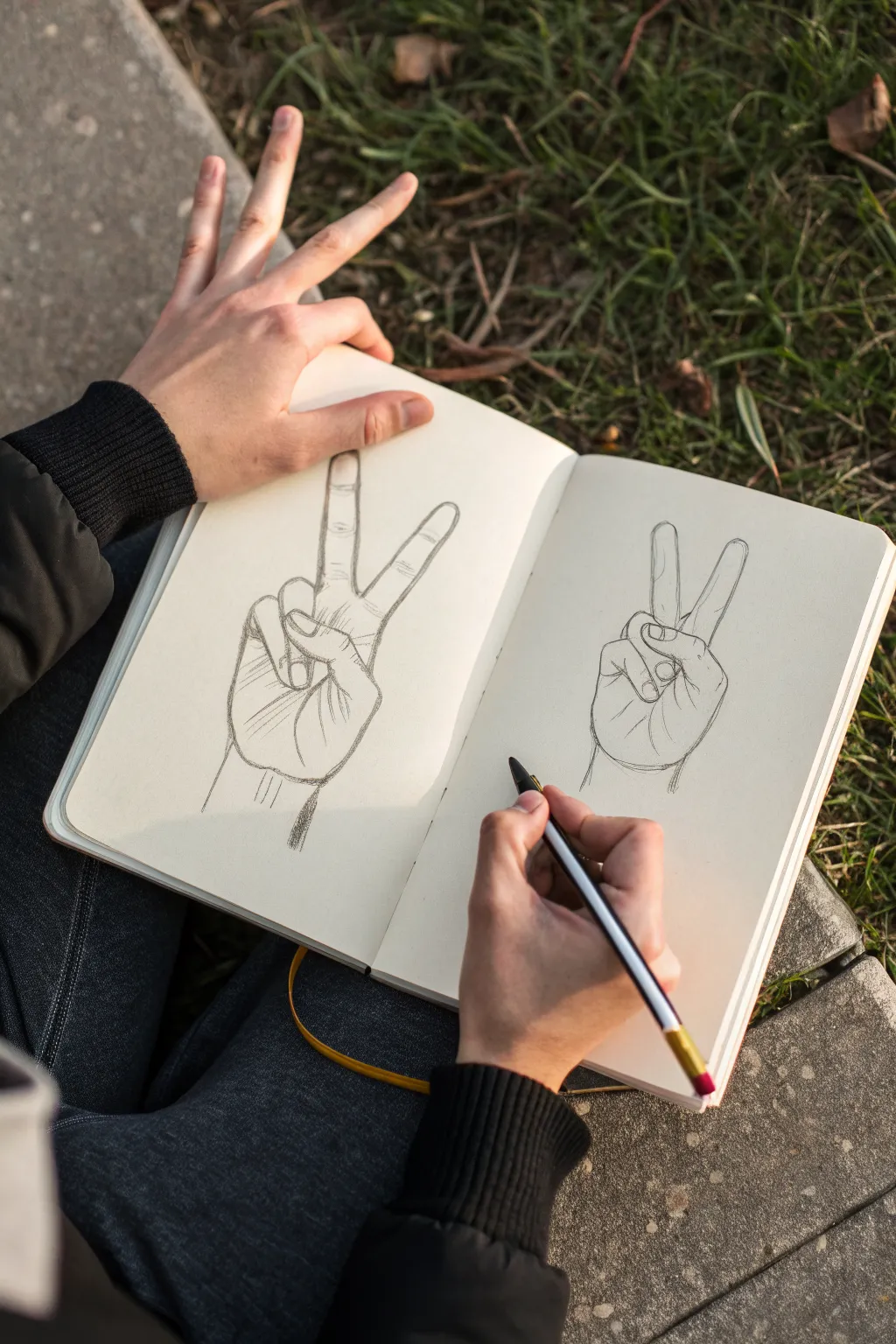
Mastering the structure of the human hand is a rite of passage for artists, and this ‘peace sign’ pose offers excellent practice in foreshortening and finger anatomy. Using simple pencil strokes, you will learn to break down the complex forms of the hand into manageable shapes to create a realistic line drawing.
Step-by-Step Tutorial
Materials
- Hardbound sketchbook (A5 or similar size, smooth grain)
- Black ink fineliner pen (0.3mm or 0.5mm)
- Graphite pencil (HB or 2B for sketching)
- Eraser
- Your own hand for reference
Step 1: Basic Structure
-
Observe your model:
Sit comfortably with your sketchbook open on your lap. Position your non-drawing hand in a ‘peace sign’ gesture, resting it naturally so the palm faces slightly inward and the two extended fingers point upward. -
Sketch the palm block:
Using your pencil, lightly draw a square or slightly rectangular shape to represent the main block of the palm. This anchors the entire drawing and establishes scale. -
Indicate finger placement:
Draw faint lines extending from the top of the palm block to mark the general direction of the index and middle fingers. Mark the knuckles with small circles. -
Map the folded fingers:
Sketch rough oval shapes over the palm area where the ring and pinky fingers curl in. Don’t worry about details yet; just focus on how much space they occupy relative to the palm. -
Position the thumb:
Add the thumb structure crossing over the folded fingers. Note how the thumb acts as a locking mechanism over the ring finger’s knuckle.
Step 2: Refining Shapes
-
Outline the extended fingers:
Refine the index and middle fingers. Instead of straight tubes, give them subtle curves that widen at the joints and taper slightly at the fingertips. -
Detail the folded fingers:
Work on the overlapping shapes of the curled fingers. Pay close attention to the nails and the creases where the skin folds; these small lines add significant realism. -
Add the thumb nuances:
Refine the thumb’s contour, ensuring the nail is positioned correctly to show the angle of the thumb pressing down. I find that capturing the tension in the thumb is key to this pose. -
Connect the wrist:
Draw two lines extending downward from the base of the palm to form the wrist. The wrist should feel like a sturdy support, not just an afterthought.
Wonky Fingers?
If fingers look like sausages, check the joints. Fingers aren’t straight tubes; they bulge slightly at the knuckles and taper. Draw the bones first as sticks to get lengths right before adding flesh.
Step 3: Inking and Definition
-
Begin inking the contours:
Switch to your fineliner pen. Carefully trace over your refined pencil lines, using confident strokes. Start with the fingers and work your way down to the palm. -
Emphasize overlaps:
Where one finger overlaps another (like the thumb over the ring finger), make the line slightly bolder or ensure it cleanly cuts off the line behind it to create depth. -
Add skin creases:
Using lighter pressure with the pen, add the articulation lines at the knuckles and the natural creases on the palm. These should be thinner than the outline. -
Suggest shadows:
Add hatching lines (closely spaced parallel lines) to the side of the palm and under the curled fingers. This shading gives the drawing volume and separates the planes. -
Drawing the wrist tendons:
Add a few subtle vertical strokes near the wrist area to suggest tendons and structure beneath the skin. -
Erase pencil guides:
Once the ink is completely dry—wait at least a minute to avoid smudges—gently erase all the underlying graphite sketch lines to reveal the crisp ink drawing.
Double Trouble
Try drawing the same pose again on the opposite page but half the size. This forces you to simplify details and focus purely on the major shapes and proportions.
keep practicing this pose from different angles to build a stronger understanding of hand anatomy
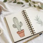
Mini Still-Life Object Outlines
Master the art of clean lines with this graphic ink illustration of a pair of scissors. The high-contrast black ink against the creamy sketchbook paper creates a striking, minimalist look perfect for practicing precise object drawing.
Step-by-Step Tutorial
Materials
- Spiral-bound sketchbook (heavyweight paper)
- HB or 2B pencil for sketching
- Soft eraser
- Fine liner pen (01 or 03 size)
- Thick black marker or brush pen
- Ruler (optional)
Step 1: Planning the Skeletons
-
Mark the center axis:
Begin by lightly drawing a diagonal line across your page with your pencil. This will serve as the central axis for the scissors, helping you keep the blades and handles aligned. -
Locate the pivot point:
About halfway down your diagonal line, draw a small circle. This marks the screw or pivot point where the two blades will cross. -
Sketch the handle shapes:
At the upper left end of your axis, sketch two oval shapes for the finger holes. One should be slightly more elongated (the finger grip) and the other a bit rounder (the thumb grip). -
Draft the blade lengths:
Extend a straight line down from the pivot point to define the length of the bottom blade. Do the same for the top blade, ensuring they angle slightly away from each other to show the scissors are open.
Step 2: Refining the Forms
-
Connect handles to pivot:
Draw the ‘shanks’ of the scissors—the metal necks that connect the oval handles to the central pivot area. Curve these lines gently so they flow naturally into the blade intersection. -
Define the blade width:
Add width to your single blade lines. Usually, drawing a parallel line that tapers to a sharp point at the end works best. Make the outer edge straight and the inner cutting edge very slightly curved. -
Add the inner rings:
Inside your initial handle ovals, draw a second, smaller oval. This creates the thickness of the plastic or metal handle loops. -
Detail the screw:
Refine the small circle at the pivot point. You can add a tiny slot line across it to represent the screw head. -
Check proportions:
Take a moment to step back. Check if the handle loops feel balanced relative to the blade length. Adjust your pencil sketch now before committing to ink.
Steady Hands Pro-Tip
For the long, straight lines of the blades, lock your wrist and move your entire arm from the shoulder. This creates much straighter lines than pivoting from your wrist.
Step 3: Inking and Definition
-
Outline the outer perimeter:
Using your thick black marker or brush pen, carefully trace the entire outer silhouette of the scissors. I find that rotating the sketchbook helps me get a smoother curve on the handles. -
Ink the handle interiors:
Switch to a slightly thinner pen if you wish, or use the tip of your marker, to ink the inner ovals of the finger holes. -
Fill the dark voids:
Identify areas that need heavy contrast. In this style, the thickness of the handles is emphasized by thickening the lines significantly, almost filling in the gap between the inner and outer oval lines. -
Draw the cutting edges:
Use your fine liner to draw the inner lines of the blades. These lines should be thinner than the outer silhouette to suggest the sharpness of the cutting edge. -
Texture the bevel:
If your scissors have a beveled blade, draw a very thin line parallel to the cutting edge to indicate that angled surface.
Fixing Wobbly Lines
If a line comes out shaky, don’t try to erase ink. Instead, thicken the line slightly to mask the wobble. A varied line weight often adds character anyway.
Step 4: Finishing Touches
-
Emphasize the pivot:
Darken the area around the screw head slightly to make the metal pivot point pop. -
Clean up:
Wait at least five minutes for the ink to dry completely. Then, gently erase all your underlying pencil construction lines. -
Add subtle depth:
Look for places where the metal parts overlap near the screw. Add a tiny extra bit of line weight or a small hash mark there to suggest a shadow.
Now you have a sharp, graphic illustration illustrating the beauty of everyday tools
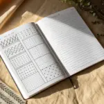
Pattern Tiles to Trace and Repeat
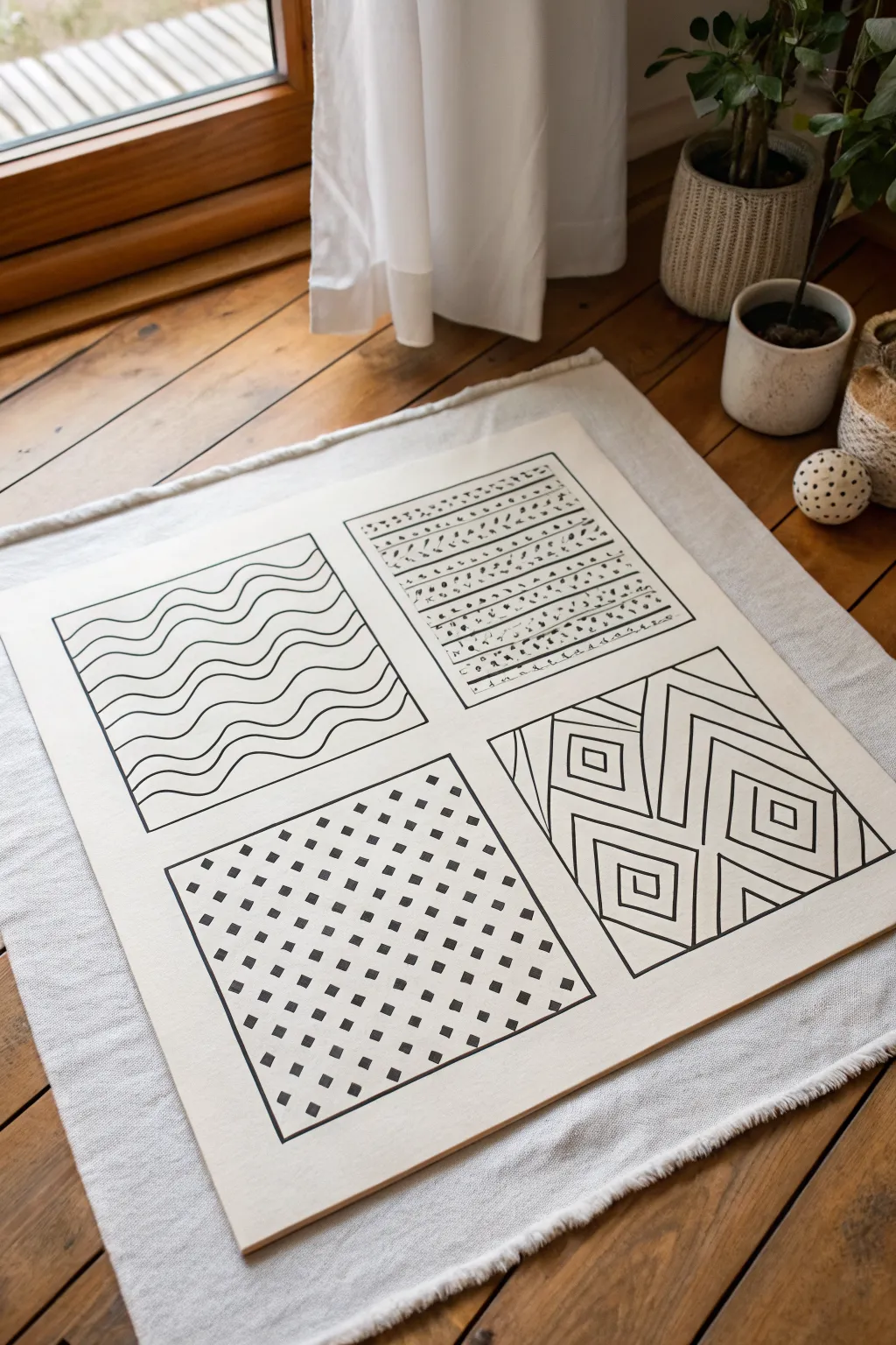
Create a calming, minimalist statement piece by combining four simple repeating patterns into a single cohesive grid. This project focuses on steady line work and contrast, resulting in a modern artwork that looks effortlessly chic on any floor or console.
How-To Guide
Materials
- Square primed canvas panel or sturdy art board (approx. 12×12 inches)
- Pencil and eraser
- Ruler or T-square
- Black paint marker (medium tip)
- Black paint marker (fine tip)
- Black fine liner pen (optional, for sketches)
- Tabletop easel or flat work surface
Step 1: Setting up the Grid
-
Measure the canvas spread:
Begin by finding the exact center point of your square canvas panel. Place your ruler horizontally and mark the halfway point. -
Draw the cross:
Rotate the ruler vertically and mark the halfway point again. Using your T-square or ruler, lightly draw one vertical line and one horizontal line connecting your marks, dividing the canvas into four equal quadrants. -
Create the frames:
To give the patterns breathing room, draw an inner square inside each quadrant. I suggest leaving about a 0.5-inch margin between this inner box and the main dividing lines you just drew.
Steady Hand Tip
Rest your pinky finger on a clean scrap of paper while drawing. This prevents smudging the canvas and acts as a stabilizer for straighter lines.
Step 2: Designing the Top Left: Waves
-
Sketch the wave guides:
In the top-left quadrant, lightly pencil in parallel horizontal lines evenly spaced from top to bottom. -
Draw the curves:
Using your medium-tip paint marker, trace over your guidelines with a fluid, sine-wave motion. Try to keep the peaks and valleys aligned vertically with the wave above it for a uniform look. -
Refine the lines:
If your marker coverage looks thin, wait for it to dry completely and go over the wavy lines a second time to ensure a solid, opaque black.
Step 3: Designing the Top Right: Texture
-
Create horizontal guides:
Move to the top-right quadrant. Similar to the first, draw light horizontal pencil rules, but space them slightly closer together. -
Add the dashed texture:
Switch to your fine-tip marker. Instead of solid lines, fill these rows with varied marks—short dashes, tiny dots, and small speckles. -
Vary the rhythm:
Alternate the density of your marks. Make one row heavy with dashes and the next lighter with dots to create visual interest and texture.
Make it a Set
Don’t stop at one panel—create a triptych by making two more canvases, swapping the positions of the four patterns for a mismatched gallery wall.
Step 4: Designing the Bottom Left: Grid Dots
-
Plot the grid:
For the bottom-left quadrant, use your ruler to create a light pencil grid of diagonal lines forming small diamonds or squares. -
Fill the squares:
Using the medium-tip marker, color in small squares at every intersection of your pencil grid. Ensure the edges of these little squares are crisp and sharp. -
Review the alignment:
Step back to check that your squares follow a diagonal trajectory. The beauty of this quadrant lies in the orderly repetition.
Step 5: Designing the Bottom Right: Optical Lines
-
Section the area:
In the final bottom-right quadrant, draw a few random angled lines with the pencil to break the space into irregular geometric shards. -
Create the chevrons:
Inside each ‘shard,’ pencil in nested chevrons or right angles that echo the shape of that specific section. -
Trace with confidence:
Go over these geometric pencil lines with the medium-tip marker. Keep your hand steady to maintain straight, structural lines. -
Enhance the centers:
In the very center of the nested shapes, you can fill in a small square or triangle with solid black to anchor the design.
Step 6: Final Assembly
-
Erase guidelines:
Once you are absolutely certain all marker ink is fully dry (give it at least 20 minutes), gently erase all visible pencil marks cleanly. -
Frame the quadrants:
Use the medium-tip marker to trace the outlining boxes of each quadrant one last time, ensuring the borders are bold and define each section clearly.
Now you have a striking piece of geometric art ready to bring a touch of structured elegance to your space
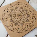
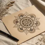
Mandala and Radial Line Templates
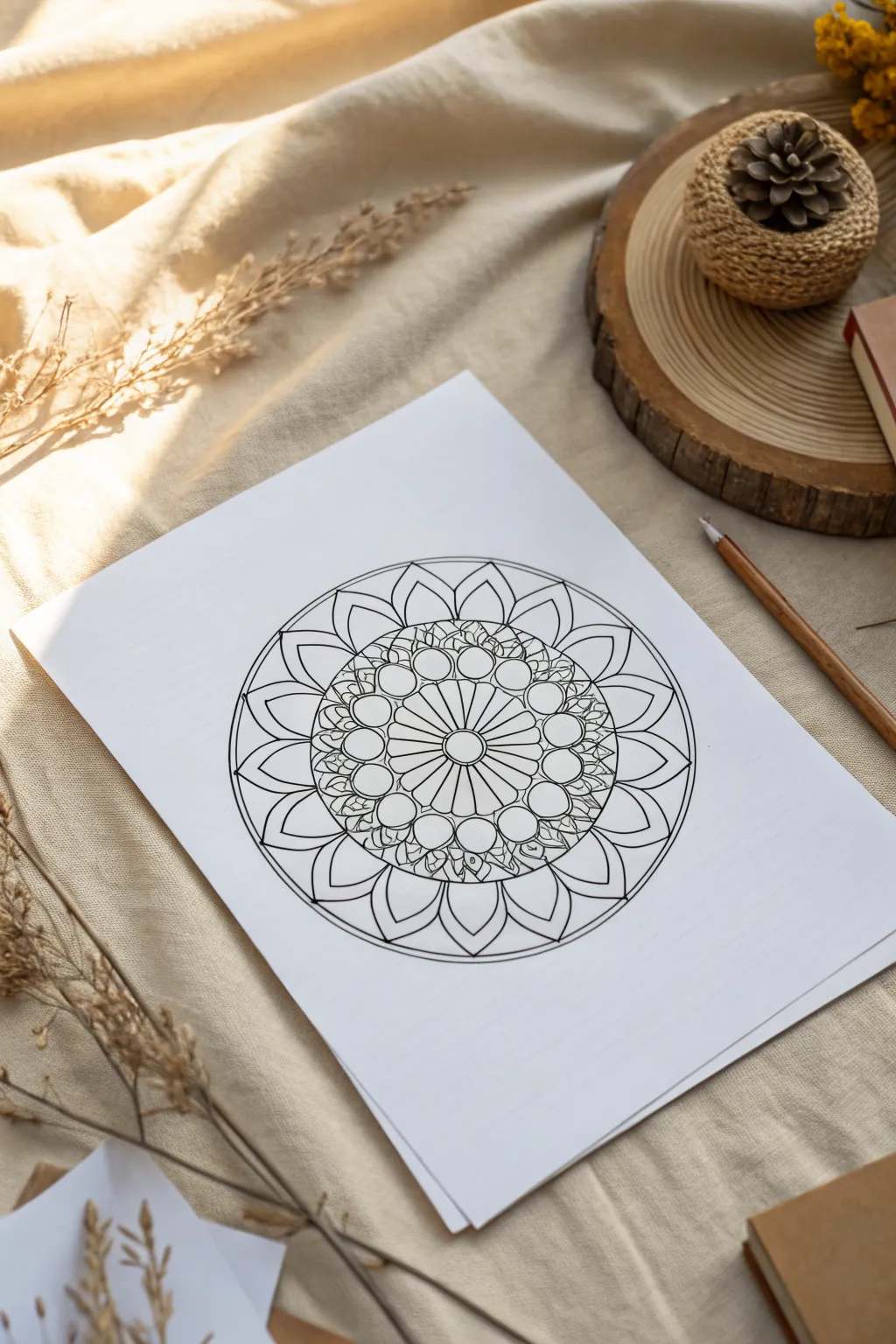
This serene mandala design balances a structured geometric core with softer, organic petal shapes radiating outward. It is a perfect beginner-friendly project that focuses on radial symmetry and clean linework, resulting in a calming piece of art ready for coloring or display.
Step-by-Step
Materials
- White drawing paper (smooth bristol or mixed media paper recommended)
- Compass like a Staedtler Mars or similar
- Protractor (360 degree preferred)
- Ruler
- HB pencil for sketching
- Fine liner pens (sizes 0.3mm and 0.5mm)
- White eraser
Step 1: Setting the Foundation
-
Find your center:
Locate the exact center of your paper and mark it lightly with a dot. This single point will be the anchor for the entire drawing. -
Establish the rings:
Using your compass, draw a series of five concentric circles lightly in pencil. Start with a very small center circle, then a second one about an inch wider, a third slightly beyond that, a fourth for the decorative band, and a large final circle to define the outer petals. -
Create the radial grid:
To ensure symmetry, lightly draw a vertical and horizontal line through the center point. Then, use your protractor to divide the circle further; aim for 16 equal sections for this specific design, drawing light ‘pizza slice’ lines extending to the edge.
Pro Tip: Rotation
Rotate your paper constantly as you draw. Pulling the pen toward your body usually produces smoother, steadier curves than pushing it away or drawing sideways.
Step 2: Drawing the Core
-
Ink the center eye:
Switch to your 0.5mm pen. Trace the innermost circle firmly, creating a bold center point for the mandala. -
Construct the sunburst:
In the ring immediately surrounding the center, draw straight lines radiating outward to match your grid lines. This creates the ‘spokes’ of the inner wheel. -
Scallop the edge:
Connect the outer tips of those spokes with small, curved arches. Each arch should peak at the guideline of the second circle, creating a scalloped flower edge.
Trouble: Uneven Petals?
If petals look lopsided, don’t restart. Simply thicken the outline on the narrower side to optically balance the shape. It adds character!
Step 3: Building the Middle Layer
-
Sketch the circle chain:
In the next band outward, lightly pencil a series of circles that sit side-by-side. Each circle should be centered on one of your radial grid lines. -
Refine the circles:
Once spacing looks even, ink these circles with the 0.3mm pen for a delicate touch. They should touch each other but not overlap. -
Add connecting details:
Between the tops of these circles, draw tiny inverted ‘V’ shapes or leaves that point outward, filling the negative space with texture. -
Detail the inner gaps:
Add small curved lines or triangles in the gaps beneath the circles, connecting them back to the central sunburst layer to make the design feel cohesive.
Step 4: Designing the Outer Petals
-
Outline the large petals:
Moving to the outermost ring, sketch large, pointed petal shapes. The tip of each petal should touch the largest pencil circle you drew in phase one. -
Check the spacing:
Ensure each petal is centered on a radial grid line. The base of the petals should emerge from behind the band of small circles. -
Ink the primary petals:
Trace over your pencil sketches with the 0.5mm pen. Use confident, single strokes for the curves to avoid scratchy lines. -
Add the secondary layer:
Draw a second, smaller pointed shape inside each large petal. This creates a double-outline effect and adds depth to the bloom. -
Draw the background petals:
Between the main large petals, draw the tips of ‘hidden’ petals poking out from behind. These should be strictly triangular shapes defined by the outer circle boundary.
Step 5: Final Touches
-
Strengthen the border:
Take your compass and trace a single, clean circle that cuts through the tips of the main petals and outlines the tops of the hidden petals. This encloses the mandala. -
Erase guidelines:
Wait at least 15 minutes for the ink to fully cure. Here I prefer to take a break and stretch. Then, gently erase all pencil guides, holding the paper taut so it doesn’t crinkle. -
Review line weight:
Look for any lines that seem too thin. Go back over the outermost border and the central eye with the thicker 0.5mm pen to increase contrast.
Now you have a crisp, symmetrical design ready to be digitized or filled with your favorite colors


Have a question or want to share your own experience? I'd love to hear from you in the comments below!