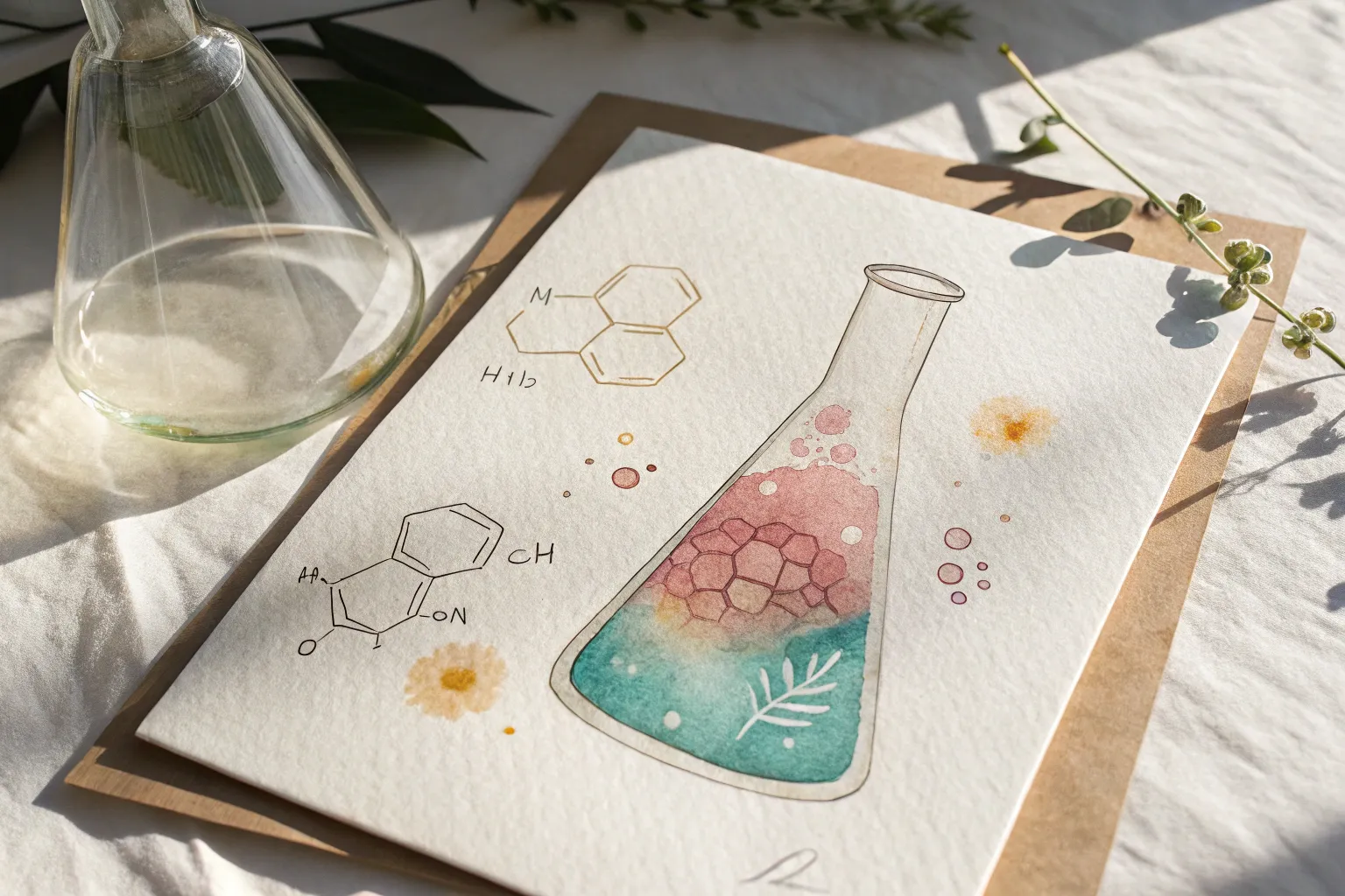
When I need a theme that practically paints itself, I reach for chemistry painting ideas—they’re equal parts colorful, graphic, and delightfully nerdy. Think glassware, molecules, and energetic “reactions” that let you play with splashes, gradients, and crisp linework all in one piece.
Bubbling Flask Reaction Burst
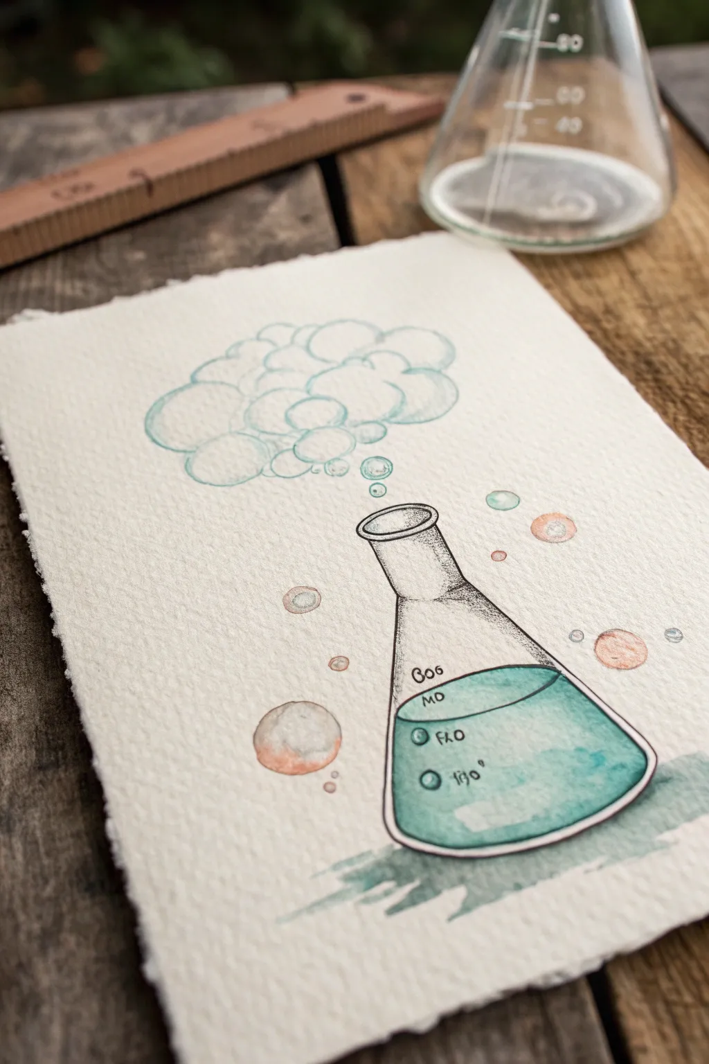
Capture the magic of science with this charming illustration featuring a bubbling Erlenmeyer flask. Combining precise ink lines with loose, expressive watercolor washes creates a delightful balance between technical drawing and artistic whimsy.
Step-by-Step
Materials
- Cold press watercolor paper (300gsm for texture)
- Pencil (HB or H)
- Waterproof fine liner pen (black, 0.3mm or 0.5mm)
- Watercolor paints (Teal/Turquoise, Burnt Sienna/Light Brown)
- Round watercolor brushes (size 4 and size 6)
- Jar of water
- Paper towels
- Ruler (optional)
- White gel pen (optional for highlights)
Step 1: Sketching the Structure
-
Outline the flask shape:
Begin by lightly sketching the central conical flask using your pencil. Start with a flat oval for the rim, draw a short neck down, and angle the sides outward to form the wide base. Curve the bottom line slightly to give the glass volume. -
Add liquid levels:
Draw a curved ellipse inside the flask, about one-third of the way up, to represent the surface of the liquid. This line should mimic the curve of the flask’s bottom foundation. -
Sketch the vapor cloud:
Above the flask’s mouth, sketch a cluster of overlapping circles to form a billowing cloud of vapor. Keep these shapes loose and vary the sizes, letting them float upward and outward. -
Draw scattered bubbles:
Add several individual circular bubbles floating around the flask and rising from the cloud. Place a few larger ones near the base and smaller ones trailing upward for a dynamic feel.
Pro Tip: Texture Talk
For that grainy, vintage look seen in the photo, use ‘Cold Press’ or rough watercolor paper. The texture catches the pigment and stippling much better than smooth paper.
Step 2: Inking the Design
-
Trace the main lines:
Using your waterproof fine liner, carefully trace over your pencil sketch of the flask. Create a double rim at the top to show the glass thickness. -
Ink the bubbles and cloud:
Trace the cloud shapes and floating bubbles. For the cloud, use broken or lighter lines in some areas to keep it looking airy rather than heavy. -
Add shading details:
Use stippling (tiny dots) specifically on the neck of the flask and the upper right side of the glass body to suggest shadow and curvature. This texture contrasts nicely with the upcoming smooth paint. -
Erase pencil marks:
Wait until the ink is completely dry to avoid smudging, then gently erase all visible pencil guidelines to leave a crisp black-and-white framework.
Troubleshooting: Bleeding Ink
If your black lines blur when you paint, your pen isn’t waterproof. Test your pen on a scrap piece of paper with water before starting the final piece.
Step 3: Adding Watercolor
-
Paint the liquid base:
Load a size 6 brush with a transparent teal or turquoise wash. Fill the liquid area inside the flask, keeping the color fairly even but slightly pooling at the bottom for depth. -
Create the glass shadow:
While the liquid paint is still wet, add a tiny drop of darker teal to the right side of the liquid to create a shadow gradients. Let this dry completely. -
Tint the vapor cloud:
Using a very diluted, watery wash of the same teal, paint the vapor cloud. Keep the edges soft and leave some white paper showing through the centers of the cloud bubbles for a highlighted effect. -
Color the floating bubbles:
Paint the scattered bubbles. Use the teal for some and a diluted burnt sienna or light brown for others to create contrast. Paint only the edges or one side of each bubble to make them look transparent. -
Ground the object:
Mix a small puddle of watery teal and grey. Paint a loose, jagged shadow directly underneath the flask to anchor it to the ‘table,’ letting the brush strokes be rough and expressive.
Step 4: Final Details
-
Add chemical symbols:
Once the paint is fully dry, use your fine liner to write small, stylized chemical formulas or numbers on the glass surface. Using faint, quirky lettering adds to the laboratory aesthetic. -
Intensify outlines:
Go back over the main flask outline with the pen if any lines were washed out, or thicken the line on the shadowed side (the right side) to give the object more weight. -
Create highlights:
If you feel the glass looks too flat, use a white gel pen to add a small reflection line on the shoulder of the flask or a tiny white dot on the liquid surface.
Now you have a bubbling piece of scientific art ready to frame or gift to your favorite chemist

Periodic Table Color Block Grid
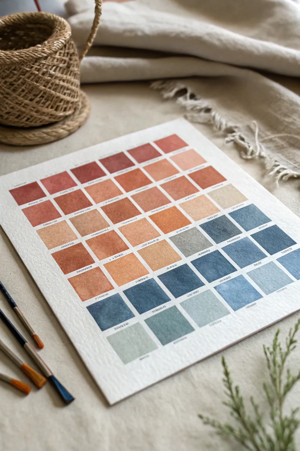
Transform the classic periodic table concept into a soothing gradient of earth tones and moody blues. This project focuses on the delicate interplay of watercolor swatches, creating a minimalist yet structured piece of wall art perfect for a study or studio.
Step-by-Step Tutorial
Materials
- Cold press watercolor paper (300 gsm or heavier)
- Watercolor paints (terracotta, burnt sienna, yellow ochre, indigo, payne’s grey, teal)
- Flat shader brush (size 6 or 8)
- Fine liner brush (size 0 or 00)
- Pencil (HB or H)
- Ruler or T-square
- Painter’s tape or masking tape (optional)
- Palette for mixing
- Jar of clean water
- Paper towels
Step 1: Grid Preparation
-
Tape your paper:
Begin by securing your watercolor paper to a flat surface using masking tape on all four sides. This prevents the paper from buckling when it gets wet and ensures you have a crisp, clean border around the entire artwork. -
Measure the margins:
Decide on the size of your grid. Measure equal margins from the top, bottom, and sides to center your workspace. Lightly mark the corners of your main working area with a pencil. -
Calculate square sizes:
Count how many squares you need (the image shows an 8×8 layout). Divide your working area width by the number of columns to adhere to a perfect square aspect ratio. Leave a small gap (about 2-3mm) between each square for breathing room. -
Draw the grid:
Using a ruler and a very light hand, draw your horizontal and vertical lines. I prefer to use an H pencil here so the lines are essentially invisible once the paint is applied. Press lightly to avoid indenting the paper. -
Double-check spacing:
Before picking up a brush, step back and verify that your grid looks even. If any line looks slanted, erase and correct it now, as you won’t be able to fix it after painting.
Step 2: Mixing and Painting
-
Prepare your palette:
Squeeze out your key colors. You want two main gradients: a warm spectrum (reds/browns/tans) and a cool spectrum (greys/blues/teals). Create several pools of diluted paint on your palette before starting. -
Start with the darkest warms:
Begin at the top left with your most saturated terracotta or burnt sienna. Load your flat brush and carefully fill the first square, using the flat edge to get crisp corners. -
Transition to lighter warms:
As you move across the row or down the column, add more water or mix in a touch of yellow ochre or unbleached titanium to lighten the value. The goal is a smooth, gradual fade from deep earth tones to pale sandy beiges. -
Paint the cool tones:
Moving to the lower half of the grid (or the right side, depending on your layout preference), start introducing your cool tones. Begin with the lightest grey-blues, mixing a tiny dot of Payne’s grey with plenty of water. -
Deepen the blues:
Progressively add more pigment—indigo and deep teal—as you move to the final squares. These should be rich and opaque compared to the translucent middle squares. -
Manage the edges:
If painting adjacent squares while the neighbors are still wet, be extremely careful not to let them touch, or the colors will bleed. It’s often safer to paint in a checkerboard pattern—painting every other square—and letting them dry before filling the gaps. -
Let it dry completely:
Once all squares are filled, step away. Allow the paper to dry completely flat. The colors will look slightly lighter once dry.
Wet-on-Dry Precision
Use the ‘wet-on-dry’ technique for sharp edges. Apply wet paint onto dry paper, letting you control the square shape perfectly without bleeding.
Step 3: Detailing
-
Plan the text:
The image features tiny text below each block, mimicking chemical element names. lightly rule a guideline about 2mm below each painted square to keep your writing straight. -
Lettering:
Using a very fine liner brush and highly pigmented black or sepia paint (or a waterproof fine-tip ink pen), carefully write the ‘element’ names or color codes. Keep the lettering small and uniform. -
Add ‘atomic numbers’:
For extra detail, you can add a tiny number in the top corner of each colored square, just like a real periodic table. This requires a very steady hand and a size 000 brush. -
Erase guidelines:
Wait until you are 100% certain the ink or paint lettering is bone dry. Then, gently erase any visible pencil guidelines with a kneaded eraser to avoid damaging the paper surface. -
Reveal:
Slowly peel off the masking tape from the edges of your paper. Pull the tape away at a 45-degree angle to ensure a clean, sharp border.
Scientific Customization
Instead of random colors, arrange the grid to represent emotional ‘elements’ (like Joy, Calm, Focus) assigning a specific color theory to each feeling.
Hang your finished color study in good lighting to let the subtle gradients truly shine

Hexagon Structure Pattern Backdrop
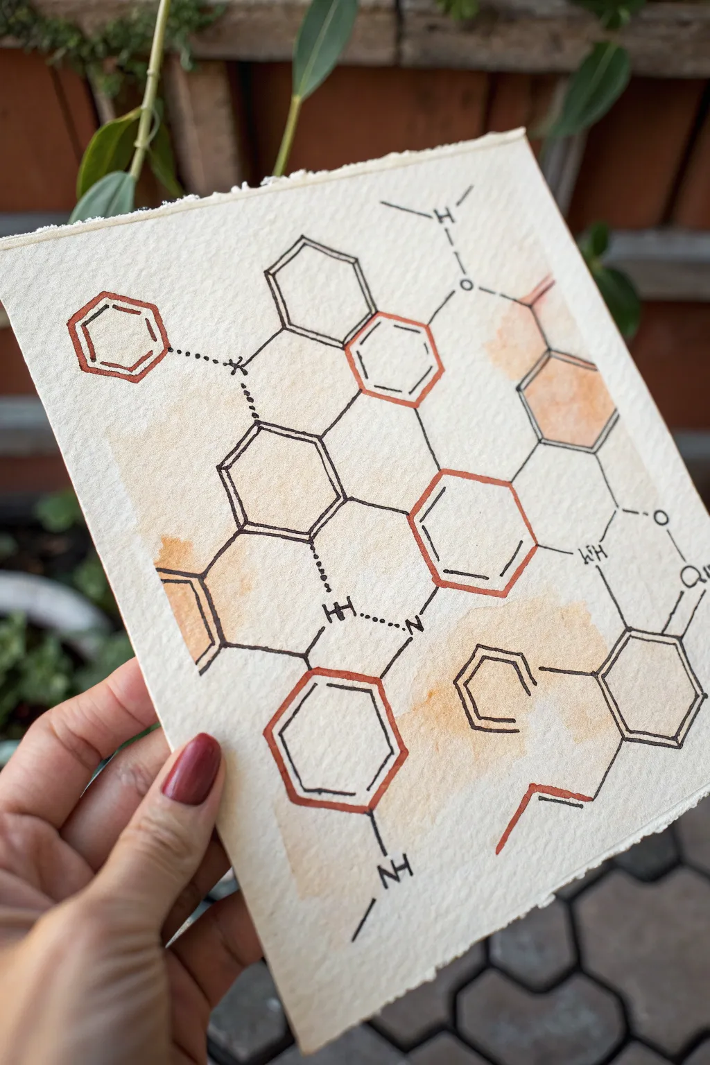
This elegant science-inspired art piece combines precise chemical line work with soft, organic watercolor washes. The contrast between the rigid hexagonal structures and the fluid, coffee-toned splashes creates a sophisticated academic aesthetic perfect for a study or lab.
Step-by-Step Guide
Materials
- Cold press watercolor paper (300 gsm)
- Pencil (HB or 2H)
- Ruler
- Protractor or hexagon stencil (optional)
- Fine liner pens (Black, 0.3mm and 0.5mm)
- Fine liner or gel pen (Burnt Sienna/Rust color)
- Watercolor paints (Burnt Sienna, Yellow Ochre)
- Round watercolor brush (size 6 or 8)
- Paper towels
- Clean water
Step 1: Drafting the Molecular Structure
-
Plan the layout:
Begin by lightly marking the center of your paper. Decide on the scale of your hexagons; for this piece, 1-inch sides work well. Lightly sketch a grid or use a ruler to ensure your spacing is even. -
Sketch the primary hexagons:
Using a pencil, draw the main hexagonal rings. They don’t need to be perfectly contiguous like honeycomb; space them out slightly to allow for connecting bonds. A stencil is helpful here if you want perfect geometric accuracy. -
Add connecting structures:
Draw single lines connecting the corners of different hexagons. Sketch in the double-bond lines inside specific rings (a smaller hexagon shape or parallel lines inside the main shape). -
Pencil in atoms and bonds:
Add the chemical symbols where the structures break, such as ‘NH’, ‘O’, or simple vertices. Sketch dotted lines for hydrogen bonds and jagged lines for chemical side chains.
Smudge Prevention
Place a scrap piece of clean paper under your drawing hand while inking. This protects the watercolor wash from oils on your hand and prevents you from smearing wet ink.
Step 2: Applying the Watercolor Wash
-
Mix your colors:
Create a watery mix of Yellow Ochre with a tiny touch of Burnt Sienna. You want a very dilute, tea-stain color, not a heavy opaque paint. -
Wet the paper strategically:
Take your clean brush with just water and wet irregular patches of the paper where the molecules are clustered. Don’t wet the entire page; keep the edges dry. -
Drop in color:
While the paper is damp, gently touch your loaded brush to the wet areas. Let the pigment bloom naturally. I like to tilt the paper slightly to let the color pool in random areas for texture. -
Create hard edges:
While the first wash is still drying, add a slightly more saturated drop of Burnt Sienna to the edge of a wet pool. This mimics the look of a coffee stain ring. -
Let it dry completely:
This is crucial. The paper must be bone dry before you start inking, otherwise, your fine lines will bleed into the damp paper fibers.
Step 3: Inking the Structure
-
Outline the focal rings:
Select 3-4 specific hexagonal rings to highlight. Use your rust-colored pen to trace over these pencil sketches. Go over the lines twice if the pen is thin to give them visual weight. -
Ink the black skeleton:
Switch to your 0.5mm black fine liner. Carefully trace all the remaining solid hexagonal rings and straight connecting bonds. Keep a steady hand, but don’t worry about machine-perfection; slight wobbles add hand-drawn charm. -
Detail the double bonds:
Ink the inner double-bond lines. Ensure these lines are parallel to the outer ring lines. -
Add text elements:
Use the finer 0.3mm pen for lettering (like ‘NH’ or ‘O’). Keep your lettering upright and consistent in size. -
Draw dashed bonds:
Ink the dotted or dashed lines connecting specific molecules. Keep the dashes short and evenly spaced. -
Enhance line weight:
Go back over intersections where bonds meet rings. Slightly thicken these junctions with the black pen to make the structure look robust and three-dimensional. -
Erase pencil marks:
Once you are absolutely certain the ink is dry (give it an extra 5 minutes), gently erase the underlying pencil grid and sketch lines.
Vintage Lab Look
For an antique textbook feel, stain the paper with actual strong brewed tea before starting, or spatter tiny droplets of brown ink with a toothbrush at the very end.
Now you have a sophisticated piece of scientific art ready to be framed
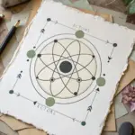
Atomic Orbit Diagram in Bold Colors
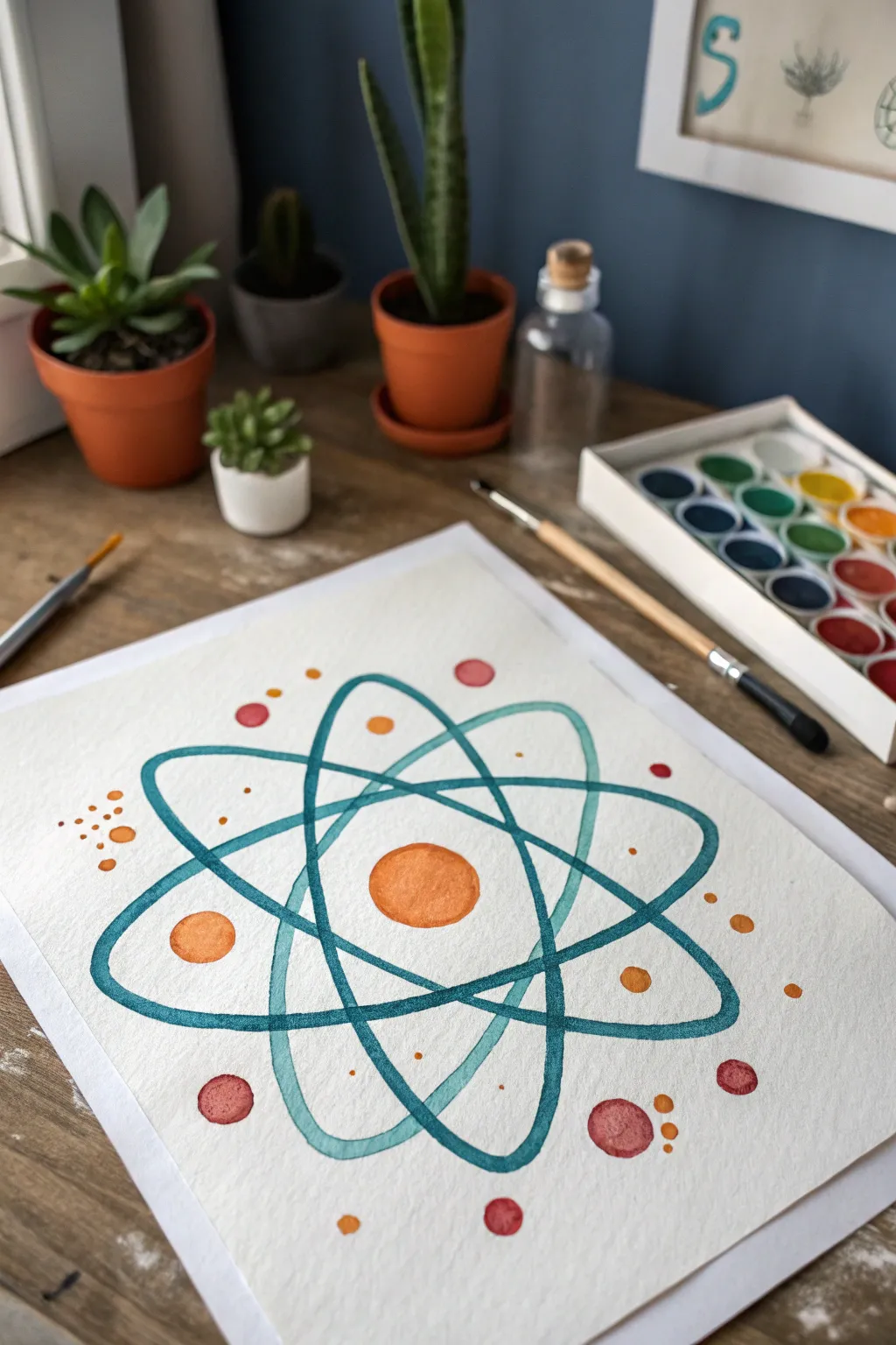
This project transforms scientific symbolism into a vibrant piece of art, featuring stylized electron orbits in teal against a textured paper surface. Using warm accents of orange and red, the design creates a lively contrast that makes chemistry look surprisingly artistic.
Step-by-Step
Materials
- Cold press watercolor paper (300 gsm)
- Pencil (HB or lighter)
- Compass or circular objects for tracing
- Watercolor paints (Teal/Turquoise, Orange, Red)
- Round watercolor brushes (size 4 and 8)
- Mixing palette
- Cup of water
- Paper towels
- Masking tape (optional)
Step 1: Preparation and Sketching
-
Secure the paper:
Begin by taping down the edges of your watercolor paper to a flat surface. This prevents buckling when the paper gets wet, which is especially important for the crisp lines we’ll be painting. -
Establish the center:
Lightly mark the exact center of your paper with a pencil. Using a compass or a small round object (like a coin), trace a perfect circle in the middle to represent the nucleus. -
Draft the first orbit:
Draw a large, elongated oval that passes behind the nucleus. Angle it diagonally from bottom-left to top-right. Keep your pencil pressure very light so the graphite doesn’t show through the paint later. -
Add the crossing orbits:
Sketch two more elongated ovals intersecting the first one. One should angle from top-left to bottom-right, and the third should be relatively horizontal. Aim for symmetry, ensuring they all cross near the central nucleus. -
Plan the electrons:
Lightly sketch small circles scattered along the orbit paths and in the surrounding negative space. Vary their sizes slightly to create visual interest and a sense of movement.
Step 2: Painting the Structure
-
Mix the teal shade:
On your palette, mix a vibrant teal color. I find adding a tiny touch of blue to a standard turquoise gives it the deep, cool tone seen in the reference. -
Paint the first orbit loop:
Using a size 4 round brush, carefully paint along the pencil line of your first oval. Keep the brush well-loaded with paint to ensure a continuous, smooth line without dry streaks. -
Complete the orbit paths:
Continue painting the remaining two ovals with the same teal mixture. Where the lines overlap, you can let the colors bleed slightly if wet, or wait for one to dry for a cleaner intersection. -
Create overlapping depth:
To make the atom look three-dimensional, slightly darken the teal paint where the lines pass ‘behind’ other lines or the nucleus, adding a subtle shadow effect. -
Paint the nucleus:
Switch to a bright orange mix. Fill in the central circle, working quickly to keep the edge wet so the color stays even. Leave a tiny sliver of white paper unpainted if you want a highlight.
Clean Lines Tip
To get steady elliptical curves, rotate the paper as you paint the curves rather than contorting your wrist. It keeps your hand in a natural position.
Step 3: Adding Details and Accents
-
Add large accent spheres:
Select a few of the larger sketched circles around the orbits. Paint these with the same orange used for the nucleus, or switch to a reddish-pink tone for variety. -
Incorporate smaller dots:
Using the tip of your smallest brush, dot in the tiny electrons. Use a mix of pure orange, red, and perhaps a muted yellow-orange. Group some together in clusters of three for a dynamic look. -
Layer transparency similar to the reference:
Notice how the teal lines look transparent in the artwork? If you want this effect, water down your paint slightly so the paper texture shows through, rather than applying opaque gouache-like layers. -
Review and refine edges:
Once the main paint is dry to the touch, use a slightly damp, clean brush to smooth out any edges that look too jagged or uneven. -
Add varying opacity:
Go back over some of the smaller red or orange dots with a second coat of paint. This makes some dots appear darker and closer, while the single-coat dots look further away. -
Final drying time:
Let the entire piece dry completely before erasing any visible pencil marks. Watercolor paper is fragile when wet, and erasing too soon will tear the surface.
Level Up: Metallic Pop
Once dry, outline the central nucleus or specific electrons with a gold or silver gel pen to mimic energy and make the science theme sparkle.
Now you have a striking, science-inspired piece that balances technical structure with fluid artistic expression.
BRUSH GUIDE
The Right Brush for Every Stroke
From clean lines to bold texture — master brush choice, stroke control, and essential techniques.
Explore the Full Guide
pH Scale Ombre Strip Painting
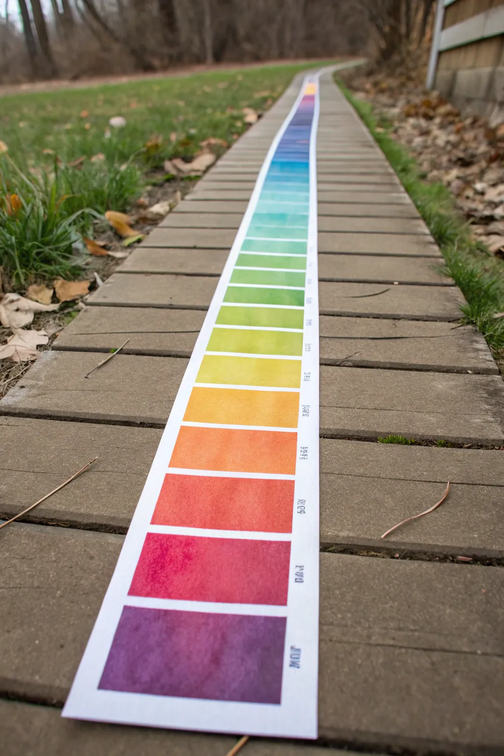
Visualize the full spectrum of acidity to alkalinity with this strikingly long, continuous gradient strip painting. This project combines scientific concepts with artistic color blending, creating a beautiful scroll-like reference tool that is perfect for classroom displays or outdoor photography.
Step-by-Step Tutorial
Materials
- Roll of heavy watercolor paper (at least 140lb/300gsm cold press)
- Watercolor paints (tube or pan set)
- Painter’s tape or low-tack masking tape
- Large flat wash brush (1 inch or wider)
- Medium round brush (size 6 or 8)
- Pencil and long ruler
- Jar of clean water
- Mixing palette
- Waterproof black ink pen or fine liner
Step 1: Preparation and Grid Layout
-
Measure the Paper Strip:
Begin by unrolling your watercolor paper. You will need a significant length to achieve the visual impact shown in the photo, somewhere between 6 to 10 feet long depending on how many distinct pH values you want to represent. Cut the strip to a width of about 6 inches. -
Flatten the Scroll:
Since rolled paper often curls, lay your strip out on a long table or clean floor. Weigh down both ends with books or heavy objects. If it’s very stubborn, you can lightly mist the back with water and let it dry flat under weight. -
Mark the Margins:
Using a ruler and a light pencil touch, draw a straight line running down the length of the paper, about 1 inch from the right edge. This margin will be reserved for writing labels later. -
Create the Swatch Dividers:
Divide the remaining width into equal rectangular sections. Use your ruler to mark horizontal lines every 3 to 4 inches down the entire length of the strip. These boxes will hold your individual color swatches. -
Tape the Borders:
Apply painter’s tape along your long vertical margin line and along the horizontal divider lines. This masking technique ensures crisp, clean white space between your painted blocks, which is crucial for the professional scientific chart look.
Step 2: Painting the Spectrum
-
Mix the Starting Colors:
Prepare your palette with the primary colors of the pH scale. You’ll need a deep violet for the alkaline end (pH 14) and a deep red for the acidic end (pH 1). I prefer to pre-mix puddles of the transition colors (indigo, blue, green, yellow, orange) so I don’t have to stop mid-painting. -
Begin with Deep Violet:
Start at the very bottom of your scroll (or the top, depending on your preference). Load your flat wash brush with the deep violet and fill the first rectangular block completely. Use smooth, horizontal strokes for even coverage. -
Transition to Indigo and Blue:
Move to the next blocks, painting them indigo and then blue. For a ‘gradient’ effect within the discrete blocks, you can add a tiny drop of the next color into your current mix for the block in between main hues. -
Painting the Greens:
As you reach the neutral and slightly alkaline section, switch to your greens. Paint several blocks in varying shades of teal, emerald, and lime green to show the gradual shift found in universal indicator tests. -
The Acidic End:
Continue painting up the strip, moving through yellow, orange, and finally red. Ensure your brush is thoroughly cleaned between major color shifts to avoid muddying the bright yellows. -
Create Texture:
While the paint is still wet in each block, you can drop in a little clear water or a slightly more saturated pigment to create the blooming, organic watercolor texture seen in the reference image. -
Let it Dry completely:
Allow the paper to dry fully. This is critical; if the paper is damp, the tape will tear the surface when removed. Wait at least an hour or use a hairdryer on a low setting.
Bleeding Lines?
If paint bled under the tape, use a white gel pen or a small amount of white gouache to tidy up the edges. For future strips, burnish the tape edge firmly with a bone folder or fingernail before painting.
Step 3: Finishing Touches
-
Reveal the Grid:
Carefully peel away the painter’s tape. Pull the tape away from the painted area at a 45-degree angle to keep lines sharp and prevent ripping. -
Label the pH Values:
In the white margin you reserved on the right side, write the corresponding pH value or chemical name. Use a waterproof black pen. You can write simple numbers (1-14) or stylized text as shown in the inspiration photo. -
Final Flattening:
If the water caused the paper to buckle slightly, place the dry painted strip under heavy books overnight to ensure it lays perfectly flat for display.
Make it Interactive
Instead of pre-mixing colors, use actual red cabbage juice and household substances (lemon, baking soda) to paint the paper, letting real chemical reactions create the colors naturally.
Now you have a stunning, scientifically accurate art piece ready to be unrolled and admired
Bunsen Burner Flame Color Study
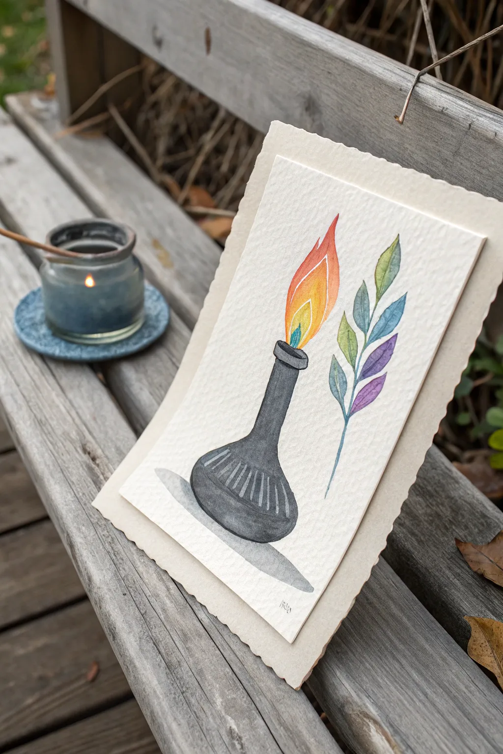
This whimsical watercolor study pairs the structured form of laboratory glassware with the organic flow of botanical art. Using graduated washes, you’ll capture the vibrancy of a flame alongside a delicate, spectrum-colored leaf sprig.
Step-by-Step
Materials
- Cold press watercolor paper (300 gsm)
- Round watercolor brushes (sizes 2, 4, and 6)
- Watercolor paints (Black, Payne’s Grey, Yellow, Orange, Red, Green, Blue, Purple)
- Pencil (HB or H)
- Kneaded eraser
- Clean water cups (2)
- Paper towels
- Scalloped edge cardstock (for mounting)
- Double-sided tape or glue stick
Step 1: Sketching Boundaries
-
Outline the flask:
Begin by lightly sketching the central flask shape. Draw a rounded bottom that tapers gently up into a narrow neck. Add a small, rectangular rim at the very top where the flame will emerge. -
Add detail lines:
Inside the rounded belly of the flask, lightly draw curved vertical lines that follow the contour of the glass. These will act as guides for the highlights later. -
Shape the flame:
Sketch a large, tear-drop shaped flame emerging from the neck. Inside this main shape, draw two smaller internal flame shapes to denote the different heat zones. -
Draw the botanical:
To the right of the flame, sketch a simple curved stem. Add paired leaves branching off upwards, creating a symmetrical fern-like structure.
Step 2: Painting the Glassware
-
Base wash for the flask:
Mix a diluted wash of Black or Payne’s Grey. Using your size 6 brush, fill in the flask shape, but be careful to leave the curved detail lines unpainted (white) to represent reflection. -
Deepening the glass:
While the first layer is still slightly damp, drop in more concentrated black paint on the shadowed side (usually the left or right edge) to give the flask volume and roundness. -
Refining the neck:
Switch to a size 4 brush to carefully paint the neck and rim, ensuring the edges are crisp. Darken the rim slightly more to show thickness. -
Adding the shadow:
Mix a very watery grey wash. Paint a cast shadow underneath the flask, extending slightly to the side to ground the object.
Bleeding Colors?
If your flame colors are running into each other unexpectedly, ensure the adjacent section is completely dry before painting the next one.
Step 3: Igniting the Flame
-
Inner flame:
Starting with the smallest, innermost flame shape, paint it a bright, clean lemon yellow. Let this dry completely before touching adjacent sections. -
Middle flame:
Paint the middle flame section with a warm orange. I like to let this color bleed ever so slightly into the yellow if the paper allows, but keeping them distinct works well for this graphic style. -
Outer flame tip:
Complete the flame by painting the outermost tip and edges in a vibrant red or red-orange, creating a gradient effect from hot to cool.
Level Up
Use metallic gold watercolor for the innermost flame or the highlights on the flask to make the illustration shimmer in the light.
Step 4: Creating the Rainbow Sprig
-
Painting the stem:
Using a size 2 brush and a cool blue or green, paint the thin central stem line with a steady hand. -
Top leaves:
Start at the top of the sprig with yellow-green. Paint the first pair of leaves. -
Gradient transition:
For the next pair down, mix a slightly cooler green. As you move down the stem, shift your color mix progressively: from green to teal, then to blue. -
Bottom leaves:
Finish the bottom-most leaves with purple and violet tones. This creates a full spectrum cascade down the branch.
Step 5: Finishing Touches
-
Final assessment:
Once everything is bone dry, gently erase any visible pencil marks with the kneaded eraser. -
Mounting the art:
Center your finished watercolor paper onto the scalloped edge cardstock. Secure it with double-sided tape or a smooth layer of glue stick for a polished presentation.
Now you have a striking piece of science-inspired art ready to display or gift

PENCIL GUIDE
Understanding Pencil Grades from H to B
From first sketch to finished drawing — learn pencil grades, line control, and shading techniques.
Explore the Full Guide
Chemistry Pun Typography Canvas
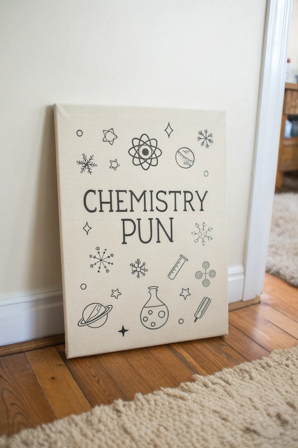
Embrace the wit of science with this clean, minimalist typography art project that combines a playful phrase with classic chemistry iconography. The result is a crisp, modern canvas with sleek black lines against a natural background, perfect for a classroom, office, or dorm room.
Detailed Instructions
Materials
- Stretched canvas (unprimed or linen-look preferred)
- Black acrylic paint (heavy body is best)
- Black paint marker (fine tip)
- Black paint marker (medium tip)
- Graphite transfer paper
- Pencil
- Ruler
- Painter’s tape
- Printed template of text and icons
- Small round detail brush (size 0 or 1)
- Matte varnish (optional)
Step 1: Preparation & Layout
-
Design your template:
Create your layout digitally or by hand first. Type the phrase ‘CHEMISTRY PUN’ in a strong serif font like Garamond or Times New Roman. Surround the text with simple line-art science doodles: an atom, a bubbling Erlenmeyer flask, a planet, test tubes, molecule structures, and stars. -
Scale and print:
Scale your design to fit your canvas dimensions exactly. If you don’t have a large format printer, you can print the design across multiple standard sheets of paper and tape them together like a puzzle. -
Prep the canvas surface:
If you are using a standard white primed canvas but want that natural beige look shown in the image, mix a wash of titanium white and raw sienna acrylic paint. Brush this over the entire canvas and let it dry completely. -
Position the transfer paper:
Lay sheet of graphite transfer paper (dark side down) onto the center of your dry canvas. I like to tape the corners down lightly with painter’s tape so it doesn’t shift while I work. -
Secure the template:
Place your printed design directly on top of the transfer paper. Use your ruler to ensure the text is perfectly centered and leveled horizontally, then tape the paper firmly to the canvas edges.
Bleeding Lines?
If paint bleeds into the canvas weave, sharpen the edge by painting over the mistake with your background color (beige/white) using a tiny detail brush.
Step 2: Tracing the Design
-
Trace the typography:
Using a sharp pencil or a ballpoint pen, trace the outline of every letter. Apply firm pressure to ensure the graphite transfers clearly to the textured canvas below. -
Trace the icons:
Move on to the science icons. Outline the atoms, flasks, and stars. For thinner decorative elements, a single line tracing is sufficient, but for thicker lines, outline the shape you intent to fill. -
Check your progress:
Lift one corner of the papers carefully to check that the transfer is visible. If the lines are too faint, press harder. Once verified, remove the tape and papers completely.
Pro Tip
For perfectly round circles (like the planets or bubbles), trace a coin or jar lid directly onto the canvas with your paint marker instead of freehanding.
Step 3: Inking and Painting
-
Outline the text:
Using your fine-tip black paint marker, carefully go over the transferred outlines of the letters. The marker gives you better control than a brush for these crisp exterior edges. -
Fill the lettering:
Switch to a small round brush or a medium-tip paint marker to fill in the body of the letters with solid black acrylic. Work slowly to keep the edges sharp. -
Paint the main icons:
Tackle the larger icons like the central atom and the flask next. Use the fine-tip marker for the circular lines and ellipses, encouraging a steady hand by resting your pinky on a dry part of the canvas. -
Add the fluid details:
Draw the bubbles inside the flask and the liquid lines. These organic shapes contrast nicely with the rigid text, so keep your lines smooth and fluid. -
Execute the fine details:
Use your finest marker tip to draw the snowflakes, molecular bonds, and small stars. These delicate lines should be applied with a very light touch to prevent the ink from bleeding into the canvas weave. -
Clean up edges:
Inspect the canvas for any graphite marks that are still visible. You can carefully erase these with a white eraser once the paint is 100% dry, usually after about an hour. -
Seal the work:
To protect your black lines from scratching or fading, apply a thin coat of spray matte varnish over the entire piece. Do this in a well-ventilated area.
Hang your clever masterpiece on the wall and enjoy the reaction it gets from every science lover who walks by
Crystallization-Inspired Abstract Textures
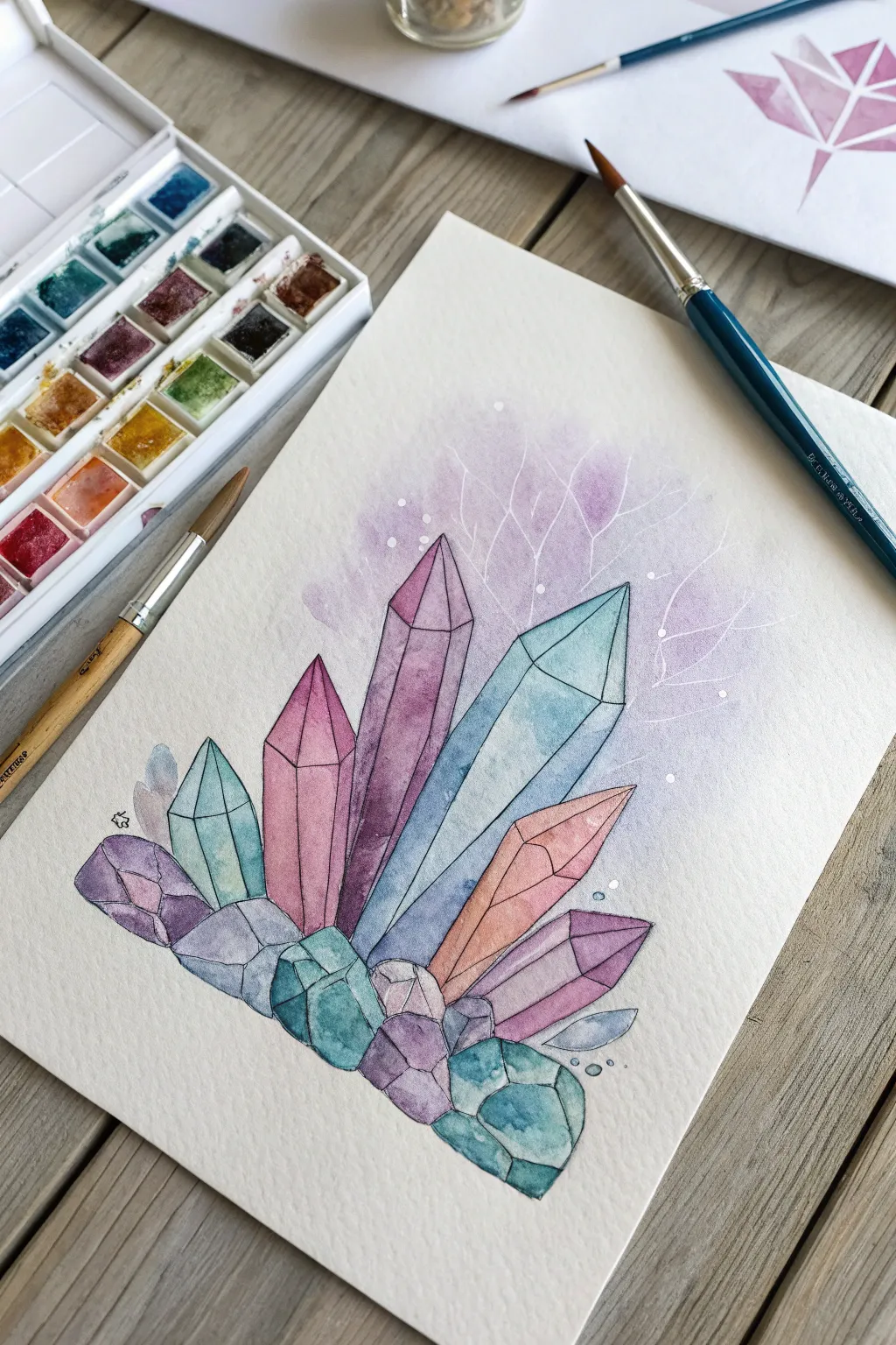
Capture the geometric beauty of geological formations with this watercolor crystal cluster study. Focusing on transparency and light refraction, this project creates a striking contrast between sharp, faceted edges and a soft, ethereal background.
Step-by-Step Tutorial
Materials
- Cold press watercolor paper (300 gsm)
- Watercolor paint set (pan or tube)
- Round brushes (sizes 2, 6, and 8)
- Pencil and eraser
- Waterproof fine-line pen (black or dark grey)
- White gel pen or white gouache
- Masking fluid (optional, but helpful)
- Two jars of water
Step 1: Drafting the Structure
-
Lightly sketch the outlines:
Begin by drawing the central cluster of crystals using a hard pencil. Focus on varying the heights and widths, creating distinct hexagonal pillars and jagged shorter rocks at the base. Keep your lines incredibly faint so they disappear under the paint later. -
Define the facets:
Within each crystal shape, draw internal lines to represent the facets. Think about where the light hits; usually, a simple vertical line meeting a triangulated tip creates a convincing 3D prism effect. -
Plan your palette:
Select a harmonious color scheme. This piece relies on a triad of teals, purples/magentas, and a touch of warm orange-pink. Pre-mix small puddles of these colors on your palette, ensuring you have enough water to create diluted, transparent washes.
Pro Tip: Hard Edges
To get perfectly straight lines on your crystal facets, you can use strips of washi tape to mask off areas. Just ensure the paper is 100% dry before applying tape so it doesn’t rip.
Step 2: Washing the Crystals
-
Paint the first layer:
choose one facet on a large crystal and fill it with a light wash of teal or purple. I like to work non-adjacently here—painting sections that don’t touch each other—to prevent wet colors from bleeding into one another uncontrollably. -
Add gradients while wet:
While a facet is still damp, drop a slightly more saturated version of the same color into the bottom corner. Let it bloom upward naturally to create a gradient that implies depth and density within the stone. -
Introduce contrast:
Once the first set of facets is dry, move to the adjacent shapes. Use a slightly different hue or value (darker or lighter) to distinguish the planes. For example, painting a pale pink facet next to a deep magenta one helps ‘turn’ the form. -
Layer the base rocks:
For the jumble of rocks at the bottom, use smaller, slightly darker strokes. Mix your purples and teals to get slightly muddier, rock-like tones, suggesting these are denser and less transparent than the tall spires. -
Build saturation:
Assess the overall cluster. If some crystals look too flat, add a second glaze of color over specific facets to darken them, reinforcing the geometric structure.
Step 3: The Ethereal Background
-
Wet the background area:
Using a clean, larger brush (size 8), paint clean water onto the paper behind the top of the crystals. Be careful not to touch the dry crystal paintings, leaving a tiny hairline gap if necessary. -
Drop in soft color:
Load your brush with a very watery purple mix. Gently touch it to the wet paper and let it diffuse outward. The goal is an airy, cloud-like aura that fades into the white of the paper. -
Create blooms:
While the background wash is semi-dry, you can splatter a few tiny drops of clean water or darker paint into it. This creates ‘cauliflower’ blooms that mimic organic mineral textures or chemical reactions. -
Dry thoroughly:
Let this background layer dry completely. It must be bone-dry before the next step to keep your fine lines crisp.
Level Up: Metallic Touch
Swap the white gel pen highlights for metallic gold or silver watercolor paint. This adds a geode-like luxury to the cracks and faceted edges.
Step 4: Details and Linework
-
Outline the geometry:
Using a very fine black waterproof pen or a tiny rigger brush with black paint, carefully trace over your initial pencil lines. Go slowly to maintain straight, structural edges. -
Add white veins:
Switch to a white gel pen or fine brush with white gouache. Draw delicate, branching networks in the purple background mist. These look like dendrites or frost patterns, reinforcing the chemistry theme. -
Highlight the edges:
Add white highlights along the sharpest edges of the crystals and a few dots on the facets to suggest sparkling light reflection. -
Add final speckles:
Finish by dotting small white circles or ‘bubbles’ floating up from the base and around the background veins to add a magical, effervescent quality.
Step back and admire your colorful mineral formation, perfectly crystallized on paper


Chemistry Apparatus Blueprint Sketch
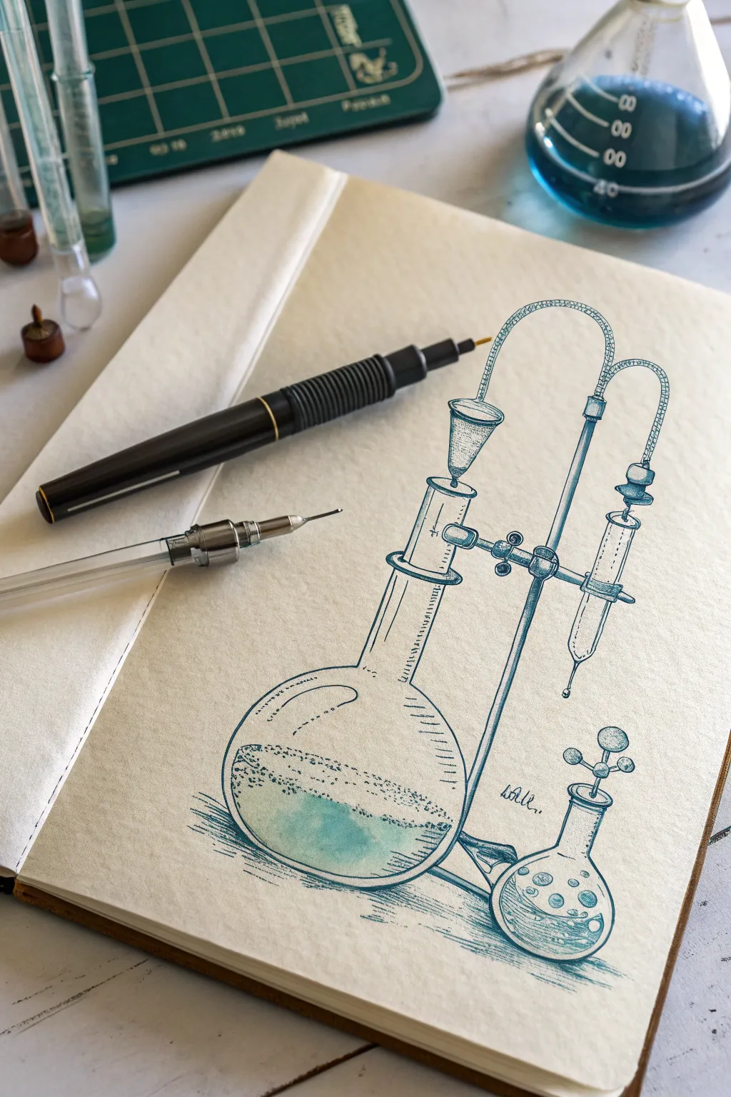
Capture the elegance of scientific discovery with this detailed pen-and-ink illustration of laboratory glassware. The drawing combines precise technical lines with soft shading techniques to create a classic, blueprint-style aesthetic on cream-colored paper.
Step-by-Step
Materials
- Smooth cream or ivory sketchbook paper (heavyweight, 140gsm+)
- HB Graphite pencil (for under-drawing)
- Fine liner pens (sizes 0.1mm, 0.3mm, and 0.5mm) in dark teal or navy blue
- Kneaded eraser
- Ruler (optional but helpful for the stand)
- White gel pen (optional for highlights)
- Watercolor brush (optional for subtle wash)
Step 1: Structural Layout
-
Establish the central axis:
Start by lightly sketching a vertical line near the center-right of your page using your HB pencil. This will serve as the main support rod for the apparatus stand. -
Outline the main flask:
To the left of the vertical rod, sketch a large circle for the body of the round-bottom flask. Add a straight, vertical cylinder extending upward from the circle to create the flask’s neck. -
Add the clamping mechanism:
Sketch the horizontal clamp arm connecting the flask neck to the main support rod. Use simple geometric shapes—small rectangles and circles—to represent the screws and joints where the clamp tightens. -
Sketch the secondary components:
Draw the funnel shape resting inside the top of the flask neck. Then, add the curved tubing extending from the top of the funnel, arching over to the right side. -
Draft the smaller flask:
In the bottom right corner, sketch a smaller, pear-shaped flask. Add a small stopper and a playful, molecule-like structure rising from it to balance the composition.
Glass Effect Tip
Don’t connect every line on the glass rims. Leaving small gaps in your ellipses makes the glassware feel transparent and reflective rather than solid.
Step 2: Inking the Outlines
-
Select your ink:
Choose a dark teal or navy blue fine liner (0.5mm). This color choice gives the drawing that distinctive ‘blueprint’ feel compared to standard black ink. -
Define the glassware edges:
Carefully trace over your pencil lines for the flasks and tubes. Keep your hand steady but allow for slight variations in line weight to give the glass distinct character. -
Ink the metal hardware:
Go over the support stand and clamps. I find that using slightly straighter, more rigid strokes here helps distinguish the metal texture from the smooth glass. -
Erase pencil guides:
Once the ink is completely dry to the touch, gently remove all underlying graphite sketch lines with a kneaded eraser.
Step 3: Detailing and Shading
-
Add liquid levels:
Draw elliptical lines inside both flasks to indicate liquid. In the large flask, stipple dots just above the liquid line to suggest fizzy condensation or bubbles. -
Hatching the glass:
Switch to a finer 0.1mm pen. Add vertical hatching lines along the sides of the flask necks and the curve of the bowl to create the illusion of roundness and reflection. -
Shade the stand:
Use dense cross-hatching on the vertical rod and clamps. This darker value adds weight to the metal components and anchors the drawing. -
Create the tubing texture:
For the curved tubing connecting the parts, apply tiny, repetitive horizontal hash marks. This mimics the look of flexible ribbed hoses often found in labs. -
Stipple the contents:
Inside the liquid areas, use a stippling technique (dots) concentrated near the bottom and edges to create depth without solid coloring. -
Ground the object:
Add horizontal sketching lines underneath the flasks to cast a shadow on the ‘table’ surface, grounding the objects so they don’t appear to be floating.
Level Up: Aged Look
Pre-stain your paper with strong tea or coffee and let it dry flat before drawing. This creates an authentic, antique scientific manuscript vibe.
Step 4: Finishing Touches
-
Add a wash (optional):
If your ink is waterproof, use a slightly damp brush to pull a tiny bit of ink from the lines into the liquid area, or add a very faint wash of teal watercolor to the liquid for volume. -
Refine highlights:
Leave the paper white in the center of the glass curves to represent strong reflections. If you covered too much, a dot of white gel pen can restore the shine. -
Final assessment:
Step back and check the balance. Strengthen any outer contour lines that feel too thin to ensure the apparatus pops off the page.
Now you have a sophisticated piece of scientific art that celebrates the beauty of experimentation
Lab Notebook Doodle Chemistry Collage
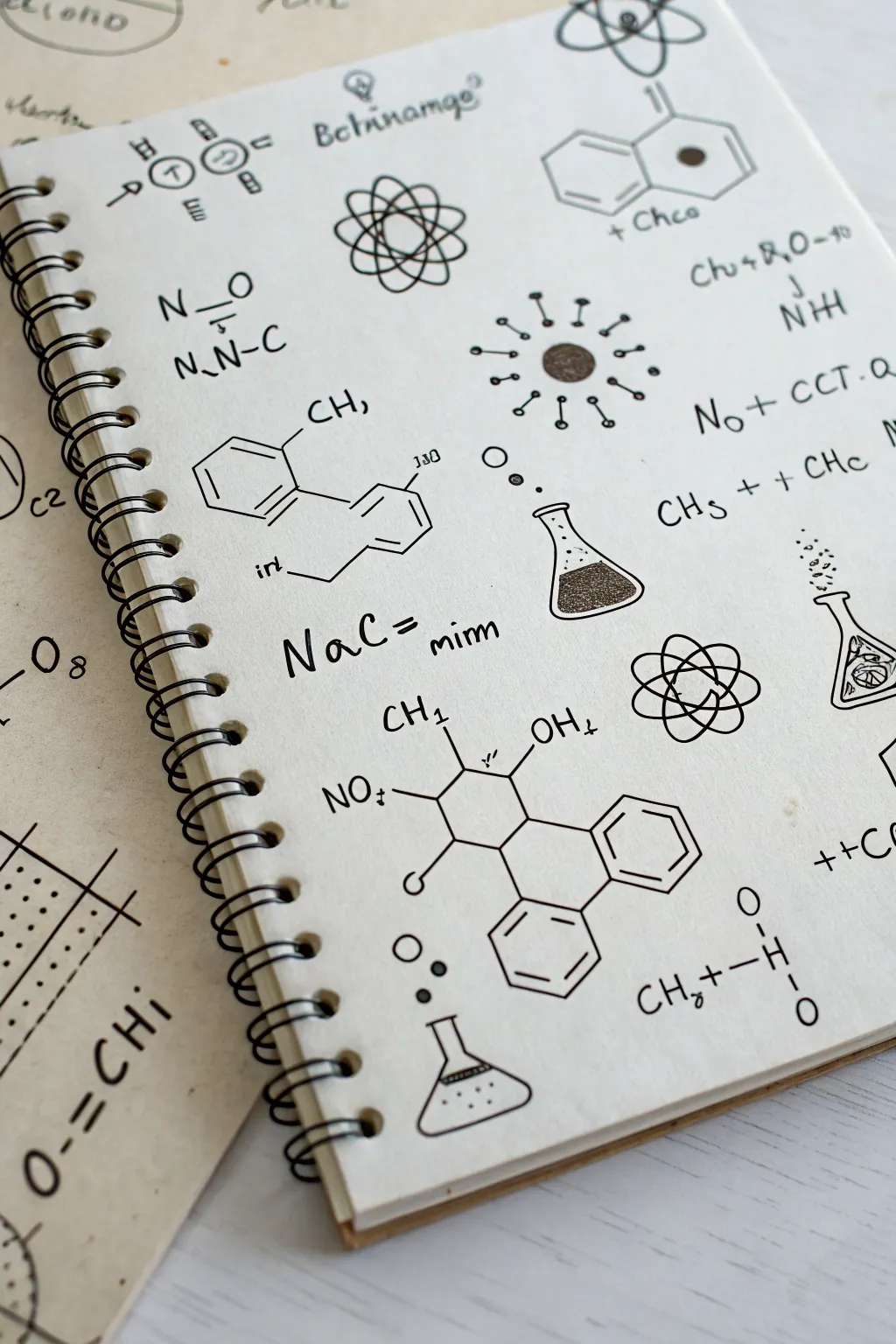
Transform a blank page into a scientific journal aesthetic with this detailed chemistry doodle collage. Using fine-line pens, you’ll create a structured yet whimsical arrangement of molecules, apparatus, and faux-formulas that looks straight out of a researcher’s notebook.
Detailed Instructions
Materials
- Spiral-bound sketchbook or notebook (creamy or off-white paper looks best)
- Fine liner pens (sizes 0.1, 0.3, and 0.5mm)
- Black brush pen or thicker marker (for filled areas)
- Pencil (HB or 2B)
- Eraser
- Ruler (optional, for structure lines)
- Reference images of chemical structures (optional)
Step 1: Planning the Composition
-
Pencil Sketching:
Begin by lightly sketching the layout in pencil. Distribute your main elements evenly across the page to avoid clutter. Place larger structures, like the complex molecule at the bottom center or the atomic diagrams, first to anchor the composition. -
Mapping the Flow:
Draw faint circles or boxes where you plan to put smaller icons like flasks or single atoms. This helps ensure you have a balanced mix of large diagrams and small filler details.
Smudge Prevention
Place a scrap piece of paper under your drawing hand as you work. This protects the graphite sketches and fresh ink from being smeared by your palm.
Step 2: Drawing Chemical Structures
-
Hexagonal Basics:
Using a 0.3mm fine liner, ink the hexagonal shapes. These represent benzene rings and other cyclic compounds. Keep your lines crisp and straight; a ruler can help here if you struggle with freehand straight lines, though a slight wobble adds hand-drawn charm. -
Double Bonds:
Add interior lines parallel to the hexagon sides to represent double bonds. Be consistent with their spacing. -
Connecting Rings:
Draw the lines connecting different ring structures, like the two-ring system near the top right or the complex multi-ring molecule at the bottom. Ensure the angles look roughly 120 degrees for realism. -
Adding Functional Groups:
Attach lines protruding from the rings and write chemical symbols like OH, CH, or NO. I find using a slightly smaller pen tip (0.1mm) keeps these letters neat and legible.
Level Up: Vintage Wash
Brush a light wash of watered-down coffee or tea over the page after the waterproof ink dries to give the paper an aged, antique scientific manuscript look.
Step 3: Illustrating Apparatus & Icons
-
Erlenmeyer Flasks:
Draw the outline of the conical flasks. Give the bottom corners a soft curve. Draw a small ellipse at the top for the opening. -
Creating Depth:
Inside the flasks, draw a horizontal line or a wavy line to indicate liquid level. Use stippling (lots of tiny dots) or a thicker brush pen to fill in the liquid, leaving a small white area to suggest a reflection on the glass. -
Atomic Models:
Draw the stylized atom icons—a central circle with orbital ellipses crossing over it. Keep the lines smooth and continuous. You can thicken the lines where the ovals overlap to create a sense of dimension. -
Virus or Sun Icons:
Create the radial icons by drawing a central circle and adding small lines with dots at the ends radiating outward. Vary the length of the lines for visual interest.
Step 4: Adding Text & Details
-
Faux Equations:
Fill the negative spaces with chemical equations. Write out things like ‘NaC = mim’ or ‘CH3 + CHc’. These don’t need to be scientifically accurate; they are decorative elements to tie the piece together. -
Lettering Style:
Keep your handwriting casual but print-style. Avoid cursive to maintain the scientific diagram look. -
Bubbles and Particles:
Add tiny circles rising from the flasks to represent bubbles or reactions. Group them in clusters of three or four. -
Final Contrast:
Review your drawing. If any main outlines feel too thin, go over them with a 0.5mm pen to make them pop against the smaller text details. -
Cleanup:
Wait at least 10-15 minutes for the ink to fully dry to prevent smudging. Gently erase all visible pencil lines to reveal the crisp black-and-white artwork.
Now you have a notebook page that looks like the brilliant brainstorming of a mad scientist
Safety Symbol Pop Color Remix
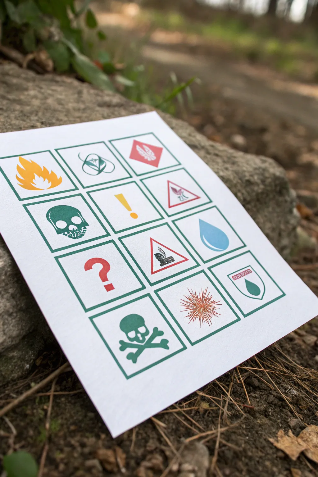
Transform standard hazard symbols into a vibrant piece of pop art by swapping stark black warnings for a playful, cohesive color palette. This project combines precise linework with flat color fills to create a chemistry-themed grid that looks great in a study or lab.
Detailed Instructions
Materials
- Heavyweight watercolor paper or mixed media paper (A4 or similar)
- Pencil (HB) and eraser
- Ruler
- Fine liner pens (emerald green or dark teal)
- Watercolor paints or fluid acrylics (vermilion red, yellow-orange, emerald green, sky blue)
- Small round brush (size 2 or 4)
- Masking tape
- Reference images of GHS hazard symbols
Step 1: Setting the Grid
-
Paper Prep:
Begin by taping down your paper to a hard board using masking tape. This prevents buckling and gives you a nice clean border later. -
Measure the Layout:
Decide on a grid size. For a standard page, a 3×4 layout works perfectly. Measure and mark faint ticks for your columns and rows. -
Draw the Boxes:
Using your ruler and pencil, lightly draw the twelve square frames. Leave a consistent gap (about 1cm) between each box to let the design breathe.
Clean Lines
If you struggle painting inside lines, use masking fluid on the symbols before painting the backgrounds, or switch to opaque gouache to correct mistakes.
Step 2: Sketching the Symbols
-
Icon Selection:
Choose your chemistry icons. Mix standard GHS symbols like the skull, flame, and exclamation mark with simpler shapes like a water drop or a question mark for visual variety. -
Outline Drafting:
Lightly sketch the symbol inside each box. Don’t worry about perfection yet; focus on centering the graphic within the square frame. -
Refining Shapes:
Go back over your sketches to sharpen the details, such as the teeth on the skull or the distinct petals of the flame. Clean up stray lines with your eraser. -
Border Decisions:
For triangular warning signs (like the figure throwing waste), sketch the triangle inside the square frame, leaving negative space around it.
Atomic Glow
Paint over the finished dry symbols with a clear UV-reactive topcoat. Under blacklight, your safety chart will glow neon for a true hazmat vibe.
Step 3: Inking the Structure
-
Choosing the Color:
Instead of black, select a dark emerald green or teal fine liner. This specific color choice gives the piece that ‘remix’ pop art feel. -
Inking the Frames:
Use the ruler and your colored pen to trace the grid boxes. Keep the pressure even for a consistent line weight. -
Tracing Symbols:
Carefully ink the outlines of your sketched symbols. For solid shapes like the skull, outline the perimeter only—we will fill them with paint later. -
Easing the Edges:
Let the ink sit for at least ten minutes to ensure it is completely set before gently erasing all underlying pencil marks.
Step 4: Adding the Pop Color
-
Mixing Palette:
Prepare your paints. You need four distinct colors: a bright orange for fire, a cool red for warnings, a matching emerald green for skulls, and a sky blue. -
Painting the Flames:
Start with the flame symbol. Load your brush with the yellow-orange mix and carefully fill the shape. I find it helps to painting the tips first and work inward. -
The Green Elements:
Use the emerald green paint to fill in the skulls and crossbones. Match this color as closely as possible to your ink outlines for a monochromatic look in those specific squares. -
Red Alerts:
Apply the red paint to the triangular borders, the large question mark, and the diamond background of the top-right symbol. Keep the application flat and even. -
Blue Accents:
Fill the water droplet with the sky blue paint. Leave a tiny sliver of white paper unpainted on the upper curve to act as a highlight. -
Detail Work:
For the finer details, like the radiating lines of the explosion symbol, switch to a very fine liner or a 00 brush to keep the lines crisp and separated. -
Second Coats:
Once the first layer is dry, evaluate the saturation. If the colors look patchy, apply a second thin layer for a solid, poster-print appearance. -
Final Styling:
Allow the entire piece to dry completely before removing the masking tape. Peel the tape away at an angle to avoid tearing the paper.
Now you have a striking piece of scientific decor that balances safety with style
Alchemy-Inspired Oxidation Patina Layers
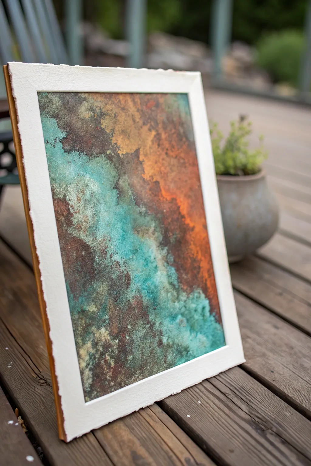
Capture the beauty of decay with this chemistry-driven art project that simulates the natural oxidation of copper and iron. By layering reactive paints and activation solutions, you can create a stunning, textural piece full of vibrant turquoise verdigris and deep, earthy rusts.
Step-by-Step Tutorial
Materials
- Heavyweight watercolor paper or mixed media board (300gsm+)
- Iron reactive metallic paint
- Copper or Bronze reactive metallic paint
- Patina activation spray (green/blue for copper)
- Rust activation spray (for iron)
- Texture paste or gesso
- Palette knives and chip brushes
- Spray bottle with water
- Sealer (spray varnish)
Step 1: Preparation and Texture
-
Prepare the surface:
Begin with a sturdy heavyweight paper or board. Since we are using heavy paints and liquids, a flimsy paper will warp. Tape the edges down to a work board to keep it flat. -
Create base texture:
Apply a layer of texture paste or gesso using a palette knife. Don’t aim for smoothness; creates ridges, peaks, and valleys. This physical texture gives the oxidation liquids pools to settle in later. -
Let it cure:
Allow the texture layer to dry completely. This usually takes 2-4 hours, or you can speed it up with a hair dryer on a low setting.
Step 2: Applying the Metallic Base
-
Map out your zones:
Decide where you want the ‘rust’ (orange/brown) vs. the ‘verdigris’ (teal/green). In the reference image, the rust runs diagonally through the center with teal on the flanks. -
Apply Iron paint:
Using a chip brush, dab the Iron reactive paint thickly onto the areas designated for rust. Ensure you get the paint into the crevices of your texture. -
Apply Copper paint:
While the iron paint is still wet or tacky, apply the Copper or Bronze reactive paint to the remaining areas. Blend the edges slightly where the two metals meet for a natural transition. -
Add a second coat:
For the best chemical reaction, you need a substantial amount of metal particles. Once the first coat is dry to the touch, apply a second, generous coat of both metallic paints.
Too Much Green?
If the patina overwhelms the metal, you can knock it back. Once dry, lightly dry-brush fresh metallic paint over the highest points of texture to reclaim the shine.
Step 3: The Oxidation Process
-
Apply Rust activator:
While the second coat of Iron paint is still wet, spray the Rust activator solution directly onto the iron sections. You can also drizzle it from the bottle cap for concentrated spots. -
Apply Patina activator:
Immediately spray the Patina (green/blue) activator onto the wet Copper/Bronze sections. Be generous; the liquid needs to interact with the metal particles to change color. -
Encourage mixing:
I like to tilt the board slightly to let the liquids run into each other, creating organic streaks where the rust and teal mix. You can also spritz a tiny bit of water to help the flow. -
Wait for the reaction:
Walk away. The reaction isn’t instant. It will begin to show within minutes but continues to develop over several hours. Do not touch or brush the surface while it’s reacting. -
Assess and re-apply:
Once dry, check the intensity. If you want more rust or more teal, you can dab more paint on specific spots and spray again. Layering adds depth.
Salt & Vinegar Hack
No fancy chemicals? You can simulate this effect using household items. Spray white vinegar and sprinkle sea salt over wet acrylic paint to create interesting organic textures.
Step 4: Finishing Touches
-
Highlighting:
If the piece looks too flat, dry brush a tiny bit of original Copper or Gold metallic paint on the highest peaks of the texture to bring back some shine against the matte oxidation. -
Dry completely:
Let the piece sit for at least 24 hours to ensure the chemical reaction has fully ceased and the moisture has evaporated. -
Seal the work:
The oxidation powder can be brittle and rub off. Gently mist the artwork with a spray varnish or sealer to lock the patina in place without smearing the delicate powdery surface. -
Mounting:
Mount your finished piece on a white backing board or within a deep mat to frame the organic edges and provide a clean contrast to the gritty textures.
Now you have a piece of chemical art that looks like it has weathered centuries of exposure
Have a question or want to share your own experience? I'd love to hear from you in the comments below!