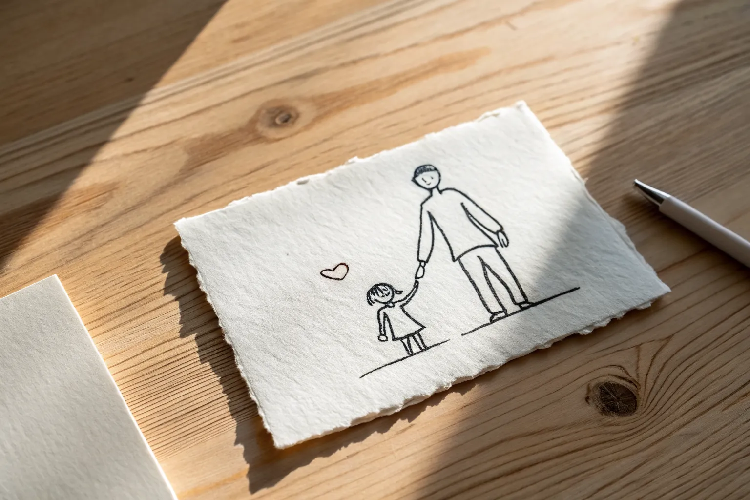
When I’m planning Father’s Day drawings, I always start with the kind of pictures that feel personal but still easy to pull off, even if you’re a beginner. Here are my favorite Father’s Day pictures to draw—from classic card staples to a few unexpected ideas that still feel heartfelt.
Best Dad Trophy Drawing
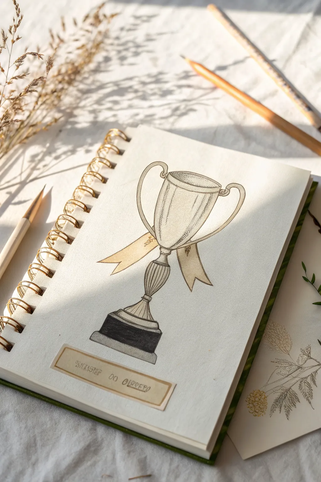
Celebrate Dad’s victories, big and small, with this classically styled trophy illustration. Featuring gentle shading and elegant ribbon details, this pencil and ink drawing captures the timeless look of a vintage prize cup.
Detailed Instructions
Materials
- Helix spiral-bound sketchbook (heavyweight paper)
- HB or 2B graphite sketching pencil
- Fine liner pen (black, 0.3mm or 0.5mm)
- Colored pencils (gold/ochre, beige, dark grey/black)
- Ruler
- Eraser
- Small scrap of kraft paper or beige cardstock
- Glue stick or double-sided tape
Step 1: Constructing the Chalice
-
Establish the centerline:
Begin by drawing a faint vertical line down the center of your page using your ruler. This axis is crucial for keeping the trophy symmetrical as you build the shape. -
Draft the bowl shape:
Near the top of your axis, sketch a wide, shallow oval for the opening of the cup. Below this, draw a slightly deeper U-shape that connects to the sides of the oval to form the main bowl of the trophy. -
Add the stem and base:
Draw the stem by creating a smaller, decorative bulb shape just below the bowl, tapering it down into a flared foot. Create the heavy base by sketching a rectangular block at the very bottom. -
Sketch the handles:
On either side of the bowl, lightly sketch the large, curved handles. Make sure they start near the rim and loop down gracefully to connect back to the lower part of the cup body. -
Draw the ribbon:
Across the ‘waist’ of the trophy, just above the stem, sketch a flowing ribbon. Let the ends drape down naturally on either side, adding V-notches at the tips for a classic look.
Pro Tip: Shadow play
When stippling, concentrate dots heavily where parts meet—like where handles join the cup—to create deep, realistic shadows instantly.
Step 2: Inking and Definition
-
Outline with ink:
Once you are happy with the symmetry, go over your main pencil lines with the fine liner pen. Use a steady hand, but don’t worry if the line weight varies slightly; it adds character. -
Add stippling texture:
To give the metal an aged look, use tiny dots (stippling) along the sides of the cup and the inner rim of the handles. Focus the dots more densely on the left side to suggest shadow. -
Drawing vertical sheen lines:
Using your pen very lightly, draw thin vertical lines following the curve of the cup’s body. These hatch marks create the illusion of a reflective, metallic surface. -
Erase pencil guides:
I usually wait a few minutes to ensure the ink is completely dry, then gently erase all the underlying graphite construction lines to reveal a clean drawing.
Level Up: Metallic shine
Use a white gel pen to add sharp highlights on the darkest part of the black base and the rim of the cup for an extra glossy metallic effect.
Step 3: Adding Color and Shadow
-
Color the ribbon:
Use a warm beige or light gold colored pencil to fill in the ribbon. Press lightly in the center and slightly harder near the knot to create depth. -
Shade the metal:
Take a pale grey or very light ochre pencil and add subtle shading to the sides of the cup and the stem. Leave the center of the cup mostly white to represent the highlight. -
Darken the base:
Color the top tiered section of the base with a medium grey. For the thick bottom block, use a dark grey or black pencil, applying heavy pressure to ground the object visually. -
Add decorative flourishes:
Using your fine liner again, add tiny, scribbled details or floral motifs onto the ribbon ends to simulate embroidery or engraving.
Step 4: The Final Label
-
Prepare the label strip:
Cut a small, rectangular strip from a piece of kraft paper or beige cardstock. It should be wide enough to fit a short phrase. -
Draw the inner border:
Use a pencil to lightly draw a box inside the kraft strip, creating a frame effect. Go over this with your fine liner for a defined edge. -
Letter the dedication:
Write your message, such as ‘Success do Queero’ or ‘World’s Best Dad,’ inside the box. A slightly imperfect, hand-printed font works best here. -
Attach the label:
Apply a small amount of glue or tape to the back of the label and adhere it below the trophy base at a slight, casual angle.
Now you have a stunning, hand-drawn award ready to make any father figure feel like a winner

Tie And Collar Dad Icon
Celebrate Father’s Day by sketching this clean, classic icon of a shirt collar and tie. The design uses crisp lines and a playful hash-marked pattern to create a simple yet sophisticated card or gift art.
How-To Guide
Materials
- High-quality cream or off-white drawing paper (A4 or Letter size)
- Pencil (HB or 2B) for sketching
- Fine-liner pen (black or dark navy blue, 0.5mm)
- Thicker marker (black or dark navy blue) for outlines
- Ruler
- Eraser
Step 1: Drafting the Collar
-
Establish the center:
Begin by lightly marking a vertical centerline on your paper with your pencil. This will help keep the tie symmetrical and the collar balanced. -
Draw the collar gap:
Near the top of your centerline, draw a small, slightly curved ‘V’ shape. This represents where the knot of the tie will sit. -
Shape the left collar wing:
From the top left point of your ‘V’, draw a line angling upwards to the left for the top edge of the collar. Then, bring a line sharply down and inward to form the pointed tip of the collar. -
Complete the left wing:
Connect the pointed tip back to the center area with a slightly angled line. Repeat these two previous steps on the right side to create a mirror image for the right collar wing. -
Add dimension:
Draw a thin rectangle shape inside the neck opening area to represent the back of the collar or a label. Then, extend two horizontal lines outward from the top corners of the collar to suggest the shoulders.
Step 2: Designing the Tie
-
Outline the knot:
Right in the ‘V’ gap between the collar wings, draw a small, inverted trapezoid (wider at the top, narrower at the bottom) for the tie knot. Give it a slight curve at the bottom. -
Draft the tie body:
From the bottom of the knot, use your ruler to draw two long, diverging lines downwards. Angle them slightly outward so the tie gets wider as it goes down. -
Create the point:
At the bottom of those two lines, draw a ‘V’ shape to close the tie. Ensure the point aligns perfectly with your initial vertical centerline. -
Refine the shape:
I prefer to soften the connection points slightly where the long lines meet the bottom ‘V’ so it looks like fabric rather than a rigid cardboard cutout.
Wobbly Lines?
If your hand shakes while inking the long lines of the tie, don’t worry. Just re-trace the line slightly to make it thicker. A variable line weight can actually make the drawing look more artistic.
Step 3: Inking and Patterning
-
Initial inking:
Take your thicker marker or pen. Carefully trace over all your pencil outlines—the collar, the shoulders, the knot, and the main body of the tie. -
Shoulder details:
Extend the shoulder lines slightly downwards at the far ends to hint at the sleeve seam, giving the drawing a bit more context. -
Erase guidelines:
Wait a moment for the ink to set, then gently erase all visible pencil marks so you have a clean slate for the pattern. -
Draw diagonal stripes:
Using your fine-liner pen and ruler, draw pairs of diagonal lines across the tie body. Keep the space between the pairs wide, but the lines within the pair close together. -
Add horizontal texture:
Inside the knot area, draw small horizontal lines. These shouldn’t be perfect stripes but rather sketchy, textured marks to differentiate the knot from the body. -
Fill the stripes:
Now, return to those diagonal stripe pairs on the tie body. Between the two close lines, fill the space with tiny, scribbled hash marks or squiggles. This creates that textured, fabric look seen in the photo. -
Add final details:
In the wide gaps between the stripes, add vertical rows of small dots or stippling. This adds visual interest without making the design too busy. -
Sign your work:
Finish by adding a small, energetic signature or a ‘Happy Father’s Day’ message in the bottom right corner.
Pro Tip: Beveled Ruler
When using a ruler with ink pens, flip the ruler upside down or use one with a beveled edge. This creates a gap between the edge and the paper, preventing the ink from bleeding underneath and smudging.
Now you have a stylish, hand-drawn illustration ready to be framed or folded into a card for Dad

Heart With “I Love You, Dad” Banner
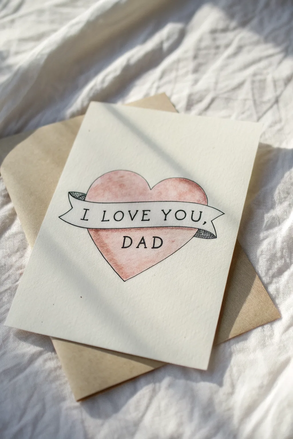
This timeless design borrows from classic tattoo artistry to create a heartfelt tribute for Dad. The combination of a soft, washed watercolor heart with crisp ink lettering gives it a vintage yet clean aesthetic.
Step-by-Step Tutorial
Materials
- Heavyweight watercolor paper or cardstock (cream or white)
- Pencil (HB)
- Eraser
- Fine-liner pen (black, 0.3mm or 0.5mm)
- Watercolor paints (red or pink tones)
- Small round paintbrush (size 4 or 6)
- Water and paper towel
- Ruler (optional)
Step 1: Drafting the Design
-
Position the heart:
Begin by lightly sketching a large, symmetrical heart in the center of your cardstock using your pencil. Keep the lines very faint since you’ll be erasing them later. -
Adding the banner layout:
Sketch a curving banner that wraps across the center of the heart. Start by drawing two parallel wavy lines horizontally across the widest part of the heart. -
Define the banner ends:
Draw the ‘fold’ lines where the banner disappears behind the heart on the left and right. Add the tails of the ribbon emerging from behind, giving them a notched or V-shaped end. -
Refine the overlaps:
Erase the parts of the heart outline that pass through the main customized banner section to make it look like the ribbon is sitting on top.
Smudge Prevention
Ink smearing is the enemy! If using a ruler for guidelines, wipe the edge frequently. Use a piece of scrap paper under your hand while inking to protect the paper.
Step 2: Inking the Outline
-
Trace the main lines:
Using your black fine-liner, carefully trace over your pencil lines for the heart and the banner. Use a steady hand and try to keep a consistent line weight. -
Detail the ribbon folds:
Add small lines or cross-hatching to the shadowed parts of the ribbon tails (the parts that curve backward). This textural shading gives the banner dimension. -
Lettering:
Lightly pencil in your text guidelines. Write ‘I LOVE YOU,’ inside the banner strip and ‘DAD’ in the lower portion of the heart. -
Ink the text:
Go over the letters with your pen. A simple serif font works beautifully here for that classic look. I find adding tiny serifs (little feet) to the letters makes them look more professional. -
Erase guidelines:
Wait at least 5-10 minutes to ensure the ink is totally dry, then gently erase all remaining pencil marks to leave a clean black-and-white drawing.
Step 3: Adding Color
-
Prepare the wash:
Mix a watery red or pink watercolor wash. You want the color to be translucent so the texture of the paper shows through. -
First layer of color:
Paint the inside of the heart, being very careful to paint *around* the banner. The banner itself should remain the color of the paper. -
Wet-on-dry technique:
Apply the paint on dry paper for crisp edges near the black outlines. Don’t worry if the color isn’t perfectly even; the slight mottling adds character. -
Add subtle shading:
While the paint is still slightly damp, drop a tiny bit more concentrated pigment near the edges of the banner to create a drop shadow effect on the heart. -
Final drying:
Let the watercolor dry completely. If the paper buckles slightly, you can press it under a heavy book overnight once it is bone dry.
Vintage Patina
give the card an aged look by lightly brushing a very diluted tea or coffee wash over the entire paper (avoiding the text) before you start drawing.
Now you have a timeless piece of art that speaks straight from the heart
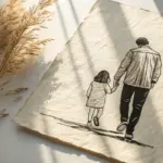

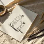
Big Hand Holding Little Hand Sketch
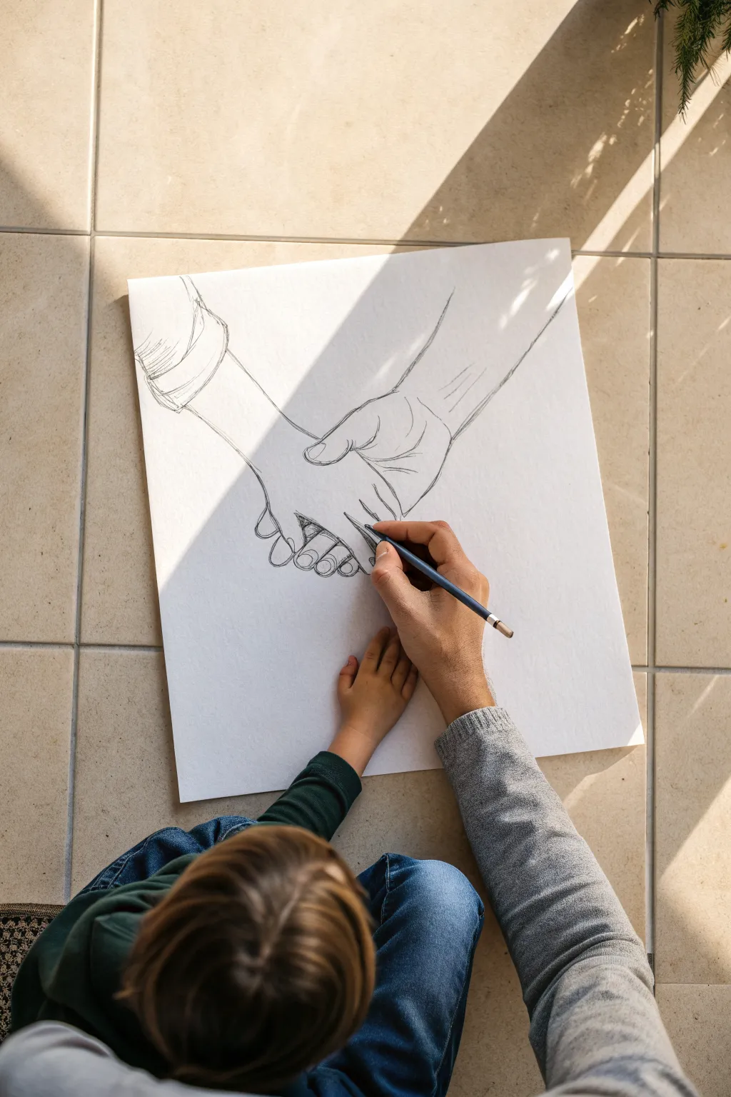
Capture the tender connection between a father and child with this minimalist pencil sketch showing a large hand interlaced with a smaller one. It’s a touching, meaningful art project that focuses on clean lines and subtle shading to create a heartfelt Father’s Day gift.
Step-by-Step
Materials
- Large drawing paper or Bristol board (18×24 inches recommended)
- Graphite drawing pencils (H for sketching, 2B and 4B for details)
- Kneaded eraser
- Pencil sharpener
- Reference photo of holding hands (optional but helpful)
- Fixative spray (optional)
Step 1: Initial Layout
-
Block in the shapes:
Start by visualizing the basic geometric shapes of the hands. Use an H pencil with very light pressure to draw a large, rough oval for the father’s palm and a smaller, tilted rectangle for the child’s hand resting within it. -
Mark the wrist angles:
Draw two parallel lines extending from the top right for the father’s arm, and two lines extending from the top left corner downward for the child’s arm. These angles are crucial for showing how the hands meet. -
Map the thumbs:
Sketch a curved tube shape for the father’s thumb, ensuring it wraps around where the child’s hand will be. Add a smaller, straighter shape for the child’s thumb pointing towards the father’s wrist. -
Indicate finger placement:
Draw faint guidelines for the fingers. The father’s fingers should curl underneath the child’s hand, while the child’s fingers should dangle slightly, showing a relaxed grip.
Smudging Issues?
If you find your hand dragging graphite across the paper, place a clean scrap sheet of paper under your drawing hand. This acts as a shield to keep the white space pristine.
Step 2: Defining the Contours
-
Outline the father’s hand:
Switch to a sharpened 2B pencil. Begin refining the silhouette of the larger hand, paying attention to the knuckles and the gentle curve of the palm muscle near the thumb. -
Draw the father’s thumb details:
Add the thumbnail and the skin creases at the joint. The thumb is a focal point here, so ensure the line weight is confident but not overly dark yet. -
Define the child’s hand:
Outline the smaller hand. Keep the lines slightly smoother and less rugged than the father’s hand to emphasize youth and softness. -
Refine the finger interaction:
This is the most critical step. Draw the father’s fingers wrapping around the child’s palm. Make sure the child’s fingers overlap the father’s palm naturally. -
Add sleeve details:
Sketch a simple cuff for the child’s sleeve on the left. You can add a few jagged lines to suggest wrinkles in the fabric, giving the drawing more context.
Step 3: Shading and Texture
-
Erase guidelines:
Take your kneaded eraser and gently dab away the initial construction lines and geometric shapes so only your clean contour lines remain. -
Add skin folds:
Look for areas where the skin bunches, particularly at the wrist and palm lines. Add thin, delicate strokes to represent these creases, especially on the larger hand. -
Shade the contact points:
Using a 4B pencil or the side of your 2B, apply light shading where the hands touch. This contact shadow gives the drawing weight and makes the grip look realistic. -
Define the fingernails:
Draw the fingernails on the visible fingers. Keep the shapes rounded and realistic, adding a tiny line for the cuticle. -
Add volume to the fingers:
I like to add very subtle hatching lines along the curve of the fingers. This rounds them out so they don’t look flat against the paper. -
Darken the deepest shadows:
Identify the darkest areas, usually between the fingers and under the thumb. Deepen these shadows with the 4B pencil to increase the contrast. -
Cross-hatch the sleeves:
Add some directional shading or cross-hatching to the sleeve cuffs. This texture differentiates the fabric from the skin. -
Final assessment:
Step back from the drawing to check the proportions. If any lines feel too harsh, soften them with the eraser or a blending stump. -
Seal the drawing:
Once you are happy with the drawing, mist it lightly with fixative spray in a well-ventilated area to prevent the graphite from smudging over time.
Use Negative Space
Don’t just look at the fingers; look at the empty shapes between them. Drawing these ‘negative spaces’ accurately often helps fix proportion errors better than drawing the fingers alone.
Now you have a timeless piece of art that freezes a beautiful moment in time
BRUSH GUIDE
The Right Brush for Every Stroke
From clean lines to bold texture — master brush choice, stroke control, and essential techniques.
Explore the Full Guide
Mustache And Glasses “Cool Dad” Doodle
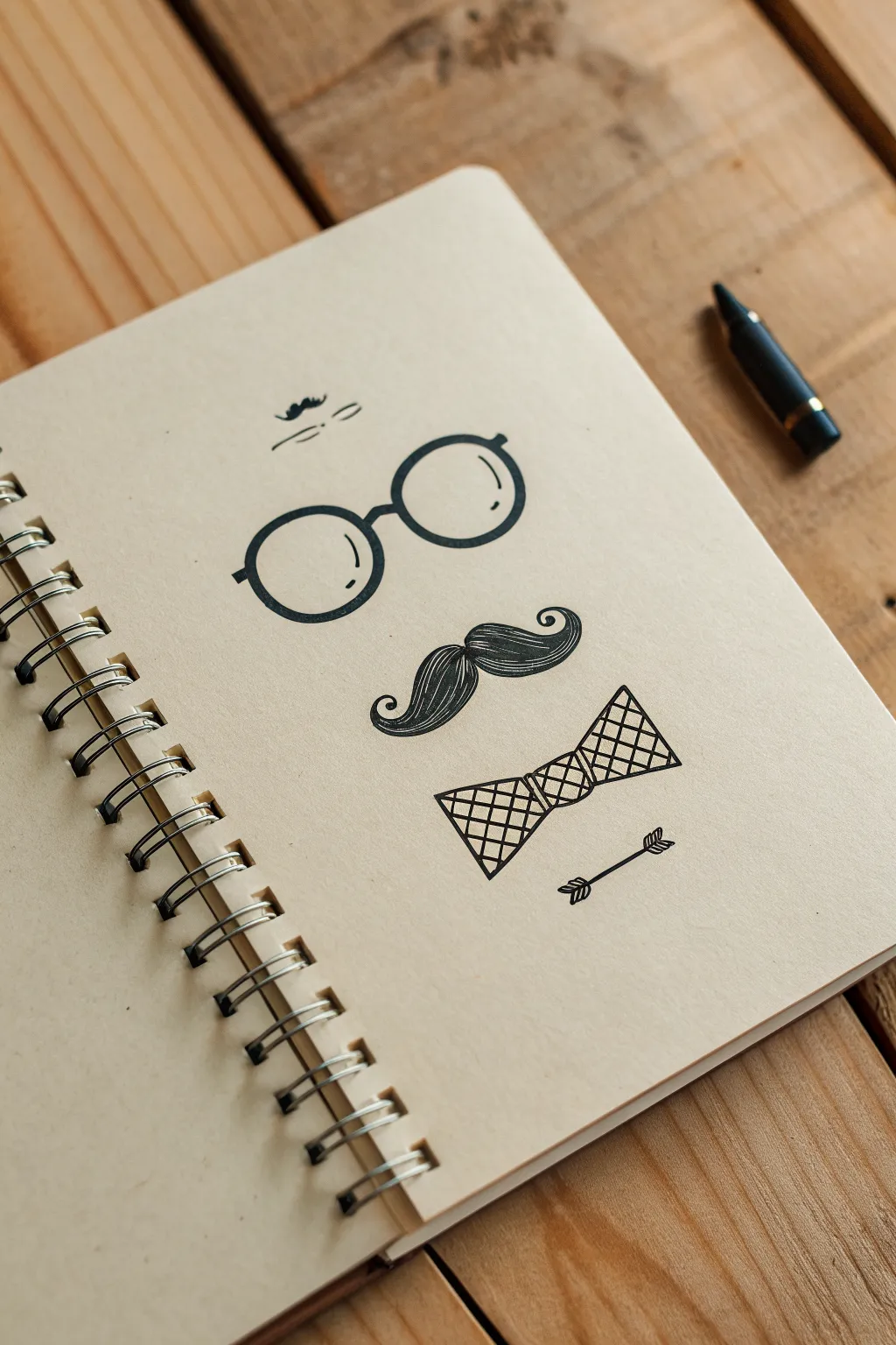
This charming, hipster-inspired sketch relies on clean lines and negative space to suggest a gentleman’s face without actually drawing one. Using simple black ink on textured paper creates a classic, timeless look perfect for a handmade Father’s Day card.
Step-by-Step Tutorial
Materials
- Wire-bound kraft paper sketchbook or tan cardstock
- Fine-point black drawing pen (0.5mm)
- Medium-point black marker or brush pen
- Pencil (HB or 2H for light drafting)
- Soft box eraser
- Ruler (optional but helpful for alignment)
Step 1: Drafting the Design
-
Find the center point:
Begin by lightly marking a vertical center line on your page with a pencil. This invisible axis is crucial for keeping the symmetrical elements like the glasses and bowtie perfectly balanced. -
Sketch the glasses frames:
About a third of the way down the page, lightly sketch two perfect circles for the glasses lenses. Leave a small gap between them for the bridge. -
Outline the mustache:
Directly below the glasses, sketch the mustache shape. Start with a dip in the center and curve outwards and slightly up, ending in curled tips that look like ocean waves. -
Draft the bowtie:
Below the mustache, draw a bowtie shape. Think of it as a small circle in the middle with two flare-out trapezoids on either side. Keep the lines crisp and angular. -
Add accent details and check proportion:
Sketch a tiny squiggle or eyebrow lines floating well above the glasses, and a small arrow graphic at the very bottom. Step back to ensure everything is aligned vertically.
Wobbly Circles?
Drawing perfect circles freehand is tough. Trace a small coin or the bottom of a glue stick for the glasses lenses to get that perfect round geometric look.
Step 2: Inking outlines
-
Trace the glasses:
Switch to your medium-point black marker. Carefully trace the outer edge of the circular lenses. To create the ‘rim’ effect, add a second circle just inside the first, then fill the space between them solid black. -
Add the bridge and hinges:
Connect the two lenses with a simple arched line for the bridge. Add tiny rectangular stubs on the outer edges for the temple hinges. -
Ink the mustache contour:
Using the same marker, outline the entire mustache shape. Make sure the curled tips are smooth and round, not pointy. -
Define the bowtie frame:
Trace the outline of your bowtie. Since this shape will have an internal pattern, keep this outer line steady and clean. -
Draw the bottom arrow:
Ink the small arrow arrow beneath the bowtie. Use simple lines for the shaft and small triangles for the fletching (feathers) and head.
Step 3: Adding Texture and Pattern
-
Detail the mustache:
Switch to your fine-point (0.5mm) pen. Inside the mustache outline, draw curved lines flowing from the center outward to the tips to mimic hair texture. I find that lifting the pen at the end of each stroke keeps the lines tapered and natural. -
Create the bowtie grid:
Using the fine pen, draw diagonal lines crisscrossing inside the bowtie to create a diamond grid pattern. This adds a nice contrast to the organic lines of the mustache. -
Add lens reflections:
Inside the glasses lenses, add two small, curved white space indicators near the upper right or left edge. You can simply draw a thin curve line to suggest reflection without filling anything in. -
Ink the top details:
Draw the floating eyebrows or squiggle at the very top using quick, loose strokes with the fine pen. -
Erase pencil lines:
Wait at least 15 minutes for the ink to fully cure. Gently erase all your pencil guides with the soft box eraser to reveal the clean design.
Add a hidden message
Before inking the diamond pattern on the bowtie, hide tiny letters inside sections of the grid to spell out ‘DAD’ or ‘LOVE’ for a secret puzzle.
Now you have a stylish, quirky portrait ready to gift to your favorite dad
“#1 Dad” Ribbon Badge
Celebrate Dad with a classic, hand-illustrated prize ribbon drawn directly onto a folded card. This clean, celebratory design uses bold line work to create a timeless token of appreciation that looks professionally printed.
Step-by-Step
Materials
- White cardstock or heavy drawing paper (folded)
- Black fine-point drawing pen (e.g., Micron 03 or 05)
- Black brush pen or chisel tip marker (for lettering)
- Pencil (HB or H)
- Quality eraser
- Compass or circular object to trace (approx. 2.5 inches)
- Ruler
Step 1: Drafting the Badge Shape
-
Prepare the card:
Begin by folding your white cardstock in half to create the card base. Lay it flat on your workspace with the fold to the left. -
Draw the central circle:
Using a compass or by tracing a circular object like a jar lid or glass, lightly draw a perfect circle in the upper center of the card front with your pencil. -
Create the inner border:
Adjust your compass or use a slightly smaller circular object to draw a second, concentric circle inside the first one. Leave about a quarter-inch gap between them to form a ring. -
Sketch the ruffle guide:
Lightly sketch a third circle outside your main shape, about half an inch larger than the first circle. This invisible guide will help keep the ribbon ruffles even. -
Draw the ruffles:
Pencil in the scalloped edges of the ribbon rosette. Draw small V-shapes or triangles connecting the outer main circle to your guide circle all the way around the badge.
Wobbly Circles?
If you struggle with freehand inking on curves, trace a lid or use a circle stencil directly with the pen. Just be careful not to smudge wet ink when lifting the tool.
Step 2: Designing the Ribbons & Text
-
Draft the left tail:
Starting from the bottom left of the rosette, use your ruler to draw a ribbon tail angling downward. Finish the bottom with an inverted V-shape for the cut end. -
Draft the right tail:
Repeat the previous step on the right side, mirroring the angle so the tails look symmetrical. Make sure they are roughly the same length and width. -
Add ribbon details:
Inside each ribbon tail, use your ruler to lightly draw a parallel line near each edge. This creates a border effect within the fabric strips. -
Placement for text:
Lightly sketch horizontal guidelines inside the center circle to ensure the lettering stays straight and balanced. -
Draft the lettering:
Sketch the text ‘#1’ in the upper half and ‘DAD’ in the lower half. Use a serif style font for a classic look, making the ‘#’ slightly smaller than the number ‘1’.
Step 3: Inking and Refining
-
Ink the main circles:
Switch to your black fine-point pen. Carefully trace the two main circles of the badge body. I actually find rotating the paper as I draw helps keep the curve smooth. -
Ink the ruffles:
Outline the zigzag ruffle pattern around the edge. Connect the points sharply for a crisp look. -
Connect the ruffle details:
Draw short, straight lines from the inner corners of the ruffles inward toward the circle. This adds dimension, making it look like folded fabric. -
Outline the tails:
Trace the outer edges of the ribbon tails with the fine-point pen. -
Add stitching lines:
On the inner lines of the ribbon tails, instead of a solid line, draw a dashed line to mimic stitching. -
Fill the lettering:
Use a thicker pen or brush marker to fill in the ‘#1 DAD’ text. Go slowly to keep the edges sharp and blocky. -
Erase guidelines:
Wait several minutes to ensure the ink is completely dry. Once set, gently run your eraser over the entire design to remove all pencil marks.
Add Dimension
Use a grey marker or diluted ink to add subtle shading under the rosette and where the ribbons overlap. This makes the drawing pop off the page.
Now you have a crisp, custom award ready to present to the winning father figure in your life

PENCIL GUIDE
Understanding Pencil Grades from H to B
From first sketch to finished drawing — learn pencil grades, line control, and shading techniques.
Explore the Full Guide
Camping Night With Dad And Kid

Capture the quiet magic of a father-child camping trip with this clean and cozy line drawing. Using simple geometric shapes and fine linework, you’ll create a peaceful night scene featuring a tent, pine trees, and a starry sky.
Step-by-Step
Materials
- Sketchbook or drawing paper (smooth bristol or mixed media)
- Pencil (HB or 2B) for initial sketching
- Eraser
- Fine liner pen (01 or 03 size) – black
- Thicker marker or brush pen – black (for silhouettes)
- Ruler (optional, for the tent lines)
Step 1: Setting the Scene
-
Map out the horizon:
Begin by lightly sketching a horizontal line across the lower third of your page with a pencil. This doesn’t need to be perfectly straight; a slight curve feels more like natural ground. -
Form the tent triangle:
Draw a large triangle in the center of your ground line. The base should be wide, sitting directly on the horizon, and the point should reach up towards the middle of the page. -
Create the tent flap:
Inside your main triangle, draw a slightly smaller triangle, but leave the bottom open this time. Connect the top peak of this inner triangle to the peak of the outer triangle with a vertical line to show depth. -
Add side details:
Sketch a diagonal line extending from the left corner of the tent outward to the ground to represent a guy line or stake. Do the same for the right side. -
Sketch the tree placements:
To the left and right of the tent, lightly mark vertical lines where your pine trees will stand. Create a cluster of three on the left and three on the right to balance the composition.
Step 2: Inking the Forms
-
Outline the tent:
Switch to your fine liner pen. Trace over your pencil lines for the tent structure. Use a ruler if you want it crisp, or freehand it for a more organic, sketchy look. -
Detail the tent opening:
Ink the inner triangle opening. At the bottom of the tent, draw a slightly textured or jagged line to suggest the fabric folds resting on the grass or a blanket. -
Draw the pine trees:
Start at the top of your tree guide lines. Use quick, downward zig-zag motions to create the branches. Make the zig-zags wider as you move down the trunk to create that classic conical pine shape. -
Group the trees:
As you ink the clusters of trees, allow the branches to overlap slightly. This adds depth to your forest background. Keep the line weight consistent with the tent. -
Ground the scene:
Draw the horizon line now, stopping when you hit the tent or trees so the line appears to go behind them. Add tiny tufts of grass near the tent corners and tree bases.
Ink Smearing?
Wait at least 5-10 minutes before erasing pencil lines. If you erase too soon, the wet ink will drag across the paper and ruin the crispness.
Step 3: Figures and Sky
-
Sketch the figures:
Inside the tent opening, pencil in two small silhouettes sitting side-by-side. One shape should be slightly larger (the dad) and one smaller (the kid). -
Fill the silhouettes:
Using your thicker marker or brush pen, carefully fill in the two figures completely black. This high contrast makes them looked like they are backlit by a lantern inside. -
Add the moon:
In the upper right quadrant of the sky, draw a crescent moon. I prefer to keep the shape open and simple rather than filling it in. -
Scatter the stars:
Draw several five-pointed hollow stars randomly across the sky. Vary their rotation so they don’t look like a pattern. -
Create distant stars:
intersperse the larger stars with simple dots throughout the sky. Add a few slightly larger colored-in circles to represent planets or brighter stars. -
Final touches:
Add a few tiny dots around the moon for atmosphere. Once the ink is completely dry, gently erase all your pencil guidelines to reveal the crisp black and white illustration.
Pro Tip: Sky Balance
Don’t overfill the sky. Leaving ‘negative space’ (empty white areas) makes the stars you *do* draw stand out more and keeps the drawing from feeling cluttered.
Now you have a charming, minimalist memory of a night spent under the stars ready for gifting
Grill Master Dad Scene
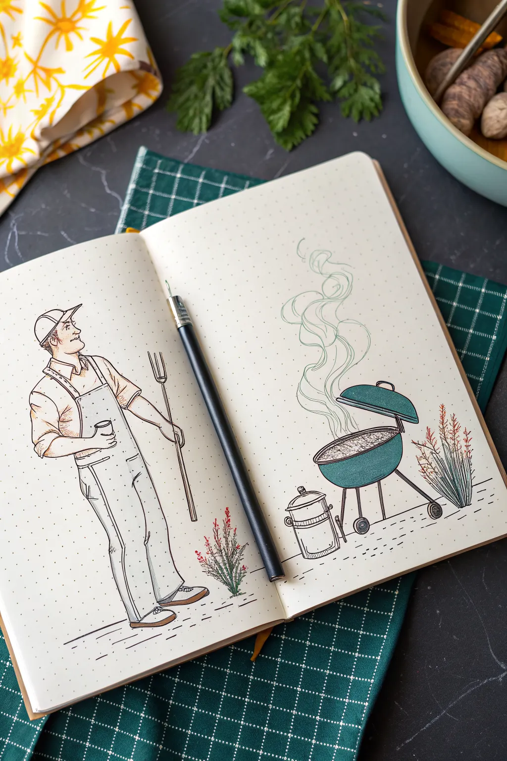
Celebrate Dad’s prowess with the tongs by sketching this charming, illustrative scene of him in his element—right next to the barbecue. This project uses a dotted grid notebook to help you keep proportions neat while maintaining a loose, artistic hand-drawn feel with ink and touches of color.
Detailed Instructions
Materials
- Dotted grid notebook or sketchbook
- HB Drawing pencil
- Eraser
- Fine liner pens (0.3mm and 0.5mm, black)
- Colored pencils (teal/green, red, brown, peach/skin tone)
- Ruler (optional, for the grid)
Step 1: Setting the Scene with Pencil
-
Divide the space:
Open your dotted notebook to a fresh spread. Visualize the seam of the book as the divider between Dad on the left and his grill on the right. Lightly mark the ground line across both pages about an inch or two from the bottom edge so everything stands on the same plane. -
Block in Dad’s posture:
On the left page, sketch a simple stick figure first to get the pose right. He should be standing tall, leaning slightly back on one leg, with one arm bent holding a cup and the other holding a grilling fork. Use circles for joints and lines for limbs. -
Flesh out the figure:
Add volume to the stick figure. Sketch the overalls over his frame, making the legs baggy and straight. Add the baseball cap sitting high on his head and outline his profile looking proudly toward the grill. -
Sketch the grill tools:
Draw the long grilling fork in his right hand. It should extend downwards, almost touching the ground line. Sketch a simple cylinder shape for the cup or can in his left hand. -
Outline the grill:
On the right page, position the grill opposite Dad. Start with a semi-circle bowl shape for the base and a matching, slightly tilted lid hovering above it. Add the tripod legs, making sure the wheels touch the ground line you established earlier. -
Add smoke and accessories:
Draw a wavy, swirling line rising from the grill to indicate smoke. To the left of the grill, sketch a small cylindrical bucket or cooler. Finally, add small tufts of grass or plants near Dad’s feet and behind the grill to ground the scene.
Grid Guide
Use the dots! Count an equal number of dots up from the bottom of the page for both the grill wheels and Dad’s shoes to ensure they aren’t floating.
Step 2: Inking the Lines
-
Ink the main character:
Using your 0.5mm fine liner, carefully trace over your pencil lines for Dad. Use broken, sketchy strokes for the clothing folds to give them texture, rather than a single continuous hard line. -
Detail the face and hands:
Switch to a 0.3mm pen for the face and hands. Keep the facial features simple—a dot for the eye and a small curve for the smile. Don’t worry about drawing individual fingers too perfectly; suggestion is key here. -
Ink the grill and equipment:
Go back to the 0.5mm pen to outline the grill body and the legs. For the grill grate area, use small stippling dots or tiny rapid dashes to suggest hot coals. -
Create the smoke:
For the smoke plume, use a very light touch with the thinner pen. Draw swirling, organic shapes that widen as they go up, keeping lines fluid and airy. -
Ground the scene:
Ink the plants with quick, upward flicking motions to mimic grass blades. Add dashed horizontal lines on the ground beneath dad and the grill to suggest a patio or ground texture. -
Erase the guide:
Wait at least five minutes to ensure the ink is completely dry. Gently erase all visible pencil marks, being careful not to crumple the page.
Step 3: Bringing it to Life with Color
-
Color the grill:
Take a teal or dark green colored pencil. Shade the lid and the bowl of the grill. I find that pressing harder on the edges and lighter in the center creates a nice rounded 3D effect. -
Add skin tones:
Lightly color Dad’s face and arms with a peach or light brown pencil. Keep it subtle; you just want to differentiate skin from the white overalls. -
Detail the plants:
Use the green pencil for the grassy stalks and add tiny dots of red near the tops of the plants to simulate small wildflowers. -
Shade the clothing:
Use a light brown or grey pencil to add very faint shadows to the folds of the overalls and the hat. This adds depth without needing to fully color the outfit. -
Final touches:
Add a few vertical strokes of green inside the smoke plume to tie the color palette together, and darken the shoes with brown.
Uneven Ink Lines?
Don’t panic if your lines wobble. This style thrives on ‘nervous’ or sketchy lines. Just go over the wobble with a second, looser line to make it look intentional.
Close the book on a job well done, knowing this personalized tribute will make a great card or framed gift for Father’s Day


Sports Jersey For Dad With Initials
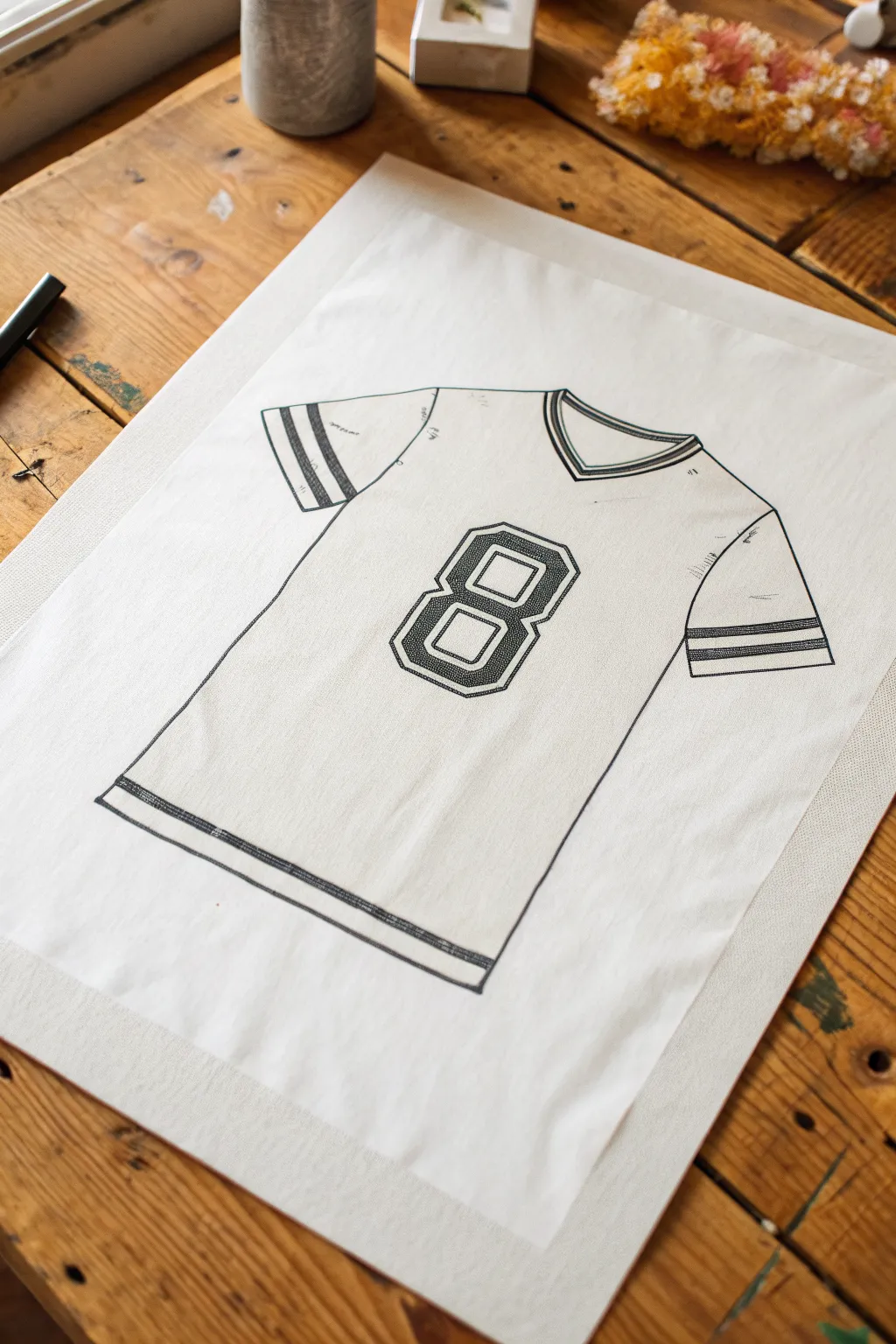
Create a classic sports tribute for Dad with this hand-drawn jersey illustration. The clean lines and bold varsity-style numbering give it a timeless, vintage athletic look that frames perfectly as a Father’s Day gift.
Step-by-Step
Materials
- Smooth heavyweight drawing paper or Bristol board
- Tracing paper (optional, for drafting)
- Pencil (HB for sketching)
- Fine liner pens (0.3mm and 0.5mm, black)
- Ruler or straight edge
- Eraser
- French curve (optional for sleeves)
- Sketching board or flat surface
Step 1: Drafting the Outline
-
Paper placement:
Secure your paper to a flat wooden surface or drafting board. If you’re using a reference photo, taping it nearby helps keep proportions in check. -
Basic T-shape:
Lightly sketch a large ‘T’ shape in the center of your page using your HB pencil. This acts as the skeleton for the torso and sleeves, ensuring the jersey stays symmetrical. -
Torso lines:
Draw two vertical lines slightly angling outward at the bottom to define the body of the shirt. A real jersey hangs loose, so avoiding perfectly parallel rigid lines makes it look more natural. -
Shoulder slope:
Connect the top of the torso to your sleeve guidelines with a gentle downward slope. Shoulders on sports jerseys are rarely perfectly straight; a slight drop mimics how fabric sits on a body. -
Sleeve definition:
Box off the ends of the sleeves. Keep the left and right sleeves angled similarly so the perspective feels consistent. -
V-neck creation:
At the top center, draw a ‘V’ shape for the collar. Double this line to create the ribbed banding effect found on vintage jerseys.
Step 2: Adding the Varsity Details
-
Sleeve stripes:
Using your ruler, measure about an inch up from the sleeve hem. Draw two parallel bands on each sleeve. These stripes are a signature element of the classic football look. -
Hem detail:
Repeat the striping process at the very bottom hem of the jersey. I find a slightly thinner double line here balances the weight of the drawing nicely. -
Center number placement:
Locate the visual center of the chest area. Lightly sketch a large rectangle as a bounding box for your number to ensure it stays centered and straight. -
Drafting the number 8:
Sketch a block-style number ‘8’ (or Dad’s favorite number) inside your box. Use sharp, angular corners rather than round curves to achieve that collegiate lettering style. -
Double outline:
Draw an inner outline inside your number to create a hollow, double-stroke effect. This mimics the stitched-on look of professional sports gear.
Wobbly Lines?
If your straight lines look shaky, don’t over-correct. Jersey fabric naturally ripples, so slightly imperfect lines can actually make the shirt look softer and more realistic.
Step 3: Inking and Refining
-
Initial inking:
Switch to your 0.5mm fine liner. Carefully trace over the main outer silhouette of the jersey. Use smooth, confident strokes to avoid wobbly fabric edges. -
Stripe detailing:
Switch to a finer 0.3mm pen for the interior details, specifically the stripes on the sleeves and hem. Fill these stripes with very distinct, tight hatching or stippling to suggest texture. -
Patterning the number:
Ink the outline of the number 8. For the interior fill, use a dense cross-hatch pattern or stippling. This darkens the number so it pops against the white shirt without being a solid black blob. -
Adding creases:
Draw small, subtle distinct lines where the sleeves meet the torso (the armpit area) and near the hem. These ‘wrinkle lines’ stop the drawing from looking flat and stiff. -
Adding texture markings:
Scatter a few very faint tick marks or broken lines across the white space of the fabric. This subtle noise suggests the weave of the fabric or slight wear. -
Clean up:
Once the ink is completely dry—give it a good five minutes to be safe—gently erase all your pencil guides. -
Final inspection:
Check your line weights. If the outer contour feels too thin compared to the bold number, go over the perimeter one last time to thicken the edge.
Make it Personal
Instead of a generic number, draw the initial of Dad’s first or last name in the same block varsity font. Or, add a small team logo patch on the upper left chest area.
Frame this artwork in a simple black frame to let the clean drafting lines stand out as a modern gift
All About My Dad Mini Icon Collage
Capture the little things that make your dad unique with this charming grid of hand-drawn icons. Using simple line work and soft color accents, you’ll create a minimalist collage that feels personal and playfully curated.
Step-by-Step
Materials
- Spiral-bound sketchbook or heavy drawing paper
- Fine-point black waterproof pen (0.3mm or 0.5mm)
- Pencil and eraser
- Ruler
- Colored pencils or fine-tip markers (muted orange, red, green, brown)
Step 1: Setting up the Grid
-
Sketch the layout:
Begin by lightly sketching a 3×3 grid of squares near the bottom half of your page using a pencil and ruler. Leave equal spacing between each box to keep the layout breathable. -
Ink the borders:
Carefully trace over your pencil grid lines with your black waterproof pen. Keep your hand steady for clean, sharp lines, or freehand it slightly if you prefer a looser, sketchier look. -
Erase guidelines:
Wait a moment for the ink to dry completely to avoid smudging, then gently erase the underlying pencil marks so you have nine clear frames.
Pro Tip: Consistent Style
Keep line weights consistent. If you use a thicker pen for the box borders, use a slightly thinner one for the detailed icons inside to create depth.
Step 2: Drawing the Upper Elements
-
The bow tie:
Above the grid on the left, draw a large bow tie shape. Use crossed lines inside the loops to create a plaid pattern, coloring alternate sections with a muted green pencil. -
The tools:
To the right of the bow tie, sketch a simple hammer and a wrench crossing each other in an ‘X’ shape. Outline them in black ink, keeping the shapes geometric and simple. -
Floating details:
Add tiny dots or sparks around a small central icon, like the drink glass shown in the example, to give it a bit of movement.
Step 3: Filling the Icon Grid
-
Row 1: Hobbies:
In the top row, start with simple shapes. For the bicycle, draw two circles and a connecting triangle line. For the bag, use a simple sack shape with a heart in the center. -
Row 2: Accessories:
Draw the hat in the first box of the second row, focusing on the brim curve. In the middle box, draw a notepad with horizontal lines. In the third box, sketch a detailed mug with a patterned surface. -
Row 3: Daily Essentials:
Sketch the tie next, adding cross-hatching for texture. Add a heart shape in the center box, and finish the bottom row with a takeaway coffee cup or a single pen. -
Ink the icons:
Go over all your pencil sketches within the boxes with your fine-point pen. Don’t worry about perfection; small wobbles add to the hand-drawn charm.
Troubleshooting: Uneven Grid
If your grid boxes aren’t perfectly square, don’t restart. Just draw the icons slightly off-center to embrace the whimsical, hand-sketched aesthetic.
Step 4: Adding Color Accents
-
Select a palette:
Choose a limited color palette—muted oranges, soft reds, and earthy greens work beautifully for a vintage dad vibe. -
Color blocking:
Fill in the heart completely with a soft red or orange. For the tie and bow tie, color specific segments to create patterns rather than filling the whole shape. -
Spot coloring:
Add subtle touches of color elsewhere: light brown for the hat, orange for the pencil body, and a dark green for the patterned mug. I like to leave plenty of white space to keep the look clean. -
Final touches:
Check for any remaining pencil lines and erase them. If any lines look too thin, gently thicken them with your pen to make the artwork pop.
This personalized grid creates a meaningful tribute that celebrates exactly who he is
Comic Strip Of Funny Dad Moments
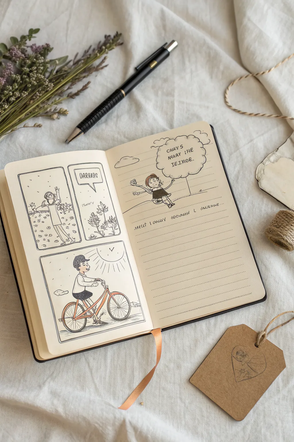
Capture the everyday chaos and joy of fatherhood with this charming comic strip style layout in your bullet journal. Using simple fine-liners and a touch of color, you’ll create a heartwarming keepsake that feels both personal and playful.
Step-by-Step Guide
Materials
- A5 dotted or blank sketchbook (cream paper recommended)
- Black fine liner pens (0.1mm, 0.3mm, and 0.5mm)
- Colored pencils (muted orange, deep grey, skin tones)
- Graphite pencil (HB or 2B)
- Eraser
- Ruler
Step 1: Planning the Layout
-
Draft the foundations:
Begin by lightly sketching the layout with your HB pencil. On the left page, mark out two vertical rectangular frames in the top half: a larger one on the left and a narrower one on the right. Below them, sketch a larger square frame that fills the bottom half. -
Sketch the right page elements:
On the facing page, sketch a single cloud-shaped speech bubble near the top right. Leave the rest of the page open for lined handwriting, but draw faint horizontal guidelines with your ruler to keep your text straight later.
Smudge Alert
If your ink smears when erasing pencil lines, you aren’t waiting long enough. Test dryness by lightly tapping an inked area with a clean finger before erasing.
Step 2: Drawing the Comic Panels
-
Scene 1: The messy moment:
In the top-left frame, sketch a figure with arms raised in exasperation or surprise. Add small squares and circles floating around them to represent confetti or a messy room. -
Scene 2: The reaction:
For the top-right frame, draw a simple speech bubble coming from off-screen or from a small character detail. You can letter a fun sound effect like ‘YAAAAAY’ or a made-up word inside. -
Scene 3: The bike ride:
In the large bottom frame, sketch a side profile of a dad figure riding a bicycle. Draw the wheels as large ovals and ensure the handlebars are within reach of the character’s hands. Add a sun and heat lines in the corner to set a warm scene. -
Right page character:
Beneath the cloud bubble on the right page, draw a small, whimsical character—perhaps a child—jumping or dancing. Use loose, gestural lines to suggest movement.
Personal Touch
Customize the ‘confetti’ in the first panel to something specific to your dad—like nuts and bolts, autumn leaves, or even puzzle pieces.
Step 3: Inking and Refining
-
Ink the frames:
Switch to your 0.5mm black fine liner. Carefully trace over the panel borders on the left page. Freehand these lines slightly rather than using a ruler for everything; a little wobble adds to the hand-drawn charm. -
Outline the characters:
Use the 0.3mm pen to ink your character sketches. Keep the lines relatively simple. For the bike spokes, quick, straight flicks work best to imply tension without needing geometric perfection. -
Add texture and details:
With your finest 0.1mm pen, add details like the texture of the ground under the bike, the floating confetti bits, and facial expressions. This is where I like to add tiny hatching lines for shadows on clothes. -
Lettering:
Ink the speech bubbles and the cloud text. Use a playful, all-caps font that matches the casual drawing style. -
Clean up:
Once the ink is completely dry (wait at least 5 minutes), gently erase all underlying pencil marks to reveal a clean, crisp drawing.
Step 4: Adding Color and Text
-
Warm accents:
Take a muted orange colored pencil and color the bicycle frame. Apply a little more pressure at the joints of the bike for shading. -
Clothing tones:
Use a deep grey pencil to color the dad’s shorts and the child’s dress. Keep the coloring soft and sketchy, leaving some white paper showing for highlights. -
Writing the narrative:
On the right page, along your penciled guidelines, write out a short story or caption using the 0.3mm pen. Keep your handwriting small and spaced out. -
Faux lines:
Finally, draw dotted horizontal lines across the right page with your 0.1mm pen to mimic notebook paper, integrating your handwritten text into the lines.
Now you have a charming, storybook-style tribute ready to make someone smile

Have a question or want to share your own experience? I'd love to hear from you in the comments below!