
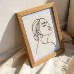
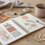
When I’m craving fresh art character ideas, I start by thinking in pieces—silhouette, personality, and one unforgettable detail that makes the design stick. Here are my favorite character prompts and mini-formats to help you invent original characters that feel instantly alive.
Character Turnaround Sheet
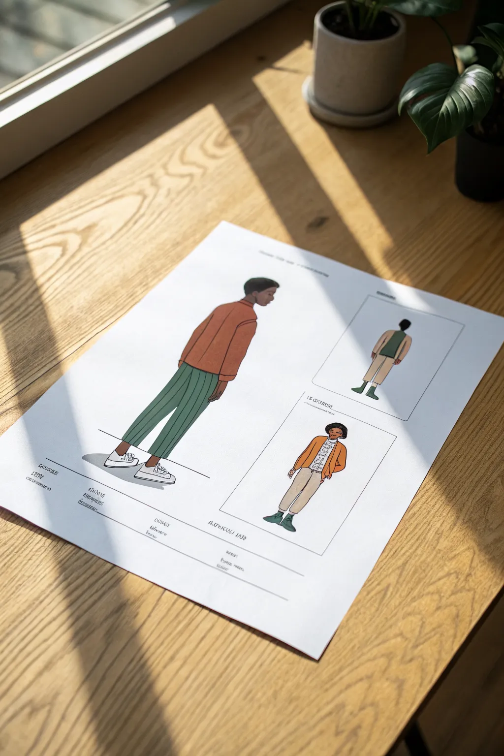
This project guides you through creating a stylish character design sheet featuring a primary side-profile figure and two smaller outfit variations. You’ll use markers and fine liners to achieve a clean, illustrative look that feels both professional and approachable.
How-To Guide
Materials
- Smooth bristol board or layout paper (A3 or A4)
- H or HB pencil for sketching
- Kneaded eraser
- Fine liner pens (black, 0.1mm, 0.3mm, 0.5mm)
- Alcohol-based markers (Rust orange, forest green, warm grey, skin tones)
- White gel pen
- Ruler
Step 1: Layout and Sketching
-
Establish the composition:
Begin by lightly marking out the positions for your three figures. Place the largest figure on the left side, taking up about two-thirds of the vertical space. Reserve the right side for two smaller, rectangular framed panels. -
Sketch the main figure’s gesture:
For the main character on the left, sketch a loose skeleton to capture the pose. He is standing in profile, facing right, with a relaxed posture. -
Flesh out the anatomy:
Build upon the skeleton with simple shapes. Sketch the head, the torso leaning slightly forward, and the legs. Pay attention to the profile of the face, keeping the features distinct but simple. -
Draft the clothing:
Draw the rust-colored sweater over the torso. It should look slightly loose, so add folds near the elbows and waist. Draw the trousers, ensuring they taper slightly toward the ankles, and sketch the simple sneakers. -
Sketch the secondary figures:
Move to the right side. In the top imaginary box, sketch a rear-view figure wearing a green vest. In the lower box, sketch a front-facing female figure in a yellow cardigan and beige pants. -
Define the frames:
Use your ruler to draw neat rectangular boxes around the two smaller figures on the right. This separates them as distinct outfit variations.
Step 2: Inking the Lines
-
Outline the main figure:
Using a 0.3mm fine liner, carefully ink over your pencil lines for the main character. Keep the lines smooth and continuous. Use a slightly thicker 0.5mm pen for outer contours to make the figure pop. -
Add clothing details:
Switch to a 0.1mm pen for internal details like the seams on the sweater, the laces on the shoes, and the facial features. Don’t ink the stripes on the pants yet—we’ll handle those later. -
Ink the layout elements:
Use the ruler and a 0.3mm pen to ink the rectangular frames on the right. Draw a horizontal ground line beneath the main figure’s feet to ground him in the space. -
Erase pencil marks:
Once the ink is completely dry, gently erase all pencil guidelines with your kneaded eraser to leave a clean slate for coloring.
Clean Lines Pro Tip
When inking long straight lines like the trouser stripes, exhale slowly as you draw. It stabilizes your hand and prevents the line from wobbling.
Step 3: Coloring with Markers
-
Color the skin:
Select a medium-dark brown marker for the skin tones. Apply smoothly to the face, neck, and hands of the main figure. I like to let this base layer dry for a moment before adding a second swipe for shadows under the chin. -
Fill the sweater:
Use a rust-orange marker to color the sweater. Work in long, even strokes to avoid streaks. Leave small slivers of white paper occasionally near the shoulders for natural highlights. -
Color the trousers:
Apply a muted forest green marker to the pants. Ensure the coverage is solid and uniform. Once dry, take your 0.1mm black pen and carefully draw vertical pinstripes following the curve of the leg. -
Detail the shoes:
Leave the sneakers mostly white, but use a very pale warm grey marker to add shadows to the sides and soles to give them dimension. -
Color the secondary figures:
Color the smaller figures using a coordinated palette. Use a lighter beige for the pants on the right and a mustard yellow for the cardigan, ensuring they visually complement the main illustration.
Level Up: Fabric Swatches
Draw small circles or squares near the bottom corner and fill them with the marker colors used for the clothes to create a ‘color palette’ key.
Step 4: Final Touches
-
Add grounded shadows:
Using a cool grey marker, draw a simple, oval-shaped cast shadow on the ground beneath the main figure’s feet. This prevents the character from looking like they are floating. -
Highlight with white gel:
Use a white gel pen to add tiny highlights to the eyes and arguably a rim light on the hair if desired. This adds a spark of life to the drawing. -
Letter formatting:
At the bottom of the page or within the boxes, use a ruler to draw very faint guidelines. Write in ‘model’ text or fabric details using a neat, all-caps architectural font style to mimic a spec sheet.
Now you have a professional-looking character sheet ready for a portfolio display.
Expression Sheet With Mood Range
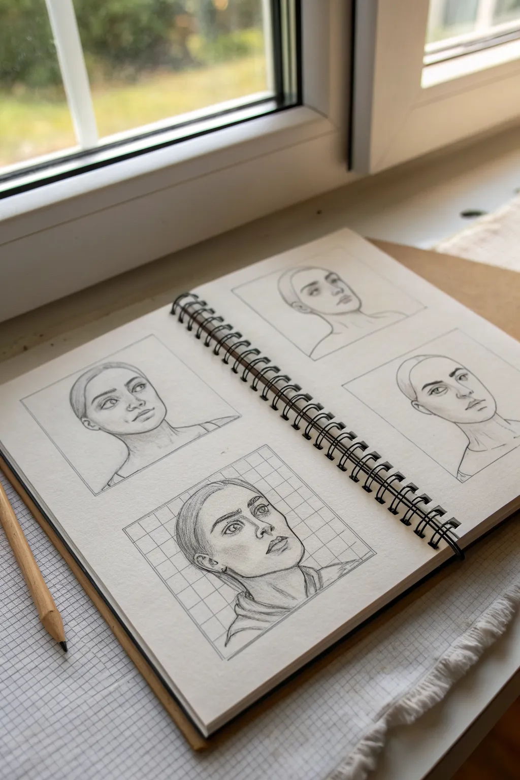
Master the subtleties of facial expressions with this clean, structured character sheet on grid paper. You will sketch a single subject across four distinct panels, exploring slight variations in angle and mood to build consistency in your portraiture.
Step-by-Step Guide
Materials
- Spiral-bound sketchbook (medium weight paper)
- Graphite pencils (HB for initial lines, 2B/4B for shading)
- Ruler or straightedge
- Kneaded eraser
- Fine-liner pen (optional, for grid lines)
- Blending stump (tortillon) or soft tissue
Step 1: Setting up the Structure
-
Prepare the layout:
Begin by deciding on the placement of your four portraits. Using a ruler and a light HB pencil, draw four equal-sized squares or rectangles on your sketchbook page—two on the left page, two on the right. Leave comfortable margins between them so the page doesn’t feel cluttered. -
Optional grid background:
For the bottom-left portrait specifically (as seen in the reference), draw a grid pattern inside the frame. Use your ruler to create evenly spaced horizontal and vertical lines behind where the head will sit. This adds a technical, architectural aesthetic to the study.
Fixing Proportions
If facial features look misaligned, view your drawing in a mirror or snap a photo with your phone. Flipping the image horizontally instantly reveals skewing errors.
Step 2: Constructing the Base Forms
-
Establish head shapes:
In each box, lightly sketch a basic oval for the cranium and a jawline. vary the tilt slightly for each one—keep some facing forward, others in a three-quarter view. Ensure the size is consistent across all four panels. -
Mark facial guidelines:
Draw faint vertical lines down the center of each face (following the curve of the tilt) and horizontal lines for the eyes, nose, and mouth. These construction lines are crucial for maintaining the same proportions for your character across different poses. -
Rough in the features:
Using your breakdown lines, lightly place the eyes, nose, and mouth. Focus on simple geometric shapes first rather than details. Check that the distance between the eyes is consistent in every box.
Varying Techniques
Try using different shading techniques for each box. Keep one smooth, cross-hatch another, and use stippling for a third to practice texture versatility.
Step 3: Refining the Features
-
Define the eyes and brows:
Switch to a slightly sharper pencil. Begin detailing the eyes, paying attention to the eyelids and the iris direction. Adjust the eyebrows for each panel to suggest different subtle moods—arched for curiosity, relaxed for neutral, or flat for seriousness. -
Sculpt the nose and mouth:
Define the nose structure, focusing on the shadow shapes underneath rather than drawing hard outlines. sketch the lips, noting how perspective changes their width in the three-quarter views. -
Add the hairline and ears:
Draw the hairline, pulling it back tightly as shown in the reference to focus on facial structure. Place the ears, aligning the tops with the eyes and the bottoms with the nose base. -
Structure the neck:
Extend the neck lines down to the shoulders. I like to add slight indications of the clavicles or shirt collars to ground the head, ensuring the neck width feels supportive enough for the head.
Step 4: Shading and Finishing
-
Start the shading process:
Switch to a 2B pencil. Identify a consistent light source (e.g., top left) and lightly shade the side of the face away from the light. Focus on the eye sockets, under the nose, and beneath the lip. -
Deepen the contrast:
Use a 4B pencil to darken the pupils, the lash line, and the deepest shadows under the chin. This pop of contrast brings the face to life. -
Blend for smoothness:
Take a blending stump or a soft tissue and very gently smudge the graphite in the shadowed areas to create smooth skin transitions. Be careful not to smudge your crisp outlines. -
Hair texture:
Add directional strokes to the hair area. Since the hair is pulled back, keep the lines uniform and following the curve of the skull towards the back of the head. -
Final clean up:
Use your kneaded eraser to pick out highlights on the nose tip, forehead, and cheekbones. Erase any stray construction lines outside the main frames to keep the presentation sharp. -
Frame alignment:
Go over the square borders of your panels one last time with a ruler and a darker pencil to make the drawings look intentional and ‘mounted’ on the page.
Your character study is now complete, providing a beautiful reference for future emotional ranges
Element-Themed Spellcaster
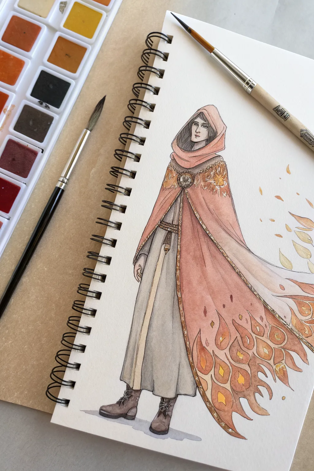
Capture the warmth and power of elemental magic with this delicate watercolor character illustration. This project combines structured ink linework with flowing gradients of peach and cadmium orange to create a cloak that seems to transform into living fire.
Detailed Instructions
Materials
- Spiral-bound mixed media or watercolor sketchbook
- Pencil and eraser
- Fine-liner pen (black, waterproof, size 0.1 or 0.3)
- Watercolor paints (pan set featuring warm yellows, oranges, and burnt sienna)
- Round watercolor brushes (size 4 for washes, size 0 or 2 for details)
- Jar of clean water
- Paper towel
Step 1: Drafting and Linework
-
Establish the pose:
Begin with a light pencil sketch to figure out the standing posture. Draw a simple vertical centerline to ensure the figure stands straight, then block in the head, shoulders, and the long, draped lines of the robe. -
Sketch the cloak’s flow:
Draft the hood framing the face and the large, sweeping cloak. Pay attention to how the fabric bunches at the shoulders and then fans out towards the bottom right, suggesting movement. -
Detail the flame motif:
Instead of a straight hem, draw the edge of the cloak breaking apart into stylized flame shapes. Sketch teardrop and curved flame segments rising from the bottom edge. -
Refine the outfit:
Add the inner tunic details, including the belt, the vertical trim down the center of the dress, and the sturdy boots. Keep the facial features simple and serene. -
Apply the ink:
Using your waterproof fine-liner, carefully trace over your pencil lines. Use confident, unbroken strokes for the long fabric folds. Add hatching lines around the face and inside the hood for deeper shadows. -
Erase guidelines:
Wait until the ink is completely dry to the touch—rushing this will smear your drawing. Gently erase all underlying pencil marks to leave a crisp black-and-white outline.
Muddy colors?
If your gradient looks brown or muddy, let the first layer dry completely before adding the next. Glazing wet paint over dry paint often keeps colors brighter than mixing them all while wet.
Step 2: Watercolor Base Layers
-
Paint the skin tones:
Mix a very dilute wash of peach or light brown for the face and hands. Apply it lightly, leaving tiny slivers of white paper for highlights on the nose or cheekbones if you can. -
Wash the inner tunic:
For the main dress, create a watery grey wash. Paint the entire inner robe, letting the color pool slightly at the bottom hem to create a natural gradient of weight and shadow. -
Color the central trim:
Use a pale ochre or beige for the vertical strip running down the center of the tunic. Keep this color flat and neutral to balance the bright cloak to come. -
Start the cloak gradient:
Mix a dusty pink or light terracotta color. Paint the upper portion of the cloak (hood and shoulders), brushing downwards but stopping before you reach the flame tips. Wet the paper slightly first to help the paint flow.
Step 3: Igniting the Details
-
Transition to orange:
While the upper cloak area is still slightly damp, introduce a vibrant orange near the mid-section. Blend it upward into the pink to create a smooth transition from fabric to heat. -
Fill the flame tips:
Switch to your brighter yellows and deep cadmium oranges. Paint the individual flame shapes at the bottom hem. Vary the intensity—some should be pale yellow, others deep orange—to mimic flickering fire. -
Paint the boots:
Use a concentrated mix of brown and black to paint the boots. Since this area is small and dark, you don’t need much water here; keep the pigment dense. -
Add floating embers:
Take a small brush with yellow-orange paint and dab small leaf-like shapes floating to the right of the figure. This suggests magic or embers drifting off the cloak. -
Enhance the embroidery:
Once the shoulders are dry, use a fine brush with yellow ochre or gold paint to add intricate patterns on the shoulder mantle and the circular clasp. -
Deepen the shadows:
Mix a darker version of your pink-terracotta color. Carefully glaze over the folds of the cloak (like inside the hood and under the arm) to add volume and dimension. -
Final highlights:
If the flame shapes look too flat, I sometimes add a touch of darker red-orange to the very bottom curves of the flames to make them pop against the white background.
Level Up: Metallic Pop
Swap the yellow ochre paint for real metallic gold watercolor or gold ink for the jewelry and cloak trim. It will catch the light beautifully when you turn the page.
Now your spellcaster is ready to light up the pages of your sketchbook with their fiery presence
Sci-Fi Courier With Utility Gear
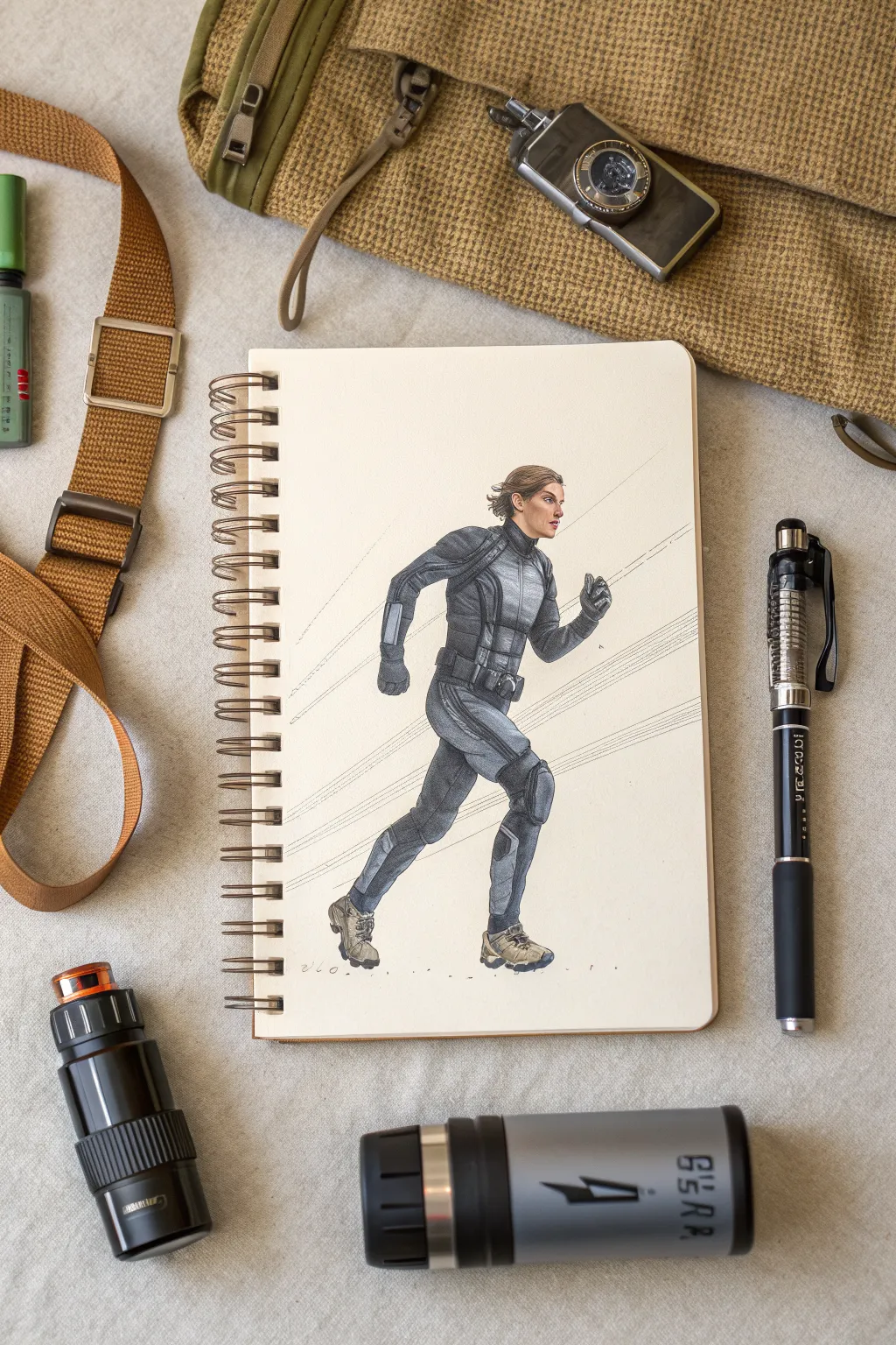
Capture the urgency and precise detail of a sci-fi courier in motion with this dynamic mixed-media illustration. You will combine the crisp lines of technical pens with the smooth shading of alcohol markers to create a character that feels both grounded and futuristic.
Step-by-Step
Materials
- Spiral-bound sketchbook (heavyweight mixed-media paper)
- H or HB graphite pencil
- Kneaded eraser
- Fine liner pens (0.1, 0.3, and 0.5mm, black)
- Alcohol-based markers (Cool Greys 1-7, Warm Greys, Tan/Sand tones)
- White gel pen or gouache
- Ruler or straight edge
Step 1: Laying the Foundation
-
Establish the gesture:
Begin with a very light graphite sketch to capture the motion. Draw a sweeping line of action indicating the forward lean of the run. Roughly block in the head, torso, and limb placement, focusing on the kinetic energy rather than anatomical details. -
Refine the anatomy:
Flesh out the figure’s forms over your stick frame. Pay close attention to the mechanics of running—the bent knee lifting high, the arms pumping in opposition. Keep the hands in loose fist shapes. -
Draft the suit design:
Sketch the tactical bodysuit over the anatomy. Draw the distinct panels of the armor, focusing on the shoulder pads, chest plate, and knee guards. Add the utility belt and pouches around the waist, ensuring they look like they have weight and volume. -
Add facial features:
Lightly sketch the profile of the face. Since the character is running, give them a focused, determined expression. Keep the hair swept back to emphasize the speed of movement.
Pro Tip: Fabric Weight
When drawing the suit’s wrinkles, focus on the joints. High-tech tactical fabric is stiff, so draw fewer, sharper folds rather than soft, draped curves like cotton.
Step 2: Inking and Outline
-
Define the main contours:
Using a 0.3mm fine liner, carefully go over your pencil lines. Use confident, smooth strokes for the long lines of the legs and arms. I tend to break the line slightly on curved armor pieces to suggest light hitting the edge. -
Detail the gear:
Switch to a 0.1mm pen for intricate details like the belt buckles, zippers, and seams on the suit. These small mechanical details sell the sci-fi aesthetic. -
Erase graphite:
Once the ink is completely dry (give it a few minutes to avoid smudging), gently erase all underlying pencil marks with your kneaded eraser.
Level Up: Holographic UI
Use a neon blue or green colored pencil to draw a faint, floating navigation map or HUD interface projected from the character’s wrist device.
Step 3: Rendering with Markers
-
Base skin tones:
Apply a base layer of a light tan marker to the face and hands. Layer a slightly darker shade under the jawline and eye socket to create form. -
Base grey for the suit:
Start with a Cool Grey 2 or 3 to fill in the majority of the bodysuit. Work quickly to keep the ink wet and blendable, avoiding harsh streaks. -
Deepen the shadows:
Use a Cool Grey 5 or 6 to add shadows to the underside of the limbs, under the belt, and behind the knees. Focus on where the fabric folds or where armor plates overlap. -
Add panel differentiation:
To make the suit look constructed from different materials, use a Warm Grey or a darker Cool Grey for specific panels like the knee pads and shoulder accents. This contrast makes the design pop. -
Coloring the boots:
Use sand or beige tones for the boots to break up the monochrome suit palette. Add grey shadows to the soles to ground the figure.
Step 4: Finishing Interactions
-
Texture the fabric:
Using your 0.1mm pen again, add tiny cross-hatching or stippling in the deepest shadow areas of the suit. This adds a texture that mimics heavy tactical fabric. -
Motion lines:
Place a ruler behind the figure aligned with the angle of the run. Use a 0.05mm pen or a very sharp pencil to draw thin, straight lines trailing behind the character to visually represent speed. -
Highlights:
Use a white gel pen to add small highlights on the armor plates, belt buckles, and the bridge of the nose. This brings a sheen to the materials. -
Ground shadow:
Add a small, disjointed shadow beneath the feet using a light grey marker. Since the character is mid-stride, the shadow shouldn’t fully connect to the boots, emphasizing the lift.
Now your courier is ready to deliver their package across the galaxy with style and speed
BRUSH GUIDE
The Right Brush for Every Stroke
From clean lines to bold texture — master brush choice, stroke control, and essential techniques.
Explore the Full Guide
Anthro Animal-Hybrid With Human Fashion
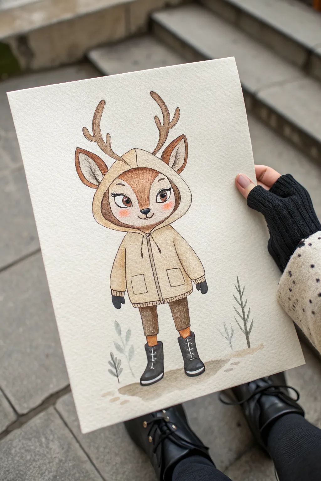
Capture the charm of winter fashion with this adorable anthropomorphic deer illustration. Using a mix of colored pencils and watercolor, you’ll create a textured, heartwarming character perfect for seasonal cards or art journals.
Step-by-Step Tutorial
Materials
- Hot press watercolor paper (A5 size)
- HB graphite pencil
- Kneaded eraser
- Waterproof fine liner pen (brown or sepia, 0.1mm)
- Watercolor paint set (pans or tubes)
- Round watercolor brush (size 4)
- Colored pencils (wax or oil-based)
- White gel pen
Step 1: Sketching the Character
-
Basic Shapes:
Start by drawing a large circle for the head in the upper center of your paper. Below it, sketch a trapezoid shape for the body (the hoodie) and two simple rectangles for the legs to establish proportions. -
Adding Features:
Refine the head shape, adding two large petal-shaped ears on the sides and branching antlers on top. Draw a large, heart-shaped face area inside the head circle. -
Clothing Details:
Outline the hood surrounding the face. Add details to the jacket: a central zipper line, two square pockets, and ribbed cuffs at the bottom and wrists. Draw the boots with simple curved lines. -
Refining the Face:
Within the face shape, sketch large, almond-shaped eyes, a small triangular nose, and a simple curved mouth. Keep your pencil lines light so they don’t show through later. -
Surroundings:
Lightly sketch a few simple plant fronds on either side of the deer and a jagged ground line beneath the boots to ground the character.
Muddy colors?
If your pencil lines are smudging into the watercolor, ensure the paint is 100% dry. If shadows look dirty, switch to a purple pencil for shading.
Step 2: Applying Watercolor Base
-
Skin Tones:
Mix a diluted warm brown watercolor wash. Paint the outer fur of the face (the area outside the heart shape) and the antlers. Let the inner face remain white for now. -
Coloring the Outfit:
Mix a pale beige or cream color for the hoodie. Apply a flat wash over the entire jacket area. While that dries, paint the pants a medium brown. -
Boots and Details:
Use a dark charcoal or black watercolor for the boots and mittens. I generally prefer two thin layers here to get a solid, opaque look without overworking the paper. Paint the ground shadow with a diluted gray-brown wash. -
Background Plants:
Paint the plant sprigs using a muted gray-green. Keep the paint watery so they look soft and slightly out of focus compared to the main character. -
Drying Time:
Allow the entire painting to dry completely. The paper must be bone-dry before we add pencil texture to prevent tearing.
Level Up: Pattern Play
Customize the hoodie by drawing a flannel pattern or polka dots with your colored pencils before adding the final shading layers.
Step 3: Adding Texture and Definition
-
Creating Fur Texture:
Using a sharp brown colored pencil, draw short, directional strokes on the darker fur parts of the head and ears to simulate hair. Add gentle shading around the edge of the cream face mask. -
Defining the Hoodie:
Take a slightly darker beige or light brown pencil to outline the hoodie. Add shading under the hood, around the pocket edges, and along the zipper to create volume. -
Deepening Shadows:
Use a dark brown pencil to deepen the shadows on the pants and antlers. Shade the inside of the ears with a soft pinkish-brown pencil. -
Eye Detail:
Color the irises with a warm brown pencil, pressing firmly for saturation. Outline the eyes with a black pencil and add exaggerated lashes for that cute, doe-eyed expression. -
Blushing Cheeks:
Lightly brush a coral or pink pencil in circular motions on the cheeks to give the deer a rosy, cold-weather flush.
Step 4: Final Touches
-
Inking the Outline:
Go over your main pencil lines with the brown fine liner. A broken or sketchy line style works best here to keep the illustration feeling organic and soft. -
Boot Laces:
Use the white gel pen to draw small ‘X’ shapes or laces onto the black boots giving them detail without needing negative space. -
Highlights:
Add small dots of white gel pen to the eyes for a sparkle. You can also add tiny white dashes on the hoodie pockets or shoulders as highlights.
Now you have a charming woodland friend ready to brave the winter weather with style
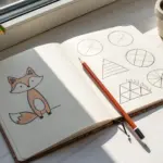
Shape Language Character: Round, Square, or Sharp

Learn to harness the power of shape language by sketching three distinct character designs based on circular, square, and triangular forms. This exercise explores how fundamental geometry influences character personality, all rendered in a clean, graphic pencil style on dot-grid paper.
Step-by-Step
Materials
- A5 Dot-grid sketchbook or loose dot-grid paper
- HB or 2B graphite pencil (for sketching)
- 0.5mm Mechanical pencil (for detail work)
- Fine-liner pen (0.3mm or 0.5mm, black)
- Kneaded eraser
- ruler (optional, but helpful for the square robot)
Step 1: Planning and Layout
-
Establish the layout:
Open your dot-grid notebook to a fresh spread. Visualize where your three characters will sit: the round character on the upper left, the square character on the right, and the sharp triangular character near the bottom center. -
Rough circular forms:
Start with the upper-left character. Using very light pressure with your HB pencil, sketch a large mushroom-cap shape for the head and a smaller square shape underneath for the body. -
Rough square forms:
Move to the right side. Lightly box out a large square for the head and a slightly taller rectangle for the torso. I find counting the dots on the paper helps keep these proportions symmetrical. -
Rough triangular forms:
For the bottom character, sketch a simple equilateral triangle that feels grounded and stable. This will serve as the entire body and head combined.
Pro Tip: Dot Grid Guide
Use the dots on your paper as measuring units. For the square robot, make the head exactly 6×6 dots and the body 6×7 to ensure perfect geometric symmetry without measuring.
Step 2: Refining the ‘Round’ Character
-
Shape the head:
Darken the outline of the mushroom cap. Round off the bottom corners significantly to emphasize a soft, friendly silhouette. -
Add facial features:
Draw two large, circular eyes wide apart on the face. Add smaller concentric circles inside for pupils to give it a curious expression, followed by a simple curved line for a smile. -
Detail the body and limbs:
Define the rectangular body, adding a grid pattern on its chest. Draw thin, stick-like arms with C-shaped hands and add large, rounded feet that look like suction cups or heavy boots.
Level Up: Color Coding
Use watercolor pencils to add a single accent color to each bot—blue for round, red for square, and yellow for sharp—to further distinguish their personalities.
Step 3: Refining the ‘Square’ Character
-
Define the boxy head:
Using your ruler or following the dot grid closely, harden the outlines of the square head. Round the corners just slightly so it doesn’t look too aggressive. -
Construct the face and antenna:
Draw two large circles for eyes, similar to the first robot, but place them within a rectangular faceplate. Add a small antenna sticking straight up from the center of the head. -
Build the torso:
Draw the torso block, connecting it to the head with a thin neck cylinder. Add rounded shoulder caps where the arms will attach. -
Add mechanical limbs:
Sketch the arms and legs as segmented cylinders—think of dryer vent tubing. Finish with blocky, rectangular feet that planted firmly on the ground.
Step 4: Refining the ‘Sharp’ Character
-
Pyramid structure:
Go back to your bottom triangle. Create a 3D effect by drawing a line from the top point down to the bottom edge, slightly off-center, to show two sides of a pyramid. -
The single eye:
Draw a singular, narrow eye in the upper third of the pyramid. Give it a heavy eyelid to create a mysterious or sleepy look. -
Floating aesthetic:
Instead of traditional legs, draw three small rectangular tabs floating or extending from the base, suggesting a hovering propulsion system.
Step 5: Texturing and Shading
-
Inking the outlines:
Switch to your fine-liner pen if you want permanent lines, or simply press harder with a softer 2B pencil. Trace over your refined sketch lines to finalize the silhouettes. -
Cross-hatching the square robot:
On the square robot’s body and face, draw a grid of vertical and horizontal lines. This emphasizes the ‘graph paper’ aesthetic of the character’s design. -
Hatching the pyramid:
For the triangular bot, use horizontal lines across the entire pyramid face to mimic layers of bricks or metal plating. -
Adding texture to the round bot:
Keep the round robot’s head mostly clean white to retain its smoothness. Add a simple grid to its chest plate to visually link it to the other robots. -
Shadowing the eyes:
Fill in the pupils of the round and square robots solid dark. For the pyramid’s eye, shade the iris heavily but leave a tiny sliver of white. -
Final shading touches:
Add subtle hatching shadows under the chins and where limbs connect to bodies. Erase any visible stray construction lines to clean up the page.
Now you have a trio of characters that perfectly demonstrate how basic shapes dictate character design.

PENCIL GUIDE
Understanding Pencil Grades from H to B
From first sketch to finished drawing — learn pencil grades, line control, and shading techniques.
Explore the Full Guide
Limited Palette Character With a Color Story
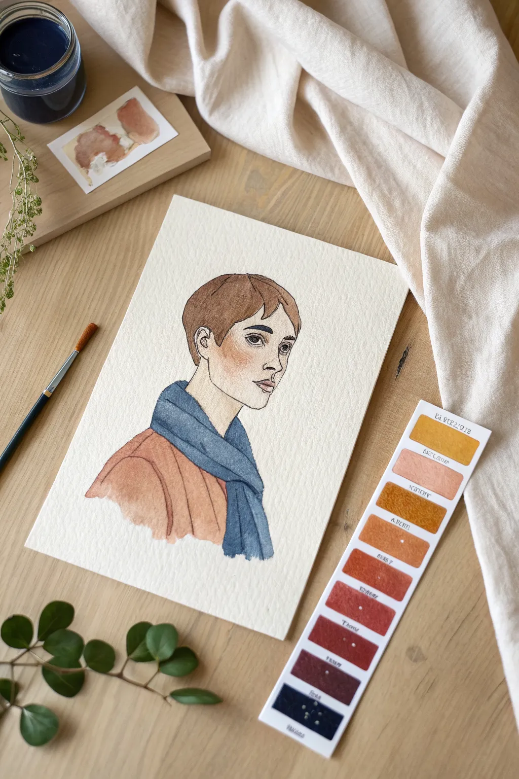
This project explores the power of a restrained palette by creating a stylized character portrait in watercolor. Using a carefully selected range of earthy ochres and deep blues, you’ll capture both warmth and structure in a single evocative illustration.
How-To Guide
Materials
- Cold press watercolor paper (300 gsm or heavier)
- H or HB pencil for sketching
- Kneaded eraser
- Watercolor paints (Yellow Ochre, Burnt Sienna, Burnt Umber, Indigo or Payne’s Gray, Alizarin Crimson)
- Round watercolor brushes (Size 4 and Size 0 or 00 for details)
- Fine liner pen or very dark watercolor on a liner brush
- Palette for mixing
- Water container and paper towels
Step 1: Conceptualizing and Sketching
-
Establish the head shape:
Begin lightly with your pencil, drawing an oval for the head. Keep the chin fairly angular and the jawline visible to match the character’s bone structure seen in the example. -
Map facial features:
Position the eyes halfway down the face. The nose should have a strong, straight bridge, and the lips should be full but relaxed. Ensure the gaze is directed slightly off to the side, giving the character a contemplative look. -
Outline the hair:
Sketch a short, pixie-style haircut. Focus on the shape of the bangs sweeping across the forehead and the hair tucking neatly behind the ear. -
Add clothing drapes:
Draw the neckline of a simple top and drape a scarf loosely around the neck. Use flowing lines to suggest fabric folds, particularly where the scarf wraps over the shoulder. -
Refine the lines:
Go over your sketch to darken the final lines slightly. Use your kneaded eraser to lift off any messy construction lines, leaving only the essential contours.
Keep it Clean
To keep skin tones muddy-free, always clean your water jar before mixing face colors. Even a tiny bit of blue residue in your water can turn a peach tone into a dull green gray.
Step 2: Applying the Base Washes
-
Mix skin tones:
Create a pale skin wash using a lot of water mixed with a tiny touch of Yellow Ochre and a speck of Alizarin Crimson. Test the color on a scrap paper; it should be very faint. -
Paint the face:
Apply the skin wash to the face and neck area. Use a wet-on-dry technique to keep the edges controlled, but work quickly so it dries evenly. -
Add a blush:
While the face wash is still slightly damp (but not puddling), drop a slightly more saturated mix of Burnt Sienna or Red Ochre onto the cheek area for a soft, natural blush. -
Base layer for hair:
Mix a light wash of Burnt Umber and Yellow Ochre. Paint the hair shape entirely, avoiding the skin. This serves as the highlight color for the hair.
Step 3: Developing the Color Story
-
Paint the top:
Mix a warm terracotta color using Burnt Sienna and a touch of red. Apply this to the shirt area using a loose, watery wash. Let the pigment pool slightly at the bottom edge for a natural watercolor texture. -
Paint the scarf:
Switch to your cool tone. Mix Indigo or Payne’s Gray with plenty of water for a denim-blue hue. Paint the scarf, carefully working around the jawline and the shirt collar. -
Deepen the shadows:
Wait for the scarf layer to dry. Mix a more concentrated Indigo and paint the shadowed areas where the scarf folds over itself and where it sits against the neck. -
Add hair volume:
Using a stronger mix of Burnt Umber, paint strands of hair over the dry base layer. Focus on the roots and the tips to create dimension, leaving the mid-section lighter.
Create a Swatch Strip
Before painting, test your color harmony on a separate strip of paper (as seen in the photo). Keep it next to your work to ensure your paint mixes stay consistent throughout the process.
Step 4: Defining Details
-
Enhance facial features:
With a small brush (size 0), use a darker skin mix to define the shadow under the nose, the eyelids, and the shadow under the lower lip. -
Paint the eyes:
Use dark brown or gray for the irises. Leave a tiny speck of white paper for the catchlight to make the eyes look alive. -
Outline the character:
For the illustrative look shown in the reference, use a very fine liner brush with concentrated dark brown paint (or a fine liner pen). Trace the main contours of the face, hair, and clothing. -
Strengthen the jawline:
Ensure the jawline is clearly defined with your liner tool, separating the pale skin of the face from the neck. -
Final texture check:
Look at the clothing. If it looks too flat, add a few quick, confident strokes of darker paint to suggest fabric weave or heavy folds. I find that less is more here—don’t overwork it.
Allow the piece to dry completely before framing it to showcase your elegant study of color harmony
Role + Setting + Gimmick Character Prompt
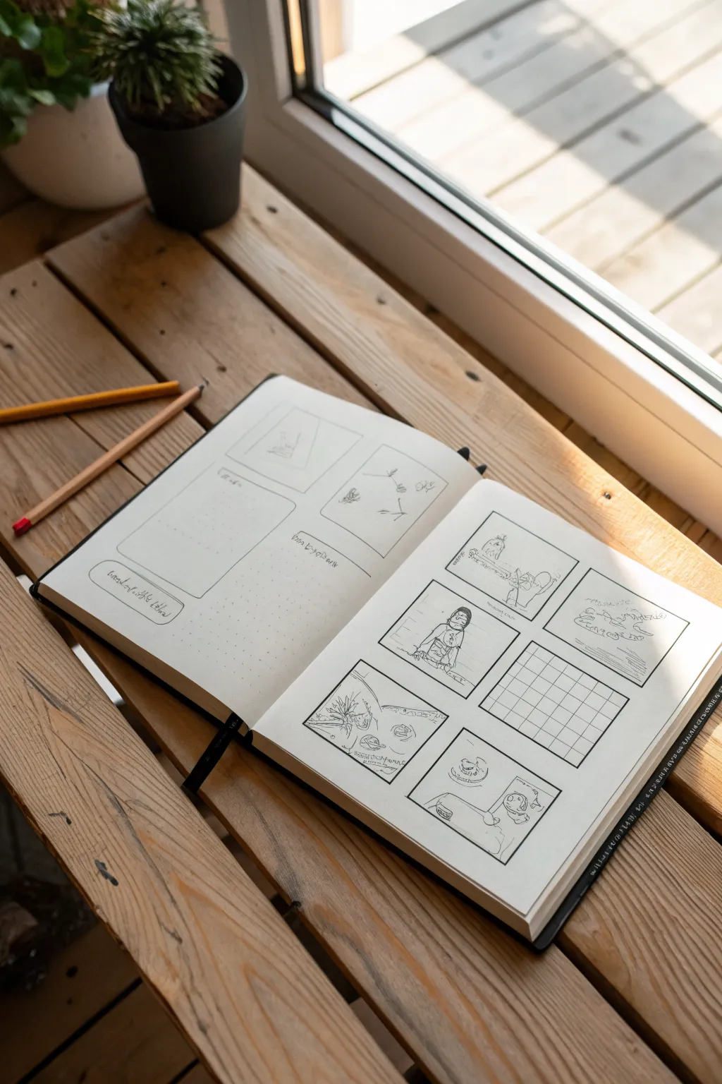
Capture the raw, creative energy of planning a story with this storyboard layout sketch. Set against a warm, rustic wooden backdrop illuminated by natural light, this project focuses on loose linework and structural planning for character ideas.
Step-by-Step Tutorial
Materials
- Hardbound sketchbook (A4 or similar size)
- Black drawing pen (fine tip/micron 0.3 or 0.5)
- Graphite pencil (HB or 2B)
- Ruler (optional, for straighter lines)
- Eraser
- Wooden surface or table for staging
Step 1: Setting the Scene & Layout
-
Prep the workspace:
Find a spot with strong natural light, ideally near a window. Place your sketchbook on a wooden surface like a crate or table to match the aesthetic. -
Open and flatten:
Open the sketchbook to a fresh spread. Press down firmly on the spine so the pages lie relatively flat, which makes drawing across the spread easier. -
Pencil in panel borders:
Lightly sketch the layout for your comic panels using a graphite pencil. Aim for six distinct boxes on the right page and a mix of rectangular and square shapes on the left page. -
Vary the sizes:
Don’t make every box identical. Create visual interest by making some panels wider or taller, mimicking a dynamic comic strip flow.
Smudged Ink?
If you smudge ink while erasing, turn it into a shadow or texture. Stippling dots over the smudge often hides mistakes effectively.
Step 2: Inking the Structure
-
Ink the frames:
Go over your pencil panel lines with a black drawing pen. You can freehand these for a looser, organic look or use a ruler if you prefer crisp edges. -
Add connecting elements:
Draw small arrows or connecting lines between panels on the left page if you want to simulate a flow chart or mind-map style. -
Create a text box:
On the left page, sketch a long, rounded rectangle near the bottom. This acts as a caption or dialogue placeholder. -
Add a grid panel:
On the right page, choose one panel (middle right is good) and fill it with a grid pattern. This suggests a technical map or a floor plan within the story.
Step 3: Sketching the Content
-
Draft the figures:
Switch back to your pencil or use a very light touch with the pen. Sketch simple character figures inside the panels. -
Keep it loose:
Don’t worry about perfect anatomy. Focus on gesture and ‘bean’ shapes for bodies to convey action rather than detail. -
Add an establishing shot:
In the top right panel, draw a horizon line and some cloud-like shapes to suggest an outdoor setting or landscape. -
Detail the character:
In the central left panel on the right page, draw a character from the waist up. Add simple facial features and hair to give them personality. -
Suggest movement:
Use quick, scribbly lines to fill in backgrounds or suggest motion. The goal is to make it look like a work-in-progress idea. -
Lettering placeholders:
Scribble some illegible loops or lines inside the text boxes and at the top of panels to represent notes or dialogue without writing actual words.
Add Grey Tones
Use a light grey alcohol marker to add simple shadows to your figures. It instantly makes the sketches pop off the page.
Step 4: Finishing Touches
-
Erase guidelines:
Once the ink is completely dry, gently erase any visible graphite pencil lines. Be careful not to smudge the ink if it’s still fresh. -
Add depth:
Use the pen to add small hatch marks or shading in the corners of the panels to give the drawings a bit of weight and dimension. -
Stage props:
Place two wooden pencils or charcoal sticks casually on the left page. Position them diagonally to lead the viewer’s eye into the drawing. -
Final check:
Review the spread to ensure the balance feels right. The roughness is part of the charm, so embrace any imperfections.
Now you have a dynamic storyboard spread ready for your next creative brainstorming session


Contrast Pair: Best Friends or Rivals
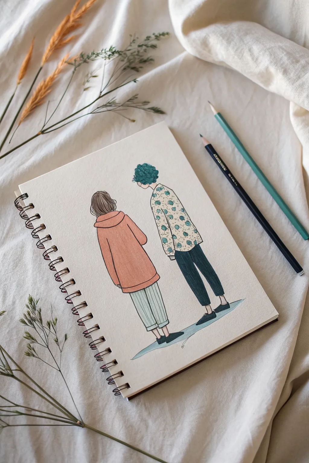
Capture the quiet connection between two distinct characters with this charming sketchbook illustration. Featuring soft colored pencil textures and simple, clean ink lines, this project explores how posture and clothing choices can define personalities even from a back view.
How-To Guide
Materials
- Spiral-bound sketchbook (medium weight paper)
- H or HB graphite pencil for sketching
- Fine liner pen (black, 0.3mm or 0.5mm)
- Colored pencils (Salmon/mute orange, teal/dark green, cream, navy blue, light grey)
- Eraser
- Pencil sharpener
Step 1: Drafting the Forms
-
Lay the Foundation:
Start by lightly sketching two vertical center lines side-by-side on your page to determine the height difference. The character on the right should be taller than the one on the left. -
Block in Shapes:
Draw simple geometric shapes for the bodies. Use a large, rounded rectangle for the left character’s oversized hoodie and a narrower, rectangular form for the right character’s patterned shirt. -
Define the Heads:
Sketch the head shapes. The left figure needs a rounded shape for a bob cut, while the right figure gets a more textured, cloudy outline to prepare for the curly hair. -
Add Limbs:
Draw the legs extending from the torso blocks. Keep the left figure’s legs straight for wide pants, and taper the right figure’s legs for fitted trousers. -
Refine the Clothing:
Add details like the hoodie pocket and cuffs on the left. For the right figure, sketch the collar and the break where the shirt meets the pants.
Pro Tip: Texture Talk
Vary your pencil strokes! Use long, straight strokes for the smooth hoodie, but tight, circular scumbles for the curly hair and fabric patterns.
Step 2: Inking the Outlines
-
Create Smooth Lines:
Switch to your fine liner pen. Trace over your pencil sketch with confident strokes. I like to keep the pressure fairly light to maintain a delicate look. -
Hair Detailing:
For the left character, draw vertical strands to suggest straight hair. For the right character, use small, bumpy loops to imply tight curls or volume. -
Fabric Folds:
Add small crease lines at the elbows and knees. These tiny details help the clothes look like they are draping naturally over the bodies. -
Erase the Guides:
Once the ink is completely dry—give it a full minute—gently erase all the underlying graphite pencil marks.
Level Up: Pattern Play
Instead of the floral print, try drawing tiny geometric shapes or polka dots on the shirt to change the character’s vibe completely.
Step 3: Coloring and Texturing
-
Base Tone: The Hoodie:
Using a salmon or muted orange pencil, fill in the hoodie. Apply consistent, diagonal strokes to create a smooth texture without pressing too hard. -
Patterning the Shirt:
Lightly color the right character’s shirt clearly with cream or leave it paper-white. Then, use a teal pencil to draw small, erratic floral or leaf shapes scattered across the fabric. -
Contrasting Hair:
Color the left bob with a soft brown. For the right character, use a deep teal or dark green, using circular scribbles to mimic the curly texture. -
Lower Body Contrast:
Fill the right figure’s pants with a solid navy blue or dark grey. This dark block contrasts nicely with the light pattern above it. -
Simple Stripes:
On the left figure’s pants, use a light grey pencil to draw subtle vertical pinstripes rather than coloring the whole shape. -
Grounding Shadows:
Use a light blue or cool grey to add a simple, elongated shadow shape beneath their feet. This anchors the figures so they aren’t floating in space.
Now you have a charming character study ready to inspire your next story

Have a question or want to share your own experience? I'd love to hear from you in the comments below!