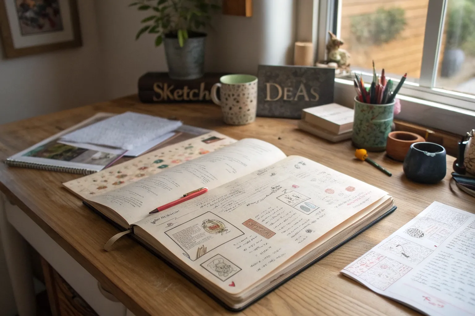
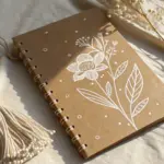
If your sketchbook feels too precious, it can freeze your hand before you even start. These messy sketchbook ideas are my favorite ways to give yourself permission to experiment, layer, scribble, and fill pages with real-life creative energy.
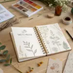
Cluttered Collage Spread
Embrace the charm of tiny details with this delicate journal spread, featuring a vertical strip of miniature landscape vignettes. This layout combines the precision of graph paper with the organic beauty of cut-paper collage and handwritten notes.
Detailed Instructions
Materials
- Spiral-bound graph paper notebook (A5 or similar size)
- Old maps, botanical prints, or scrapbook paper with nature motifs
- Scissors and precision craft knife
- Glue stick or double-sided tape runner
- Fine-point black ink pen (0.3mm or 0.5mm)
- Pencil (HB or H)
- Ruler
- Washi tape (optional, floral pattern)
- Coffee or tea (for paper aging, optional)
Step 1: Preparation & Selection
-
Gather your source material:
Begin by sifting through your collection of paper scraps. You are looking for interesting textures: fragments of old maps, botanical illustrations of flowers, or printed patterns that resemble tiny landscapes. -
Visualize the layout:
Open your spiral-bound graph notebook to a fresh spread. The design relies on a vertical alignment on the left-hand page, leaving the right side mostly open for writing. -
Identify the collage zone:
Mentally mark out a column on the far left of the left page, about 1.5 inches wide, where your miniature artworks will live.
Step 2: Creating the Miniatures
-
Cut the base shapes:
Using your scissors or craft knife, cut out 4-5 small squares or rectangles from your source papers. Keep them uniform in width (roughly 1 inch) but vary the content. -
Curate the imagery:
Select pieces that look like tiny worlds. One might be a swatch of a yellow flower, another a dense green texture, and another a fragment of a blue and beige map. -
Refine the edges:
Check the edges of your cutouts against the grid lines of your notebook to ensure they are perfectly straight and square. -
Dry fit the arrangement:
Place the cutouts vertically on the left side of the page without glue. Space them out evenly, leaving about a half-inch of grid paper visible between each one.
Wrinkled Paper?
If your glued squares are buckling, you may be using too much liquid glue. Switch to a dry glue tape runner or a high-quality glue stick for flatter results on thin notebook paper.
Step 3: Assembly
-
Adhere the first piece:
Start with the top square. Apply a thin layer of glue to the back and press it firmly near the top left corner of the page, aligning it with the grid lines. -
Continue the column:
Glue the remaining squares down the column, maintaining consistent spacing. I find using a ruler here helps keep the left margin perfectly straight. -
Smooth it out:
Gently rub over each adhered piece with a clean scrap of paper to ensure the edges are flat and there are no air bubbles.
Add Dimension
Use foam risers or double-sided dimensional tape on just one of the collage squares to make it pop off the page, creating a subtle shadow and breaking the flatness.
Step 4: Adding Details
-
Draw the list box:
Below the column of collages, use your fine-point black pen to draw a square box. Instead of a solid line, use a thick, dashed line to create a ‘stitched’ effect. -
Populate the list:
Inside the dashed box, write a small list or a few lines of thoughts. Use bullet points or numbers (1, 2, 3…) to give it structure. -
Add the header:
At the very top of the page, aligned with your collage column, write a small date or title. Underline it with a double line for emphasis. -
Create the main title:
On the top of the right-hand page, pencil in a larger title or date (like ‘APRIL’). Go over it with a slightly thicker pencil stroke or pen. -
Add a subtitle:
Write a smaller subtitle underneath the main right-page header in a neat, small script.
Step 5: Finishing Touches
-
Pencil in guidelines:
If you plan to write extensively, lightly mark where your text blocks will go, or simply leave the rest of the grid open for future thoughts. -
Optional: Add loose ephemera:
Tuck a few loose decorative cards or dried pressed flowers into the notebook to photograph alongside your spread for that ‘lived-in’ aesthetic. -
Final review:
Erase any stray pencil marks around your writing and ensure all glue edges are completely dry and secure.
Now you have a serene, structured space ready to fill with your daily observations or remaining tasks

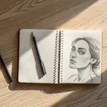
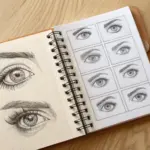
Overlapping Sketch Pile-Up
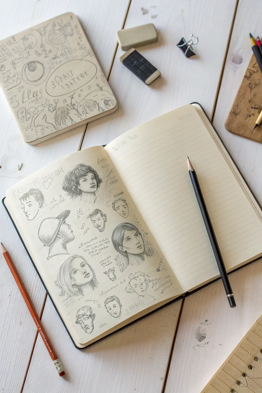
This sketchbook spread focuses on practicing facial features and expressions by filling a single page with scattered, unpolished portrait sketches. The result is a dynamic, crowded collection of characters that feels both studied and spontaneous.
Step-by-Step Tutorial
Materials
- A5 or A4 sketchbook (preferably cream or off-white paper)
- Graphite pencils (HB for layout, 2B-4B for shading)
- Fine-liner pen (optional, for final details)
- Kneaded eraser
- Pencil sharpener
- Reference photos of faces
Step 1: Conceptual Layout
-
Visualize the spread:
Note that the left page will be the ‘messy’ collage of faces, while the right page remains largely empty with just ruled lines, serving as a resting space for the eye. -
Plan variety:
Before drawing, decide on a mix of angles: profiles, 3/4 views, and straight-on portraits. This variation creates energy and prevents the page from looking static.
Smudge Control
Place a scrap piece of paper under your drawing hand. This prevents your palm from dragging graphite across the faces you’ve already finished.
Step 2: Drafting Key Portraits
-
Start with the anchors:
Begin with the largest portraits to anchor the composition. Lightly sketch the 3/4 view woman with short hair near the top center using an HB pencil. -
Add a profile view:
Below the first face, sketch a man with a cap in a side profile view. Keep your lines loose and search for the main shapes rather than details initially. -
Introduce a frontal view:
Draw the woman with long, straight hair near the center-right of the page. Ensure her eyes are level to practice symmetry. -
Scatter smaller faces:
Fill the gaps between these main figures with smaller, quicker sketches. I like to include a few stylized or slightly caricatured faces here to loosen up the realism.
Scale It Up
Try varying the scale dramatically. Make one eye huge and detailed next to a tiny full-body figure to create surreal visual interest.
Step 3: Refining and Shading
-
Define the eyes:
Switch to a slightly sharper or darker pencil (like a B or 2B). Go back to your main portraits and define the pupil and lash lines to bring the faces to life. -
Hatch shading:
Use diagonal hatching lines to add shadow under the chins, noses, and hair. Don’t smudge with your finger; keep the texture visible to maintain that ‘sketchbook’ aesthetic. -
Detailing hair texture:
For the woman with the cap, use quick, looping strokes to suggest curly hair peeking out. For the straight-haired woman, use long, sweeping directional lines. -
Add scribbled notes:
Around the faces, lightly scribble unreadable text or quick notes. These don’t need to be legible; they act as texture to fill negative space and connect the drawings.
Step 4: Finishing Touches
-
Incorporate unfinished elements:
Leave some of the smaller faces near the bottom deliberately unfinished. Seeing the construction lines adds to the ‘work in progress’ charm. -
Add geometric doodles:
In the very small gaps, draw tiny symbols, arrows, or cross-hatching patches to further density the collage effect. -
Final contrast check:
Take a soft 4B pencil and darken just the deepest shadows—nostrils, pupils, and the nape of the neck—to make the drawings pop off the page. -
Clean up slightly:
Use a kneaded eraser to lift up any graphite that has muddied the highlights on the foreheads or noses, but avoid erasing the initial construction lines entirely. -
Prop styling:
To recreate the photo’s look, rest a sharp pencil on the blank right page, pointing diagonally toward the artwork to lead the viewer’s eye back to your sketches.
Your sketchbook page is now a lively gallery of expressions that captures the raw process of learning portraiture


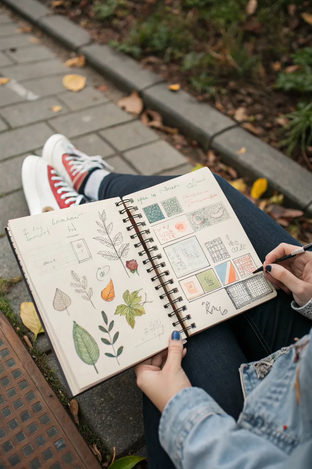
Notes, Arrows, and Scribbled Margins
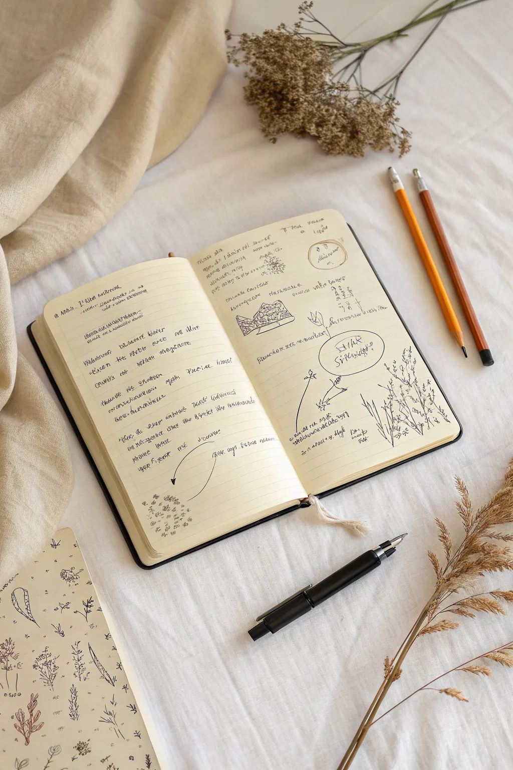
This project embraces the charm of imperfection, blending handwritten observations with botanical doodles to create a page that feels like a natural history discovery log. The aesthetic is raw and immediate, capturing thoughts and sketches as they happen rather than aiming for polished perfection.
How-To Guide
Materials
- A5 or similar sized notebook with cream-colored paper (blank or faint lines)
- Black ink pen (fine tip rollerball or fountain pen)
- Graphite pencil (HB or 2B)
- Colored pencil (orange or yellow ochre)
- Reference images of dried flowers or weeds (optional)
- Ruler (optional, for diagrams)
Step 1: Setting the Layout
-
Define the page split:
Visualize your open spread as two distinct but connected zones. The left page will serve mainly for text and linear thoughts, while the right page will host diagrams, sketches, and looser annotations. -
Start with a header:
At the top of the left page, write a title or date in your normal handwriting, but slightly larger. Don’t worry about perfect centering; a left-aligned, casual header sets the tone immediately. -
Create text blocks:
Begin writing rows of text on the left page. Use a ‘mock writing’ style or actual stream-of-consciousness notes about your day or surroundings. Keep the left margin consistent but let the right edge remain ragged. -
Leave breathing room:
After every 4-5 lines of text, leave a slightly larger gap. This prevents the page from feeling too dense and mimics the look of distinct thought paragraphs.
Step 2: Adding the Core Diagrams
-
Sketch the center diagram:
On the upper-middle section of the right page, draw a small, geometric shape or a cross-section of a seed pod. I like to keep lines shaky here rather than ruler-straight to maintain that field-sketch vibe. -
Add a circular focus:
Draw a freehand circle on the right page, slightly below the center. Inside, write a key phrase or question in capital letters to create a focal point. -
Draw the botanical sketch:
In the bottom right corner, sketch a cluster of tall grass or weeds. Use quick, upward strokes for the stems and small scribbles for the flower heads, allowing the drawing to bleed slightly off the edge or into the gutter. -
Incorporate a stamped element:
Near the top right corner, draw (or stamp if you have one) a small circle containing a date or a location code. This adds an ‘official’ archival feel to the messy notes.
Ink Smearing?
If your fresh ink smudges while drawing overlapping arrows, don’t erase it. Circle the smudge and write a tiny note pointing to it like ‘oops.’ It adds authentic character.
Step 3: Layering the Details
-
Insert arrows and connectors:
Draw sweeping, curved arrows connecting your text blocks on the left to the diagrams on the right. These visual bridges help guide the eye across the gutter of the book. -
Annotate figures:
Add tiny labels next to your diagrams. Use very small, illegible scribbles or shorthand to suggest detailed scientific labeling without needing actual content. -
Add margin notes:
Turn the notebook slightly or write vertically in the margins. These ‘afterthoughts’ add depth and make the page feel revisited and lived-in. -
Sketch the seed spread:
At the bottom of the left page, draw a loose cluster of small dots or seed shapes. Let them drift upward as if blown by the wind, breaking the rigid structure of the text lines above.
Varying Line Weight
Switch between a thick nib for headers and an ultra-fine 0.3mm nib for detailed labels. This contrast makes the page look rich and visually organized.
Step 4: Finishing Touches
-
Underline for emphasis:
Take your black pen and double-underline a few random words in your text blocks. This creates visual weight without adding new elements. -
Add colored pencil accents:
Using an orange or ochre pencil, very lightly color in one or two small sections of a diagram, or underline a single header. Keep the color application faint and dusty. -
Review the balance:
Look for large empty white spaces. Fill one or two of them with tiny ‘x’ marks, small math equations, or little sprigs of leaves to balance the composition. -
Smudge slightly (optional):
If using a graphite pencil for some sketches, gently rub a finger over a dense area to soften the lines and give the page a slightly worn, traveled texture.
Close your book and enjoy knowing you’ve captured a moment of creative chaos on paper

Crowded Grid of Tiny Studies
Transform a sketchbook spread into an explorative canvas by combining delicate botanical illustrations with a structured grid of miniature experiments. This layout blends the organic freedom of nature drawings with satisfyingly organized technical studies.
Step-by-Step Tutorial
Materials
- Spiral-bound mixed media sketchbook
- Fine liner pens (0.1, 0.3, 0.5 sizes)
- Watercolors or watercolor pencils (greens, autumn reds, oranges)
- Graphite pencil (HB or 2B) and eraser
- Ruler
- Small round paintbrush (size 2 or 4)
Step 1: Planning the Layout
-
Observe your spread:
Begin with an open sketchbook. Mentally divide the two pages: the left page will be dedicated to free-floating organic forms, while the right page will host a structured grid of abstract and texture studies. -
Draft the grid:
On the right page, use your ruler and graphite pencil to lightly map out a 3×4 grid of squares. These don’t need to be mathematically perfect; a little hand-drawn character works well here. -
Create text zones:
At the top of the left page, lightly pencil in a few horizontal lines for future handwriting. This creates a dedicated ‘header’ space that anchors the loose drawings below.
Step 2: Right Page: The Texture Grid
-
Ink the squares:
Go over your pencil grid lines with a 0.5 fine liner. I like to double up some lines or let them cross over at the corners to emphasize the sketch-like aesthetic. -
Fill the first row:
In the top squares, use green tones to create dense textures. Try stippling (dots) in one square and a dense cross-hatch pattern in green ink or pencil in the next. -
Add geometric contrast:
In the middle row, switch to geometric exploration. Draw a smaller square within a square, or a grid-within-a-grid pattern using black ink to contrast with the colored squares. -
Experiment with solids:
Select two squares to fill with solid blocks of soft color—perhaps a split square of blue and orange—using your watercolors or pencils to test opaque coverage. -
Create a detailed graph:
For the bottom corner square, draw a precise, high-density grid. Fill specific cells with red ink dashes or numbers to simulate a data chart or calendar.
Bleed-Through Blues?
If ink ghosts to the other side, glues two pages together for a thicker surface, or prep the page with a thin layer of clear gesso before starting.
Step 3: Left Page: Botanical Studies
-
Sketch the central branch:
Lightly sketch a large, multi-leaf branch stem dominating the upper center of the page. Keep the line work faint so you can adjust the leaf angles. -
Outline leaves:
Using a 0.1 fine liner, ink the branch. Use broken or jittery lines for the leaf edges to mimic the natural imperfections of dried foliage. -
Add floating elements:
Around the main branch, sketch isolated botanical elements: a single broad leaf, a small sprig of berries, and a drying autumn leaf. Distribute them loosely to fill the negative space. -
Apply base color:
Use watercolor or watercolor pencils to add a wash of sap green to the broad leaf and the main branch. Let the color be uneven to suggest light and shadow. -
Layer autumn tones:
For the solitary autumn leaf, blend orange and ochre. If using pencils, scribble texturally and then activate with a wet brush for a mottled effect. -
Detail the veins:
Once the paint is completely dry, use your finest pen to draw delicate vein structures over the colored areas. Follow the curvature of the leaf to give it volume. -
Add notations:
Scribble loose, illegible, or shorthand notes near the drawings. Use a pencil for some notes and ink for others to create depth and visual hierarchy.
Level Up: Collage It
Mix media by pasting a real pressed flower or a small square of graph paper into one of your grid boxes for added tactile texture.
Now you have a lively spread that perfectly captures the balance between observation and analysis

PENCIL GUIDE
Understanding Pencil Grades from H to B
From first sketch to finished drawing — learn pencil grades, line control, and shading techniques.
Explore the Full Guide
Color Swatch and Tool Test Chaos
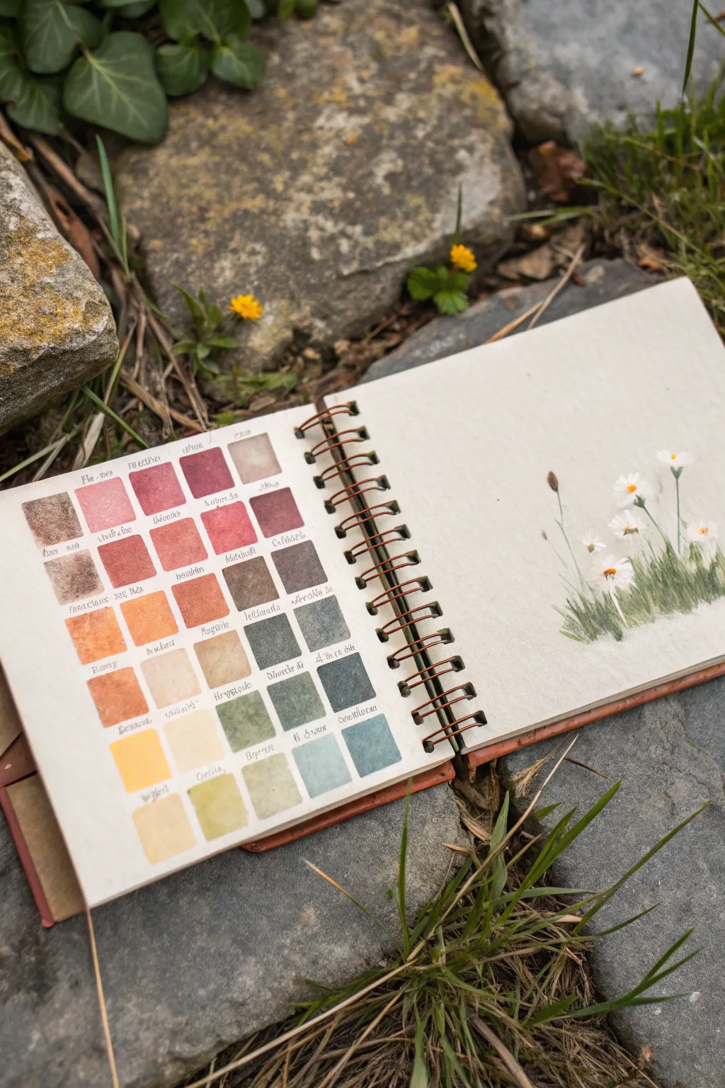
Embrace the beauty of experimentation with this dual-page sketchbook spread, featuring organized color swatches alongside a delicate wildflower study. It’s a perfect way to test new pigments while creating a gentle, nature-inspired composition.
How-To Guide
Materials
- Spiral-bound sketchbook (heavyweight mixed media or watercolor paper)
- Watercolor paint set (pan or tube)
- Round watercolor brush (size 4 or 6)
- Fine detail brush (size 0 or 1)
- Fine liner pen (waterproof, sepia or black) or dip pen
- Pencil and eraser
- Ruler
- Jar of clean water
- Paper towel
Step 1: Planning the Grid
-
Measure the layout:
On the left-hand page, use a ruler and pencil to lightly map out a grid system. Aim for five columns and seven rows, leaving a small gap between each square for labels. -
Draft the squares:
Sketch the individual square outlines lightly. They don’t need to be mechanically perfect; a bit of hand-drawn wobble adds character to a messy sketchbook style. -
Label zone:
Leave a designated space directly beneath each square, about 3-4mm high, where you will write the color names later. Seeing this space now helps avoid cramping your writing.
Wet-on-Wet Gradient
For more dynamic swatches, wet the square with clean water first, then drop pigment into just the top half. Tilt the book to let it flow down naturally.
Step 2: Creating the Swatches
-
Start with warm tones:
Begin at the top left with your warmest colors. Load your brush with a saturated red or rust hue and fill the first square. I like to let the paint pool slightly in one corner for texture. -
Transition through earth tones:
Move across and down the grid, shifting from reds into burnt siennas, ochres, and muted oranges. Clean your brush thoroughly between distinct color families to keep the swatch pure. -
Introduce greens:
As you move to the middle rows, start introducing your greens. Begin with warm, olive tones and transition slowly into cooler, blue-based greens. -
Cool down the palette:
Fill the bottom rows with your coolest tones—slate blues, teals, and light grays. Observe how the gradient flows from the top of the page to the bottom. -
Label the pigments:
Once the paint is completely dry, use a fine liner or dip pen to write the name of the pigment (or the specific mix) under each square. Using a sepia ink gives it an old-world botanical feel.
Step 3: Painting the Wildflowers
-
Sketch the stems:
On the right-hand page, lightly sketch the placement of your wildflower cluster in the bottom right corner. Vary the heights of the stems to create a natural, organic rhythm. -
Base layer for grass:
Using a mix of the greens from your swatch page, paint vertical, flicking strokes at the base to create a grassy bed. Keep the strokes loose and varying in length. -
Adding stems:
With your fine detail brush, pull thin lines upward for the flower stems. Use a darker green to differentiate them from the grass background. -
Painting the blooms:
For the daisy-like flowers, use very diluted white gouache or simply leave the paper white (negative painting) for the petals. If using white paint, add small dabs in a radial pattern. -
Flower centers:
Drop a small dot of yellow or orange into the center of each flower head. If the white petals are still damp, the yellow will bleed slightly, creating a soft, realistic look. -
Adding buds:
Paint a few unopen buds using small, elongated brown or green shapes at the tips of the taller, thinner stems. -
Deepen the shadows:
Go back into the grassy base with a concentrated dark green or indigo mix. Add depth near the bottom of the cluster to ground the plants.
Add Splatters
Once your flower study is dry, load a brush with watered-down green or gold paint and tap it against a pencil to add tiny splatters around the blooms for energy.
Now you have a practical reference guide and a beautiful piece of art side-by-side
One-Pen Monochrome Madness
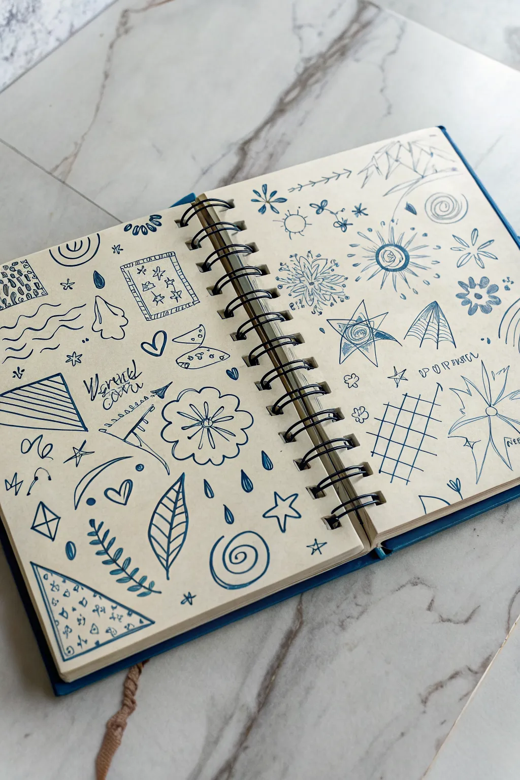
Embrace the chaos of a wandering mind with this monochromatic doodle spread that turns simple shapes into a cohesive visual texture. Using just a single blue pen, you’ll fill a double-page spread with a mix of geometric patterns, botanical elements, and abstract marks.
How-To Guide
Materials
- Spiral-bound sketchbook (cream or off-white paper recommended)
- Blue gel pen or fine-liner (0.5mm or 0.7mm)
- Pencil (optional, for layout planning)
- Eraser (optional)
Step 1: Setting the Structure
-
Open fully flat:
Start by opening your sketchbook completely flat. The spiral binding creates a natural division, but we want to treat both pages as a single canvas where motifs can echo each other across the gap. -
Anchor with large shapes:
Begin on the left page by drawing a few larger ‘anchor’ shapes to define the space. Sketch a large triangle near the bottom left corner and fill it with horizontal stripes. Add a rectangular ‘rug’ shape near the top left, filling it with tiny star patterns. -
Mirror on the right:
Move to the right page to balance the composition. Draw a large, distinctive starburst or sun shape in the upper middle area. Keep the lines loose and energetic rather than perfectly geometric. -
Add geometric frames:
On the bottom right page, draw a large grid pattern that looks like a net or a window pane. Let the lines be slightly wavy to maintain that hand-drawn, doodle aesthetic. This adds structure without rigidity.
Don’t Overthink It
The charm of this style is imperfection. If you make a “mistake” or a wobbly line, just draw over it or turn it into a new pattern. No erasing allowed
Step 2: Botanical Elements
-
Draw the central flower:
On the left page, near the center-right, draw a large, rounded flower with scalloped petals. Add a simple crisscross center. This serves as a soft organic contrast to the sharp geometric shapes nearby. -
Adding vines and leaves:
In the bottom left area, draw a long, curving stem with paired leaves climbing upwards. I like to fill the leaves with diagonal hatching to give them visual weight. -
Create a detailed leaf:
Draw a large, single leaf shape near the bottom center of the left page. Detail the inside with a ‘skeleton’ structure and horizontal veins, making it look almost like a diagram. -
Scattered florals:
On the right page, sprinkle in smaller floral elements. Draw a few five-petaled flowers with solid centers and some star-like blooms to fill the negative space around your main sun drawing.
Step 3: Celestial & Abstract Fillers
-
Sketch the suns and stars:
Scatter celestial motifs throughout both pages. Draw a sun with wavy rays near the top bind, and several five-pointed stars of varying sizes. Some can be simple outlines, while others can have double lines. -
Draw the spiral clouds:
Create movement with spiral shapes. Draw a large swirl at the very bottom center of the left page, and a tighter, smaller spiral in the top right corner of the right page. -
Add whimsical shapes:
Include some random abstract objects to break up the theme. Draw a crescent moon, a few envelopes, a cone shape, and some wavy water lines on the left page. -
Incorporate radiating patterns:
On the right page, draw a large eight-pointed star or compass shape with lines radiating from a central eye or circle. This draws the viewer’s attention to the middle of the right grouping.
Add a Pop of Highlight
Once the blue ink is fully dry, use a white gel pen to add tiny dots or highlight lines inside the filled darker areas for dimension
Step 4: Final Details
-
Fill small gaps:
Look for empty white spaces that feel too open. Fill them with tiny doodles like water droplets, miniature hearts, small circles, or clusters of dots. -
Add text elements:
If you wish, scribble a few illegible words or a short phrase in a messy cursive style. Place this near the center of the left page to simulate a stream-of-consciousness look. -
Review and balance:
Step back and look at the spread as a whole. If one side feels heavier with ink, add a few more dark, filled-in shapes (like solid leaves or thick border lines) to the lighter side to balance the visual weight.
Now you have a lively, textured spread that captures a moment of creative flow without the pressure of perfection
BRUSH GUIDE
The Right Brush for Every Stroke
From clean lines to bold texture — master brush choice, stroke control, and essential techniques.
Explore the Full Guide
Five-Minute Ugly Page Challenge
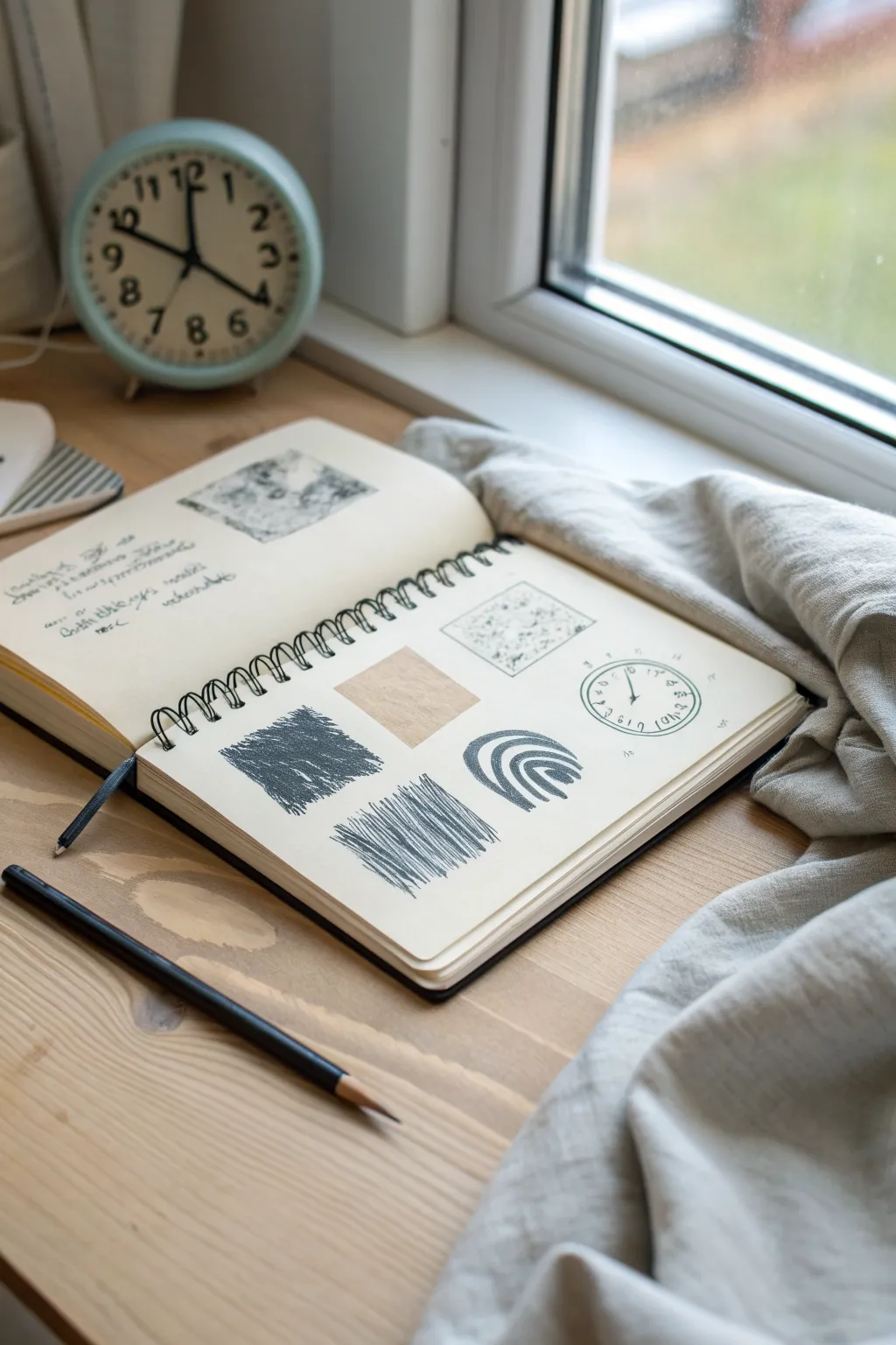
Embrace imperfection with this rapid-fire texture study that focuses on mark-making rather than finished drawings. This messy grid layout encourages you to test scribbles, hatching, and shapes in small, manageable boxes without the pressure of a full-page composition.
How-To Guide
Materials
- Spiral-bound sketchbook (cream or off-white paper)
- Black graphite pencil (HB or 2B)
- Ruler (optional, for spacing)
- Eraser (optional)
Step 1: Setting the Structure
-
Visualize the grid:
Visualize a loose 2×3 grid on either the left or right page of your sketchbook. You don’t need to draw actual grid lines; just imagine six zones where your textures will live. -
Start with a square:
Near the center-left of the page, block out a rough square shape. Don’t outline it first; instead, define the shape by filling it immediately with dense, heavy scribbling. -
Build the density:
Press down hard with your pencil to create a dark, almost solid charcoal-like texture within that first square. Let the edges be rough and uneven.
Smudge Control
Graphite transfer can ruin clean pages. Place a scrap sheet of paper under your hand while drawing to prevent smearing your earlier work.
Step 2: Adding Linear Textures
-
Create the hatch block:
Directly below your dark scribbled square, imagine another square of the same size. Fill this area with diagonal hatching marks. -
Vary the pressure:
Make your strokes quick and aggressive. I like to let the pencil lift slightly at the end of each stroke to create a tapered, sketchy look. -
Layer the lines:
Go back over the diagonal lines with a few darker, thicker strokes to add depth and erratic energy to the hatching. -
Draw the arch shape:
To the right of your hatching block, draw a simple arch shape resembling a rainbow. Instead of clean lines, use thick, repetitive strokes to create bold, curved bands. -
Thicken the curves:
Go over each curve of the arch multiple times until the lines are thick and dark, leaving distinct negative space in between them.
Step 3: Detailed Motifs
-
Sketch the dotted square:
In the top right quadrant, lightly outline a square shape using stippling. Fill the interior of this square with various small dots, speckles, and tiny ‘x’ marks. -
Add the circle element:
Below the dotted square, draw a circle. It doesn’t need to be perfect; a hand-drawn wobbly circle adds character. -
Detail the circle:
Add small ticks around the inner edge of the circle like a clock face. Sketch a few erratic symbols or numbers inside to give it a cryptic, diagrammatic feel. -
Insert a contrast block:
In the remaining center space, create a lighter texture block. Use the side of your pencil lead to create a soft, shaded square, or paste in a small piece of brown kraft paper for contrast.
Level Up: Mixed Media
Tape small swatches of textured paper or dried leaves into the empty grid spaces to mix physical textures with your drawn ones.
Step 4: Text and Refinement
-
Add illegible writing:
On the opposite page, write a few lines of asemic writing—scribbles that look like cursive text but have no actual meaning. Vary the size to mimic titles and paragraphs. -
Insert a doodle:
Above the text, draw a small, abstract box containing a messy graphite texture, similar to a landscape or cloud study. -
Review balances:
Look at the main grid page. If any square feels too light, add a few more heavy pencil strokes to balance the visual weight across the page. -
Smudge slightly:
Use your finger to gently rub the dense scribbled square, softening the graphite texture and blending the strokes slightly.
This exercise frees your hand to make bold marks without worrying about making something pretty
Drips, Splatter, and Accidental Marks
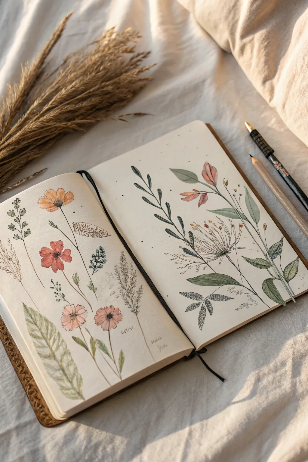
Capture the delicate beauty of a field guide in your sketchbook with these mixed-media wildflower studies. This spread combines precise pen work with loose watercolor washes and subtle, intentional specks to mimic organic imperfections.
Detailed Instructions
Materials
- Dotted or blank sketchbook (heavyweight paper preferred)
- Black fineliner pens (sizes 0.1, 0.3, and 0.5)
- Watercolor paint set (muted palette including earthy greens, terracottas, and browns)
- Small round watercolor brush (size 2 or 4)
- Pencil and eraser
- Dried grass or wheat stalks (for reference)
- Spray bottle or stiff brush for splattering
Step 1: Left Page: Composition
-
Pencil Sketching:
Begin by lightly sketching the placement of your flower stems on the left page. Create a variety of heights and angles, ensuring they don’t look too rigid or uniform. -
Defining the Orange Poppies:
Draw the basic shapes for the orange poppy-like flowers. Focus on open petals for the top two blooms and simpler, cup-like shapes for the lower ones. -
Adding Leaf Shapes:
Sketch a large, prominent fern-like leaf at the bottom left corner, letting it curve naturally towards the center. Add smaller, simpler leaves to the flower stems. -
Texture Details:
Lightly outline the feathery texture of the grass stalks on the right side of this page. Keep the lines faint, as the ink will do most of the work later.
Step 2: Right Page: Composition
-
Establishing the Vine:
On the right page, draw a long, curving stem that reaches from the bottom right corner up towards the top left. This will be your main anchor. -
Branching Out:
Add secondary branches coming off the main stem. Sketch tear-drop shaped leaves along these branches, alternating their placement for a natural look. -
Central Bloom:
In the lower middle area, sketch a large, airy seed head—similar to a dandelion or allium—with radiating lines exploding from a central point. -
Corner Foliage:
Fill the bottom right corner with denser leaf clusters to weigh down the composition and frame the page.
Master the Splatter
Test your splatter technique on a scrap paper first. The amount of water on your brush dictates splatter size—less water makes finer mist, more makes big drops.
Step 3: Inking the Outlines
-
Fine Lines:
Using your 0.1 fineliner, trace over your delicate floral sketches. Use broken or jittery lines for the grass textures to suggest movement and fragility. -
Bold Accents:
Switch to a 0.3 or 0.5 pen for the main stems and the large fern leaf. This line weight variation adds visual interest and depth to the drawing. -
Detail Work:
Add tiny veins inside the leaves and stippling (small dots) to the center of the flowers. Erase all pencil marks once the ink is completely dry.
Vintage Paper Effect
Wash the entire page with diluted coffee or tea before starting. Let it dry completely for an antique, parchment-like background for your botanicals.
Step 4: Watercolor Washes
-
Muted Greens:
Mix a watery sap green with a touch of brown. Paint the leaves loosely, allowing the color to sometimes stray outside the ink lines for that ‘messy’ aesthetic. -
Warm Florals:
Use a diluted terracotta or peach tone for the poppy flowers. Keep the wash transparent to let the ink drawing show through clearly. -
Fern Texture:
For the large fern leaf on the left, use a pale olive wash. While it’s still damp, drop in a slightly darker green near the central vein to create a soft gradient. -
Darker Accents:
Paint the leaves on the right page with a slightly deeper, cooler green to differentiate them from the left page’s foliage.
Step 5: Final Touches and marks
-
Adding Splatter:
Load a stiff brush with diluted brown or black paint. Flick the bristles with your thumb to create tiny, random specks across both pages, concentrating around the empty spaces. -
Intentional Dots:
Take your fineliner and add deliberate clusters of dots around the flower heads and seed pods to simulate pollen or floating seeds. -
Handwritten Notes:
If desired, scribble faint, illegible notes or botanical names in pencil or light grey ink near the stems to mimic an old naturalist’s field diary.
Close your book knowing you’ve created a charming botanical study that embraces imperfection


Have a question or want to share your own experience? I'd love to hear from you in the comments below!