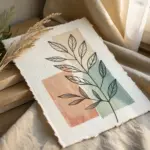
If you’re craving that relaxed boho vibe without stressing over perfect realism, you’re in the right headspace. These easy boho drawing ideas lean on simple shapes, earthy colors, and playful line work that looks stylish even when it’s quick.
Simple Monstera Leaf Line Art
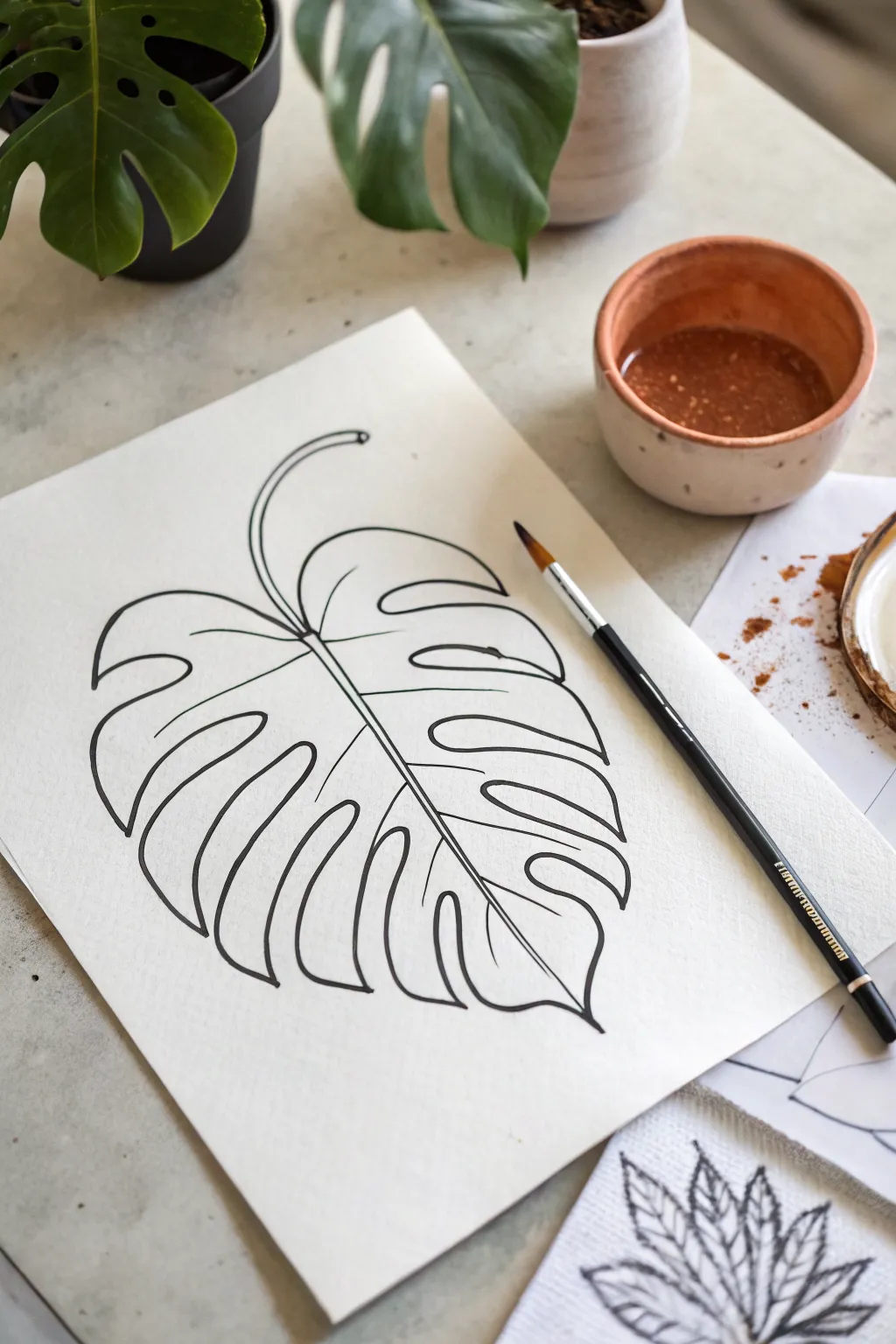
Capture the iconic tropical vibe with this clean, single-leaf line drawing that focuses on negative space and flowing curves. This project is perfect for beginners looking to practice steady hand control while creating a stylish piece of boho wall art.
Step-by-Step Guide
Materials
- High-quality mixed media or watercolor paper (heavyweight)
- Pencil (HB or 2B)
- Eraser (kneaded preferred)
- Fine liner pen (black, archival ink, size 0.5 or 0.8)
- Small round paintbrush (size 4 or 6)
- Sepia or brown liquid watercolor/ink (optional for later shading)
- Reference image of a Monstera leaf
Step 1: Sketching the Framework
-
Establish the central vein:
Begin by lightly sketching a long, curved line acting as the spine of the leaf. Start from the top left and sweep it down towards the bottom right, creating a gentle ‘S’ curve or arch. -
Add the stem:
At the top of your spine line, extend a thinner line upwards and curve it off the page or stop it abruptly for a floating look. This will be the petiole (stem) that connects to the leaf blade. -
Outline the leaf shape:
Sketch a large heart shape around your central spine. Don’t worry about the slits yet; just get the general perimeter of the leaf down on paper so you know how much space it occupies. -
Mark the fenestrations:
Along the edges of your heart shape, mark where the deep majestic cuts (fenestrations) will go. Standard Monstera leaves have deep indentations that point inward toward the spine. -
Refine the segments:
Now, draw the actual leaf segments. Instead of a solid outline, draw individual ‘fingers’ of the leaf, curving the lines inward toward the spine and then back out to the edge.
Uneven Lines?
Don’t stress over shaky lines. Go over the wobble with a second pass to thicken the line intentionally. Varied line weights make the drawing look more organic.
Step 2: Inking the Lines
-
Prepare your pen:
Switch to your black fine liner. Test the flow on a scrap piece of paper to ensure the ink is running smoothly and isn’t dried out. -
Ink the central vein:
Start by inking the central spine. Draw two excessively thin lines very close together to give the vein some weight, rather than just a single stick line. -
Define the upper leaf sections:
Start at the top of the leaf near the stem joint. Draw the upper curves, pressing firmly to get a solid, confident line. Keep your wrist loose to maintain smooth curvature. -
Work down the left side:
Trace over your pencil sketches for the left-side leaf fingers. Focus on making the tips of the leaves slightly rounded rather than sharp points for a softer, organic feel. -
Create the heavy bottom curves:
As you move to the larger bottom segments, you can thicken the line weight slightly by going over it a second time or pressing harder, which adds visual weight to the bottom of the leaf. -
Ink the right side:
Mirror the process on the right side. Ensure the deep cuts (sinuses) reach close to the central vein but don’t touch it. -
Add the holes (optional):
If your sketch included complete oval holes (inner fenestrations) near the spine, ink distinct ovals now. The reference image focuses mainly on the side slits, but adding one or two oval holes adds realism. -
Connect to the stem:
Carefully ink the stem, connecting it seamlessly to the top of the central vein. I find drawing the stem in one continuous stroke prevents shaky interruptions.
Dynamic Flow
When drawing the deep cuts (fenestrations), imagine they are pointing towards the point where the stem meets the leaf blade. This radial orientation looks most natural.
Step 3: Finishing Touches
-
Let the ink dry:
Wait at least 5 to 10 minutes to ensure the archival ink is completely set. Smudging black ink at this stage is heartbreaking. -
Erase guidelines:
Gently rub your kneaded eraser over the entire drawing to lift the initial graphite sketch. Hold the paper taut with one hand so it doesn’t crinkle. -
Assess line weight:
Look at your drawing from a distance. If some outer lines look too thin, careful re-trace them to bold them up. A variation in line thickness (thick outer, thin inner) can add depth. -
Prepare for wash (optional):
If you wish to replicate the brown wash seen in the photo’s bowl, dilute a small amount of sepia ink or coffee in water. -
Apply a shadow wash (optional):
Using a clean brush and your diluted mix, you can add a very faint shadow to just one side of the leaf vein for dimension, or leave it crisp black and white.
Now you have a striking piece of botanical art ready to be framed or gifted
Minimal Fern Frond Sketch
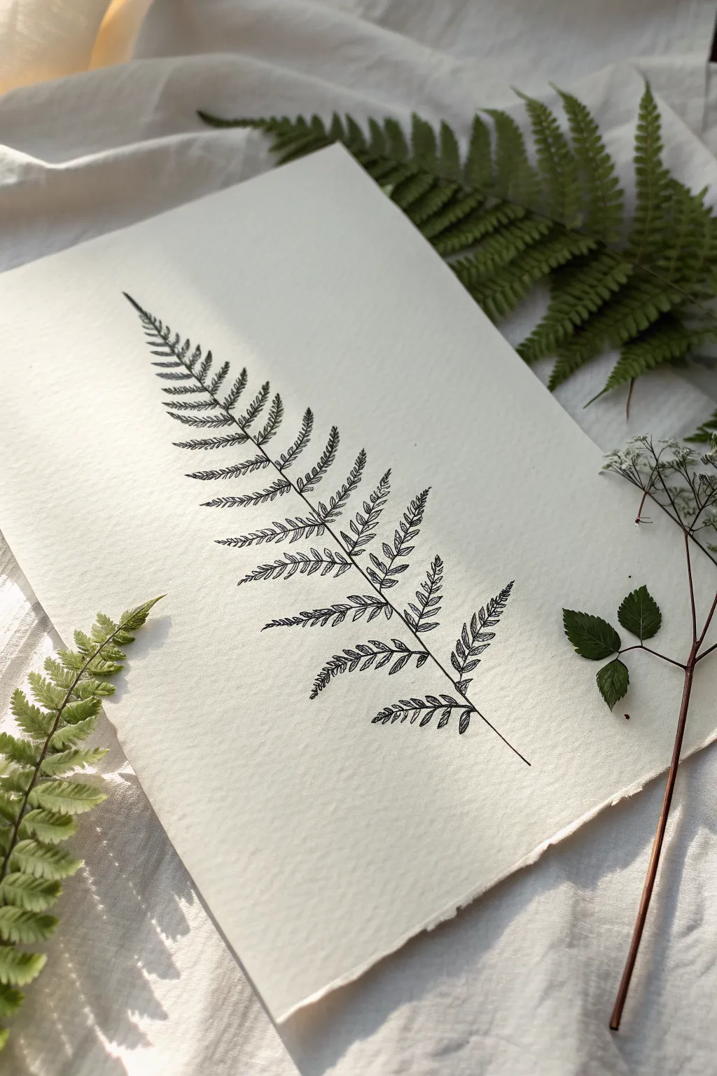
Capture the graceful, organic beauty of nature with this simple yet striking pen illustration. This project focuses on repetitive, meditative line work to create a delicate fern frond on textured paper, perfect for that relaxed boho aesthetic.
Step-by-Step Tutorial
Materials
- Textured watercolor paper or handmade cotton rag paper (off-white)
- Fine liner pen (sizes 005 and 01, black archival ink)
- H pencil (hard graphite for light sketching)
- Kneaded eraser
- Ruler (optional)
- Real fern leaf for reference (optional)
Step 1: Preparation & Foundation
-
Select your paper:
Choose a paper with visible tooth or texture. The rough surface adds character to the simple line work, mimicking the organic feel of the real leaves surrounding the art. -
Establish the central stem:
Using your H pencil, lightly draw a single, slightly curved line down the center of your page. This will be the rachis (main stem) of your fern. -
Mark the width:
Lightly sketch a triangular guideline around the stem. It should be wide at the bottom and taper to a sharp point at the top to define the overall shape of the frond. -
Plan the pinnae placement:
Along the central stem, mark small ticks where the side branches (pinnae) will emerge. Space them wider apart near the base and closer together as you move toward the tip. -
Sketch the side branches:
Draw light pencil curves extending from your tick marks out to the edge of your triangular guide. Remember that fern branches usually curve slightly upward.
Step 2: Inking the Structure
-
Ink the main stem:
Switch to your 01 fine liner. Trace over your central stem line, but keep your hand loose. I like to lift the pen slightly now and then to create a broken, organic line rather than a rigid ruler-straight one. -
Thicken the base:
Go back over the bottom third of the stem to add just a tiny bit of weight, suggesting the thicker part of the stalk. -
Ink the side branch spines:
Trace the central spine of each side branch. Like the main stem, keep these lines delicate and slightly tapering as they reach the ends.
Natural Variation
Don’t make the fern perfectly symmetrical. Draw a few bent or missing leaflets on the lower branches to make it look authentically organic.
Step 3: Adding the Leaflets
-
Start the leaflets (pinnules):
Switch to your finer 005 pen for the most delicate details. Starting at the bottom-most branch, begin drawing the tiny individual leaflets. -
Shape the leaflets:
Each leaflet should be a small, elongated oval or almond shape. They should attach directly to the side branch spine you just inked. -
Create the sawtooth edge:
Instead of a smooth loop, give each leaflet a slightly jagged or wavy edge to mimic the natural texture of a fern. Don’t worry about perfection; nature is gloriously imperfect. -
Fill the bottom branches:
Work your way along the bottom branches. Notice how the leaflets near the main stem are larger and they get tiny toward the tip of the branch. -
Add central veins:
Draw a profoundly thin line down the center of the larger leaflets. You don’t need to do this for the tiniest ones at the tips. -
Move up the frond:
Continue this process moving up the stem. As the branches get smaller near the top, simply draw the leaflets as small dashes or zig-zags rather than full shapes. -
Detail the tip:
For the very top of the main frond, merge the side branches into simple, singular leaf shapes, as the differentiation disappears at the apex.
Vintage Vibe
Lightly stain the paper with diluted tea or coffee before drawing and let it dry completely to give the background an aged, antique botanical feel.
Step 4: Finishing Touches
-
Review contrast:
Step back and look at the drawing. If the main stem feels too light compared to the dense leaves, darken it slightly with the 01 pen. -
Erase guidelines:
Wait at least 15 minutes to ensure the ink is bone dry. Gently erase your pencil marks with the kneaded eraser, dabbing rather than rubbing to protect the paper texture. -
Deckle the edges (optional):
If you used a standard sheet of paper, you can tear the edges against a ruler to create the torn, handmade look shown in the reference.
Place your finished drawing alongside some real dried leaves for a beautiful, serene display


One-Line Potted Plant
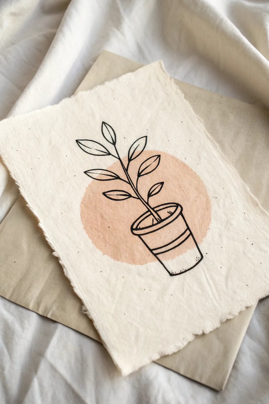
This project combines the organic texture of handmade paper with a sleek, minimalist line drawing to create subtle boho wall art. The contrast between the soft watercolor backdrop and the crisp black ink creates a modern yet earthy aesthetic perfect for calming spaces.
Detailed Instructions
Materials
- Handmade cotton rag paper (deckled edge)
- Watercolor paint (terracotta or peach)
- Medium round watercolor brush (size 8 or 10)
- Fine liner pen (black, archival ink, 0.5mm)
- Pencil (HB)
- Kneaded eraser
- Water cup and paper towel
Step 1: Setting the Background
-
Select your paper:
Choose a sheet of heavy, handmade cotton rag paper. The texture is crucial for this look, so ensure it has those beautiful, rough deckled edges. -
Mix the color:
Prepare your watercolor wash. Mix a peach or terracotta pigment with a generous amount of water. You want a very translucent, watery consistency rather than a thick, opaque paint. -
Paint the circle shape:
Load your round brush with the watery mix. Place your brush in the center of where you want the design and gently swirl outward to create a rough circle. It doesn’t need to be geometrically perfect; an organic shape fits the vibe better. -
Let it dry completely:
Wait for the paint circle to dry fully. Handmade paper is absorbent, so give it extra time. I usually wait about 20 minutes to ensure the ink won’t bleed later.
Working with Rag Paper
Cotton rag paper fibers can clog fine felt-tip pens. Use a light touch or choose a drawing pen with a plastic or metal nib rather than felt to prevent snagging.
Step 2: Drafting the Design
-
Sketch the pot rim:
Using a light hand with your pencil, draw a flattened oval (ellipse) near the bottom of your painted circle. This will be the opening of the pot. -
Draw the pot body:
Extend two lines downward from the widest points of your oval, angling them slightly inward. Connect them at the bottom with a slightly curved line to form the pot base. -
Add the stem:
Draw a single, slightly curved line rising from the center of the pot opening, extending up through the top of the painted circle. -
Sketch leaf placement:
Mark light alternating points along the stem where you want your leaves to go. Aim for 3-4 pairs of leaves. -
Outline the leaves:
Sketch simple almond shapes for the leaves at your marked points. Keep them open and airy, pointing generally upward and outward.
Paint Bleeding?
If your ink feathers into the paper, the watercolor wasn’t dry enough. Use a hair dryer on a low, cool setting to ensure the paper is bone-dry before inking.
Step 3: Inking the Final Art
-
Ink the pot details:
Switch to your black fine liner. Trace over your pencil lines for the pot. Add a second parallel line inside the top rim to give it thickness. -
Add pot decoration:
Draw a horizontal stripe across the middle of the pot body. Double this line to create a decorative band, keeping your hand steady but relaxed. -
Ink the main stem:
Trace the central stem line, stopping where each leaf branch connects so you don’t draw through the leaves. -
Trace the leaves:
Ink the leaf outlines. For a stylized look, add a simple central vein line down the middle of each leaf, but don’t connect it all the way to the tip. -
Refine the pot base:
Add tiny, short vertical hatch marks along the very bottom curve and right side of the pot to suggest a slight shadow or rugged texture.
Step 4: Finishing Touches
-
Erase pencil marks:
Once you are absolutely certain the ink is dry, gently dab (don’t rub hard) with a kneaded eraser to lift the graphite sketch. Rubbing too hard can damage the soft surface of rag paper. -
Final assessment:
Step back and look at your composition. If the drawing feels too light, you can go over the main outline of the pot one more time to thicken the line weight slightly.
Frame your botanical sketch in a floating frame to show off those beautiful deckled edges

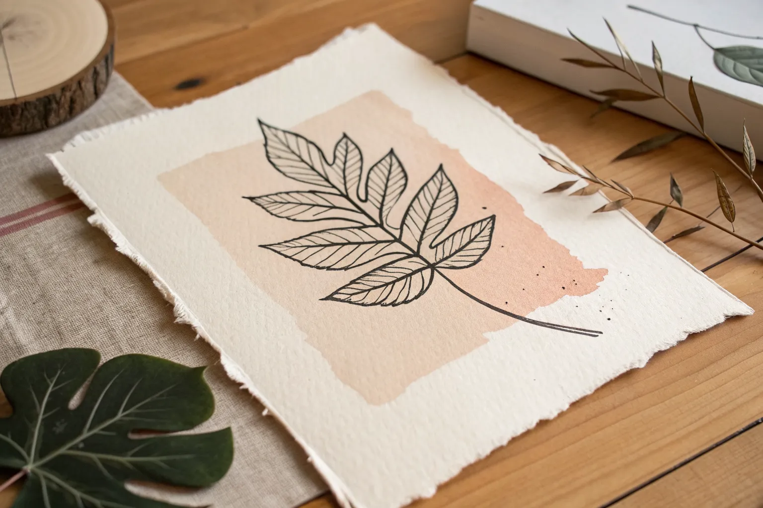
Line Art Over Color Blocks
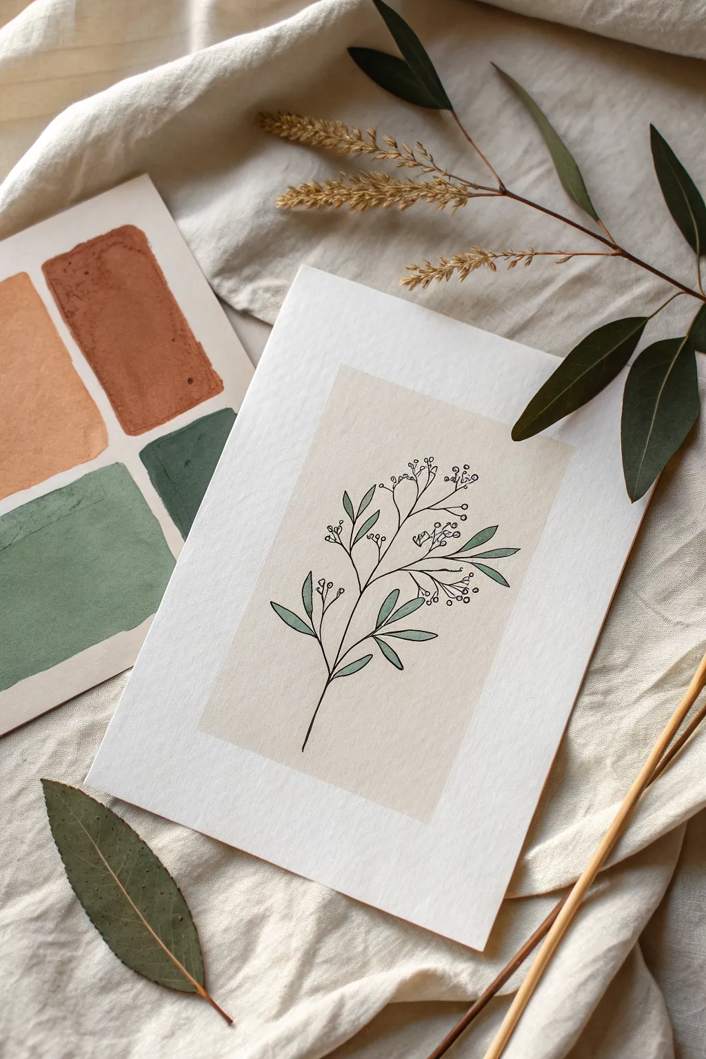
This elegant project combines the softness of muted color blocking with the crisp precision of botanical line drawing. The result is a modern, minimalist piece that perfectly captures the relaxed boho aesthetic.
Step-by-Step
Materials
- High-quality watercolor paper or heavy cardstock (white)
- Beige or oatmeal-colored acrylic gouache or matte craft paint
- Flat paintbrush (approx. 1 inch)
- Ruler
- Pencil
- Eraser
- Fine-liner pen (black, 0.3mm or 0.5mm)
- Sage green colored pencil or marker
- Masking tape or painter’s tape
Step 1: Creating the Background Block
-
Prepare the paper:
Cut your white watercolor paper or cardstock to your desired size (A5 works lovely for this). Tape the edges down to your workspace if your paper tends to curl. -
Map out the rectangle:
Using your ruler and a very light pencil touch, draw a rectangle in the center of the paper. Leave a generous white margin around all sides to frame the artwork. -
Tape the edges:
Apply masking tape perfectly along the pencil lines on the *outside* of the rectangle. Press the edges of the tape down firmly to ensure a crisp paint line. -
Paint the block:
Load your flat brush with the beige or oatmeal paint. Apply an even coat inside the taped area. I find that brushing in vertical strokes creates a nice, subtle texture that looks like linen. -
Dry and define:
Let the paint dry completely until it is no longer cool to the touch. Carefully peel away the masking tape at a 45-degree angle to reveal your clean color block.
Clean Lines
To prevent paint bleeding under the tape, brush a tiny bit of white paint (or clear medium) along the tape edge first to seal it before applying your color.
Step 2: Drawing the Botanical
-
Sketch the stem:
Lightly sketch a central, slightly curved stem line starting from the bottom third of the color block and reaching toward the top. -
Add branches:
Draw sketching lines for small branches extending outward from the main stem. Alternate them left and right for a natural, organic look rather than a symmetrical one. -
Position the leaves:
Sketch elongated, pointed oval shapes for the leaves. Place them mostly on the lower and middle branches. -
Draft the berries:
At the ends of the upper branches, sketch clusters of tiny circles to represent berries or buds. -
Ink the main lines:
Using your black fine-liner, trace over the main stem and branches. Keep your hand relaxed to avoid jittery lines. -
Outline the leaves:
Ink the leaf outlines. You can add a single central vein line to each leaf for a little extra detail, but keep it simple. -
Detail the berries:
Ink the small berry circles. Add tiny ‘stems’ connecting the individual berries to the main branch lines. -
Erase pencil marks:
Wait at least 5-10 minutes to ensure the ink is totally dry, then gently erase your underlying pencil sketch. Be gentle so you don’t scuff the paint layer.
Step 3: Adding Final Accents
-
Color the leaves:
Take your sage green colored pencil or marker. Carefully fill in the leaf shapes. If using pencil, consistent pressure creates a smooth, solid look. -
Review and refine:
Check the illustration for any gaps in the line work. I like to thicken the very bottom of the main stem slightly to ground the drawing. -
Set the artwork:
If you used heavy paint or markers, give the piece a final moment to rest flat before framing or displaying.
Gold Accents
Use a metallic gold gel pen to add tiny dots to the center of the berries or to trace just one side of each leaf for a sophisticated shimmer.
This serene artwork is now ready to bring a touch of nature into your space

PENCIL GUIDE
Understanding Pencil Grades from H to B
From first sketch to finished drawing — learn pencil grades, line control, and shading techniques.
Explore the Full Guide
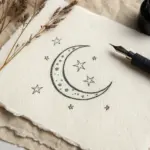
Simple Crescent Moon and Stars
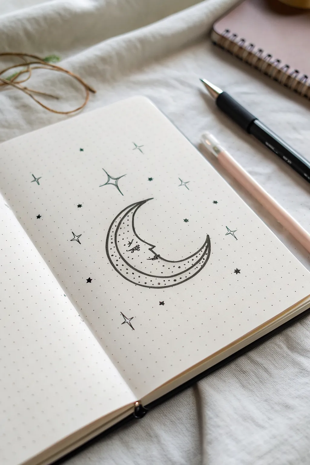
Embrace a celestial vibe with this charming line art crescent moon, featuring delicate details and playful stars scattered across the page. The simple black ink on dot grid paper creates a clean, minimalist aesthetic perfect for your bullet journal or sketchbook.
Step-by-Step Tutorial
Materials
- Dot grid notebook or journal
- Fine-tipped black drawing pen (0.3mm or 0.5mm)
- Pencil (HB or 2H recommended)
- Eraser
- Ruler (optional, for star points)
Step 1: Drafting the Shapes
-
Define the grid area:
Visualize a center area on your dot grid page roughly 8 dots wide by 10 dots tall to house your main subject. -
Sketch the outer curve:
Using a pencil, lightly sketch a large ‘C’ shape. Let the curve span about 6-7 vertical dots, keeping the line smooth and rounded. -
Sketch the inner curve:
Draw a smaller, deeper curve inside the first one to form the crescent. Taper the shapes together at the top and bottom to create sharp, pointed tips. -
Add the face profile:
In the middle of the inner curve, slightly erase your line and sketch a simple profile: a small bump for the nose and tiny curved lines for closed eyelashes and lips. -
Draft the moon’s pattern:
Draw a second line inside the crescent shape, running parallel to the outer edge, creating a narrow border strip.
Wobbly Lines?
Don’t stress if your curves aren’t perfect arcs. The uneven, hand-drawn quality is exactly what gives this boho style its charm. Just keep your wrist loose.
Step 2: Standard Inking
-
Outline the main shape:
Take your fine black pen and carefully trace over your pencil lines for the outer and inner crescent curves. -
Detail the face:
Ink the facial features with a very light touch. Use a tiny flick for the nose and gentle curves for the eye and mouth to keep expression peaceful. -
Draw the internal border:
Ink the internal parallel line you sketched earlier. This divides the moon into a main body and a decorative outer rim. -
Add decorative dots:
Inside that narrow outer rim, place a single row of tiny ink dots spaced evenly apart, following the curve all the way from top tip to bottom tip. -
Stipple the interior:
Fill the main body of the moon with random stippling. I find it looks best to cluster dots slightly denser near the bottom curve for shading, leaving the area near the face more open.
Make it Shine
Use a metallic gold or silver gel pen for the stars and the stippled dots inside the moon to make the illustration catch the light.
Step 3: Celestial Embellishments
-
Draw the four-point stars:
Select 3-4 spots around the moon for larger stars. Draw a cross first, then curve the lines inward to connect the points, creating concave diamonds. -
Add simple starbursts:
In the empty spaces, draw smaller, simple crosses (+) or asterisks (*) to represent distant glimmering stars. -
Scatter tiny stars:
Draw tiny, solid five-point stars (the classic shape) sparsely around the perimeter to add variety. -
Clean up the sketch:
Wait at least five minutes to ensure the ink is completely dry, then gently erase all underlying pencil marks. -
Final touches:
Assess the balance of your sky. If a spot looks too empty, add a single ink dot or a tiny plus sign to finish the composition.
Now you have a serene celestial drawing to decorate your daily planner spread
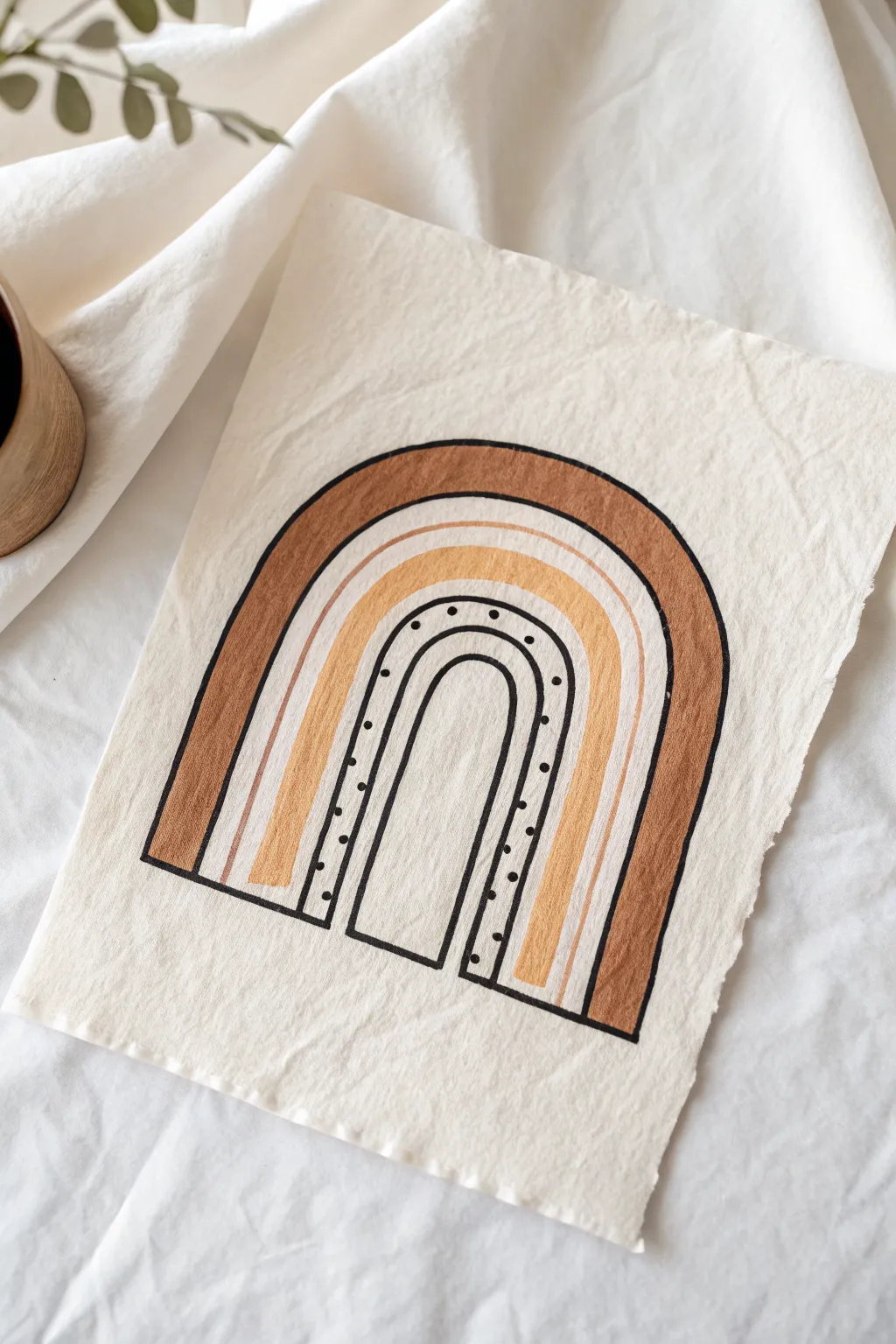
Boho Rainbow Arches
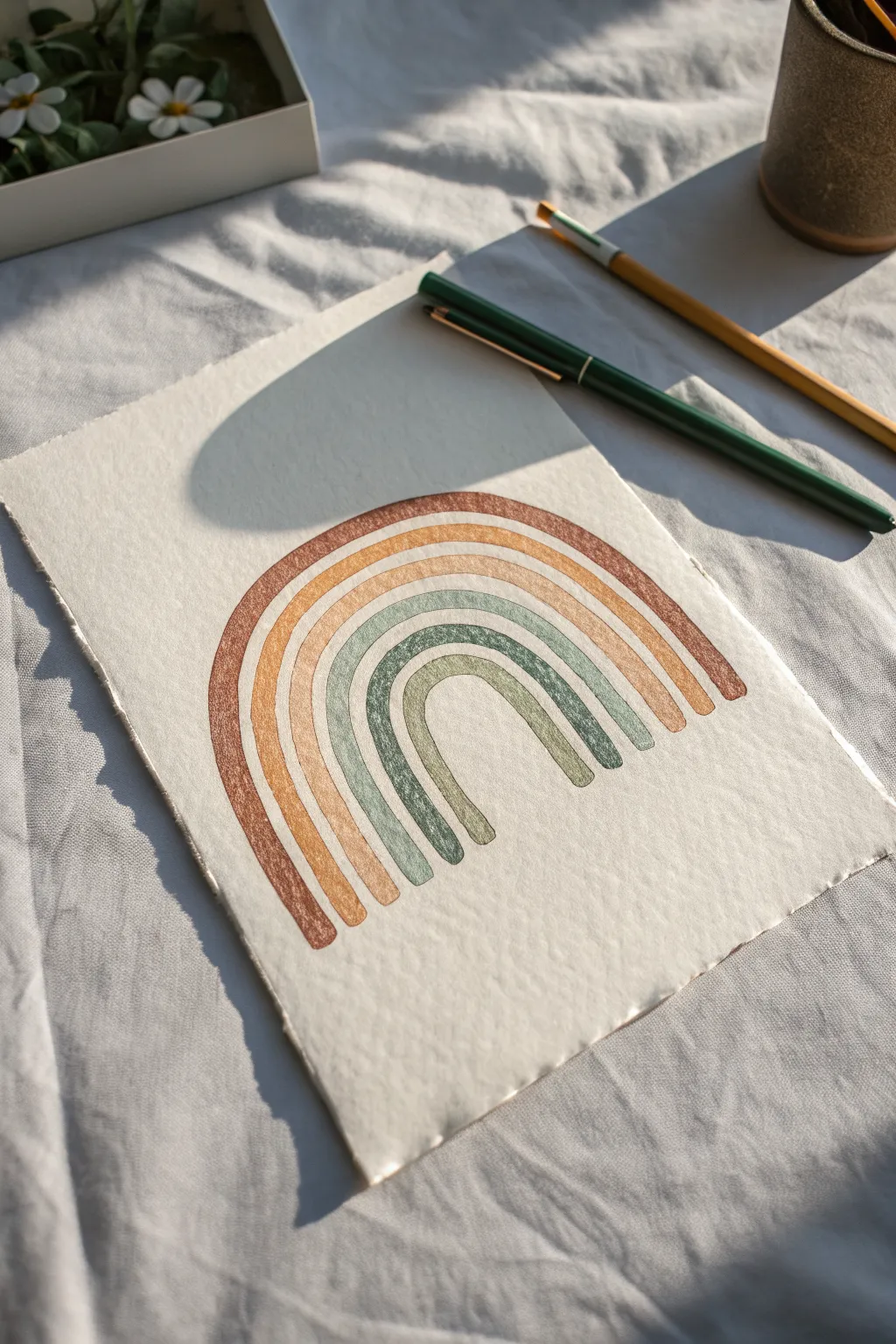
This soothing project captures the essence of bohemian style with muted, earthy colors and textured paper. The soft, imperfect arches create a relaxed feel that makes this piece perfect for beginners looking to experiment with watercolor or gouache.
Step-by-Step Guide
Materials
- Cold press watercolor paper (textured)
- Pencil (HB or lighter)
- Round watercolor brush (size 4 or 6)
- Watercolor or gouache paints
- Palette
- Jar of water
- Paper towel
- Eraser (kneaded preferred)
Step 1: Preparation & Sketching
-
Paper selection:
Choose a high-quality cold press watercolor paper. The rough texture is crucial for achieving the speckled, deckled look seen in the reference image. -
Create deckled edges:
If your paper has straight machine-cut edges, you can gently tear the edges against a ruler to create that soft, fibrous deckled border. -
Mark the center:
Lightly mark the center bottom of your paper with a pencil. This will guide the starting point for your smallest arch. -
Sketch the inner arch:
Draw a faint U-shape for the smallest, innermost arch. Keep the lines very light so they don’t show through the final paint. -
Map out the remaining arches:
Sketch four concentric arches around your first one, leaving a very small gap (about 1-2mm) between each band. Don’t worry about perfect symmetry; slight wobbles add charm.
Step 2: Mixing the Palette
-
Mix the rust tone:
For the outermost arch, mix a burnt sienna with a touch of red oxide or orange to get a warm, deep clay color. -
Create the mustard yellow:
Mix yellow ochre with a tiny bit of the previous rust mix to harmonize the colors, creating a muted, autumnal yellow. -
Blend the biscuit beige:
Water down a raw sienna or buff titanium heavily. You want this middle band to be the lightest, most neutral tone. -
Prepare the sage green:
For the fourth band, mix a sap green with a little white gouache or dilute it heavily, adding a touch of grey to desaturate it. -
Mix the olive green:
For the innermost arch, take your sage mix and add a little more green and a dot of brown to deepen it into an olive shade.
Dry Brush Secret
To get that speckled vintage texture, blot your brush on a paper towel after loading paint. Less water means the paint sits on the paper’s ‘peaks,’ leaving the ‘valleys’ white.
Step 3: Painting the Arches
-
Test the consistency:
Ensure your paint isn’t too wet. Using a ‘dry brush’ technique (less water, more pigment) helps the paper’s texture show through, creating those lovely white speckles. -
Paint the outer arch:
Starting with the rust color, carefully fill in the outermost band. Use one continuous stroke if possible, or connect smaller strokes smoothly. -
Paint the yellow arch:
Move inward to the second band with your mustard yellow. Maintain that small white gap between the rust and yellow bands. -
Apply the beige band:
Fill the middle arch with your lightest biscuit color. I find it helpful to rotate the paper as I curve around the top to keep my hand steady. -
Add the sage layer:
Paint the fourth band with the sage green mix. Keep the width consistent with the previous bands. -
Finish the center:
Complete the rainbow by painting the small inner arch with the olive green mix. -
Refine the ends:
Check the bottom of each arch leg. You can carefully square them off with your brush or leave them slightly rounded for a softer look. -
Let it dry completely:
Wait for the paint to fully set. The colors will often lighten slightly as they dry, revealing more of the paper’s texture. -
Clean up sketch lines:
Once absolutely dry, gently erase any visible pencil marks from the gaps between the arches using a kneaded eraser.
Gold Accents
Once the paint is dry, use a metallic gold paint pen or fine brush to trace thin lines in the white gaps between arches for a bit of subtle sparkle.
Now you have a serene piece of art perfect for a desk nook or gallery wall
BRUSH GUIDE
The Right Brush for Every Stroke
From clean lines to bold texture — master brush choice, stroke control, and essential techniques.
Explore the Full Guide
Modern Arch Window Shape
This project combines minimalist arch shapes with warm, earthy tones to create a stunning piece of wall art. The rough, raw edge of the canvas paper adds a beautiful tactile element that perfectly complements the boho aesthetic.
Step-by-Step Tutorial
Materials
- Heavyweight cotton rag paper or unprimed canvas sheet
- Pencil (HB or lighter)
- Ruler
- Compass or round object for tracing (large bowl)
- Acrylic paints (Burnt Sienna, Yellow Ochre, Titanium White, Raw Umber)
- Black fine liner pen (waterproof) or thin black paint marker
- Flat shader brush (medium size)
- Fine detail brush
- Palette or mixing plate
- Water cup and paper towels
Step 1: Preparing the Surface and Sketch
-
Create the raw edge:
Start by tearing your paper or canvas sheet by hand rather than cutting it with scissors. This creates the soft, deckled edge characteristic of this style. If the paper is too tough, score a line with a damp paintbrush first, then tear along the wet line. -
Set the baseline:
Use your ruler to draw a straight horizontal line lightly in pencil near the bottom third of the paper. This will serve as the grounding line for your arch. -
Mark the width:
Decide how wide you want your arch to be and mark two points on the baseline. Find the exact center between these points and draw a faint vertical line upwards to help with symmetry. -
Draw the outer curve:
Using a compass set to your desired width, or by tracing a round household object like a bowl, draw the top semi-circle of the arch. Connect the ends of this curve straight down to your baseline markings. -
Sketch internal layers:
Lightly sketch three concentric arches inside the main shape. Space them out to create distinct bands: a wide outer band for the dark brown, a thinner middle band, and an inner band for the dotted detail.
Clean Curves Secret
Rest your pinky finger on a dry spot of the paper while painting curved lines. It acts as a pivot point and stabilizer for smoother arches.
Step 2: Painting the Earth Tones
-
Mix the darkest tone:
On your palette, mix Burnt Sienna with a tiny touch of Raw Umber to create a deep, warm terracotta color. I find adding just a drop of water helps the paint flow smoothly on textured paper. -
Paint the outer arch:
Using your flat shader brush, carefully fill in the outermost band of the arch with your dark terracotta mix. Keep your hand steady on the curves, rotating the paper if it helps you maintain a clean edge. -
Mix the ochre tone:
Clean your brush and mix Yellow Ochre with a significant amount of Titanium White. You want a soft, sandy yellow color that contrasts well with the dark brown. -
Fill the middle band:
Paint the second arched band with this sandy ochre mixture. Leave a small gap of unpainted paper between this band and the dark brown one if you want a natural separation, or let them touch for a solid look. -
Add the cream accent:
Mix a large amount of White with a tiny dot of the Burnt Sienna to create a warm cream or beige. Paint a thin line or narrow band inside the yellow arch to create visual depth. -
Let it dry completely:
Allow the paint to fully dry. This is crucial because the next step involves ink, which can bleed if the surface is damp. A hairdryer on a low cool setting can speed this up.
Add Texture
Mix a pinch of baking soda into your acrylic paint before applying. It creates a matte, terracotta-like texture that looks amazing on the wall.
Step 3: Inking and Details
-
Outline the main shape:
Take your black fine liner or paint marker and trace the outermost perimeter of the entire arch shape. Go slowly to ensure the line weight is consistent. -
Define the bands:
Draw black contour lines separating your colored bands. These hard outlines give the artwork that specific illustrative look. -
Create the inner arch:
Draw the final, smallest arch in the very center. Leave the inside of this shape unpainted (the color of the raw paper) to act as the ‘light’ coming through the window. -
Add the decorative dots:
In the band between the center ‘window’ and the colored arches, carefully place a row of small black dots. Try to space them evenly, following the curve of the arch all the way around. -
Clean up sketch lines:
Once you are absolutely certain the ink is dry, gently erase any visible pencil marks that weren’t covered by paint or ink.
Hang your finished piece using simple wooden clips or float mount it in a frame to show off those lovely deckled edges
Pampas Grass Stems
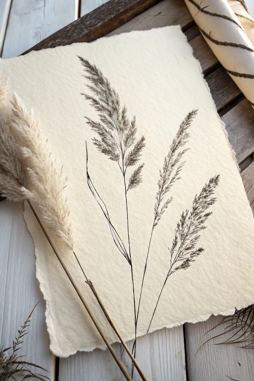
Capture the delicate beauty of dried pampas grass with this minimalist ink drawing on textured paper. The contrast between the fragile, feathery plumes and the rough, deckled edge of the paper creates a perfect bohemian aesthetic.
Detailed Instructions
Materials
- Heavyweight, handmade paper with deckled edges (cream or off-white)
- Fine liner pens (sizes 005, 01, and 03)
- H lead pencil
- Kneaded eraser
- Real pampas grass (optional, for reference)
Step 1: Sketching the Composition
-
Map the stems:
Begin by lightly sketching three main curving lines with your H pencil to establish the stems. Vary their heights, placing the tallest stem on the left and angling the others slightly outward to the right to create a natural spread. -
Outline the plume shapes:
At the top of each stem, lightly sketch rough, elongated diamond or oval shapes. These don’t need to be detailed; they just mark the boundaries where the feathery texture will go. -
Add the leaf blades:
Draw long, slender leaves extending from the lower part of the stems. Let them curve gracefully, occasionally crossing over the main stem lines to add depth and movement.
Flick of the Wrist
When drawing the feathery plumes, always lift your pen at the end of the stroke. This creates a tapered line that mimics hair or fine grass much better than a solid line.
Step 2: Inking the Stems and Leaves
-
Trace the main stems:
Switch to your 03 pen. Carefully trace over your pencil lines for the main stems, but don’t make the line perfectly uniform. A slight wobble or variation in pressure mimics organic growth. -
Refine the leaves:
Use the 01 pen for the long, grass-like leaves. Use a flicking motion at the end of each leaf to taper it into a sharp, fine point. -
Add stem joints:
Where the leaves meet the stem, thicken the line slightly to suggest the sheath wrapping around the stalk. This small detail adds significant realism.
Step 3: Detailing the Plumes
-
Start the spine:
Using the 005 pen, draw the central spine of the first plume. It should be thinner than the main stem below it. -
Create the texture:
Work on one side of the spine at a time. Use quick, short hatching strokes that angle upward and outward. I find it helpful to vary the length of these strokes—some short, some long—to create fluffiness. -
Build density:
Layer more strokes closer to the central spine to make the plume look dense in the middle. As you move toward the outer edges of your pencil guide, make the strokes lighter and more sparse. -
Repeat for all plumes:
Apply this same technique to the remaining two flower heads. Remember to follow the curve of the stem; if the stem leans right, your hatching strokes should flow with that direction. -
Add stray fibers:
Draw a few tiny, flyaway lines extending beyond the main shape of the plume. This captures that ‘windblown’ look characteristic of dried grasses.
Go Sepia
Instead of standard black ink, try using dark brown or sepia fineliners. This warms up the drawing and coordinates beautifully with the cream-colored paper.
Step 4: Final Touches
-
Deepen the shadows:
Look at where the stems overlap or where the leaves fold. Add a few extra lines or stippling dots with the 005 pen in these nooks to create shadow. -
Erase pencil guides:
Wait until the ink is completely dry to avoid smudging. Gently roll a kneaded eraser over the surface to lift away the graphite guidelines. -
Distress the edges (optional):
If your paper isn’t already textured enough, you can gently roughen the edges with a fingernail or sandpaper to enhance the rustic look.
Place your finished drawing in a floating frame to show off those beautiful paper edges


Desert Cactus Shapes
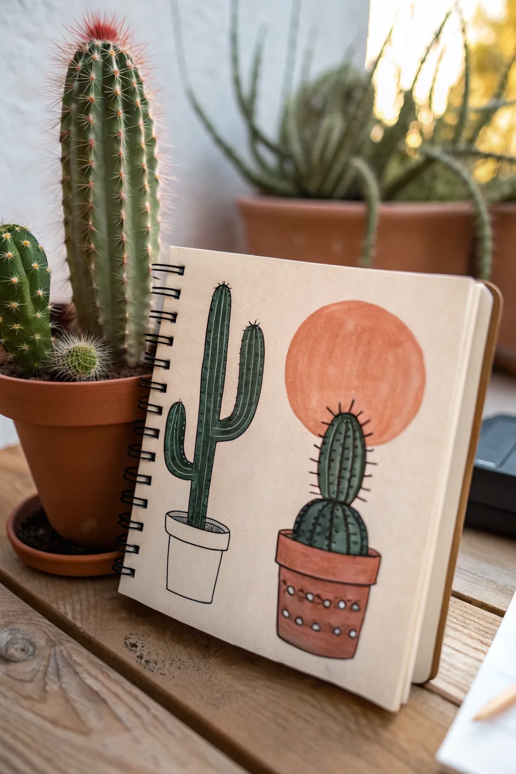
Capture the serene vibes of the desert with this charming sketchbook spread featuring two distinct cactus styles. This project combines simple line work with bold blocked shapes and earthy tones for a modern bohemian look.
How-To Guide
Materials
- Spiral-bound sketchbook with off-white or tan paper
- Pencil (HB or 2B)
- Eraser
- Fine liner pen (black, size 03 or 05)
- Alcohol-based markers or colored pencils (Dark Green, Terracotta/Orange, Red-Brown)
- White gel pen (optional for highlights)
Step 1: Planning the Layout
-
Visualizing the Space:
Open your sketchbook to a clean page. Visualize dividing the page roughly in half vertically, dedicating the left side to a taller, branching cactus and the right side to a rounder, potted cactus with a sun element. -
Drafting the Pots:
Start by lightly sketching the pots at the bottom of the page. On the left, draw a simple cylindrical pot with a rolled rim. On the right, sketch a slightly more substantial terracotta pot, wider at the top and tapering down, also with a distinct rim. -
Outlining the Left Cactus:
Sketch the left cactus shape. Draw a tall, central column rising from the pot. Add a curved arm on the left side pointing up, and a slightly higher curved arm on the right side, creating a classic Saguaro silhouette. -
Outlining the Right Cactus:
For the right cactus, stack two rounded shapes. Draw a larger, slightly flattened oval sitting directly in the pot, and place a slightly taller, pill-shaped oval on top of it to form the main body. -
The Sun Element:
Behind the top portion of the right cactus, lightly sketch a large, perfect circle to represent a setting sun. Ensure the circle is large enough to frame the top of the cactus without overwhelming it.
Step 2: Color Blocking
-
Coloring the Tall Cactus:
Take your dark green marker. Fill in the entire shape of the left cactus. Apply the color evenly, following the vertical direction of the stem to minimize streakiness. -
Coloring the Round Cactus:
Use the same dark green shade to fill in the two stacked sections of the right cactus. I find it helps to work slowly near the edges to keep the rounded shape crisp. -
Painting the Sun:
Switch to a terracotta or muted orange marker. Fill in the large circle behind the right cactus. If your marker is translucent, be careful where it overlaps the green cactus; if opaque (like paint markers), you can layer it, but usually, it’s best to color around the green if you didn’t sketch it first. -
Coloring the Right Pot:
Color the pot on the right with a reddish-brown or clay-colored marker. Leave the left pot uncolored for now to maintain the stylistic contrast shown in the reference.
Uneven marker coverage?
If your markers leave streaks, try coloring in small circular motions rather than long lines, or go over the area a second time once the first layer is dry to saturate the paper.
Step 3: Inking and Details
-
Defining the Outlines:
Once the marker ink is fully dry, take your black fine liner. Carefully trace over the pencil outlines of both cacti and the pots. Keep your hand steady for a clean, graphic look. -
Left Cactus Textures:
On the tall left cactus, draw vertical lines running the length of the stem and arms. Space them somewhat evenly to represent the ribs of the cactus. These lines give the flat color dimension. -
Left Pot Detail:
Ink the rim and the body of the left pot. Add a small hatched shadow area just inside the rim to show depth, but leave the rest of the pot explicitly white/uncolored as a stylistic choice. -
Right Cactus Ribs:
Draw vertical, curved lines on the round sections of the right cactus. Curve your lines to follow the form of the intense spheres—bulging in the middle and tapering at the top and bottom. -
Adding Spines:
On the right cactus, draw small, short horizontal dashes or spikes along the vertical rib lines. This adds that prickly texture. Extend some longer spikes sticking out from the silhouette edges. -
Right Pot Decoration:
Add decorative details to the colored pot. Draw small circles or a pattern of dots across the body of the pot. You can leave these as negative space if you planned ahead, or use a white gel pen to add them over the marker. -
Final Cleanup:
Wait a moment for all ink to dry completely to avoid smudging. Gently erase any visible pencil marks that weren’t covered by the ink or marker.
Make it Pop
Use a white gel pen to add tiny highlights on the sunny side of the cactus ribs or to add white decorative patterns on the terracotta pot for extra contrast.
Now you have a stylish desert spread ready to inspire your next botanical adventure.
Crystal Cluster Doodle
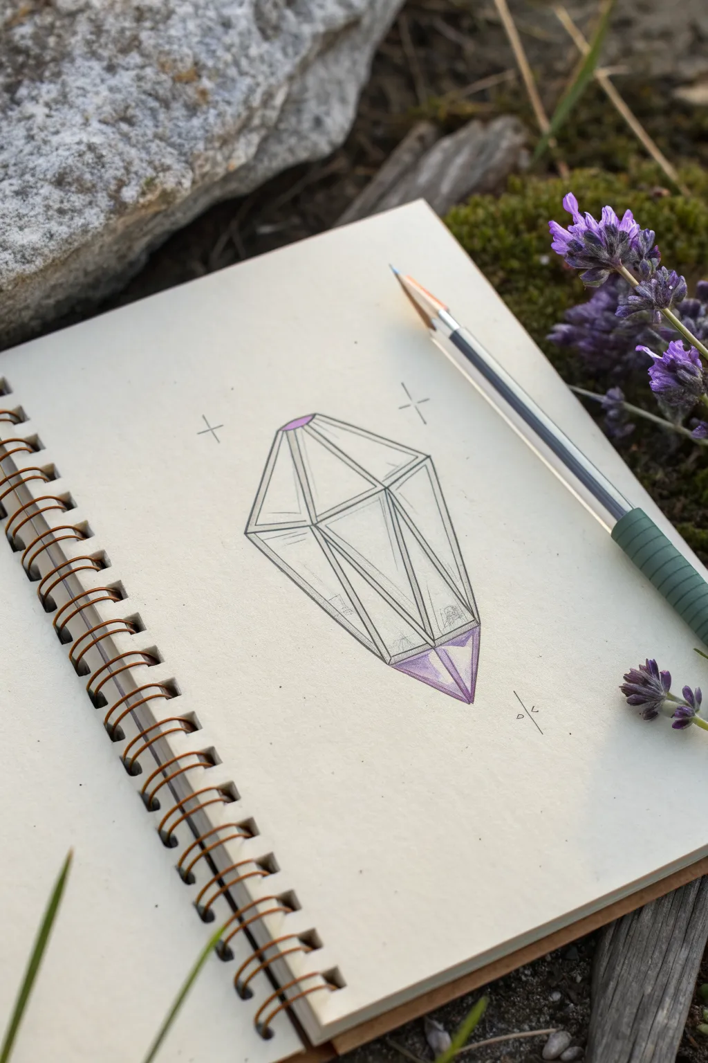
Capture the magic of nature with this minimalist crystal drawing. Featuring crisp geometric lines and soft purple accents, this sketch is the perfect addition to any boho-themed journal page.
Step-by-Step Guide
Materials
- Sketchbook with cream or off-white paper
- HB Graphite pencil
- Fine liner pen (black, 0.3mm or 0.5mm)
- Purple colored pencil (or marker)
- Ruler (optional but helpful)
- Eraser
Step 1: Drafting the Structure
-
Establish the central axis:
Start by drawing a very faint vertical line in the center of your page to act as a guide. This will help keep your crystal symmetrical. -
Mark the height:
Decide how tall you want your crystal to be. Mark a small dot at the top and bottom of your guide line. -
Create the widest point:
Slightly above the vertical center, draw a horizontal line crossing your axis. This will be the widest part of the gem, often called the ‘girdle’ in jewelry terms. -
Connect the outer shape:
From the ends of your horizontal line, draw straight diagonal lines connecting up to the top dot and down to the bottom dot. You should now have a kite-like diamond shape. -
Define the top facet:
At the very top of the shape, draw a small, flattened triangle or trapezoid. This creates the flat ‘table’ of the crystal.
Step 2: Adding Geometric Detail
-
Draw the main vertical facets:
From the corners of your top flat shape, drop two vertical lines down to the horizontal ‘girdle’ line. -
Add inner angles:
Connect the bottom of those vertical lines to the very bottom point of the crystal. This creates the long, central facets of the lower section. -
Subdivide the sides:
Draw diagonal lines from the central vertical facets out to the edges of the crystal. I find this adds that complex, light-refracting look without being overly complicated. -
Refine the lines:
Double-check your symmetry. If any lines look shaky, now is the time to straighten them out with your pencil before inking.
Fixing Wobbly Lines
If a line goes crooked, don’t erase! Turn it into a facet. Draw a connecting line from the ‘mistake’ to a corner, making the crystal look more complex.
Step 3: Inking and Coloring
-
Trace with fine liner:
Using your black fine liner, carefully trace over your pencil lines. Keep your hand steady and try to make single, confident strokes rather than short, scratchy ones. -
Double-line technique:
To give the drawing some depth, draw a second, very thin line right next to some of the main structural lines. This mimics the thickness of the glass or stone. -
Let the ink set:
Wait a moment for the ink to dry completely to avoid smudging. -
Erase guidelines:
Gently erase your initial graphite sketch, leaving only the crisp ink lines behind. -
Apply top color:
Take your purple pencil and color strictly within the small top facet. Press firmly to get a saturated, opaque look. -
shade the base:
Add purple to the very bottom tip of the crystal. Start solidly at the point and fade it upward slightly into the clear section. -
Add texture marks:
Use your pencil or a very light gray pen to add tiny scratches or hatching inside the clear facets. These represent internal flaws or reflections. -
Draw mystical accents:
Place a simple cross or ‘sparkle’ shape on either side of the crystal’s top half. -
Add a signature element:
Draw a small rune-like symbol or your initials near the bottom right to balance the composition.
Pro Tip: Depth effect
Leave a tiny sliver of white space between your purple coloring and the black outline. This ‘highlight’ makes the gem look 3D and glossy.
Now you have a mystical geometric gem grounding your page with its simple elegance
Boho Woman Face Profile Line Art
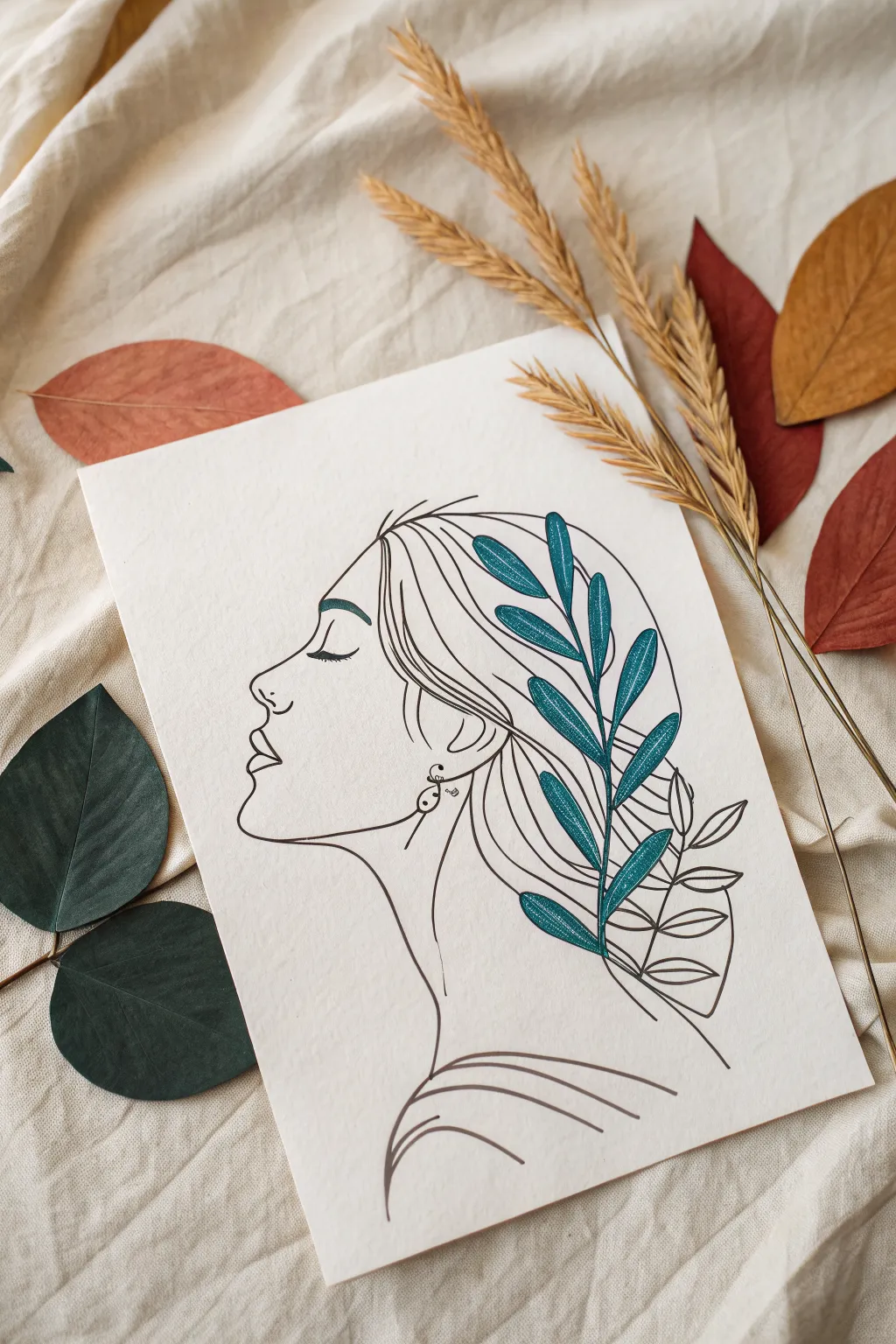
Capture the serene beauty of this botanical portrait, combining clean, minimalist face contours with vibrant leaf details. This project uses simple fine liner techniques and a touch of teal to create a modern, bohemian piece perfect for framing.
Detailed Instructions
Materials
- Heavyweight textured paper (watercolor or mixed media paper, around 300gsm)
- Black archival fine liner pens (sizes 0.3mm and 0.5mm)
- Pencil (HB or 2B)
- Soft kneaded eraser
- Teal or dark cyan marker/brush pen
- Protractor or round object (optional, for head shape guide)
Step 1: Sketching the Foundations
-
Outline the head shape:
Begin with your pencil, lightly sketching a slightly tilted oval shape in the center of your paper. This doesn’t need to be perfect; it just serves as a boundary for the hair and face. -
Mark the facial features:
On the left side of your oval, lightly mark where the forehead, nose, lips, and chin will fall. A good rule of thumb is to place the eye line about halfway down height of the head. -
Draw the profile:
Refine the pencil sketch of the face. Create a gentle curve for the forehead, a small, slightly upturned nose, full lips, and a distinct jawline. Keep the lines fluid and connected. -
Sketch the neck and shoulder:
Extend a long, elegant line down from the chin to form the neck, curving it outward at the bottom for the shoulder. Add a parallel line from the back of the head/ear area down towards the back. -
Map out the hair:
Draw sweeping, curved lines flowing from the forehead back over the ear and down the neck. The hair should feel voluminous, so keep the lines loose rather than tight. -
Add the botanical element:
Sketch a central stem curving through the hair area. Add outlines for the leaves—these should be elongated ovals attached to the stem, overlapping the hair strands.
Smooth Lines Pro-Tip
Draw profile lines by moving your entire arm from the shoulder, not just your wrist. This prevents shaky, jagged lines and creates that confident, sweeping look essential for line art.
Step 2: Inking the Lines
-
Start the fine liner work:
Switch to your 0.5mm black pen. Carefully trace your final profile line, starting from the forehead and working your way down to the neck. Use confident, single strokes rather than short, scratchy ones. -
Detail the face:
Ink the eye as a simple closed curve with eyelashes. Add the small nostril hook and the separate lines for the upper and lower lips. Don’t forget the eyebrow, which should be slightly thicker. -
Outline the main hair flow:
Trace the primary hair strands. Notice that the lines aren’t just one solid mass; they are individual sweeping curves that suggest movement. I like to vary pressure slightly here to thin the lines at the ends. -
Ink the earring:
Draw the small dangle earring below the earlobe using the fine liner. Keep it delicate and minimal. -
Draw the clothing lines:
At the bottom of the neck, add the curved lines suggesting a collarbone or top. These lines should echo the curve of the shoulder. -
Erase pencil marks:
Wait about 5-10 minutes to ensure the ink is completely dry. Then, gently roll your kneaded eraser over the entire drawing to lift the graphite without damaging the paper surface.
Step 3: Adding Color and Texture
-
Color the leaves:
Using your teal marker or brush pen, fill in the leaves that weave through the hair. Leave a tiny sliver of white space near the central vein of each leaf to create a highlight effect. -
Outline the color:
Once the teal ink is dry, use your 0.3mm fine liner to outline the leaves. Go right over the colored edges. Add a central vein line down the middle of each teal leaf. -
Create texture on leaves:
Add stippling (small dots) or tiny hatching lines inside the teal leaves using the 0.3mm pen. Concentrate these dots near the base of the leaves to add depth and shadow. -
Incorporate line leaves:
Below the colored teal leaves, ink the remaining botanical stems in black only. Do not color these; leaving them as just outlines creates a beautiful visual contrast. -
Final assessment:
Step back and look at the composition. If the hair feels too empty, add one or two very thin, long stray hairs with the 0.3mm pen to enhance the breezy, boho feel.
Ink Smearing?
If your fine liner smears when coloring the leaves, switch the order: color the teal shapes first, let dry completely, and then apply the black outline over the top.
Now your stunning profile is ready to bring a touch of calmness to your space
Hands Holding a Flower Stem
This minimalist project combines the fluid, organic shapes of watercolor with crisp, structured line art. The result is a calming piece that captures a delicate moment of connection between nature and ourselves.
Step-by-Step
Materials
- Cold press watercolor paper (deckled edge optional)
- Watercolor paints (Yellow Ochre, Dusty Pink/Burnt Sienna, Cream/Buff)
- Round watercolor brush (size 6 or 8)
- Fine liner pen (Black, waterproof, 0.3mm or 0.5mm)
- Pencil (HB or 2H)
- Eraser
- Jar of clean water
- Paper towels
Step 1: Creating the Abstract Backdrop
-
Prepare your palette:
Mix a warm, muted palette. You’ll need a mustard yellow (Yellow Ochre), a soft earthy pink (diluted Burnt Sienna or Dusty Pink), and a very pale beige. Keep the mixtures quite watery for a transparent look. -
Paint the first shape:
Load your brush with the mustard yellow mix. Paint an irregular, rounded shape near the center of the paper, slightly higher than the exact middle. Don’t worry about perfect edges; a wobbly, organic edge adds to the boho charm. -
Add the secondary tone:
While the yellow shape is still damp (but not soaking), rinse your brush and pick up the dusty pink. Paint a second, larger irregular shape that overlaps the bottom of the yellow area. Let the colors bleed slightly where they touch. -
Finish the background wash:
Add a final wash of the pale beige or cream color at the very bottom of your painted area, blending it softly into the pink section. This creates a sunset-like gradient. -
Let it dry completely:
This is crucial. The paper must be bone dry before you start drawing, or your ink will bleed. I like to let this sit for at least an hour or speed it up with a hair dryer on a low setting.
Keep it clean
Place a scrap piece of paper under your hand while inking to prevent oils from your skin transferring to the paper or smudging pencil lines.
Step 2: Sketching the Composition
-
Outline the stems:
Using a light pencil, draw two long, curving stems that start near the bottom left and reach up through your painted background shapes. They should cross slightly. -
Position the hands:
Sketch the basic shapes of the two hands. The upper hand grips the stems near the middle, with fingers wrapping around. The lower hand gently supports the stems near the bottom. -
Refine the fingers:
Pay attention to the interaction between the fingers and the stems. The stems should appear to pass *through* the grip, not just sit on top. Keep the hand shapes simplified and elegant. -
Draw the flower heads:
At the top of the stems, lightly sketch out two daisy-like flowers. One can be slightly higher than the other. Draw a central circle for the pollen and simple, oval petals radiating outward. -
Add leaves:
Draw small, pointed leaves branching off the stems, particularly between the top hand and the flower heads. These add balance to the vertical lines.
Step 3: Inking the Final Art
-
Trace the hands:
Switch to your waterproof fine liner. Start by carefully tracing the pencil lines of the hands. Use confident, continuous strokes to keep the line work looking smooth. -
Inking the stem:
Draw the stems. Be mindful to stop your line when you reach a finger that is wrapping *over* the stem, then continue the line on the other side. -
Detailing the flowers:
Ink the flower petals and centers. For a bit of texture, add tiny dots or a grid pattern inside the center circle of the flowers. -
Adding the leaves:
Ink the leaves. Draw a central vein in each leaf and add small diagonal hatching lines on one side of the vein to suggest shadow and texture. -
Check line weight:
Look over your drawing. If some lines look too thin or faint, go over them again to darken them, ensuring the black ink stands out boldly against the pastel background. -
Erase pencil marks:
Once you are absolutely certain the ink is dry (give it 10-15 minutes to be safe), gently erase all your pencil sketches used for guidance. -
Deckle the edges (optional):
To match the rustic look of the inspiration image, you can tear the edges of your paper against a ruler to create a soft, deckled edge effect.
Add some sparkle
Use a metallic gold gel pen to trace just the flower centers or add tiny dots around the flower heads for a subtle, shimmering highlight.
Display your artwork in a floating frame to show off those beautiful edges
Negative Space Botanical Silhouette
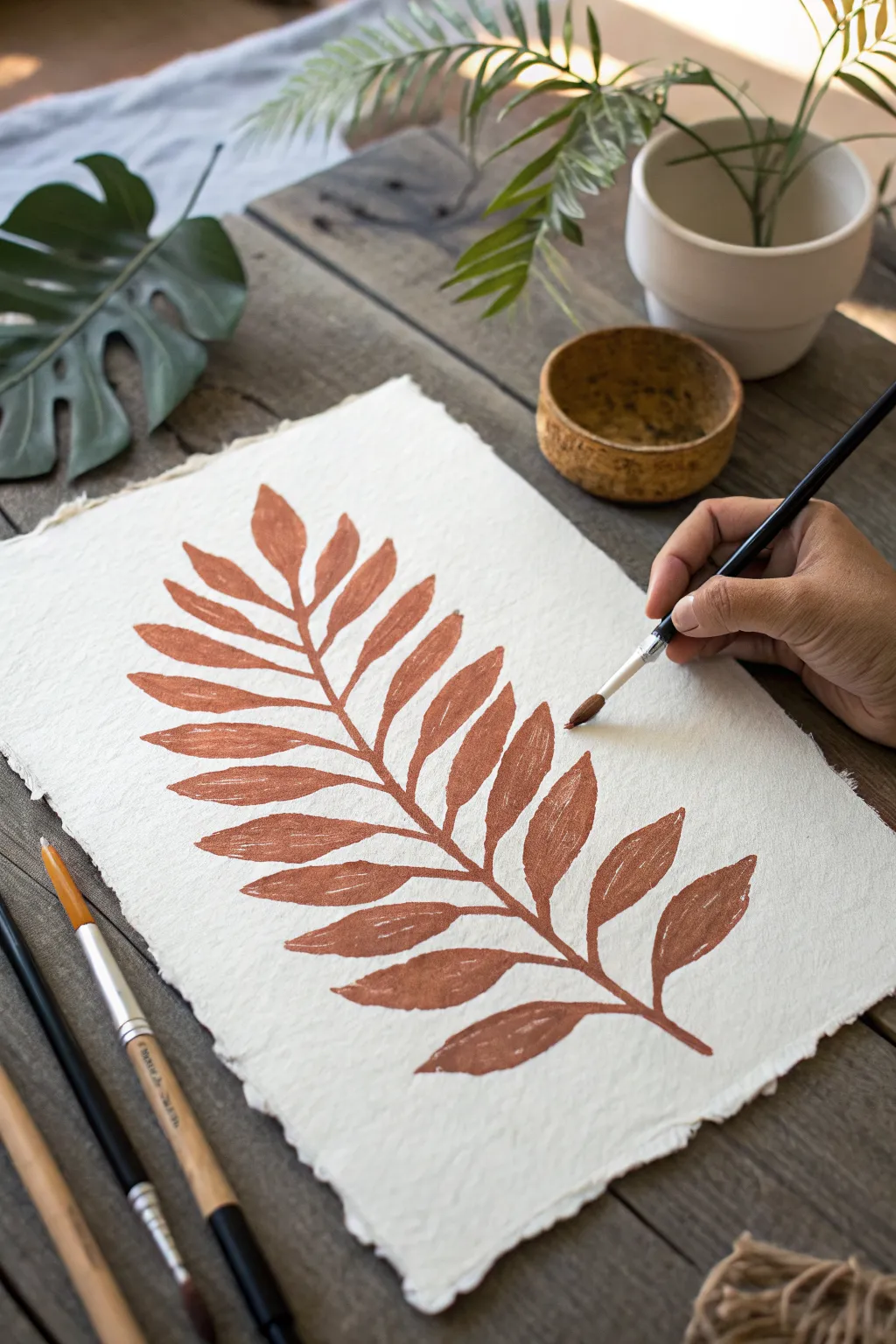
Capture the organic beauty of nature with this simple yet striking botanical painting on textured handmade paper. The warm terracotta tones and deckled edges give this piece a distinctively rustic, bohemian charm perfect for minimalist decor.
How-To Guide
Materials
- Handmade cotton rag paper (deckle edge, roughly A4 size)
- Terracotta or burnt sienna watercolor or gouache paint
- Pointed round brush (size 6 or 8)
- Small liner brush (size 2)
- Pencil (HB or lighter)
- Kneaded eraser
- Mixing palette
- Jar of clean water
- Paper towel
Step 1: Drafting the Design
-
Prepare the paper:
Lay your handmade paper on a flat, clean surface. Since this paper is textured and soft, handle it gently to avoid smudging or tearing the fibers. -
Mark the stem line:
Using a very light touch with your pencil, draw a gentle, curved line extending diagonally from the bottom corner toward the opposite top corner. This will be the central vein or ‘rachis’ of your fern. -
Outline leaf placements:
Sketch faint, elongated oval shapes or simple lines coming off the center stem to map out where each leaflet (pinna) will go. Keep the spacing consistent but natural, allowing them to get smaller toward the tip. -
Refine the shapes:
Lightly trace the final shape of the leaflets over your guides. Aim for a tapered, almond-like shape for each one. Don’t worry about perfection; natural irregularities add to the boho aesthetic. -
Faint erasure:
Use a kneaded eraser to dab—not rub—over your pencil lines. You want the graphite to be barely visible so it doesn’t show through the paint later.
Step 2: Painting the Fern
-
Mix the paint:
Squeeze a generous amount of terracotta or burnt sienna paint onto your palette. Mix it with a little water until it reaches the consistency of heavy cream—opaque enough to cover, but fluid enough to glide. -
Paint the central stem:
Load your pointed round brush and carefully paint the central stem line first. Start from the bottom (base) where it’s thickest and gently lift pressure as you move to the tip for a thinner line. -
Start the bottom leaflets:
Begin with the largest leaflets at the base of the stem. Place the tip of your brush at the stem, press down to widen the stroke for the belly of the leaf, and lift up as you reach the tip to create a point. -
Work upwards:
Continue panting leaflets in pairs, working your way up the stem. Rotate the paper if needed to keep your hand from smudging wet paint. -
Refine the edges:
Go back over the leaf edges while precise while the paint is still workable to smooth out any wobbles, ensuring the leaf shapes are distinct and graceful. -
Add texture variation:
I like to leave a tiny bit of ‘dry brush’ texture in some areas or slight transparency variations to emphasize the handmade feel.
Fixing fuzzy edges
If the textured paper causes your paint to bleed, mix your paint slightly thicker with less water, or use a very small amount of painting medium to control flow.
Step 3: Adding Details
-
Switch brushes:
Pick up your smaller liner brush (size 2) for the finer details. -
Connect the joins:
Neaten the connection points where the leaflets meet the main stem. These should look seamless and organic, slightly thickening the joint. -
Sharpen the tips:
Use the fine tip of the liner brush to extend the very ends of the leaflets into sharper, more delicate points if the round brush left them too blunt. -
Check balance:
Step back and look at the overall composition. If a gap feels too large, you can add a small, partial leaflet or slightly thicken an existing one to balance the visual weight. -
Final drying:
Let the artwork dry completely flat. Textured rag paper holds water longer than standard paper, so give it at least an hour before framing.
Vintage variation
Add a few drops of coffee or tea to your water cup when mixing the paint. This subtly mutes the color, giving the finished piece an aged, antique botanical look.
Now you have a timeless botanical piece ready to bring warmth to any wall.


Have a question or want to share your own experience? I'd love to hear from you in the comments below!