Markers are my go-to when I want color that looks instantly bold, juicy, and confident on the page. If you’re craving ideas that really show off smooth gradients, bold outlines, and that satisfying color layering only markers do, you’re in the right place.
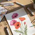
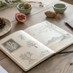
Bright Flower Bouquet With Clean Outlines
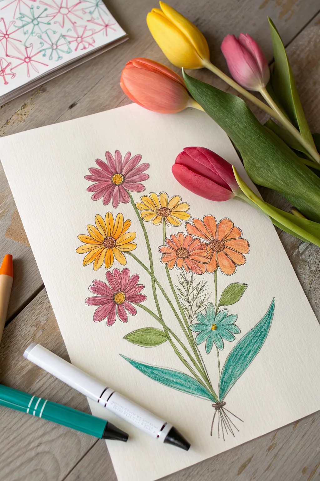
Capture the fresh energy of spring with this vibrant, hand-drawn bouquet featuring daisies and wildflowers. The clean outlines combined with soft, textured shading create a charming illustration perfect for greeting cards or wall art.
How-To Guide
Materials
- Heavyweight drawing paper or mixed media paper
- Fine-tip black drawing pen (0.3mm or 0.5mm)
- Colored pencils (pinks, yellows, oranges, greens, teal)
- Pencil and eraser for sketching
- Fine-point markers (optional for bolder color)
- Ruler (optional)
Step 1: Planning and Sketching
-
Establish the composition:
Begin by lightly marking the top and bottom boundaries of your bouquet with a pencil. Draw a small cluster of crossing lines near the bottom to represent where the stems will be tied together. -
Map out the flower heads:
Lightly sketch circles and ovals to indicate where your main flowers will go. Place two larger circles near the top left and bottom left for the pink daisies, and a cluster of three smaller circles in the middle right for the orange and yellow blooms. -
Add the stem lines:
Connect your flower head circles to the bottom tie-point with long, slightly curved lines. Don’t worry about drawing perfect straight lines; a little natural curve makes the bouquet look more organic. -
Sketch the leaves:
Draw two large, sweeping lance-shaped leaves at the bottom, curving outward. Add smaller, simpler leaves attached to the central stems.
Smudge Control
Place a scrap piece of paper under your drawing hand. This prevents oils from your skin transferring to the paper and keeps you from smearing the fresh ink or pencil pigment.
Step 2: Inking the Outlines
-
Draw the petals:
Using your fine-tip black pen, trace over your pencil sketches. For the daisies, draw long, oval petals radiating from a central disk. Make sure the petals overlap slightly for realism. -
Detail the flower centers:
Inside the center of each daisy, draw a textured circle using tiny dots or stippling to mimic the pollen texture. -
Ink the stems and leaves:
Go over your stem lines with the pen. For the stems, use double lines to give them thickness. Outline the large bottom leaves and the smaller stem leaves. -
Add filler foliage:
In the gap between the middle flowers and the bottom leaves, draw a few stems of feathery, dill-like foliage using quick, short strokes. -
Erase guidelines:
Once the ink is completely dry—give it a minute to be safe—gently erase all your original pencil marks to leave a clean black-and-white outline.
Step 3: Adding Color
-
Color the pink daisies:
Take a dusty rose or pink colored pencil. Color the petals of the top and bottom daisies. Use a slightly heavier hand near the center of the flower and fade out toward the tips to create depth. -
Fill the yellow and orange blooms:
Color the middle cluster of flowers using yellow for the left one and orange for the right two. Again, layer the color more densely near the centers. -
Add the blue accent:
Find the small flower tucked near the bottom right and color it a bright teal or turquoise. This cool tone balances all the warm pinks and oranges. -
Texture the centers:
Use a darker brown or deep orange to color the stippled centers of the flowers, leaving tiny hints of white paper showing through for highlights. -
Color the stems and small leaves:
Use a light olive green for the stems and the smaller leaves attached to them. Keep the pressure even for a smooth look. -
Shade the large leaves:
For the two large bottom leaves, use a teal or blue-green pencil. I prefer to use varied directional strokes here to mimic the texture of the leaf veins. -
Refine with shadows:
Go back over the areas where petals overlap or where stems cross. Add a second layer of color to these spots to create simple shadows that make the drawing pop.
Level Up: Mixed Media
Try using watercolor markers for the base color, then layer colored pencils on top once dry. This creates vibrant saturation with the lovely texture of pencil shading.
Step back and appreciate the lovely balance of clean lines and soft colors in your botanical creation
One-Line Marker Portrait
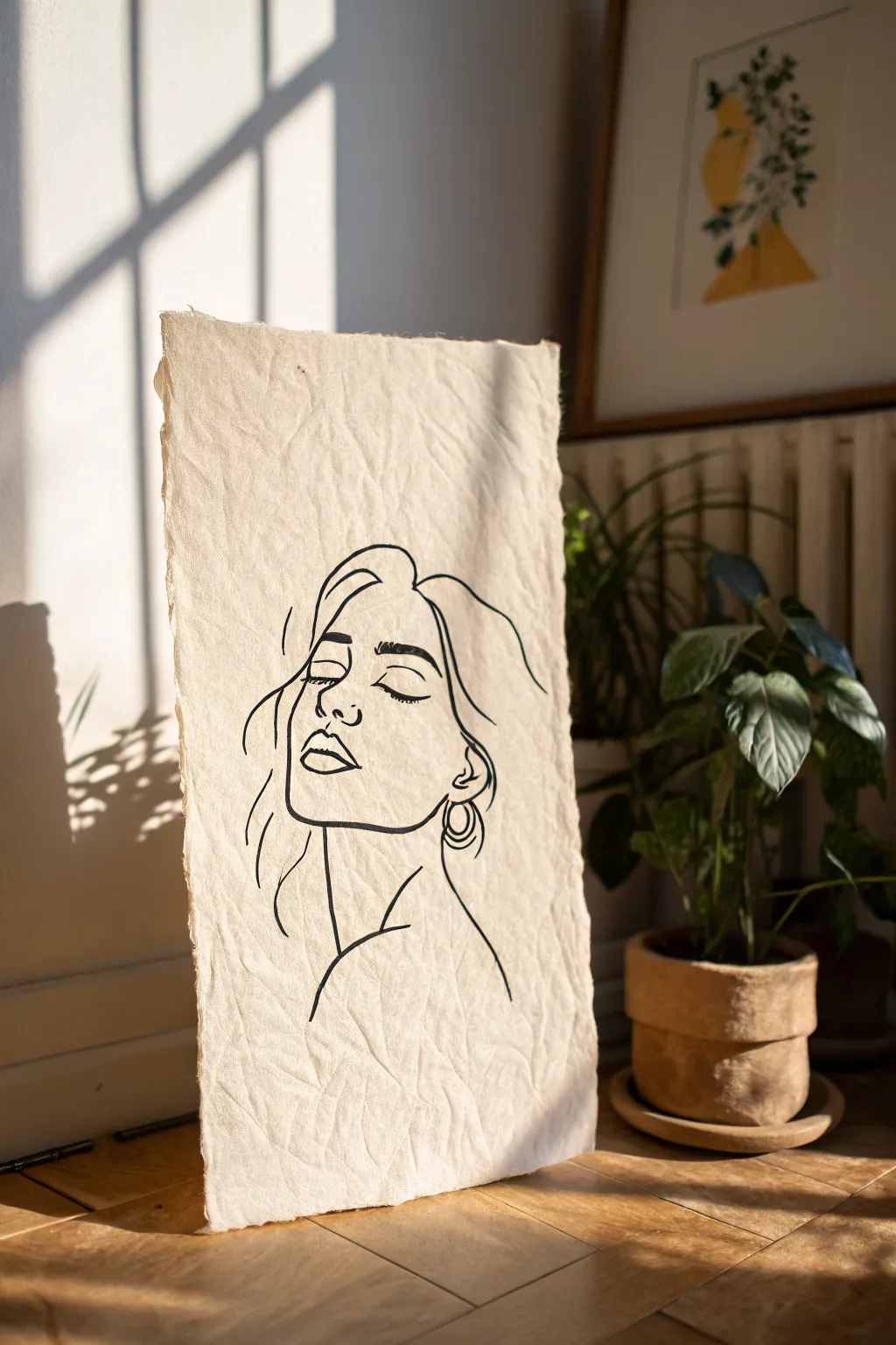
Capture the essence of relaxed elegance with this continuous-line style portrait on stunning textured paper. The combination of black ink and raw, handmade edges creates a piece that feels both modern and timelessly organic.
Step-by-Step Tutorial
Materials
- Handmade cotton rag paper (deckled edge)
- Black brush pen or archival ink marker (0.5mm – 0.8mm)
- Pencil (HB or 2H)
- Kneaded eraser
- Reference photo of a face in profile/semi-profile
- Painter’s tape or masking tape
- Smooth drawing board or table surface
Step 1: Preparation & Sketching
-
Secure the paper:
Because handmade paper often has an uneven surface, taping just the corners to your work surface helps keep it stable without flattening the beautiful texture. -
Analyze your reference:
Look at your reference photo and try to visualize the main shapes. Instead of seeing ‘eyes’ or ‘lips,’ look for the major lines that define the shadow under the chin or the curve of the hair. -
Rough placement:
Using your pencil very lightly, mark the top of the head, the bottom of the neck, and the centerline of the face to ensure your composition fits comfortably on the page. -
Sketch the primary contour:
Lightly sketch the profile line: forehead, nose, lips, and chin. Keep your grip loose. The goal isn’t photographic realism but capturing the flow of the features. -
Add facial details:
Place the eye (closed with lashes) and the eyebrow. Notice how the eyebrow arches and aligns with the top of the ear in your composition. -
Outline the hair:
Sketch the hair using long, sweeping motions. Don’t worry about individual strands; focus on the overall volume and a few loose tendrils falling near the cheek. -
Refine the sketch:
Step back and look at your pencil marks. Soften any lines that feel too stiff with your kneaded eraser until you have a faint ‘ghost’ image to guide your ink.
Step 2: Inking the Portrait
-
Test your pen stroke:
On a scrap piece of paper, test your marker. Practice varying your pressure to see how the line thickens and thins, which adds life to the drawing. -
Start with the eyes:
Begin inking at the focal point, usually the closed eye and eyebrow. Use a steady, deliberate stroke to capture the curve of the lashes. -
Define the profile:
Ink the nose and lips. I find it helpful to lift the pen slightly at the corners of the mouth to keep the expression soft rather than rigid. -
Commit to the jawline:
Draw the jawline in one confident motion if possible. If the paper texture bumps your pen, embrace that irregularity—it adds character to the piece. -
Draw the ear and earring:
Add the ear shape and the hoop earring. The earring creates a nice geometric contrast to the organic flow of the face. -
Flow into the hair:
Use faster, more fluid strokes for the hair. Let the lines taper off naturally at the ends rather than stopping abruptly. -
Connect the neck and shoulder:
Bring a line down for the neck and curve it outward to suggest the shoulder. This grounds the floating head and gives the drawing weight. -
Add detail lines:
Place a few sparse, intentional lines to suggest the cheekbone or a stray lock of hair. Remember, in this style, less is usually more.
Bleeding Ink?
If ink feathers on the textured paper, switch to a finer nib or move the pen faster. Slower strokes allow more ink to soak into the absorbent fibers.
Step 3: Finishing Touches
-
Let the ink settle:
Wait at least 15 minutes for the ink to fully bond with the fibers of the cotton paper. Handmade paper absorbs ink differently than standard sketch paper. -
Erase guidelines:
Gently dab—don’t rub—the remaining pencil marks with your kneaded eraser. Rubbing too hard can ruin the paper’s delicate surface nap. -
Evaluate line weight:
Check if any key lines, like the underside of the jaw or hair roots, need to be slightly thickened to add depth, but do so sparingly.
Loose & Lively
Don’t connect every single line. Leave small gaps in the hair or neckline outline; your brain will fill in the missing visual information naturally.
Now you have a deeply personal piece of art that celebrates simplicity and the beauty of handmade materials

Bold Pop-Art Color Portrait
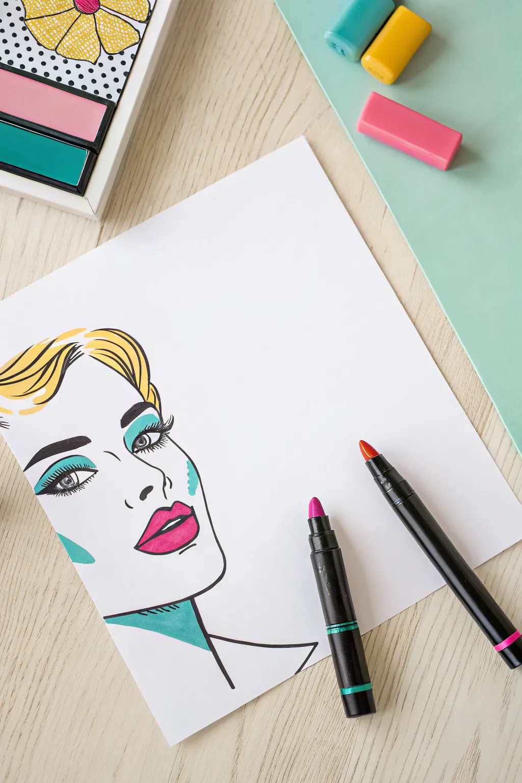
Capture the essence of mid-century comic art with this strikingly simple yet bold portrait tutorial. Using clean lines and a limited, vibrant color palette, you’ll create a graphic face that pops right off the page.
Detailed Instructions
Materials
- High-quality white drawing paper (heavyweight marker paper preferred)
- Pencil (HB or H)
- Soft eraser
- Fine liner pen (black, 0.5mm or 0.8mm)
- Thick black marker or brush pen
- Alcohol-based markers (yellow, teal/aqua, magenta/hot pink)
- Reference photo of a female face (optional)
Step 1: Drafting the Foundations
-
Establish the head shape:
Start with a light pencil sketch. Draw a gentle U-shape for the chin and jawline, keeping the angle biased towards the right side of the paper. -
Place guidelines:
Lightly sketch a vertical center line that curves slightly with the face’s direction, and a horizontal line for eye placement. -
Sketch the features:
Draw the eyes, nose, and lips. In pop art, features are stylized, so focus on the outline shapes rather than hyper-realistic shading. -
Outline the hair:
Block in the hair shape with sweeping, wavy lines. Keep the hair volume high on the top and flowing to the left. -
Define the neck:
Add the neck lines and a hint of the shoulder. Include a geometric shadow shape under the jaw on the neck—this is crucial for that comic-book look.
Clean Lines
For steady long lines (like hair), lock your wrist and move your entire arm from the shoulder. This prevents shaky, hairy-looking strokes.
Step 2: Refining the Lines
-
Ink the main contours:
Using your fine liner pen, confidently trace over your pencil lines. The jawline and nose should be clean, single strokes. -
Thicken the lash line:
Go over the upper eyelid line several times or switch to a slightly thicker nib to create that heavy, retro eyeliner effect. -
Detail the lashes:
Draw distinct, separated eyelashes coming off the outer corners. They should look a bit like spikes or petals. -
Sculpt the eyebrows:
Ink the eyebrows with a solid shape rather than individual hairs. Give them a dramatic arch. -
Create varying line weights:
Go back over curves in the hair and the jawline. I find thickening the line where shadows would naturally fall adds instant dimension. -
Erase the pencil:
Wait a moment for the ink to fully set, then gently erase all visible graphite marks to leave a crisp black-and-white base.
Step 3: Adding the Color Pop
-
Apply the blonde:
Take your yellow marker and fill in the hair. Leave some white gaps or streaks to simulate glossy highlights. -
Shadow the hair:
Add a few extra strokes of yellow in the hair crevices to deepen the color slightly without needing a second shade. -
Paint the lips:
Use the hot pink or magenta marker for the lips. Leave a small white oval on the bottom lip to represent a shine reflection. -
Add graphic eye shadow:
Using the teal marker, color the eyelid space above the crease. Apply a solid block of color rather than blending it. -
Define the cheek:
Draw a small, jagged or wavy shape on the cheekbone using the teal marker. This abstract touch mimics comic book shading. -
Color the neck shadow:
Fill in the geometric shadow shape under the chin with the teal marker. This contrasting shadow color is a hallmark of the style. -
Finalize the eyes:
Color the irises (if visible) or darken the pupil with black. Ensure the whites of the eyes remain bright white. -
Review contrast:
Check your black lines against the colors. If any marker bled over a line, carefully go over the black outline again to sharpen it up.
Bleeding Markers?
If ink feathers, your paper is likely too absorbent. Place a scrap sheet underneath to protect your table, or switch to marker-specific pads.
Step back and admire your chic, graphic masterpiece

Fantasy Hair Ombre Color Test
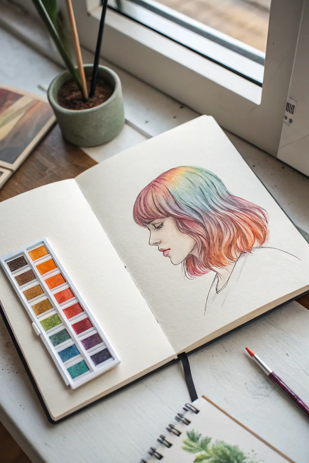
Capture the delicate beauty of fantasy hair with this soft, colorful profile study. By blending vibrant hues into a seamless ombre effect, you’ll transform a simple sketch into ethereal art that practically glows on the page.
Step-by-Step Guide
Materials
- Mixed media sketchbook (heavyweight paper)
- HB or 2B graphite pencil
- Fine liner pen (dark grey or brown, 0.1mm)
- Alcohol-based markers (pastel pink, peach, yellow, mint, light blue)
- Colored pencils (coordinating rainbow shades)
- White gel pen (optional)
Step 1: Initial Sketching
-
Map basic proportions:
Start lightly with your pencil. Draw a loose circle for the cranium and a curved line extending down for the jawline to establish the head shape. -
Profile features:
Refine the profile. Unlike a realistic portrait, keep the nose small and slightly upturned for a stylized look. Add softly parted lips and a defined chin. -
Hair outline:
Sketch the hair shape. Start with bangs that sweep across the forehead, then draw the bulk of the hair falling just past the shoulders. Keep the lines wavy and organic. -
Inking the face:
Use your fine liner to ink just the face, neck, and ear. Keep the line weight very delicate on the nose and lips. Leave the hair un-inked for now so the colors can stay soft.
Fixing Muddy Colors
If blending complimentary colors (like pink and green) creates brown, let the first layer dry completely before adding the next. Or, use a colorless blender to push pigment away.
Step 2: Marker Base Layer
-
Pink roots:
Take your pastel pink marker. Start coloring at the roots, particularly around the bangs and the crown of the head. Use flicking motions downward to prevent hard edges. -
Transition to orange:
While the pink is still slightly damp, blend in a peach or soft orange marker. Overlap the pink slightly to create a smooth transition color. -
Yellow highlight band:
Add a band of yellow where light would naturally hit the curve of the head. This acts as a ‘halo’ of shine in the middle of the ombre. -
Cool tones:
Continue down the hair length with mint green, blending it into the yellow. Finish the tips of the hair with a light blue marker. -
Base layer check:
Ensure all the white space inside the hair shape is filled. Don’t worry if it looks flat; this step is just laying down the foundation color.
Add Metallic Flair
Use gold watercolor or a metallic gold pen to trace a few select hair strands. It adds a magical, glimmering quality when the page catches the light.
Step 3: Pencil Detailing
-
Defining strands:
Switch to your colored pencils. Starting with a darker pink pencil over the pink marker area, draw individual hair strands. Follow the curve of the head. -
Deepening shadows:
Use a darker purple or deep magenta pencil to add contrast right at the roots and behind the ear. This gives the hair volume and lifts it off the page. -
Orange texture:
Take an orange pencil and add texture to the mid-section. I usually vary my pressure here—pressing harder in the heavy waves and lighter near the highlights. -
Cooler ends:
Use teal and blue pencils to define the ends of the hair. Draw sharp, tapering lines at the tips to make the hair look realistic and piecey. -
Blending zones:
Go back over the transition areas (where pink meets orange, green meets blue) with your pencils to smooth out any harsh marker lines.
Step 4: Final Touches
-
Inking the hair:
Now re-introduce your fine liner. Don’t outline the whole hair shape; instead, draw broken, flowing lines along the major waves to suggest movement. -
Facial details:
Add gentle shading to the face using a very light cosmetic blush pencil or a pale marker. Focus on the eyelid, cheekbone, and under the lip. -
Clothing sketch:
Keep the clothing minimal. Just a few simple, loose lines to suggest a collar or neckline keeps the focus entirely on the colorful hair. -
Optional highlight:
If you want extra shine, use a white gel pen to add tiny dots or lines on the highest point of the hair curve or the tip of the nose.
Step back and admire how the colors flow together to create a whimsical portrait full of life

PENCIL GUIDE
Understanding Pencil Grades from H to B
From first sketch to finished drawing — learn pencil grades, line control, and shading techniques.
Explore the Full Guide
Glowing Mushrooms on Dark Paper
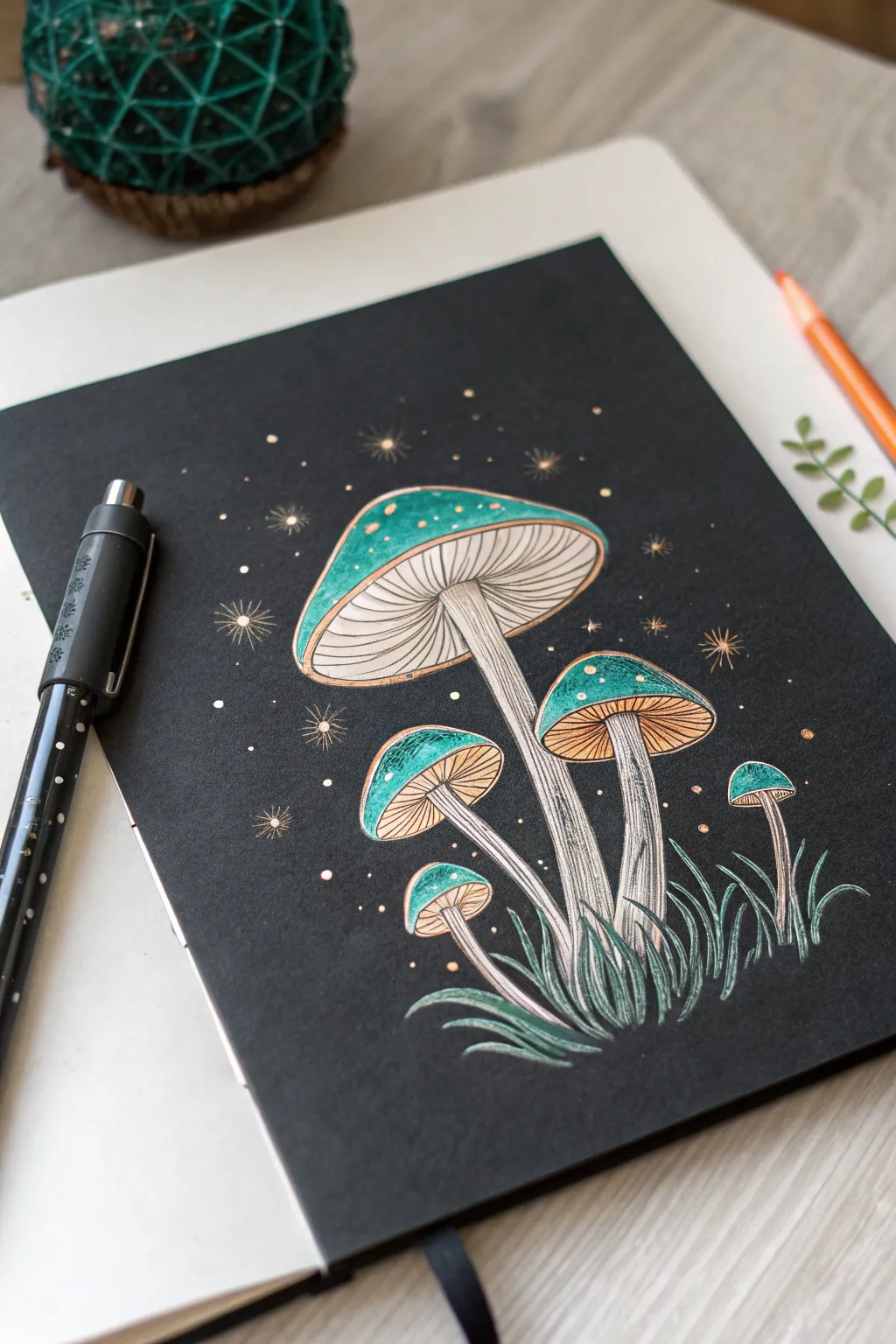
Transform a simple sheet of black paper into a magical night scene featuring glowing emerald mushrooms. This project uses the stunning contrast of opaque markers and metallic accents against a dark background to make your artwork pop off the page.
Step-by-Step Tutorial
Materials
- Black sketchbook paper or cardstock (smooth surface)
- White gel pen (fine tip)
- Metallic gold or bronze gel pen
- Emerald green paint marker or opaque gel pen (Posca or similar)
- Black fine liner pen (for blending/shading)
- Light gray or beige pencil (for initial sketching)
Step 1: Planning and Sketching
-
Outline the caps:
Using a light gray pencil, sketch the curved top of the main central mushroom first. Place it slightly off-center in the upper middle area. Then, arrange four smaller mushroom caps around it at varying heights to create a balanced composition. -
Draw the stems:
Connect curved stems to each cap. The main stem should be thickest, tapering slightly upward. Let the smaller stems curve gracefully, gathering toward a central point at the bottom of the page. -
Add the gills:
Sketch the underside of each mushroom cap. Draw a curved line connecting the outer edges of the cap back to the stem, creating an elliptical opening where the gills will go. -
Sketch the grass:
At the base where the stems converge, lightly pencil in tufts of grass blades swooping outward to ground your composition.
Ink Ghosting?
If your white gel pen absorbs into the black paper and looks dull, wait for it to dry completely and apply a second layer. Don’t press too hard, or you’ll scratch the first layer.
Step 2: Coloring the Caps
-
Fill the base color:
Use your emerald green paint marker to fill in the top domes of all the mushroom caps. I find it best to work in smooth, horizontal strokes to avoid streaks. -
Add a rim highlight:
Once the green is dry, take your metallic gold pen and carefully outline the very edge of the mushroom caps. Add a slightly thicker gold line along the bottom rim of the green area. -
Create texture details:
Dot the green surface with tiny metallic gold or white specks. Cluster them slightly towards the top center of the caps to simulate light hitting a textured surface.
Magical Glow
Use a soft white colored pencil to lightly shade around the mushroom caps on the black paper. This creates a soft, hazy ‘bioluminescent’ glow effect around the artwork.
Step 3: Detailing the Underside
-
Outline the gills:
Switch to your fine white gel pen. Draw fine, radiating lines from the top of the stem outward to the edge of the cap’s underside. These lines should be close together but not touching. -
Add depth to gills:
In the spaces between your white gill lines, add very faint touches of gold or leave the black paper showing through to create shadow and dimension. -
Define the stems:
Outline the stems with the white gel pen. Fill the interior of the stems with vertical strokes, mixing white and faint gray (or thinned white ink) to give them a fibrous, organic texture. -
Shadowing the stems:
Use a black liner or simply leave negative space on one side of each stem to suggest a light source coming from the top left.
Step 4: Atmospheric Touches
-
Draw the grass:
Go over your grass pencil sketches with the emerald marker for the main blades. Add highlights to the tips using white or silver gel pen to make them look dewy. -
Create background stars:
Using the gold pen, dot the background area generously. Vary the size of the dots to create depth. -
Add starbursts:
Select several of the larger gold dots and draw tiny intersecting lines through them to create twinkling starbursts. Place a few of these near the mushroom caps to enhance the glowing effect. -
Final highlights:
Do a final pass with your brightest white pen, adding tiny reflective highlights on the very top curve of the green caps and the sharpest edges of the grass blades.
Enjoy the mysterious atmosphere of your glowing night garden
Tropical Fish and Sea Creatures
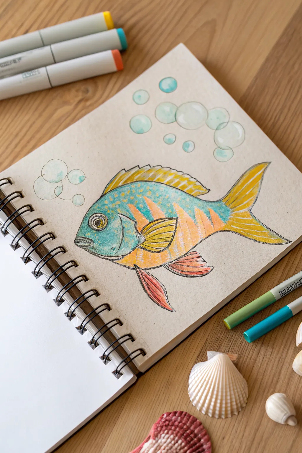
Capture the vibrant colors of the ocean with this charming tropical fish illustration. By combining marker base layers with pencil detailing, you’ll create a textured, lively look on sketchbook paper.
Step-by-Step Guide
Materials
- Spiral-bound sketchbook (heavyweight paper recommended)
- Alcohol-based markers (teal, yellow, orange, light blue)
- Black fineliner pens (0.3mm and 0.5mm)
- Colored pencils (white, teal, yellow)
- Graphite pencil (HB) and eraser
Step 1: Planning the Sketch
-
Draft the body shape:
Start with a light graphite pencil sketch. Draw a wide, oval-like shape for the main body, tapering towards the tail. Keep your lines very faint so they don’t show through later. -
Add fins and tail:
Sketch the dorsal fin running along the top back, looking somewhat spiky. Add the forked tail fin at the rear, a pectoral fin on the side, and the ventral fins at the bottom. -
Mark the details:
Lightly outline the large circular eye near the front. Draw the gill cover curve behind the eye and lightly map out where the color stripes will go on the body. -
Sketch the bubbles:
Draw loose circles of varying sizes rising from the fish’s mouth area and flowing towards the top right corner to create movement.
Pro Tip: Layering Ink
Wait for the first layer of marker to dry before adding a second layer of the same color. This creates darker values and shadows without needing a new pen.
Step 2: Adding Color
-
Base layer for the face:
Using a teal or light blue marker, color the face area of the fish, stopping at the gill line. Leave the eye plain for now. -
Body stripes:
take an orange marker and fill in the vertical stripes along the mid-body. Intersect these with teal or light blue sections, blending the edges slightly if your paper allows. -
Coloring the fins:
Use a bright yellow marker for the top dorsal fin and the tail. Add touches of orange near the base of the tail for depth. -
Lower fin details:
Color the pectoral fin (the one on the side) yellow with an orange tip. For the bottom ventral fins, use a reddish-orange marker to make them stand out. -
Bubble base:
Lightly dab varying shades of light blue or teal marker into the bubble circles. Don’t fill them completely; leave plenty of white space to make them look transparent.
Step 3: Inking and Definition
-
Outline the eye:
Use a 0.5mm black fineliner to draw the pupil and the ring around the eye. Add a small white highlight (or leave the paper white) to make it look alive. -
Line the body:
Go over your pencil lines with the fineliner. Use broken or sketchy lines for the textured parts of the scales and smoother lines for the belly. -
Detail the fins:
Draw thin lines inside the fins to represent the rays. I like to flick the pen outward to keep the lines tapered and natural. -
Add scale texture:
On the teal upper body, add small dots and ‘u’ shapes with your pen to suggest scales. This adds wonderful texture over the marker ink. -
Define the bubbles:
Outline the bubbles loosely with a very thin pen (0.3mm). Don’t close the circles perfectly; open lines look airier.
Level Up: Glossy Eye
Use a white gel pen to add a single sharp dot of pure white to the fish’s eye and the tops of the bubbles for a realistic ‘wet’ look.
Step 4: Final Highlights
-
Enhance with colored pencil:
Take a white colored pencil and lightly shade over the top curve of the bubbles and the top of the fish’s head to create a glossy highlight. -
Deepen shadows:
Use a dark teal or grey pencil to add slight shading under the gill cover and at the base of the fins to give the fish volume. -
Clean up:
Once the ink is completely dry, gently erase any remaining graphite pencil marks to leave a clean, crisp illustration.
Enjoy your customized piece of the ocean in your sketchbook
BRUSH GUIDE
The Right Brush for Every Stroke
From clean lines to bold texture — master brush choice, stroke control, and essential techniques.
Explore the Full Guide
Cozy House Facade With Warm Shadows
Capture the charm of a cozy Scandinavian-style facade with this clean-line marker illustration. This project combines crisp architectural drawing with soft, muted tones to create a welcoming home portrait that feels both modern and timeless.
Step-by-Step
Materials
- High-quality smooth drawing paper or bristol board
- Fine liner pens (sizes 0.1, 0.3, and 0.5)
- Alcohol-based markers (Cool Grey 1-3, Warm Grey, Terracotta/Sienna, Sage Green, Olive Green, Warm Yellow)
- Pencil (HB or 2H for sketching)
- Eraser (kneaded or vinyl)
- Ruler
- White gel pen (optional for highlights)
Step 1: Drafting the Structure
-
Establish the main shape:
Begin by using a ruler and a light pencil (like an HB) to draw the main body of the house. Start with a square base, then add a tall, steep triangle on top for the roof. This sharp angle is key to that Nordic aesthetic. -
Mark the siding lines:
Lightly rule vertical lines across the entire front of the house to represent the wood siding panels. Space them evenly, but leave a small gap where the door and windows will eventually go. -
Frame the openings:
Sketch a central rectangle for the door at the bottom. Flank the door with two uniform rectangular windows on either side. Add a smaller, square window in the upper triangular gable area. -
Add architectural details:
Draw the roof overhangs extending slightly past the walls. Sketch the chimney on the left slope of the roof. Don’t forget the three small steps leading up to the front door. -
Sketch the greenery:
At the base of the house steps, lightly outline two rectangular planter boxes. Fill them with loose, leafy shapes to indicate the plants, keeping the pencil strokes organic compared to the rigid house lines.
Step 2: Inking the Lines
-
Outline the main structure:
Switch to your 0.5 fineliner to ink the main silhouette of the house, the roofline, and the ground line. Use the ruler here if you want a precise look, or go freehand for more character. -
Define the siding:
Use a thinner 0.1 or 0.3 pen to ink the vertical siding lines. These lines should be slightly lighter than your main outline to create depth without overwhelming the drawing. -
Detail windows and doors:
Ink the window frames and door panels. Be careful to double-line the frames to give them thickness. Add the muntins (the grid bars) inside the windows with your finest pen. -
Ink the plants and pots:
Trace over your plant sketches with the 0.3 pen. Unlike the house, avoid using a ruler here; let your lines have natural curves and slight wobbles to mimic organic growth. -
Erase guidelines:
Wait at least 15 minutes for the ink to fully dry to prevent smudging. Once safe, gently erase all underlying pencil sketch marks until the paper is clean.
Clean Edges Pro-Tip
When filling large areas like the door, color in small circular motions rather than back-and-forth streaks. This keeps the ink saturation even and prevents harsh overlap lines.
Step 3: Adding Color and Shadow
-
Base shadow layer:
Using a very light Cool Grey marker (C1), color the entire door and the window frames. Add a stripe of this grey under the roof eaves to visually ‘pop’ the roof forward. -
Deepen the shading:
With a slightly darker Cool Grey (C2 or C3), add shadows to the right side of the door panels and under the window ledges. I find that establishing a consistent light source from the top-left helps make the shadows believable. -
Warm up the windows:
Color only the glass panes of the lower windows with a pale warm grey or a very desaturated yellow. Leave some white space in the center vertically to suggest reflection on the glass. -
Glow effect:
Use a Warm Yellow marker to color the edges of the glass panes, blending inward slightly. This creates a cozy ‘lights on’ effect inside the house. -
Color the terracotta pots:
I like to use a Sienna or Terracotta marker for the planter boxes. Apply one even coat, then go over the bottom and right edges a second time to create a rounded, 3D form. -
Greenery tones:
Fill the leaves with a Sage Green marker. For depth, dab a darker Olive Green near the base of the plants where the leaves meet the dirt, and in the gaps between leaves. -
Final steps:
Color the front steps with your light Cool Grey. Finally, add the house number or small decorative light fixture above the door if you sketched one.
Level Up: Texture
Use a white gel pen to add tiny dots to the cylinder planters for a clay texture, or add thin white highlights to the upper corners of the dark grey window panes.
Step back and admire your charming architectural miniature, perfectly capturing the warmth of home.
Floorplan Sketch With Color Zoning
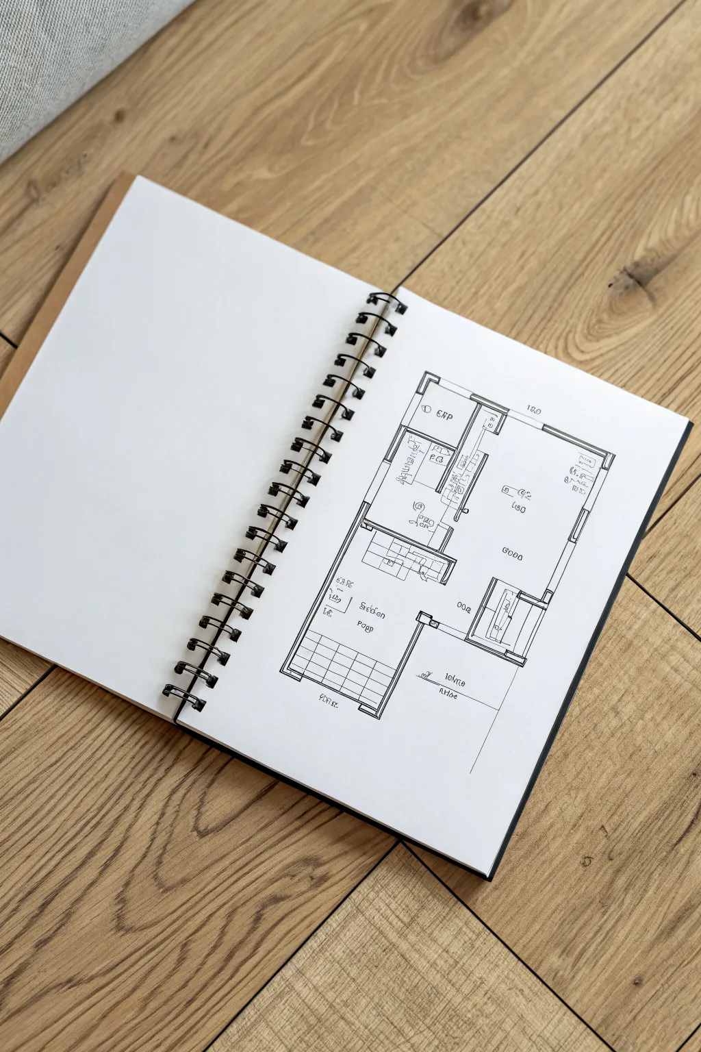
Master the clean lines and spatial logic of architectural drafting with this minimalist floorplan sketch. This project focuses on sharp, confident ink work to create a professional-looking layout straight from your imagination onto paper.
Step-by-Step Tutorial
Materials
- Spiral-bound sketchbook with smooth, heavyweight paper
- Pencil (HB or 2H for light drafting)
- Eraser (kneaded or soft vinyl)
- Black fineliner pens (sizes 0.1, 0.3, and 0.5 or 0.8)
- Ruler or scale ruler
Step 1: Planning and Layout
-
Visualize the Orientation:
Begin by deciding the orientation of your floorplan. In the reference, the plan is drawn vertically on the page, leaving plenty of white space around the edges for a clean, design-studio aesthetic. -
Establish the Outer Perimeter:
Using your pencil and ruler, lightly draft the exterior rectangle that will form the boundary of the apartment or house. Keep your pressure very light so lines are easily erasable later. -
Divide the Space:
Section off the main living areas within your rectangle. Draw a vertical line to separate the bedrooms/bathroom zone from the living/dining zone. Think about flow—where would a person walk? -
Draft Interior Walls:
Add thickness to your walls. Instead of single lines, draw double lines for every wall to represent structural depth. Exterior walls usually look best if they are slightly thicker than interior partitions. -
Refine Room Layouts:
Sketch in the specific shapes for the bathroom fixtures, bedroom closets, and the kitchen counter runs. Accuracy isn’t as critical as clarity here; you just want recognizable shapes. -
Mark Openings:
Identify where doors and windows go. Erase small sections of your wall lines where a door will swing or a window will sit to keep the drawing clean for inking.
Step 2: Inking the Structure
-
Ink the Walls:
Switch to your thickest pen (0.5 or 0.8). Trace over your pencil wall lines using a ruler. I find it helps to lift the pen at corners rather than pivoting to ensure sharp, crisp intersections. -
Draw Windows and Doors:
Use a medium thickness pen (0.3) for these elements. For windows, draw thin parallel lines inside the wall gaps. For doors, draw the door leaf and a curved line indicating the swing direction. -
Add Structural Grids:
If your plan includes a patio or tiled area (like the bottom section in the reference), use a 0.3 pen to grid out the floor tiles. Keep the spacing consistent for a realistic scale. -
Define Fixtures:
Ink the bathroom sink, toilet, and kitchen counters with the 0.1 or 0.3 pen. Keep these lines thinner than the walls to show they are movable or non-structural objects.
Smudge Prevention
When using a ruler with ink, stick a small piece of masking tape on the underside of the ruler. This raises the edge slightly off the paper, preventing ink bleeding beneath it.
Step 3: Detailing and Annotation
-
Sketch Furniture:
Using your finest pen (0.1), draw simple box shapes to represent beds, sofas, or tables. Keep these lines delicate so they don’t compete with the heavy wall lines. -
Add Text Labels:
Write room names (e.g., ‘Bed’, ‘Bath’, ‘Living’) in small, all-caps block lettering. Try to center the text within each room for a balanced look. -
Include Dimensions:
Add small numerical dimensions near major walls if desired (like ‘18.0’ or ‘6000’). These add a touch of technical authenticity to the sketch. -
Clean Up:
Wait at least 5-10 minutes for the ink to fully dry. Then, gently erase all remaining pencil guidelines, being careful not to crumple the paper. -
Final Contrast Check:
Step back and look at the drawing. If the walls don’t pop enough, go over the exterior boundary one more time with your thickest marker to firmly ground the structure.
Add Depth
To duplicate the ‘color zoning’ idea mentioned in the section title, use light grey markers or pastel highlighters to shade the floor areas, leaving the walls white.
Now you have a crisp architectural floorplan that captures the essence of spatial design right in your sketchbook


Swatch Chart and Mini Gradient Library
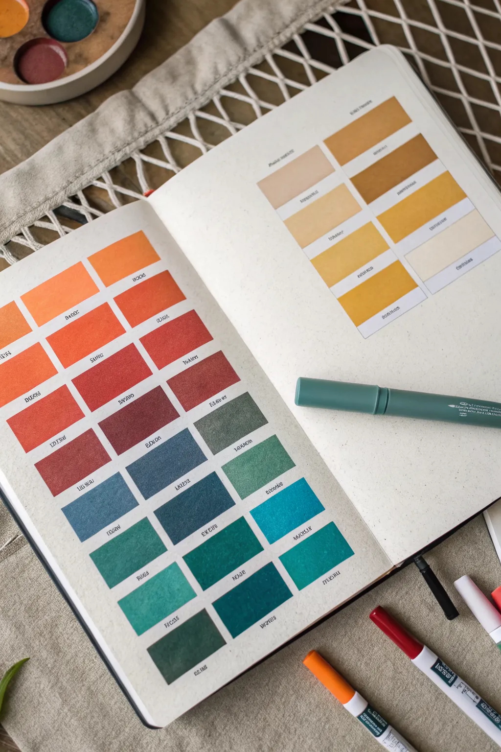
Transform a notebook spread into a valuable reference tool with this satisfying color spectrum exercise. This project creates an organized, aesthetically pleasing gradient chart that not only tests your supplies but serves as a permanent record of how your colors interact.
How-To Guide
Materials
- A5 or B5 dot grid notebook (heavyweight paper recommended)
- Set of dual-tip markers or watercolor markers
- Fine liner pen (black, 0.1mm or 0.3mm)
- Ruler
- Pencil
- Eraser
- Water brush or small paintbrush (optional, for blending)
- Scrap paper for testing
Step 1: Grid & Layout Preparation
-
Determine swatch size:
Count the total dots across your page to decide on a size. For a standard A5 journal, a width of 6-8 dots and a height of 3-4 dots per rectangle usually works well. -
Structure the left page:
Using a pencil and ruler, lightly mark out a grid structure on the left page. Aim for 3 columns of rectangles. -
Calculate spacing:
Leave a small gap (about 1-2 dots or 5mm) between each rectangle vertically and horizontally to prevent colors from bleeding into one another. -
Plan the right page:
On the facing right page, create a similar but smaller grid. Based on the image, this section is perfect for a specific color family, like yellows or earth tones, arranged in two columns. -
Finalize the lines:
Once you are happy with the layout, re-trace the pencil lines if needed, but keep them faint. You want the color to define the shape, not a harsh outline.
Bleed-Through Blues
If you notice the markers ghosting to the other side of the page, glue two pages together before drawing your grid to create a double-thick canvas.
Step 2: Color Selection & Sorting
-
Gather your spectrum:
Pull out all the markers you intend to use. Organize them physically on your desk in the order of the rainbow: oranges, reds, burgundies, violets, blues, teals, and greens. -
Test the transition:
Before committing to the page, swipe the colors quickly on a scrap piece of paper. This ensures the gradient flows logically from warm to cool tones without jarring jumps. -
Select the yellow set:
For the right-hand page, pick out your ochres, mustards, pale yellows, and creams to create a separate, sunny study.
Pro Tip: Seamless Blending
For a smoother look, use high-quality paper. If markers look streaky upon application, do small circular motions rather than straight lines.
Step 3: Filling the Swatches
-
Start with orange:
Begin at the top left of the main page. Fill the first rectangle with your lightest orange marker. Use broad, consistent strokes to minimize streak marks. -
Move through the reds:
Progressively work your way down the first column and into the second, shifting from orange to deep reds and rust tones. I like to work fairly quickly here so the ink settles evenly. -
Transition to cool tones:
As you reach the middle of the grid, switch to burgundies and purples, which act as the bridge between the hot reds and the cool blues coming next. -
Apply the blues and greens:
Fill the lower section with your blues, moving into teals, and finally deep forest greens at the very bottom. -
Detailed saturation:
For certain swatches, apply a second layer of ink if you want a richer, more opaque look which mimics the texture of paint. -
Fill the right page:
Populate the second page grid with your yellow and earth tone selection, keeping the lighter shades at the top and darker ochres at the bottom.
Step 4: Labeling & Finishing
-
Let ink dry fully:
Wait at least 10 minutes to ensure the marker ink is completely dry before writing near it to avoid smudging. -
Add color codes:
Using your fine liner pen, write the specific color name or number code directly underneath each rectangle. Keep the text small and centered. -
Erase guidelines:
Gently erase any visible pencil grid lines that extend beyond the colored squares for a clean, floating look.
Now you have a practical reference guide that makes choosing colors for future journal spreads effortless
Glass and Metal Shine Study
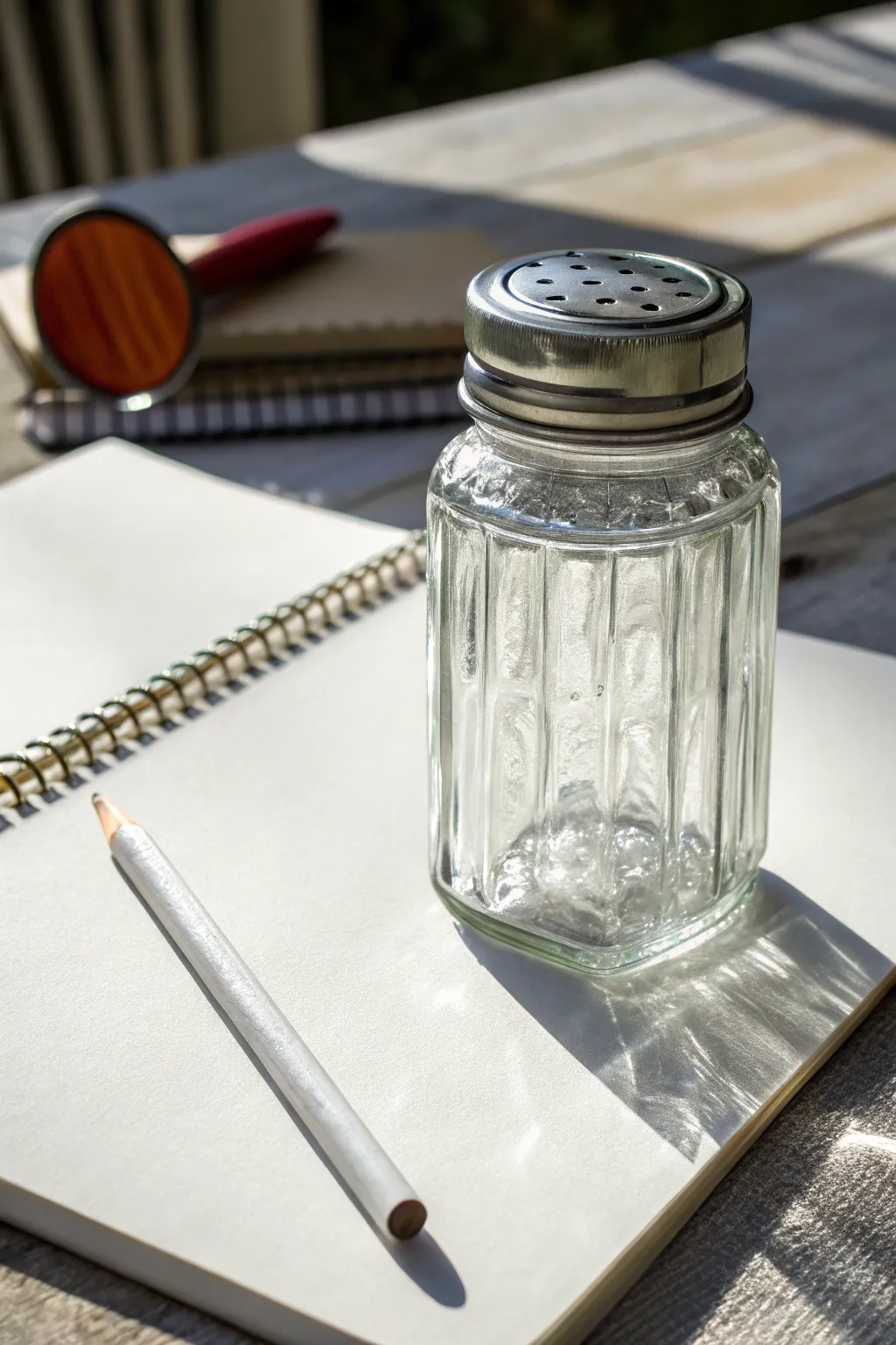
Master the art of capturing transparency and reflection with this detailed study of a glass shaker. You’ll learn how to render intricate metal textures and sharp, sunny highlights using markers and colored pencils.
Step-by-Step Guide
Materials
- Smooth bristol board or marker paper (A4 size)
- Alcohol-based markers (Cool Greys 10-50%, Warm Greys 10-30%)
- Light blue-grey marker (very pale)
- Fine liner pens (Black, 0.1mm and 0.3mm)
- White gel pen or gouache
- Colored pencils (White, Black, Dark Grey, Indigo Blue)
- Ruler
- Pencil (HB) and eraser
Step 1: Sketching the Structure
-
Establish the Basic Form:
Start by drawing a vertical center line to ensure symmetry. Sketch a rectangle for the main body of the shaker and a slightly wider, flatter oval on top for the lid. Don’t press too hard with your pencil, as we want faint guidelines. -
Refine the Shaker Body:
Cut the corners of your rectangle to create the octagonal or fluted shape typical of these shakers. Draw vertical lines down the body to represent the faceted glass edges. -
Detail the Metal Lid:
Draw the rim of the lid with two parallel curved lines. Add the top dome, carefully spacing out the small shaker holes in a circular pattern. Remember perspective; the holes near the back should look more elliptical. -
Sketch the Setting:
Lightly outline the spiral binding of the notebook underneath the shaker and position the pencil lying diagonally. Add the cast shadow shape stretching to the right, which is crucial for grounding the object.
Muddy Reflections?
If your glass looks dull, you likely over-blended. Glass relies on hard edges between darks and lights. Wait for marker layers to dry fully before adding new ones to keep edges crisp.
Step 2: Layering the Markers
-
Base Grey Tones:
Using a 10% Cool Grey marker, fill in the shadow areas of the glass facets. Leave paper white for the brightest highlights on the left side of the glass. Glass is mostly defined by what is behind it or reflected in it. -
Deepening Glass shadows:
Switch to a 30% Cool Grey to darken the vertical edges of the facets. I find that building up these vertical stripes gradually helps mimic the thickness of the glass bottom. -
Rendering the Lid:
Apply Warm Grey 30% to the metal lid, leaving a crisp white highlight strip on the upper rim. Metal needs high contrast to look shiny. -
Adding the Cast Shadow:
Use a 50% Cool Grey marker to fill in the cast shadow on the paper to the right of the shaker. Notice how the light passes through the glass, creating lighter ‘caustics’ within the shadow itself—leave those areas lighter or white.
Step 3: Refining Texture with Pencil
-
Define the Metal Edges:
Take your black fine liner (0.1mm) and very lightly broken-line the edges of the metal lid. Use the 0.3mm pen to darken the holes in the lid, making them solid black. -
Sharpen Glass Details:
Use a Dark Grey colored pencil to sharpen the vertical lines of the glass facets. Keep your lines crisp; fuzzy lines ruin the illusion of hard glass. -
Enhance the Bottom Distortion:
The bottom of the jar is thick and distorts light. Use an Indigo Blue pencil lightly mixed with dark grey to create complex swirls and refraction patterns at the base. -
Notebook Spiral Detail:
Use a medium grey marker to dot in the spiral binding shadows, then define the wire loops with a fine liner. This adds context to your surface.
Pro Tip: The White Card Trick
To get those super straight vertical highlights on the glass, use a ruler as a barrier for your white gel pen or white pencil. It keeps the reflection looking manufactured and sleek.
Step 4: Highlights and Final Polish
-
Brightening the Highlights:
This is the transformational step. Use a white gel pen or gouache to add sharp, brilliant highlights to the metal lid rim and the sun-facing -
Softening Transitions:
Use a White colored pencil to blend the grey marker edges into the white paper on the glass body. This creates a ‘frosted’ look or soft reflection. -
Shadow Caustics:
In the cast shadow area, use the white pencil to enhance the ribbons of light that shine through the glass. This contrast makes the shadow look realistic. -
Drawing the White Pencil:
Don’t forget the prop! Shade the cylindrical side of the white pencil with a very light cool grey, leaving a strip of white for the highlight. Draw the exposed wood tip with a beige or warm grey tone.
Step back and admire how contrast creates the illusion of transparency in your new drawing
Retro Lettering With Chisel-Tip Strokes
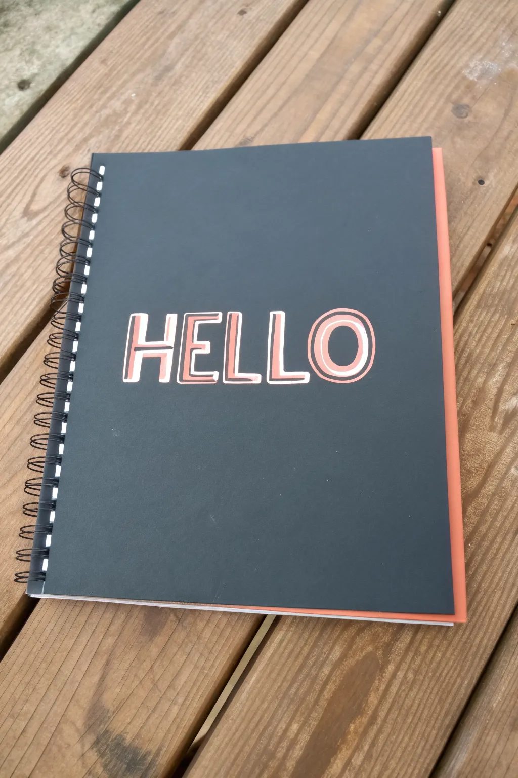
Transform a plain notebook from basic to bold using a simple yet striking retro lettering technique. This project highlights crisp, sans-serif letterforms and dramatic drop shadows to create a playful 70s vibe.
Detailed Instructions
Materials
- Dark grey or black notebook or sketchbook
- Peach or light coral paint pen (medium or chisel tip)
- White gel pen (size 08 or 10)
- Pencil
- Eraser
- Ruler
Step 1: Planning and Layout
-
Measure the center:
Begin by finding the visual center of your notebook cover. Use your ruler to measure the total width and height, marking a very faint crosshair in pencil where the middle point lies. -
Determine baseline:
Decide how tall you want your letters to be. For this ‘HELLO’ design, a height of about two inches works well. Draw a faint horizontal baseline and a cap-line (top line) centered on your crosshair. -
Space the letters:
Sketch out the word ‘HELLO’ lightly in pencil. Since ‘HELLO’ has five letters, placement is easy: the first ‘L’ should sit right in the center. Sketch the ‘H’ and ‘E’ to the left, and the ‘L’ and ‘O’ to the right. -
Define the letter width:
Refine your penciled letters into block shapes. Aim for a mono-weight sans-serif style where the bars of the ‘H’ match the thickness of the curve of the ‘O’.
Ink Skipping?
If the white gel pen skips over the paint pen, the base layer might still be tacky. Let it dry longer, or try a water-based acrylic marker instead of gel for better adherence.
Step 2: Adding the Color
-
Prime the paint pen:
Shake your peach or coral paint pen well to mix the pigment. Depress the nib on a scrap piece of paper until the flow is consistent and smooth to avoid blobs on your cover. -
Outline the E and L’s:
Start by outlining the shapes of the straight-edged letters first. Keep your hand steady and trace directly over your pencil sketch lines for the main skeleton of each letter. -
Outline the curves:
Carefully outline the ‘O’. To get a smooth curve, I find it helpful to rotate the notebook itself as I draw the arc, rather than trying to contort my wrist. -
Fill the shapes:
Once the outlines are dry to the touch, fill in the bodies of the letters. Use smooth, horizontal strokes to prevent streakiness in the paint. -
Second coat:
Depending on the opacity of your paint pen and the darkness of the notebook, you might need a second layer of color once the first is completely dry.
Step 3: Creating Dimensions
-
Visualize the light source:
To create the drop-shadow effect, imagine a light source coming from the top left. This means your highlights and shadows needs to follow a consistent logic. -
Add inner highlights:
Switch to your white gel pen. Draw a thin line inside the peach letters, hugging the left and top edges of each stroke. This creates an ‘inset’ look. -
Detail the curves:
For the ‘O’ and the curve of a ‘D’ or ‘P’, break the white line slightly where the curve turns. On the ‘O’, ensure the white line stays on the upper-left interior curve and the lower-right exterior curve. -
Add drop shadows:
Using the white pen again, draw a shadow line on the OUTSIDE of the peach letters. Place this line exclusively on the right and bottom edges of every letter shape. -
Connect corners:
Where the letter corners meet the shadow, create a sharp 45-degree angle connection. This simple geometric detail is key to nailing that blocky, retro typography look. -
Final clean up:
Wait at least 15 minutes for all ink to cure completely. Then, very gently erase any visible pencil guidelines, being careful not to rub off the paint pen sitting on top of the textured cover.
Make it Pop
For an even stronger retro 3D effect, add a third layer of color—like a deep teal or navy—as a thicker shadow behind the white outline to push the letters forward.
You now have a personalized notebook ready for your next big idea
Glitchy Color-Offset Marker Drawing
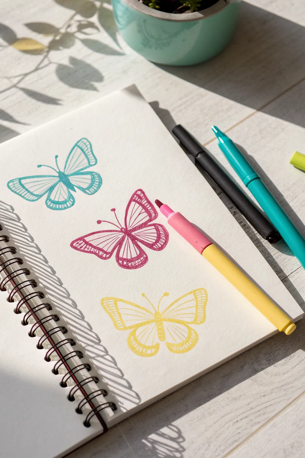
Create a series of charming butterflies that appear to vibrate with a subtle, stylized offset effect. Using dual-ended markers, you’ll layer line art to mimic the look of a misaligned print or a glitchy screen.
Step-by-Step
Materials
- Spiral-bound sketchbook (smooth paper works best)
- Dual-tip markers (Pink, Teal, Yellow, Black)
- Pencil (HB or H)
- Eraser
- Ruler (optional for spacing)
Step 1: Drafting the Shapes
-
Plan your layout:
Open your spiral-bound sketchbook to a fresh page. Visualize three evenly spaced positions for your butterflies, stacking them vertically down the center of the page. -
Sketch the center lines:
Using a light pencil, draw a faint vertical line or axis for each butterfly body. This helps keep your underlying symmetry correct before you intentionally distort it later. -
Outline the top wings:
Starting with the top position, sketch the upper wings of the first butterfly. They should be somewhat triangular with rounded corners, extending outwards from the top of your axis line. -
Add lower wings:
Draw the lower wings just below, making them slightly smaller and more rounded than the top pair. Keep your pencil strokes light so they are easy to erase later. -
Repeat the process:
Move down to the middle and bottom positions, sketching similar butterfly outlines. You can vary the wing shapes slightly for interest, or keep them uniform for a pattern effect. -
Detail the wings:
Inside each wing, lightly sketch the vein patterns. Draw a central loop near the body and radiate lines outward toward the wing edges to create segments.
Step 2: Inking the Offset Layers
-
Start with teal:
Take your teal marker and begin with the top butterfly. Trace your pencil sketch but shift your hand slightly to the left. Draw the body, antennae, and wing outlines just a millimeter or two off-center from your sketch. -
Fill the segments:
Still using teal, draw the internal wing veins. Instead of simple lines, add small repetitive hatch marks or ‘ladder’ lines inside the wing segments to give it a textured, printed look. -
Switch to pink:
Move to the middle butterfly sketching. Using a bright pink or magenta marker, trace the main outline. This time, try shifting your lines slightly to the right of your pencil sketch to create variety in the offset direction. -
Texturize the pink wings:
Fill in the wing details with the pink marker. Use the same hatching technique for the veins, varying line thickness slightly to mimic a hand-drawn illustration style. -
Ink the yellow butterfly:
For the bottom butterfly, use a sunny yellow marker. Trace the outline directly over your pencil sketch this time, or shift it downwards slightly. -
Complete the yellow details:
Add the internal veining and texture to the yellow wings. Because yellow is light, you might need to go over lines twice to ensure they stand out clearly against the white paper.
Bleed-Through Fix
If your markers bleed to the next page, place a scrap sheet of heavy cardstock or construction paper underneath your current page while you draw to protect the rest of the book.
Step 3: Refining and Cleaning
-
Add the ‘ghost’ layer (Optional):
To enhance the ‘glitch’ effect, you can take a very fine black pen or a darker shade of the same color and draw a second, thinner outline slightly offset from your main colored lines. -
Let ink set:
Give your drawing a few minutes to fully dry. Marker ink can smear easily if you erase over it while it’s still damp. -
Erase pencil guides:
Gently erase your original pencil sketches. The goal is to leave only the vibrant marker lines, making the intentional ‘misalignment’ of the drawing stand out clearly. -
Check for gaps:
Look over your work for any lines that are too faint. I sometimes go back in and thicken the outer edges of the wings to give the butterflies more weight on the page.
Level Up: Neon Pop
Use a white gel pen to add tiny highlights over the thickest parts of your colored lines. This makes the ink look wet and dimensional, like a fresh screen print.
Now you have a trio of vibrant butterflies that seem to flutter right off the page


Have a question or want to share your own experience? I'd love to hear from you in the comments below!