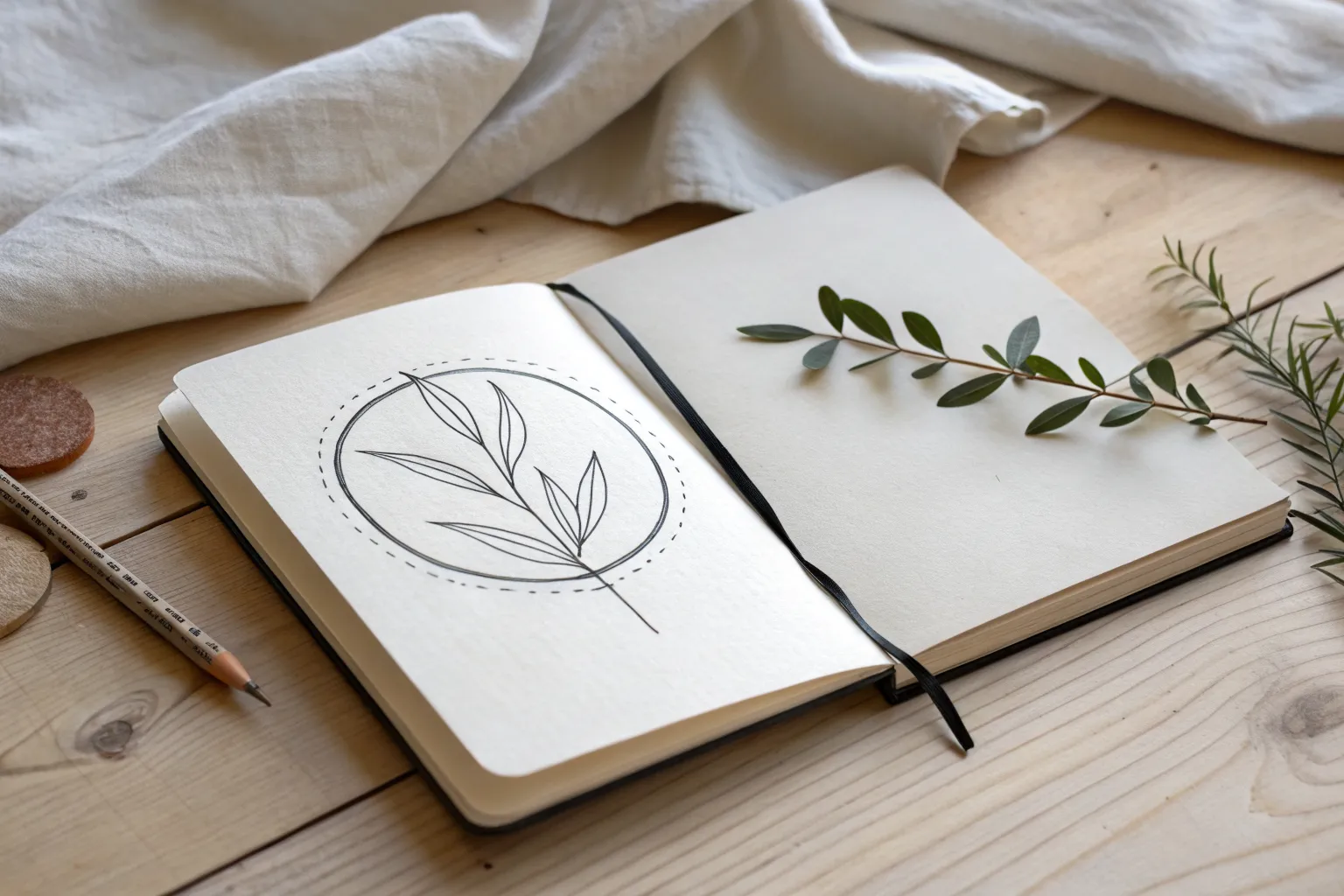
Sometimes you just want a drawing idea that feels doable right now and still looks like a finished little piece. These easy designs to draw are my go-to prompts when I want quick results, clean lines, and that satisfying “I made this” feeling.
Hearts With Easy Variations
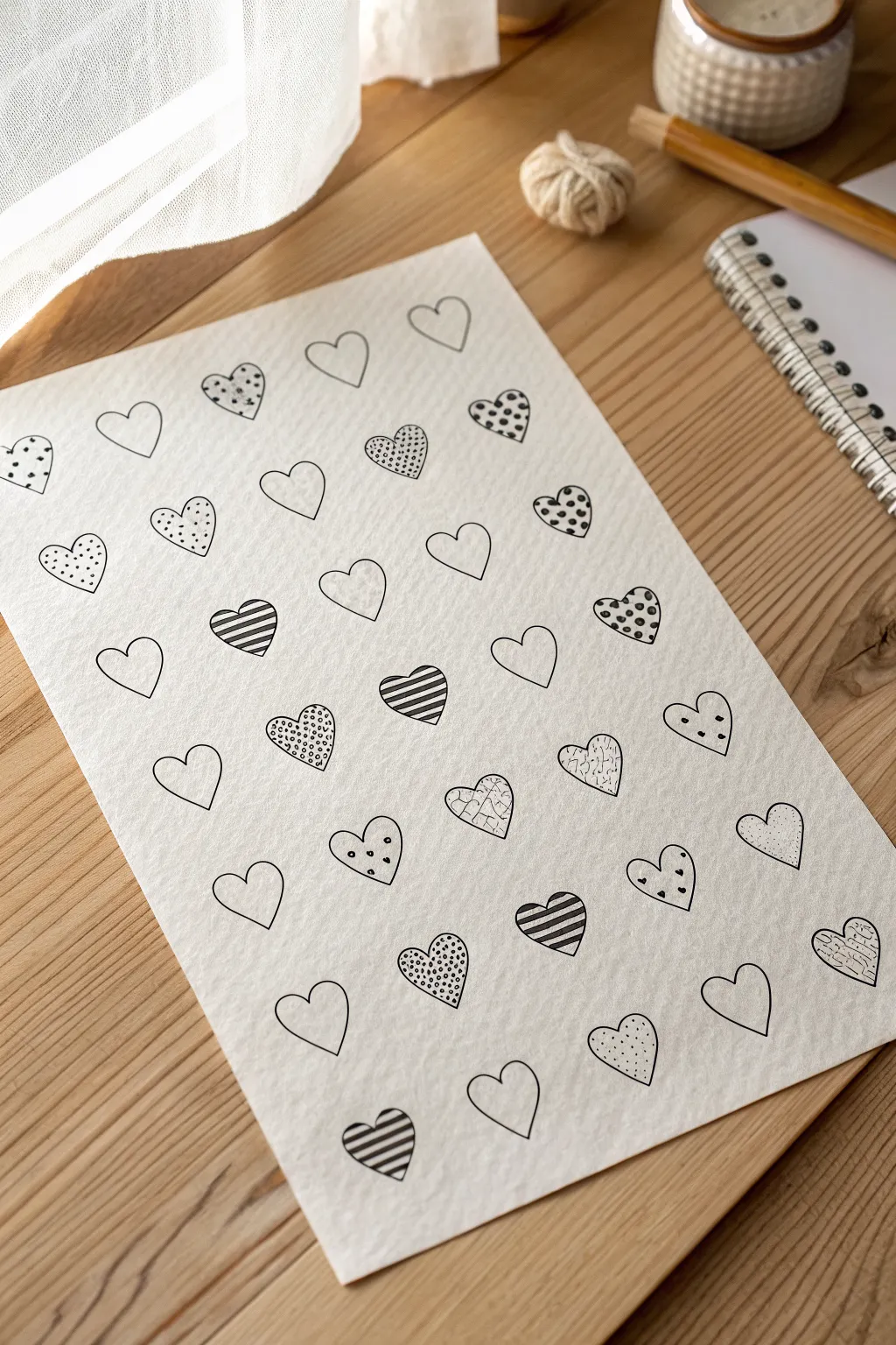
This charming doodle project combines simple heart outlines with a variety of easy-to-draw patterns, creating a visually pleasing sampler sheet. It’s the perfect meditative drawing exercise to practice line control and explore different textures using just a single pen.
How-To Guide
Materials
- Textured sketch paper or cold-press watercolor paper (A4 or similar size)
- Black fine-liner pen (0.5mm or 0.3mm nib recommended)
- Pencil (HB or 2H)
- Eraser
- Ruler (optional)
Step 1: Planning and Layout
-
Prepare your paper:
Start with a clean sheet of slightly textured paper. The texture adds a lovely vintage quality to the final ink lines, but standard smooth paper works too if that is what you have on hand. -
Visualize the grid:
Visualize a grid of imaginary boxes on your page. You want roughly seven or eight rows of hearts. You can lightly mark horizontal guidelines with a pencil and ruler to keep your rows straight, or just eyeball it for a more organic, hand-drawn look. -
Sketch the first row:
Using your pencil very lightly, sketch the outlines of the hearts for the top row. Aim for hearts that are roughly the same size—about an inch tall—but don’t worry about them being identical; slight variations add character. -
Drift the placement:
As you sketch subsequent rows, try to stagger the hearts slightly so they fit in the gaps of the row above, creating a brick-lay pattern rather than perfect vertical columns.
Keep it Loose
Don’t strive for machine-perfect symmetry. The charm of this doodle lies in the slight wobbles and varying line weights.
Step 2: Inking the Outlines
-
Trace the outlines:
Take your black fine-liner and carefully trace over your pencil heart sketches. Keep your hand relaxed to ensure smooth, continuous distinct curves for the lobes. -
Varied shapes:
Allow some hearts to be taller and thinner, and others to be wider and rounder. This variety keeps the composition dynamic. -
Let the ink set:
Wait a few minutes for the outline ink to dry completely. This is crucial to prevent smudging when you erase the pencil lines. -
Clean up:
Gently erase the pencil guidelines and heart sketches, leaving only crisp black ink outlines on the paper.
Step 3: Adding Patterns
-
Leave some blank:
To give the eye a place to rest, leave several hearts completely blank. Scatter these open hearts randomly throughout the page. -
Simple stripes:
Choose a few hearts to fill with diagonal stripes. Draw parallel lines from one edge to the other, keeping the spacing consistent. I find that alternating the direction of the diagonals on different hearts adds nice visual rhythm. -
Polka dots:
Fill another set of hearts with small, solid black dots. Space them evenly for a clean look, or randomize them for a ‘confetti’ feel. -
Tiny grids:
Create a checkerboard or grid texture on a few hearts by drawing vertical lines followed by horizontal lines. Keep the squares small and tight. -
Stippling texture:
For a softer tone, fill a couple of hearts with tiny, distinct specks or ‘stippling’ dots, concentrating them near the edges for a slight shading effect. -
Confetti shapes:
On a few scattered hearts, draw tiny triangles, miniature dots, and small dashes to create a festive, sprinkle-like pattern. -
Crackle effect:
Draw jagged, vein-like lines inside one or two hearts to mimic a crackled glass or dried earth texture. -
Review and balance:
Step back and look at your sheet. If one area looks too heavy with dark patterns, add a lighter patterned heart (like the crackle or stipple) nearby to balance it out. -
Final touches:
Check for any gaps in your lines or patterns that need closing up, and erase any stray pencil marks you might have missed earlier.
Color Pop
Once the black ink is fully dry, use a single highlighter color (like pale pink or gold) to fill in just 3 random hearts on the page.
Now you have a wonderful page of patterns that can be framed as modern art or scanned for greeting cards


Smiley Faces With Personalities

This charming project turns a simple grid notebook into a study of character and emotion. By using a basic circle template, you’ll create a delightful collection of minimalist faces that range from happy and goofy to skeptical and sleepy.
Step-by-Step Tutorial
Materials
- Grid paper spiral notebook with 5mm squares
- Fine-liner black pen (0.3mm or 0.5mm)
- Pencil (for sketching)
- Eraser
- Circle stencil or small round object (approx. 2cm diameter)
Step 1: Setting the Stage
-
Prepare your canvas:
Open your grid notebook to a fresh page. The grid lines are incredibly helpful here, acting as built-in guides for spacing your artwork evenly without needing a ruler. -
Map out the grid:
Decide on your layout. In the reference, the circles are arranged in rows but staggered slightly. Plan for about 5 columns and 4 rows of faces. -
Draft the circles:
Using a pencil and your circle stencil (or a coin), lightly draw your circles. Leave some breathing room between each one—roughly two grid squares of space between each circle works well. -
Add a header:
At the top left of the page, lightly pencil in a title like ‘HUMANITY’ or ‘FACES’. You can use a quirky, uneven serif font style to match the playful vibe.
Keep it Loose
Don’t aim for perfect geometry. The charm of this project comes from the wobbly, hand-drawn aesthetic. Imperfect circles look more organic and friendly.
Step 2: Bringing Faces to Life
-
Ink the outlines:
Switch to your fine-liner pen. Carefully trace over your penciled circles. Don’t worry if the lines aren’t perfectly smooth; a little wobble adds hand-drawn charm. -
Draw the happy eyes:
Start with the top row. For the first face, draw two small, wide-set circles for eyes inside the main circle. -
Add a simple smile:
Place a curved line beneath the eyes for a classic smile. Keep the features centered but floating in the middle of the circle space. -
Create variation:
Move to the next circle. Try different eye shapes: loops, dots, or small dashes. For the second face, add tiny eyebrows to signal surprise. -
Experiment with mouths:
For the third face, draw a tongue sticking out. Use a ‘U’ shape for the mouth and a smaller ‘u’ inside it for the tongue detail. -
Draw quirky expressions:
As you move down the rows, get creative. Draw a straight line for a bored mouth, or a squiggly line for confusion. I like to make the eyes asymmetrical on a few faces to make them look goofy. -
Add floating elements:
Outside of some circles, add tiny marks like sweat drops (for nervousness) or ‘z’s (for sleepiness) to enhance the emotion. -
Fill the page:
Continue until all circles have unique faces. Remember, less is more—these are minimalist doodles, so just a few lines can convey a lot of feeling.
Add Color Poppies
Use a light pink highlighter or colored pencil to add small circular blush marks to the cheeks of the happy faces for an extra dose of cuteness.
Step 3: Finishing Touches
-
Ink the text:
Go back to your header title. Trace over your pencil letters with the black pen, perhaps thickening the down-strokes slightly for emphasis. -
Add ruled lines:
Below the grid of faces, use the notebook’s grid as a guide to draw straight horizontal lines across the bottom half of the page. This creates a space for notes or reflections. -
Erase guidelines:
Wait until the ink is completely dry to avoid smudging. Then, gently erase all remaining pencil marks from the circles and the text. -
Decorate the pen (optional):
For a meta touch matching the photo, you can draw tiny faces on a white pencil or pen barrel to match your notebook theme.
Now you have a whimsical page of expressions that captures a wide range of emotions in the simplest way possible


Easy Flower Doodles
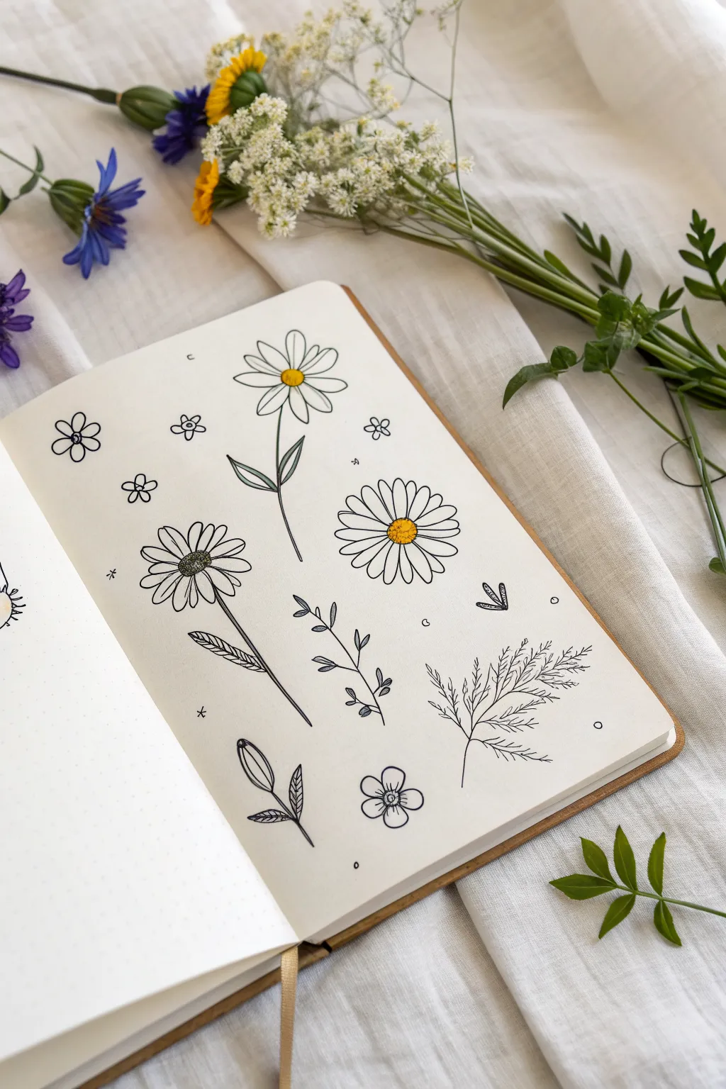
Capture the delicate beauty of a summer meadow with these simple yet charming pen-and-ink flower drawings. This spread combines various botanical shapes—from classic daisies to fern-like greenery—accented with tiny pops of sunny yellow for a fresh, minimalist look.
Step-by-Step
Materials
- Dotted or plain sketchbook journal
- Fine liner pen (black, approx. 0.3mm or 0.5mm)
- Yellow colored pencil or marker
- Pencil (HB) for sketching
- Soft eraser
Step 1: Preparation & Layout
-
Light Sketching:
Begin by lightly sketching the placement of your main flowers with an HB pencil. Aim for a scattered, organic arrangement rather than perfect rows. Place the three largest flowers in a loose triangle formation across the page to balance the composition. -
Pencil Stems:
Draw faint, curved lines for the stems of the larger flowers. Vary the curves slightly; nature rarely produces perfectly straight lines. This ensures your final ink lines will feel fluid and natural.
Ink Confidence
Commit to your ink lines. If a line goes astray, don’t try to fix it; turn it into a new petal or leaf. Imperfection mimics nature.
Step 2: Drawing the Main Blooms
-
Classic Daisy Center:
Start with the top-middle flower. Draw a small, slightly oval circle for the center using your fine liner pen. Don’t worry if it’s not a perfect circle; a wobbly line adds character. -
Daisy Petals:
Radiate long, thin U-shaped petals outward from the center. Keep them relatively spaced out for an airy feel. I find it easiest to draw the bloom at the 12, 3, 6, and 9 o’clock positions first, then fill in the gaps. -
Dense Daisy:
Move to the middle-right flower. Draw a slightly larger, textured center using tiny dots or stippling. Then, draw many narrow, tightly packed petals around it, creating a fuller, more traditional daisy look. -
Coneflower Style:
For the bottom-left flower, draw a textured, gumdrop-shaped center. The petals here should be slightly shorter and wider. Add a few lines inside the petals near the center to suggest texture and dimension.
Step 3: Adding Foliage & Fillers
-
Simple Leaves:
Add stems to your main blooms using confident, single strokes. On the top flower, draw two simple, leaf-shapes branching out. For the bottom-left flower, draw elongated leaves with a central vein and diagonal shading lines. -
Fern Sprig:
In the bottom right corner, draw a long central stem line. From this spine, draw many short, feathery lines branching upwards and outwards on both sides to create a fern-like texture. -
Budding Branch:
In the center space, draw a vertical stem. Add pairs of small, oval-shaped leaves growing opposite each other as you move up the stem, getting smaller toward the top. -
Closed Bud:
Near the bottom center, draw a teardrop shape pointing upwards. Split the top slightly to show petals just beginning to unfurl, and attach it to a short stem with two small leaves at the base. -
Tiny Flora:
Fill the empty spaces with miniature 5-petal flowers (like cherry blossoms) and simple 4-petal geometric flowers to create variety in scale.
Pressed Flower Look
Try coloring the leaves with a muted sage green and the petals with a soft dusty rose to mimic the look of a vintage herbarium.
Step 4: Finishing Touches
-
Erase Sketches:
Wait a few moments to ensure the ink is completely dry, then gently erase all your initial pencil guidelines. -
Adding Color:
Take your yellow colored pencil or marker and carefully fill in the circular centers of the three main daisies. Keep the color solid but contained within the ink lines. -
Tiny Accents:
For a magical, finished quality, add tiny floating elements like small circles, asterisks, or crescent shapes in the negative space between the flowers.
Close your sketchbook knowing you’ve preserved a little piece of summer on the page

Leaves and Little Branch Sprigs
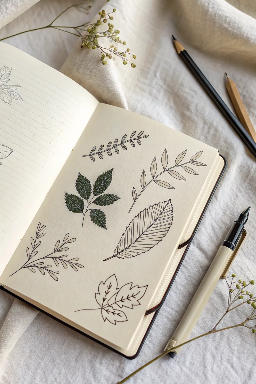
Create a charming collection of botanical studies using simple line work and selective coloring. This project captures the delicate beauty of various leaf shapes, arranging them into a pleasing, organic composition on a single sketchbook page.
Step-by-Step Tutorial
Materials
- Cream-colored sketchbook (smooth paper preferred)
- Black fineliner pens (sizes 0.1, 0.3, and 0.5)
- Deep olive green marker or brush pen
- Pencil (HB or H)
- Eraser
Step 1: Planning and Layout
-
Map out the composition:
Visualize the page as being divided into a 2×3 grid, though you want the spacing to feel natural, not rigid. Lightly pencil in the general flow or ‘spine’ for six different botanical elements to ensure they fit nicely without crowding. -
Sketch the primary stems:
Using your pencil, draw the central stems for your six designs. Vary the curvature: make some straight, some gently arched, and others with a slight ‘S’ curve to add movement to the page.
Step 2: Drawing the Linear Fern
-
Draft the top-left frond:
Starting with the top left design, sketch small, oval-shaped leaves along the stem. These should be arranged in opposite pairs that get slightly smaller toward the tip. -
Ink the outlines:
Switch to a 0.3 pen. Carefully trace over your pencil lines, intentionally leaving small gaps where the leaves meet the stem to keep the look airy. -
Add vein details:
With a finer 0.1 pen, draw a single central line down the middle of each tiny leaflet.
Keep it Clean
Place a scrap piece of paper under your hand while drawing. This prevents oils from your skin transferring to the page and keeps you from smudging wet ink or pencil graphite.
Step 3: Creating the Solid Green Cluster
-
Outline the serrated leaves:
For the middle-left design, sketch a cluster of five leaves radiating from a single point. Give them jagged, serrated edges to mimic a raspberry or rose leaf. -
Fill with color:
Use your deep olive green marker to color these leaves in completely. I find that working in the direction of the leaf growth helps prevent streakiness. -
Detail with white or black:
Once the green is fully dry, use a fine black pen to draw the veins right over the ink. Alternatively, a white gel pen creates a striking contrast here.
Add Depth
Use a light gray marker to add a simple drop shadow to just one side of each stem or leaf. This instantly lifts the drawing off the page and adds subtle dimension.
Step 4: Drafting the Delicate Sprig
-
Form the bottom-left branch:
Sketch a branch with longer, thinner stems branching off the main line. Add small, teardrop-shaped leaves at the end of each sub-branch. -
Ink the sweeping lines:
Use a 0.3 pen to ink the stems with confident, sweeping strokes. -
Complete the leaves:
Outline the teardrop leaves, adding a simple central vein to each one.
Step 5: Sketching the Right-Side Elements
-
Draw the top-right pinnate leaf:
Create a long stem with elongated, lance-shaped leaves arranged in pairs. Keep the leaves pointed and slender. -
Ink the details:
Ink the outline with your 0.3 pen. Draw a straight line down the center of each leaf, then add diagonal hatching lines on just one side of each leaf for a shaded effect. -
Create the large beech leaf:
In the middle-right space, draw a single large, broad leaf with a pointed tip. Sketch prominent parallel veins running from the center to the edges. -
Texture the large leaf:
When inking, make the outer edge slightly jagged or wavy between the vein endings. Ink the many parallel veins closely together to emphasize texture. -
Form the bottom-right maple leaf:
Sketch a three-lobed leaf shape, similar to a maple or ivy leaf. Keep the edges relatively smooth but include a few points. -
Finalize ink work:
Ink the outline. Draw a main vein into each of the three lobes, and add shorter branching veins coming off them.
Step 6: Finishing Touches
-
Erase pencil marks:
Wait until the ink is completely dry to avoid smudging. Gently run a high-quality eraser over the entire page to remove the initial graphite guides. -
Review and refine:
Check your line weights. If any outer edges feel too thin, carefully re-trace them with a 0.5 pen to make the shapes pop off the page.
Now you have a serene page of botanical studies ready to inspire your next nature walk
BRUSH GUIDE
The Right Brush for Every Stroke
From clean lines to bold texture — master brush choice, stroke control, and essential techniques.
Explore the Full Guide
Cute Cloud and Raindrop Icons
Bring a forecast of charm to your journal with this collection of simple, hand-drawn weather icons. Featuring fluffy clouds, minimalist raindrops, and cheerful rainbows, these designs use clean lines and soft accents to create a playful aesthetic.
Step-by-Step Guide
Materials
- Grid paper notebook or bullet journal
- Fine-liner pen (black, 0.3mm or 0.5mm)
- Grey marker or brush pen
- Light orange or peach marker
- Light blue marker
- Pencil and eraser (optional for sketching)
Step 1: Drawing the Base Outlines
-
Start the dotted cloud:
Begin near the top left. Draw a fluffy cloud shape using a continuous, bumpy line. Instead of leaving the inside empty, fill it with tiny, random stippling dots to give it texture. -
Add the sun icon:
To the right of the dotted cloud, draw a small circle. Add rays extending outward using simple straight lines, alternating with small ‘V’ shapes for variety. Draw a tiny arrow pointing down below the sun. -
Create the heart cloud:
Draw another fluffy cloud below the first one, similar in shape. Above and to the right of this cloud, sketch a small, simple heart shape. -
Outline the plain clouds:
Move downwards to draw two more cloud outlines. For the one on the right, keep the line smooth and bubbly. For the bottom-left cloud, give the bumps a slightly flatter bottom edge to vary the style. -
Draw the rain:
Under the second cloud on the left, draw three tiers of raindrops. Use simple teardrop shapes: three in the top row, two in the middle, and a larger single drop at the bottom. -
Sketch the striped cloud:
Near the bottom left, draw another cloud outline. Inside this one, draw diagonal lines spacing them evenly apart to create a hatch pattern. -
Outline the dotted cloud variation:
On the middle-right side, draw a cloud shape. Inside, draw small circles—some touching the edges, some floating in the middle—to create a bubbly, porous look. -
Form the rainbows:
Draw two rainbows. For the bottom-right one, draw two large arches. For the bottom-center one, draw a smaller, tighter triple arch. Add tiny vertical dashed lines underneath the rightmost rainbow to represent rain.
Ink Smearing?
Wait at least 60 seconds after drawing your black outlines before erasing any pencil sketches or adding marker color. This ensures crisp, clean lines.
Step 2: Adding Color and Details
-
Color the sun:
Use your light orange marker to gently color the center of the sun icon. I find a single circular motion works best to keep the ink even. -
Shade the grey clouds:
Take the grey marker and color in the plain cloud on the middle-right completely. For the diagonally striped cloud, color every other stripe grey. -
Add blue accents:
Using the light blue marker, color in just the large bottom raindrop on the left side. Then, carefully color the outer arch of the small bottom-center rainbow. -
Apply peach tones:
Switch back to the peach or light orange marker. Color the outer arch of the large bottom-right rainbow and the middle arch of the small bottom-center rainbow. -
Detail the faces:
If you want to match the wood cutout on the desk, you can add a tiny face to your sun drawing with two dots for eyes and a small curve for a smile. -
Final touches:
Review your doodles. If any lines look too faint, carefully go over them again with your black fine-liner significantly to make them pop against the grid background.
Consistent Curves
When drawing cloud bumps, try to rotate your wrist rather than moving your whole arm. This helps keep the curves uniform in size and roundness.
You now have a charming set of weather icons ready to brighten up your weekly spread
Mini Mountain Landscape in a Circle

Capture the serenity of the outdoors with this minimalist circle landscape. Using clean lines and simple stippling techniques, you’ll create a peaceful mountain scene that looks striking on crisp cardstock.
Step-by-Step Tutorial
Materials
- High-quality off-white or cream cardstock
- Compass or circle stencil (approx. 3-4 inch diameter)
- Pencil (HB or lighter)
- Eraser
- Black Fineliner pens (0.3mm and 0.5mm)
- Ruler or straight edge
- Dried pressed wildflowers/grasses (optional for border)
- Light grey ink pad (optional for border)
Step 1: Setting the Scene
-
Draw the boundary:
Start by positioning your compass in the center of the paper. Lightly draw a circle that is approximately 3 to 4 inches in diameter. Keep the pencil pressure very light so it’s easy to erase later. -
Draft the horizon base:
Using a ruler, lightly sketch a straight horizontal line across the lower third of the circle. This doesn’t need to go all the way to the edges yet, but it establishes where your mountains will sit. -
Sketch the peaks:
Draw three triangles resting on your horizon line. Make the center one the largest and tallest. Add a medium-sized peak to the right, slightly overlapping the main one, and a smaller, narrow peak on the far left. vary the angles to keep it organic. -
Add snow caps:
About a third of the way down from the top of each peak, sketch a jagged, zig-zagging line to represent the snow line. These should be irregular—nature isn’t perfect. -
Position the moon:
In the upper open space of the sky, slightly to the right of the center peak, lightly sketch a small crescent moon shape.
Step 2: Inking the Landscape
-
Outline the circle:
Switch to your 0.5mm black fineliner. Carefully trace over your pencil circle. Go slowly to maintain a smooth, continuous curve. I find rotating the paper as I draw the curve helps keep my hand steady. -
Thicken the frame:
Go over the circle outline a second time to thicken the line weight, giving the drawing a bold, badge-like appearance. Do the same for the bottom horizontal base line. -
Ink the mountains:
The mountains require a slightly thinner line, so switch to a 0.3mm pen if you have one. Trace the triangular peaks and the jagged snow lines. Stop the lines where mountains overlap to create depth. -
Create the moon:
Ink the crescent moon with a clean, single line. You can fill it in completely black for high contrast, or leave it as an outline as seen in the reference.
Wobbly Circle?
If you struggle to trace a perfect circle freehand, use the plastic rim of a cup or jar as a physical guide for your pen instead of relying solely on the compass pencil line.
Step 3: Shading and Details
-
Start stippling:
To give the mountains texture, we will use stippling (tiny dots). Focus on the non-snowy parts of the mountains using the 0.3mm pen. -
Build the gradient:
Concentrate your dots heavily on the right side of each mountain face to suggest a light source coming from the left. Make the dots dense near the edges and sparser as they move toward the center. -
Detail the left peak:
For the smallest peak on the left, use a very dense stippling or a solid black fill on one side to make it stand out against the larger mountain behind it. -
Clean up sketch lines:
Once the ink is completely dry—give it a few minutes to be safe—gently erase all the underlying pencil marks. Be careful not to smudge your stippling. -
Add botanical accents (Optional):
To recreate the subtle border effect, take a piece of dried grass or a fern. Press it onto a light grey ink pad, then gently press it onto the paper corners outside the circle. -
Final touches:
Inspect your bold outer circle. If the line looks uneven, carefully smooth it out with one final pass of the 0.5mm pen to ensure a crisp, graphic finish.
Stippling Patience
Keep your pen vertical when stippling. Slanted dots look like dashes and ruin the texture. Tap gently and rhythmically rather than stabbing the paper.
Now you have a serene piece of geometric art ready to frame or gift

PENCIL GUIDE
Understanding Pencil Grades from H to B
From first sketch to finished drawing — learn pencil grades, line control, and shading techniques.
Explore the Full Guide
Ocean Waves in a Rectangle Frame
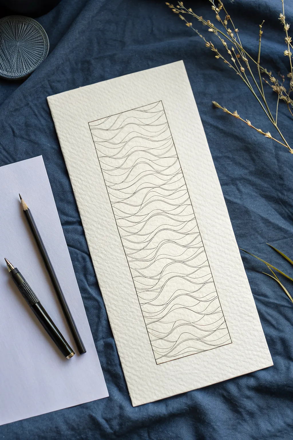
This serene line art project captures the rhythmic motion of the ocean using nothing but simple, repetitive curves. It’s a meditative drawing exercise that results in a striking piece of minimalist art, perfect for textured paper which adds depth to the clean lines.
How-To Guide
Materials
- Heavyweight textured watercolor paper (cold press) or handmade paper
- Fine liner pen (0.3mm or 0.5mm, black)
- Graphite pencil (HB or 2H)
- Ruler
- Eraser
Step 1: Setting the Boundaries
-
Paper selection:
Choose a high-quality paper with visible grain or texture. The rough surface interacts beautifully with the ink lines later. -
Draft the outer frame:
Using your ruler and pencil, lightly draw a tall, narrow rectangle in the center of your paper. Leave generous negative space around the edges to let the design breathe. -
Define the frame weight:
Go over the pencil rectangle with your fine liner pen to create a crisp border. If you prefer a hand-drawn look, you can skip the ruler for this final inking pass, but keep the lines straight.
Step 2: Drafting the Wave Structure
-
Pencil guidelines:
Lightly sketch horizontal guidelines across the rectangle, spacing them about an inch apart. These don’t need to be perfectly straight; a slight waviness helps. -
Establish the primary curves:
In pencil, draw your main wave lines following your guidelines. Think of rolling hills—up and down. Vary the peaks and troughs so they don’t look like a uniform zigzag pattern. -
Connect the flows:
Draw secondary lines that bridge the gaps between your main wave lines. Some lines should merge together while others drift apart, mimicking the natural flow of water. -
Review the composition:
Step back and look at your pencil draft. Ensure the density of lines feels balanced from top to bottom before you commit to ink.
Finding Your Rhythm
Don’t overthink the curves. Practice drawing ‘S’ shapes on scrap paper first to loosen up your wrist. The goal is fluid motion, not geometric perfection.
Step 3: Inking the Flow
-
Start from the top:
Begin inking your lines starting at the top of the rectangle to avoid smudging your work with your hand as you move down. -
Commit to the stroke:
Trace over your pencil lines with the fine liner. Try to make each wave a single, continuous stroke rather than short, sketchy dashes for a smoother look. -
Add line variation:
As you draw, occasionally press slightly harder on the down-curves of the waves. This subtle variation adds weight and dimension to the water. -
Create intersections:
Where lines meet or overlap, ensure the connection is clean. I find that stopping just a hair before touching the next line creates a delicate, airy feeling. -
Fill the frame:
Continue working your way down to the bottom border. Don’t worry if your inked line deviates slightly from the pencil sketch; usually, the spontaneous line looks better. -
Check the edges:
Ensure all wave lines clearly touch the side borders of the rectangle. This makes the design look contained and intentional, rather than floating.
Shaky Lines?
If your hand shakes, try drawing faster. Slow movement often causes more wobble. A quick, confident stroke is usually smoother than a hesitant one.
Step 4: Finishing Touches
-
Let the ink settle:
Allow the drawing to dry completely for at least 15 minutes. Textured paper holds ink longer than smooth paper, and smudging at this stage is heartbreaking. -
Erase the evidence:
Gently erase all underlying pencil marks. Hold the paper taut with one hand while erasing with the other to prevent the paper from buckling or creasing. -
Final inspection:
Look for any gaps in your border or waves that might need a tiny touch-up with your pen to feel complete.
Display your wave study in a simple frame or use it as a calming bookmark design
Easy Planet and Ring Doodles
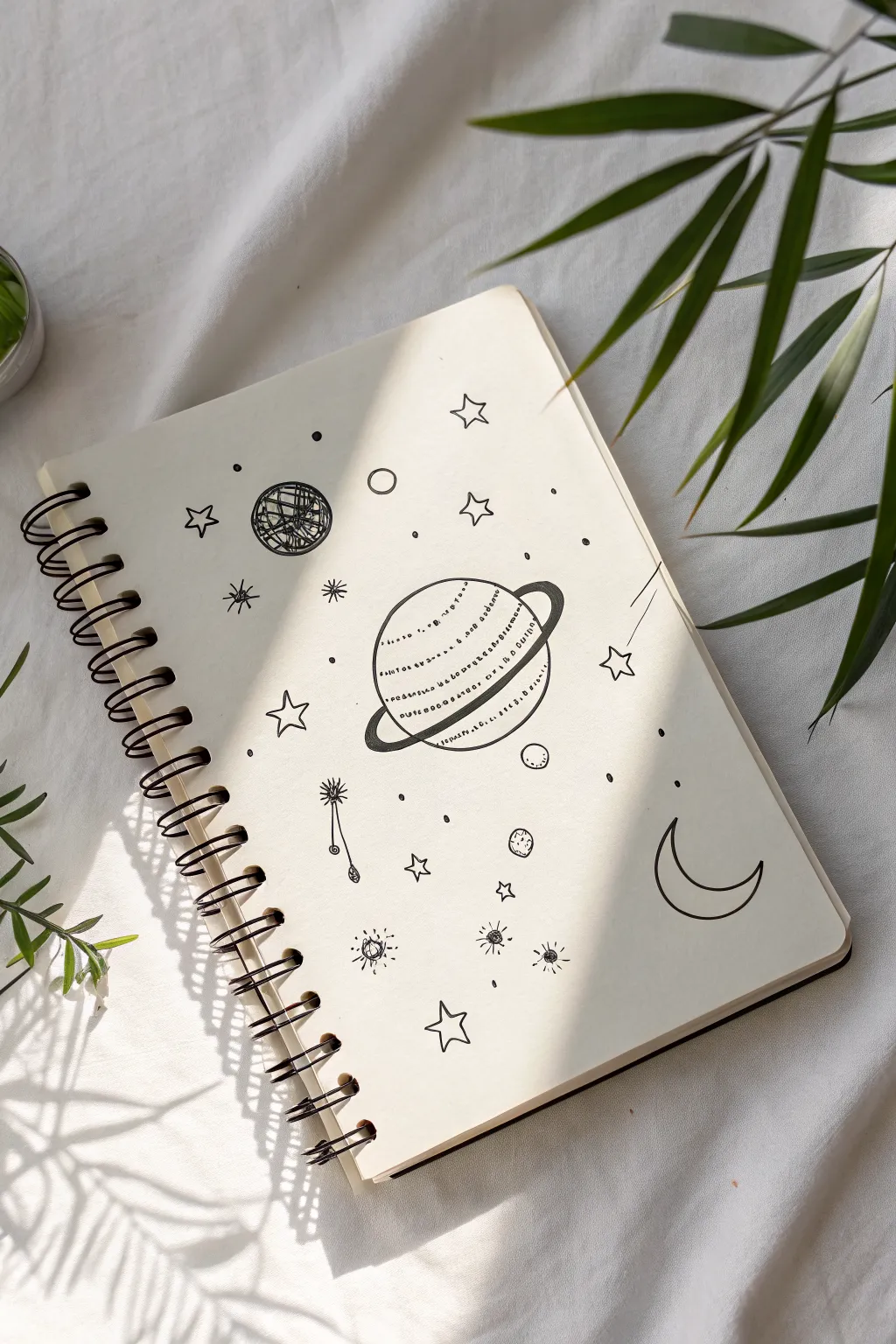
Transform a blank notebook page into a whimsical galaxy with these simple black ink doodles. This project features a central ringed planet surrounded by a scattering of stars, moons, and cosmic dust for a dreamy, minimalist aesthetic.
Step-by-Step Guide
Materials
- Spiral-bound sketchbook or journal (cream or white paper)
- Black fineliner pen (0.3mm or 0.5mm nib)
- Pencil (HB or 2B for sketching)
- Eraser
Step 1: Setting the Scene
-
Sketch the central planet:
Start in the center of your page with a light pencil sketch of a medium-sized circle. This will form the body of your main planet. -
Add the ring structure:
Draw a long, thin oval shape that cuts across the middle of the planet at a slight diagonal tilt. The back part of the oval should go ‘behind’ the planet, while the front curves across the face. -
Outline the planet:
Switch to your black fineliner. Carefully trace the circle of the planet, but stop where the ring crosses in front of it. This makes the ring look like it’s truly wrapping around the sphere. -
Define the rings:
Ink the ring shape. Give the ring some thickness by drawing a second line parallel to the outer edge, creating a band. Fill in the small slivers where the ring goes behind the planet with solid black ink to add depth. -
Detail the planet surface:
Instead of shading, use horizontal text or dashed lines across the face of the planet. You can write tiny, illegible scribbles or simple dash-dot patterns in rows to mimic atmospheric bands.
Ink Control
If you’re nervous about drawing perfect circles in ink, keep your wrist stiff and move your entire arm from the shoulder for a smoother curve.
Step 2: Cosmic celestial bodies
-
Draw the crescent moon:
In the lower right quadrant, draw a classic ‘C’ shape. Close the shape with a smaller inner curve to create a crescent moon. Keep the lines clean and simple. -
Create a textured planetoid:
To the upper left of the central planet, draw a smaller circle. Fill this one with a chaotic, scribble-hatch pattern to give it a darker, rocky texture compared to the smooth main planet. -
Add floating orbs:
Scatter two or three very small circles around the page. Leave some empty, and fill others with a quick, loose texture to suggest distant moons or asteroids.
Add Magic
Use a white gel pen to add tiny highlights on the black ring sections or inside the filled-in scribbles for extra dimension.
Step 3: Stars and Sparkles
-
Draw five-point stars:
Draw several open five-point stars around the composition. Vary their sizes, placing a larger one near the top right and smaller ones tucked into empty spaces. -
Add bursting stars:
Create ‘bursting’ stars by drawing a small center dot and radiating short lines outward. I like to make the vertical and horizontal lines slightly longer than the diagonal ones. -
Sketch a shooting star:
Find a star or small circle and draw two or three long, straight lines trailing behind it to simulate movement, creating a comet or shooting star effect. -
Draw a hanging star:
Draw a star shape with a long, wavy line drooping down from it, ending in a small teardrop shape. This adds a bit of fantasy whimsy to the layout. -
Fill the void:
Look for large empty gaps in your composition. Fill these with tiny solid black dots or small open circles to represent distant stars and space dust. -
Clean up the sketch:
Wait a few minutes to ensure the ink is completely dry. Gently erase all your initial pencil guidelines to leave a crisp, black-and-white illustration.
Now you have a charming galaxy spread ready to inspire your next journaling session


Cactus in a Tiny Pot
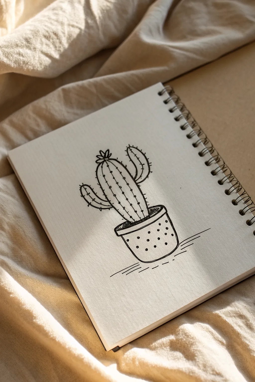
Capture the charm of the desert with this minimalist line drawing of a cactus nestled in a polka-dot pot. The stark black ink against cream paper creates a clean, modern aesthetic that looks perfect sketched into a spiral notebook.
Step-by-Step
Materials
- Spiral-bound sketchbook with cream or off-white paper
- Fine liner pen (0.3mm or 0.5mm, black ink)
- Pencil (HB or 2B)
- Eraser
- Ruler (optional, for ground, though freehand is preferred)
Step 1: Sketching the Shapes
-
Establish the pot base:
Begin by lightly sketching with your pencil. Near the bottom center of your page, draw a slightly flattened oval shape for the top opening of the pot. -
Form the pot body:
Draw two diagonal lines angling slightly inward from the sides of the oval, creating a bucket shape. Connect these at the bottom with a curved line that mimics the curve of the top oval. -
Add the rim:
Create the rim of the pot by drawing a second curve just below the front edge of the top oval giving it some thickness. -
Outline the main cactus body:
From the center of the pot’s opening, sketch a tall, pill-shaped oval stretching upward. This will be the main trunk of your cactus. -
Create the arms:
Add two arms branching off the main trunk. On the left, draw an L-shaped arm curving upward. On the right, draw a slightly higher arm that curves inward like a crescent moon. -
Top blossom:
Sketch a small, flower-like shape at the very crown of the main trunk using three or four small petal shapes.
Confident Lines
Don’t sketch with short, hairy strokes when inking. Ghost the movement with your hand first, then commit to a single, smooth stroke.
Step 2: Inking the Outline
-
Ink the pot:
Switch to your fine liner pen. Carefully trace over your pencil lines for the pot, making the lines firm and confident. I like to double up the line on the rim slightly to give it visual weight. -
Ink the cactus silhouette:
Trace the outer perimeter of the cactus. Keep your hand steady to create a smooth, continuous line around the curves of the arms and the main body. -
Define the flower:
Ink the small petals at the top, making sure they connect cleanly to the top of the cactus head. -
Erase guidelines:
Once the ink is completely dry (give it a full minute so it doesn’t smudge), gently erase all your pencil sketches.
Step 3: Adding Details & Texture
-
Draw vertical ribs:
Inside the main cactus body, draw two vertical lines that follow the curvature of the outer shape. Do the same for each arm, adding a central line inside the curves. -
Add the spines:
Along the outer edges and the internal vertical ribs, add small horizontal ticks or short lines. These represent the prickles. -
Create the soil:
Inside the rim of the pot, draw a few small, scribbly lines at the base of the cactus to suggest soil texture. -
Decorate the pot:
Add small, evenly spaced dots all over the body of the pot to create a cute polka-dot pattern. -
Ground the object:
To stop the pot from floating, draw a few horizontal lines underneath it. Make the lines closer to the pot slightly longer and the outer ones shorter and dashed. -
Wait and clean:
Ensure all the new ink additions are dry, then do a final pass with your eraser to remove any lingering graphite dust.
Inconsistent Ink Flow?
If your fine liner skips, hold the pen more vertically. Drawing at a steep angle comfortably can sometimes lift the nib too far off the paper fibers.
Now you have a charming desert companion that never needs watering
Fruit Slices With Simple Patterns
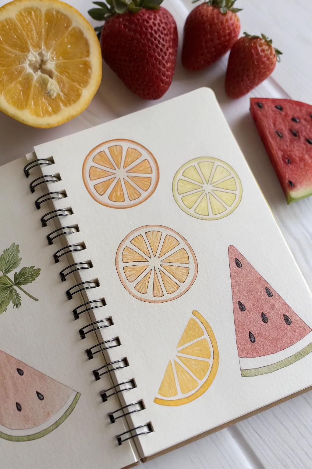
Capture the juicy vibrancy of summer fruits with these clean, illustrative slices. This sketchbook page features a delightful mix of citrus wheels and watermelon wedges, rendered in soft colored pencils and fine liners for a crisp, graphic look.
Detailed Instructions
Materials
- Sketchbook with smooth, heavy-weight paper
- HB graphite pencil
- Eraser
- Colored pencils (orange, yellow, light yellow, red, pink, light green, dark green)
- Black fine liner pen (0.3mm or 0.5mm)
- Circle template or compass (optional)
- Ruler
Step 1: Planning the Composition
-
Map out the shapes:
Begin by lightly sketching the placement of your fruit slices on the page. Draw full circles for the citrus wheels and triangles for the watermelon wedges to ensure a balanced layout before committing to details. -
Refine the citrus circles:
For the orange and lemon slices, use a compass or trace a circular object to get perfectly round shapes. Draw a second, slightly smaller circle inside each one to create the thickness of the rind. -
Define the segments:
Find the center point of your citrus circles. Lightly draw straight lines raiding out from the center like wheel spokes to divide the fruit into equal triangular segments. Leave a small gap between each segment to represent the pith. -
Sketch the watermelon:
Refine your triangle shapes for the watermelon. Curve the bottom edge slightly to give it volume, then add a parallel curved line near the bottom to separate the red flesh from the green rind.
Keep it Sharp
Keep your colored pencils extremely sharp, especially when filling the corners of the fruit segments. A dull point will smudge into the white ‘pith’ areas you want to keep clean.
Step 2: Adding Color
-
Base layer for oranges:
Start with a light orange pencil. Fill in the triangular segments of your orange slices using soft, circular strokes to avoid harsh lines. Leave the pith lines white. -
Deepen the orange tones:
Layer a slightly darker or richer orange near the outer edges of each segment and toward the center point to create a subtle gradient effect. -
Color the lemon slice:
Switch to a pale yellow pencil for the lemon wheel. Fill the segments gently, keeping the touch light so the paper texture still shows through a bit. -
Add lemon highlights:
Use a brighter yellow to add definition to the edges of the lemon segments. I find that leaving tiny specks of white within the yellow helps the fruit look juicy and glistening. -
Render the watermelon flesh:
Take a soft red or pinkish-red pencil and fill the main body of the watermelon triangle. Apply uneven pressure—heavier near the top point and lighter toward the rind—to create a textured, organic look. -
Color the watermelon rind:
Using a light green pencil, fill in the strip at the bottom of the watermelon. Add a very thin line of darker green at the absolute bottom edge for definition.
Step 3: Inking and Details
-
Outline the citrus:
Once you are happy with the coloring, take your black fine liner. Carefully outline the outer circle of the citrus slices and the inner segments. -
Detailing the pith:
Keep your hand steady as you ink the white spaces between the fruit segments. The lines shouldn’t be too rigid; a slight wobble can make it look more natural. -
Ink the watermelon:
Outline the triangle shape of the watermelon slice. Draw a thin line separating the red flesh from the green rind area. -
Draw the seeds:
Using the same black pen or a slightly thicker marker, draw small teardrop shapes on the red part of the watermelon for seeds. Scatter them randomly but keep them oriented toward the center. -
Clean up:
Wait for the ink to dry completely to avoid smudging. Then, gently erase any remaining visible pencil sketch lines. -
Optional shading:
For a little extra depth, add very subtle hatching lines with your fine liner on the darker sides of the fruit segments, following the direction of the color gradient.
Uneven Color?
If your colored pencil looks scratchy, try blending it out with a colorless blender pencil or a white pencil to smooth the pigment without altering the hue too much.
Now you have a refreshing page of fruit illustrations ready to brighten up your sketchbook
Coffee Cup and Steam Swirls

This cozy illustration captures the warmth of a fresh brew with a stylized red mug and whimsical, curling steam. Using simple lines and basic shading techniques, you’ll create a charming piece of art perfect for bullet journals or sketchbooks.
How-To Guide
Materials
- Spiral-bound sketchbook or drawing paper
- HB or 2B pencil for sketching
- Fine liner pen (black, roughly 0.5mm)
- Red marker or colored pencil (warm, earthy tone)
- Black marker
- Dark brown marker
Step 1: Sketching the Shape
-
Draw the rim:
Begin by drawing a flattened oval (ellipse) near the bottom-center of your page. This will be the opening of the coffee cup. Keep your pencil pressure light so you can erase mistakes easily. -
Form the cup body:
From the widest points of your ellipse, draw two vertical lines slightly angling inward as they go down. Connect them at the bottom with a slightly curved line that mirrors the curve of the rim’s lower edge. -
Add the handle:
On the right side of the cup body, sketch a ‘C’ shape for the handle. Draw a smaller ‘C’ inside it to give the handle thickness and dimension. -
Create the decorative band:
Draw a curved line across the upper part of the cup, parallel to the rim. This creates the space for the decorative pattern we’ll add later. -
Plan the steam:
Lightly sketch three main swirling lines rising from the cup. Outline the general flow: a central tall swirl, one curling to the left, and two smaller ones to the right.
Wobbly Lines?
If your ellipses are uneven, try drawing a cross first to mark the height and width. Draw the curves connecting these points for a more symmetrical shape.
Step 2: Inking the Outline
-
Ink the main cup:
Using your fine liner pen, carefully trace over your pencil lines for the cup’s rim, body, and handle. Keep your hand steady for clean, smooth curves. -
Detail the decorative band:
Ink the line separating the band from the rest of the cup. Inside this band, draw a series of small swirls or spirals connected by a wavy line. -
Refine the steam swirls:
Using the fine liner, trace the steam. Instead of single lines, thicken them gradually. Start thin at the base (near the coffee) and widen the lines as they curl upward, ending in distinct spirals. -
Add decorative dots:
Place small dots inside the loops of the decorative band pattern for a bit of extra texture. -
Erase pencil marks:
Once the ink is completely dry—I usually give it a full minute just to be safe—gently erase all the underlying pencil sketches.
Texture Twist
Instead of diagonal hatching for the red cup, try stippling (lots of tiny dots) near the edges for a softer, more vintage shadowed effect.
Step 3: Coloring and Shading
-
Color the coffee:
Fill the ellipse at the top with a dark brown marker. Leave a tiny sliver of white or lighter brown near the top edge to suggest the liquid’s reflection. -
Shade the cup body:
Take your red marker or colored pencil. Color the main body of the cup (below the decorative band) using diagonal hatching strokes. Applying strokes in one direction gives it a sketched, artistic look. -
Deepen the shading:
Go over the left side and bottom of the red area a second time with your red marker to create a shadow, making the cup look rounder. -
Color the handle:
Fill in the handle with the same red tone. Add a slightly darker line on the underside of the handle loop for depth. -
Darken the steam:
Take your black marker (or go over the lines multiple times with the fine liner) to make the steam swirls bold and solid black. -
Ground the object:
Using the fine liner, draw three or four horizontal lines underneath the cup, slightly varying in length. This creates a simple surface so the cup doesn’t look like it’s floating.
Now you have a charming coffee illustration ready to warm up your page
Playing Card Icons
This minimalist bullet journal spread captures the classic charm of playing cards with simple, clean line work. Using a dotted grid as your guide, you’ll create four petite card illustrations that look striking in black ink.
Step-by-Step Tutorial
Materials
- Dotted grid notebook (A5 size recommended)
- Fine liner pen (0.3mm or 0.5mm)
- Pencil (HB or lighter)
- Eraser
- Ruler
Step 1: Drafting the Layout
-
Define the card boundaries:
Start by locating the center of your page. Using your ruler and pencil, lightly draw four rectangles in a 2×2 grid formation. Each rectangle should be roughly 6 dots wide by 8 dots tall, with one or two dots of spacing between them. -
Round the corners:
Sketch tiny curves at each corner of your rectangles to soften the edges, giving them that authentic playing card shape rather than a harsh boxy look. -
Mark the indices:
In the top-left and bottom-right corners of each card, lightly broaden the space where the numbers and suit symbols will go. Keep these small so they don’t dominate the card.
Grid Guide
Use the dots! Instead of measuring with inches, count dots (e.g., 6×8) to ensure all four cards are exactly the same size without complex math.
Step 2: Sketching the Suits
-
Outline the Heart:
For the top-left card (4 of Hearts), draw a large, simple heart in the center. Use the grid dots to ensure the two lobes of the heart are symmetrical. -
Draft the Spade:
In the top-right card (Ace of Spades), sketch an upside-down heart shape with a pointed stem at the bottom. Make this symbol slightly larger than the others, as the Ace of Spades traditionally features an ornate center pip. -
Create the Club:
For the bottom-left card (4 of Clubs), draw three small circles touching a central point, with a triangular stem flaring out at the bottom. -
Form the Diamond:
In the bottom-right card, sketch a tall diamond shape. Draw a vertical line down the center to give it a faceted, jewel-like appearance.
Wobbly Lines?
If your straight lines look shaky, pull the pen toward your body rather than pushing it away. This range of motion is naturally more stable for your hand.
Step 3: Inking the Details
-
Ink the card frames:
Switch to your fine liner pen. Carefully trace the outer rounded rectangles. I like to lift my pen slightly at the corners to keep the line weight consistent. -
Add the numbers/letters:
Ink the numbers corresponding to your cards. Place a ‘4’ in the top-left corner of the Heart and Club cards. Write an ‘A’ for the Spade card. It looks like the Diamond card is a unique design, but feel free to assign it a number or leave it decorative. -
Draw the corner pips:
Below the top-left number and above the bottom-right number, draw tiny versions of the suit symbol (hearts, spades, clubs, diamonds). These should be solid black. -
Detail the main Heart:
Go over the central heart outline for the 4 of Hearts with a smooth, continuous line. -
Pattern the Spade:
Outline the Ace of Spades. Instead of filling it in solid, draw tiny white polka dots inside and color the space around them black for a textured look. -
Style the Club:
Ink the outline of the Club. Add internal details like small starbursts or lines within the three circles to give it a vintage, illustrated feel. -
Finish the Diamond:
Trace the diamond shape. Add shading or double lines to one side of the internal vertical line to create a sense of depth and dimension.
Step 4: Finishing Touches
-
Let the ink settle:
Wait at least 5-10 minutes for the ink to dry completely. This is crucial to prevent smudging your crisp lines. -
Erase pencil marks:
Gently erase the underlying grid sketches and layout lines, leaving only the clean black ink.
Now you have a charming set of illustrated cards ready to decorate your journal page
Pattern Grid of Tiny Textures
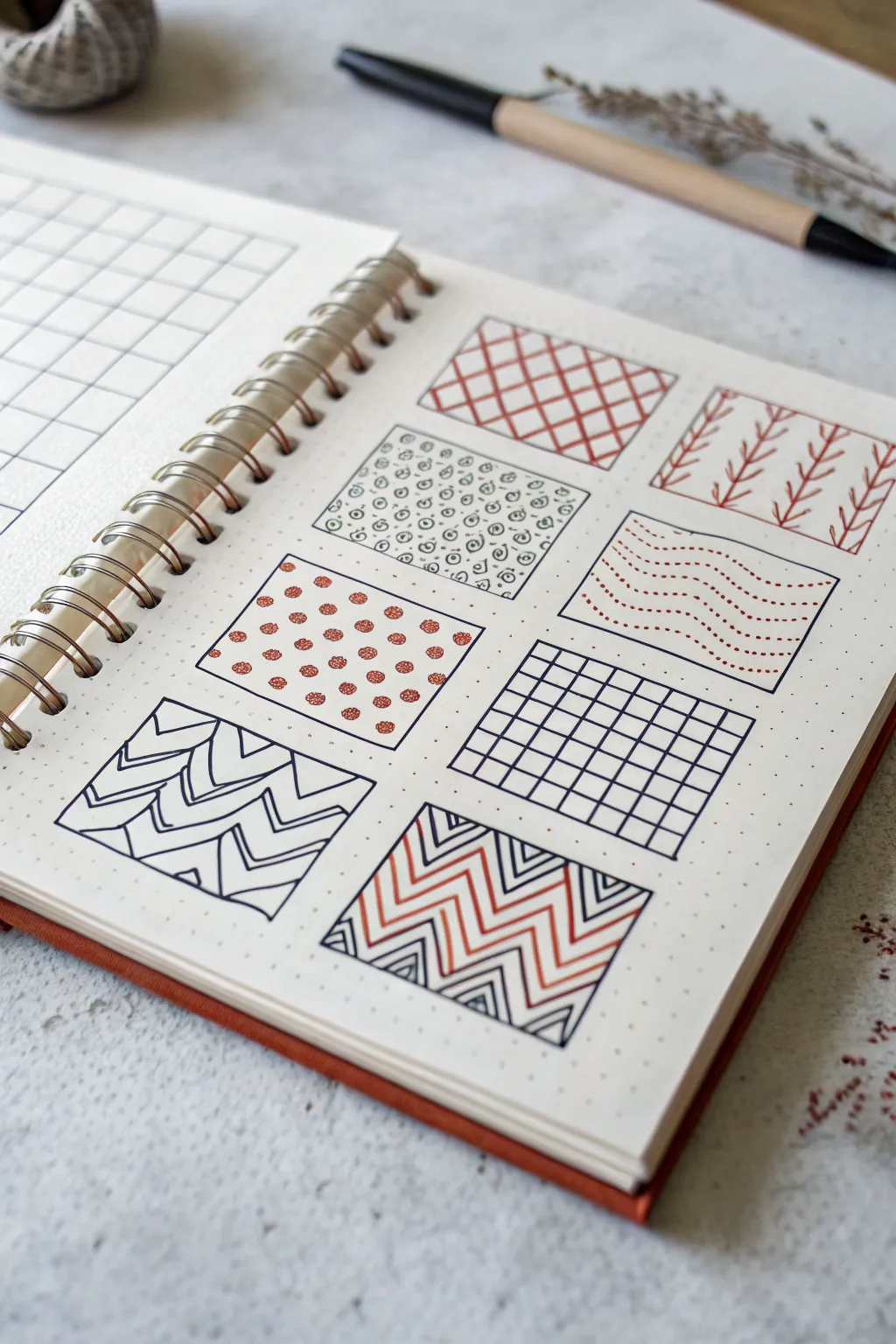
This project transforms a simple notebook page into a visually satisfying reference board of textures. By compartmentalizing eight distinct patterns into neat boxes, you create a tidy and inspiring collection of doodles.
Step-by-Step
Materials
- Dotted or grid notebook (spiral bound preferable for flat lay)
- Fine liner pen (black, 0.3mm or 0.5mm)
- Fine liner or gel pen (rust/terracotta color)
- Ruler
Step 1: Setting the Framework
-
Define the layout:
Count out the dot grid spaces to ensure your boxes will be evenly sized. A 3-column layout works well for most A5 journals. Leave 2-3 dot spaces between each box for breathing room. -
Draw the borders:
Using your black fine liner and a ruler, carefully draw the square outlines for eight separate boxes. Keep the lines crisp and connect the corners cleanly. You will have two empty spots if doing a 3×3 grid, or you can just fill two rows of three and one row of two.
Grid Counting Trick
Don’t guess the spacing. Count the dots! Standard journals are 5mm apart. A 10×10 dot box creates a perfect 5cm square.
Step 2: Row 1: Linear & Organic
-
Pattern 1: Diagonal Grid:
In the top-left box, use your terracotta pen to draw diagonal lines spaced evenly apart from bottom-left to top-right. Cross them with opposing diagonal lines to create a diamond lattice. -
Pattern 2: Spiral Scatter:
Move to the middle box. With the black fine liner, draw tiny, freehand spirals. Vary their orientation slightly and fill the gaps with small dots or circles to create a dense, organic look. -
Pattern 3: Botanical Sprigs:
In the top-right box, switch back to the terracotta pen. Draw vertical lines spaced out, then add small V-shapes along each line to create stylized vines or wheat stalks.
Wobbly Lines?
If your straight lines look shaky, breathe out while drawing the stroke. Use a ruler for the box borders, but freehand the internal patterns for charm.
Step 3: Row 2: Dots & Waves
-
Pattern 4: Polka Cluster:
For the left box in the middle row, use the terracotta pen to draw small, rough circles. Fill the negative space between them with tiny black dots using the tip of your black pen. -
Pattern 5: Dotted Waves:
In the far right box (skipping the center for now to let ink dry), draw horizontal wavy lines. Instead of solid strokes, compose these waves entirely of tiny terracotta dots. -
Pattern 6: Simple Grid:
In the remaining middle-row space (or creating a new row), use the black pen and ruler to draw a standard checkerboard grid. Keep the spacing tight for a technical look.
Step 4: Row 3: Bold Geometrics
-
Pattern 7: Zig-zag Chevrons:
In the bottom-left box, draw horizontal zig-zag lines using the black pen. Once the main lines are down, outline the inner angles of each chevron to create a ‘nested’ effect. -
Pattern 8: Alternating Zig-zags:
For the final central box, create a high-contrast pattern. Draw a set of black zig-zags first. Then, pick up the terracotta pen and echo these lines, drawing colored zig-zags specifically in the gaps between the black ones. -
Add depth:
To finish the final box, go back in with the black pen and add smaller, internal triangles inside the peaks and valleys of the black zig-zags for extra detail.
Now you have a stunning reference page of patterns ready to be applied to larger art projects
One-Line Continuous Face
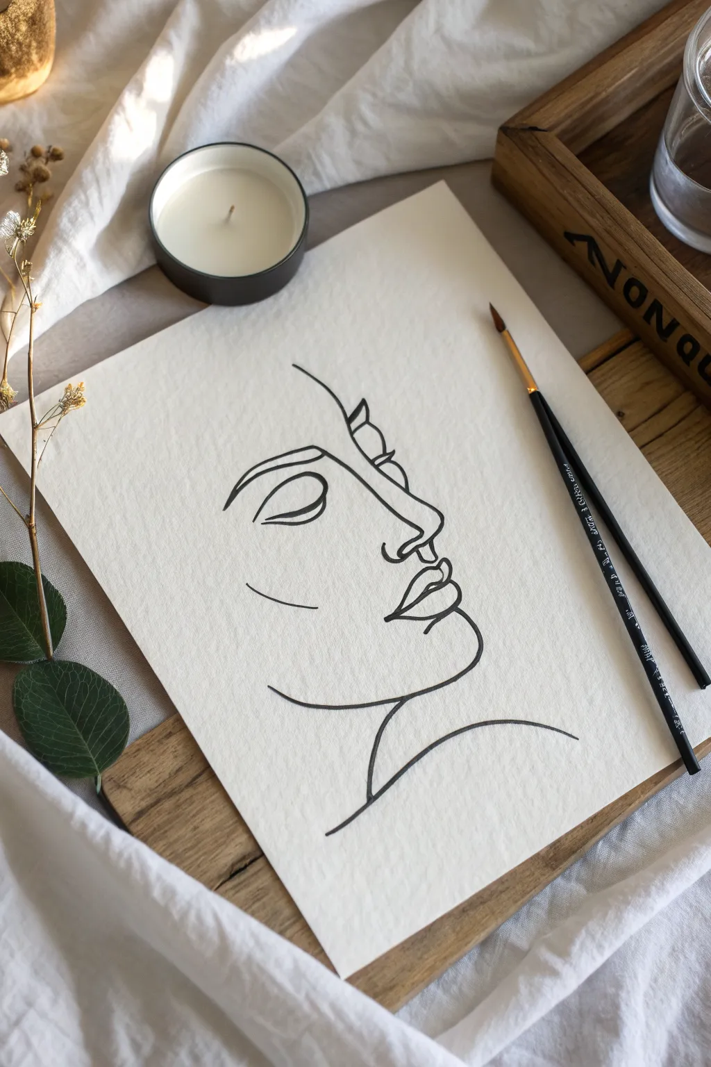
This elegant project captures the essence of a tranquil face using the fluid, unbroken style of continuous line art. The result is a sophisticated, minimalist piece that relies on confident curves and negative space to create form.
Step-by-Step Guide
Materials
- High-quality watercolor paper or mixed media paper (heavyweight, slight texture)
- Black ink brush pen or fine liner (size 05 or 08)
- Pencil (HB or 2H for sketching)
- Kneaded eraser
- Small round brush (size 2-4) and black India ink (optional alternative to pen)
- Drafting tape or masking tape (optional)
Step 1: Preparation and Sketching
-
Surface Setup:
Begin by securing your paper to a flat surface with a bit of drafting tape if you want to prevent it from shifting while you work. -
Visualize the Flow:
Before putting pencil to paper, look at the reference image and trace the path with your finger in the air. Notice clear starting points, like the top of the forehead or the neck line. -
Light Skeleton Sketch:
Using your HB pencil, very lightly sketch a loose oval shape to determine the overall size and placement of the face on the page. Keep this faint so it’s easy to erase later. -
Mapping Key Features:
Mark small, faint dots where the nose tip, the lips, and the chin will fall. This acts as a constellation map to guide your continuous line. -
Refining the Profile:
Lightly sketch the actual profile curve, connecting your dots. Don’t worry about the continuous nature yet; just get the proportions of the nose and lips correct. -
Planning the Eye:
Sketch the closed eye shape. In this style, the eyebrow often connects directly to the nose bridge, which is a crucial transition point.
Step 2: Inking the Continuous Line
-
Ink Consistency Check:
If using a dip brush and ink, I always test the flow on a scrap paper first to ensure the line isn’t too dry or dripping wet. -
Starting the Forehead:
Begin your final line near the top center of the forehead. Draw a smooth curve moving downward and slightly left toward the eyebrow ridge. -
Eyebrow to Nose Bridge:
Curve outward to form the eyebrow arch, then bring the line sharply down and inward to start the bridge of the nose. -
Defining the Nose:
Extend the line down to create the nose length, looping around the tip to suggest the nostril shape without lifting your pen. -
Creating the Philtrum:
From the nostril base, draw a short, gentle curve downward to the center of the upper lip. -
Upper Lip Contour:
Trace the shape of the upper lip, dipping down in the center and curving back up for the corner of the mouth. -
Lower Lip and Chin:
Loop back underneath to form the full lower lip, then extend that line downward to carve out the roundness of the chin. -
Jawline to Neck:
Continue the line from the chin, sweeping upward and back to define the jawline, stopping before you reach where an ear would be. -
The Shoulder Line:
Draw the neck line starting from the jaw/chin area (or a separate line if breaking continuity for style), sweeping down into a graceful shoulder curve. -
Adding the Eye Detail:
Finally, add the closed eyelid. Start with the lash line, curving gently, and add a second line above it for the crease. This can be separate from the main profile line for clarity. -
cheekbone Accent:
Add the small, floating curved line on the cheek area to suggest the cheekbone structure and add dimension to the negative space.
Confident Strokes
Don’t correct mistakes! In continuous line art, a wobble adds character. If your hand shakes, keep moving; stopping creates blotches.
Step 3: Final Touches
-
Drying Time:
Allow the ink to dry completely. If you used a brush and India ink, give it at least 15 minutes to prevent smearing. -
Clean Up:
Gently erase your pencil guides using the kneaded eraser. Dab rather than rub if you are worried about lifting the ink. -
Line Weight Variation:
Review your drawing. If you want more depth, carefully re-trace parts of the line (like under the chin or the lash line) to thicken them slightly.
Add a Splash
Once the black ink is 100% dry, paint a loose, abstract shape of watercolor (like blush pink or beige) behind the face.
Now you have a striking, modern piece of art that looks effortless and chic on any wall
Easy Stippled Shapes
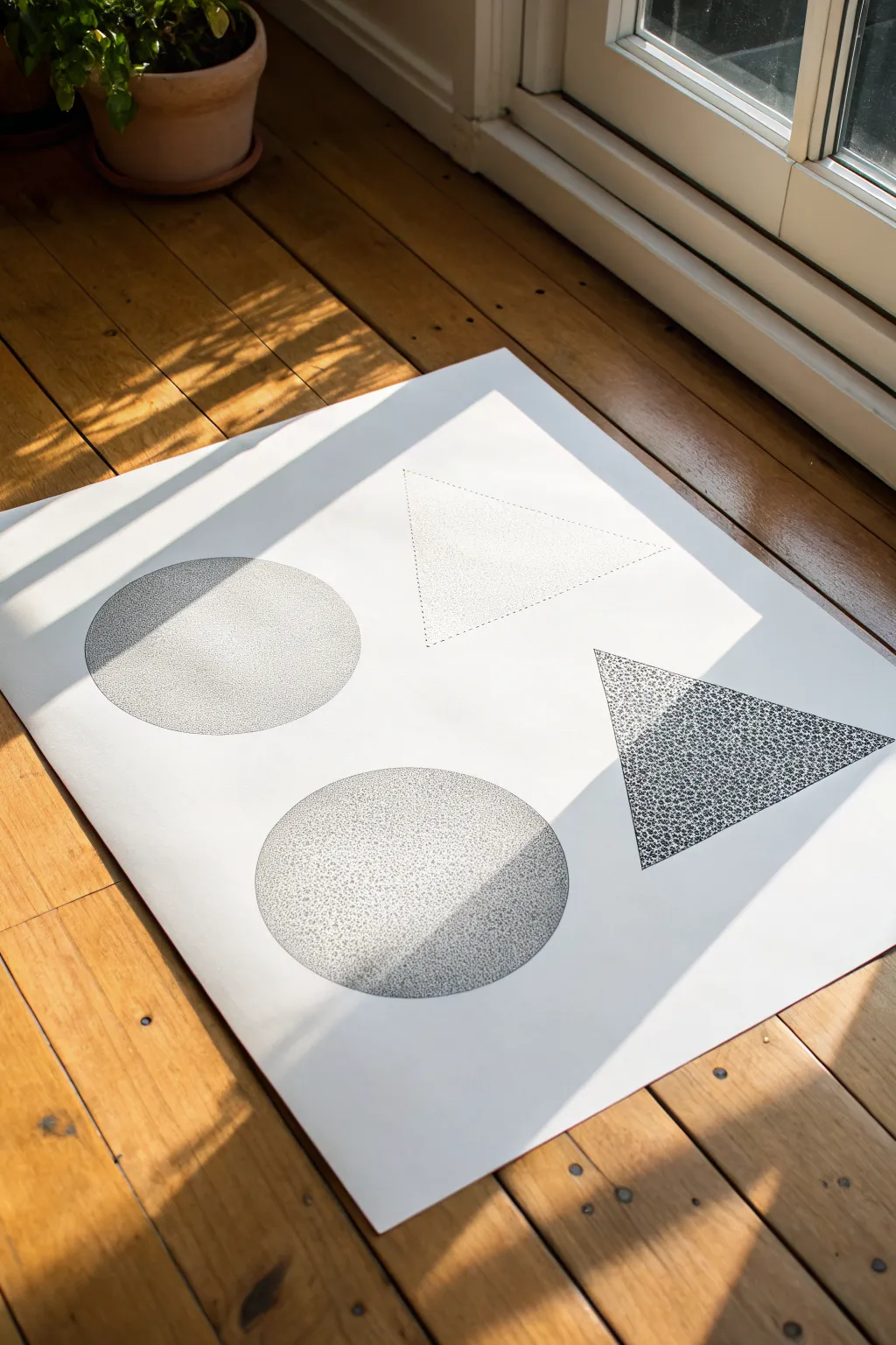
This project explores the meditative art of stippling, using thousands of tiny ink dots to build up geometric forms on a large scale. The result is a striking, minimalist composition where shadows and depth emerge purely from the density of black ink against crisp white paper.
How-To Guide
Materials
- Large sheet of high-quality drawing paper (A2 or similar size)
- Fine liner pens (sizes 0.1, 0.3, and 0.5)
- Pencil (HB or 2H)
- Large circular object or compass (for tracing)
- Ruler
- Eraser
Step 1: Drafting the Shapes
-
Plan your layout:
Begin by laying your large paper on a flat surface. Visualize an invisible grid dividing the paper into four quadrants to ensure your shapes will be evenly spaced. -
Draw the circles:
in the left two quadrants, use a large circular object (like a dinner plate or mixing bowl) or a compass to lightly trace two identical circles with your pencil. Keep the lines very faint. -
Draw the triangles:
In the right two quadrants, use your ruler to sketch two equilateral triangles. Orient them so they point in different directions—perhaps one pointing right and one pointing left—to create dynamic tension. -
Check the balance:
Step back and look at your composition. The shapes should float comfortably with generous white space around them. I find this negative space is just as important as the inked areas.
Wrist Relief
Stippling is repetitive! Keep your hand loose and tap from the wrist, not the elbow. Take frequent breaks to stretch your fingers to avoid cramping and keep your dot shape consistent.
Step 2: Stippling the Circles
-
Establish the outline:
Start with the top-left circle. Using a 0.3 pen, apply dots along the pencil line to define the edge. Don’t trace a solid line; let a row of close dots create the boundary. -
Create the gradient:
Decide on a light source direction (for example, coming from the top right). Begin placing dots densely on the side opposite the light source to create a shadow. -
Fade to light:
As you move toward the ‘lit’ side of the circle, space your dots further apart. The transition should be gradual, moving from a dark cluster to sparse speckles. -
Repeat for the second circle:
Move to the bottom-left circle. Repeat the process but vary the density slightly to give it a unique texture compared to the first one.
Color Pop
Once the black ink is dry, layer a second set of stippling using a single bright color, like neon pink or electric blue, over just one shape to create a vibrating visual effect.
Step 3: Stippling the Triangles
-
Define the top triangle:
For the top-right triangle, try a lighter touch. Use your finest 0.1 pen to outline the shape with widely spaced dots, making the form feel airy and almost transparent. -
Fill gently:
Fill the interior of this top triangle with a consistent, low-density stipple. Keep the spacing uniform so the shape looks flat rather than spherical. -
Anchor the bottom triangle:
For the bottom-right triangle, switch to a thicker 0.5 pen. Pack the dots tightly, especially near the corners, to create a heavier, darker visual weight. -
Add texture variation:
Instead of a simple gradient, try clustering small groups of dots together inside this darker triangle to mimic organic textures like stone or moss.
Step 4: Refinement and Cleanup
-
Evaluate contrast:
Stand up and view the artwork from a distance. identify areas where the shapes might need more definition and add dots to darken shadows as needed. -
Soften edges:
If any edges look too harsh, add a few stray dots just outside the boundary line to soften the transition into the white paper. -
Dry thoroughly:
Wait at least 30 minutes to ensure the ink is completely dry. Stippling can deposit wet pools of ink that smear easily. -
Erase guidelines:
Gently erase your original pencil lines. Be careful not to rub too hard over the inked areas, as this can sometimes fade the black pigment.
Now you have a stunning piece of modern geometric art ready to be framed or displayed on the floor for a casual studio vibe
Split Circle: Day and Night

This minimalist black-and-white illustration captures the duality of the sky on a beautiful piece of deckle-edged paper. The design features a cheerful line-art sun balanced by a stippled crescent moon, separated by a clean diagonal divider.
Detailed Instructions
Materials
- Heavyweight drawing paper or watercolor paper (cream/off-white)
- Black fine liner pens (sizes 05 and 01)
- Ruler
- Compass or circle template
- Pencil
- Eraser
Step 1: Preparation and Layout
-
Prepare the paper edge:
If your paper has straight machine-cut edges, you can create a faux deckle edge for that handmade look. I like to carefully tear the edges against a ruler or just freehand rip strips off the sides to give it a soft, fibrous border. -
Find the center:
Lightly mark the approximate center of your paper with a pencil to ensure your main design feels balanced. -
Draw the diagonal divide:
Place your ruler diagonally across the paper, angling from the bottom left to the top right. Draw a dashed line using your pencil to mark the separation between day and night.
Steadier Circles
If you struggle with freehand circles, trace a roll of tape or a gluestick cap. This guarantees a perfect shape without poking a compass hole in your paper.
Step 2: Drafting the Sun
-
Sketch the sun’s circle:
Using a compass or a small round object (like a jar lid), sketch a circle on the upper left side of the diagonal line. Keep the pressure light so it’s easy to erase later. -
Add the inner rim:
Draw a slightly smaller circle inside the first one to create a rim for the sun’s face. -
Sketch the face:
In the center of the inner circle, sketch two closed, curved eyelids with small lashes. Add a small ‘u’ shape for the nose and a wider curve for the smile. -
Draft the rays:
Pencil in the rays radiating outward. Alternate between longer and shorter lines to create a dynamic burst effect.
Step 3: Drafting the Moon
-
Outline the crescent:
On the lower right side of the diagonal, sketch a large ‘C’ shape to form the outer edge of the moon. Draw a smaller inner curve to complete the crescent shape. -
Position the stars:
Lightly sketch three five-pointed stars to the right of the moon. Vary their sizes slightly for visual interest.
Gold Leaf Accent
For a magical twist, use liquid gold leaf or a metallic gold pen to fill in the sun’s rays or the stars. The shimmer looks incredible against the matte black ink.
Step 4: Inking the Sun
-
Ink the dashed line:
Switch to your thicker black pen (size 05). Trace over the diagonal pencil line, creating distinct, evenly spaced dashes. -
Line the sun circles:
Carefully trace the two concentric circles of the sun. Try to keep your hand steady for a smooth continuous line. -
Detail the face:
Ink the sleeping eyes, nose, and mouth. Use swift, confident strokes to keep the expression looking relaxed. -
Ink the rays:
Go over the sun’s rays. You can thicken the base of each ray slightly where it touches the circle for a bolder look.
Step 5: Inking and Stippling the Night
-
Ink the moon and stars:
Outline the crescent moon shape and the three stars with your 05 pen. -
Fill the stars:
You can leave the stars hollow or fill them in solid black depending on your preference. In the reference, they are solid black silhouettes. -
Start stippling the moon:
Switch to a finer pen (size 01) for the shading inside the moon. Begin adding small dots near the inner curve of the crescent. -
Build the density:
Add more dots, clustering them densely near the points and the outer edge create a gradient effect. Leave some small circular areas white to represent craters or texture. -
Add background stars:
Draw tiny four-pointed stars or simple distinct dots floating near the crescent moon to fill the negative space. -
Final clean up:
Once the ink is completely dry (give it a few minutes to avoid smearing), gently erase all your underlying pencil sketches.
Now you have a charming piece of celestial art ready to display or gift to a friend
Whimsical Object Mashups
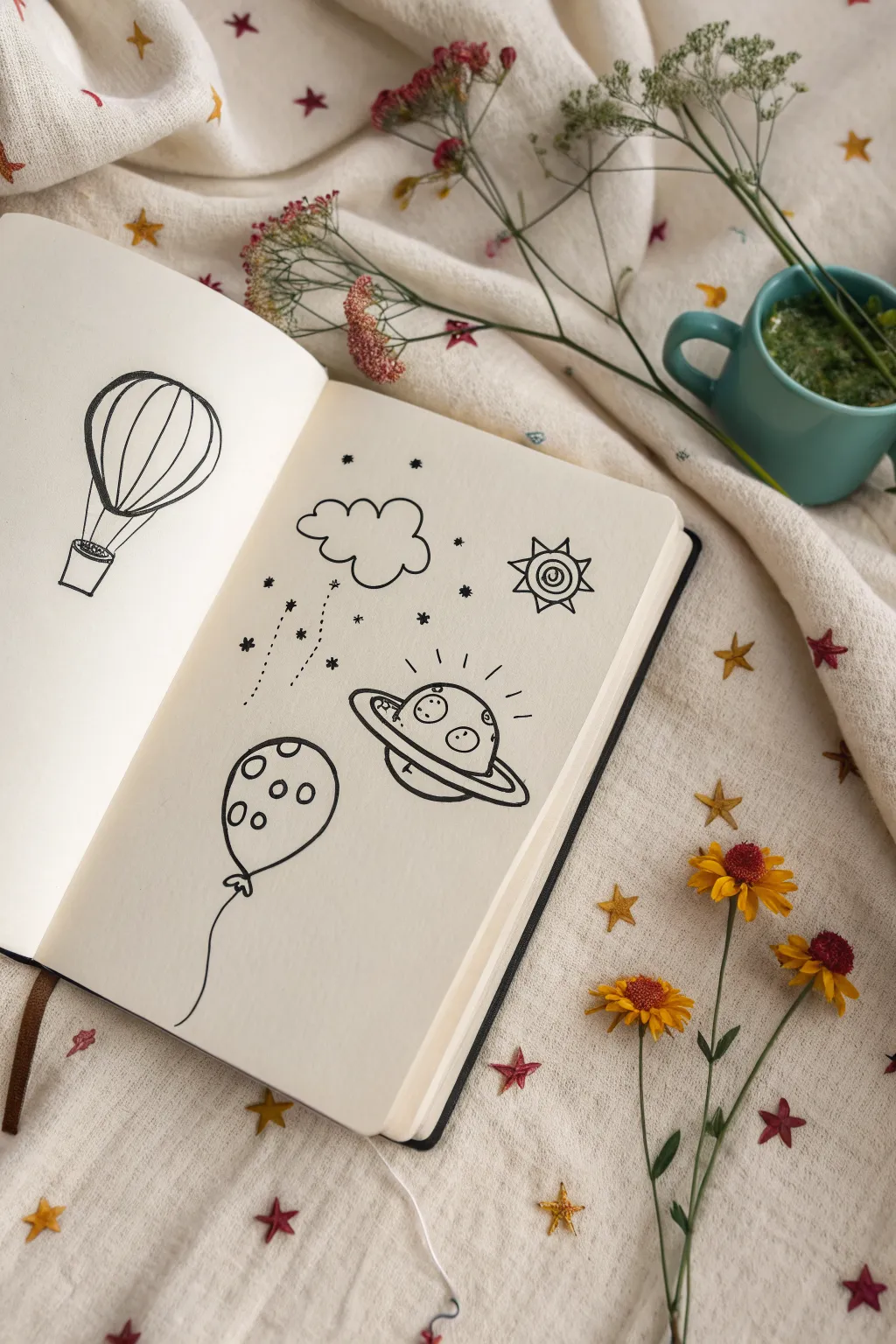
This charming sketchbook spread features a collection of playful, celestial-themed doodles drawn in bold black ink. From a classic hot air balloon to a friendly flying saucer, these simple line drawings are perfect for filling blank pages with imagination.
Step-by-Step
Materials
- Sketchbook or drawing paper (smooth surface works best)
- Graphite pencil (HB or H)
- Eraser
- Black drawing pen (fineliner, size 0.5mm or 0.8mm)
- Ruler (optional, for spacing)
Step 1: Left Page: The Hot Air Balloon
-
Outline the balloon shape:
Start by lightly sketching a large, inverted teardrop shape with your pencil. The top should be round and full, tapering down towards a narrower bottom. -
Add the basket:
Below the tapered end of the balloon, sketch a small rectangle-like shape for the basket. Connect the basket to the balloon with two short, straight lines on either side. -
Draw the segments:
Draw vertical curved lines inside the balloon shape to create the segments. Start with a central vertical line, then add curved lines mirroring the outer shape on both sides. I find drawing from top to bottom helps keep the curves smooth. -
Ink the main shape:
Go over your balloon outline with the black pen. Use confident, continuous strokes for the outer edge. For the basket, you can add a little texture or simply outline the box. -
Ink the details:
Trace over the internal segment lines. Don’t worry if they aren’t perfectly symmetrical; a little wobble adds character.
Ink Confidence
Draw with your arm, not just your wrist, for smoother long lines on the balloon. If a line goes astray, thicken it slightly to hide the wobble.
Step 2: Right Page: Celestial Playground
-
Sketch the cloud:
Near the top left of the page, pencil in a fluffy cloud shape using a series of connected semi-circles. Keep the bottom edge mostly flat but bumpy. -
Position the sun:
To the right of the cloud, sketch a small circle for the sun. Add triangles around the perimeter for rays, and draw a smaller circle inside for the face. -
Draft the UFO:
In the center of the page, draw a flattened oval (ellipse) for the ring of the planet or UFO. Add a dome shape on top for the cockpit and a shallow curve underneath for the hull. -
Sketch the spotted balloon:
Towards the bottom left, draw an oval shape for a regular balloon. Add a small knotted triangle at the bottom and a long, wavy string trailing downward. -
Ink the cloud and rain:
Trace your cloud with the pen. Instead of normal rain, draw three vertical dotted lines falling from the cloud, and finish each line with a tiny star or asterisk shape. -
Ink the sun character:
Trace the sun’s circle and rays. Inside the face circle, draw a spiral or concentric circles for the eye/cheek detail to match the whimsical style. -
Ink the UFO:
Outline the UFO with bold lines. Draw two thick lines for the ring to give it dimension. Inside the dome, add three small circles for windows or alien eyes. Add short dash lines radiating from the top to show movement. -
Ink the balloon:
Outline the balloon shape and the string. Fill the inside of the balloon with various small circles to create a polka-dot pattern. -
Add connecting elements:
Fill the empty spaces between your main drawings with tiny stars, dots, and asterisks. This connects the separate elements into a cohesive scene. -
Erase and refine:
Wait a few moments for the ink to dry completely to avoid smudging. Gently accept the pencil sketches with your eraser to reveal the clean, black line art.
Smudge Prevention
If you’re left-handed, place a scrap piece of paper under your hand as you draw to prevent dragging wet ink across the page.
Now you have a playful page of doodles ready to be colored or enjoyed as minimalist art

Have a question or want to share your own experience? I'd love to hear from you in the comments below!