When I want a painting that actually gets finished, I start with a simple drawing that creates clear little “containers” for color. These drawing to paint ideas are all about easy outlines first, then the satisfying part: filling, blending, and playing with paint.
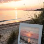
Moon Over an Ocean Horizon
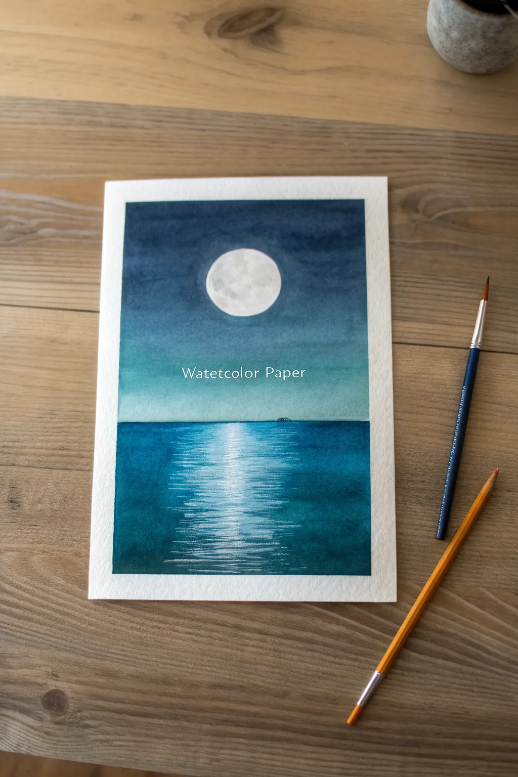
Capture the calm stillness of a full moon reflecting on the ocean with this beginner-friendly watercolor tutorial. Using gradient washes and careful lifting techniques, you will create a luminous night scene that glows with soft light.
Detailed Instructions
Materials
- Cold press watercolor paper (taped down)
- Watercolor paints (Indigo, Phthalo Blue, Prussian Blue, Turquoise)
- White gouache or white gel pen
- Round brushes (size 8 or 10 for washes, size 2 or 4 for details)
- Masking fluid (optional) or masking tape
- Circular object (like a coin or lid) for tracing
- Pencil and eraser
- Two jars of water
- Paper towels
Step 1: Preparing the Moon and Sky
-
Define the horizon:
Start by lightly sketching a horizontal line across the lower third of your paper to separate the sky from the ocean. Use a ruler if you want it perfectly straight. -
Trace the moon:
Position your circular object in the center of the sky area and lightly trace a circle. Keep the pencil lines faint so they disappear under the paint later. -
Mask the moon:
Carefully apply masking fluid inside the circle to preserve the white paper. If you don’t have fluid, you can paint carefully around it, but masking makes the wash much easier. Let it dry completely. -
Wet the sky:
With a large, clean brush, wet the entire sky area with clear water, stopping exactly at the horizon line. You want an even sheen, not puddles. -
Start the gradient:
Load your brush with a deep Indigo or Prussian Blue. Start painting at the very top of the paper, applying the darkest pigment there. -
Blend downward:
As you move down toward the horizon, rinse your brush slightly to dilute the pigment. Introduce a touch of Turquoise or a lighter blue as you approach the bottom of the sky for a glowing effect. -
Smooth the transition:
Use a clean, damp brush to smooth out any harsh lines in the sky gradient, ensuring the color is lightest right above the horizon line.
Step 2: Painting the Ocean
-
Let the sky dry:
Wait until the sky is completely bone-dry. If you paint the ocean too soon, the colors will bleed into the sky. -
Establish the horizon line:
Using a deep blue mixed with turquoise, paint a straight, crisp line right against the bottom of the sky. This defines the edge of the water. -
Create the reflection path:
While painting the water, leave a vertical column of white paper directly under the moon. This doesn’t need to be perfect; rough edges look like ripples. -
Fill the ocean sides:
Paint the water on either side of the reflection path using horizontal strokes. Make the color darker at the bottom corners and slightly lighter near the horizon. -
Softening the reflection edges:
While the blue paint is still wet, take a damp (not dripping) brush and gently drag some of the blue pigment into the white reflection area using horizontal strokes. This creates a soft, rippled transition. -
Add a distant island:
Once the horizon is semi-dry, use a small brush with concentrated Indigo to paint a tiny, low silhouette of an island on the horizon line.
Tape It Down
Use painter’s tape or washi tape on all four edges of your paper before starting. This creates that crisp white border and prevents buckling.
Step 3: Final Details and Highlights
-
Remove the mask:
Once everything is totally dry, gently rub off the masking fluid from the moon to reveal the clean white paper underneath. -
Texture the moon:
Mix a very watery, pale gray. Dab it onto the moon in random patches to create craters and texture, leaving some areas bright white. -
Intensify the reflection:
Using white gouache or a white gel pen, draw thin, horizontal lines across the reflection path on the water. Group them tighter near the horizon and space them out as they come closer to the viewer. -
Layering brightness:
Add a few very crisp white lines on top of the blue water right next to the main reflection to show light catching the wave crests. -
Final assessment:
Step back and check your values. If the sky isn’t dark enough at the top, you can carefully glaze another layer of Indigo over it, avoiding the moon area.
Bloom Prevention
If you see ‘cauliflower’ blooms forming in the sky, it means you added water to semi-dry paint. Wait for it to dry fully, then glaze over to fix it.
Now you have a stunning, atmospheric seascape ready to frame or give as a card


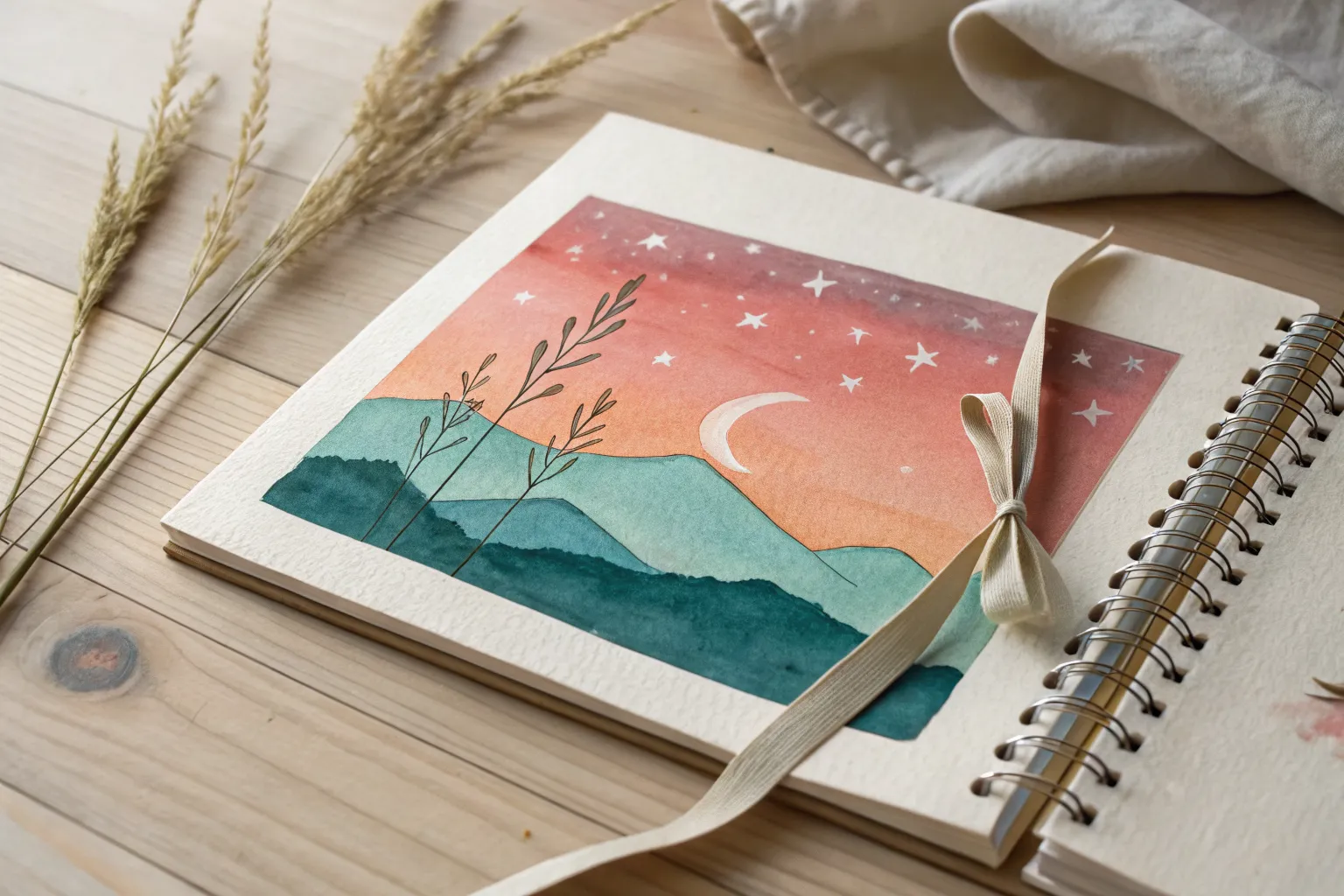
Layered Mountain Range Shapes
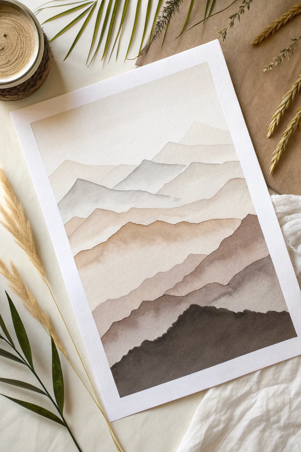
Capture the serene beauty of distant peaks fading into the mist with this layered watercolor study. By mastering the wet-on-dry technique and progressively darkening your values, you’ll create a stunning sense of atmospheric depth in neutral tones.
Step-by-Step Tutorial
Materials
- Cold press watercolor paper (300 gsm)
- Watercolor paints (Payne’s Grey, Burnt Umber, Yellow Ochre, Sepia)
- Round brushes (Size 4, 8, and 12)
- Jar of clean water
- Paper towels
- Painter’s tape
- Pencil (HB or lighter)
- Palette or white plate for mixing
Step 1: Preparation and Sketching
-
Secure the paper:
Tape down all four edges of your watercolor paper to a board or table. This creates that clean white border shown in the image and prevents the paper from buckling when wet. -
Lightly map the ridges:
Using a very light hand, sketch wavy, irregular lines horizontally across the paper. Create about 6-8 distinct ridges, ensuring they overlap slightly. The top ridges should be simpler, while the bottom ones can be more jagged.
Fixing “Cauliflowers”
If you see blooming textures (cauliflowers) where wet paint hit damp paper, wait for it to dry. Then, use a damp stiff brush to gently scrub and smooth the edge.
Step 2: Painting the Background Layers
-
Mix the lightest wash:
Prepare a very watery mix of Yellow Ochre with a tiny touch of Paynes Grey. It should be barely tinted water—almost transparent. -
Paint the sky:
Apply this pale wash to the sky area and the very first mountain peak. The goal is a seamless, soft color that mimics hazy sunlight. -
Let it dry completely:
This is the most critical step. Wait until the paper is bone dry. If it feels cool to the touch, it’s still damp. -
Second layer mix:
Add a little more pigment to your existing puddle. You want a color that is just slightly darker than the sky. -
Define the first ridge:
Using a size 12 brush, paint the shape of the second mountain layer. Start at the pencil line for a sharp edge, then pull the color down, fading it out slightly with water as you reach the bottom of that section.
Step 3: Building the Middle Ground
-
Introduce cooler tones:
For the next layer down, mix a bit more Paynes Grey into your wash to create a cooler, blue-grey tint. This helps suggest distance. -
Create the grey peak:
Paint the third mountain shape. Notice how the peaks are becoming more defined. Keep the top edge crisp against the dry layer above it. -
Warm up the palette:
For the middle layers, shift back to warm tones. Mix Burnt Umber into your puddle to get a soft, sandy brown. -
Paint the sandy ridges:
Apply this warm brown to the next two layers. I find this creates a nice contrast against the cooler grey peak above. Let the paint settle naturally to create subtle texture. -
Wait for drying:
Ensure the previous layers are fully dry before proceeding. Patience prevents the colors from bleeding into one another.
Mist Effect
To add localized fog, lift pigment from the bottom of a specific mountain layer with a clean, thirsty brush while the paint is still damp but not flowing.
Step 4: The Foreground and Details
-
Darken the mix significantly:
Prepare a mix of Sepia and Paynes Grey. This layer should be much more pigmented and opaque than the previous ones. -
Paint the lower ridges:
Use a size 8 brush to paint the second-to-last layer. Carefully follow the contour of the ridge line. The contrast here creates the illusion of shadow. -
Mix the darkest value:
For the final foreground mountain, use almost pure pigment—Sepia mixed with a tiny drop of black or deeply concentrated Paynes Grey. -
Detail the foreground:
Use your size 4 brush to paint the jagged, uneven top edge of the closest mountain. Use the belly of the brush to fill in the rest of the shape with solid, dark color. -
Refine edges:
Look closely at your dried layers. If you see any uneven watermarks that look messy, you can lift them slightly with a clean, damp brush, or leave them for texture. -
Reveal the border:
Once the final dark layer is completely dry, slowly peel off the painter’s tape at a 45-degree angle to reveal your crisp white edges.
Frame your finished landscape or gift it to bring a sense of calm to someone’s day


City Skyline at Dusk
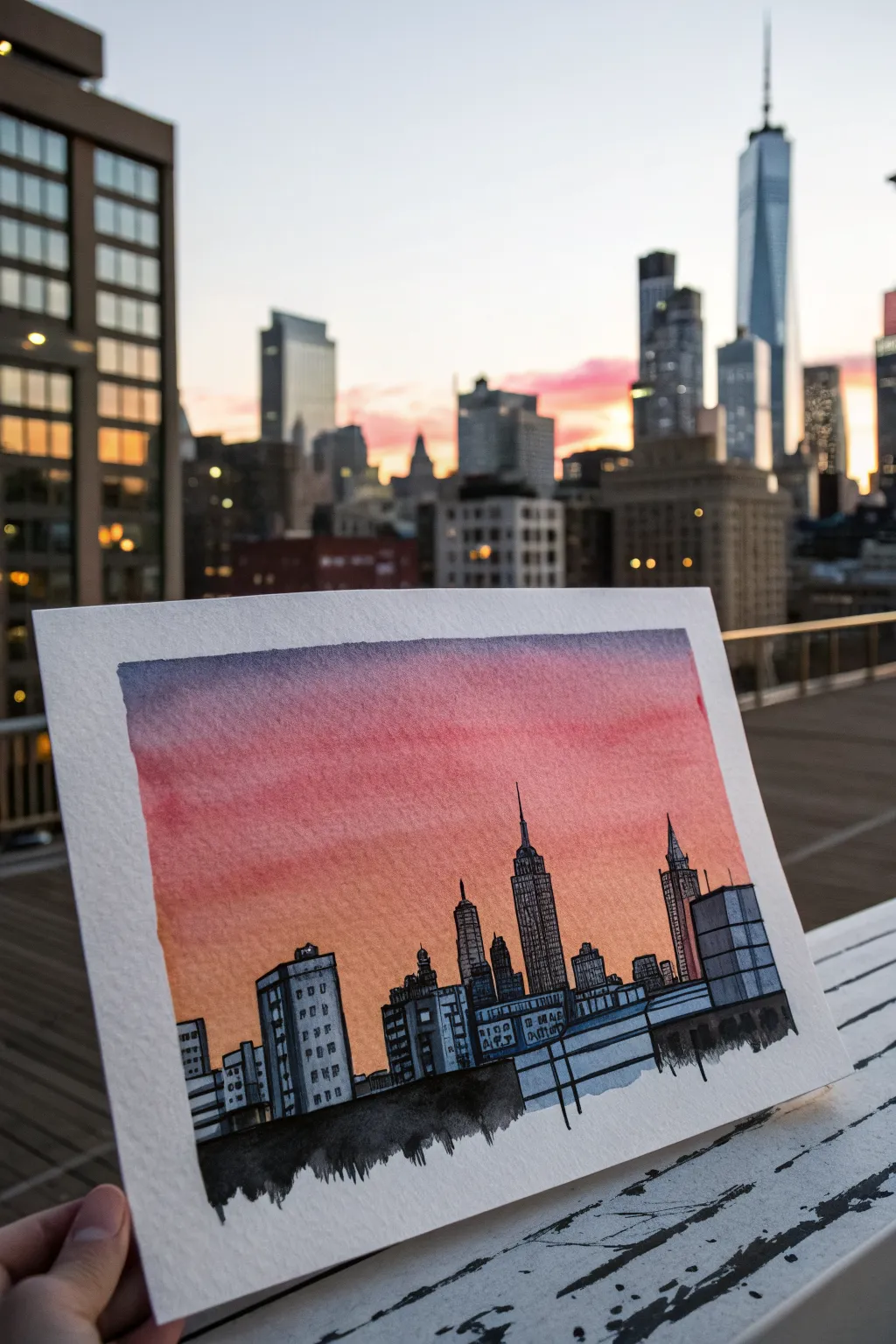
Capture the magic of golden hour with this mixed-media city skyline. By combining a wet-on-wet watercolor wash for the sky with crisp black ink lines for the buildings, you’ll create a striking contrast between soft atmosphere and rigid architecture.
How-To Guide
Materials
- Cold press watercolor paper (approx. 5×7 inches)
- Watercolor paints (Indigo, Alizarin Crimson, Cadmium Orange)
- Flat wash brush (3/4 inch)
- Round brush (size 4 or 6)
- Waterproof fineliner pens (0.3mm and 0.5mm)
- Pencil and eraser
- Ruler
- Masking tape
- India ink or black watercolor (optional for foreground)
Step 1: Preparation & Sky Wash
-
Tape the edges:
Begin by taping down all four edges of your watercolor paper to a board or hard surface. This creates a clean white border and keeps the paper flat while it absorbs water. -
Wet the paper:
Using your large flat brush and clean water, apply a generous coat of water to the entire upper two-thirds of the paper where the sky will be. -
Paint the top layer:
Load your brush with a watery mix of Indigo or a dark blue-violet. Sweep it across the very top edge, letting the color bleed downward naturally. -
Add the middle gradient:
Quickly rinse your brush and pick up Alizarin Crimson. Apply this horizontally below the blue, allowing the wet edges to touch and merge softly without over-mixing. -
Finish the horizon:
Complete the sky by adding a band of Cadmium Orange near the bottom of your wet area. Ensure this transition is seamless for that glowing dusk effect. -
Dry completely:
Let the paper dry flat until it is cool to the touch but no longer damp. This is crucial before moving to the sketching phase.
Pro Tip
To get a seamless sunset gradient, tilt your board slightly. Gravity will help pull the wet paint downward, blending the colors naturally without brushstrokes.
Step 2: Sketching the Skyline
-
Establish the horizon line:
Lightly draw a horizontal line across the lower third of the paper with a pencil to serve as the base for your buildings. -
Outline the skyscrapers:
Sketch simple rectangular blocks for the buildings. Vary the heights and widths to create visual interest. I like to place the tallest tower slightly off-center for a balanced composition. -
Add architectural details:
Lightly sketch key features like spires, stepped roofs, or water towers on top of your rectangular blocks.
Level Up
Use a white gel pen to add tiny dots of city lights on the darkened buildings or a few faint stars in the indigo portion of the sky.
Step 3: Inking & Coloring Buildings
-
Outline with ink:
Using a 0.5mm waterproof fineliner, trace over your pencil lines to define the outer edges of the buildings. Use a ruler if a very crisp look is desired, or freehand it for character. -
Paint the buildings:
Mix a very watery, pale blue-grey using your Indigo paint. Fill in the building shapes, leaving them quite transparent so they don’t look heavy. -
Add windows:
Once the grey wash is dry, use a smaller 0.3mm pen or the tip of your brush to add rows of small dashes or squares for windows. Keep them loose and suggest detail rather than drawing every single pane. -
Detail the spires:
Use your fine pen to add vertical line textures and intricate needle points to the taller skyscrapers, mimicking the Empire State or Chrysler building styles. -
Darken the foreground:
Mix a dense black watercolor or use India ink to paint a solid, jagged silhouette along the very bottom edge. This grounds the image and hides the straight horizon line. -
Dry brush texture:
While dragging the black paint across the bottom, use a slightly dry brush to create a rough, textured edge that fades downward. -
Final reveal:
Wait for everything to be 100% dry, then carefully peel away the masking tape at a 45-degree angle to reveal your crisp white border.
Frame your mini-masterpiece or hold it up against your own view to compare the mood

Single Blossom With Bold Outline
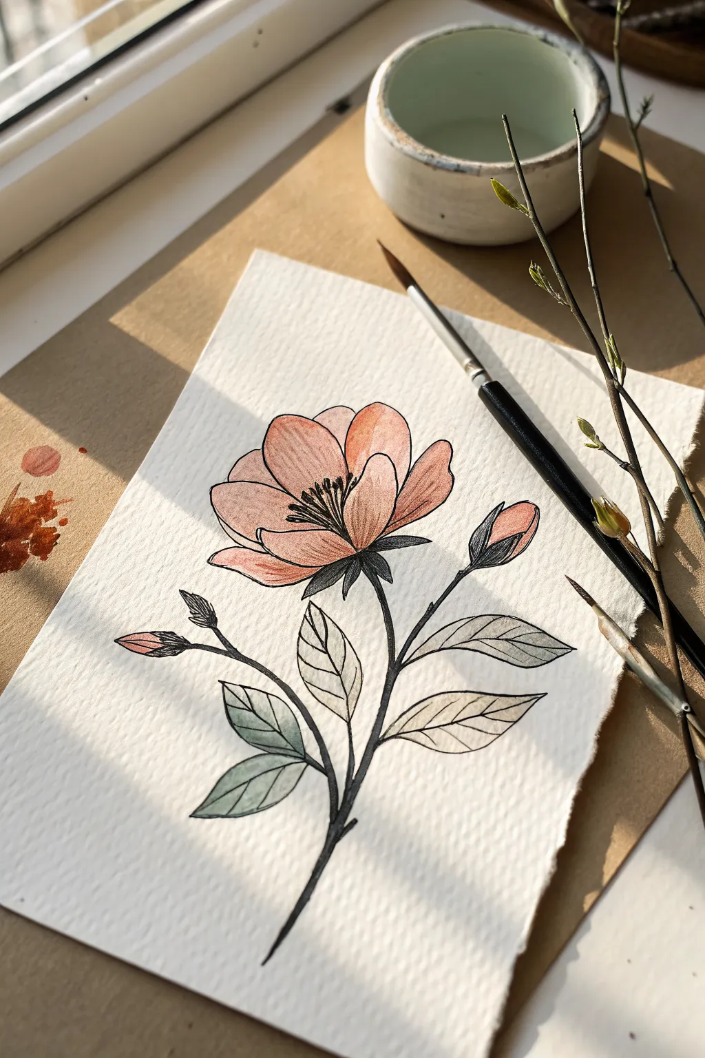
Capture the delicate warmth of spring with this elegant single-blossom study. Combining soft watercolor washes with crisp ink outlines creates a beautiful illustrative style that looks striking on textured watercolor paper.
Detailed Instructions
Materials
- Cold press watercolor paper (300 gsm)
- Fine liner pen (black, water-resistant, size 0.3 or 0.5)
- Watercolor paints (Peach, Coral, Sap Green, Burnt Umber)
- Round watercolor brush (size 6)
- Pencil (HB or 2H)
- Kneaded eraser
- Clean water and paper towel
Step 1: Sketching the Composition
-
Map out the stem:
Begin with a gentle curve for the main stem, starting from the bottom third and sweeping upward toward the center of the page. Add two smaller offshoot branches on either side for balance. -
Sketch the main bloom:
At the top of your main stem, draw a loose oval shape to guide the flower head. Break this down into overlapping petal shapes, ensuring the petals curve inward slightly to create a cupped appearance. -
Add buds and leaves:
Draw small teardrop shapes at the ends of your side branches to form tight buds. Along the lower stem, pencil in serrated leaf shapes, keeping them pointed and arranged in alternating pairs. -
Refine the sketch:
Review your pencil lines. Lightly erase any heavy strokes with a kneaded eraser until you have a faint ‘ghost’ image that won’t show through the paint later.
Loose Bleeds
Don’t try to paint perfectly inside the lines. Letting the watercolor spill slightly outside your intended ink lines adds a charming, illustrative looseness.
Step 2: Adding Color
-
Prepare the peach wash:
Mix a watery blend of Peach and a tiny touch of Coral on your palette. You want a very translucent, light mix for the first layer. -
Paint the petals:
Apply the wash to the flower petals. I like to drop a slightly more concentrated amount of color near the base of the petals and let it bleed outward for a natural gradient. -
Tint the buds:
Use the same peach mixture to paint the tips of the tight side buds, leaving the base of the buds unpainted for now. -
Mix leaf greens:
Clean your brush and mix Sap Green with a little Burnt Umber to create a muted, earthy green. Dilute this well with water. -
Paint foliage:
Fill in the leaf shapes with this muted green wash. While wet, you can touch the edges with a slightly darker green mix to add dimension. -
Deepen the shadows:
Once the first petal layer is dry, mix a slightly stronger Coral tone. Glaze this over the areas where petals overlap to create depth and separation. -
Let it dry completely:
Wait until the paper is bone dry. If the paper feels cool to the touch, it is still damp; patience here prevents the ink from bleeding.
Ink Bleeding?
If your fine liner runs when you paint near it or dampens the paper, verify it is ‘archival’ or ‘waterproof.’ If not, simply do the ink step last after painting.
Step 3: Inking the Details
-
Outline the center:
Using your fine liner pen, draw the stamens in the center of the flower first. Use quick, upward flicking motions to create fine lines topped with small dots. -
Define the stem:
Trace the main stem with a confident, solid line. Thicken the line slightly where the branches join the main stem to suggest strength. -
Outline the petals:
Go over your pencil lines for the petals. Include the internal details and veins on the petals with very fine, broken lines to suggest texture rather than rigid wire. -
Ink the leaves:
Outline the leaves, ensuring you capture the slightly serrated edges. Draw a central vein down each leaf, but avoid drawing every single side vein to keep the look clean. -
Add contrast hatching:
To give the flower volume, add very subtle hatching lines near the center of the bloom where the petals meet the stamens. This darkens the core without using more paint.
Frame your delicate bloom in natural light to really show off the transparent watercolor layers
BRUSH GUIDE
The Right Brush for Every Stroke
From clean lines to bold texture — master brush choice, stroke control, and essential techniques.
Explore the Full Guide
Mushrooms With Patterned Caps
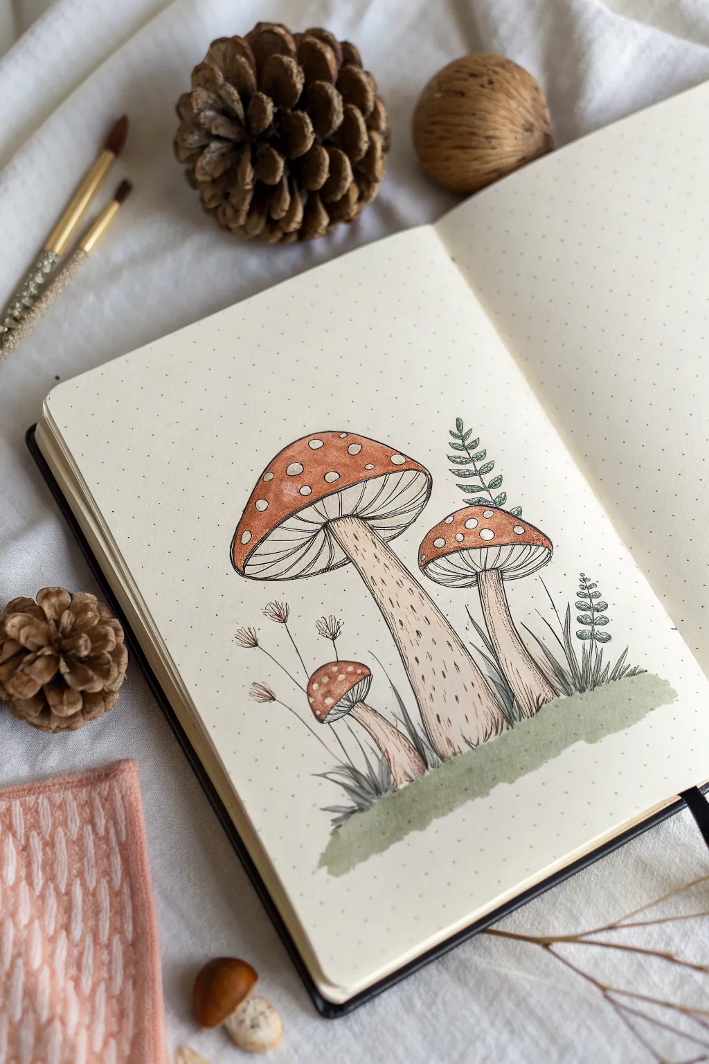
Capture the charm of the forest floor with this delightful illustration featuring three spotted mushrooms nestled in grass. Using a combination of fine pen work and soft watercolor washes, you’ll create a cozy, nature-inspired spread perfect for your bullet journal.
Step-by-Step Tutorial
Materials
- Dotted notebook or sketchbook containing mixed media paper
- Pencil (HB or lighter)
- Eraser
- Fine liner pens (Black, waterproof, sizes 01 and 03)
- Watercolor paints (Burnt Sienna, Sap Green, Yellow Ochre)
- Small round watercolor brush (size 2 or 4)
- White gel pen (optional for highlights)
Step 1: Sketching the Composition
-
Establish the ground line:
Begin by lightly sketching a loose, uneven horizontal line near the bottom of your page to represent the grassy mound where your mushrooms will sit. -
Sketch the largest mushroom:
Draw the largest mushroom first, slightly left of center. Start with a large, curved cap shape like a semi-circle, and extend a thick stem downwards, flaring slightly at the base. -
Add the medium mushroom:
To the right of the large one, sketch the second mushroom. Make its cap slightly smaller and flatter, with a stem that leans just a bit toward the right. -
Place the smallest mushroom:
Tuck the smallest mushroom low on the left side, slightly overlapping the large stem. This one is just a baby, so keep the cap round and button-like. -
Detail the caps and gills:
Inside each cap, draw a curved line parallel to the bottom edge to create the rim. Determine the spots on the caps by drawing random circles of various sizes. -
Add nature elements:
Sketch a few thin, leafy sprigs rising up behind the mushrooms. Add a tall leafy frond on the right and some delicate, thin stems with seed heads on the left.
Step 2: Inking the Outline
-
Outline the main shapes:
Switch to your 03 fine liner. Carefully go over the pencil lines for the mushroom caps and stems. Use a steady hand, but don’t worry if the lines aren’t perfectly smooth; a little wobble adds organic character. -
Draw the gills:
Underneath the caps, use the finer 01 pen to draw lines radiating from the stem connection point out to the rim. These are the gills. -
Define the stem texture:
Use the 01 pen to add short, vertical dashed lines and small dots up and down the stems. This stippling effect gives them a woody, textured appearance. -
Ink the foliage:
Trace your background leaves and grass blades. For the grass at the base, use quick, upward flicking motions to keep the tips sharp and energetic. -
Erase pencil marks:
Wait at least five minutes for the ink to fully dry to prevent smudging. I usually test a small corner first, then gently erase all visible pencil sketches.
Spot Check
To make the white spots on the caps really pop, outline them with your finest pen before painting, or use masking fluid to protect the paper.
Step 3: Adding Color
-
Paint the caps:
Dilute your Burnt Sienna watercolor to a tea-like consistency. Carefully paint around the white circular spots on the caps. Let the color pool slightly at the top edges for natural shading. -
Wash the stems:
For the stems, mix a very watery wash of Yellow Ochre with a tiny touch of brown. Apply it lightly, leaving some white paper showing on the left side of the stems for a highlight. -
Color the ground:
Use Sap Green to paint a horizontal wash across the bottom, grounding the mushrooms. Keep the edges ragged and uneven to mimic an earthen patch. -
Tint the leaves:
With a small brush, add touches of green to the larger leaves on the right. You can leave the delicate seed heads on the left unpainted or give them a faint brown tint. -
Final dry and check:
Allow the paint to dry completely. If the white spots on the caps got painted over by accident, you can reclaim them with a dot from a white gel pen.
Bleed Prevention
If your notebook paper is thin, slip a piece of cardstock behind the page you are working on. This stops ink or watercolor from ghosting onto the next sheet.
Enjoy your cozy little forest scene and try experimenting with different cap colors next time
Koi Fish With Flowing Fins
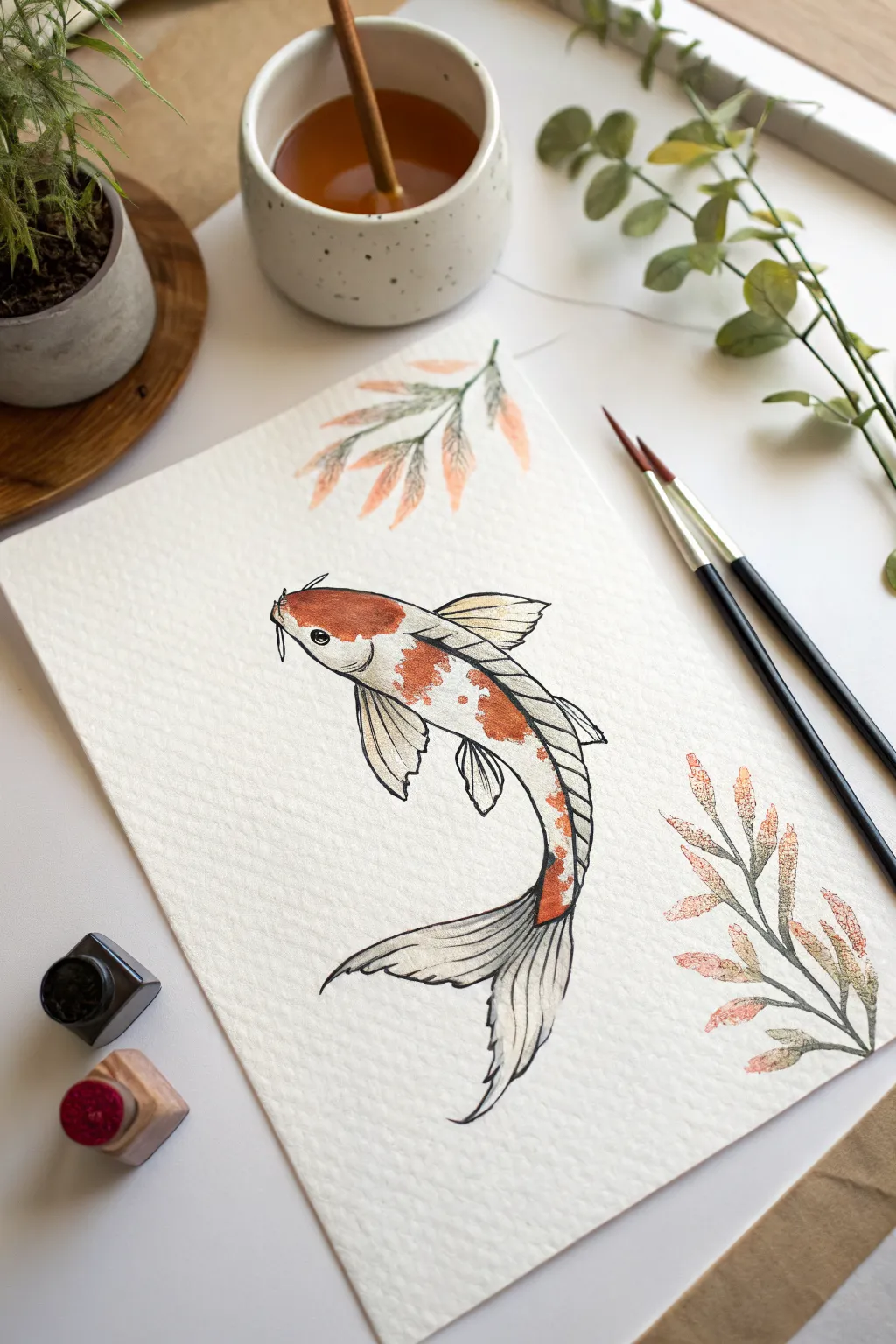
This project captures the graceful movement of a koi fish using a mixed-media approach that combines delicate ink lines with soft watercolor washes. The subtle orange spotting and flowing tail create a sense of underwater serenity perfect for a thoughtful art journal entry.
Detailed Instructions
Materials
- Cold-press watercolor paper (at least 140lb/300gsm)
- Fine liner pen (waterproof, black, size 01 or 03)
- Watercolor paints (Vermilion, Burnt Sienna, and hints of Yellow Ochre)
- Round watercolor brushes (Size 4 for washes, Size 0 for details)
- Pencil (HB or H) and kneaded eraser
- Two jars of water (one clean, one for rinsing)
Step 1: Sketching the Form
-
Establish the curve:
Start with a light pencil gesture line that mimics the curve of a letter ‘S’. This will serve as the spine of your fish and ensures a fluid sense of movement. -
Block in the body:
Draw an elongated oval shape around the top part of your ‘S’ curve for the head and main torso, tapering it significantly as you move toward the tail. -
Add fin structures:
Roughly sketch the pectoral fins (the side fins) extending outward like wings. Then, draw the long, flowing dorsal fin along the back and the sweeping, bifurcated tail fin at the bottom. -
Refine the outline:
Go back over your rough shapes with your pencil to define the actual contour of the fish. Add the small barbels (whiskers) near the mouth and indicate the eye placement.
Step 2: Inking the Lines
-
Outline the body:
Using your waterproof fine liner, carefully trace the outer contour of the fish. Keep your wrist loose to maintain the organic flow of the curves. -
Detail the fins:
Draw the internal lines of the fins. Instead of straight lines, use slightly wavy, broken strokes that radiate from the body outward to suggest the delicate, rippled texture of distinctive koi fins. -
Add scale texture:
Ink the scales on the back, but don’t draw every single one individually. Suggest the texture with small, curved lines, particularly along the spine and near the tail where the body curves. -
Erase pencil marks:
Wait until the ink is completely dry to touch—smearing creates a mess. Once safe, gently erase all underlying graphite guidelines.
Bleeding Ink?
If your black lines bleed when you paint, your pen isn’t fully waterproof. switch to micron pens or wait 24 hours before painting over ink.
Step 3: Watercolor Application
-
Base wash for spots:
Mix a watery version of Vermilion with a touch of Yellow Ochre. Paint irregular patches on the head and back, leaving plenty of white paper visible for the classic koi pattern. -
Deepen the color:
While the first layer is still slightly damp, drop in more concentrated Vermilion or Burnt Sienna into the center of the spots. This wet-on-wet technique creates soft, natural gradients. -
Shadowing the body:
Dilute a tiny amount of black or grey paint heavily with water. Add a very faint shadow along the underside (belly) of the fish to give it volume and roundness. -
painting the fins:
For the fins, use a very pale, watery grey wash. Start near the body and pull the brush outward, lifting off the paper before you reach the tips to keep the edges disappearing into the white.
Make it Metallic
Once the watercolor is dry, trace the outer rim of the orange scales with gold watercolor or a metallic gel pen for a shimmering effect.
Step 4: Botanical Accents
-
Sketch the foliage:
Lightly sketch two simple leafy branches—one at the top and one at the bottom—framing the fish without touching it. -
Ink the stems:
Ink the central stems and the veins of the leaves using your fine liner, keeping the lines thin and delicate. -
Add muted color:
I like to use a ‘dirty brush’ mix here—combine leftover orange on your palette with a bit of green or grey to get a muted, autumnal tone. -
Stipple technique:
Instead of filling the leaves solidly, use the tip of your brush to dab color onto the leaves, creating a loose, textured look. -
Final touches:
Once everything is dry, add a tiny white highlight to the fish’s eye if you painted over it, or darken the pupil with your pen for contrast.
Now you have a serene piece of aquatic art ready to be framed or gifted.

PENCIL GUIDE
Understanding Pencil Grades from H to B
From first sketch to finished drawing — learn pencil grades, line control, and shading techniques.
Explore the Full Guide
Cat on a Branch Silhouette
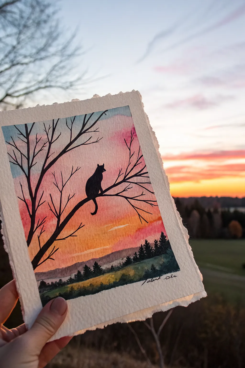
Capture the serene beauty of twilight with this evocative watercolor painting featuring a sleek cat silhouette. Contrasting a vibrant, gradient sky against stark black ink creates a dramatic and atmospheric piece perfect for beginners.
Step-by-Step
Materials
- Cold press watercolor paper (approx. 5×7 inches)
- Watercolor paints (Indigo, Alizarin Crimson, Cadmium Yellow, Sap Green)
- Black waterproof ink or black gouache
- Flat wash brush (3/4 inch)
- Round brushes (size 4 and size 0/detail brush)
- Masking tape or washi tape
- Paper towels
- Jar of clean water
- Pencil and eraser
- Ruler (optional, to create the border)
Step 1: Preparing the Sky Gradient
-
Tape the edges:
Begin by taping down your cold press watercolor paper to a board or table. Create a clean border by measuring about half an inch in from the rough edges; pressing the tape down firmly ensures crisp lines later. -
Wet the paper:
Using your large flat brush and clean water, apply an even coat of water across the entire area inside your taped border. The paper should glisten but not have puddles. -
Apply the yellow horizon:
Load your brush with a watered-down Cadmium Yellow. Paint a horizontal strip across the middle-lower section of the paper where the sun would be setting. -
Add the pink transition:
Clean your brush slightly, then pick up Alizarin Crimson. Paint this directly above the yellow while both are still wet, allowing them to bleed together naturally to create a soft orange transition. -
Paint the upper sky:
Mix a light wash of Indigo or a cool blue. Apply this to the very top of the paper, pulling it down to meet the pink. Let the wet paint merge so there are no hard lines between the blue, pink, and yellow bands. -
Create distant hills:
While the sky is drying (but slightly damp), mix a faint purple-grey using a touch of Indigo and Crimson. Paint a soft, uneven horizon line near the bottom for distant mountains; the dampness will keep them looking far away and hazy. -
Let it dry completely:
This is crucial. Wait until the paper is bone dry and flat before moving to the next steps to prevent the black ink from bleeding into the sky.
Bleeding Lines?
If your black ink creates spiderwebs in the sky, your background wasn’t dry enough. Let it dry longer, or use a less watery medium like an opaque marker or pen for the silhouette.
Step 2: Painting the Foreground
-
Paint the tree line foundation:
Mix a dark green using Sap Green and a little Indigo. With a size 4 round brush, paint a rolling hill shape at the very bottom of the paper, covering the white space below your distant purple mountains. -
Add texture to the grass:
While the green hill is wet, drop in slightly darker pigment near the bottom edge and lighter yellow-green near the top ridge to simulate light hitting the grass. -
Paint the pine trees:
Using a smaller round brush and a very dark green (nearly black), paint small, vertical jagged shapes along the ridge of your green hill to represent a distant forest line. -
Dry the foreground:
Allow this bottom section to dry completely. A hair dryer on a low setting can speed this up if you’re impatient.
Step 3: Adding the Silhouette
-
Sketch the main branch:
Lightly sketch the main tree branch using a pencil. Start from the left side, about halfway up, and curve it downwards and then upwards towards the center. -
Outline the cat:
On the highest point of your sketched branch curve, lightly draw the outline of a sitting cat. Focus on the ears and the curve of the back; keep the shape simple. -
Paint the main branch:
Switch to your waterproof black ink or black gouache and a detail brush. Carefully fill in the main branch, making it thickest at the left edge and tapering as it extends right. -
Add smaller twigs:
From the main branch, paint thin, spindly twigs reaching upward and outward. Use a very light touch with the tip of your smallest brush to get fine lines. -
Fill in the cat:
Carefully fill in your cat sketch with solid black. Make sure the edges are sharp, particularly the ears and the tail hanging down below the branch. -
Add final branches:
Review the composition. Add a few more thin branches crossing in front of or behind the sunset to balance the empty space on the right side. -
Reveal the edges:
Once the black ink is 100% dry, slowly peel away the masking tape at a 45-degree angle to reveal your crisp white border.
Make It Yours
Try tearing the edges of the paper manually before you start painting (using a ruler as a guide) to create the rustic, deckled edge look seen in the reference photo.
Frame your mini masterpiece against a window to see how it complements the real sky outside
Bird on a Wire Line Drawing
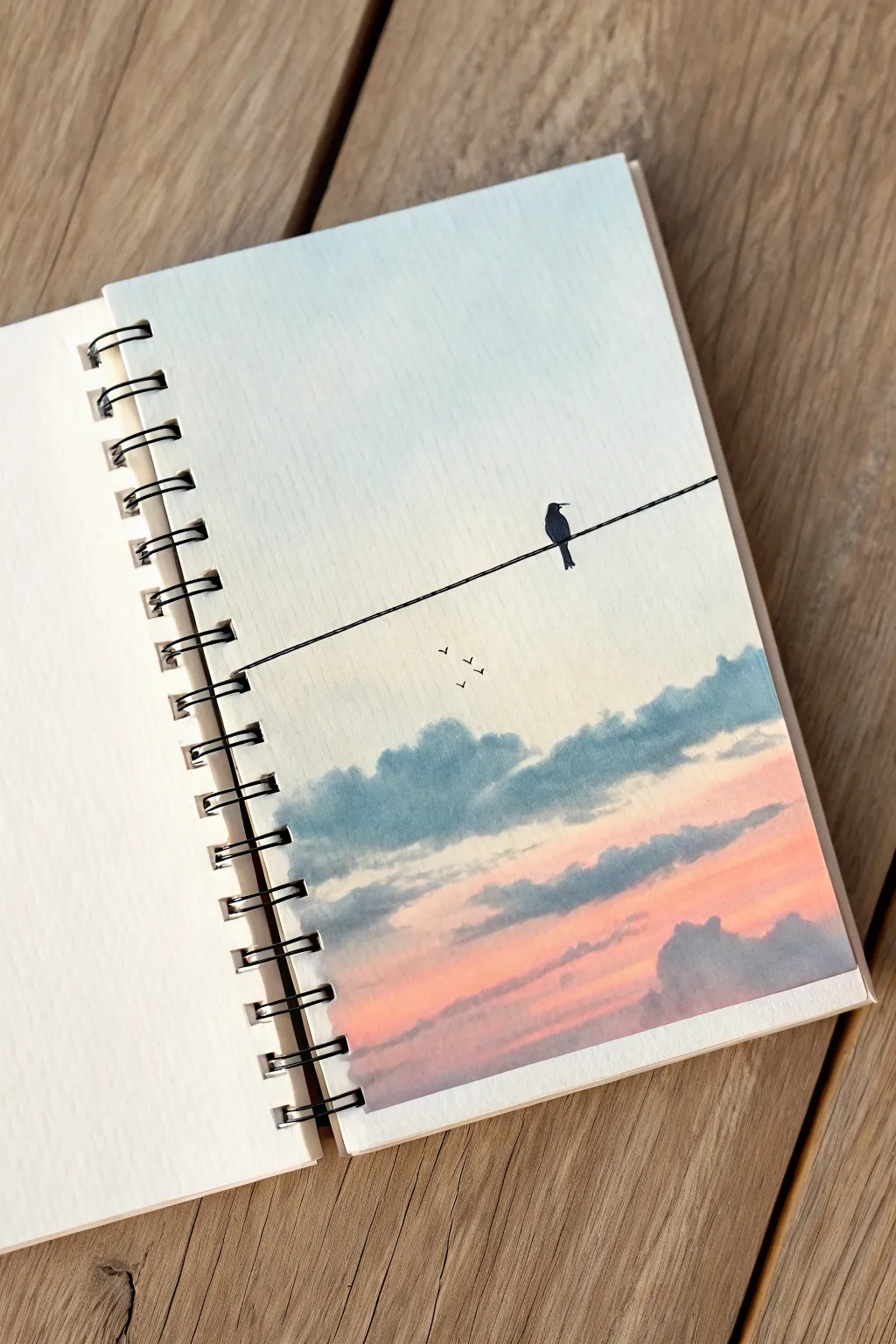
Capture the serene beauty of a twilight sky with this lovely watercolor project that balances soft, blended gradients with striking silhouette details. This sketchbook painting features a gentle fade from blue to peach, fluffy clouds, and a solitary bird resting on a power line.
Detailed Instructions
Materials
- Watercolor paper sketchbook (spiral bound)
- Watercolor paints (Cerulean Blue, Indigo, Rose Madder or Alizarin Crimson, Peach/Flesh Tint)
- Black waterproof fine liner pen (0.3mm or 0.5mm)
- Soft round watercolor brushes (size 8 for wash, size 4 for clouds)
- Masking tape (optional, for clean edges)
- Cup of water
- Paper towels
- Ruler
Step 1: Painting the Sky Gradient
-
Prepare your page:
Open your sketchbook to a fresh page. If you want perfectly crisp edges, you can tape off the sides, but the example image shows the charm of a full-bleed painting right to the paper’s edge. -
Wet the paper:
Using your largest brush, gently wet the entire surface of the paper with clean water. You want it to be damp and glistening, but not forming puddles. -
Apply the top blue:
Load your brush with a watery mix of Cerulean Blue. Start at the very top of the page and paint horizontal strokes, allowing the color to fade naturally as you move downward. -
Fade the middle section:
Clean your brush and use just water to pull the blue pigment down toward the center of the page, creating an almost white or very pale blue middle area. -
Introduce the sunset tones:
Mix a soft Peach or heavily diluted Rose Madder. Start painting from the bottom of the page upward, pushing this warm color until it meets the pale middle section. -
Blend the transition:
Where the pale blue and peach meet, use a damp, clean brush to gently blend them. Be careful not to overwork this area, or you might get a muddy grey instead of a soft transition. -
Initial drying time:
Let this base layer dry completely. The paper must be bone dry before adding clouds to prevent them from bleeding uncontrollably.
Pro Tip: Flat Paper
Does your paper ripple? Tape it down to a hard board before painting. Leave the tape on until the paper is 100% dry to ensure it stretches back flat.
Step 2: Adding Clouds
-
Mix the cloud color:
Create a blue-grey shade by mixing Indigo with a tiny touch of your Rose Madder. The paint consistency should be thicker than your sky wash—think milk or thin cream. -
Paint the upper cloud bank:
Using a size 4 round brush, dab in the shapes of the clouds roughly one-third of the way up from the bottom. Use a jagged, rolling motion with your brush tip to create fluffy top edges. -
Soften the cloud bottoms:
While the cloud paint is still wet, rinse your brush and blot it on a paper towel. Run this damp brush along the bottom edge of your painted clouds to soften them into the background sky. -
Add lower sunset clouds:
Near the bottom of the page, paint another layer of clouds horizontally. These should interact with the pink sky, appearing slightly purpler due to the transparency. -
Layering for depth:
For the denser parts of the clouds on the right side, drop in a little more concentrated Indigo pigment while the cloud shape is still damp to create volume. -
Final drying phase:
Allow the entire painting to dry thoroughly. I usually wait at least 15-20 minutes here, as drawing ink on damp paper will bleed and ruin the crisp lines.
Step 3: The Line Drawing Details
-
Draw the wire:
Place a ruler across the page, starting slightly lower on the left side and angling upward toward the right. Use your black fine liner to draw a single, steady line across the sky. -
Sketch the bird outline:
Visualize the bird shape sitting on the wire. Start with a small oval for the body and a smaller circle for the head. Add a pointy beak facing right and a tail extending below the wire. -
Fill the silhouette:
Carefully fill in the bird sketch with your black pen or ink. Make the edges sharp and clean to contrast against the soft watercolor background. -
Add distant birds:
In the open sky area above the clouds but below the wire, draw three tiny ‘v’ shapes to represent birds flying in the distance. Vary their sizes slightly to suggest depth. -
Final touches:
Check the thickness of your main wire line. If it looks too thin compared to the bird, go over it once more to give it a little more visual weight.
Level Up: Telephone Poles
Rather than just a floating line, draw a vertical telephone pole silhouette on one side of the page, with multiple lines connecting to it for a complex scene.
Now you have a tranquil, minimal landscape that perfectly captures the quiet moments of evening.


Arched Doorway With Climbing Vines
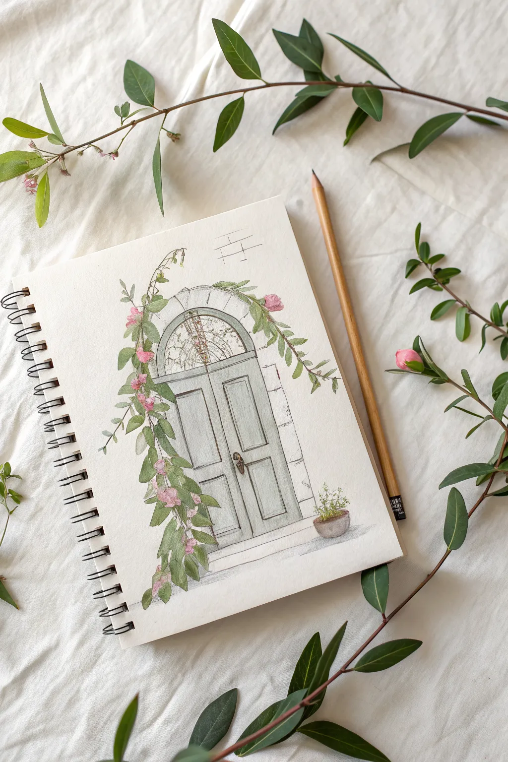
Capture the charm of a rustic French countryside entrance with this delicate watercolor and pencil illustration. This project combines loose floral elements with structural architectural lines to create a soft, inviting scene on sketchbook paper.
Step-by-Step Tutorial
Materials
- Spiral-bound watercolor sketchbook (cold press paper recommended)
- H or HB graphite pencil for initial sketching
- Waterproof fine liner pen (0.1mm or similar, light grey or sepia)
- Watercolor paints (Sage Green, Sap Green, Rose Madder, Paynes Grey, Burnt Umber)
- Round watercolor brush (size 4 or 6)
- Wooden coloring pencil (brown or ochre) for warmth
- Ruler
- Kneaded eraser
Step 1: Structural Foundation
-
Establish the arch:
Begin by lightly sketching the central arched doorway. Use your ruler to ensure the vertical sides are straight, but freehand the top curve to keep a slightly organic, rustic feel. Place it centrally on your page, leaving plenty of white space. -
Map the door panels:
Divide the door vertically down the center. Sketch two large rectangular panels on each side of the divide. Don’t worry about perfect symmetry; slight wobbles add character. -
Add the fanlight:
Above the main door section, draw the semi-circular transom window (fanlight). Sketch a simple grid pattern or a few radiating lines to suggest leaded glass. -
Frame the stone:
Around the arch, faintly sketch irregular rectangular shapes to represent the stone casing. Keep these lines very light as they will be mostly hinted at rather than fully outlined.
Step 2: Vegetation and Details
-
Sketch the vine structure:
Draw a winding, S-curved line starting from the top left, cascading down the left side of the doorframe. Extend a lighter branch reaching over the top of the arch toward the right. -
Leaf placement:
Along your vine lines, sketch clusters of oval-shaped leaves. Group them more densely on the lower left side to create visual weight, and keep them sparse and airy near the top. -
Floral accents:
Intersperse small, rounded bud shapes among the leaves, focusing on the points where the vine bends. These will become our pink flowers. -
Ground the scene:
At the base of the door, sketch a simple horizontal step. On the right side of the step, draw a small, round pot shape with a few scribbly lines coming out of it for a potted herb.
Loose Ivy Effect
Don’t connect every leaf to a stem. Letting some painted leaves ‘float’ near the vine creates a looser, more natural look that mimics how vines move in the wind.
Step 3: Applying Color
-
Paint the door:
Mix a very watery wash of Paynes Grey and a touch of Green. Apply this to the door panels, keeping the color translucent so the paper texture shows through. Leave tiny white gaps for highlights. -
Color the leaves:
Using two shades of green—one lighter sage and one deeper sap green—fill in the leaves. I like to let the colors bleed slightly into each other for variation, but avoid overworking them. -
Add floral blooms:
Dip your brush into a diluted Rose Madder or soft pink. Gently dab color onto the flower buds. Keep the paint wet so edges remain soft and romantic. -
Paint the pot:
Use a mix of Burnt Umber and a tiny bit of red for the terracotta pot. Ensure the light source is consistent by keeping the left side slightly lighter.
Paper Buckling?
If your pages warp, use less water on your brush (dry brush technique) or clamp the page edges with binder clips while painting to keep the sheet taut.
Step 4: Refining and Ink
-
Stone details:
Once the paint is dry, use a very pale grey wash to suggest shadows on the stone surround. You don’t need to paint the whole stone, just the corners and edges. -
Inking the vines:
With a fine liner pen, re-trace the main stems of the vine. Add little thorns or connection points, but don’t outline every single leaf; let the watercolor define the shapes. -
Architectural lines:
Go over the door panels and the arch with your pen. Use broken lines for the stone walls to suggest texture and age rather than a solid, rigid structure. -
Hardware details:
Draw the door handle carefully with the pen, darkening the shadow side to give it dimension and a metallic feel. -
pencil accents:
Take a sharpened wooden pencil (brown or ochre) and lightly shade the glass area in the fanlight to suggest reflection and interior depth without overpowering the delicate lines. -
Final touches:
Erase any remaining heavy graphite lines. If the scene feels too floating, add a faint pencil shadow underneath the step and the pot to ground them.
Close your sketchbook knowing you’ve captured a quiet, charming architectural moment on the page
Glass Jar With Wildflower Stems
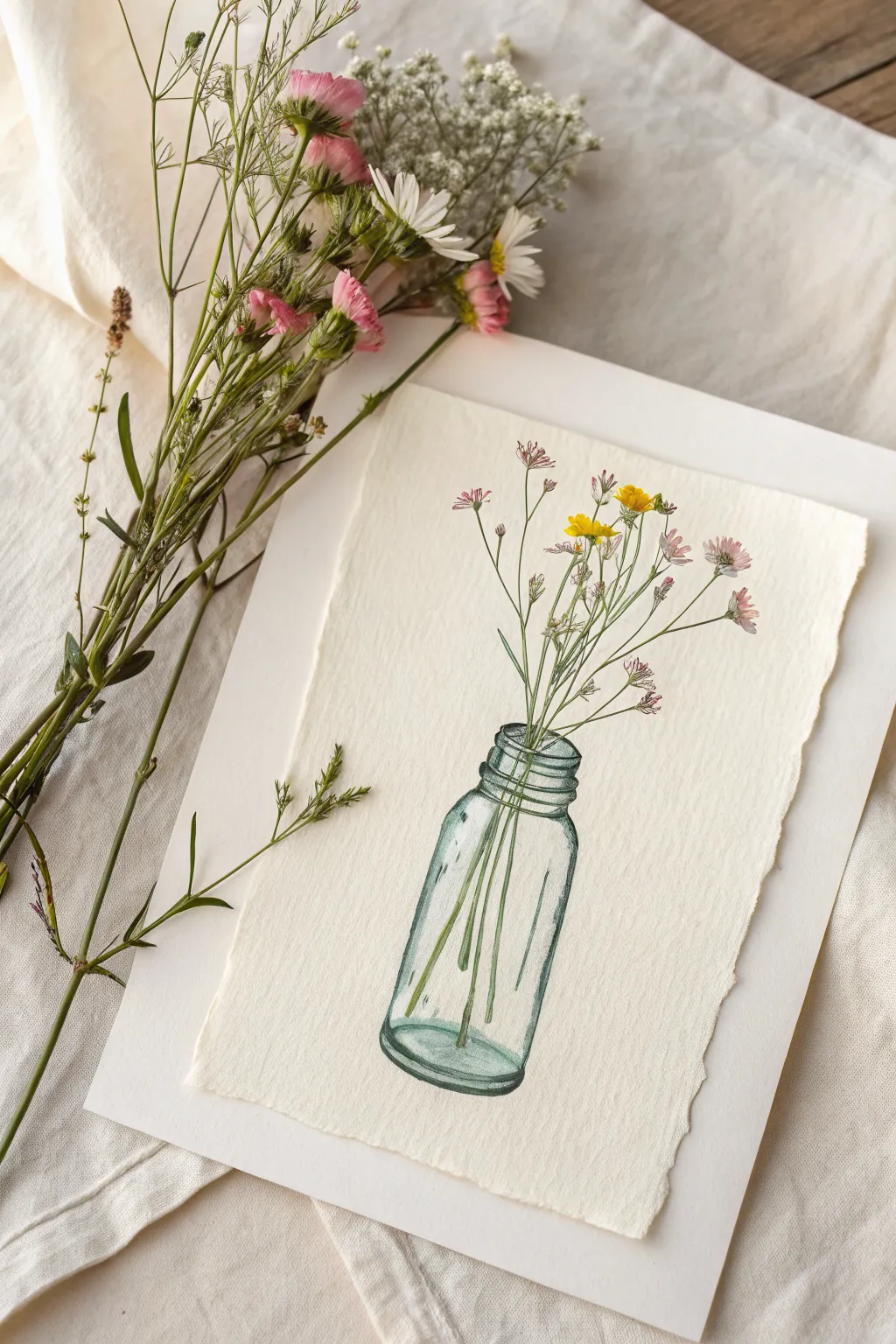
Capture the simple beauty of nature with this charming mixed media study. By combining fine ink liners with soft watercolor washes, you’ll create a vintage-inspired illustration of dainty wildflowers in a classic glass bottle.
Detailed Instructions
Materials
- Heavyweight cold-press watercolor paper (deckled edge optional)
- Pencil (HB or 2H)
- Soft eraser
- Waterproof technical drawing pens (0.1mm and 0.3mm, black or dark sepia)
- Watercolor paints (Sap Green, Olive Green, Phthalo Blue, Alizarin Crimson, Lemon Yellow)
- Small round watercolor brushes (sizes 2 and 4)
- Jar of water
- Paper towels
Step 1: Sketching the Composition
-
Outline the bottle shape:
Begin lightly with your pencil to establish the main structure of the apothecary jar. Draw a cylinder for the body and taper it gently at the top toward a threaded neck. Keep your lines faint so they can be erased later. -
Draw the rim details:
Sketch the thick, rounded rim of the bottle. Add two or three horizontal rings below the opening to represent the threads where a lid would screw on. -
Map out the stems:
From the bottle opening, draw thin, sweeping lines extending upward and outward for your flower stems. Vary their heights to create a natural, unforced arrangement. -
Add stem refractions:
Continue the stem lines down into the bottle. Remember that glass distorts light, so slightly offset the lines or change their angle once they ‘enter’ the water inside the jar. -
Sketch the blooms:
At the tips of your stems, lightly mark the positions of the flowers. Draw small clusters for the pink wildflowers and small, simple daisy shapes for the yellow ones.
Ink Smearing?
If your pen smears when painting, switch to a permanent pigment liner (like a micron) and wait at least 15 minutes before wetting the paper.
Step 2: Inking the Details
-
ink the glass contours:
Using your 0.3mm waterproof pen, carefully trace the outer lines of the bottle. I like to break the line occasionally—leaving small gaps creates the illusion of light hitting the glass edges. -
Define the threads:
Ink the threaded neck with curved, parallel lines. Use a slightly lighter touch here to suggest volume without making the glass look heavy. -
Draw the stems:
Switch to the finer 0.1mm pen for the delicate stems. Draw confident, fluid lines. For the stems inside the water, you can make the lines slightly wobbly to mimic refraction. -
Detail the flowers:
Ink the flower petals with quick, loose strokes. Don’t close every shape perfectly; open lines feel more organic. Add tiny dots or stippling near the center of the blooms for texture. -
Erase pencil marks:
Wait until the ink is completely dry to the touch, then gently erase all your initial pencil guidelines.
Vintage Patina
Make the drawing look like an old botanical plate by washing the entire background with weak staining tea or coffee before you start painting.
Step 3: Painting with Watercolors
-
Paint the glass tint:
Mix a very watery wash of Phthalo Blue with a tiny touch of Sap Green. With a size 4 brush, apply this pale teal color to the edges and bottom of the bottle, leaving the center white for a highlight. -
Add glass reflections:
While the first layer is damp, drop a slightly darker concentration of the teal mix into the bottom corners and the neck threads to create depth. -
Color the stems:
Mix Sap Green with a little Olive Green. Using the size 2 brush, carefully paint the stems. Where the stems are underwater, you can glaze over them with the teal mixture once the green is dry to push them back visually. -
Paint the pink blooms:
Dilute Alizarin Crimson until it’s a soft pink. Dab color onto the flower petals, keeping the application loose. Let some white paper show through for sparkle. -
Paint the yellow blooms:
Use Lemon Yellow for the small daisy-like flowers. If you want more contrast, add a tiny dot of orange or brown to their centers. -
Adding final shadows:
Once the glass area is dry, mix a very faint grey-blue and add a thin shadow line underneath the bottle to anchor it to the surface.
Now you have a timeless botanical sketch ready to be framed or gifted
Citrus Slice Segment Shapes
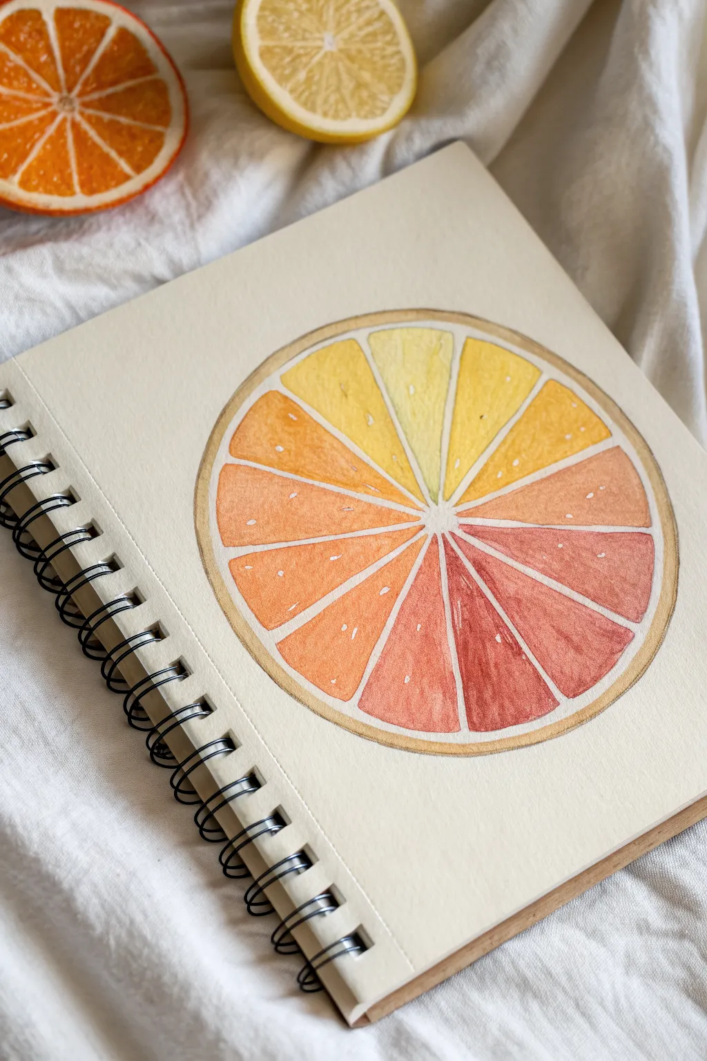
This refreshing watercolor project transforms a simple fruit slice into a vibrant study of color gradients. By painting each segment in a slightly shifting hue, you’ll create a seamless transition from pale lemon yellow to deep blood orange.
Detailed Instructions
Materials
- Watercolor sketchbook or mixed media paper
- Pencil (HB or H)
- Compass or circular object (bowl/cup)
- Ruler
- Watercolor paints (Yellow, Orange, Red)
- Round watercolor brush (size 4 or 6)
- White gouache or white gel pen
- Water cups and paper towels
- Eraser
Step 1: Sketching the Structure
-
Draw the outer circle:
Start by finding the center of your page. Use a compass or trace around a circular object like a bowl to draw a large, perfect circle. This will form the rind of your citrus slice. -
Add the inner boundary:
Draw a slightly smaller circle inside the first one, leaving about a 1/4 inch gap between them. This gap represents the pith and peel of the fruit. -
Mark the center:
Locate the exact center point of your circles. Draw two very small concentric circles here to act as the central core where all the segments meet. -
Divide into segments:
Using a ruler, draw light lines radiating from the center to the inner large circle. Treat this like a clock face to space them evenly; aim for 12 or 14 segments depending on how gradual you want your color shift to be. -
Round the corners:
Inside each wedge you just created, sketch the actual fruit segment shape. Round off the outer corners and the inner point so they look like soft, juicy teardrops rather than sharp triangles. -
Clean up the sketch:
Gently erase your guide lines (the straight ruler lines), leaving only the rounded segment shapes and the outer rind rings. Keep your pencil marks light enough that they won’t show heavily through the paint later.
Step 2: Painting the Gradient
-
Prepare your palette:
Squeeze out a generous amount of lemon yellow, a medium orange, and a deep red or alizarin crimson. You will be mixing these progressively as you work around the wheel. -
Start with yellow:
Begin at the top segment (the ’12 o’clock’ position). Paint this section with a very watery, pale lemon yellow wash. Keep the edges neat. -
Transition to orange:
For the next segment moving clockwise, add a tiny drop of orange to your yellow mix. Paint the segment, ensuring the color is slightly warmer than the first. -
Deepen the hue:
Continue painting each subsequent segment, adding progressively more orange to your mix. By the time you reach the 3 o’clock position, your color should be a rich golden yellow-orange. -
Introduce red:
As you move to the bottom half of the circle, start mixing small amounts of red into your orange. The segments should shift into coral and salmon tones. -
Paint the darkest segments:
At the bottom of the wheel, your mix should be a deep grapefruit red. I find it helpful to test the color on a scrap paper first to ensure the step-change isn’t too drastic. -
Complete the loop:
Continue up the left side, gradually adding yellow back into your red mix until you return to the pale yellow starting point. The transition should feel smooth and continuous. -
Paint the rind:
Mix a diluted, light brown or beige wash. Paint the thin ring between your two outermost pencil circles to create the citrus peel. Let everything dry completely.
Wet-on-Dry Precision
Paint on dry paper for this project. If the paper is wet, the segment colors will bleed into each other, ruining the crisp separation needed for the slice effect.
Step 3: Adding Details
-
Add texture marks:
Once the paint is bone dry, look at your segments. Use a tiny brush with slightly saturated paint (matching the segment color) to add faint vertical streaks inside some segments for fiber texture. -
Highlight with white:
Using white gouache or a white gel pen, add tiny dots and short dashes to the fruit segments. These look like juice vesicles catching the light and add dimension. -
Refine the center:
If the center white space got messy, touch it up with opaque white paint to keep the core crisp and clean.
Uneven Color Steps?
If a color jump looks too sudden, glaze over the lighter segment with a very watery wash of the darker neighbor’s color to bridge the gap.
Now you have a zesty, colorful art piece that brightens up your sketchbook page
Butterfly Wings as Symmetry Practice
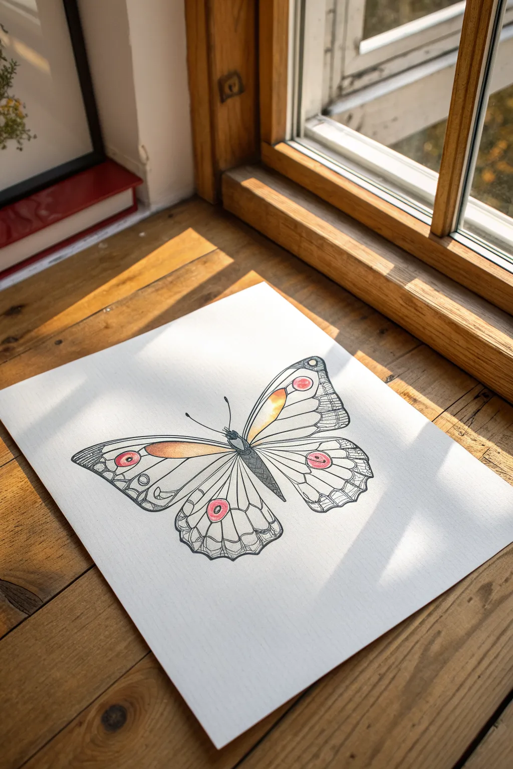
This elegant project combines precision linework with delicate pops of watercolor to create a stunning butterfly study. The result is a crisp, clean illustration that balances structural detail with soft, warm hues, perfect for practicing symmetry and ink control.
How-To Guide
Materials
- Heavyweight drawing paper or mixed media paper (smooth texture)
- Pencil (HB or H for light sketch lines)
- Kneaded eraser
- Fine liner pens (sizes 005, 01, and 03)
- Watercolor pencils or watercolor pan set (marigold, coral/pink)
- Small round watercolor brush (size 2 or 4)
- Ruler
Step 1: Drafting the Skeleton
-
Establish the centerline:
Start by lightly drawing a vertical axis line right down the center of your page using a ruler. This invisible spine is crucial for keeping your butterfly perfectly symmetrical. -
Block in the body shape:
Along the centerline, sketch a slender, elongated oval for the thorax and abdomen. Keep the head small and rounded at the top. -
Map the wing span:
Lightly mark the width of the wings on either side. Draw large diagonal guides extending from the upper thorax to define the top edge of the forewings. -
Refine the wing outline:
Connect your guide marks with smooth curves to form the forewings and hindwings. Ensure the left side mirrors the right as closely as possible, creating that classic butterfly silhouette.
Step 2: Inking the Structure
-
Outline with ink:
Using an 03 fine liner, carefully trace the main perimeter of the wings and the body. Use confident, single strokes rather than feathery lines for a clean look. -
Erase pencil guides:
Once the main outline ink is completely dry, gently run your kneaded eraser over the page to lift away the graphite, leaving just the crisp black lines. -
Draw primary veins:
Switch to an 01 pen. Draw the major veins radiating from the body toward the wing edges. Imagine these as the bones of the wing, curving gently with the wing’s shape. -
Add secondary veins:
Branch out smaller veins from the primary ones, creating cells within the wing structure. Keep these lines slightly thinner to suggest depth. -
Detail the wing edges:
Along the outer margins of the wings, use the 005 pen to draw tiny scalloped shapes or U-curves inside each cell section.
Uneven Wings?
If one wing looks larger, use tracing paper. Draw one perfect wing, fold the paper along the center axis, and trace it onto the other side for perfect symmetry.
Step 3: Adding Texture and Pattern
-
Hatch the body:
Use the 005 pen to add cross-hatching to the butterfly’s body, making the center darker to create a cylindrical 3D form. -
Create the eye-spots:
Draw circular ‘eye’ patterns on the wings—one near the top of the forewing and one on the hindwing. Draw concentric rings to add interest. -
Texture the margins:
Fill the scalloped edges you drew earlier with very fine, dense hatching lines. This creates a darker border that frames the delicate interior. -
Add stippling details:
I like to add tiny dots (stippling) near the body where the wings attach, which adds a velvety texture to the illustration.
Pro Tip: Line Weight
Varying your pen pressure is key. Press harder on the outer edges and shadowy areas, and use a whisper-light touch for the interior veins to verify delicacy.
Step 4: Applying Color Accents
-
Lay down orange base:
Using a wet brush and a small amount of marigold paint (or a watercolor pencil dipped in water), color the elongated cells nearest the body on the forewings. -
Paint the eye-spots:
Clean your brush and pick up the coral or pink hue. carefully fill in the center circle of the eye-spots on all wings. -
Blend the gradients:
While the orange sections are still slightly damp, use a clean, damp brush to soften the outer edges, letting the color fade gently into the white of the paper. -
Final ink touches:
After the paint is bone dry, go back in with your 005 pen to re-define any lines that got washed out or to add antennae if you haven’t yet.
Enjoy the calm focus that comes from balancing your intricate inked lines with those splashes of warm color
Hot Air Balloon With Patchwork Panels
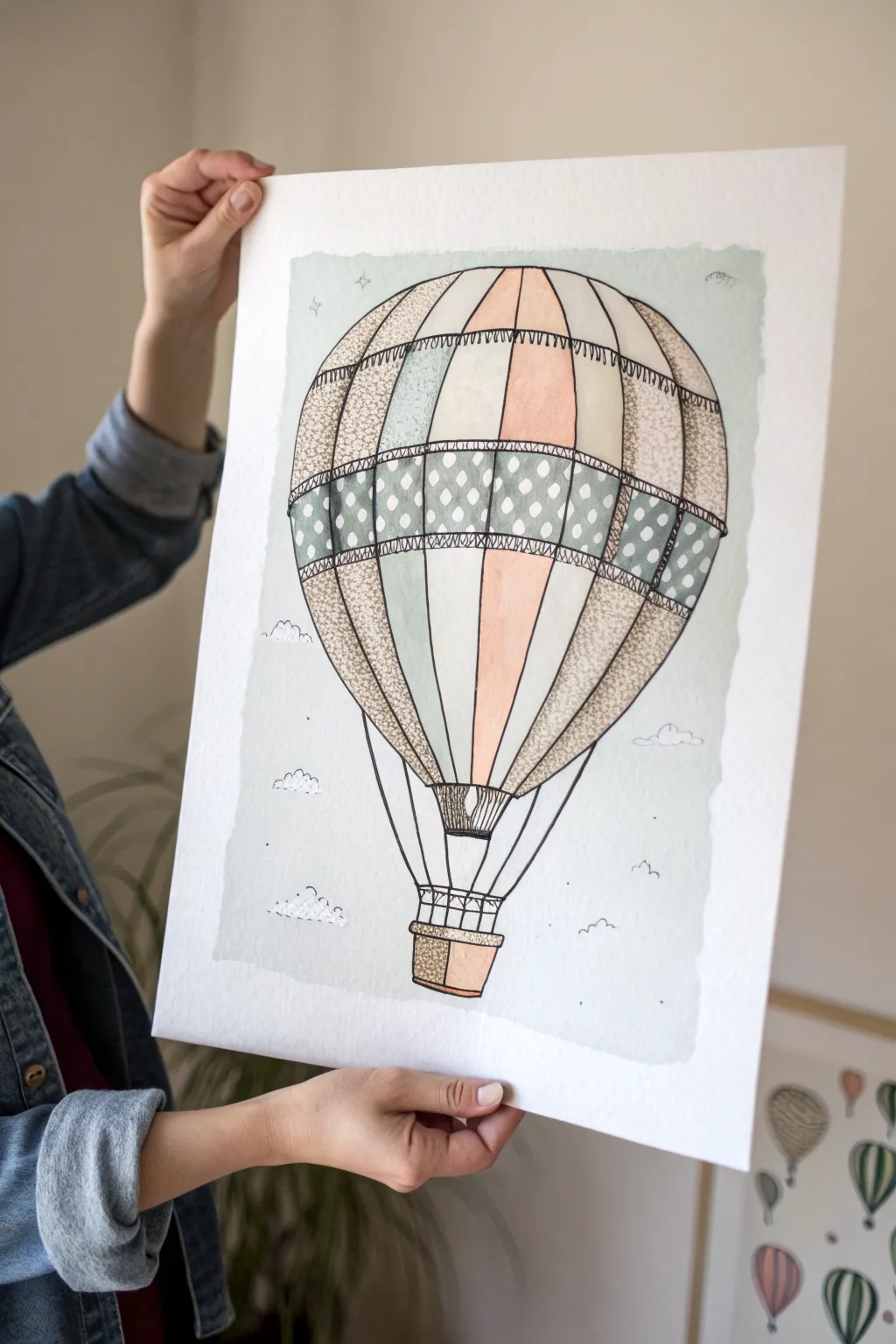
Capture the charm of vintage travel with this delightful hot air balloon illustration. Combining soft watercolor washes with intricate pen detailing creates a lovely patchwork effect that feels both nostalgic and fresh.
Step-by-Step Guide
Materials
- Cold press watercolor paper (A3 or similar size)
- Watercolor paints (sage green, blush pink, warm beige, soft grey)
- Black waterproof fineliner pens (0.1mm and 0.5mm)
- Round watercolor brushes (size 4 and 8)
- Pencil and eraser
- Ruler
- White gel pen or gouache (optional)
Step 1: Sketching the Structure
-
Outline the balloon shape:
Begin by lightly sketching a large, inverted tear-drop shape for the main balloon body. Keep your pencil lines faint so they can be easily erased later. -
Define the vertical gores:
Draw curved vertical lines from the top center point down to the base of the balloon, creating the segmented panels or ‘gores’. Make the outer lines more curved to emphasize the round volume. -
Add horizontal bands:
Sketch two horizontal bands across the middle of the balloon. This creates a distinct belt area that we will later fill with a polka dot pattern. -
Draw the basket and ropes:
Below the balloon, sketch a small rectangular basket. Connect the basket to the balloon with straight lines for the ropes, ensuring they angle inward slightly toward the connection point.
Wet-on-Dry Precision
To keep panel edges crisp, always wait for a painted section to be bone-dry before painting its neighbor. Use a hairdryer to speed this up.
Step 2: Applying Watercolor Washes
-
Paint the background wash:
Prepare a very dilute mix of soft grey-blue. Paint a loose, rectangular shape around the balloon, leaving ragged, uneven edges for an organic feel. Don’t worry about painting tight to the pencil lines yet. -
Color the solid panels:
Select alternating vertical panels to color with your sage green and blush pink paints. Keep the wash transparent and watery. I like to let adjacent panels dry before painting the next one to prevent colors from bleeding into each other. -
Paint the patterned band:
Fill the horizontal belt band with a slightly darker shade of sage green or grey. This needs to be solid enough to make white dots stand out later, or light enough to draw dark dots on top. -
Texture the beige panels:
For the remaining vertical panels, use a warm beige wash. While still wet, you can drop in tiny specks of darker brown to create a subtle texture. -
Color the basket:
Paint the basket with a warm brown or ochre tone, keeping it simple for now as detail will be added with ink.
Uneven Background Edges?
If your background wash looks too messy, dampen a clean brush with nothing but water and gently soften the harsh edges for a cloudier look.
Step 3: Inking and Detailing
-
Outline the main shapes:
Once the paint is completely dry, use your 0.5mm fineliner to go over the main structural lines of the balloon and basket. Use a confident hand, but don’t worry if lines are slightly shaky; it adds character. -
Add the stitch marks:
Switch to a 0.1mm pen. Along horizontal seams and the top of the ‘belt’, draw tiny, short vertical hatch marks. These resemble stitching and give the ‘patchwork’ look. -
Create the polka dots:
If your painted band is light, outline small circles with your pen. If you painted it dark, you might use a white gel pen here to add the dots. In the example, the dots are negative space or light circles on a green band. -
Stipple the textured panels:
On the beige panels on the far left and right, use the fine pen to add dense stippling (lots of little dots). This mimics a rough fabric texture compared to the smooth painted panels. -
Detail the basket weave:
Draw a cross-hatch or simple grid pattern on the basket to suggest wickerwork. Outline the ropes connecting the basket to the balloon with firm, straight lines.
Step 4: Final Flourishes
-
Draw stylistic clouds:
Using your fine pen, draw tiny, jagged little cloud outlines in the background wash area. Keep them small and scattered—just a few scribbles to suggest the sky. -
Add distant birds:
Draw a few tiny ‘m’ shapes in the distance to represent birds flying far away. -
Enhance contrast:
Look at the junction where the ropes meet the balloon. Darken this area with some extra ink hatching to create depth and shadow. -
Clean up:
Wait for the ink to dry fully, then gently erase any remaining visible pencil marks to clean up the illustration.
Now you have a charming piece of art ready to frame or gift to a fellow dreamer
Cozy Candle With Simple Flame Shape
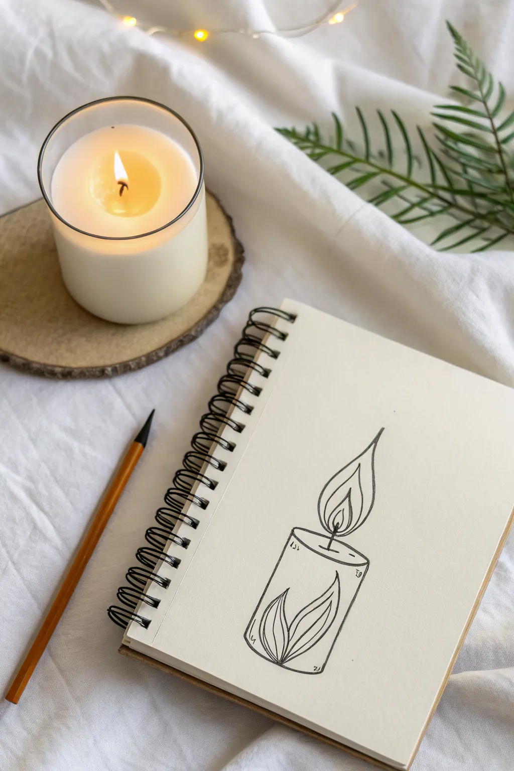
Capture the warmth of a flickering flame with this clean, line-art interpretation of a pillar candle. This project combines simple geometric forms with organic leaf motifs for a uniquely stylized and cozy illustration.
Step-by-Step Tutorial
Materials
- Sketchbook or drawing paper (heavyweight preferred)
- HB graphite pencil
- Eraser
- Fine liner pen (0.3mm or 0.5mm, black ink)
- Ruler (optional)
Step 1: Planning the Structure
-
Position the base:
Begin by lightly sketching a narrow oval near the bottom of your page using your HB pencil. This flat oval will represent the bottom of the cylinder shape. -
Building the walls:
Draw two straight, vertical lines extending upward from the extreme left and right edges of your bottom oval. Keep these lines parallel to give the candle solidity. -
Creating the top surface:
Connect the top of the two vertical lines with another flat oval, identical in width and curve to the bottom one. This defines the top rim of your candle. -
Locating the wick:
Find the center point of the top oval and draw a tiny dot. From this dot, sketch a short, vertical line upward to serve as the wick.
Wobbly Lines?
Draw from your shoulder, not your wrist, for smoother curves. If a line goes astray, thicken the outline slightly to mask the mistake.
Step 2: Drafting the Shapes
-
Sketch the main flame:
Draw a teardrop shape starting from the top of the wick. The bottom should be rounded and wide, tapering up to a sharp, elegant point that curves slightly to the right. -
Add the inner flame:
Inside the main teardrop, sketch a smaller, similar shape. This negative space represents the bright core of the flame. -
Detail the flame core:
Add a third, even smaller teardrop shape inside the second one. I find making this one slightly asymmetrical adds a nice sense of movement. -
Plan the bottom motif:
Looking at the lower third of the candle body, lightly sketch a central leaf shape that points upward. The tip should reach about halfway up the candle’s body. -
Add side leaves:
Draw two curved lines flanking the central leaf, creating two more leaf shapes that hug the sides of the central one. These should look like they are wrapped around the cylinder.
Varying Line Weight
Use a slightly thicker pen (0.5mm) for the candle body and a thinner one (0.1mm) for the inner flame details to create instant depth.
Step 3: Refining with Ink
-
Outline the flame:
Switch to your fine liner pen. Carefully trace over your pencil lines for the three nested flame shapes, using confident, fluid strokes to keep the curves smooth. -
Define the top rim:
Ink the top oval. You can leave the back part of the oval slightly lighter or broken if you want to suggest depth, or ink the full ellipse for a graphic look. -
Draw the candle sides:
Trace the vertical lines of the candle body. Stop your lines when you reach the top of the leaf motif at the bottom; don’t draw through the leaves. -
Ink the leaf motif:
Outline the three leaf shapes at the base. Add a central vein line down the middle of each leaf for detail. -
Close the bottom:
Ink the visible bottom curve of the candle, connecting the outer leaves. Ensure the line follows the curvature of your original oval sketch.
Step 4: Finishing Touches
-
Add the wick:
Draw over the wick line with the pen. You can make this line slightly thicker than the others to show the carbon buildup. -
Suggest movement:
Add two very small, disconnected lines or dots hovering just outside the flame tip to suggest heat rising or a slight flicker. -
Erase and clean:
Wait at least five minutes for the ink to dry completely. Gently erase all visible pencil guidelines, being careful not to smudge the ink or crinkle the paper. -
Final assessment:
Check for any gaps in your line work. You can add tiny decorative hatch marks near the rim or bottom if you want to suggest shadow or texture.
Now you have a charming, minimalist illustration ready to admire
Desert Cactus and Sun Shapes
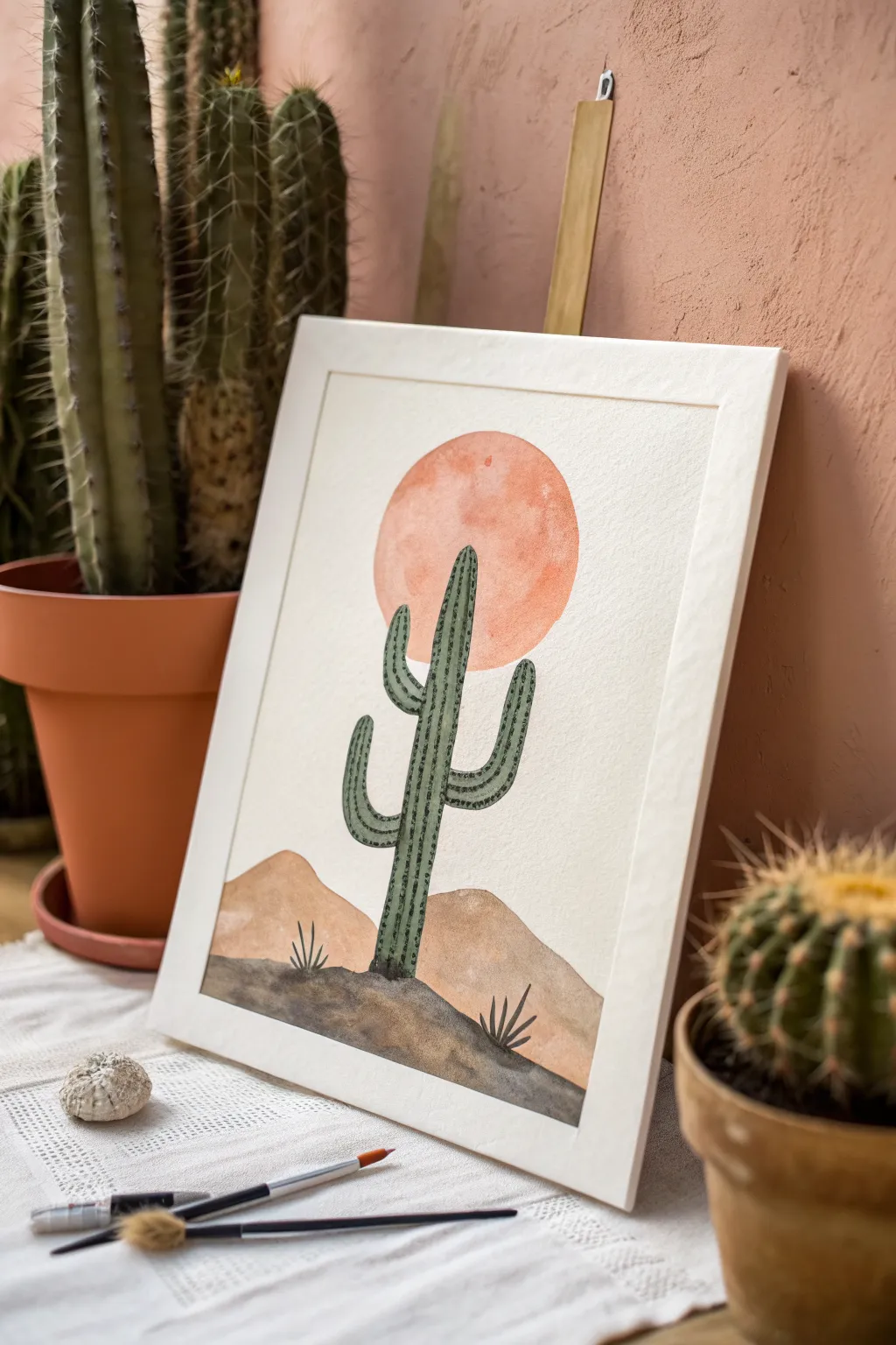
Capture the serene beauty of the desert with this minimalist watercolor project featuring a tall saguaro cactus against a bold, warm sun. Its clean lines and earthy palette make it a perfect piece of calming wall art.
Step-by-Step
Materials
- Cold press watercolor paper (approx. 9×12 inches)
- Watercolor paints (Terracotta/Burnt Orange, Olive Green, Sap Green, Yellow Ochre, Burnt Umber, Lamp Black/Payne’s Grey)
- Round brushes (Size 8 for washes, Size 2 or 0 for details)
- Pencil (HB or H)
- Kneaded eraser
- Compass or circular object for tracing
- Clean water
Step 1: Sketching the Layout
-
Outline the sun:
Start by lightly sketching a perfect circle in the upper center of your paper using a compass or by tracing a bowl. This will be the focal point of the sky. -
Draw the horizon lines:
Below the circle, sketch rolling hill shapes for the background dunes. Add a slightly more jagged, lower horizon line in the foreground for the darker earth, ensuring it overlaps the bottom of the dunes. -
Place the cactus:
Sketch the main trunk of the saguaro cactus rising from the foreground, extending up into the circle. Add two arms: one lower curved upward on the left, and a higher one curved upward on the right. -
Refine the sketch:
Lighten all your pencil lines with a kneaded eraser so they are barely visible, preventing graphite from smudging into your wet paint later.
Step 2: Painting the Background
-
Paint the sun:
Mix a watery wash of Terracotta or Burnt Orange. Carefully fill in the circle, keeping the edges crisp. You can drop in slightly more pigment while it’s wet to create a subtle texture, but avoid the area where the cactus overlaps if you want to keep the green bright. -
Fill the dunes:
Mix Yellow Ochre with a tiny touch of Burnt Umber for a sandy beige. Paint the middle ground hills, carefully working around the cactus trunk. -
Paint the foreground:
Combine Burnt Umber with a little Lamp Black or Payne’s Grey to create a dark, muddy earth tone. Fill in the bottom-most section of ground. I like to keep this wash slightly uneven to suggest rocky terrain. -
Let it dry completely:
This is crucial—wait until the paper is bone dry before touching the cactus area to prevent colors from bleeding into one another.
Fixing Bleeds
If paint bleeds into the sun, quickly dab it with a clean paper towel. Once dry, restart the edge with opaque gouache to cover the mistake.
Step 3: Painting the Cactus
-
Base green wash:
Mix a muted Olive Green. Fill in the entire cactus shape using your size 8 brush, ensuring smooth coverage. -
Second layer for depth:
Once the first layer is barely damp or dry, you can add a second, slightly darker green wash to intensify the color if the first coat looks too transparent against the orange sun. -
Add vertical ribs:
Using your smallest detail brush and a darker Sap Green mixture, carefully paint vertical lines running down the length of the trunk and arms to represent the cactus ribs. -
Create the prickly texture:
Along the vertical rib lines, make tiny horizontal dashes or dots using the very tip of your brush. These represent the spines without needing to draw every single needle. -
Outline the edges:
Very gently outline the outer edges of the cactus with the dark green mix to give it a defined silhouette against the background.
Make it Pop
Use a white gel pen to add highlights on the sun-facing side of the cactus ribs to create a 3D effect.
Step 4: Final Details
-
Add ground shrubs:
Using the dark foreground color and your smallest brush, paint tiny, spiky grass or agave shapes sprouting from the dark earth at the bottom. -
Touch up edges:
Inspect the meeting points between the sun, hills, and cactus. Fill in any unintentional white gaps with the appropriate color. -
Flatten and display:
Once completely dry, if the paper has buckled, press it under heavy books before framing it to replicate the clean look of the reference image.
Hang your finished desert landscape in a spot that needs a touch of warmth and tranquility
Top-Down Beach Shoreline Linework
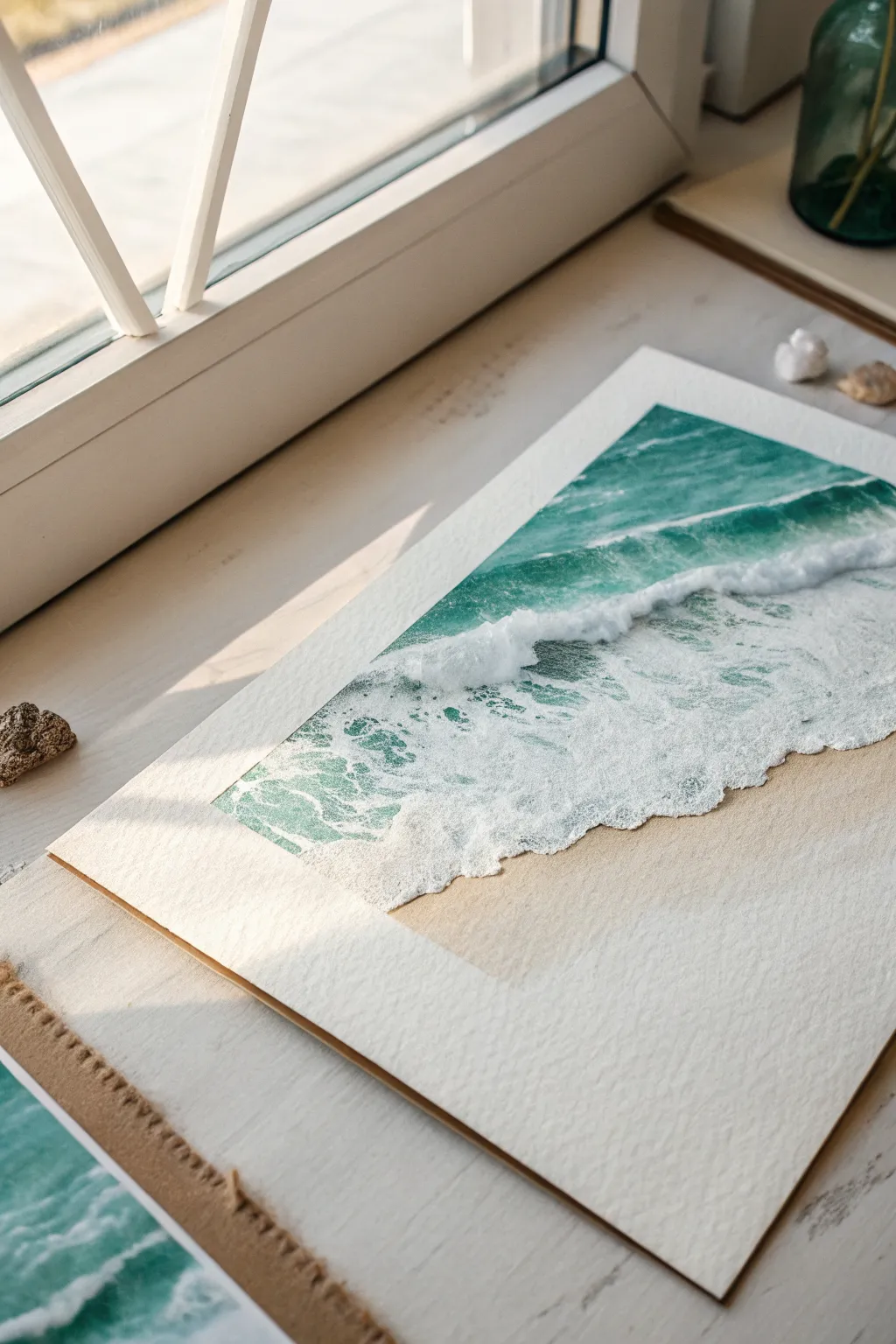
Capture the serene motion of a crashing wave meeting the sand with this textured watercolor shoreline study. By combining wet-on-wet gradients with controlled dry brushing, you’ll create a realistic interplay between deep ocean teal, frothy white foam, and warm beach sand.
Step-by-Step Guide
Materials
- Cold Press or Rough watercolor paper (minimum 300gsm)
- Masking tape or painter’s tape
- Watercolor paints: Turquoise, Phthalo Blue, Phthalo Green, Burnt Sienna, Yellow Ochre
- White Gouache or Bleed Proof White ink
- Flat brush (3/4 inch)
- Round brush (size 6 or 8)
- Small detail brush (size 2)
- Two jars of water
- Paper towels
- Palette
- Hairdryer (optional)
Step 1: Preparation and Sand Base
-
Secure the paper:
Tape down all four edges of your watercolor paper to a board or table to create a clean white border and prevent buckling when wet. -
Mix the sand color:
Create a warm, sandy beige by mixing a generous amount of Yellow Ochre with a touch of Burnt Sienna and plenty of water. -
Lay the sand wash:
Apply the sand mixture to the bottom third of the paper. Use a gentle, sweeping motion, letting the wash fade out slightly as it moves upward toward where the water will begin. -
Add sand texture:
While the sand layer is still damp (but not soaking), flick a few tiny specks of slightly darker brown paint from your brush to mimic pebbles or texture in the sand. -
Dry completely:
Allow the sand layer to bone dry before moving on to the ocean. You can use a hairdryer on a low setting to speed this up.
Uneven Watermark Edges?
If your ocean wash dries with unwanted hard lines (‘blooms’), soften them with a damp scrubber brush while slightly wet, or cover the error later with white foam texture.
Step 2: Painting the Deep Ocean
-
Prepare ocean greens:
Mix a vibrant teal using Turquoise and Phthalo Green. Prepare a second, deeper mix by adding Phthalo Blue for the furthest part of the water. -
Apply the horizon:
Start at the very top of the painted area (below the top tape line) with your darkest blue-green mix. Paint a horizontal band across the top. -
Create the gradient:
Clean your brush slightly and pick up the lighter teal. Pull the dark color down, blending it into the lighter teal as you move toward the middle of the paper. -
Define the wave shape:
Stop the teal wash abruptly where you want the main crashing wave to be. Leave a jagged, uneven edge of white paper here; this negative space will become the brightest part of the foam.
Step 3: Creating the Translucent Shallows
-
Mix the shallow water tone:
Dilute your teal mix significantly with water until it is very pale and transparent. -
Paint below the wave:
Paint the area immediately below the white negative space, dragging the color down over the top edge of your dried sand layer. This creates the look of thin water sliding over sand. -
Blend the transition:
Soften the bottom edge where the water meets the dry sand so it doesn’t look like a hard line. Use a clean, damp brush to feather it out.
Creating Foam Depth
To make the foam look thick and dimensional, don’t just use white paint. Leave some of the rough paper texture unpainted in the wave area to sparkle like sunlight.
Step 4: Adding Foam and Details
-
Prepare the white:
Squeeze out some fresh white Gouache. It needs to be thick and creamy, opaque enough to cover the underlying colors. -
Paint the main crash:
Using an old or stiff brush, dab the thick white gouache along the borderline where the deep ocean meets the shallow water. Use a stippling motion to create a fluffy, cloudy texture for the crashing wave. -
Add seafoam trailing:
Switch to your smallest detail brush. Paint thin, web-like lines of white over the shallow teal area, mimicking the lace-like foam patterns left as a wave recedes. -
Create shadows:
Mix a tiny drop of blue into your white gouache to create a cool light grey. Dab this sparingly under the thickest parts of the white foam to give the wave volume and 3D height. -
Splatter for spray:
Load a toothbrush or stiff brush with watery white gouache and gently flick it over the crashing area to create fine mist and sea spray. -
Final reveal:
Once the painting is 100% dry, carefully peel away the masking tape at a 45-degree angle to reveal the crisp white edges.
Frame your finished coastline to bring a permanent breath of fresh sea air into your room
Mini Tape-Bordered Paint Sketches
Transform a single sketchbook page into a gallery of six miniature landscapes using simple geometric framing. These charming, stamp-sized illustrations combine earthy tones with celestial and botanical motifs for a cohesive, modern aesthetic.
Step-by-Step Tutorial
Materials
- Heavyweight sketchbook or watercolor paper (cold press)
- Washi tape or low-tack painter’s tape (approx. 5mm width)
- Watercolor or gouache paints
- Fine liner pen (black, waterproof, 0.3mm or 0.5mm)
- Small round brushes (size 0 and 2)
- Pencil and eraser
- Ruler
Step 1: Setting the Grid
-
Tape the borders:
Begin by taping off a grid on your page. Use low-tack tape to create a large rectangle first, then run a long strip vertically down the center. Finally, place two horizontal strips across the page to create six equal square sections. Press the edges down firmly to prevent paint bleed. -
Lightly sketch motifs:
With a pencil, lightly sketch the central motif for each square. Aim for simple, icon-like imagery: a sunburst in the top left, a crescent moon in the top right, snowy peaks in the middle row, and botanical leaves or geometric hills at the bottom.
Clean Lines Secret
Before painting, press the tape edges down with the back of your thumbnail or a spoon. This ‘burnishing’ stops paint from seeping under the tape.
Step 2: Applying Color
-
First color block: The Sunburst:
For the top-left square, leave the background paper white. Paint a small, soft pink circle in the center for the sun’s core. -
Painting the Crescent Moon:
Moving to the top-right square, paint a solid background using a warm beige or ochre wash. While that dries, paint a terracotta orange crescent moon shape. -
The Night Sky:
In the middle-left square, fill the entire box with a deep indigo or navy blue. This will be a night scene, so ensure the coverage is opaque and even. -
Snowy Mountains:
For the middle-right square, paint a jagged mountain range at the bottom using the same indigo blue. Add a small yellow crescent moon in the sky, leaving the rest of the background white to represent snow or clear air. -
Botanical Simplicity:
Skip the background for the bottom-left square to keep it airy. Paint a central stem with paired leaves using a rusty red or burnt sienna shade. -
Geometric sunset:
In the final bottom-right square, paint a large golden-yellow semi-circle for a setting sun. Below it, create stylized zig-zag hills using a deep forest green.
Level Up: Metallic Pop
Use gold watercolor or a metallic gold paint pen for the celestial details (moons and stars) to add a shimmering, luxurious finish to your spread.
Step 3: Inking Details
-
Wait for thorough drying:
This is crucial: ensure all paint is completely bone-dry before touching it with a pen. If the paper feels cool to the touch, it’s still damp. -
Line the Sunburst:
Using your fine liner, draw a box around the paint area (using the tape as a guide). Draw rays extending from the pink center to the edges of the box. -
Detail the Beige Moon:
Outline the terracotta moon in ink. Add horizontal hatching lines inside the moon shape for texture, and outline a white border around it to separate it from the beige background. -
Enhance the Night Sky:
On the indigo square, use a white gel pen or white gouache with a tiny brush to paint a crescent moon and a four-pointed star. Add tiny dots for distant stars. -
Define the Mountains:
Ink the outline of the blue mountains. Use stippling (dots) or small dashes in the sky area to suggest falling snow or stars around the yellow moon. -
Frame the Leaves:
Draw a simple ink box border around the red leaf painting. In the top left corner, add a few small vertical hatch marks for a decorative touch. -
Structure the Hills:
Outline the green hills with white ink or gel pen to separate the geometric layers. Use blue or black ink to draw vertical hatching in the sky area behind the sun.
Step 4: The Reveal
-
Peel the tape:
Slowly peel back the tape at a 45-degree angle, pulling away from the paint area. This reveals the crisp, clean white borders that give the project its polished look. -
Final touches:
Erase any lingering pencil marks from the unpainted white borders to clean up the presentation.
Enjoy seeing your collection of miniature landscapes come together neatly on the page
Abstract Map Lines to Color Fields
Capture the organic beauty of map-making with this meditative drawing exercise that mimics topographical elevation lines. Using simple concentric shapes and meandering paths, you’ll create a complex, terrain-like pattern directly in your sketchbook.
How-To Guide
Materials
- Spiral-bound notebook with dot grid or blank paper
- Fine liner pen (0.3mm or 0.5mm, black)
- Pencil (optional for initial layout)
- Eraser (if using pencil)
Step 1: Planning the Peaks
-
Identify focal points:
Start by looking at your blank page and mentally placing three to five ‘peaks’ or high points. These will be the centers of your concentric circles. -
Draw the summits:
Using your fine liner, draw small, irregular organic shapes in scattered locations on the page. These shouldn’t be perfect circles; think of them as kidney beans or amoebas. -
Add numerical details:
Inside a few of these center shapes, write tiny numbers like ‘407’ or ‘620’. This mimics elevation markers on real maps and adds an authentic touch. -
Create the first ring:
Draw a larger line surrounding each center shape, maintaining a somewhat consistent distance from the first line but allowing for wobbles.
Uneven Lines?
Don’t worry if your lines touch or wobble too much. In topography, lines converging represents a cliff face, so mistakes just become dramatic landscape features.
Step 2: Drawing the Terrain
-
Expand the ripples:
Continue drawing concentric rings around your peaks. Let the lines be shaky and organic rather than smooth and geometric. -
Merge the slopes:
As your circles grow outward, they will eventually meet lines coming from other peaks. Instead of crossing them, curve your line to run parallel to the neighbor’s line. -
Fill the valleys:
In the spaces between the peaks—the ‘valleys’—draw hourglass-shaped loops that contour along the edges of the merged mountain slopes. -
Vary the spacing:
To suggest steep terrain, draw lines very close together. For flatter areas, space the lines further apart. -
Add subtle breaks:
Occasionally break a line or add a tiny tick mark to give the appearance of rough terrain or rocky outcrops.
Step 3: The Hiking Trail
-
Plot the path:
Visualize a hiking trail that winds through your landscape. It should meander through the valleys and perhaps loop around a peak. -
Draft the trail guide:
Lightly sketch a single continuous line where you want the path to go, cutting directly across your contour lines. -
Stipple the path:
Go over your guide line with a series of small, tight circles or dots. These should be larger than the pen width of your contour lines to stand out. -
Create borders:
For a distinct look, draw two parallel dotted lines to create a wide path, or sticking to a single chain of small circles works well for a simpler trail. -
Integrate the trail:
Where the trail crosses a contour line, you don’t need to erase the line beneath, as maps show elevation regardless of man-made paths.
Add Dimension
Use a light gray brush pen or watercolor wash to shade one side of the ‘mountains.’ This simple addition gives instant 3D relief to your 2D map.
Step 4: Final Details
-
Review the density:
Step back and look at the overall balance. If there are large empty white spaces, add a few more wide, wandering contour lines to fill the void. -
Add map symbols:
Draw tiny symbols like triangles for viewpoints or little squiggles to represent marshy areas in the wider gaps. -
Clean up:
I always let the ink dry for a full minute before erasing any underlying pencil marks to prevent smudging.
Now you have a unique abstract map that charts a landscape from your own imagination

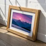
Have a question or want to share your own experience? I'd love to hear from you in the comments below!