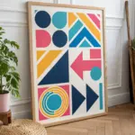
When I’m not sure what to draw, I lean on art designs built from simple, repeatable patterns—they’re relaxing, satisfying, and endlessly customizable. Here are some of my favorite patterns ideas you can use as tiny swatches, full-page fills, or texture inside bigger drawings.
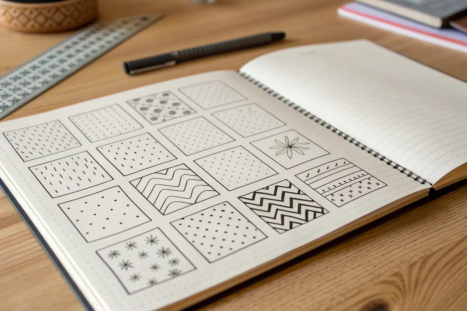
Classic Pattern Grid Sampler
This classic pattern grid is an excellent exercise in mindfulness and line control, resulting in a minimalist piece of art suitable for framing. You’ll create a structured sampler sheet filled with diverse textures ranging from organic waves to structured hexagons.
Step-by-Step Tutorial
Materials
- High-quality white drawing paper or cardstock (A4 or Letter size)
- Fine liner pens (sizes 0.1, 0.3, and 0.5mm)
- Graphite pencil (HB or 2H)
- Ruler or T-square
- Eraser (preferably kneaded for gentle lifting)
Step 1: Setting the Grid
-
Calculate layout:
Measure your paper width and height. You want to create a grid of equal-sized squares (roughly 1.5 to 2 inches each) with consistent spacing between them. -
Mark specific points:
Using your ruler and pencil, lightly mark the corners of your squares. For the layout shown, aim for a grid of 4 columns by 4 rows. -
Draw the frames:
Connect your marks to draw the square outlines lightly in pencil. Keep the lines very faint so they can be easily erased or inked over later without leaving heavy indentations. -
Ink the borders:
Using a 0.5mm fine liner and a ruler, carefully trace over your pencil squares to create crisp, black frames. I like to lift the pen slightly at the corners to avoid ink pooling. -
Clean up:
Once the ink is completely dry, gently erase the underlying pencil structure.
Uneven Spacing?
If your hand-drawn patterns look uneven, lightly pencil a sub-grid inside the square first. This acts as a guide for spacing motifs like flowers or dots evenly before inking.
Step 2: Linear & Geometric Patterns
-
Dotted lines:
In the top left square, create vertical lines made entirely of small dots using a 0.3mm pen. Keep the spacing consistent to create a light, airy texture. -
Dashed grid:
Move to the next square. Draw horizontal dashed lines. Then, add vertical dashed lines that intersect the gaps, creating a subtle woven look. -
Hexagon hive:
In a middle-left square, sketch a honeycomb pattern. Start by drawing rows of stacked hexagons, ensuring the vertices touch accurately. This one takes patience, so go slow. -
Diagonal fills:
Select a central square and fill it with closely spaced diagonal lines. Use a ruler here for precision to create a uniform tone. -
Dashed diagonals:
For a variation, fill another square with diagonal lines, but break them into small dashes rather than solid strokes.
Use Line Weight
Add visual interest by swapping pen nib sizes. Use a thick 0.5mm for the square borders and main shapes, but switch to a delicate 0.1mm for texture details like stippling or hatching.
Step 3: Organic & Floral Textures
-
Simple flowers:
Choose a square near the center line. Draw tiny, five-petaled flowers in a grid formation. Keep them simple—just small loops around a center point. -
Stippling:
In the square below the diagonal lines, use a stippling technique. Create a density gradient by placing dots closer together at the bottom and spreading them out as you move up. -
Cracked earth:
Draw irregular, intersecting shapes that resemble dried mud or a stone path. Avoid straight lines; let your hand wobble slightly for a natural effect. -
Tiny clouds:
Fill another square with scattered, small cloud-like shapes or three-bump clusters. Orient them randomly to fill the negative space evenly.
Step 4: Wave Patterns
-
Standard waves:
In the bottom right corner, draw horizontal wavy lines. Try to keep the ‘wavelength’ consistent so the peaks and valleys align vertically. -
Alternating waves:
In the adjacent bottom square, draw the same wavy lines, but space them further apart to create a lighter visual weight. -
Offset waves:
For the final bottom square, draw wavy lines but shift the peak of each new line slightly to the right, creating a sense of diagonal movement. -
Final erase:
Inspect the entire page for any stray pencil marks or guidelines and erase them carefully.
Now you have a beautiful reference sheet of patterns ready to inspire future doodles
Simple Shape Repeat Tiles
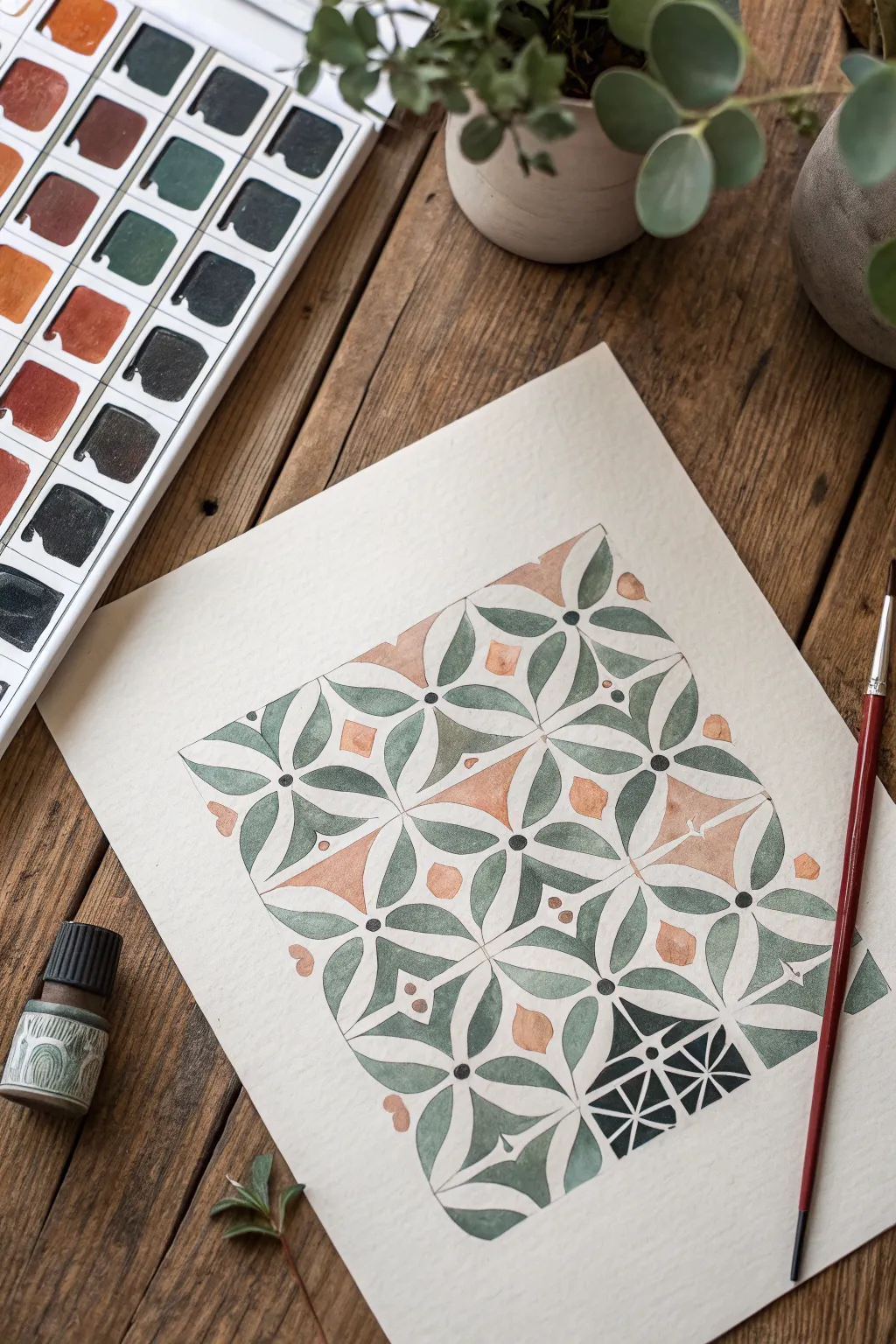
This soothing geometric study relies on the repetition of simple mandorla shapes to build a complex, tile-like pattern. The interplay of cool sage greens against warm terracotta accents creates a balanced, organic feel perfect for a meditative painting session.
Step-by-Step Guide
Materials
- Cold press watercolor paper (block or taped sheet)
- Watercolor paints (Sage Green, Deep Teal, Burnt Sienna/Rust)
- Fine round brush (size 2 or 4)
- Ruler and pencil (H or HB)
- Compass or circle template
- Eraser (kneaded is best)
- Water jar and paper towel
Step 1: Drafting the Grid
-
Create the border:
Start by lightly drawing a square or rectangle on your paper to define the boundaries of your pattern area. Leave a generous margin of white space around the edges. -
Mark the grid points:
Using your ruler, mark even intervals along the top and bottom edges (e.g., every 1.5 inches). Do the same for the sides. Lightly connect these marks to create a grid of squares. -
Find the centers:
Draw light diagonal lines through each square to find the exact center point. This ‘X’ inside each square is crucial for aligning your petals later. -
Sketch the primary curves:
Using a compass set to the distance from a corner to the center of a square, or drawing freehand, sketch arcs connecting the center points to the corners. This creates the four-petal flower shape inside each grid square. -
Add secondary shapes:
In the negative spaces between the flower tips (where four squares meet), sketch small diamond or star shapes. These will be your warm-toned accents. -
Refine the lines:
Go over your pencil lines one last time to ensure symmetry, but keep them faint. Lift any heavy graphite with a kneaded eraser so it won’t show through the transparency of the watercolor.
Step 2: Painting the Pattern
-
Mix your greens:
Prepare two distinct green mixtures on your palette: a lighter, watery sage green and a slightly deeper, more saturated teal. Having variation will give the piece visual depth. -
Paint the first petals:
Start painting the petal shapes. I find it easiest to work from the center outwards to avoid smudging. Fill alternate petals with your lighter sage green mixture. -
Vary the tones:
For the remaining petals, use the deeper teal mix or drop a little extra pigment into the wet sage paint to create effortless gradients within the shapes. -
Create separation:
Leave a hairline gap of white paper between the petals where they meet in the center. This ‘breathing room’ prevents colors from bleeding into each other and defines the geometry. -
Paint the accents:
Load your brush with Burnt Sienna or Rust. Carefully fill in the small diamond shapes and corner accents located between the green petal clusters. -
Add the dark variation:
Notice the dark, graphic tile in the bottom right of the reference? To recreate this contrast, mix a very concentrated Payne’s Grey or Black-Green and fill one corner cluster entirely, leaving thin white lines to define the pattern. -
Detail the centers:
Once the green petals are fully dry, use the tip of your brush to place a small, dark dot in the absolute center of each flower cluster.
Bleeding Edges?
If your petals are bleeding into each other, you are working too fast. Paint non-adjacent petals first (checkboard style) and let them dry completely before painting their neighbors.
Step 3: Finishing Touches
-
Erase guidelines:
Wait until the paper is completely bone-dry. Gently run your eraser over the exposed grid lines to clean up the white spaces. -
Assess and adjust:
Look for any uneven edges. You can carefully reshape a wonky petal by re-wetting the edge with a clean, damp brush and lifting color, or adding a tiny amount of paint to smooth the curve.
Steady Hand Trick
For crisp geometric edges without masking tape, exhale slowly as you pull your brush along the pencil line. Locking your pinky finger on the table stabilizes your hand.
Step back and appreciate the rhythm created by your steady repetitions and color choices

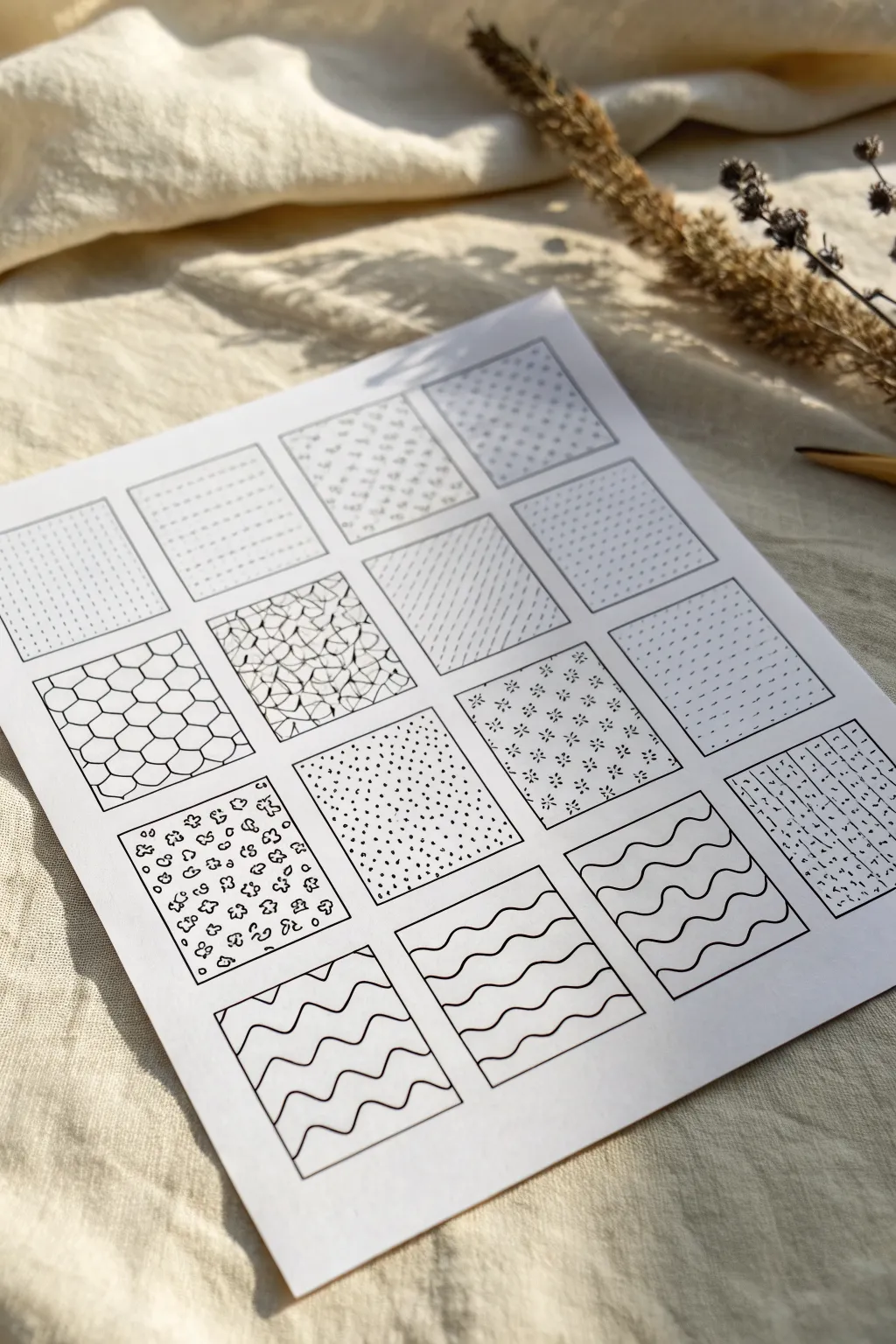
Stripe and Line Rhythm Patterns
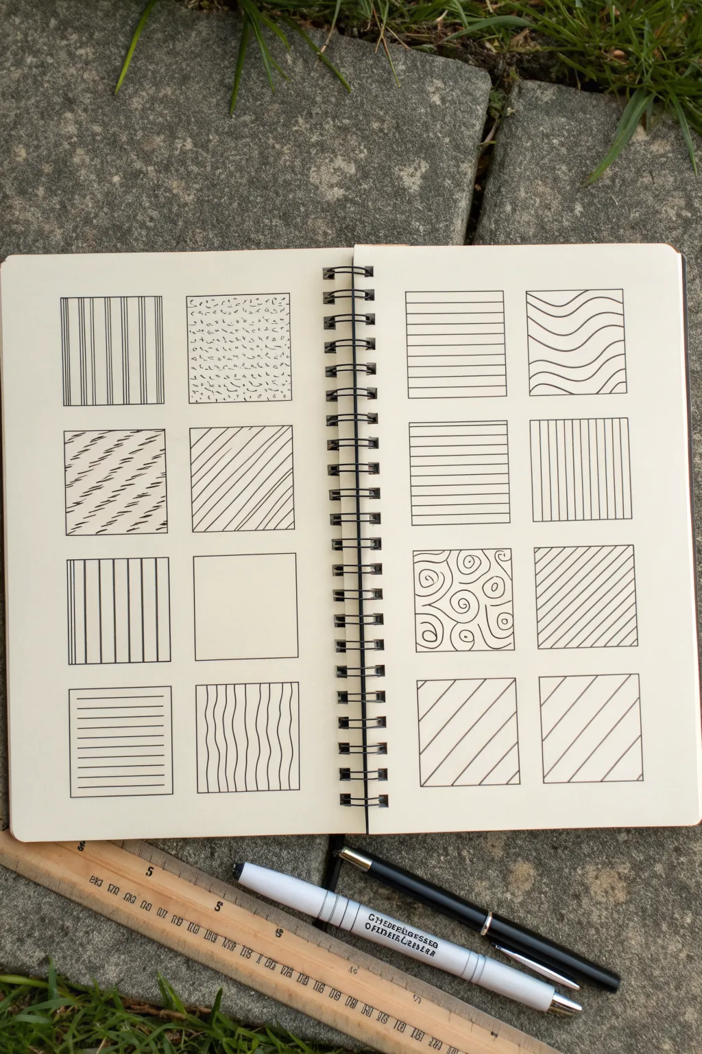
This study in texture and line rhythm transforms a simple grid into a library of visual patterns. By isolating different line types—from rigid stripes to organic swirls—you create a reference guide that explores how spacing and direction affect visual weight.
How-To Guide
Materials
- Spiral-bound sketchbook (A5 or similar)
- Fine liner pen (black, 0.3mm or 0.5mm)
- Ruler
- Pencil (HB or 2H for light guidelines)
- Eraser
Step 1: Setting the Structure
-
Plan the grid:
Begin by deciding on the size of your squares. A 4×4 cm (approx. 1.5 inches) square is usually large enough to show a pattern but small enough to finish quickly. You will need a layout of 16 squares total across the two pages. -
Draw the grid outlines:
Using your ruler and pencil, lightly draw your squares. Draw two columns of four squares on the left page, and two columns of four squares on the right page. Leave even margins between them to let the designs breathe. -
Ink the frames:
Once you are happy with the spacing, trace over your pencil squares with a fine liner pen to create crisp, permanent boundaries. I find using a ruler here ensures the frames look professional and neat. -
Erase guidelines:
Wait a moment for the ink to dry completely to avoid smudging, then gently erase all remaining pencil marks so you have a clean slate.
Step 2: Left Page: Weight and Texture
-
Vertical variations:
In the top-left square, draw vertical stripes. Vary the line weight or group them—try three thin lines close together, then a gap, then repeat. -
Stippled texture:
Beside it, create a distinct texture using small marks. Instead of clean lines, use tiny ‘c’ shapes, dashes, or dots scattered randomly to fill the box with organic noise. -
Broken diagonals:
For the second row, fill the first box with diagonal lines that are ‘interrupted’ or dashed. This creates a fabric-like weave effect. -
Clean diagonals:
Next to the dashed lines, fill the square with standard, evenly spaced diagonal lines. Notice how this contrasts with the broken lines beside it. -
Rhythmic grouping:
In the third row, return to vertical lines. This time, create a pattern of one thick line followed by four very thin lines. If you only have one pen size, simulate thickness by drawing two lines side-by-side. -
Negative space:
Leave the box next to it largely empty or draw a very minimal border. Sometimes, the absence of pattern is a pattern itself. -
Horizontal standard:
In the bottom-left box, draw simple, evenly spaced horizontal lines. Keep your hand steady and use the ruler if you want machine-like precision. -
Wavy verticals:
For the final box on this page, draw vertical lines but give them a gentle, organic wave. Keep them roughly parallel, but let them wiggle naturally.
Wobbly Lines?
Don’t stress if freehand lines aren’t perfect. Small jitters add character. If you want precision, just stick to using a ruler for every stroke.
Step 3: Right Page: Movement and Flow
-
Horizontal uniformity:
Start the top of the right page with clean horizontal lines. Vary the spacing slightly from the ones on the left page to see how density changes the ‘darkness’ of the square. -
Undulating waves:
Beside it, draw horizontal wavy lines. Let the distinct curves nest into each other, creating a topographic map effect. -
Dense horizontals:
In the second row, repeat the horizontal theme but pack the lines much closer together. This creates a darker value compared to the box above it. -
Tight verticals:
Similarly, fill the next box with tightly packed vertical lines. This is a study in density and tension. -
Swirls and distinct shapes:
In the third row, break the geometric pattern. Fill this square with loose, hand-drawn swirls or spirals of varying sizes. This adds an organic softness to the grid. -
Steep diagonals:
Next to the swirls, draw diagonal lines again, but change the angle. Try a steeper slope to see how it changes the dynamism of the block. -
Opposing Diagonals:
For the final bottom row, fill the first box with wide diagonal lines slanting upwards to the right. -
Mirrored Diagonals:
Finish the gride grid by filling the last box with wide diagonals slanting upwards to the left, creating a mirror image of its neighbor.
Go Bolder
Try alternating between a 0.1mm and a 0.8mm pen within a single square. The high contrast in line weight creates a dramatic optical vibration.
Now you have a personal catalog of textures you can reference for future drawings
Dot Trails and Stippling Fills
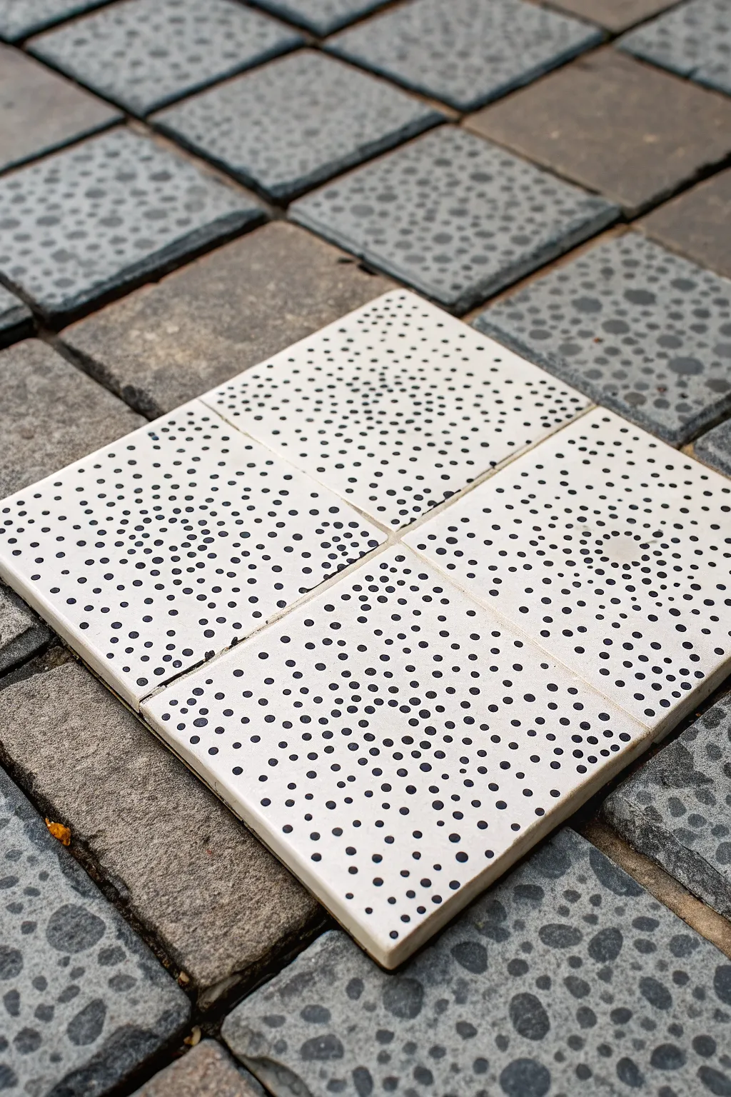
Create a striking set of faux-ceramic coasters featuring a mesmerizing stipple pattern that radiates from the center. This project transforms simple square tiles into a modern, geometric art piece using only paint and patience.
Step-by-Step
Materials
- 4 unglazed white ceramic tiles (4×4 inches)
- Black acrylic paint (high flow or fluid type)
- Set of dotting tools (various sizes) or drill bits
- Fine-grit sandpaper (320 grit)
- Matte or satin spray sealant
- Ruler
- Pencil
- Paper plate or palette
- Cotton swabs
- Rubbing alcohol
- Cork backing sheets
Step 1: Preparation & Planning
-
Clean the surface:
Before starting, wipe down your ceramic tiles with rubbing alcohol and a clean cloth to remove any dust, oils, or residues from the manufacturing process. -
Arrange the grid:
Place your four tiles together on a flat surface in a 2×2 square formation. This is crucial because your design will span across all four tiles as a cohesive unit. -
Mark the center:
Using your ruler and pencil, lightly mark the exact center point where the four corners of the tiles meet. This intersection is the origin point for your radiating pattern. -
Draw guide circles:
Lightly sketch faint concentric circles radiating outward from that center point across all four tiles. These don’t need to be perfect, but they will help structure your dot placement.
Step 2: Stippling the Design
-
Prepare your palette:
Pour a small amount of black liquid acrylic paint onto your paper plate. You want a consistency that is fluid enough to drop off a tool but thick enough to hold its shape. -
Select your tools:
Choose 3-4 dotting tools of different diameters. If you don’t have specialized tools, the flat ends of drill bits or the handles of paintbrushes work wonderfully. -
Start at the origin:
Begin stippling with your smallest tool right at the center corners where the four tiles meet. Place small, dense dots here to create a dark focal point. -
Work outward in rings:
Follow your pencil guidelines, moving outward in circular ripple patterns. As you move away from the center, slightly increase the spacing between dots. -
Vary dot sizes:
To mimic the organic look in the image, switch to a slightly larger tool for the middle section of the radius. Randomize the size slightly within each ‘zone’ to keep it looking artistic rather than mechanical. -
Create density gradients:
As you reach the outer edges of the tiles, space the dots further apart and perhaps return to a smaller size. This creates a fading effect that draws the eye back to the dense center. -
Check the flow:
I like to step back occasionally to ensure the density looks balanced across all four quadrants. Fill in any bald spots with tiny micro-dots to smooth out the transition. -
Clean up edges:
If any dots have dripped over the side edges, wipe them quickly with a damp cotton swab before they set.
Perfect Dot Consistency
Reload your tool with paint after every singe dot for uniform size. For a ‘fading’ trail effect, dot 3-4 times before reloading.
Step 3: Finishing Touches
-
Allow to cure:
Let the paint dry completely. Acrylics on ceramic can take longer than on canvas, so leave them for at least 24 hours to ensure the bond is secure. -
Erase guidelines:
Once the paint is rock-hard, gently erase any visible pencil marks. Be careful not to scrub the paint itself. -
Seal the artwork:
Take the tiles to a well-ventilated area and apply 2-3 light coats of matte or satin spray sealant. This protects the design from moisture and scratches. -
Add backing:
Peel and stick cork backing sheets to the underside of each tile. This protects your furniture and completes the coaster functionality.
Oops! Smudged Paint?
Don’t wipe wet paint! Let the mistake dry completely, then gently scrape it off with a craft knife or toothpick.
Arrange your finished tiles on a coffee table to enjoy the interplay of the optical illusion pattern
BRUSH GUIDE
The Right Brush for Every Stroke
From clean lines to bold texture — master brush choice, stroke control, and essential techniques.
Explore the Full Guide
Checkerboard Variations
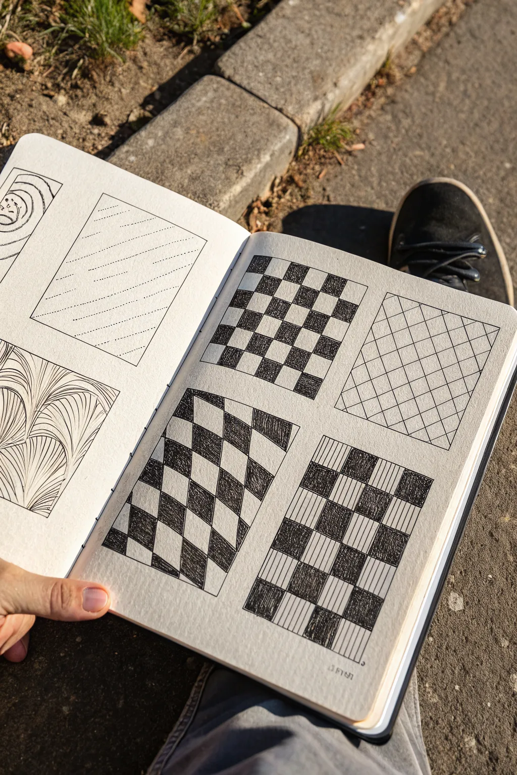
Explore the versatility of simple grids with these four distinct geometric patterns. By bending lines and alternating fills, you can transform a basic checkerboard into optical illusions and textured designs.
Step-by-Step Tutorial
Materials
- Fine-liner pen (0.5mm)
- Pencil (HB or H)
- Eraser
- Ruler
- Sketchbook or drawing paper
Step 1: Setting up the Grids
-
Mark the boundaries:
Start by drawing four equal-sized rectangles on your page using a ruler and pencil. Leave comfortable spacing between them so the designs don’t feel crowded. -
Top-left basic grid:
For the first box, draw a standard, evenly spaced grid with vertical and horizontal lines. Aim for roughly 8 squares across and 8 down. -
Warped perspective grid:
In the bottom-left box, you are going to create a ‘flag’ effect. Draw vertical lines that are straight. Then, draw horizontal waving lines that curve up and down, creating a rippling grid structure. -
Diagonal grid:
In the top-right box, rotate your ruler 45 degrees. Draw a series of parallel diagonal lines, then cross them with perpendicular lines to form diamonds rather than squares. -
Simple vertical grid:
For the final bottom-right box, draw straight vertical lines. Then, add horizontal lines to create a standard grid similar to the first box; the variation here will come later with the shading.
Smudge Prevention
Place a scrap piece of paper under your drawing hand. This acts as a shield, preventing oils from your skin or wet ink from smearing across your clean paper.
Step 2: Inking and Filling
-
Trace the outlines:
Switch to your 0.5mm fine-liner. Carefully trace the outer borders of all four rectangles to define your workspace. -
Standard checkerboard fill:
Return to the top-left grid. Ink over your pencil grid lines. Then, starting in the top corner, fill in every other square with solid black ink. I find that working row by row helps prevent accidental mis-coloring. -
Warped checkerboard shading:
Move to the bottom-left ‘waving’ grid. Ink the waving lines carefully. Fill in the alternating sections just like a checkerboard. Because the lines curve, your filled shapes will look distorted, which creates the 3D ripple effect. -
Diagonal lattice:
For the top-right diamond grid, simply ink the grid lines you drew. Do not fill these shapes; the beauty of this variation is the clean, open diaper pattern. -
Line-shaded checkerboard:
On the bottom-right grid, ink the structure. Instead of solid black fills, use vertical hatching (closely spaced lines) to fill alternating squares. This creates a lighter, textural contrast compared to the solid black versions. -
Clean up:
Allow the ink to dry completely to avoid smearing. Once dry, gently erase all underlying pencil marks to reveal the crisp black-and-white contrast.
Level Up
Try stippling (dots) instead of lines for the bottom-right squares. It takes longer but creates a soft, gradient texture.
Enjoy seeing how simple lines can bend perception and create depth on a flat page
Chevron and Zigzag Rows
This serene watercolor project captures the calming rhythm of repeating chevron patterns in a muted, earthy palette. Using thick, textured paper adds a lovely tactile quality to the geometric precision of the design.
Detailed Instructions
Materials
- Cold press watercolor paper (300 gsm or heavier)
- Watercolor paints (terracotta/rust, sage green, grey-blue)
- Drawing pencil (HB or H)
- Ruler
- Round watercolor brush (size 4 or 6)
- Water container
- Paper towels
- Kneaded eraser
Step 1: Preparation and Mapping
-
Paper selection:
Begin with a high-quality cold press watercolor paper. The rough texture shown in the image is key to achieving that organic, handcrafted look, so avoid smooth hot press papers for this specific project. -
Establish the grid:
Using your ruler and pencil, lightly draw horizontal guidelines across the paper. Space them evenly, perhaps an inch or 1.5 inches apart, depending on how chunky you want your chevrons to be. -
Mark the peaks and valleys:
along the top guideline, make a tick mark every inch. On the guideline below it, make tick marks every inch but offset them by half an inch. Connect these points lightly to create a continuous zigzag skeleton. -
Thicken the lines:
Once you have your single-line skeleton, draw parallel lines to give width to each chevron row. Leave consistent white space between the rows to separate the colors clearly. -
Add floating accents:
Sketch a few small, detached triangles in the negative space at the very top and bottom of the composition, following the slope of the main zigzags. -
Lighten the guide:
Gently roll a kneaded eraser over your pencil sketch. You want the graphite to be barely visible—just enough to guide your brush but faint enough to disappear under the paint.
Wobbly Lines?
Don’t panic if lines aren’t perfect. Embrace the ‘wabi-sabi’ aesthetic. If a wobble is distracting, wait for it to dry, then use a damp, clean brush to gently scrub and lift the edge back to straight.
Step 2: Painting the Pattern
-
Mix your palette:
Prepare three distinct puddles of paint: a warm terracotta or rust orange, a muted sage green, and a soft grey-blue. Dilute them enough to be transparent but keep the pigment strong enough to stand out. -
Start with the rust:
Load your round brush with the terracotta mix. Paint the second complete row from the top. Use the tip of the brush to carefully define the sharp points of the peaks and valleys. -
Apply the sage green:
Moving down the paper, paint the row directly beneath the rust one using your sage green mixture. Keep your hand steady to maintain crisp edges against the white paper. -
Introduce the grey:
Paint the next row with the pale grey-blue wash. I find that alternating warm and cool rows creates the most pleasing visual rhythm. -
Continue the sequence:
Repeat the color pattern (Rust, Sage, Grey) as you move down the page. Remember to rinse your brush thoroughly between color changes to keep the hues muddying. -
Paint the disconnected shapes:
Fill in the small floating triangles at the top and bottom borders. Match their colors to the sequence—if the top row would have been green, paint the floating triangles green.
Step 3: Refining and Finishing
-
Check for consistency:
Look over your wet paint. If any areas look too pale, you can gently drop a little more pigment into the wet wash to deepen the color without creating hard lines. -
Let it dry completely:
Allow the paper to sit flat until bone dry. Resist the urge to touch it, as damp paper can smudge easily. -
Clean up edges:
Once fully dry, inspect your edges. If any pencil lines are still visible outside the paint, use the kneaded eraser to dab them away gently.
Try Masking Fluid
For ultra-crisp white gaps between rows, apply thin lines of masking fluid or artists tape before painting. Peel it away after the paint is dry for sharp, professional negative space.
Step back and admire the simple, harmonious rhythm of your new geometric artwork

PENCIL GUIDE
Understanding Pencil Grades from H to B
From first sketch to finished drawing — learn pencil grades, line control, and shading techniques.
Explore the Full Guide
Spirals, Swirls, and Curls
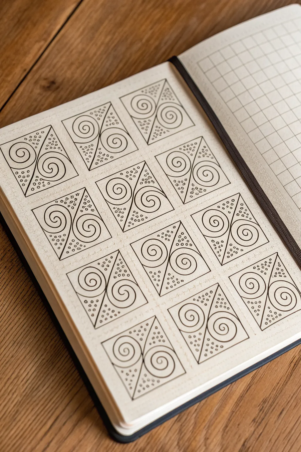
This mesmerizing page layout features a grid of divided squares, each housing a pair of interlocking spirals surrounded by delicate stippling. The design combines geometric structure with organic curves, creating a satisfyingly balanced and meditative repeating pattern.
Step-by-Step Guide
Materials
- Dotted or grid journal (A5 size recommended)
- Fine liner pen (0.3mm or 0.5mm, black)
- Pencil (HB or lighter)
- Ruler or straight edge
- Eraser
Step 1: Setting the Grid
-
Map out the squares:
Begin by counting the dots or grid squares in your journal to determine the size of your tiles. A 6×6 dot square works well for this pattern, leaving a 1-dot gap between tiles for breathing room. -
Draw the grid lines:
Using your pencil and ruler, lightly sketch out a grid of squares across the page. Aim for a layout of 3 columns and 4 rows to match the reference image exactly. -
Add diagonal dividers:
Within each penciled square, draw a diagonal line from the top-left corner to the bottom-right corner. This simple line will split every square into two triangular sections.
Pro Tip: Consistent Curves
Draw the spirals ‘from the outside in’ rather than inside out. Starting at the corner gives you better control over how the curve fits the triangle shape.
Step 2: Inking the Structure
-
Outline the squares:
Switch to your fine liner pen. Carefully trace over the outer perimeter of each square you penciled in earlier. Keep your hand steady to ensure crisp, sharp corners. -
Ink the diagonals:
Draw the diagonal dividing line in ink for each square. Be sure to stop exactly at the corners so the lines don’t bleed into the surrounding gutter space. -
Erase guidelines:
Wait a moment for the ink to dry completely to avoid smudging. Then, gently erase the underlying pencil marks to leave a clean, black-and-white framework.
Step 3: Drawing the Spirals
-
Start the first spiral:
Focus on the upper-right triangle of your first square. Place your pen tip near the center of the triangle’s widest part and begin drawing a spiral that winds inward. -
Refine the curve:
As you wind the spiral, try to keep the spacing between the lines consistent. The tail of the spiral should curve outwards and eventually meet the corner of the triangle. -
Mirror the spiral:
Move to the bottom-left triangle of the same square. Draw a second spiral here, mirroring the first one. It should wind in the opposite orientation, creating a pleasing symmetry. -
Repeat across the grid:
Continue this process for every square on the page. I find it helpful to draw all the top-right spirals first, then go back and fill in the bottom-left ones to maintain a consistent flow.
Level Up: Color Accents
Use a light grey marker or a soft pastel highlighter to color in the background of just the spirals, leaving the stippled corners white for depth.
Step 4: Adding Details
-
Identify empty space:
Notice the small triangular gaps left in the corners of the triangles, outside the curves of the spirals. These negative spaces are perfect for texture. -
Apply stippling:
Fill these corner gaps with small, varying circles or dots. Keep the circles tiny and somewhat random to create a bubbly, organic texture that contrasts with the rigid lines. -
Vary dot density:
Cluster the dots slightly denser near the corners of the square and let them spread out as they get closer to the spiral line. -
Final check:
Scan your page for any missed corners or uneven lines. You can thicken the outer borders of the squares slightly if you want them to pop more against the page.
Enjoy seeing your page fill up with this rhythmic, hypnotic pattern
Scales and Petal Overlaps
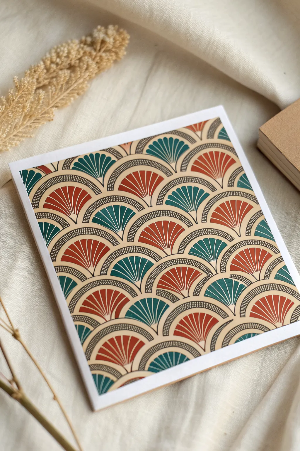
Embrace the elegance of the Art Deco era with this stunning geometric scale pattern. Featuring alternating fans of deep teal and terra cotta, this project creates a sophisticated, repetitive design perfect for handmade greeting cards or framed wall art.
Detailed Instructions
Materials
- Heavyweight white cardstock (square format, e.g., 6×6 inches)
- Fine liner pens (black, 0.3mm and 0.5mm)
- Compass or circle stencil template
- Ruler
- Pencil (HB)
- Eraser
- Markers or gouache paint (Deep Teal, Burnt Orange/Terra Cotta, Warm Cream/Beige)
Step 1: Drafting the Grid
-
Measure the canvas:
Start with your square cardstock. Using a ruler and pencil, lightly mark horizontal guidelines across the paper. Space them evenly based on how large you want your scales to be (about 1 inch apart works well for this density). -
Mark vertical centers:
Along the first horizontal line, mark points at regular intervals (e.g., every 2 inches). On the second horizontal line, markings should be offset so they sit exactly halfway between the marks on the line above. -
Repeat the offset:
Continue marking these alternating center points all the way down the page. This staggered grid creates the classic fish-scale or scallop formation.
Step 2: Drawing the Base Structure
-
Draft the arches:
Place your compass point on one of your pencil marks. Adjust the radius so the arc just touches the neighboring center points. Draw a semi-circle. -
Connect the scales:
Move across the row, drafting semi-circles that touch seamlessly at the bottom corners. Repeat this for every row. You should now see the overlapping scale pattern emerging in pencil. -
Add the inner border:
Without moving the compass point, slightly reduce the radius (by about 3-4mm) and draw a second, smaller arc inside each scale. This creates the channel where the dotted detail will go later. -
Create the fan center:
Reduce the compass radius once more, significantly this time, to define the solid colored fan shape at the core of each scale.
Sticky Note Shield
Place a post-it note under your hand while drawing. This prevents hand oils from transferring to the paper and keeps you from smudging wet ink as you move across the grid.
Step 3: Inking the Pattern
-
Outline the main shapes:
Switch to your 0.5mm black fine liner. Carefully trace over your pencil lines, defining the outer arch, the inner arch, and the central fan shape. -
Draw the fan dividers:
Locate the center bottom point of a scale. From this point, draw radiating straight lines outward to the top edge of the inner fan shape. I usually aim for 5 or 7 lines to create uniform segments. -
Ink the dots:
Using a 0.3mm pen for finer detail, fill the narrow channel between the two outer arches with tiny vertical dashes or dots. Keep them tightly packed to create a textured, ‘stitched’ look. -
Erase guidelines:
Wait until the ink is completely dry to avoid smudging. Gently run your eraser over the entire piece to remove the pencil grid and compass marks.
Metallics Upgrade
Swap the beige background color or the black ink for a metallic gold pen. The gold accents will catch the light and emphasize the 1920s Art Deco inspiration.
Step 4: Adding Color
-
Fill the background:
Using a warm cream or beige marker, color the background areas. This is typically the small triangular gaps between the tops of the arches. -
Start the teal fans:
Select your deep teal marker. Color in the segmented fan shapes on alternating scales. Be careful to stay within the lines of the segmented dividers. -
Add the terra cotta:
Fill the remaining empty fan shapes with your burnt orange or terra cotta color. The alternating warm and cool tones give the design its retro appeal. -
Refine the lines:
If any color bled slightly or obscured your black lines, go back over the main outlines with the 0.5mm pen to crisp up the edges. -
Clean up borders:
If your pattern runs off the edge of the paper, ensure the cut-off points look intentional and clean. You might want to outline the very edge of the cardstock for a finished look.
Now you have a striking geometric art piece ready to be gifted or displayed


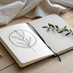
Leafy Vine Repeat Patterns
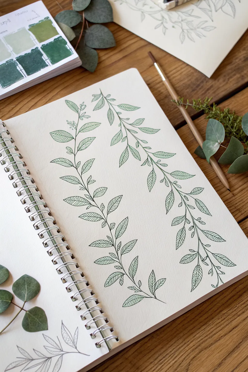
This elegant botanical study features two parallel leafy vines flowing vertically across the page, captured in a crisp, illustrative style. The design balances organic movement with structured line work, making it a perfect exercise for practicing leaf anatomy and composition.
Step-by-Step Guide
Materials
- Spiral-bound sketchbook (mixed media or watercolor paper)
- Green fine-liner pen (0.3mm or 0.5mm)
- Light pencil (HB or 2H)
- Eraser
- Reference leaves (optional, like eucalyptus or olive)
- Flexible ruler (optional)
Step 1: Planning the Flow
-
Mark the stems:
Begin by lightly sketching two long, vertical curves with your pencil to establish the main stems. Give them a gentle S-curve shape rather than making them perfectly straight; this adds a natural, organic feel. Position them so they mirror each other slightly but remain distinct. -
Map leaf positions:
Along each stem line, lightly mark small ticks where the leaves will attach. Alternate these points on the left and right sides of the stem to create a balanced, climbing pattern. -
Sketch the leaf shapes:
Using your pencil marks as a guide, sketch the basic outline of each leaf. Aim for an elongated almond or lanceolate shape—wider near the base and tapering to a point. Vary the angles slightly so some leaves point upward and others tip outward, mimicking how a real plant reaches for light.
Uneven Lines?
If your long stem lines look shaky, try drawing from your shoulder rather than your wrist. This creates smoother, more confident curves.
Step 2: Inking the Foundations
-
Ink the main stems:
Switch to your green fine-liner. starting from the bottom, trace over your pencil stem lines. Keep your hand relaxed to maintain a fluid line. -
Outline the leaves:
Carefully ink the perimeter of each leaf. When you connect the leaf to the main stem, add a tiny, curved stem (petiole) for a realistic attachment point rather than sticking the leaf directly onto the main vine. -
Add small shoots:
In the spaces between the larger leaves, sketch tiny, budding shoots or smaller baby leaves. This adds density and visual interest to the negative space. -
Erase pencil guides:
Once the basic ink outlines are completely dry, gently erase the underlying pencil sketches to clear up your workspace for the details.
Step 3: Detailing and Texture
-
Draw the center veins:
Draw a single line down the center of each leaf, extending from the base almost to the tip. I prefer to curve this line slightly to match the bend of the leaf. -
Add primary lateral veins:
From the center vein, draw diagonal lines branching outward toward the leaf edges. Space them evenly, angling them upwards toward the leaf tip. -
Cross-hatching technique:
To achieve the textured look seen in the example, add very fine, closely spaced lines between the lateral veins. These can be straight or slightly curved. -
Vary line density:
You can make some leaves look darker or shadowed by placing your hatching lines closer together, or lighter by spacing them apart. -
Refine the connections:
Go back over the points where the leaf stems meet the main vine. Thicken these joints very slightly with your pen to add weight and stability to the drawing. -
Final touches:
Review your composition. If any areas look too sparse, add a small extra leaf or a curling tendril to fill the gap.
Observation Trick
Look at real leaves (like the eucalyptus in the photo) to see how veins actually connect; nature rarely makes straight lines.
Now you have a serene botanical spread ready to be framed or used as a border for your journaling
Flower Burst Doodle Patterns
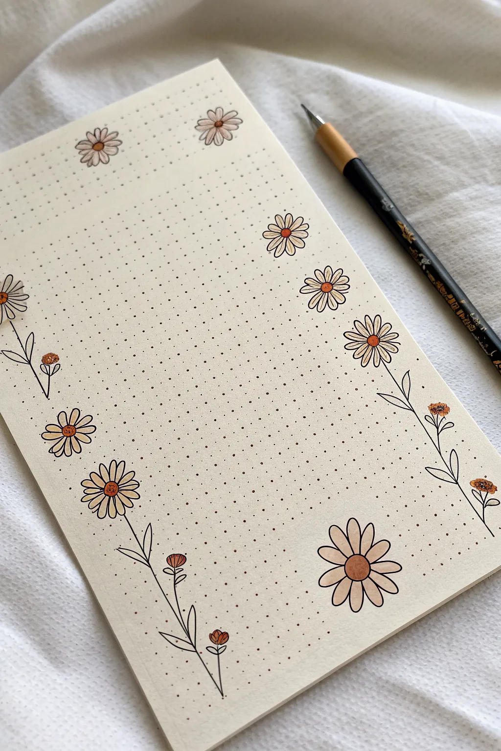
Transform a simple page into elegant stationery with this delicate daisy border design. Using fine liners on dot grid paper creates a clean, structured look that feels playful yet organized, perfect for bullet journaling or letter writing.
Step-by-Step
Materials
- Dot grid notebook or loose-leaf paper (cream or white)
- Black fine liner pen (01 or 03 size)
- Pencil (HB or lighter)
- Soft eraser
- Light orange or peach colored pencil/marker
- Ruler (optional)
Step 1: Planning and Layout
-
Define the writing space:
Visualize a large rectangle in the center of your page where your future writing will go. We want to keep this area clear, focusing our drawing only on the outer margins. -
Pencil placement markers:
Before committing to ink, lightly pencil in small circles along the left and right sides where you want your main flower heads to sit. Stagger them so they aren’t perfectly aligned straight down. -
Mark the corners:
Place a few loose flower markers near the top corners and the bottom center to create a sense of framing without closing the box entirely.
Oops! Wobbly Lines?
If a stem line goes crooked, don’t scrap it. Turn that wobble into a leaf node or a branch point for a new flower bud to hide the mistake naturally.
Step 2: Drawing the Main Blooms
-
Start the center disks:
Using your black fine liner, draw small circles for the centers of your daisies. Keep your hand relaxed so the circles look organic rather than mechanically perfect. -
Add primary petals:
Draw the first layer of petals radiating from the center disk. They should be long, slender ovals. Don’t worry if they overlap slightly or vary in width; that adds character. -
Fill the gaps:
If you see large spaces between petals, tuck a small triangular tip of a petal behind the main ones to make the flower look fuller. -
Vary the flower sizes:
Draw a larger, dominant daisy in the bottom right corner for visual weight. I like to make the top daisies slightly smaller to keep the header feeling light.
Step 3: Adding Stems and Buds
-
Draw the main stems:
From the bottom of your side flowers, draw thin, slightly curving lines downwards. Use the dot grid to guide you, but don’t just connect the dots perfectly straight. -
Create branching stems:
Add smaller offshoot lines from the main stems. These will hold your buds and leaves. Keep the angles sharp and upward-facing. -
Sketch the buds:
At the tips of your shorter stems, draw small, cup-shaped semi-circles with tiny petals peeking out from the top to represent unbloomed buds. -
Add simple leaves:
Draw slender, pointed laurel-leaf shapes along the stems. Draw a central vein line down the middle of each leaf for a bit of detail.
Make it Pop
Use a white gel pen to add tiny highlight dots on the orange flower centers or add a very light grey shadow under the petals for a 3D sticker effect.
Step 4: Color and Details
-
Erase pencil guides:
Once the ink is completely dry—wait at least a minute or two to prevent smudging—gently erase your initial planning marks. -
Color the centers:
Take your light orange or peach pencil and gently color in the central disks of the open daisies. Apply the color softly for a pastel look. -
Tint the buds:
Add a tiny touch of that same orange color to the tops of the small flower buds to tie the color palette together. -
Optional shading:
You can add a tiny dot or hatching line on the petals near the center disk to give the flower a little more depth.
Enjoy using your beautifully bordered paper for your next journal entry or letter
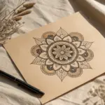
Mandala Ring Pattern Ideas
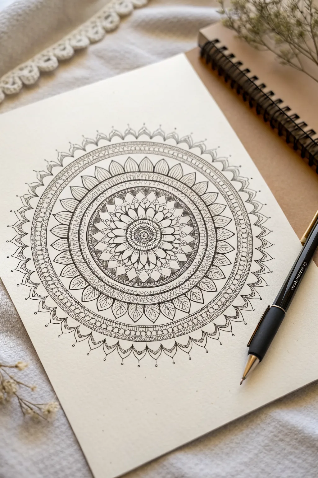
This stunning mandala features a series of expanding concentric circles filled with delicate petal shapes and intricate stippling details. The monochromatic design emphasizes contrast and precision, resulting in a mesmerizing, balanced piece that looks beautiful on heavy cream cardstock.
Detailed Instructions
Materials
- Heavyweight drawing paper or cardstock (cream or white)
- Pencil (HB or 2H)
- Compass
- Protractor (optional)
- Ruler
- Eraser (kneaded preferred)
- Fine liner pens (0.1mm, 0.3mm, 0.5mm)
- Black brush pen (optional for filling large areas)
Step 1: Setting the Structure
-
Find the center:
Begin by marking the precise center of your paper. This singular dot is the anchor for the entire piece, so measure carefully. -
Draw guide circles:
Using your compass and pencil, draw a series of concentric circles radiating from the center. Start small (about 1cm radius) and work outward, spacing subsequent rings about 1-1.5cm apart until you have about 6-7 main rings. Keep the pressure light so these lines can be erased later. -
Divide the pie:
Use a protractor or a division technique to divide your circle into equal pie slices. Drawing faint lines through the center across the whole shape helps align opposite petals. Aim for 16 or 32 sections to keep the symmetry tight.
Steady Hands
Rotate the paper, not your hand. Keeping your wrist in a comfortable, fixed position and spinning the page allows for much more consistent curves and petal shapes.
Step 2: Drawing the Core
-
The central flower:
In the innermost circle, draw a tiny central rosette or button shape with a 0.3mm pen. Surround this with small stamens or dots. -
First petal layer:
Draw the first ring of petals around the center. These should be fairly small and rounded. Make sure the tip of each petal touches the circumference of your first guide circle. -
Inner detailing:
Inside these first petals, add a tiny vein line or a small dot at the base to create depth. I find that adding these small details immediately helps visualize the density of the final piece. -
Layering the second ring:
Create a second layer of slightly larger, pointed petals behind the first set. Use the intersections of the previous petals as the halfway point for the new ones to create an overlapping effect.
Step 3: Expanding the Pattern
-
The geometric band:
Move outward to the next guide circle gap. Instead of petals, fill this ring with a geometric pattern, such as small triangles or a tight grid. Use a 0.1mm pen here for crispness. -
Dark contrast ring:
For the next section, draw a ring of simple U-shapes or scallops. Fill the negative space between the scallops with black ink to create a high-contrast band that makes the center pop. -
Large petal framework:
Draw the largest ring of petals now. These should be elongated leaf shapes. Use the pencil guidelines to ensure each leaf tip hits the same height. -
Leaf details:
Inside each large leaf, draw a smaller, parallel leaf shape. Fill the space between the inner and outer leaf lines with fine diagonal hatching or stippling (dots) for texture.
Oops, a mistake?
If you draw a crooked line or uneven petal, don’t scrap it. simply thicken the line weight of that entire ring to mask the wobble, or fill that section with solid black.
Step 4: Final Borders and Details
-
The braided border:
Create a thick band outside the large leaves. Fill this with a series of small, repetitive circles or ‘pearls’ tightly packed together. This acts as a frame for the inner work. -
Outer scallops:
Draw a final ring of decorative scallops or pointed arches on the very outside edge. Add a small dot floating above each point to extend the design into the negative space. -
Reinforce lines:
Switch to a slightly thicker pen (0.5mm) and re-trace the major structural lines—the main circles separating the bands—to separate the sections clearly. -
Erase and polish:
Allow the ink to dry completely—wait at least 15 minutes to be safe. Gently erase all pencil guidelines, being careful not to buckle the paper.
Now you have a serene, symmetrical artwork ready to be framed or gifted to a friend
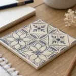
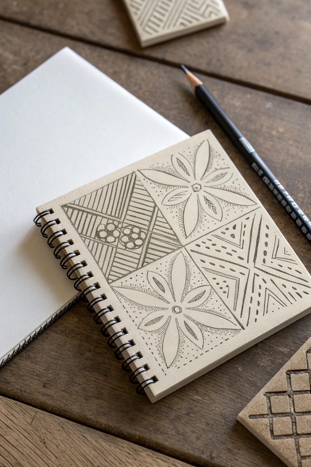
Tessellated Triangle and Hexagon Patterns
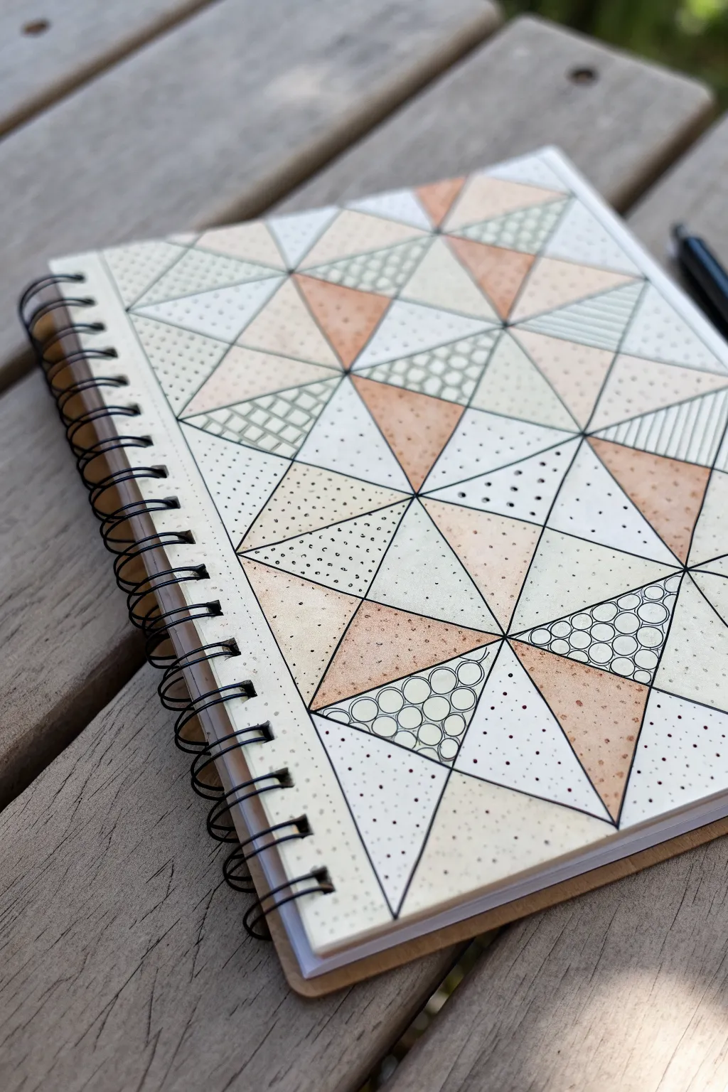
Transform a plain sketchbook cover or a single art page into a soothing geometric tessellation using simple tools. This project combines structural grid-work with meditative zentangle-inspired fill patterns in a soft, earth-toned palette.
Step-by-Step
Materials
- A5 or A4 sketchbook (spiral bound works well)
- Ruler or straight edge
- Pencil (HB or lighter)
- Eraser
- Fine liner pen (Black, 0.3mm or 0.5mm)
- Colored pencils or fine markers (Peach, Beige, light Sage Green)
- White gel pen (optional, for highlights)
Step 1: Drafting the Grid Structure
-
Establish the orientation:
Begin with your sketchbook page or cover oriented vertically. You will be creating a grid based on equilateral triangles. -
Mark vertical guides:
Using your ruler and pencil, lightly mark vertical lines spaced evenly across the page. A spacing of about 2 inches works well for a medium-sized journal. -
Create horizontal baselines:
Lightly draw horizontal lines intersecting your vertical guides. These will help you align the points of your triangles. -
Connect the diagonals:
Connect the intersection points diagonally to form a series of large diamonds and triangles. Aim for a 60-degree angle if you have a protractor, or simply connect the corners of your grid boxes to create the tessellated effect. -
Subdivide the shapes:
Once the main large triangles are drawn, use your ruler to divide them further. Draw lines connecting the midpoints of the larger triangle sides to create smaller, nested triangles within the main grid.
Clean Corners Pro Tip
When inking the grid, place a dot at every intersection point first. Connect the dots rather than drawing long continuous lines to ensure perfect geometric vertices.
Step 2: Inking the Framework
-
Trace the main lines:
Switch to your black fine liner. Carefully trace over your pencil grid lines. I prefer to rotate the notebook so I’m always pulling the pen toward me for straighter lines. -
Define the sections:
Ensure all intersection points meet cleanly. If lines overshoot slightly, don’t worry—this adds a bit of hand-drawn charm. -
Erase pencil marks:
Wait at least 10 minutes for the ink to fully dry to prevent smearing. Gently erase all the underlying pencil structure.
Level It Up
Use a metallic gold gel pen instead of black for the stippling on the colored triangles. It adds a subtle shimmer that catches the light wonderfully.
Step 3: Adding Color & Pattern
-
Plan your color distribution:
Select a few triangles to be solid colors. In the reference, a soft peach/terracotta color is used. Distribute these randomly but evenly to balance the composition. -
Apply base color:
Color in your chosen ‘solid’ triangles. You can use colored pencils for a textured look or markers for a flatter finish. Keep the shading light and even. -
Stipple shading:
On the colored triangles, use your black pen to add tiny dots (stippling) on one side or corner. This creates a gradient effect that suggests depth. -
Create the circle fill:
Choose a few empty triangles for the circle pattern. Draw tightly packed small circles. Fill the negative space between circles with black ink for contrast, or leave them open like bubbles. -
Draw linear textures:
In another set of triangles, draw parallel straight lines. Vary the direction—some horizontal, some vertical, some following the diagonal angle of the triangle. -
Add the grid fill:
Select a few more sections and fill them with a mini-grid or checkered pattern. Keep the lines very fine to distinguish them from the main structural borders. -
Dot the remaining spaces:
For the triangles that remain white/cream, add simple stippling. Varing the density of dots—some dense, some sparse—adds visual interest without overwhelming the design. -
Review and refine:
Look over the entire piece. If any lines look too thin, thicken them slightly with the pen to make the geometry pop.
Enjoy the rhythmic process of filling these shapes and seeing your geometric tapestry come to life
Border and Frame Pattern Bands
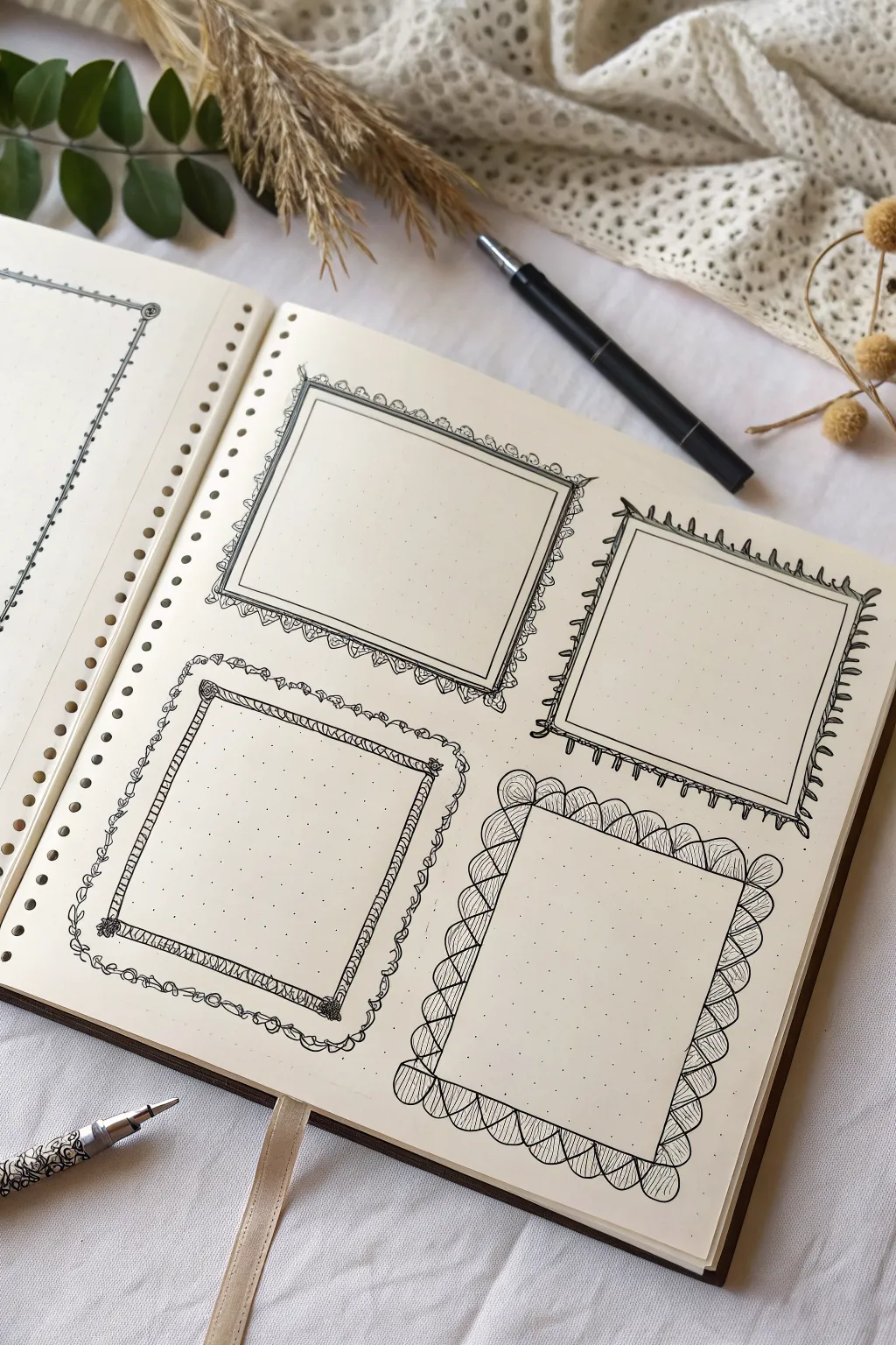
Elevate your bullet journal layout with this collection of four distinct, hand-drawn decorative frames. Using simple ink lines on dotted paper, you can create elegant scalloped edges, botanical vines, and rustic doodle borders that turn ordinary notes into featured highlights.
Detailed Instructions
Materials
- Dotted grid journal or notebook
- Fine liner pen (black, 0.3mm or 0.5mm)
- Pencil (HB or lighter)
- Eraser
- Ruler
Step 1: Planning and Layout
-
Map the spacing:
Begin by deciding where your four frames will sit on the page. Using the dot grid as a guide, count the dots to ensure equal spacing between each designated area, aiming for a 2×2 grid layout. -
Pencil the skeletons:
Lightly sketch four basic rectangles using your ruler and pencil. These don’t need to be heavy lines; they just serve as the skeletal structure for your ink work later.
Uneven Scallops?
If your corner scallops look awkward, try drawing the four corner scallops first, then spacing the remaining side scallops evenly between them.
Step 2: Drawing the Scalloped Fan Frame (Bottom Right)
-
Draw the inner border:
Switch to your fine liner. Draw a solid rectangular line over your pencil sketch, but leave a small gap at the corners if you want a softer look. -
Add the scallop base:
drawing a series of semicircles (scallops) all the way around the outside of the rectangle. Try to keep them roughly the same width, pivoting slightly at the corners. -
Detail the fans:
Inside each scallop semicircle, draw fine lines radiating from the center point of the arch outward to the edge, creating a fan or seashell texture. -
Create depth:
Go back over the outer edge of the scallops with a slightly heavier line or a second pass to define the silhouette against the page.
Add a Splash of Color
Use mild highlighters to fill the inner whitespace of the frames or tint the detailed leaves for a soft, vintage botanical look.
Step 3: Drawing the Rustic Vine Frame (Bottom Left)
-
Sketch the inner box:
Draw the main rectangle, but instead of a simple straight line, use small, slightly diagonal hatch marks to create a ‘rope’ or ‘threaded’ texture along the straight edges. -
Add corner accents:
At each of the four corners, draw a small, dense spiral or rosette shape to anchor the frame. -
Draw the outer vine:
Loosely draw a wavy, organic line that wraps around the entire rectangle. This shouldn’t be perfect; let it flow naturally. -
Leafy details:
Along the wavy line, add small, simple leaf shapes or tiny loops at regular intervals to give it the appearance of a climbing vine.
Step 4: Drawing the Lacey Double Frame (Top Left)
-
Create the double line:
Draw two concentric rectangles, one slightly smaller than the other, with about a 3-4mm gap between them. -
Connect the lines:
Fill the space between the two rectangles with small diagonal hatch marks or zig-zags to create a textured band. -
Add lace loops:
On the very outside edge, draw tiny, repetitive ‘u’ shapes or loops. I find it helpful to rotate the notebook as I work around the corners to keep my hand angle consistent.
Step 5: Drawing the Spiky Botanical Frame (Top Right)
-
Draft the boundary:
Draw a simple, single-line rectangle for the base shape. -
Add organic spikes:
Draw flame-like or long leaf-like shapes extending outward from the border. Vary their height slightly—some short, some long—to create energy and movement. -
Refine the base:
Thicken the base line slightly where the spikes attach to the rectangle to make the foliage look grounded.
Step 6: Finishing Touches
-
Erase pencil marks:
Wait at least five minutes for the ink to fully cure, then gently erase all underlying pencil sketches. -
Final assessment:
Check for any gaps in your lines or areas that need a little extra ink weight to balance the four frames visually.
Start filling your new frames with quotes, to-do lists, or tiny sketches to complete the spread
Pattern-on-Pattern Layering
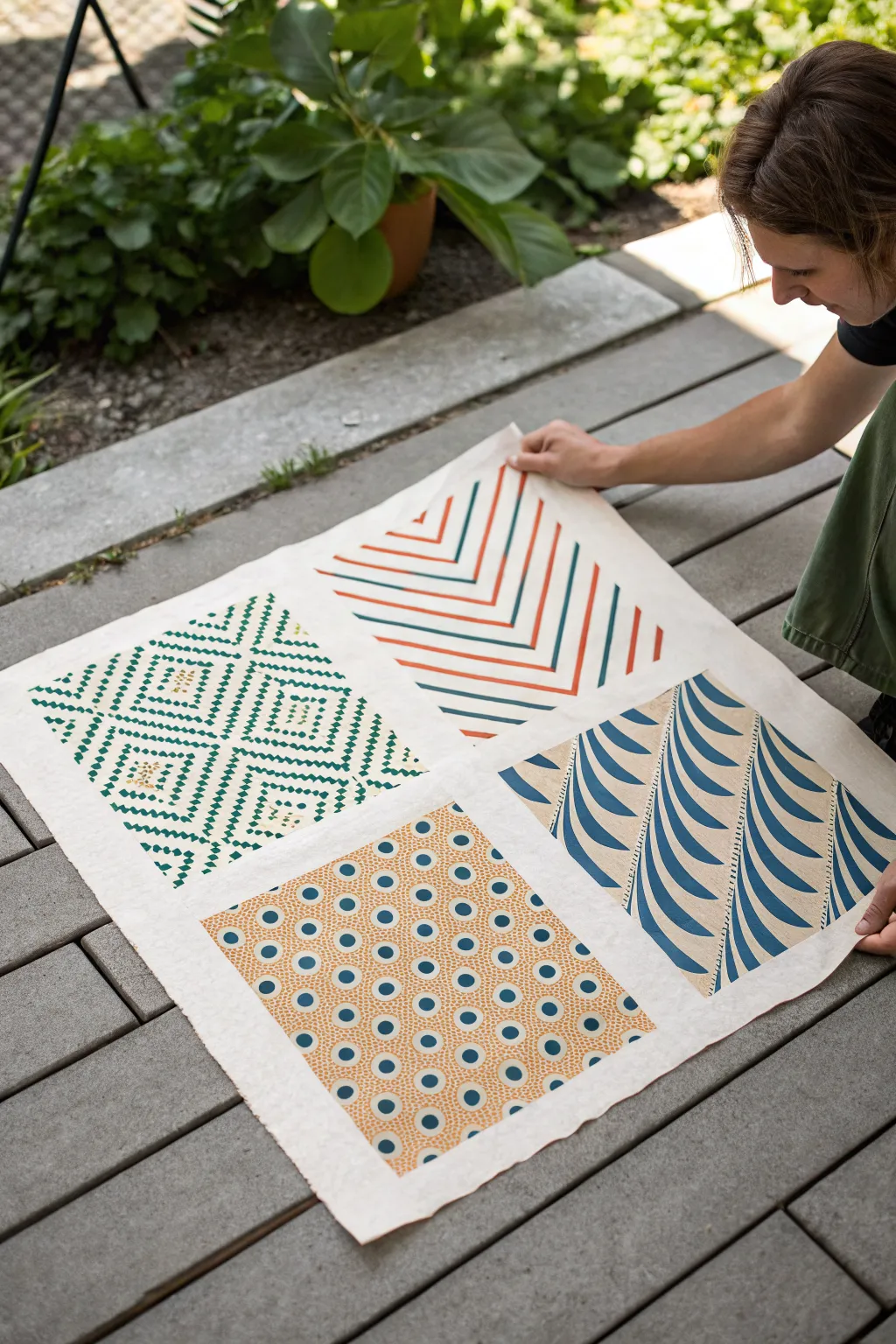
Create a striking piece of wall art or a custom textile by combining four distinct geometric patterns onto a single sheet. This project explores the art of relief printing to achieve a bold, graphic look with a cohesive color palette.
Detailed Instructions
Materials
- Large sheet of printmaking paper (e.g., Rives BFK or mulberry paper) or cotton fabric
- Soft-cut linoleum blocks or rubber stamping carving blocks (4 separate blocks)
- Linoleum carving tools (V-gouge and U-gouge)
- Block printing ink (Screen printing ink if using fabric) in teal, orange, and blue
- Brayer (rubber roller)
- Glass or acrylic sheet for inking
- Pencil and ruler
- Paper for sketching designs
- Baren or a clean wooden spoon
Step 1: Design and Preparation
-
Plan your layout:
Begin by deciding the size of your final piece. Measure your paper and divide it visually into four equal quadrants, leaving a comfortable border around the edges and a cross-shaped gap between the four sections to act as a frame. -
Draft the patterns:
Sketch four distinct geometric designs on scrap paper cut to the size of your linoleum blocks. Aim for variety: a diamond lattice, a chevron stripe, a wave pattern, and a circular dot motif. -
Transfer to blocks:
Place your sketches face down onto the carving blocks and rub the back with a spoon to transfer the graphite. Alternatively, draw directly onto the blocks, remembering that the final print will be a mirror image.
Patchy Prints?
If your print looks salty or speckled, you likely didn’t use enough ink. Add a bit more to your slab, roll until tacky, and re-ink. Paper tooth also matters—smoother paper yields solid blocks of color.
Step 2: Carving the Blocks
-
Carve the lattice:
For the top-left diamond pattern, use a fine V-gouge to outline the diamond shapes. Switch to a wider gouge to clear away the negative space inside the diamonds, leaving a textured, dashed line effect. -
Carve the chevron:
For the top-right chevron design, use a ruler to mark parallel zigzag lines. Carefully carve out the valleys between the ridges. Varying the line thickness adds visual interest here. -
Carve the dots:
For the bottom-left dot pattern, you can use a U-gouge to scoop out circles. To get the ‘eye’ effect, leave a small raised dot in the center of a larger cleared circle, acting as a bullseye. -
Carve the waves:
For the bottom-right wave pattern, use long, sweeping strokes with a medium gouge to create the rhythmic blue curves. Carve away the background to leave the wave shapes raised. -
Clean up:
Brush away any loose carving debris. I usually do a quick test print on scrap paper at this point to check for any high spots that might catch unwanted ink.
Step 3: Printing the Design
-
Prepare the workspace:
Lay your large final paper on a flat, clean surface. Lightly mark the quadrant boundaries with a pencil if you need a guide, or use masking tape to delineate the cross-shaped negative space. -
Ink the lattice:
Squeeze a small amount of teal green ink onto your inking plate and roll it out with the brayer until it sounds like sizzling bacon. Roll an even layer onto the diamond lattice block. -
Print the first quadrant:
Position the block carefully in the top-left section. Press down firmly. Use a baren or the back of a wooden spoon to rub the back of the paper (if printing face down) or the back of the block to ensure even transfer. -
Ink and print the chevron:
Clean your brayer or use a second one. Mix an orange-red ink. Apply this to the chevron block and print it in the top-right quadrant, mirroring the placement of the first block. -
Print the dots:
Using a golden-yellow or light orange ink, ink up the dot-pattern block. Align this in the bottom-left quadrant. Apply consistent pressure, especially in the center of the block, to capture the detailed dots. -
Print the waves:
Finally, ink the wave block with a deep blue. Place it in the bottom-right quadrant. This dark color anchors the composition, so take care to align the edges with the neighboring prints. -
dry and set:
Carefully lift the blocks if you haven’t already. Allow the ink to dry completely. If you printed on fabric, follow the ink manufacturer’s instructions for heat setting with an iron.
Registration Station
Make a ‘jig’ using cardboard corners tape-marked on your table. Slide your paper into the corner, then place your block into a matching marked spot to ensure perfect alignment every time.
Now you have a stunning geometric sampler that showcases the beautiful imperfections of hand-pressed art
Texture Rubbing Pattern Designs
Combine the tactile art of texture rubbing with precise pencil work in this unique geometric sketchbook study. By layering graphite over textured tiles and refining the shapes with crisp outlines, you’ll create a striking grid of contrasting patterns.
Detailed Instructions
Materials
- Small spiral-bound sketchbook (smooth or light-grain paper)
- Graphite pencil (HB or B for outlines, 2B-4B for rubbing)
- Texture plates or tiles (geometric patterns)
- Ruler
- Eraser
- Pencil sharpener
Step 1: Setting the Structure
-
Define the boundaries:
Begin by using your ruler to lightly draw a large square in the center of your sketchbook page. Ensure there is an even margin of white space around the edges. -
Create the grid:
Divide your large square into four equal quadrants by drawing one vertical line and one horizontal line through the center point. -
Plan the diagonals:
In the top-left and bottom-right quadrants, draw faint diagonal lines from corner to corner. These will serve as guides for your geometric patterns later. -
Sketch floral guides:
In the remaining two quadrants (top-right and bottom-left), lightly sketch a small circle in the very center of each square to act as the flower’s midpoint.
Step 2: Capturing Texture
-
Position the first tile:
Slip a texture plate or patterned tile underneath the page, positioning it directly beneath the top-left quadrant. -
Rub the pattern:
Using the side of your lead or a softer pencil held at a low angle, gently rub over the paper surface to pick up the texture. Aim for a medium grey tone, not too dark yet. -
Rotate and repeat:
Move the texture plate under the bottom-right quadrant. I usually check the alignment with my fingers before rubbing to ensure the pattern runs straight. -
Add contrasting texture:
If you have a different texture plate (perhaps a floral or dotted one), place it under the floral quadrants and apply a very light, subtle rubbing key to give the background some grit.
Uneven Texture?
If your rubbing looks patchy, ensure your pencil is dull and broad. Don’t press the tip down; use the side of the lead and secure the plate with tape so it doesn’t shift.
Step 3: Geometric Definition
-
Outline the top-left:
Switch to a sharpened HB pencil. In the top-left quadrant, draw firm lines over your rubbed texture, defining nested triangles or chevrons based on the underlying grid. -
Add circle details:
Draw three small, interlocking circles near the center intersection of the top-left quadrant, creating a focal point amidst the stripes. -
Define the bottom-right:
Move to the bottom-right quadrant and darken the geometric lines. Use broken or dashed lines for some sections to add variety to the visual rhythm. -
Enhance the stripes:
Go back over the striped areas of your geometric squares. If the rubbing is too faint, carefully shade between your pencil lines to simulate depth.
Add Dimension
Use a paper blending stump (tortillon) to soften the graphite rubbing in the floral sections. This creates a smooth, misty background that makes your sharp pencil lines pop.
Step 4: Floral Detailing
-
Draw petals:
In the top-right quadrant, draw six to eight petals radiating from the center circle. Make them pointed and leaf-like, extending almost to the quadrant’s edge. -
Detail the center:
Add a second, larger ring around the center point of the flower, and fill the innermost circle with tiny dots or stippling. -
Texture the petals:
Inside each petal, draw a central vein line. Add light shading or stippling near the base of the petals to make them look dimensional. -
Repeat for the second flower:
Recreate this floral design in the bottom-left quadrant. Try to mirror the angle slightly so the two flowers feel connected across the diagonal. -
Final border:
Take your ruler and darken the main outer square and the dividing cross lines to crisply separate the four distinct designs.
Now you have a beautifully balanced composition bridging organic shapes and structured patterns
Optical Illusion Line Patterns
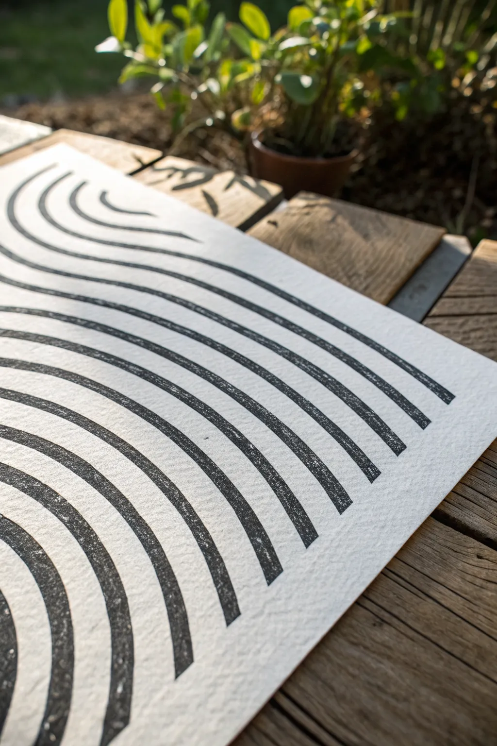
Capture the mesmerizing rhythm of flowing water with this minimalist relief print project. Using simple linocut techniques, you’ll create bold, undulating lines that play with negative space on textured paper.
Step-by-Step
Materials
- Soft-cut linoleum block (approx. A4 or A3 size)
- Linocut carving tools (V-gouge and U-gouge)
- Black relief printing ink (water-based or oil-based)
- Brayer (rubber roller)
- High-quality printmaking paper (e.g., Stonehenge or Rives BFK)
- Pencil and eraser
- Tracing paper
- Ruler
- Baren or a large wooden spoon
- Inking plate or piece of glass
Step 1: Designing and Transferring
-
Draft your waves:
Begin by sketching your design on a piece of paper the same size as your linoleum block. Draw a series of parallel, curving lines that flow from one corner to another. Vary the spacing slightly if you want a more organic feel, but aim for consistency for an optical effect. -
Refine the lines:
Go over your sketch with a dark marker to clearly define which areas will be black (the inked surface) and which will be white (the carved-away paper). The lines should be thick enough to carve around comfortably. -
Transfer the design:
Place tracing paper over your sketch and trace the lines carefully. Flip the tracing paper over onto your linoleum block (graphite side down) and rub the back firmly with a bone folder or spoon to transfer the image. -
Reinforce the image:
If the transfer is faint, go over the lines directly on the lino block with a permanent marker. This prevents the design from smudging while you carve.
Step 2: Carving the Block
-
Outline the waves:
Using a fine V-gouge tool, carefully carve along the edges of your drawn lines. I prefer to carve away from myself for safety, rotating the block as needed to follow the curves smoothly. -
Clear the negative space:
Switch to a wider U-gouge to clear out the material between the wave lines. Carve shallow, consistent scoops rather than digging deep trenches. -
Creating texture:
Decide on your background texture. For a clean look, smooth out any ridges in the negative space. If you want the ‘chatter’ (visible carving marks) to show, leave small ridges. -
Clean the block:
Once carving is complete, brush away all loose bits of linoleum. Wipe the block down with a slightly damp cloth to remove any graphite or dust that could muddy your ink.
Clean Lines Tip
Warm your lino block slightly with a hair dryer or on a sunny windowsill before carving. This softens the material, making it easier to cut smooth, continuous curves without jagged edges.
Step 3: Inking and Printing
-
Prepare the ink:
Squeeze a small line of block printing ink onto your inking plate. Roll it out with the brayer until you hear a sticky, velcro-like sound. The ink should be smooth and velvety, not goopy. -
Ink the block:
Roll the brayer over your carved block in multiple directions. Apply a thin, even layer of ink first, then reload the brayer and apply a second pass to ensure solid coverage on the raised wave lines. -
Position the paper:
Carefully align your printmaking paper over the inked block. Once the paper touches the ink, do not shift it, or the image will blur. -
Burnish the print:
Using a baren or the back of a wooden spoon, rub the back of the paper in small circles. Apply firm, consistent pressure over the entire surface, paying special attention to the edges and corners. -
Check for coverage:
carefully lift one corner of the paper while holding the rest down to peek at the transfer. If the black looks patchy, lay it back down and burnish that area more vigorously. -
The reveal:
Slowly peel the paper off the block from one end to the other to reveal your print. Any small imperfections or ‘salt’ spots add to the handmade character. -
Drying:
Place your finished print on a flat drying rack or hang it up. Oil-based inks may take several days to cure fully, while water-based inks will dry much faster.
Two-Tone Twist
Try a gradient roll (rainbow roll) technique! Put two ink colors side-by-side on your glass plate and roll them out together to create an ombre effect across your waves.
Now you have a striking piece of optical art ready to be framed and displayed.

Have a question or want to share your own experience? I'd love to hear from you in the comments below!