
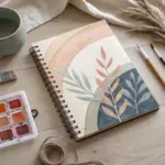
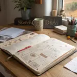
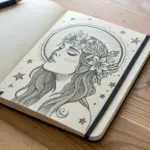
When I need quick, satisfying sketch practice, I love using college drawing ideas because they’re packed with nostalgia and little symbols you can riff on forever. Here are my favorite prompts that capture campus life, studying, and that big “I’m doing this” energy—ranging from classic to delightfully unexpected.
College Doodle Dump Icons
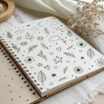
Capture the busy, scattered energy of college life with this fun spread of bite-sized illustrations. This project focuses on simple line work and minimal color accents to create a cohesive page of academic-themed icons.
Detailed Instructions
Materials
- A5 Spiral-bound sketchbook or bullet journal (dot grid preferred)
- Fine-point black ink pen (0.3mm or 0.5mm)
- Pencil and eraser (optional for sketching)
- Teal or mint green highlighter/marker
- Silver or grey light marker (optional for shading)
Step 1: Planning the Layout
-
Establish the scatter pattern:
Visualize your page as a random assortment of items. The goal isn’t perfect rows, but an even distribution of ‘weight’. Start by imagining where 5-6 larger items will anchor the page. -
Penciling placeholders:
Using a light pencil touch, mark rough circles or squares where your main doodles will go. This ensures you don’t crowd all the drawings into one corner.
Uneven Spacing?
If you end up with a large blank gap, don’t force a large object in. Instead, draw a cluster of three small stars or dots to fill the void naturally.
Step 2: Drawing the Major Icons
-
Sketch the lightbulb:
Near the top right, draw a classic lightbulb shape. Add vertical lines inside for the filament and a zig-zag screw base at the bottom. -
Add the travel bag:
On the left side, draw a rounded rectangle for a suitcase. Add a sturdy handle on top and a simple pocket on the front to give it dimension. -
Create the coffee cup:
Near the bottom center, draw a travel coffee cup. Start with the lid shape, then the cup body tapering down. Add a cardboard sleeve band around the middle. -
Draw the vinyl record:
In the center, sketch two concentric circles to form a vinyl record or CD. Add a small circle in the very middle and a few lines to suggest reflection. -
Insert the graduation cap:
Draw a diamond shape on the right side. From the bottom three points, drop short vertical lines to form the cap structure, and add a tassel hanging off the side. -
Sketch the mini-calendar:
Draw a small grid tilted slightly. Thickening the top line suggests the binding of a notebook or calendar page.
Use A Stencil
For perfectly round elements like the vinyl record or bubbles, trace a coin or use a template ruler to keep circles crisp and professional looking.
Step 3: Adding Filler Elements
-
Scattering stars:
Fill the larger empty gaps with open 5-point stars. Draw some larger and some smaller to create variety. -
Drawing leaves:
Add a simple, elongated leaf shape near the center-left. Draw a single line down the middle for the vein. -
Mini-grids and tech:
Draw a small phone shape or a tiny grid notepad near the bottom left to balance the composition. -
Tiny details:
Look for any remaining awkward spaces. Fill these with tiny asterisks, dots, or miniature lightning bolts to connect the larger drawings.
Step 4: Inking and Coloring
-
Commit to ink:
Go over your pencil sketches with your fine-point black pen. Focus on clean, confident lines. Don’t worry if lines overlap slightly; that’s part of the charm. -
Erase pencil guides:
Wait at least five minutes for the ink to fully dry to avoid smearing, then gently erase all your pencil marks. -
Apply the accent color:
Take your teal marker and color in specific sections, but not the whole object. Fill the coffee cup sleeve, the suitcase body, and the liquid inside a beaker or bottle doodle. -
Strategic shading:
I like to use a light grey marker to add a quick shadow under larger objects like the suitcase or lightbulb to ground them, though this is optional. -
Final texture check:
Add tiny hatching lines (shading) to areas like the lightbulb base or the top of the coffee cup for extra definition.
Now you have a lively page of icons ready to decorate your planner or study notes


Dream College Building Facade
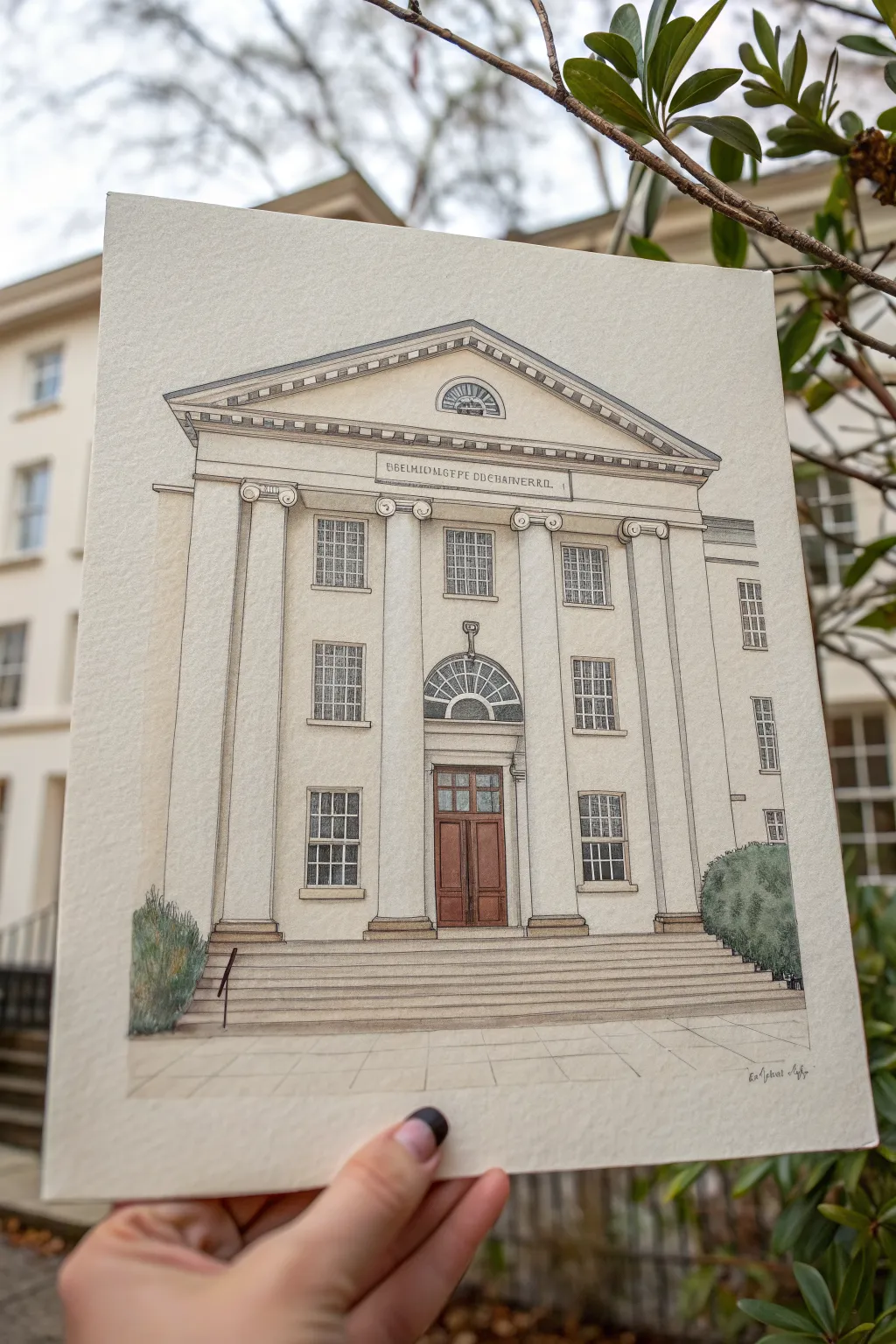
Capture the stately elegance of academic architecture with this detailed mixed-media illustration. Combining precise ink linework with soft watercolor washes creates a timeless, dignified portrait of your dream university building.
Step-by-Step Guide
Materials
- Cold-pressed watercolor paper (300 gsm)
- HB or 2H graphite pencil
- Ruler and T-square
- Fine liner pens (0.05mm, 0.1mm, and 0.3mm, waterproof)
- Watercolor paints (Sepia, Yellow Ochre, Burnt Sienna, Payne’s Grey, Sage Green)
- Round watercolor brushes (Size 2 and 4)
- Kneadable eraser
- Masking tape
Step 1: Planning and Pencil Construction
-
Paper preparation:
Begin by taping your watercolor paper to a board with masking tape. This prevents buckling when we add the washes later and creates a crisp, clean border around the final piece. -
Establish the horizon line:
Using a ruler and your HB pencil, lightly draw a horizon line near the bottom third of the paper. This will serve as the baseline for your stairs and the building’s foundation. -
Block in the main structure:
Draw a large rectangle for the main facade. Locate the center point and draw a vertical centerline; this is crucial because classical architecture relies on perfect symmetry. -
Draft the columns and pediment:
Sketch the triangular pediment at the top. Below it, draft four vertical columns. Use your ruler to ensure they are evenly spaced and exactly perpendicular to the ground. -
Window and door placement:
Lightly grid out the window placements—two rows of rectangular windows flanking the center. Sketch the central doorway with its arched fanlight window above. -
Staircase details:
Draw the wide, horizontal lines for the steps leading up to the entrance. Keep the lines close together to suggest the rise of each step.
Wobbly Lines?
If your hand shakes while inking long column lines, exhale slowly as you draw the line. Alternatively, use a ruler with a beveled edge upside down to prevent ink bleeding under.
Step 2: Inking the Structure
-
Primary outlines:
Using a 0.3mm fineliner, carefully ink the main structural lines: the columns, the roofline, and the base of the building. Use a ruler for the straightest possible edges. -
Detailing the windows:
Switch to a 0.1mm pen to draw the window frames and mullions (the grid inside the glass). These lines should be slightly more delicate than the structural walls. -
Adding architectural ornaments:
Use the 0.05mm pen for the finest details, such as the dentils (teeth-like blocks) under the roof, the Ionic scrollwork at the top of the columns, and the fanlight pattern. -
Texture and shadow:
Add minimal hatching with the 0.05mm pen to suggest shadow under the roof overhang and inside the deep window recesses. Do not over-shade; paint will handle most of this. -
Erase pencil guides:
Once the ink is completely dry—I usually wait at least 15 minutes to be safe—gently erase all graphite marks with a kneadable eraser.
Level Up: Texture
After the stone wash dries, splatter tiny specks of darker beige paint from an old toothbrush onto the facade. This mimics the grit and imperfections of real limestone or concrete.
Step 3: Watercolor Washes
-
Base stone color:
Mix a very dilute wash of Yellow Ochre and a tiny touch of Sepia to create a warm, creamy stone color. Apply this over the entire building facade, avoiding the windows and door. -
Shadows and depth:
While the first layer is dry, mix a watery Payne’s Grey with a little purple or brown. Paint thin vertical shadows along the right side of the columns and under the pediment to give the building 3D form. -
Window panes:
Use a diluted mix of Payne’s Grey and blue for the glass. Paint the panes loosely; leaving some small white gaps can simulate reflection and make the glass look glossy. -
The wooden door:
Paint the main entrance door with Burnt Sienna. Once dry, add a second coat to the recessed panels to create depth and richness in the wood. -
Foreground and greenery:
Paint the steps with a cool grey (diluted black). For the bushes on the sides, use Sage Green with dabbling brushstrokes to create a leafy texture, darkening the bottom area for volume. -
Final inspection:
Check for any areas that need more definition. You can use your 0.1mm pen to re-emphasize lines that might have gotten lost under the paint, like the stair edges.
Peel off the tape carefully to reveal your crisp, architecturally precise masterpiece.
Dorm Room Corner Sketch
Capture the organized chaos of student life with this detailed pen-and-ink sketch of a study space. This project focuses on drawing a diagrammatic view of a desk layout within an open notebook, blending architectural sketching with loose, expressive line work.
Detailed Instructions
Materials
- A5 or A4 sketchbook with off-white or cream paper
- Fine liner pens (sizes 0.1, 0.3, and 0.5)
- Graphite pencil (HB or 2H)
- Kneaded eraser
- Ruler or straight edge
Step 1: Planning the Layout
-
Establish the page structure:
Begin by lightly drawing a vertical line down the center of your open sketchbook spread to denote the gutter. Then, sketch a large rectangle on the left page where your main diagram will live. -
Map out the main shapes:
Using your HB pencil, lightly block in the primary forms of the desk objects. Draw a large, irregular looped shape in the center for the main focal point (perhaps a lamp base or cable coil) and boxy shapes around it representing books or containers. -
Add directional flow:
Sketch light arrows or connecting lines between these shapes. This mimics a flowchart style often used in design planning or mind-mapping. -
Draft the text blocks:
Instead of writing words immediately, draw small horizontal guidelines where text annotations will go. Place these near the object shapes to label them later.
Loose but Controlled
Don’t connect every single corner perfectly. Leaving small gaps at line intersections makes architectural sketches feel more dynamic and less rigid.
Step 2: Inking the Diagram
-
Outline the central object:
Switch to your 0.3 fine liner. Carefully trace over the central looped shape. Keep your hand relaxed to give the line a slightly organic, sketchy feel rather than a perfect geometric curve. -
Define the containers:
Ink the boxy shapes surrounding the center. Use a ruler if you want crisp edges, or freehand it for a more casual look. I like to double up on a few lines to add weight to the ‘shadow’ side of the boxes. -
Connect the elements:
Draw the connecting lines or arrows with the 0.3 pen. Ensure they start and stop cleanly at the edges of your shapes. -
Add internal details:
Switch to the finer 0.1 pen. Inside the central looped shape, add small hatching or texture marks to suggest volume or complexity, depicting the internal wires or structure.
Step 3: Adding Text and Texture
-
Inscribe the annotations:
Use your 0.1 pen to write the notes. You don’t need to write legible sentences; scribble-text or ‘lorem ipsum’ style marks work perfectly to create the texture of writing without the distraction of meaning. -
Create the right-page grid:
Move to the right-hand page. With your ruler and pencil, lightly draft a table or chart structure. This balances the organic diagram on the left with structured data on the right. -
Ink the chart lines:
Go over the table grid with the 0.1 pen. Keep the lines very thin and delicate so they don’t overpower the drawing on the left. -
Populate the chart:
Fill the cells of your chart with tiny script or numbers using the 0.1 pen. Vary the density of the text to make the page look used and busy. -
Enhance shading:
Return to the main diagram on the left. Use the 0.1 pen to add diagonal hatching on the sides of the boxy shapes to give them rudimentary 3D form. -
Clean up:
Once the ink is completely dry, gently erase the underlying pencil structure. Check for any smudges and clean them up with the kneaded eraser. -
Final heavy lines:
Take the 0.5 pen and re-trace just the outermost contour of the main diagram group. This ‘holding line’ helps the entire sketch pop off the page.
Smudged Ink?
If you smudge fresh ink, turn it into a shadow. Add cross-hatching over the smudge to integrate the mistake into the drawing’s shading pattern.
You now have a sophisticated, study-themed aesthetic spread ready to inspire your next creative session


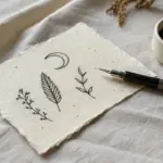
Campus Map Mini Illustration
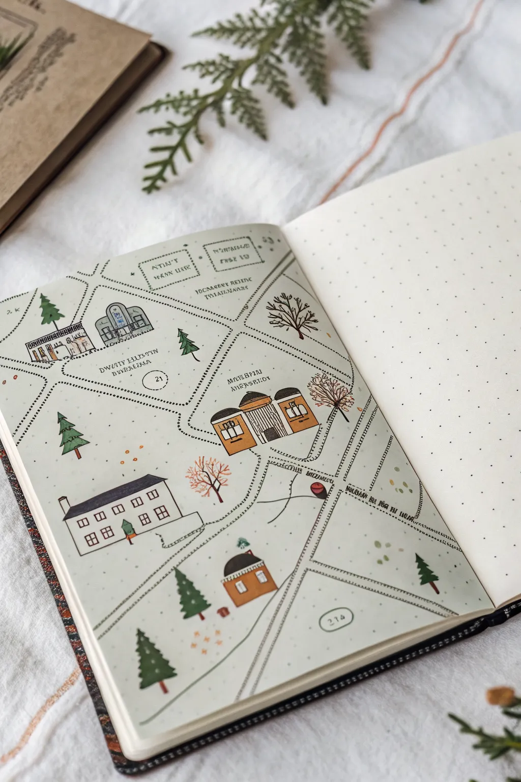
Capture the charm of your college grounds or a favorite fictional setting with this delightful simplified map illustration. Using a dot-grid notebook as your guide, you’ll build a cozy network of paths, tiny buildings, and evergreen trees that feels like a storybook village.
Step-by-Step Guide
Materials
- Dot-grid notebook or journal
- Fine liner pens (black, sizes 01 and 03)
- Colored pencils or alcohol markers (muted tones: rust orange, sage green, grey)
- Pencil and eraser
- Ruler (optional, for straighter paths)
Step 1: Planning the Layout
-
Define the boundaries:
Start by sketching a very light outline of the main roads using your pencil. Instead of solid lines, think of these as negative space where buildings won’t go. Creating a central intersection or a diagonal main road adds dynamic visual interest. -
Mark building locations:
Lightly sketch rectangles and squares where your main buildings will sit. Don’t worry about details yet; just focus on varying the sizes and angles to make the map look organic. -
Draft the paths:
Connect your building shapes with smaller walkways. Use dotted lines directly in pencil to map out the ‘walking routes’ between your main structures and the edge of the page.
Grid Guide
Use the dot grid to your advantage! Instead of measuring, count dots to ensure your buildings are roughly proportional to each other without needing a ruler.
Step 2: Inking the Structures
-
Ink the main buildings:
Using an 01 fine liner, go over your pencil sketches for the buildings. Keep the style simple—think 2D facades rather than perfect 3D perspective. Add basic roof shapes like triangles or simple trapezoids. -
Add architectural details:
Draw tiny windows as simple squares or rectangles. Add doors and perhaps a few columns on larger buildings to suggest a library or administrative hall. I like to keep lines slightly imperfect to maintain that hand-drawn charm. -
Draw the ‘dotted’ roads:
Switch to your 03 pen for a slightly bolder look. Carefully ink your road paths using a dashed line style. Create double lines of dashes to define the width of the streets, leaving the center empty. -
Add whimsical text labels:
Write the names of buildings or areas in a small, capitalized serif font. Draw uneven, dashed boxes around the text labels to separate them from the rest of the map.
Step 3: Adding Nature Elements
-
Sketch evergreen trees:
Fill empty spaces with pine trees. Start with a small triangle at the top and stack slightly wider, jagged triangles underneath until you reach the ground. -
Add deciduous trees:
For variety, draw a few rounder trees or bare winter branches depending on the season you want to depict. These soften the angular lines of the buildings. -
Draw tiny scattered details:
Add very small clusters of dots or tiny ‘v’ shapes in empty white spaces to suggest grass, fallen leaves, or rough terrain, preventing the map from looking too stark.
Make It Personal
Add ‘hidden’ personal landmarks, like your favorite coffee bench or a tiny stick figure walking a dog on one of the paths to make the map uniquely yours.
Step 4: Color and Final Touches
-
Color the roofs:
Using a rust-orange or muted brown marker/pencil, fill in the roofs of the main buildings. Leave the walls white or tint them very lightly with grey. -
Fill the evergreens:
Color your pine trees with a deep sage or forest green. If using markers, one layer is usually enough to keep the paper from bleeding through. -
Highlight the deciduous trees:
Use a lighter autumnal orange or brown for the rounder trees to create contrast against the evergreens. -
Add subtle ground accents:
Take your orange or yellow pencil and add tiny dots near the trees to simulate fallen leaves or flowers. -
Erase pencil guides:
Once the ink is completely dry—give it a good five minutes—gently erase all underlying pencil sketch lines to clean up the page. -
Label numbering (optional):
If you want a legend, draw small circles with numbers inside them near specific landmarks, which adds an official ‘guidebook’ feel.
Now you have a charming mini-map that perfectly preserves a memory of your favorite campus spots

PENCIL GUIDE
Understanding Pencil Grades from H to B
From first sketch to finished drawing — learn pencil grades, line control, and shading techniques.
Explore the Full Guide
Lecture Hall Quick Gestures
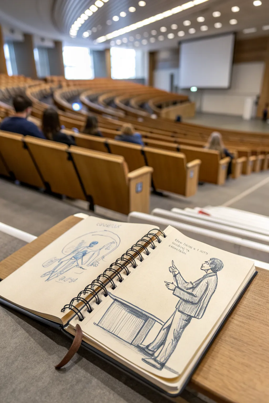
Capture the academic atmosphere with these quick, observational sketches drawn directly into a spiral notebook. This project focuses on gestural figure drawing using simple lines to depict a professor in action and a more abstract concept sketch.
Step-by-Step
Materials
- Spiral-bound sketchbook (A5 or similar size)
- Blue ballpoint pen (medium point)
- Black fine liner or drawing pen (0.5mm)
- Pencil (optional for under-drawing)
Step 1: The Right Page: The Lecturer
-
Establish the pose:
Begin on the right-hand page. Use light, swift strokes with your blue ballpoint pen to block in the standing figure’s posture. Imagine a line of action running from the head down to the heel to capture the lean. -
Sketch the head and profile:
Define the head shape, keeping it simple. Sketch a side profile looking upwards, indicating the professor is addressing the room. Add rough hatching to suggest short, dark hair. -
Draft the jacket structure:
Draw the shoulders and the hang of the jacket. Use loose, scratchy lines to suggest a textured fabric like tweed or corduroy. Make sure the sleeves bunch slightly at the elbows to show movement. -
Position the arms:
Sketch the arms in an active gesture. One arm should be raised with a pointing finger, while the other is bent at the waist, perhaps holding notes or gesturing for emphasis. -
Add trousers and stance:
Extend lines down for the legs. The trousers should look slightly baggy and relaxed. Use vertical hatching lines to shade the leg furthest from the light source. -
Anchor with the podium:
Draw the corner of a desk or podium in the bottom left foreground. Use firm, straight lines to create the geometric shape, adding vertical paneling details to contrast with the organic figure. -
Refine with texture:
Go back over the jacket with denser cross-hatching to deepen the shadows and separate the jacket from the lighter shirt underneath. -
Add text elements:
Above the figure’s head, scribble some text to simulate notes or a quote. Keep the handwriting loose and slightly illegible to maintain the ‘sketchy’ aesthetic.
Keep it Loose
Don’t correct mistakes. If a line is wrong, just draw the correct one over it. The multiple lines add energy and movement to the final piece.
Step 2: The Left Page: Abstract Anatomy
-
Start with a faint circle:
On the left page, lightly sketch a large circle using the blue ballpoint pen. This serves as a container or aura for the figure within. -
Sketch the seated figure:
Inside the circle, draw a faint, skeletal or anatomical figure in a seated position. Keep the pressure on your pen very light here; this drawing is meant to look like an idea in progress. -
Detail the anatomy:
Add suggestions of ribs and leg bones. This sketch is looser than the professor, so don’t worry about perfect proportions; focus on the flow of the limbs. -
Layer in darker accents:
Select specific areas like the knees or shoulders and press harder with the pen to create focal points, leaving the rest of the drawing airy and transparent. -
Inscribe titles:
Write a title at the top and bottom of the circle in a stylized, architectural font. Imperfections here add character to the sketchbook feel. -
Review and unify:
Look at both pages together. Add small stray marks or test scribbles near the spiral binding to make the sketchbook look authentically used and loved.
Ink Smudging?
Ballpoint ink can smudge if your hand drags. Place a scrap piece of paper under your drawing hand to protect the paper while you work.
Close your sketchbook and enjoy the satisfaction of having captured a moment in time with nothing but simple ink lines
Major-Themed Icon Set
This aesthetic project organizes academic subjects into a neat grid of minimalist doodles, each framed by a warm, golden-brown circle. It’s a perfect way to decorate a bullet journal cover page or create visual labels for your class notes.
Step-by-Step Guide
Materials
- Spiral-bound notebook with grid or dot grid paper
- Fine liner pen (black, 0.3mm or 0.5mm)
- Golden-brown or mustard yellow marker (felt tip or brush pen)
- Circle stencil or a small circular object (approx. 1 inch diameter)
- Pencil
- Eraser
Step 1: Setting the Grid
-
Plan placement:
Visualize a 3×4 grid on your notebook page. You want twelve circles total, evenly spaced. Using the grid lines on your paper as a guide, lightly mark the center point for each of the twelve circles with a pencil to ensure they are aligned vertically and horizontally. -
Draw the circles:
Take your golden-brown marker and your circle stencil. Carefully trace twelve circles based on your pencil marks. If you don’t have a stencil, trace around a bottle cap or draw them freehand for a looser, more organic look. -
Let the ink set:
Wait a moment for the marker ink to fully dry before touching the paper to avoid smudging the edges of your frames.
Use Grid Lines
Count the grid squares on your paper to spacing perfect. For example, leave exactly 4 squares between each circle.
Step 2: Sketching the Icons
-
Draft the top row:
With your pencil, lightly sketch the first three icons inside the top circles. From left to right: a fountain pen tip (classics or literature), a file folder with a heart (health or social work), and a globe with latitude lines (geography or international relations). -
Draft the second row:
Moving down, sketch a calculator (math or accounting), a sun/gear hybrid symbol (physics or engineering), and a microscope (biology or general science). -
Draft the third row:
In the third row, sketch a conical flask (chemistry), a computer monitor with symbols on the screen (computer science), and a graduation cap (education or general studies). -
Draft the bottom row:
For the final row, pencil in an open laptop (technology), a complex world map doodle (history or global studies), and a standard click-pen (journalism or writing). -
Refine the sketches:
Step back and check your pencil sketches. Center them within their golden rings. Use your eraser to nudge any drawings that feel too close to the edge.
Color Code Majors
Instead of one color for all rings, use different colored markers for the circles to categorize subjects (e.g., blue for STEM, green for Humanities).
Step 3: Inking and Detailing
-
Outline the top row:
Using your black fine liner, trace over the pencil lines for the first row. For the globe, keep the lines thin and crisp. For the folder, add the small heart detail carefully. -
Ink the math and science row:
Ink the calculator buttons with tiny squares. When drawing the microscope, use solid black to fill in the base or the eyepiece to add weight and contrast. -
Define the tech row:
Trace the chemistry flask and add a few floating bubbles. On the computer monitor, keep the stand geometric and straight. Fill the graduation cap with solid black ink, leaving a tiny white line for separation if needed. -
Finish the bottom row:
Ink the laptop keyboard with simple horizontal lines. For the complex globe map, use squiggly, organic lines to suggest continents rather than trying to be geographically perfect. -
Add floating details:
Go back through and add tiny accent marks outside the main icons where appropriate, like the small circles near the graduation cap or the radiating lines around the central gear/sun icon. -
Clean up:
Wait at least five minutes to ensure the black ink is completely dry. I always test a small spot with my finger first. Once safe, gently erase all remaining pencil marks to leave a clean, crisp finish.
You now have a beautifully organized set of academic icons ready to inspire your next study session
BRUSH GUIDE
The Right Brush for Every Stroke
From clean lines to bold texture — master brush choice, stroke control, and essential techniques.
Explore the Full Guide
College Sports and School Spirit

Capture the energy of game day with this collection of simple, bold varsity-themed doodles. Using thick lines and striking stipple textures, you’ll create a classic looking set of icons perfect for decorating notebooks or planners.
Step-by-Step
Materials
- Spiral-bound sketchbook (heavyweight paper preferred)
- Black fine liner pen (0.5mm or 0.8mm)
- Thicker black marker or brush pen
- Pencil (HB for sketching)
- Eraser
Step 1: Planning and Layout
-
Lightly sketch the layout:
Start with a pencil to map out where each element will go. You want a balanced scatter pattern. Place rough circles for the soccer ball and football, a triangle shape for the pennant flag, and a shield shape for the logo at the bottom. -
Refine the shapes:
Go back over your rough placement circles and refine the outlines. Add the triangular tail to the pennant flags and sketch out the trophy cup shape on the right side.
Stippling Success
Don’t rush the dots! Fast tapping creates tails or dashes. Hold the pen vertical and press straight down for perfect, round stippling texture.
Step 2: Drawing the Sports balls
-
Ink the soccer ball:
Using your fine liner, draw the outer circle of the soccer ball. Inside, draw a central pentagon and surround it with hexagons. Fill in the pentagons with solid black ink to create the classic pattern. -
Outline the football:
Draw the oval football shape. Add two stripes near the ends and the laces in the center. The laces are just a simple rectangle with small hash marks across it. -
Add football texture:
Instead of filling the football completely, use a ‘stippling’ technique. Make many tiny dots with your pen on the ends of the ball to give it a textured, shadowed look without coloring it solid.
Ink Smearing?
If your hand drags ink across the page, place a scrap piece of paper under your drawing hand to act as a shield while you work.
Step 3: Adding Decorative Elements
-
Draw the diamond:
Above the pennant flags, draw a simple diamond. Start with a trapezoid on top and an inverted triangle on the bottom. Connect the corners with lines to show the facets. -
Create the pennant banner:
Draw a diagonal line for the string. Hanging from it, draw several small triangles. Use your stippling technique again to add texture or shading to alternating flags. -
Add the arrow flight:
To the left of the flags, draw a long, thin triangle representing an arrow or feather. Divide it with a central line and add diagonal hatching to mimic the feather texture.
Step 4: The Trophy and Crest
-
Build the trophy cup:
Ink the outline of the trophy cup you sketched earlier. Add handles on both sides that curve outward. Draw a small sports ball icon in the center of the cup. -
Detail the trophy base:
Draw a stepped base for the trophy. Use your thicker marker to fill in the bottom section solid black, leaving a small white rectangle for numbers or a date, like ‘2023’. -
Texture the gold cup:
Using your fine pen, add stippling dots all over the cup part of the trophy to suggest a metallic texture and give it visual weight. -
Outline the varsity crest:
At the bottom, draw a shield shape. Give it a double outline to create a thick border. I find it helps to rotate the sketchbook slightly to get these long lines straighter. -
Add lettering:
Inside the crest, draw a large block letter ‘I’. Above it, write ‘SOFBU’ or your own school’s acronym in a slight arch to follow the curve of the shield.
Step 5: Finishing Touches
-
Thicken outlines:
Take your thicker marker and trace around the outer edge of the main shapes—especially the football, the crest, and the trophy base—to make them pop off the page. -
Erase pencil lines:
Once you are absolutely sure the ink is dry, gently erase all your initial pencil sketches. -
Clean up details:
Check for any gaps in your black fill areas or places where the stippling looks too sparse, and touch them up.
Now you have a spirited page of doodles ready to show off your team pride
Campus Cafe People Sketch

Capture the relaxed atmosphere of a coffee shop with this charming ink-and-wash double page spread. You’ll combine loose figure drawing with architectural details to create a narrative snapshot of daily campus life.
Step-by-Step Tutorial
Materials
- Hardcover sketchbook (A5 or similar size)
- Fine liner pens (0.1mm, 0.3mm, 0.5mm, black waterproof ink)
- Watercolor set (pan or tube)
- Water brush or small round watercolor brush (size 4 or 6)
- HB Graphite pencil
- Kneaded eraser
- Paper towel or rag
Step 1: Setting the Scene
-
Scout your composition:
Decide on your layout before putting pencil to paper. For this spread, dedicate the left page to character interaction and the right page to the environment. Lightly sketch a vertical line slightly off-center on the right page to mark the corner of the room. -
Light pencil framework:
Using your HB pencil, block in the basic shapes. For the figures on the left, use circles for heads and simple ovals for torsos to capture the posture of the seated figure and the standing friend leaning over. -
Perspective lines:
On the right page, sketch the architectural elements. Draw the window frame, the hanging light fixture, and the counter edge. Keep your lines loose; perfect perspective isn’t the goal here, but rather the feeling of the space.
Smudged Ink?
If your waterproof pen smudges when you paint, it likely wasn’t fully dry. Wait at least 15 minutes before erasing pencil or painting, or speed it up with a gentle hair dryer.
Step 2: Inking the Figures
-
Outline the characters:
Switch to a 0.3mm fine liner. Start with the seated figure’s hair and shoulders. Notice how the lines aren’t continuous but rather broken and sketched to suggest movement and fabric folds. -
Add gesture details:
Ink the standing figure. Focus on the tilt of the head and the interaction of the hands. Use quick, confident strokes for the pants and shoes to keep the energy high. -
Detailing the furniture:
Draw the chair legs and the small table. Don’t worry if the ovals of the table aren’t perfect ellipses; wobbly lines add distinct character to urban sketches.
Loose Lines
Hold your pen further back on the barrel, away from the tip. This reduces control slightly, forcing your lines to be looser and more expressive for that authentic sketch look.
Step 3: Architectural Ink Work
-
Structure the room:
Move to the right page with a 0.5mm pen for the heavier structural lines like the wall corners and the main window frame. This weight variation helps ground the drawing. -
Add decorative elements:
Use the finer 0.1mm pen for delicate details like the hanging plants, the texture of the light fixture, and the small items on the shelf. Scribble lightly to suggest foliage without drawing every leaf. -
Erase pencil guides:
Once the ink is completely dry—and I mean completely—gently sweep your kneaded eraser over the page to lift the graphite guidelines. This leaves a clean, crisp drawing ready for color.
Step 4: Watercolor Wash
-
Skin tones and hair:
Mix a diluted wash of Yellow Ochre and a touch of Burnt Sienna. Lightly dab this onto the faces and hands. While damp, drop a slightly darker brown into the hair areas for soft shading. -
Clothing colors:
For the standing figure’s shirt, use a watery pink or light magenta. Keep the paint thin to let the paper texture show through. Paint the seated figure’s shirt in a soft cool blue. -
Adding shadows:
Mix a transparent grey using Ultramarine Blue and Burnt Sienna. Apply this selectively under the chair, behind the legs, and in the folds of the clothing to give the figures volume. -
Architectural warmth:
On the right page, use a very pale wash of raw sienna or cream for the walls. This mimics the warm indoor lighting of a cafe. -
Plant accents:
Touch the hanging plants with Sap Green or Olive Green. Let the color differ slightly between leaves to create visual interest. -
Final touches:
Add a pop of terracotta color to the plant pot and a bright red or orange to the light fixture shade. These small bright spots draw the eye across the page.
Step 5: Finishing Details
-
Text annotation:
Using your smallest pen, add handwritten notes about the location, the date, or snippets of overheard conversation. Keep your handwriting small to match the scale of the drawing. -
Reinforce blacks:
If the watercolor has dulled any ink lines, go back over crucial areas like the eyes or deep crevices with your pen to make them pop again.
Now you have a lively memory of a campus moment preserved in your sketchbook


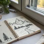
College Journey Metaphor Sketch
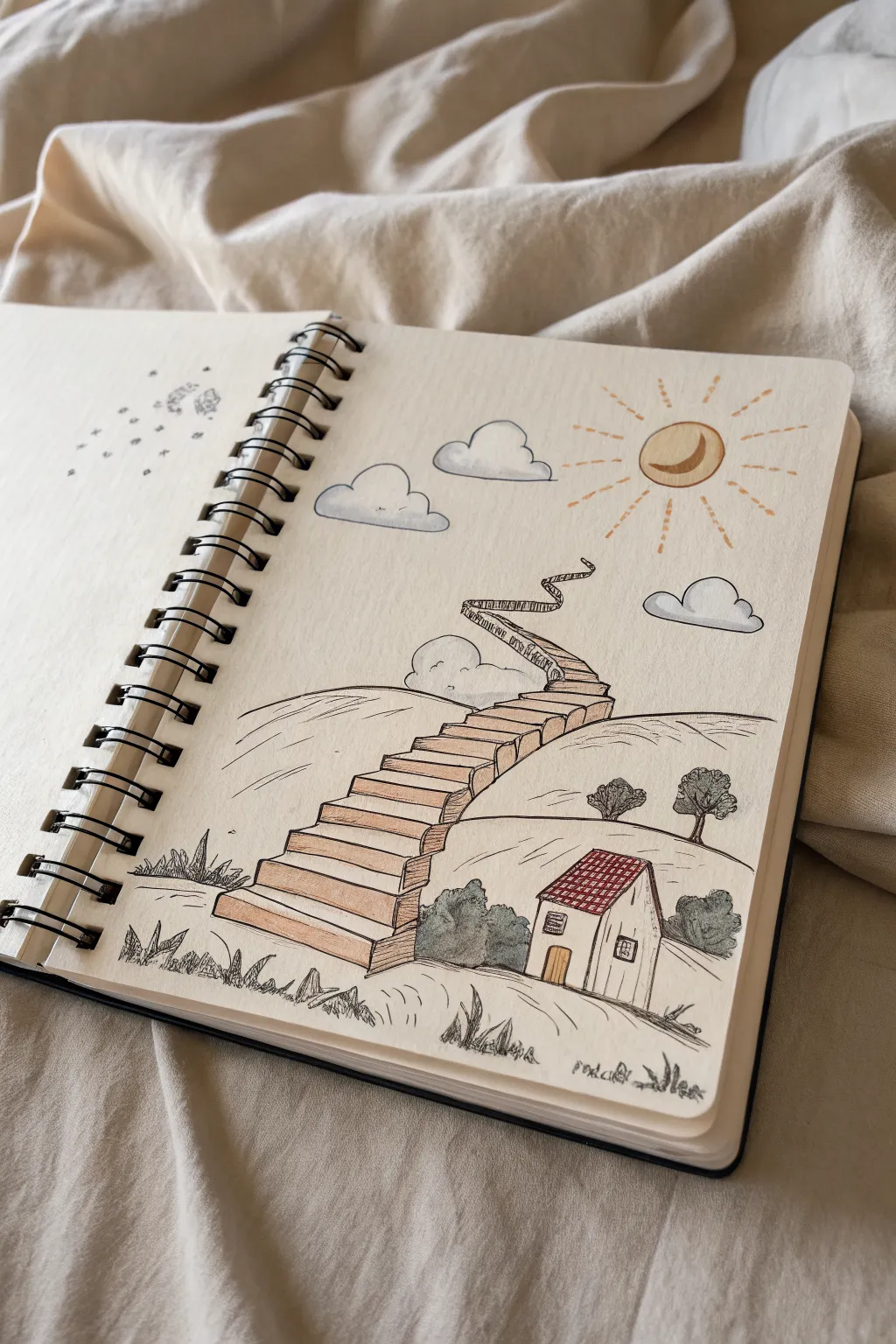
This metaphorical illustration captures the feeling of a long journey with a whimsical, winding staircase stretching from a humble cottage into the sky. Using simple ink lines and soft color washes, you’ll create a piece that feels both grounded and dreamy, perfect for representing personal growth.
Step-by-Step Guide
Materials
- Spiral bound sketchbook (mixed media paper preferred)
- Fine liner pen (black, 0.3mm or 0.5mm)
- Pencil (HB for sketching)
- Eraser
- Colored pencils or light alcohol markers (terracotta, grey-blue, sage green, yellow)
- Optional: White gel pen for highlights
Step 1: Planning the Composition
-
Establish the horizon:
Start by lightly sketching a rolling hill line about one-third of the way up from the bottom of the page. Make it a gentle curve to support the house. -
Place the house:
Sketch a small, simple house on the right side of the hill. Draw a rectangular base and a pitched roof. Don’t worry about details yet; just get the proportions right. -
Draft the staircase path:
Draw a light guideline for the staircase. Start it wide near the house and curve it upwards toward the center, getting narrower as it ascends to create perspective. Let the top finish in a whimsical curl or twist mid-air. -
Sketch the celestial elements:
In the upper right corner, sketch a circle for the sun/moon. Add a few fluffy cloud shapes floating around the top half of the page.
Uneven Steps
Don’t make your stairs perfectly uniform. Varying the wobbliness of the lines slightly makes the climb look more organic and adventurous, fitting the metaphor.
Step 2: Inking the Outlines
-
Ink the house structure:
Using your fine liner, go over the house sketch. Add a small door and a square window on the side. I like to keep the lines slightly loose for a hand-drawn feel rather than using a ruler. -
Draw the roof tiles:
Create a cross-hatch pattern on the roof to simulate shingles. Keep the lines close together. -
define the stairs:
Carefully ink the horizontal steps. Start from the bottom, drawing rectangular blocks. As the stairs go higher, make the steps thinner and shorter to enhance the depth. -
Add dimension to the stairs:
Draw vertical lines connecting the steps on the side facing the viewer to give the staircase 3D volume. -
Background details:
Ink the rolling hills behind the stairs. Add two small trees on the horizon line using scribbly circular motions for foliage. -
Celestial inking:
Ink the sun circle and add a crescent moon shape inside it. Draw dashed or broken lines radiating outward for sunrays. Outline the clouds with bubbly, interrupted lines.
Constellation Additions
Draw tiny constellations in the sky area or on the adjacent page using dots and thin connecting lines to personalize your journey map.
Step 3: Adding Texture and Grounding
-
Texturing the grass:
At the very bottom foreground, draw scattered tufts of grass using quick, upward jagged strokes. This grounds the scene. -
Adding shrubbery:
Draw bushy shapes around the base of the house and the bottom of the stairs to integrate them into the landscape. Use loose, scribbly textures here. -
Erase pencil guides:
Once the ink is completely dry, gently erase all your initial pencil sketches to leave a clean black-and-white drawing.
Step 4: Color Application
-
Color the staircase:
Use a terracotta or light brown pencil to shade the top surface of each step. Press harder on the lower steps and fade out slightly as you go up. -
Shade the stair sides:
Use a slightly darker brown or add a grey layer to the vertical sides of the steps to emphasize the shadow and 3D form. -
Roof and door accents:
Color the roof tiles with a rusty red or brown. Add a touch of yellow or warm wood tone to the door. -
Greenery wash:
Use a sage or muted green for the bushes and trees. Apply the color lightly, leaving some white paper showing for a sketchy, airy look. -
Sky elements:
lightly shade the clouds with a cool grey-blue, focusing on the bottom edges for volume. Color the sun/moon shape with a warm golden yellow. -
Final touches on the left page:
If you have a facing page, mirroring the theme with small star doodles or scattered dots creates a cohesive spread.
Now you have a thoughtful visual metaphor for your college path, reminding you that every step counts, no matter how winding.


Have a question or want to share your own experience? I'd love to hear from you in the comments below!