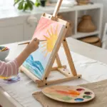
When preschoolers paint on an easel, the whole experience feels bigger—bigger movements, bigger choices, and (usually) bigger smiles. Here are my favorite easel painting preschool ideas that keep things playful, process-focused, and totally doable in your everyday art corner.
Finger Painting on a Vertical Easel
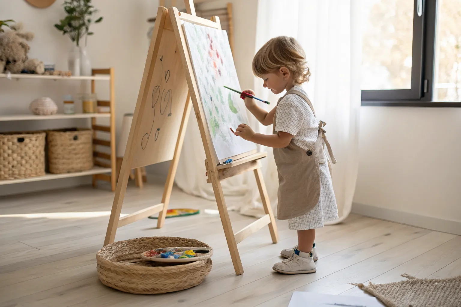
Encourage budding artists to explore vertical creativity with this simple, colorful painting exercise perfect for preschoolers. The result is a charming, airy composition featuring soft watercolor-like shapes that hint at a garden scene with floating fruit and grassy textures.
Detailed Instructions
Materials
- Wooden floor easel
- Large sheet of white easel paper
- Tape or clips to secure paper
- Watercolors or diluted tempera paints (red, yellow, teal, sap green)
- Medium round paintbrush
- Water cup for rinsing
- Child-sized apron or smock
- Drop cloth or floor cushion (optional, for spills)
Step 1: Setting the Stage
-
Prepare the Easel:
Begin by unrolling a fresh sheet of white paper and securing it firmly to the top of the easel board using the wooden clamp or clips. Make sure the paper hangs flat and smooth against the backing. -
Arrange the Space:
Place a soft cushion or drop cloth on the floor beneath the painting area to catch any drips and make standing comfortable for little feet. -
Set Up Palette:
Prepare your color palette nearby. If using tempera, dilute it slightly with water to achieve the translucent, watercolor-like consistency seen in the image. -
Gear Up:
Have the young artist put on a protective apron, preferably one with pockets for holding dry cloths or extra tools.
Step 2: Painting the Elements
-
Start with Red:
Dip the brush into the red paint. Near the center-left of the page, about eye-level, paint a loose, oval shape. It doesn’t need to be filled in completely; a sketchy outline creates a lovely texture. -
Add a Yellow Patch:
Rinse the brush. Move slightly to the left of the red shape and paint a soft, rectangular patch of yellow. Use vertical strokes to give it energy. -
Introduce Teal Scribbles:
Clean the brush again and switch to a teal or light blue color. Paint rapid, vertical scribbles directly under the red shape, letting the bristles dance on the paper to create a grassy effect. -
Layering Colors:
While the teal section is still slightly damp, it’s okay if it touches the yellow or red neighbors; this bleeding effect adds charm to the preschool style. -
Second Yellow Section:
Using the yellow paint again, create another vertical patch to the right of the teal area. Keep the strokes loose and free, similar to the first yellow patch. -
Green Texture:
Finish the row of shapes by dipping into a sap green. Create a scribbled, textured patch on the far right, mimicking the motion used for the teal section. -
Connect the Elements:
Step back and look at the line of colors. If desired, you can add small connecting strokes or faint lines between the color blocks to make them feel like a unified garden row.
Drip Control
Work with a fairly dry brush. Dip in paint, then wipe excess on the rim of the cup to prevent heavy drips on the vertical paper.
Step 3: Finishing Touches
-
Review and Refine:
Check the painting for any large drips running down the vertical surface. I usually like to catch these quickly with a dry brush or paper towel, though leaving one or two can look artistic. -
Let it Dry:
Allow the painting to dry completely while still attached to the easel. Gravity helps the paint settle into the paper grain. -
Remove Artwork:
Once dry to the touch, carefully unclip or untape the paper from the top of the easel. -
Display:
Frame the artwork or hang it using magnetic wooden rails to celebrate the young artist’s vibrant creation.
Color Mixing Fun
Give the child only primary colors (red, blue, yellow) and let them discover how to make the green and orange patches right on the paper.
This colorful exercise creates a wonderful keepsake while building fine motor coordination on a vertical surface
Sponge Dabbing Dot Paintings
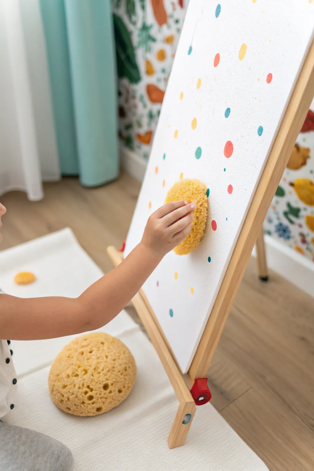
Embrace the joy of imperfect circles with this delightful sponge painting project that turns simple dabs into a confetti-like masterpiece. The finished look is airy and playful, featuring soft-edged, colorful dots scattered across a crisp white background.
Step-by-Step Guide
Materials
- Large sheet of heavy white paper or a primed canvas panel
- Preschool-friendly wooden easel
- Natural sea sponges (round or oval shapes)
- Washable tempera or acrylic paints (yellow, red, teal, orange)
- Shallow paint trays or paper plates
- Drop cloth or mat for floor protection
- Paper towels for blotting
Step 1: Preparation
-
Workspace Setup:
First, lay down a drop cloth or mat underneath the easel to catch any stray drips. Secure the large sheet of heavy white paper or canvas firmly onto the easel using clips or tape so it doesn’t shift during the enthusiastic dabbing process. -
Prepare the Sponges:
If you are using natural sea sponges, dampen them slightly with water and squeeze them out thoroughly until they are just barely moist. This helps the sponge absorb paint evenly rather than just soaking it up into the center. -
Palette Creation:
Pour small puddles of your chosen paint colors—yellow, red, teal, and orange—onto shallow trays or paper plates. Keep the colors separated to prevent them from turning muddy too quickly.
Smudged Dots?
If dots are smearing, use less water when prepping sponges. The sponge should be damp, not wet. Also, encourage a ‘stamp and lift’ motion rather than dragging the sponge.
Step 2: Creating the Polka Dots
-
First Dip:
Select a round sea sponge and dip the flat bottom face gently into the yellow paint. You don’t need to saturate the entire sponge; just coat the surface that will touch the paper. -
Blotting Excess:
Before touching the canvas, press the sponge once onto a spare paper towel. This removes globs of excess paint and ensures the texture of the sponge comes through in the print. -
Yellow Layer:
Press the yellow-loaded sponge firmly against the white paper. Lift it straight back to create a clean circle. Repeat this randomly across the canvas, leaving plenty of white space between the dots. -
Switching Colors:
Grab a fresh sponge (or rinse and squeeze dry the previous one) for the next color. Dip it into the teal paint. -
Teal Accents:
Add teal dots interspersed among the yellow ones. Try to vary the pressure slightly; pressing harder makes a larger, bolder dot, while a light touch creates a smaller, airy texture. -
Adding Warmth:
Load a sponge with red paint. Place these red dots strategically in the empty zones to balance the composition. I like to step back occasionally to see where the canvas looks too empty. -
Orange Highlights:
Finally, dip a smaller section of a sponge into the orange paint. Add these as smaller accent dots to fill in tiny gaps without overwhelming the primary colors.
Step 3: Finishing Touches
-
Review and Refine:
Look at the overall spread of dots. If one area looks too sparse, dab a light ‘ghost’ print (using a sponge that is running out of paint) to fill the space softly. -
Texture Check:
Some dots might be thick with paint. If you see big globs that might drip, gently blot them with a clean, dry corner of a sponge to lift the excess while maintaining the round shape. -
Drying:
Allow the painting to dry completely while still on the easel. This prevents gravity from moving the wet paint puddles and keeps your circles nice and round.
Pro Tip: Size Variety
Cut one large sea sponge into three different sizes. Using varied diameters creates a more dynamic, confetti-style look that feels professional and intentional.
Now you have a vibrant, textured piece of art that brightens up the room with simple geometric joy

Stamping With Blocks and Simple Shapes
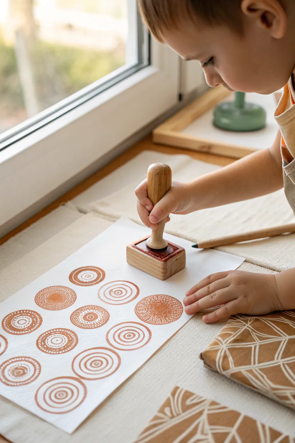
Embrace the simple beauty of repetition with these rustic, geometric block prints that celebrate texture and form. The warm, earthy tones and intricate circular motifs create a soothing visual rhythm perfect for custom wrapping paper or wall art.
Step-by-Step Tutorial
Materials
- Large heavy-weight white paper or cardstock
- Wooden block stamps with circular relief patterns (spirals, concentric circles, dots)
- Terracotta or rust-colored poster paint (or block printing ink)
- Foam roller or flat paint tray
- Paper towels or wipes for cleanup
- Protective table covering
Step 1: Preparation
-
Set the Stage:
Begin by clearing a spacious work area and covering it with a protective tablecloth or craft mat. Since we are doing repeated stamping, you want plenty of elbow room. -
Paper Selection:
Choose a large sheet of white paper. A slightly textured paper or heavy butcher paper works beautifully to catch the details of the stamp. -
Prepare the Ink:
Pour a small amount of terracotta-colored paint or ink onto a flat tray or paper plate. You want a shallow pool, spread evenly, rather than a deep blob. -
Test the Stamp:
I always recommend doing a quick ‘test stamp’ on a scrap piece of paper first. This helps determine exactly how much pressure is needed.
Step 2: Inking the Block
-
Load the Stamp:
Press the wooden block stamp firmly into the prepared paint or ink. Ensure the entire design surface is coated, but try to avoid getting paint deep into the crevices. -
Check Coverage:
Lift the stamp and inspect the surface. It should cling to the raised design pattern without dripping. If it’s too heavy, blot it lightly on a paper towel. -
Angle Awareness:
Hold the stamp by the handle, keeping the stamping surface parallel to the table. This prevents uneven ink distribution before you even touch the paper.
Uneven Ink Transfer?
If the center of the image is missing, your table might not be perfectly flat. Place a foam mat or stack of newspapers under your paper to provide a yielding surface.
Step 3: Creating the Pattern
-
First Impression:
Position your stamp over the paper where you want your first motif. Lower it straight down—avoid rocking it side-to-side to keep lines crisp. -
Applying Pressure:
Press down firmly on the stamp handle. For larger blocks, use your other hand to apply pressure to the corners of the block base to ensure the edges transfer. -
The Reveal:
Lift the stamp straight up. Admire the texture; small imperfections or ‘noise’ in the print add to that authentic handmade charm. -
Planning the Grid:
Visualize where the next circle will go. You can create a structured grid like the reference image, or scatter them randomly for a confetti look. -
Re-Inking Strategy:
Dip the stamp back into the ink tray before every single impression. This ensures consistent color density across the page. -
Spacing Matters:
Leave a comfortable amount of whitespace between each stamped circle so the individual patterns don’t feel crowded. -
Alternating Designs:
If you have multiple designs (concentric circles, spirals, dotted textures), switch stamps every few impressions to create visual variety in your rows. -
Filling the Page:
Continue this process, working from one side of the paper to the other to avoid smudging wet ink with your hand or sleeve.
Crisper Lines
For sharper details, use a foam roller to apply a thin, even layer of paint to the stamp face instead of dipping it directly into a puddle of paint.
Step 4: Drying and Finishing
-
Correction Touches:
If a stamp didn’t transfer fully and looks too faint, you can dip a small brush in the paint and carefully dab in the missing distinct lines, though usually, the faded look is quite nice. -
Surface drying:
Let the paper sit undisturbed. Since block printing ink or poster paint is thicker, give it at least 30 minutes to become touch-dry. -
Final Cure:
Wait until the paint is completely matte and dry before rolling up the paper or using it for gift wrapping.
Once dry, your patterned paper is ready to be framed as modern art or used to wrap a truly special gift
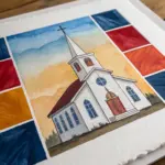
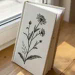
Nature Printing With Leaves and Pinecones
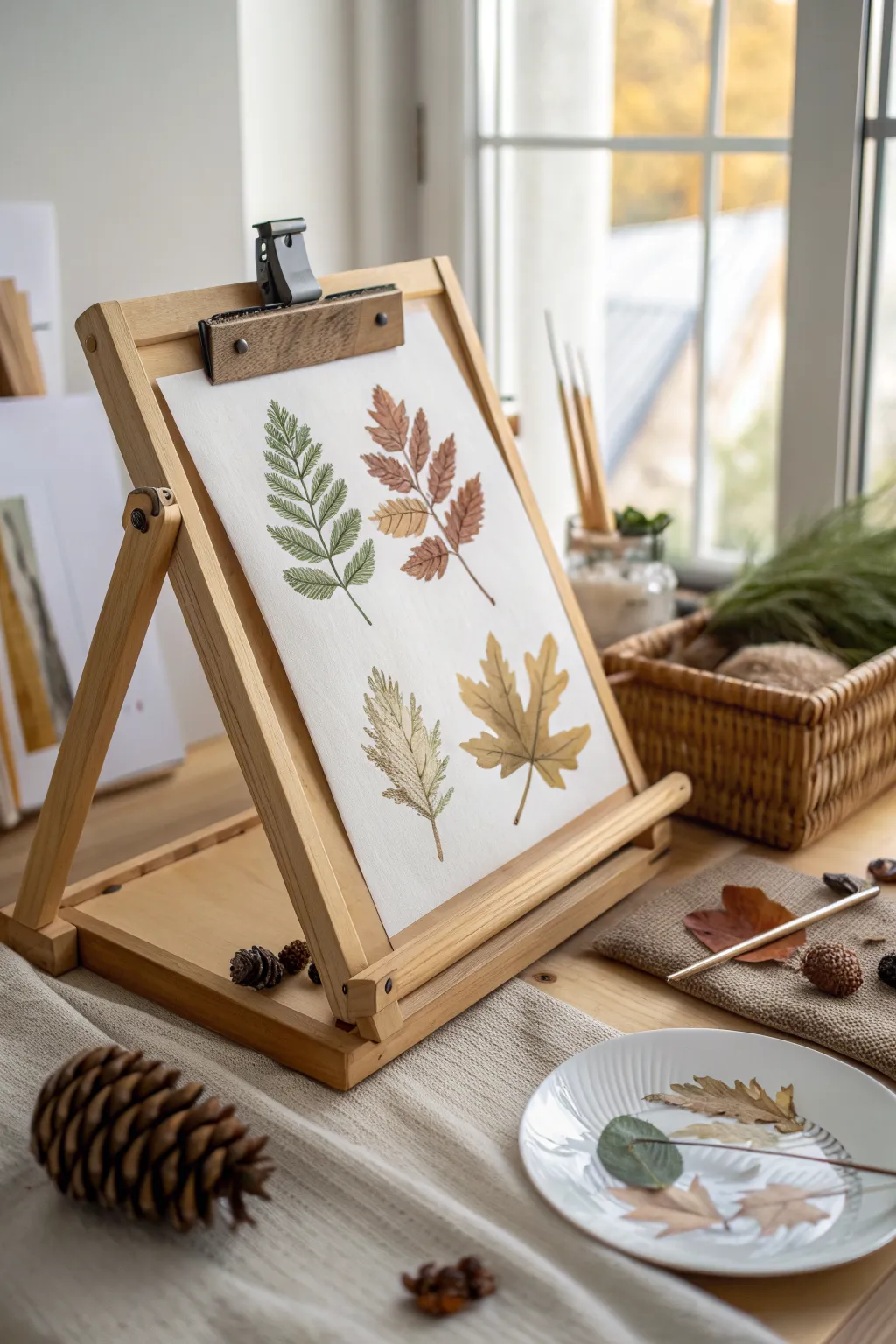
Wait until you see how simple these elegant leaf prints are to create, capturing the delicate veins and shapes of your backyard finds. This project combines the joy of a nature walk with a gentle introduction to printmaking, resulting in a gallery-worthy display.
How-To Guide
Materials
- Heavyweight white drawing paper or watercolor paper (approx. 9×12 inches)
- Assorted fresh leaves (fern, rowan or ash, maple, and a serrated leaf)
- Acrylic paints or tempera paints (sage green, rusty orange, ochre yellow, brown)
- Flat paintbrushes or foam brushes
- Paper towels or newspaper
- Brayer or rolling pin (optional)
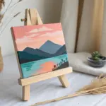
- Tabletop easel (for display)
Step 1: Gathering & Preparation
-
Select your specimens:
Start by collecting four distinct leaves. Look for variety in shape: a feathery fern, a compound leaf like rowan or sumac, a classic maple leaf, and a serrated oval leaf. -
Press for flatness:
If your leaves are very curled, press them under a heavy book for about an hour. They don’t need to be dry, just flat enough to make good contact with the paper. -
Set up your workspace:
Cover your table with newspaper. I find it helpful to have a separate ‘inking station’ and ‘printing station’ to keep the final artwork clean.
Smudged Prints?
If prints smear, you might have too much paint or you may be shifting the leaf while rubbing. Use less paint and press straight down without wiggling.
Step 2: Inking the Leaves
-
Mix your palette:
Prepare your paints. You want natural, earthy tones. Mix a little brown into your greens and yellows to desaturate them for that vintage botanical look seen in the photo. -
Test paint consistency:
The paint should be fluid but not drippy. If it’s too thick, the leaf veins will get clogged; too thin, and the print will lack definition. -
Apply green to the fern:
Place the fern bottom-side up on a scrap paper. Using a flat brush, apply a coat of sage green paint. The underside usually has more prominent veins, which prints better. -
Paint the compound leaf:
For the rowan-style leaf, use a rusty orange hue. Paint from the stem outward to avoid brushing against the grain of the leaflets. -
Blend colors for the maple:
For the maple leaf, try a little blending. Paint the center ochre yellow and the edges a light brown, blending them slightly on the leaf surface before printing. -
Prepare the final leaf:
Coat the last serrated leaf with a muted yellow-green or brownish-green tone.
Make It Sparkle
Once the paint is dry, lightly brush a tiny bit of gold watercolor or metallic paint over just the edges of the leaves for a magical autumn shimmer.
Step 3: Printing the Composition
-
Plan the layout:
Before printing, hover your painted leaves over the white paper to visualize spacing. You want two leaves high and two leaves low, roughly centered. -
Print the fern:
Carefully flip the painted fern onto the top left quadrant of your paper. Place a clean paper towel over it and press gently but firmly. Don’t shift the leaf. -
Reveal the first print:
Lift the paper towel, then grab the fern by the stem and peel it back slowly to reveal your first impression. -
Add the rust leaf:
Repeat the process with the orange compound leaf, placing it in the top right quadrant. Ensure the stem points diagonally downward. -
Place the bottom leaves:
Print the muted yellow serrated leaf in the bottom left, and the maple leaf in the bottom right. Keep the spacing balanced so no leaf touches the edge of the paper. -
Touch up if needed:
If a stem didn’t print clearly, you can use a very fine brush with a tiny amount of paint to lightly extend or connect the stem line.
Step 4: Final Display
-
Allow to dry:
Let the paper sit flat until the acrylic paint is completely dry to the touch, which usually takes about 15-20 minutes. -
Mount usually:
Once dry, clip the artwork onto a wooden tabletop easel. The natural wood of the easel complements the earth tones of your prints perfectly.
Now you have a beautiful botanical study ready to brighten up any corner of the room
BRUSH GUIDE
The Right Brush for Every Stroke
From clean lines to bold texture — master brush choice, stroke control, and essential techniques.
Explore the Full Guide
Chalk Drawing Plus Paint Resist
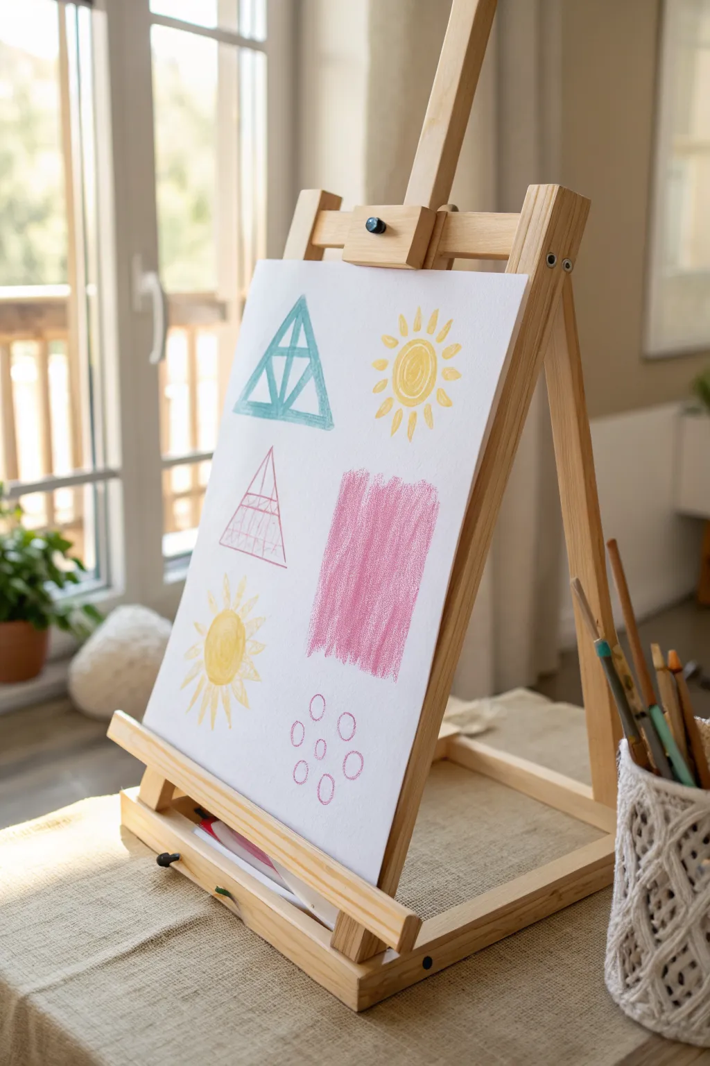
This bright and breezy project combines the gentle texture of chalk pastels with the bold coverage of colored pencils or crayons to create a simple, modern design. The contrasting shapes and sunny motifs make it a cheerful addition to any playroom or classroom.
Step-by-Step Tutorial
Materials
- Easel with drawing board
- Large sheet of white drawing paper or easel paper roll
- Soft chalk pastels (blue, yellow, pink)
- Colored pencils or wax crayons (teal/blue, yellow, magenta/pink)
- Ruler (optional)
- Paper towels or blending stump
- Fixative spray (optional)
Step 1: Planning the Layout
-
Prepare your surface:
Secure a large sheet of white paper to your easel using the clips or tape. Ensure distinct space is cleared, as this project uses four main quadrants. -
Visualize the quadrants:
Mentally divide the paper into four rough sections: top left, top right, middle/bottom left, and middle/center.
Step 2: Drawing the Geometric Forms
-
Outline the top blue triangle:
In the top left area, use a teal or light blue colored pencil (or crayon) to draw a large equilateral triangle. -
Detail the first triangle:
Draw an inner triangle connected by vertical lines to the base, creating a segmented look. Color this in lightly with the pencil. -
Outline the lower pink triangle:
Moving down to the middle-left area, draw a second, slightly taller triangle using a thin magenta or pink pencil. -
Add internal lines:
Sketch horizontal lines across this pink triangle to create a ladder effect, then sketch a vertical line down the center.
Keep it Clean
Work from top to bottom! Chalk pastels create dust that falls downward, so drawing the top elements first keeps your lower drawings clean.
Step 3: Adding the Warm Sun Motifs
-
Create the top sun center:
In the top right quadrant, draw a spiral circle using a yellow pastel or crayon. -
Add the rays:
Draw short, radiating dash marks around the spiral to form the sun’s rays. -
Draw the lower sun:
In the bottom left corner, draw a solid yellow circle. Add longer, more traditional triangular rays extending outward. -
Blend the lower sun:
If using chalk pastel for the lower sun, use your finger to gently smudge the yellow outward to create a soft glow.
Try a watercolor wash
After drawing with wax crayons, paint over the entire paper with diluted watercolor. The wax will repel the paint for a cool resist effect.
Step 4: Creating Texture Blocks
-
Start the pink rectangle:
In the center of the paper, next to the pink triangle, take a pink chalk pastel stick on its side. -
Fill the rectangular shape:
Rub the pastel vertically to create a large, textured rectangle block. Don’t press too hard; let the paper’s grain show through. -
Layering the texture:
Go back over the pink rectangle with slightly more pressure in the center to create depth and variation in the color. -
Draw the floating circles:
beneath the pink rectangle, use a magenta pencil or fine crayon to draw six small, loose circles arranged in two rows of three.
Step 5: Final Touches
-
Review and refine:
Step back to look at the balance. If the top blue triangle looks too faint, go over the outline one more time to thicken the border. -
Clean up smudges:
Use a clean eraser or a dry paper towel to wipe away any stray chalk dust from the white background areas. -
Set the artwork:
If you used chalk pastels, I like to lightly mist the paper with a fixative spray or cheap hairspray in a well-ventilated area to prevent smearing.
Once the fixative is dry, your geometric masterpiece is ready to brighten up the room
Spray Bottle Mist Over Wet Paint
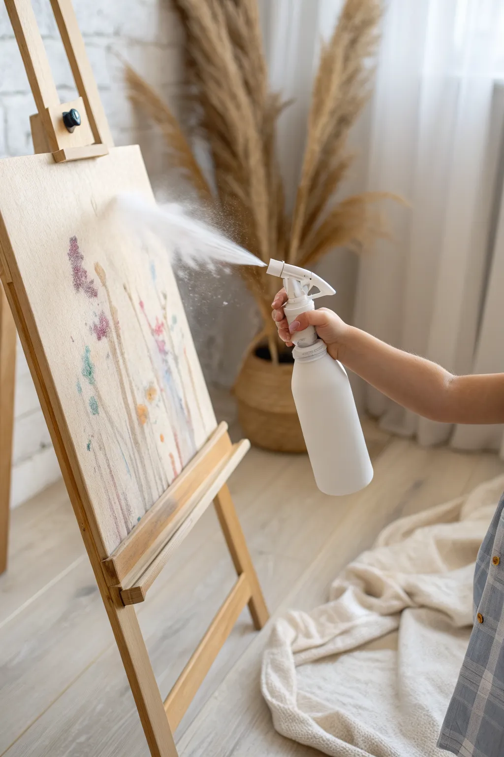
Transform a simple drawing into a hazy, atmospheric masterpiece using nothing more than gravity and a gentle mist of water. This process turns crisp lines and dabs of color into soft, flowing forms that resemble wild grasses or rainy-day flowers.
Detailed Instructions
Materials
- Sturdy easel paper or heavy watercolor paper
- Water-based markers or liquid watercolors
- Paintbrushes (if using liquid paints)
- Spray bottle filled with clean water
- Wooden easel
- Paper towels or rag (for drips)
- Drop cloth or mat (to protect the floor)
- Masking tape or easel clips
Step 1: Preparation & Drawing
-
Secure the canvas:
Begin by firmly attaching your paper to the easel using clips or masking tape. It is crucial that the paper is vertical so gravity can do its work later. -
Set up your workspace:
Since this method creates intentional drips, place a drop cloth or plastic mat directly underneath the easel legs to catch any colored water that runs off the paper. -
Observe the composition:
Notice how the artwork in the image features tall, vertical forms. Encourage thinking about upward-growing shapes like tall grass, reeds, or flower stems. -
Apply the base color:
Using water-based markers or a brush with liquid watercolor, draw vertical lines starting from the bottom third of the paper and reaching upwards. -
Add floral details:
Near the top of your vertical lines, dab clusters of color to represent flower heads or leaves. Use distinct, vibrant colors like purples, pinks, and cyans that will blend beautifully when wet. -
Layer your colors:
Don’t be afraid to overlap colors slightly. A bit of blue marker drawn over a pink area will create a lovely violet hue once the water hits it. -
Keep the bottom clear:
Try to leave the very bottom edge of the paper somewhat clear of heavy heavy pigment, as the colors from above will inevitably flow down into this space.
Too Much Water?
If the paper gets soaked and colors turn into a muddy puddle, stop spraying immediately. Use a dry paper towel to gently dab—not rub—the overly wet areas to lift excess moisture.
Step 2: The Misting Process
-
Prepare the spray bottle:
Fill your spray bottle with clean, room-temperature water. Test the nozzle mechanism away from the art first; you want a fine, dispersed mist, not a hard, single stream. -
Position the artist:
Have the young artist stand back about 12 to 18 inches from the easel. Standing too close can flood the paper too quickly. -
First spritz:
Aim the nozzle near the top of the drawing and give it one or two gentle squeezes. I like to pause here to watch how the paper absorbs the initial moisture. -
Watch the bleed:
Observe as the crisp marker lines or paint strokes begin to soften and fuzz out. This is the ‘blooming’ effect. -
Encourage the drip:
Add a few more sprays, focusing on areas where you want more movement. The water should start to collect and pull the pigment downward in long, trailing rivers. -
Control the flow:
If the water isn’t dripping enough, move slightly closer or spray more generously. If it’s dripping too fast, stop spraying immediately and let it settle. -
Blotting excess:
If a pool of muddy water forms at the bottom of the paper or on the easel tray, gently blot it up with a paper towel to keep the bottom of the artwork clean.
Step 3: Drying & Finishing
-
Let it sit:
Allow the painting to hang on the easel undisturbed for several minutes. The colors will continue to travel even after you stop spraying. -
Lay flat to finish:
Once the major dripping has stopped but the paper is damp, carefully remove it from the easel and lay it flat to dry completely. This prevents the colors from washing out entirely.
Salt Texture Magic
While the paper is still very wet from the spray, sprinkle coarse sea salt over the pigmented areas. As it dries, the salt absorbs color, creating beautiful star-burst textures.
Now you can step back and admire the soft, dreamlike atmosphere you’ve created with just a splash of water

PENCIL GUIDE
Understanding Pencil Grades from H to B
From first sketch to finished drawing — learn pencil grades, line control, and shading techniques.
Explore the Full Guide
Two-Sided Easel Collaboration Painting
Transform a standard art station into a shared creative zone with this dual-sided easel setup. By preparing a continuous roll of fresh paper and accessible supplies, you create an inviting space ready for collaborative preschool masterpieces.
How-To Guide
Materials
- Wooden art easel with paper roll holder
- Large roll of white bond paper (12-18 inches wide)
- Wide masking tape or painter’s tape
- Assorted tempera paints in spill-proof cups
- Thick bristled paintbrushes
- Washable markers (broad tip)
- Small plastic tray for loose parts (optional)
- Wooden beads or sensory balls (optional)
Step 1: Preparing the Canvas
-
Load the paper roll:
Insert the wooden dowel through the center of your paper roll and place it securely into the top holder of the easel. Ensure the paper feeds from the bottom of the roll so it lays flat against the board. -
Feed the paper through:
Pull the leading edge of the paper underneath the top guide bar (if your easel has one) and drape it down the front face of the drawing board. -
Secure the bottom:
Pull the paper all the way to the bottom tray. Tear off any ragged edges to create a clean start. -
Anchor with clips or tape:
Slide the paper under the bottom wooden guide rail. If the paper curls up, I like to use a small piece of masking tape on the corners to hold it taut against the board. -
Repeat for the second side:
If your easel accommodates dual rolls, set up the second side exactly the same way. If it uses a single top roll, pull a longer length of paper over the top and drape it down the opposite side, securing it firmly at the bottom.
Double the Fun
Use the bottom shelf to store drying paintings flat. This keeps them safe while the next masterpiece is being created above.
Step 2: Organizing the Supply Station
-
Arrange the paint cups:
Place the spill-proof cups into the designated circular cutouts on the easel tray. This prevents accidental tipping during enthusiastic painting sessions. -
Fill with primary colors:
Pour a moderate amount of washable tempera paint into the cups. Start with red, yellow, and blue to encourage color mixing discoveries. -
Set out the brushes:
Place one thick-handled brush into each paint cup. Color-coding the brushes to the paint can help keep colors muddy-free for a little longer. -
Prepare markers:
On the opposite side or a shared shelf, lay out a selection of broad-tip washable markers. Remove the caps or place them in a shallow bin for easy access. -
Add a sensory element:
On the floor nearby, place a shallow plastic tray filled with colorful wooden beads or balls. This invites children to explore texture or take breaks between painting strokes.
Step 3: Facilitating the Collaboration
-
Position the easel:
Pull the easel away from the wall, placing it in the center of the room. This is crucial as it allows children to access both sides simultaneously. -
Adjust height:
Check the leg adjustments to ensure the painting surface is at specific eye level for your young artists. -
Clear obstacles:
Ensure the floor area around the easel is free of tripping hazards, except for your designated sensory tray. -
Invite the artists:
Encourage two children to stand on opposite sides. They can paint independently or play games where they try to connect lines over the top edge. -
Refresh as needed:
Once the paper is filled, tear it off using the guide bar as a straight edge and pull down a fresh section of white paper immediately to keep the momentum going.
Paper Curled Up?
If the bottom of the paper keeps rolling up, attach two heavy binder clips to the bottom edge to act as weights.
With the supplies organized and the fresh paper waiting, your creative station is ready for the first brushstrokes
Pipette Drop Painting for “Rainy Day” Effects
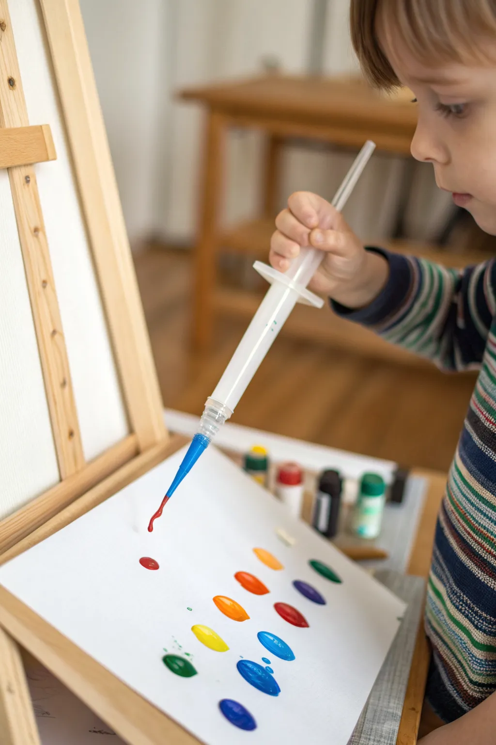
Embrace the unpredictability of gravity with this engaging process art activity that transforms simple drops of paint into a cascading masterpiece. By using liquid watercolors and pipettes on an inclined easel, children can explore color mixing and fluid dynamics in a visually striking way.
Step-by-Step Tutorial
Materials
- Wooden easel
- Heavyweight white paper (watercolor paper or mixed media cardstock)
- Liquid watercolor paints or diluted tempera paint
- Large plastic syringes or jumbo droppers
- Small jars or cups for holding paint
- Masking tape or painter’s tape
- Drop cloth or messy mat for the floor
Step 1: Setting the Stage
-
Prepare the workspace:
Since this project involves dripping liquids, start by placing a drop cloth or messy mat directly under the easel to catch any stray runaway drips. -
Secure the canvas:
Take a sheet of heavyweight white paper. Standard printer paper is often too thin and will warp quickly, so I prefer watercolor paper for its absorbency. -
Tape it down:
Use masking tape to firmly secure all four corners of the paper to the easel board. Ensure the paper is flat and taut against the surface. -
Mix your paints:
Pour liquid watercolors into small jars. If you are using tempera paint, dilute it with a little water until it reaches a pouring cream consistency that flows easily. -
Arrange the palette:
Place the paint jars on the easel shelf or a nearby low table where they are easily accessible but stable enough not to tip over.
Runny Paint Rescue
If paint is running too fast and pooling at the bottom, your mixture is too thin. Add a touch more undiluted tempera to thicken the consistency for slower drips.
Step 2: The Dropping Technique
-
Load the tool:
Demonstrate how to submerge the tip of the large syringe or pipette into a paint color. -
Drawing up paint:
Slowly pull back the plunger to fill the chamber with color. You don’t need to fill it completely; a half-full syringe offers better control for small hands. -
Positioning:
Hold the filled syringe near the top of the paper, pointing the tip downward at a slight angle toward the surface. -
The first drop:
Gently push the plunger to release a single, large drop of paint. Watch as gravity immediately takes hold. -
Observing the flow:
Let the drop travel down the paper naturally. It might move fast or slow depending on the thickness of the paint and the angle of the easel.
Step 3: Layering and Experimenting
-
building the composition:
Continue adding drops across the paper. Try creating distinct rows of color drops similar to the reference image. -
Mixing on the page:
Experiment by dropping a blue drip directly onto a wet yellow drip to see them merge into green right on the paper. -
Volume control:
Try pushing the plunger harder to release a stream rather than a drop, creating a long, continuous line of color down the board. -
Varied spacing:
Leave white space between some droplets to keep the colors distinct, or crowd them together to create a wash effect. -
Drying process:
Once the artwork is covered in colorful trails, leave it fastened to the easel to dry completely so the drips don’t run in new directions.
Wax Resist Magic
Draw on the paper with a white crayon before painting. The dripping paint will glide over the wax markings, revealing secret hidden messages or patterns.
Now you have a dynamic piece of abstract art that captures the movement of color in real-time
Have a question or want to share your own experience? I'd love to hear from you in the comments below!