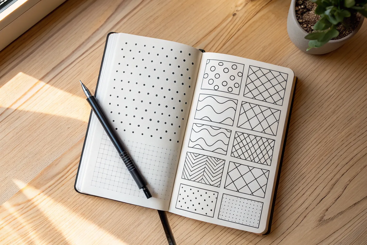
When you want your main subject to shine, easy backgrounds are your best studio secret—simple, quick, and still super satisfying. I lean on these background drawing ideas all the time because they fill space beautifully without needing perfect perspective or tons of detail.
Soft Gradient Wash
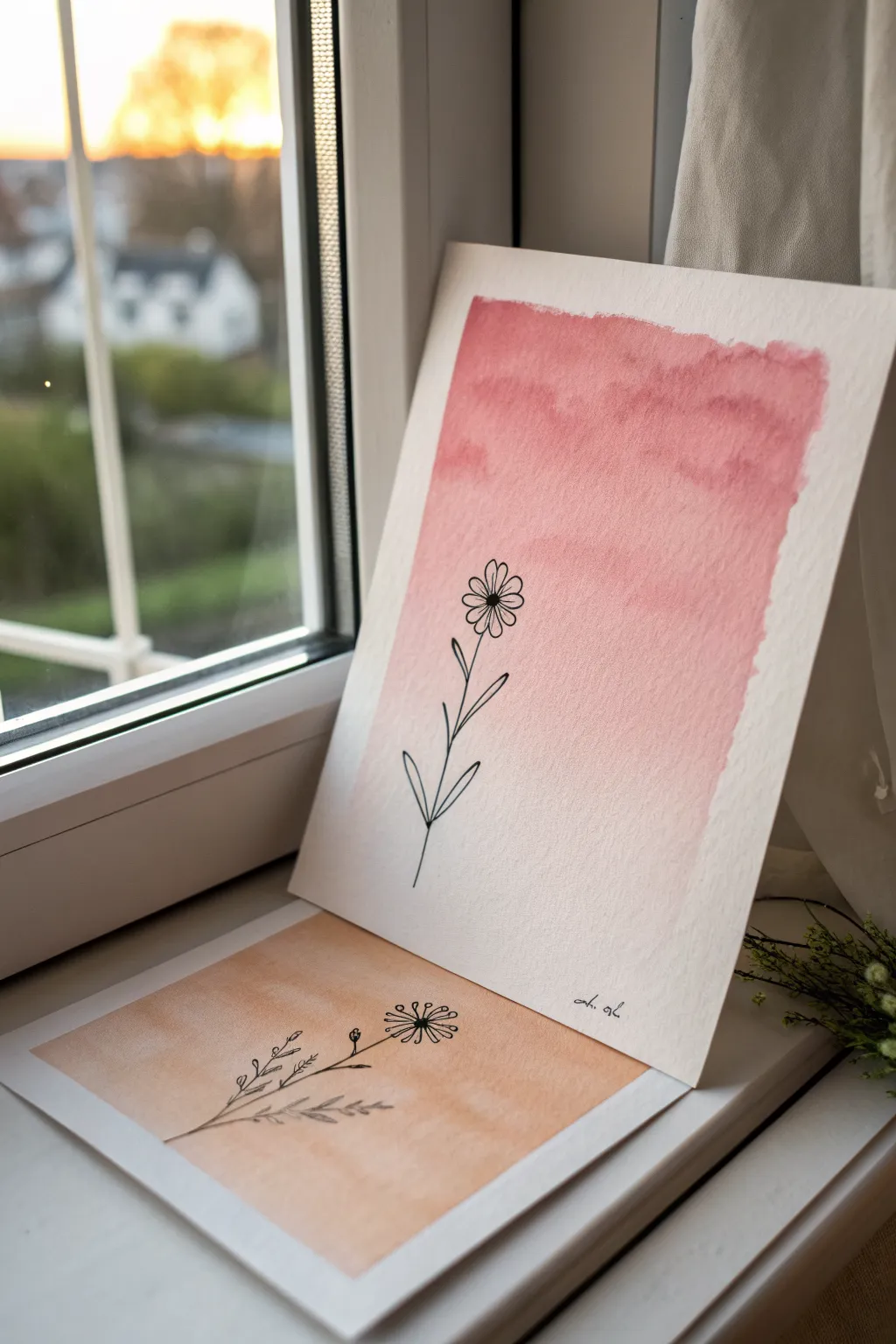
This project combines the ethereal beauty of a soft watercolor wash with the crisp definition of ink illustration. The result is a minimalist, modern piece where a simple flower silhouette stands out beautifully against a dreamy, sunset-colored sky.
Step-by-Step
Materials
- Cold press watercolor paper (300 gsm recommended)
- Watercolor paints (Pink, Rose, or Coral shades)
- Clean water jar
- Large flat brush or wash brush
- Medium round brush
- Fine liner pen (waterproof black ink, size 03 or 05)
- Paper towel
- Washi tape or masking tape
- Drawing board or hard surface
Step 1: Preparing the Gradient
-
Secure the paper:
Begin by taping down all four edges of your watercolor paper to a board. This prevents the paper from buckling when it gets wet and creates that crisp, clean white border you see in the final piece. -
Mix your base color:
Select a rose or coral watercolor paint. In your palette, mix a generous amount of this color with water. You want a strong, saturated puddle of paint ready to go. -
Pre-wet the paper:
Load your large flat brush with clean water. Apply an even sheen of water across the area where you want the sky to be, roughly the top two-thirds of the paper. -
Apply the first stroke:
While the paper is still damp (but not dripping), load your brush with the saturated paint mix. Paint a deliberate horizontal stripe across the very top of the wet area. -
Pull the color down:
Dip your brush into water just once to dilute the pigment slightly. Paint the next stripe immediately below the first, slightly overlapping it so the colors bleed together. -
Create the fade:
Continue painting horizontal stripes downwards, adding more water to your brush with each new line. The color should naturally become paler and more transparent as you move down the page. -
Soften the bottom edge:
When you reach the bottom of your painted area, use a clean, damp brush to feather out the edge so it fades softly into white, rather than ending in a hard line. -
Create texture (optional):
If you want the cloud-like texture seen in the reference, gently dab a crumpled paper towel onto the wet paint in the darker upper section to lift a tiny bit of pigment. -
Let it dry completely:
This is crucial. The paper must be bone dry before you use any pen. If you touch it and it feels cool, it’s still damp. I usually wait at least 30 minutes or use a hairdryer on low heat.
Fixing “Blooms”
If weird cauliflower-shaped marks appear in your wash, you added too much water to drying paint. Embrace the texture as clouds, or keep your brush drier next time.
Step 2: Adding the Botanical Line Art
-
Outline the flower head:
Using your waterproof fine liner, start roughly in the center of the gradient area. Draw a small circle for the flower center, then add simple, looped petals radiating outward. -
Draw the stem:
Draw a single, continuous line downwards from the flower head. It doesn’t need to be perfectly straight; a slight curve adds organic realism. -
Add foliage:
Near the bottom third of the stem, draw pairs of leaves extending outwards. Keep the shapes simple—almond shapes or slender loops work best for this minimal style. -
Review and refine:
Check your line work. If any lines look too thin or broken, go over them carefully once more to bold them up, making the black pop against the pink background. -
Sign the work:
Add your signature or initials at the bottom right corner in a small, unobtrusive script. -
Remove the tape:
Once the ink is fully set, slowly peel away the masking tape. Pull the tape away from the center of the paper at a 45-degree angle to ensure a perfect, tear-free edge.
Try Metallic Accents
Once the black ink is dry, add tiny dots of gold watercolor or a gold gel pen to the center of the flower for a subtle shimmer that catches the light.
Now you have a serene piece of art perfect for gifting or framing on a bright windowsill
Classic Polka Dots
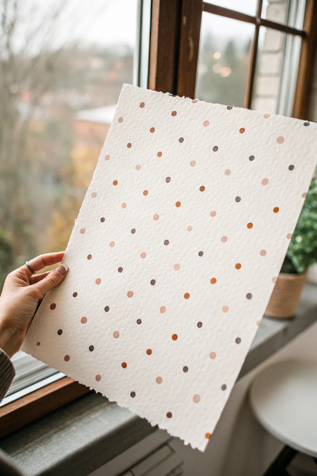
Embrace the warmth of fall with this textured, polka-dotted background that mimics the look of high-end stationery. By combining rough-edged watercolor paper with a palette of earthy browns and metallic coppers, you will create a simple yet sophisticated pattern perfect for cards or framing.
Step-by-Step Guide
Materials
- Cold press watercolor paper (heavyweight, roughly 300gsm)
- Ruler or straight edge (metal prefered)
- Water
- Small paintbrush or water brush
- Acrylic paints or gouache (Burnt Sienna, Raw Umber, Metallic Copper, Cream)
- Small round paintbrush (size 2 or 4)
- Palette for mixing
- Pencil and eraser (optional)
Step 1: Preparing the Paper
-
Measure your borders:
Begin with a larger sheet of watercolor paper than your desired final size. Using your ruler and a pencil, lightly mark lines about an inch in from the edges where you want your paper to end. -
Wet the tear lines:
Take a small brush dipped in clean water and run it precisely along your pencil line. You want the paper fibers to be thoroughly soaked just along this specific track to make tearing easier. -
Wait for absorption:
Let the water sit for about one minute. The paper should look dull and saturated along the line, not shiny and pooling. -
Create the decked edge:
Place your ruler firmly along the wet line to hold the main sheet down. Gently pull the waste strip of paper up and away against the ruler’s edge to create that beautiful, torn ‘deckled’ look seen in the photo. -
Smooth the edges:
If there are any overly long fibers hanging off the edge, you can gently pluck them away with your fingers while the paper is still damp.
Step 2: Painting the Pattern
-
Prepare your palette:
Squeeze out small amounts of Burnt Sienna, Raw Umber, Cream, and Metallic Copper paint onto your palette. You want distinct puddles rather than mixing them all together immediately. -
Mix custom shades:
Create a few intermediate shades by mixing the brown with a little cream for a latte color, or the dark umber with burnt sienna for a rich rust tone. Aim for about 4-5 distinct earthy variations. -
Plan the grid:
To keep the polka dots evenly spaced but not rigid, I find it helpful to visualize a diagonal lattice pattern. You can lightly tap tiny pencil dots as guides if you don’t trust your freehand spacing. -
Start with the darkest tone:
Load your round brush with the darkest brown (Raw Umber). Paint small, solid circles spaced widely apart across the page. Think of this as anchoring the pattern. -
Add the medium tones:
Rinse your brush and switch to the reddish-brown (Burnt Sienna). Place these dots in the empty spaces between your dark dots, trying to keep the diagonal alignment roughly consistent. -
Layer in light shades:
Using the cream or latte mixture, fill in more gaps. These lighter dots add depth and softness to the overall look, preventing the pattern from feeling too heavy. -
Apply metallic accents:
Finally, pick up the Metallic Copper paint. Place these dots sparingly in the remaining open spots. They will catch the light beautifully when the paper is moved. -
Refine the shapes:
Look over your work. The dots don’t need to be perfect circles—a little organic irregularity adds to the handmade charm—but you can round out any lopsided ones while the paint is fresh. -
Check the edges:
Ensure the pattern extends naturally to the torn edges. A few ‘half-dots’ disappearing off the side of the paper make the design feel like a snippet of a larger fabric. -
Let it dry completely:
Allow the paint to dry fully before handling. If the paper curled slightly from the moisture, flatten it under a heavy book once dry.
Use a Q-Tip
For perfectly uniform dots without a brush, dip the end of a cotton swab (Q-tip) into the paint and press straight down onto the paper.
Luxe Finish
Swap the copper paint for gold leaf size and apply genuine gold leaf to a few random dots for an ultra-premium, textured shine.
You now have a beautifully textured piece of art that radiates warmth and handcrafted elegance

Simple Checkerboard Grid
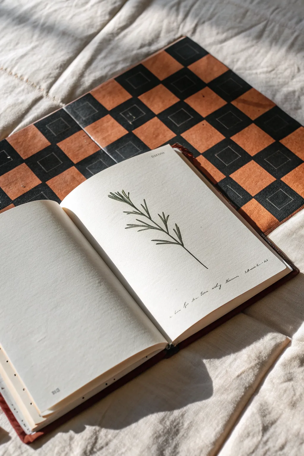
This project creates a striking, geometric surface inspired by vintage board games, perfect as a backdrop for flat-lay photography or as a unique sketchbook cover. The warm terracotta and charcoal tones give it an aged, authentic character that contrasts beautifully with simple line drawings.
Step-by-Step Guide
Materials
- Large, thick cardboard sheet or masonite board
- Gesso (optional, for priming)
- Ruler and pencil
- Painter’s tape or masking tape (low tack)
- Acrylic paints: black, burnt sienna (or terracotta), and white
- Flat shader brushes (medium and small)
- Matte sealant spray or Mod Podge
- Fine-grit sandpaper (optional)
- Sketchbook with cream paper (for the botanical drawing)
- Fine liner pen (0.3mm or 0.5mm, black)
Step 1: Preparing the Grid
-
Prepare the base:
Begin with your heavy cardboard or masonite board. If the surface is too slick or dark, apply a thin coat of white gesso to prime it. Let this dry completely before moving on. -
Measure the board:
Measure the total width and height of your board. Decide on a square size that fits evenly across the surface—2 to 3 inches usually works best for this scale. -
Draw the grid lines:
Using your ruler and a light pencil touch, mark out your grid across the entire surface. Ensure your lines are perfectly perpendicular to keep the squares uniform. -
Tape the first set:
To get crisp edges, tape off every other row horizontally. Within those open rows, tape off every other square vertically. This checkerboard taping method allows you to paint half the squares at once without bleeding.
Tape Sealing Trick
After taping your grid, paint a thin layer of the *base* color (or clear matte medium) over the tape edges first. This seals the gap, ensuring your next color creates a razor-sharp line.
Step 2: Painting the Dark Squares
-
Mix the charcoal hue:
Mix black acrylic paint with just a tiny drop of white or burnt umber to soften it. You want a charcoal tone rather than a stark, jet black. -
Paint the first batch:
Fill in the exposed squares with your dark mixture. Use a flat brush and stroke from the tape inward to prevent paint from seeping underneath the edges. -
Remove tape and dry:
Carefully peel back the tape while the paint is still slightly tacky to avoid tearing. Allow these squares to dry fully—I usually wait about 20 minutes to be safe. -
Paint remaining dark squares:
Re-tape the grid to expose the remaining squares destined to be black (the ones diagonal to the ones you just painted). Paint these, remove the tape, and let dry completely.
Aged Leather Look
For the terracotta squares, try sponging on a thin layer of brown shoe polish after the paint dries. Buff it gently with a cloth to create a rich, realistic sheen.
Step 3: Applying the Terracotta Tone
-
Mix the warm tone:
Combine burnt sienna with a touch of white and perhaps a dot of yellow ochre to achieve that warm, vintage leather look seen in the photo. -
Fill the alternating squares:
You can carefully freehand these squares if you have a steady hand, using the existing dried black squares as your guide. If you prefer precision, re-tape the grid again to mask the black squares. -
Create texture:
When painting the terracotta squares, don’t worry about perfect opacity. A slightly streaky application adds to the aged, leathery texture. -
Add the inner detail:
Once all paint is dry, use a ruler and a sharpened grey colored pencil or a silver gel pen to draw faint, smaller squares inside the black blocks. This mimics the embossed detail of old game boards.
Step 4: Finishing Touches & Botanical Sketch
-
Distress the surface:
If everything looks too new, lightly sand the surface with fine-grit sandpaper, focusing on the corners and edges to simulate wear. -
Seal the board:
Apply a coat of matte sealant spray. This unifies the sheen of the different paint colors and protects your work. -
Sketch the branch stem:
Open your sketchbook to a clean page. Using a fine liner pen, draw a single, slightly curved vertical line for the main stem of your rosemary sprig. -
Add the needles:
Draw small, needle-like leaves extending from the stem. Group them in small bunches, angling them upwards. Keep the lines quick and confident for an organic feel. -
Write the caption:
At the bottom of the page, add a line of small, cursive handwriting or illegible script to mimic old botanical notes.
Now you have a sophisticated, vintage-style prop that adds instant history and geometry to your workspace


Fluffy Cloud Sky
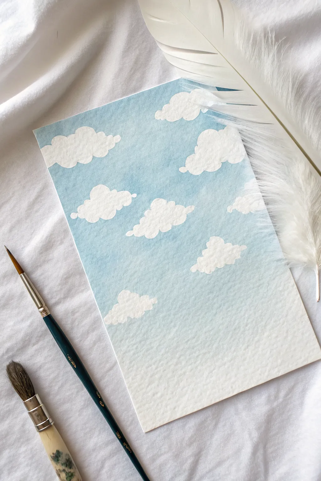
Capture the serene beauty of a crisp summer day with this gentle watercolor background. By painting negative space around your cloud shapes, you’ll create a soft, gradient sky that feels bright and airy.
Step-by-Step Tutorial
Materials
- Cold Press Watercolor Paper (A5 or similar)
- Watercolor Paint (Cerulean Blue or gentle Sky Blue)
- Round Brush (Size 6 or 8)
- Flat Wash Brush (optional for gradient)
- Jar of Clean Water
- Paper Towel
- Pencil (H or HB, very light)
Step 1: Planning and Sketching
-
Outline the Cloud Shapes:
Begin by lightly sketching the outline of your clouds directly onto the watercolor paper. Keep your pencil marks extremely faint, as you want the white of the paper to be the cloud itself. -
Vary Cloud Sizes:
Draw about seven to nine clouds, varying their sizes. Place larger, fluffier clouds near the top and middle, and slightly smaller, flatter ones toward the bottom to hint at perspective. -
Refine the Edges:
Ensure the edges of your sketched clouds are bumpy and irregular. Real clouds aren’t perfect circles; give them ‘scalloped’ edges to make them look fluffy.
Step 2: Painting the Sky Gradient
-
Mix Your Base Blue:
Prepare a watery pool of Cerulean Blue on your palette. You want a consistency that flows easily but isn’t too pale yet. -
Start at the Top:
Dip your round brush into the paint and begin painting the ‘sky’ area at the very top of the paper, carefully painting *around* your pencil sketches. -
Define the Upper Clouds:
Use the tip of your brush to carefully trace the bumpy contours of the top clouds. The blue paint defines the shape, leaving the dry paper inside the cloud stark white. -
Dilute the Paint:
As you move down the page past the first row of clouds, dip your brush into the water jar briefly to dilute the pigment on your brush. We want the sky to get lighter as it nears the horizon. -
Paint the Middle Section:
Continue painting the negative space around the middle clouds with this slightly lighter blue wash. Work quickly so the paint doesn’t dry with hard lines between sections. -
Fade to the Bottom:
For the bottom third of the paper, add even more water to your mix. The blue here should be very faint, almost white, creating a natural atmospheric fade. -
Smooth the Transition:
If you notice hard stripes of color, run a clean, damp brush horizontally across the transition areas while the paint is still wet to blend the gradient.
Clean Edges
For the fluffiest look, keep the blue paint wet as you outline the cloud. If the paint dries mid-stroke, you’ll get hard lines. Work wet-edge to wet-edge.
Step 3: Shadows and Details
-
Wait for Drying:
Allow the blue sky layer to dry completely. If the paper is cool to the touch, it is still wet. Wait until it is room temperature. -
Mix a Shadow Color:
Take your original blue mix and add a tiny touch of Paynes Grey or purple to create a very pale, cool shadow tone. Dilute this well; it should be subtle. -
Add Cloud Volume:
Inside the white cloud shapes, paint a small crescent or line of shadow along the *bottom* edge of the scallops. This gives the clouds 3D volume. -
Soften Shadow Edges:
Immediately after placing a shadow stroke, rinse your brush and blot it. Use the damp, clean brush to touch the upper edge of the shadow line, softening it into the white center. -
Repeat for All Clouds:
I like to work on one cloud at a time here so the shadow paint doesn’t dry before I can soften it. Repeat this process for all the clouds. -
Erase Sketches:
Once the entire painting is bone-dry, gently erase any visible pencil lines around the clouds to leave a crisp, clean edge.
Golden Hour Glow
Swap the bottom fade for a pale yellow or peach wash. Let it blend into the blue halfway up for a soft sunset transition instead of a midday sky.
Now you have a tranquil, fluffy sky ready to serve as a backdrop or stand alone as a minimalist piece
BRUSH GUIDE
The Right Brush for Every Stroke
From clean lines to bold texture — master brush choice, stroke control, and essential techniques.
Explore the Full Guide
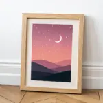
Layered Mountain Silhouettes
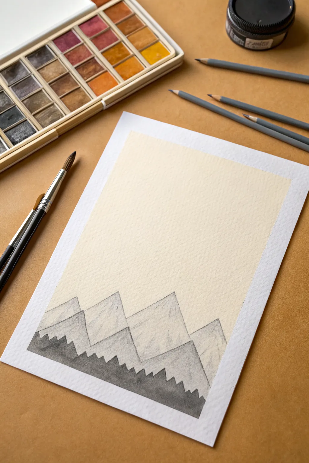
This project creates a serene, geometric mountain landscape using simple triangular forms and atmospheric perspective. By varying the shades from dark in the foreground to light in the background, you’ll achieve a striking sense of depth with minimal effort.
How-To Guide
Materials
- Cold press watercolor paper (A5 or similar size)
- Masking tape
- Graphite pencils (H for sketching, HB/2B for shading)
- Black watercolor paint or black India ink
- Small round paintbrush (size 2-4)
- Ruler (optional)
- Blending stump or tissue
- Jar of water
Step 1: Preparation & Sketching
-
Secure the paper:
Tape your watercolor paper down to a flat surface using masking tape. Create a crisp border by pressing the tape firmly along all four edges, leaving a framed white margin around your work area. -
Outline the furthest peaks:
Using a light H pencil, sketch the outline of the tallest mountain range about one-third of the way up from the bottom. These should be large, simple triangles with slightly uneven tops to look natural. -
Add the middle range:
Draw a second layer of mountains slightly lower than the first, overlapping the bases of the rear peaks. Make these shapes slightly wider and more irregular. -
Sketch the foreground:
Lightly mark a jagged, saw-tooth line across the very bottom of the composition. This will become your dark foreground silhouette representing trees or rocky terrain.
Smudgy Sky?
If graphite smears into your sky, use a kneaded eraser. Press and lift the graphite rather than rubbing, which keeps the paper texture intact.
Step 2: Shading the Mountains
-
Start the shading:
For the furthest back mountains (the top layer), use an HB pencil to lightly shade the shapes. Keep your strokes vertical or diagonal to mimic rocky textures. -
Refine the background texture:
Add slightly more pressure near the peak of each triangle and let the graphite fade as you move downward. This gradient creates a misty, high-altitude effect. -
Shade the mid-ground:
Move to the middle layer of mountains. Shade these darker than the background layer using a 2B pencil or by layering your strokes more densely. -
Create separation:
Ensure there is a clear contrast where the middle mountains overlap the rear ones. If the lines blur together, darken the edge of the middle mountains slightly to make them pop forward. -
Blend for softness:
Take a blending stump or a clean tissue and very gently smudge the graphite on the mountain faces. I like to smudge in the direction of the slopes to keep the structural integrity while softening the grain. -
Clean up edges:
Use an eraser to clean up any smudge marks that went into the sky area. The sky should remain pristine white paper for maximum contrast.
Step 3: Applying the Foreground
-
Mix your paint:
Prepare a small amount of black watercolor or ink. It should be fairly opaque, so don’t dilute it too much with water. -
Paint the tree line:
Using your small round brush, carefully fill in the jagged foreground shape you sketched earlier. Follow the saw-tooth pattern to create the impression of a dense forest or sharp rocks. -
Ensure solid coverage:
Make sure the black fill is solid and flat. This dark silhouette against the lighter pencil mountains is what anchors the entire image. -
Let it dry completely:
Allow the paint or ink to dry fully before touching the paper to avoid smearing the black pigment into the delicate pencil work. -
Remove the tape:
Once everything is dry, slowly peel away the masking tape at a 45-degree angle, away from the artwork, to reveal your clean, crisp borders.
Pro Texture Tip
When painting the black foreground, keep the top edge slightly rough or ‘dry’ with your brush tip to simulate loose pine needles or rocky crags.
You now have a beautifully atmospheric mountain scene that balances graphite texture with bold ink contrast
Wavy Line Flow
This rhythmic, meditative pattern transforms a simple sketchbook page into a stunning landscape of flowing lines. The minimalist design uses repeated curves to create a sense of movement and texture resembling rolling hills or ocean ripples.
Detailed Instructions
Materials
- Spiral-bound dot grid notebook or high-quality sketchbook
- Gold or tan fine-liner pen (0.3mm or 0.5mm)
- Pencil (HB or H)
- Eraser
- Ruler (optional, for edge alignment)
Step 1: Setting the Foundation
-
Prepare your canvas:
Begin by opening your notebook to a fresh two-page spread. For this project, we will focus primarily on the right-hand page, leaving the left page as a clean dot grid for notes or future doodles. -
Visualizing the flow:
Look at the layout of the page. Imagine dividing the vertical space into invisible bands or rows. You generally want about three to four main rows of waves stacking on top of each other. -
Sketch the base peaks:
Using your pencil very lightly, draw a series of gentle, connecting arches for the bottom-most row. These hill-like shapes should vary slightly in height and width to look organic. -
Layer the second row:
Sketch the next row of arches directly behind the first set. Position the peaks of this second row so they sit roughly in the valleys of the first row, creating an alternating scale-like pattern. -
Complete the composition:
Continue this stacking process until you reach the top of the page. Don’t worry about perfect symmetry; natural variation makes the final piece more interesting.
Step 2: Inking the pattern
-
Choose your starting point:
Pick up your gold or tan fine-liner. I find it easiest to start with the wave shape in the bottom left corner so my hand doesn’t smudge the ink as I move across. -
Trace the first boundary:
Carefully ink over your initial pencil sketch for the first wave shape to define its outer boundary. -
Begin the inner curves:
Draw a second curve just inside the first boundary line. Keep the spacing consistent, leaving about 2-3mm of white space between the lines. -
Repeating the motion:
Continue drawing concentric nested curves inside that first shape. As you get smaller and closer to the center bottom, the curves will naturally flatten out slightly. -
Connect to the next shape:
Move to the adjacent wave shape on the bottom row. Define its boundary line, ensuring it touches the darker line of the previous wave seamlessly. -
Fill the row:
Repeat the concentric line filling process for every wave shape in the bottom row. Let the ink dry for a moment before moving up. -
Handle overlapping areas:
When moving to the second row, remember these shapes appear ‘behind’ the first row. Ensure your vertical lines stop cleanly when they hit the top boundary of the row below. -
Varying line density:
Try to keep your line spacing fairly consistent across the whole page, but don’t stress over ruler-perfect precision—hand-drawn imperfections add warmth. -
Top edge considerations:
As you reach the top edge of the paper, let your curves run off the page naturally to simulate an infinite field.
Steady Hand Tip
Draw the curves by moving your whole arm from the elbow, rather than just pivoting your wrist. This creates smoother, more confident long lines.
Step 3: Final Touches
-
Wait for ink to set:
Allow the entire page to dry completely. Gel or felt pens can smear easily if erased too soon. -
Erase guidelines:
Gently erase any visible pencil marks from your initial sketch. Use a soft, circular motion to avoid wrinkling the paper. -
Inspect and refine:
Look closer at your line work. If any lines look too faint or have gaps, carefully re-trace them to ensure the color is solid and consistent.
Level Up: Ombré Effect
Use three graduating shades of brown or gold pens. Use the darkest pen for the bottom rows and switch to lighter shades as you move up the page.
Now you have a serene, structured background ready for journaling or simply admiring on its own

PENCIL GUIDE
Understanding Pencil Grades from H to B
From first sketch to finished drawing — learn pencil grades, line control, and shading techniques.
Explore the Full Guide
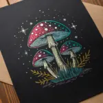
Starry Dot Night
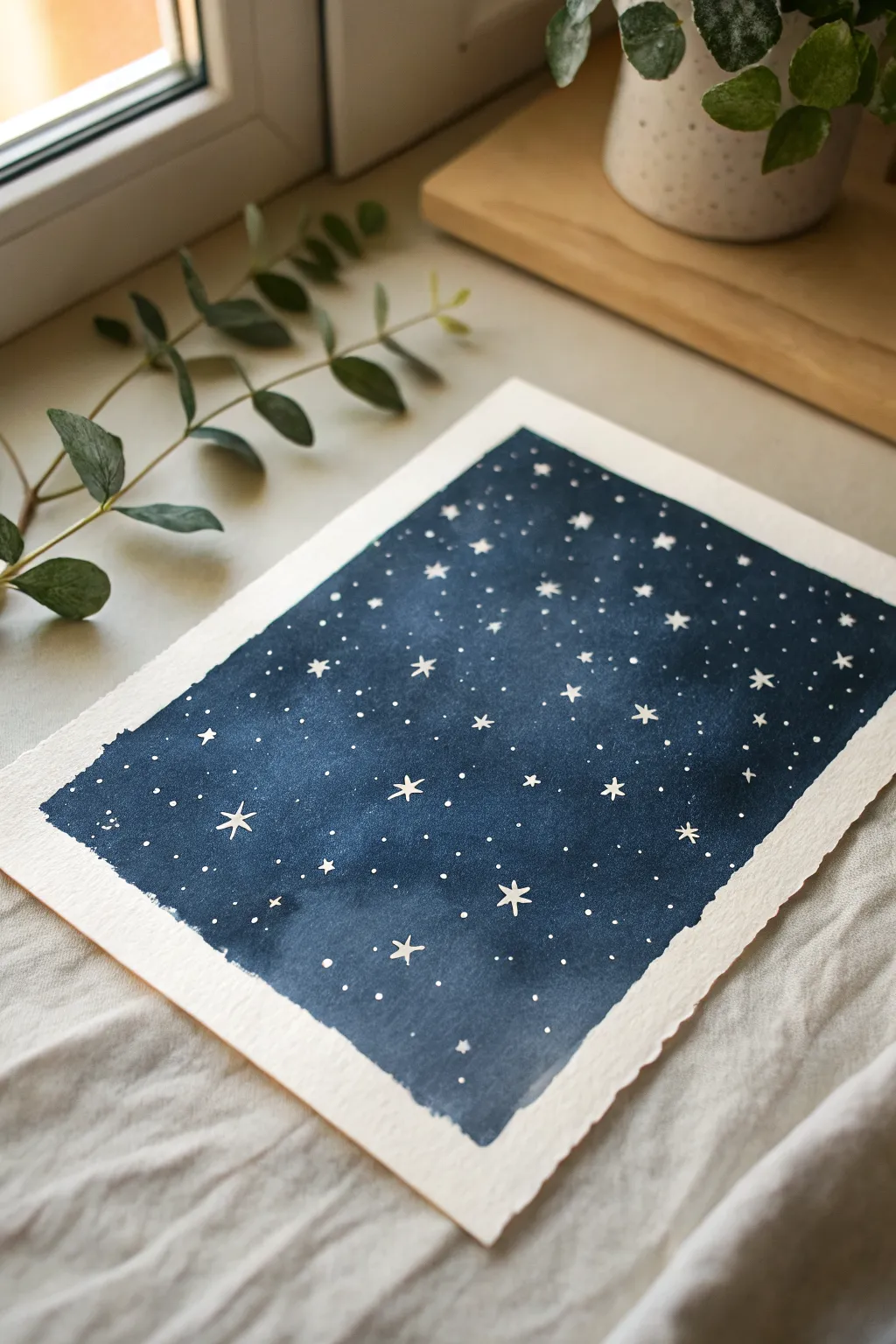
Capture the serene beauty of the cosmos with this simple yet striking starry night sky painting. Using opaque blue paint and delicate white details, you’ll create a moody, magical backdrop that feels expansive and peaceful.
How-To Guide
Materials
- Cold press watercolor paper (300 gsm)
- Painter’s tape or masking tape
- Navy blue gouache or acrylic paint
- Black gouache or acrylic paint (optional, for deepening)
- White gel pen or fine white ink
- Flat paint brush (about 3/4 inch)
- Small round detail brush
- Palette for mixing
- Jar of water
- Paper towels
Step 1: Preparation and Base Layer
-
Prepare your surface:
Start by taping down your sheet of watercolor paper to a board or your work surface. Create a clean border by pressing the painter’s tape firmly along all four edges; this ensures those crisp white margins you see in the final piece. -
Mix your night sky color:
Squeeze out a generous amount of navy blue gouache onto your palette. If you want a deeper, more infinite look like the reference creates, mix in a tiny touch of black or dark indigo to enrich the blue without making it muddy. -
Load the brush:
Dip your flat brush into water and then into your paint mixture. You want a creamy consistency—thick enough to be opaque but fluid enough to spread easily across the textured paper. -
Apply the first pass:
Begin painting at the top of the paper, using horizontal strokes to lay down the color. Don’t worry about perfect coverage yet; just focus on getting the pigment onto the page. -
Refine the edges:
As you paint near the tape, use the edge of your brush to push the paint right up to the line, ensuring a sharp rectangle shape when the tape is removed later. -
Even out the texture:
Work your way down the paper with consistent strokes. The goal is a relatively flat, solid field of blue, though a little variation in opacity can add a nice atmospheric depth. -
Let it dry completely:
Allow this base layer to dry fully. It needs to be bone-dry so that the white details we add later sit crisply on top without blending into the blue background.
Clean Edge Secrets
To stop paint from bleeding under the tape, run a bone folder or the back of your fingernail firmly along the tape edge before you start painting.
Step 2: Adding the Stars
-
Test your white medium:
Whether using a white gel pen or white ink on a small brush, scribble on a scrap piece of paper first to ensure the flow is smooth and opaque. -
Plan your major stars:
Visualize where your largest stars will go. These aren’t just dots; they are the focal points. Aim for an uneven, random distribution to make the sky look natural rather than patterned. -
Draw the main stars:
For the larger stars, draw a simple five-pointed star shape. Keep them small and delicate—don’t fill them in completely, just outline the shape purely. -
Create distinct star shapes:
Scatter about 10–12 of these five-pointed stars across the blue field. Vary their orientation slightly so they don’t all look like they are standing upright. -
Add secondary stars:
Switch to making smaller, solid asterisks or tiny crosses. These represent slightly more distant stars that still have a distinct shine but aren’t full shapes. -
Fill the gaps with stardust:
Now, begin dotting the empty spaces. Use a very light touch to create tiny pinpricks of light. I find that varying the pressure creates a nice mix of bright and faint stars. -
Cluster the dots:
Instead of spacing everything evenly, group some dots closer together to form faint milky way dust trails, leaving other areas slightly sparser for contrast. -
Review and refine:
Step back and look at the composition. If a corner feels too empty, add a few more speckles. The density should feel balanced but organic. -
The reveal:
Once the white ink is 100% dry, carefully peel away the painter’s tape. Pull it away from the painting at a 45-degree angle to prevent tearing the paper, revealing your beautiful clean edges.
Level Up: Galaxies
Before the blue layer dries, dab varied blues/purples with a scrunched paper towel for a cloudy galaxy texture.
Hang your finished piece near a window or frame it to enjoy a little piece of the night sky during the day
Tiny Heart Scatter
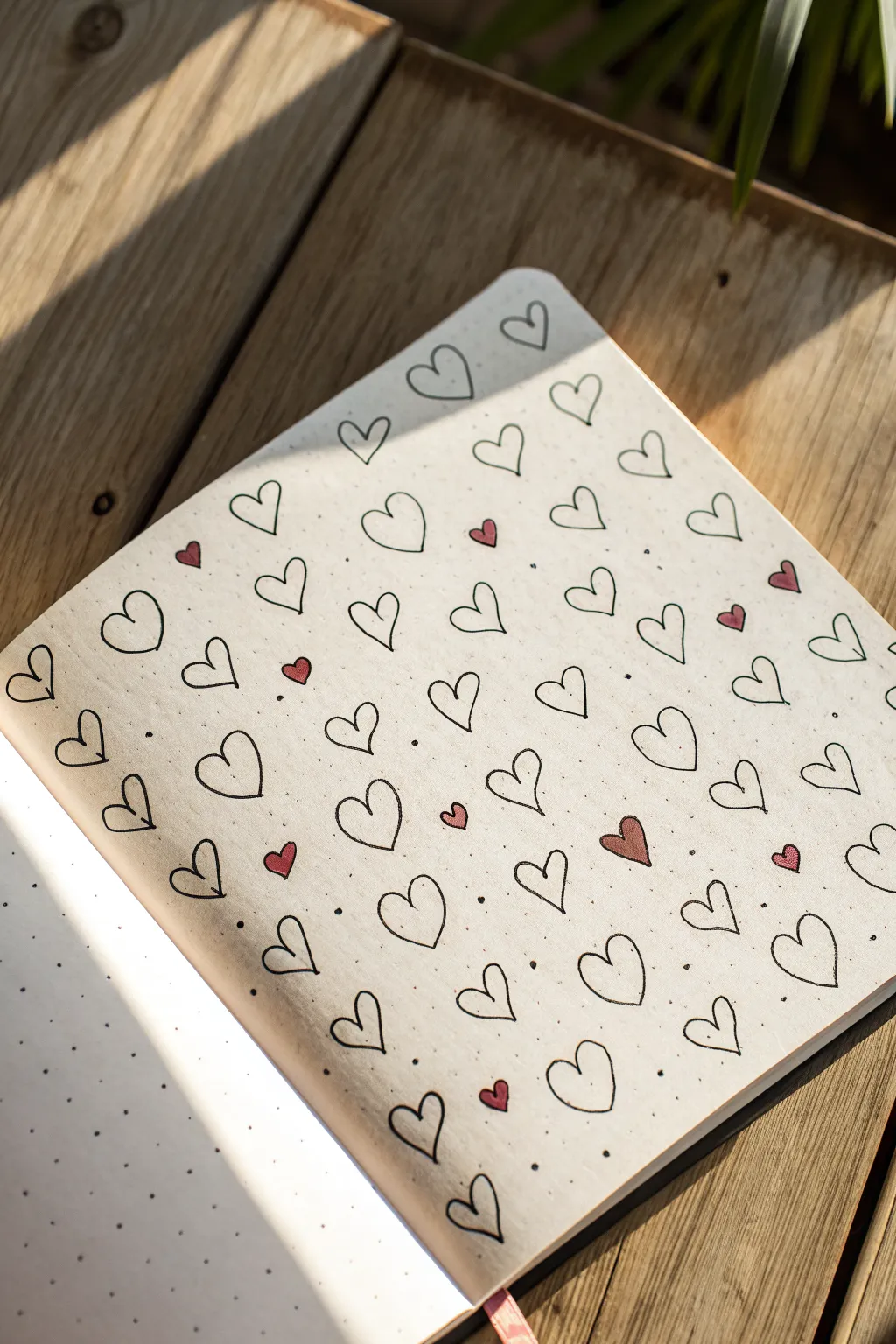
This charming, minimalist background turns a simple shape into a rhythmic pattern that feels both cozy and artistic. The design leverages the structure of a dot-grid journal to create a loosely orderly scatter of outlined and filled hearts.
Step-by-Step
Materials
- A5 Dot-grid notebook
- Fine-point black fineliner pen (0.3mm or 0.5mm)
- Red gel pen, marker, or colored pencil
- Ruler (optional, but helpful for spacing)
- Pencil (optional for sketching)
Step 1: Planning the Grid
-
Observe the spacing:
Before putting pen to paper, take a moment to look at your dot grid. This design uses a staggered or ‘brick’ layout rather than a perfect square grid, which gives it that nice, flowing look. -
Test your size:
Visualize how large you want each heart to be. In the example, each heart generally occupies a space of about 2×2 dots, allowing for breathing room between them. -
Optional pencil sketch:
If you are nervous about committing to ink immediately, lightly mark the center point for each heart with a pencil. Aim to place a heart on every other ‘significant’ intersection, shifting the next row over by one unit to create a diagonal flow.
Consistent Curves
Draw the heart in two strokes. Start at the top center divot, curve down to the point, then lift your pen and repeat for the other side.
Step 2: Drawing the Base Pattern
-
Start the first row:
Begin at the top left of your page. Using your black fineliner, draw a simple outline heart. Keep the shape loose and hand-drawn rather than striving for geometric perfection. -
Establish the rhythm:
Move horizontally across the page. Skip a bit of space (roughly the width of one heart) and draw the next outline. Continue this until the first row is complete. -
Start the second row:
Move down to the next imaginary line. Instead of drawing directly underneath the first heart, position your new heart in the gap between the two hearts above it. This creates that essential triangular grouping. -
Continue the pattern:
Fill the rest of the page using this alternating brick-lay pattern. Every odd row should align with row 1, and every even row should align with row 2. -
Vary the shapes:
As you draw, allow natural variation to happen. Some hearts might be slightly wider, taller, or tilted. This organic quality is what makes the page feel hand-drawn and warm.
Mix It Up
Instead of solid red hearts, try filling the small accent hearts with diagonal stripes or cross-hatching for a textured look.
Step 3: Adding Scale and Color
-
Identify gaps:
Scan your page for the larger empty spaces between your main outline hearts. The layout doesn’t need to be rigid, so you might spot areas that look a little too empty. -
Draw tiny hearts:
Switch to your red pen or marker. In roughly 10-15 random spots across the page, draw a much smaller solid heart. These act as accents. -
Position the accents:
Try to place these tiny red hearts slightly off-center relative to the black outlines. I like to tuck them near the bottom curves of the larger hearts to create a sense of movement. -
Balance the color:
Step back and look at the whole page. Ensure the red accents are distributed relatively evenly so one corner isn’t heavier with color than another.
Step 4: Final Details
-
Add micro-dots:
Using the tip of your black fineliner, add single, tiny stippling dots in the negative spaces. Don’t overdo it—just a sprinkle here and there to break up the white space. -
Refine the outlines:
Check your black hearts. If any lines are too faint or didn’t connect fully at the point, gently touch them up now. -
Erase guidelines:
If you used pencil marks at the beginning for spacing, wait until the ink is completely dry (give it at least 5 minutes) and then gently erase them.
You now have a wonderfully sweet patterned background ready for journaling or doodling over


Leafy Vine Repeat
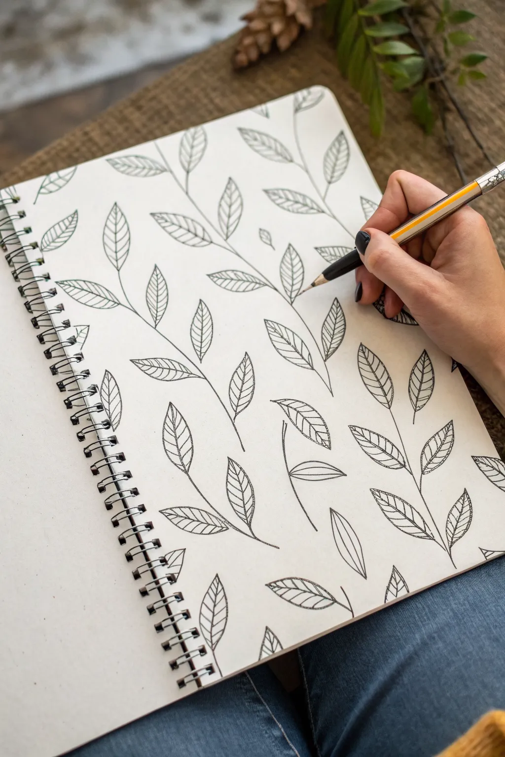
This simple yet elegant leaf pattern turns a blank page into a serene garden of climbing vines. Using just clean lines and consistent repetition, you’ll create a full-page background that feels organic and handcrafted.
Detailed Instructions
Materials
- A sketchbook or sheet of drawing paper
- A fine-point black drawing pen or pencil (0.5mm is ideal)
- A pencil (optional, for sketching)
- An eraser
Step 1: Drafting the Structure
-
Visualize the vertical flow:
Before making a mark, imagine several invisible vertical columns running from the bottom of your page to the top. These will be the lanes your vines grow in. -
Draw the first stem:
Starting at the bottom left, draw a single, gently wavy line moving upward. Let it snake back and forth slightly, like a lazy river, rather than drawing a straight stick. -
Add spacing for the second vine:
Move your hand about two inches to the right. Draw a second wavy line that roughly mirrors the first one, but vary the curves slightly so it doesn’t look like a carbon copy. -
Fill the page with stems:
Continue this process across the entire page until you have a series of vertical, wavy lines. Try to keep the spacing somewhat consistent, but natural variations add character.
Step 2: Adding the Foliage
-
Start the first leaf:
Choose a spot near the bottom of your first vine. Draw a small stem branching off the main line, curving slightly outward. -
Shape the leaf outline:
From the end of that small stem, draw a classic teardrop or almond shape. The bottom should be rounded and the tip should come to a sharp point. -
Draw the center vein:
Starting from the base of the leaf, draw a central line that curves with the leaf’s shape, stopping just before it hits the very tip. -
Add detail veins:
On both sides of that center line, create small, diagonal dashes to represent the leaf veins. For this style, I find keeping them straight and simple looks cleaner than curving them too much. -
Alternate the placement:
Move slightly further up the main vine and draw the next leaf on the *opposite* side. Alternating left and right creates a balanced, organic growth pattern. -
Work your way up:
Continue adding alternating leaves all the way up the first stem. Allow the leaves to tilt at different angles to mimic natural movement.
Oops! Uneven Spacing?
If a gap looks too wide, don’t erase! Draw a small, floating leaf or a disconnected twig in the whitespace. It looks like falling foliage and adds charm.
Step 3: Completing the Pattern
-
Repeat on the next vine:
Move to your second vertical stem. Begin adding leaves just like before, but try to stagger them so they sit in the empty spaces left by the first vine’s leaves. -
Handle the edges:
When you reach the edges of the paper, draw partial leaves that look like they are running off the page. This creates the illusion that the pattern continues infinitely. -
Fill empty pockets:
Scan your drawing for any large, awkward gaps. You can add a tiny, extra leaf or a budding shoot in these spaces to balance the composition. -
Refine the lines:
Go over your main stem lines again if they feel too thin compared to the leaves. A slightly bolder stem can help anchor the drawing. -
Clean up:
If you started with a pencil sketch, gently erase any visible guidelines once the ink is completely dry to reveal the crisp black-and-white contrast.
Make It Grow
Add tiny berries, intricate spirals, or small flowers at the junction where the leaf meets the stem to turn this into a blooming floral pattern.
Now you have a serene, repeating botanical design perfect for a journal background or wrapping paper
Crayon Resist Scribble Texture
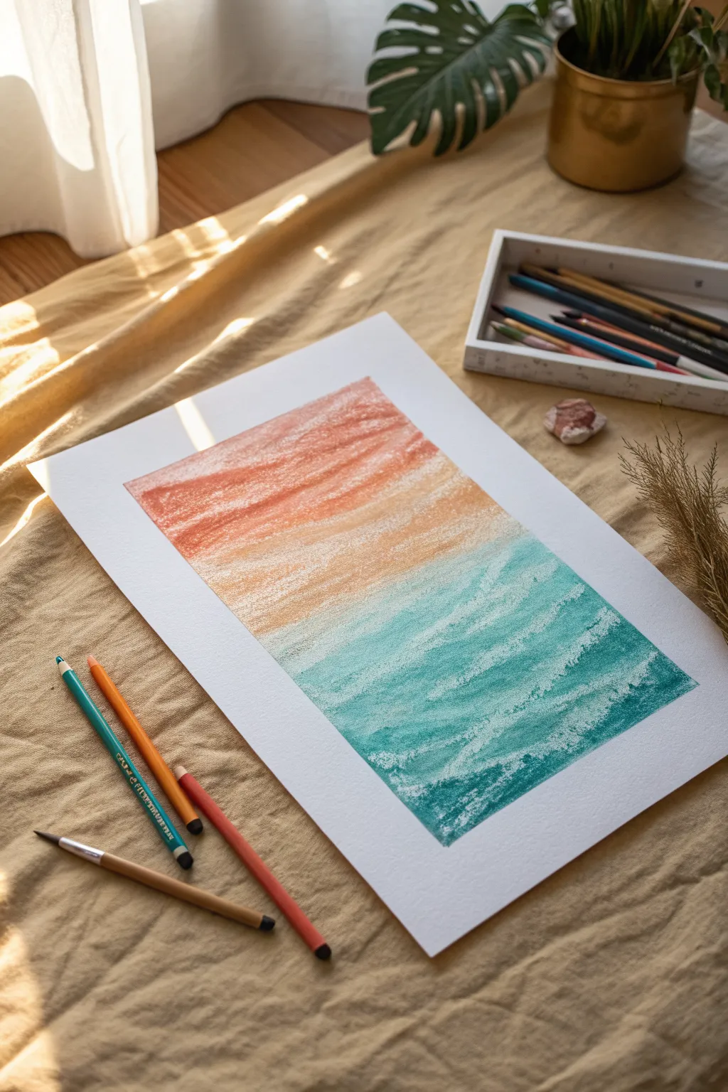
Capture the serene transition from a warm sky to a cool ocean using the simple yet effective power of texture. This project combines vibrant oil pastels or wax crayons with the natural grain of paper to create a stunning, effortless gradient effect.
Step-by-Step Guide
Materials
- Heavyweight textured art paper (watercolor or mixed media paper works best)
- Oil pastels or high-quality wax crayons (coral, orange, teal, and deep turquoise)
- Masking tape or painter’s tape
- A clean workspace or drawing board
- Optional: White crayon for resist highlights
Step 1: Preparation and Sky Layer
-
Secure the paper:
Begin by taping down the edges of your textured paper to a flat surface or drawing board. This creates that crisp, clean white border seen in the final piece and keeps the paper from shifting while you work. -
Establish the horizon:
Visualize where the sky meets the water. For this composition, aim for a split just slightly below the center of the page to give the sky plenty of breathing room. -
Begin with the lightest warm tone:
Take a pale peach or light orange pastel. Using the side of the a crayon rather than the tip, gently drag it across the middle section of your paper. -
Let the paper grain show:
Apply very light pressure. The goal is to let the color catch only on the high points of the paper’s texture, leaving white speckles showing through. This is key to the aesthetic. -
Intensify the sky:
Move upwards towards the top of the page, switching to a deeper coral or terra-cotta color. Apply this color slightly heavier than the first layer. -
Blend the warm transition:
Where the coral meets the peach, gently scumble the two colors together. You generally want a rough, organic blend rather than a perfectly smooth gradient. -
Add texture variation:
Go back in with your coral crayon and make a few decisive, sweeping horizontal strokes to simulate cloud movement. Keep these strokes loose and intentionally scribbly.
Step 2: Ocean and Mixing
-
Start the water line:
Switch to a light teal or aqua color. Start coloring right below your peach horizon line. -
Create the first waves:
Use short, horizontal back-and-forth strokes. Unlike the sky, which felt airy, the water should feel a bit denser, but still maintain that grainy texture. -
Deepen the depths:
As you move toward the bottom of the page, transition into a deeper turquoise or teal blue. This adds visual weight to the bottom of the composition. -
Introduce the resist effect:
If you want stark white caps on your waves, take a white crayon or pastel and press firmly in jagged horizontal lines over the blue areas. -
Layering for contrast:
Layer your deepest teal over the white crayon marks. The wax from the white crayon will resist the new color, creating instant foamy wave textures. -
Refine the edges:
Check the edges near the tape. Make sure your color goes all the way to the tape line so you get a perfect rectangle when you peel it off. -
Final texture check:
Stand back and look at the whole piece. I like to add a few final, heavier pressure strokes in the dark blue area to create strong contrast against the white paper speckles.
Too much rubbing?
If you accidentally filled the paper tooth too much and lost the white speckles, try gently scratching the surface with a palette knife or fingernail to remove some wax and reveal the texture again.
Step 3: Finishing Touches
-
Clear debris:
Oil pastels and crayons can leave little crumbs. Gently blow them off or tap the paper vertically; wiping them with your hand might smear the artwork. -
The reveal:
Slowly peel the masking tape away from the paper. Pull the tape away from the center of the drawing at a 45-degree angle to prevent tearing the paper surface. -
Sign and display:
Your textured gradient landscape is complete. The beauty really lies in the rough interaction between the wax and the paper tooth.
Add a sun
Before starting the sky, draw a circle with white crayon where you want the sun. The sky colors will skip over this hidden wax circle, leaving a glowing white sun when you color over it.
Enjoy the relaxing rhythm of creating these textured waves and skies


Have a question or want to share your own experience? I'd love to hear from you in the comments below!