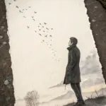
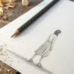
When I want a quick creative win, I grab my colored pencils and go for subjects that are simple to draw but still pop with color. These easy pencil colour drawing ideas are all about clean shapes, chill blending, and that “I can totally do this” feeling.
Simple Flower Bouquet
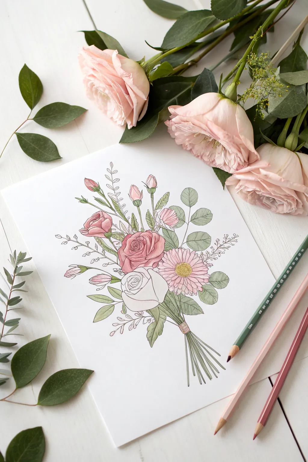
Capture the soft elegance of fresh blooms with this gentle colored pencil study. Featuring romantic roses, a cheerful pink daisy, and sprays of eucalyptus, this project teaches you how to layer colors for a natural, airy finish.
Step-by-Step Guide
Materials
- Smooth white drawing paper or cardstock
- HB or 2H graphite pencil (for sketching)
- Fine-tip black liner pen (0.1mm or 0.3mm)
- Colored pencils (Soft pink, deep rose, sage green, olive green, yellow, grey)
- Eraser
- Pencil sharpener
Step 1: Sketching the Composition
-
Basic Shapes:
Start lightly with your graphite pencil. Draw a central circle for the main pink rose, a slightly lower oval for the white rose, and a circle to the right for the daisy. These will form the heart of your bouquet. -
Stem Placement:
Sketch a diagonal bundle of lines extending downward from your flower shapes to create the stems. Gather them at a single point where the binding will go. -
Adding Height:
Draw upward-reaching lines for the buds and tall foliage. Place two rose buds near the top left and a few smaller filler stems reaching up through the middle. -
Fleshing out the Blooms:
Refine the circle of the main rose into spiraling petals. For the lower rose, draw broad, cupped petals. Add distinct, long petals for the daisy on the right. -
Adding Greenery:
Sketch the eucalyptus leaves. These should be rounded and attached to the outer stems. Add small, pointed leaves around the rose buds and at the base of the bouquet.
Clean Lines
Keep your pencil sharp! A fine point is crucial for getting into the tiny corners of the rose petals without coloring outside the lines or smudging details.
Step 2: Inking the Outline
-
Tracing the Flowers:
Using your fine-tip black liner, carefully trace over your pencil lines. Use a broken or thinner line for delicate inner petals to keep them looking soft. -
Defining Leaves:
Ink the leaves with confident strokes. Add a central vein line to the larger eucalyptus leaves but keep the smaller filler leaves simple. -
Binding Detail:
Draw the binding wrapper around the gathered stems. Add small horizontal lines to suggest texture on the tie. -
Clean Up:
Allow the ink to dry completely for a minute or two. Gently erase all visible graphite pencil lines so you have a clean slate for coloring.
Add a Gradient
Make the pink rose petals darker at the center spiral and fade to white at the very tips. This mimics how real roses often hold color.
Step 3: Adding Color
-
Base Pink Tones:
Take a soft pink pencil and lightly shade the upper rose and the daisy. Keep the pressure very light; you want a pastel wash, not heavy saturation. -
Rose Depth:
Switch to a deeper rose or mauve pencil. Add shading to the center of the pink rose and the shadowy areas where petals overlap. -
Daisy Center:
Color the center of the daisy with a bright yellow. I like to adding tiny dots of light brown or orange around the edge of the yellow center for texture. -
The White Rose:
Leave the lower rose mostly white. Use a very pale grey or light blue pencil to add subtle shadows at the base of the petals to give it 3D form. -
Greenery Base:
Color the eucalyptus leaves with a sage green. Apply the color evenly but lightly. -
Leaf Variation:
Use an olive green to color the rose leaves and stems. Press harder near the base of the leaves and stems to create shadow depth. -
Bud Details:
Color the tips of the rose buds with your deep rose pencil, fading into green as you move down the bud. -
Binding and Stems:
Color the binding tie with a light brown or peach. Shade the stems below the binding with olive green, leaving thin slivers of white to suggest light hitting the round stems.
Now you have a timeless floral illustration perfect for greeting cards or framing
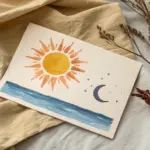
Sunset in a Circle
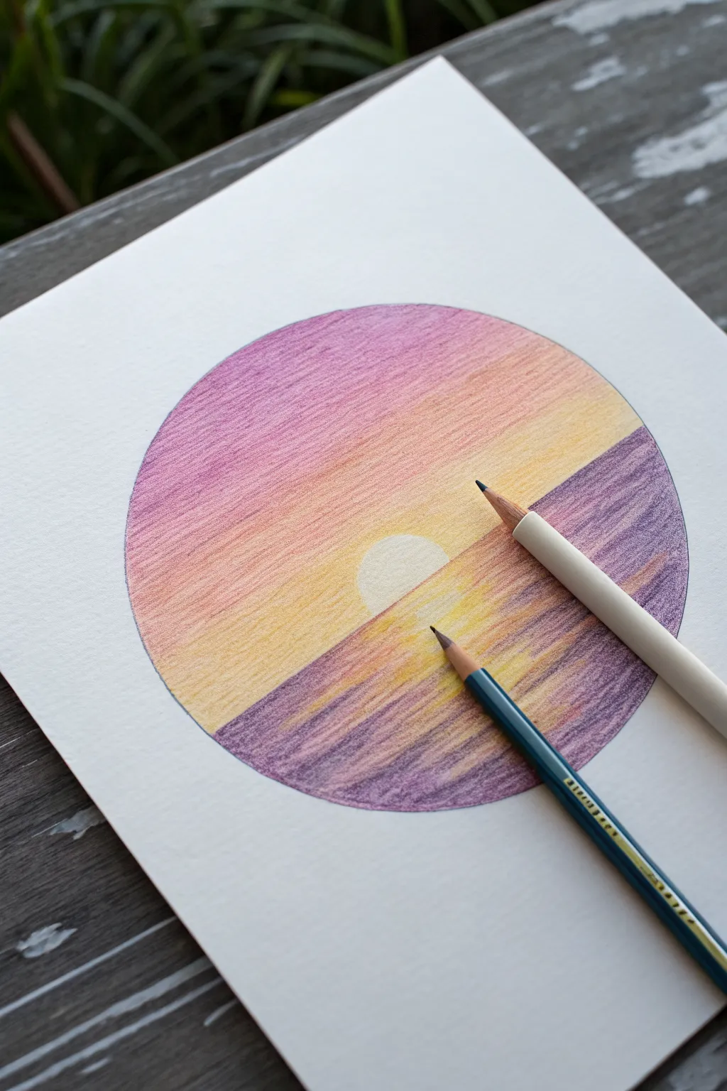
Capture the serenity of dusk with this contained landscape drawing, featuring a soft gradient sky and textured water ripples. The clean circular border contrasts beautifully with the organic flow of the setting sun’s reflection.
Step-by-Step Guide
Materials
- High-quality white drawing paper (heavyweight cardstock or mixed media paper recommended)
- Colored pencils (specifically: deep purple, magenta/pink, orange, yellow, and white/cream)
- Compass or a large circular object to trace (e.g., masking tape roll or bowl)
- Graphite pencil (HB or lighter) for outlining
- Eraser
- Pencil sharpener
Step 1: Setting the Scene
-
Create the boundary:
Begin by lightly drawing a perfect circle in the center of your paper using a compass or by tracing a round object. Keep the line faint so it won’t be distracting later. -
Establish the horizon:
Draw a straight horizontal line across the lower third of the circle to separate the sky from the water. -
Define the sun:
Sketch a small semi-circle resting exactly on the horizon line in the center. I like to keep this very light because we want the sun to remain almost purely the white of the paper.
Fixing Patchiness
If the colors look grainy or scratchy, drawing small circular motions rather than back-and-forth lines helps fill the paper’s texture better.
Step 2: The Gradient Sky
-
Start with purple:
Using your deep purple pencil, begin shading the very top curve of the circle inside the sky area. Apply light pressure initially to establish a smooth layer. -
Transition to magenta:
Select a magenta or deep pink pencil. Overlap it slightly with the bottom edge of the purple section and continue coloring downward, blending the two hues together. -
Introduce orange:
Switch to an orange pencil for the middle band of the sky. Blend it up into the pink area to create a warm, seamless transition. -
Brighten with yellow:
Fill the remaining sky area down to the horizon line with bright yellow, blending it into the orange above. Be careful to color around the sun shape, keeping that semicircle pristine white. -
Deepen the layers:
Go back over your sky gradient with the same colors, applying slightly more pressure this time to increase saturation and smooth out the paper tooth.
Make it Pop
Add a silhouette of a boat, palm tree, or birds in solid black ink over the finished sunset for an instant focal point enhancement.
Step 3: Water and Reflections
-
Base water color:
Take the deep purple pencil again. Start shading from the bottom edge of the circle upwards, but leave a triangular path directly under the sun uncolored for now. -
Create the reflection path:
In that uncolored triangular area beneath the sun, lightly lightly sketch horizontal strokes using your yellow pencil to mimic sunlight hitting the water. -
Blend water tones:
Layer some magenta and orange into the purple areas of the water, specifically near the horizon line, to mirror the sky’s colors. -
Defining ripples:
Using a sharp purple pencil, draw stronger, darker horizontal lines across the water to represent waves. Let these lines encroach onto the yellow reflection path slightly to make it look integrated. -
Intensify contrast:
Darken the edges of the water near the bottom and sides of the circle with your deepest purple to create a sense of depth and focus.
Step 4: Final Touches
-
Solar glow:
Very lightly shade the ‘white’ sun with a cream or pale yellow pencil if it feels too stark against the background. -
Burnish the sky:
Use a white colored pencil to color over the entire sky area heavily. This ‘burnishing’ technique blends the pigments together for a creamy, painterly look. -
Clean up:
Gently erase any stray marks outside the circle boundary to keep that crisp, clean edge.
Step back and admire the warm, peaceful atmosphere you have created within a simple shape
Big Moon and Tiny Stars
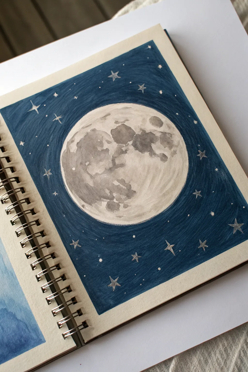
Capture the serene glow of a full moon surrounded by shimmering stars in this deep blue night scene. Using a combination of marker and colored pencil creates a striking contrast that makes the lunar surface pop right off the page.
How-To Guide
Materials
- Sketchbook with mixed media or heavy drawing paper
- Compass or round object (for tracing)
- Graphite pencil (HB or 2B)
- Dark blue alcohol marker (e.g., Prussian Blue or Navy)
- Gray alcohol markers (light and medium tones)
- White gel pen or white gouache paint
- Silver metallic gel pen or marker
- Ruler
Step 1: Planning the Composition
-
Create the boundary:
Start by drawing a rectangular frame in the center of your sketchbook page using a ruler and pencil. This creates a clean, bordered look for your artwork rather than filling the whole page. -
Outline the moon:
Place the point of your compass in the center of the rectangle and draw a large circle. If you don’t have a compass, trace a circular object like a masking tape roll or a glass. The moon should take up a significant portion of the frame.
Uneven marker coverage?
If your blue background looks streaky, color in small circular motions rather than long lines. This keeps the ink wet longer, allowing it to blend seamlessly into a solid block of color.
Step 2: Creating the Night Sky
-
Fill the background:
Using your dark blue alcohol marker, carefully outline the outer edge of the moon circle first to protect the shape. Then, fill in the rest of the rectangular background. -
Layering for depth:
Apply the ink in consistent strokes, perhaps radiating outward from the moon or in horizontal bands, to minimize streakiness. You might need a second layer of marker to get that deep, solid midnight blue.
Step 3: Detailing the Moon
-
Base shadows:
Switch to your lightest gray marker. Look at the reference image or a real photo of the moon and start blocking in the ‘maria’—the large dark plains on the lunar surface. These shapes are organic and irregular. -
Deepen the craters:
Use a medium-tone gray marker to add depth to specific areas within the light gray patches you just drew. Focus on the central right area and the bottom left edge to create the illusion of roundness. -
Create texture:
Dab small dots or varied strokes with the gray markers around the edges of your shadows. This mimics the cratered, rocky texture of the moon rather than leaving smooth, perfect edges. -
Tint the background paper:
I like to leave the white paper showing for the brightest parts of the moon, but if your paper is cream-colored like this sketchbook, you can add very faint washes of diluted white paint or a very pale gray to brighten the highlights.
Pro Tip: Masking
Use liquid frisket or masking fluid on the stars before coloring the blue background. Rub it off at the end to reveal crisp white paper stars without needing a gel pen.
Step 4: Adding the Stars
-
Draw primary stars:
Take a silver metallic pen or a fine white gel pen. Draw several larger four-pointed stars scattered around the moon. Draw a cross shape first, then gently curve the inner corners inward to make them look sharp. -
Add distinct dots:
Place medium-sized dots randomly throughout the blue background. Try to keep them spaced out unevenly so the sky looks natural, not like a grid. -
Fill with stardust:
Finally, use the tip of your white pen to tap tiny specks of dust and distant stars between the larger ones. Varying the pressure will give you different sizes of stars.
Now you have a tranquil celestial scene preserved right in your sketchbook


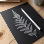
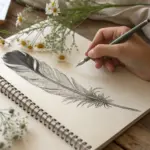
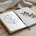
Leafy Branch Study
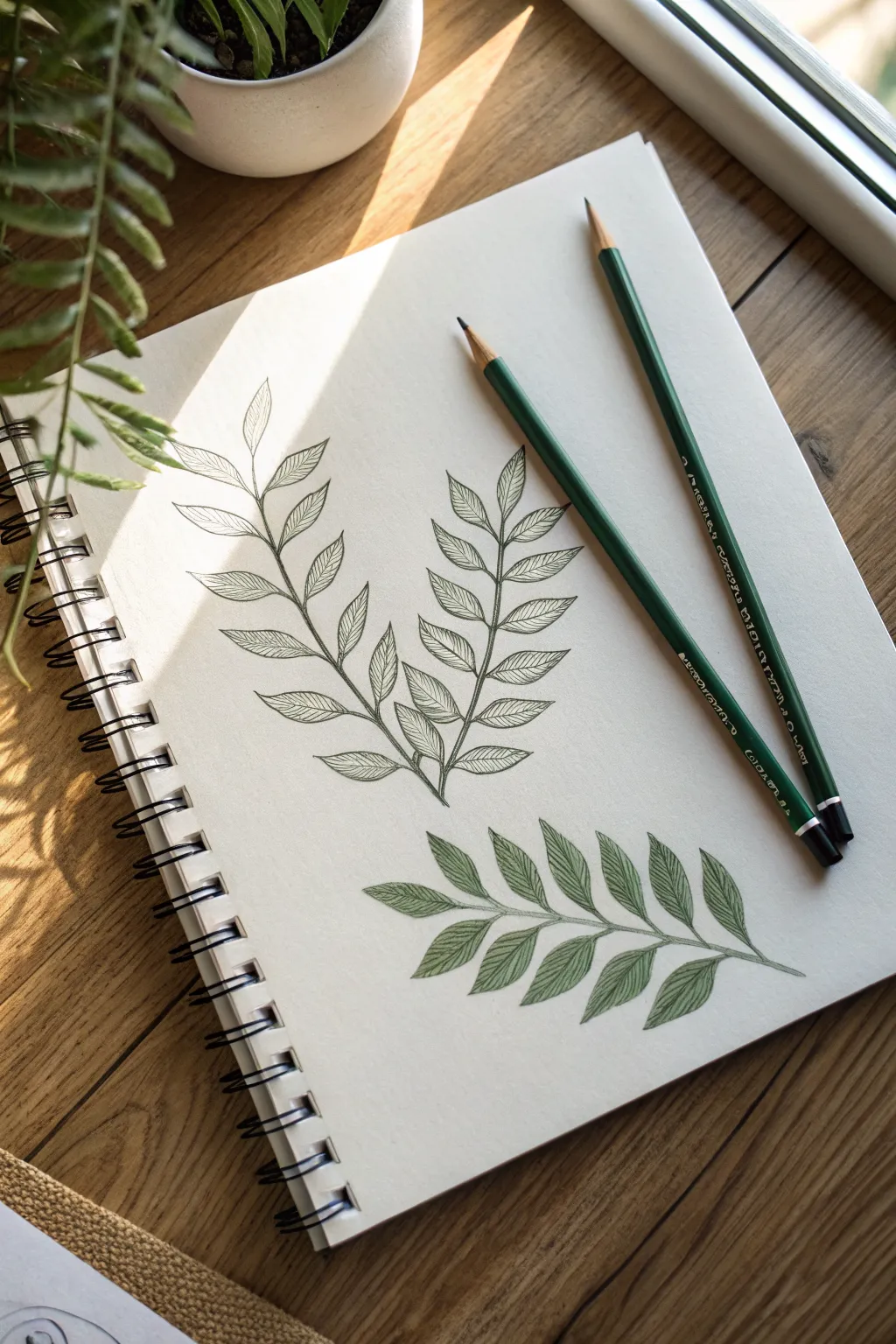
Capture the delicate beauty of botanical illustrations with this serene pencil study. You’ll practice creating flowing organic lines and subtle shading to bring a simple leaf pattern to life.
Detailed Instructions
Materials
- Sketchbook with smooth, heavy paper
- HB graphite pencil
- Fine-point black or dark green archival ink pen
- Olive green colored pencil
- Forest green colored pencil
- Pencil sharpener
Step 1: Sketching the Framework
-
Draw the central stems:
Begin by lightly drawing the central stems for your upper composition. Create two graceful, slightly curved lines that originate from a single point at the bottom and separate as they rise, forming a gentle ‘V’ shape. -
Add leaf midribs:
Along each stem, mark the positions for your leaves. Draw short, curved lines extending outward in pairs or alternating patterns, mimicking how leaves naturally sprout from a branch. -
Shape the leaves:
Outline the basic shape of each leaf around the midribs. Aim for an elongated oval or lanceolate shape that tapers to a point at the tip. Keep your pencil pressure very light so you can easily erase later.
Step 2: Detailing with Ink
-
Outline the stems:
Using your fine-point pen or a very sharp dark green pencil, carefully trace over your graphite stem lines. Vary your pressure slightly to make the base of the stem feel slightly thicker than the delicate tips. -
Define the leaf edges:
Trace the outline of each leaf. Instead of a perfectly smooth line, add tiny, almost imperceptible serrations or waves to the edge to give the leaves a more organic, natural texture. -
Draw the veins:
Draw the central vein (midrib) for each leaf first. Then, add the smaller lateral veins branching off the center. Keep these side veins thin and closely spaced, angling them toward the leaf tip. -
Erase guidelines:
Once the ink is completely dry—give it a minute or two—gently erase all the underlying graphite sketch marks to reveal a clean, crisp line drawing.
Fix Smudged Ink?
If you smudge fresh ink while erasing, turn it into a shadow. Gently shade over the smudge with your darker green pencil to blend it into the leaf’s natural coloring.
Step 3: Coloring and Shading
-
Sketch the lower branch:
Below your line drawing, sketch a single horizontal branch with leaves using the same technique as the first phase. This time, skip the ink; we will use colored pencils directly. -
Base layer of color:
Take your olive green colored pencil and lightly fill in every leaf on this lower branch. Use the side of the lead for soft, even coverage, leaving the paper’s white showing through slightly. -
Define the veins with color:
Switch to your sharper forest green pencil. Draw the central vein and the lateral veins over the olive base. Press firmly enough to make the veins stand out against the lighter background. -
Add depth to the leaves:
I like to go back in with the olive green pencil and darken the areas right next to the central vein. This creates a slight valley effect, making the leaf look three-dimensional. -
Shadowing the overlaps:
Where one leaf overlaps another or tucks behind the stem, add a touch of the darker forest green shading. This small shadow separates the forms and adds realism. -
Refining the edges:
Sharpen your forest green pencil to a fine point and trace the outer edge of each colored leaf to give it a crisp finish similar to the inked version above. -
Final stem connection:
Draw the main stem of this colored branch with the forest green pencil, thickening it slightly where the leaves attach to ground the composition.
Add Realistic Texture
Instead of coloring the leaf solidly, use directional strokes that mimic the angle of the veins. This reinforces the leaf structure even before you draw the vein lines.
Now you have a sketchbook page that beautifully contrasts linear form with soft color application

PENCIL GUIDE
Understanding Pencil Grades from H to B
From first sketch to finished drawing — learn pencil grades, line control, and shading techniques.
Explore the Full Guide
Cute Bird on a Twig
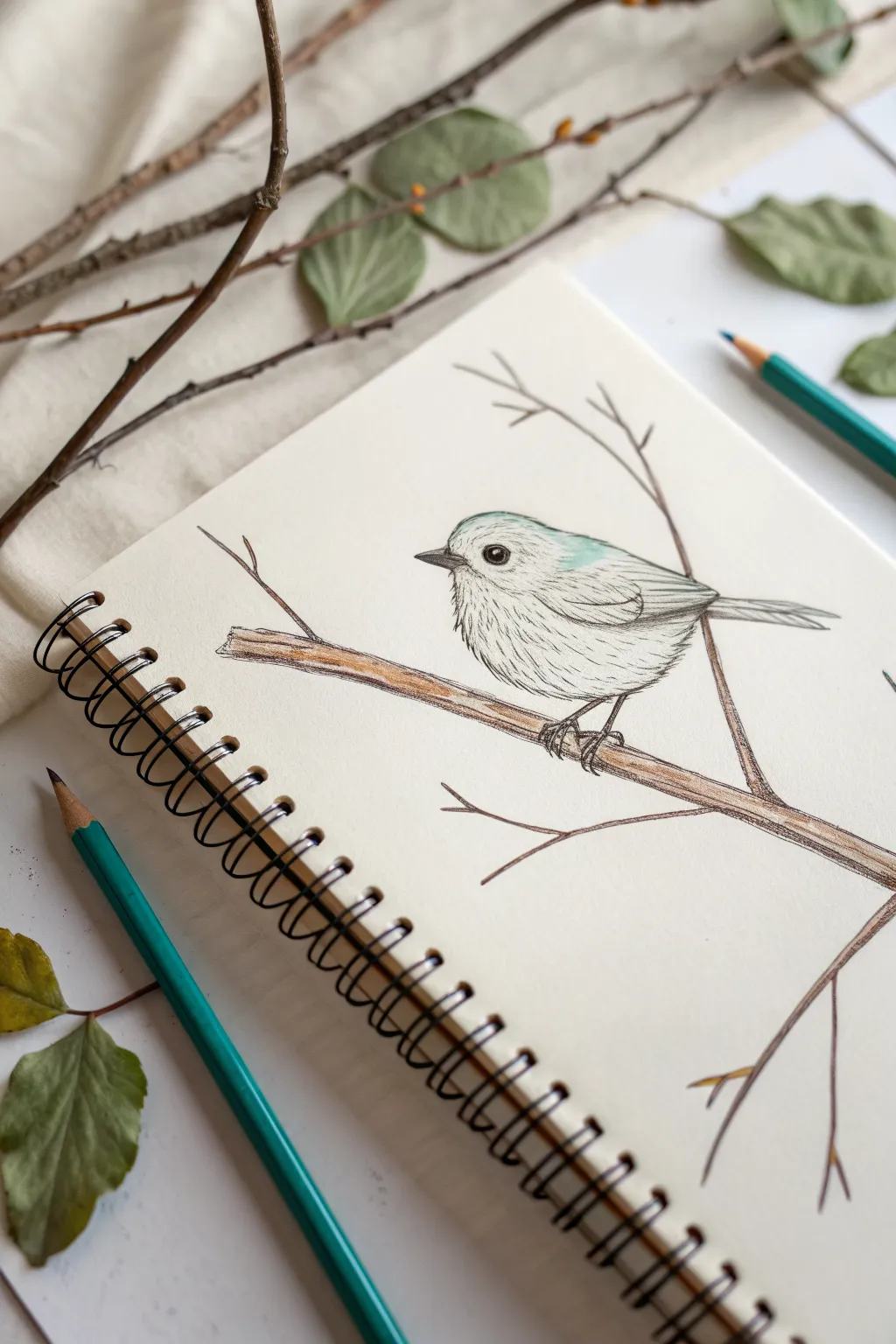
Capture the charm of nature with this delicate illustration of a small bird perched quietly on a branch. Using a combination of fine pen lines and soft colored pencil touches, you will create a sketchbook page that feels both organic and refined.
Step-by-Step
Materials
- Spiral-bound sketchbook (medium tooth paper)
- Graphite pencil (HB or H for sketching)
- Fine liner pen (black, 0.1mm or 0.3mm)
- Teal or soft blue colored pencil
- Brown colored pencil (warm, earthy tone)
- Grey colored pencil
- Eraser
Step 1: Initial Sketching
-
Outline the head and body:
Start lightly with your graphite pencil. Draw a rounded, slightly flattened circle for the head and connect it to a larger oval shape angled downwards for the body. Keep your lines very faint so they can be erased later. -
Add the tail and wing:
Extend a small, rectangular shape from the back of the body to form the tail feathers. Draw a teardrop shape on the side of the body to indicate the folded wing. -
Position the branch:
Draw a long, diagonal line passing under the bird’s feet to represent the main branch. Add a second, thinner line branching off generally upwards to the right to create visual balance. -
Refine the features:
Sketch a small, triangular beak on the left side of the head. Mark a small circle for the eye, leaving a tiny white spot for the highlight. Add stick-like legs gripping the branch.
Fix Spidery Legs
If the bird’s legs look too thin or stick-like, thicken the joints slightly with your pen. Birds have knobby toes, and emphasizing these gripping points adds realism.
Step 2: Inking the Details
-
Outline the eye:
Switch to your fine liner pen. Carefully ink the eye circle, filling it in black while preserving that crucial white highlight to give the bird life. -
Define the beak:
Ink the beak with sharp, clean lines. I like to add a tiny separation line in the middle to show where the beak opens. -
Create feather texture:
Instead of drawing a solid outline for the bird’s body, use short, broken dashes. This technique mimics the softness of fluffy down feathers, especially on the belly and chest. -
Detail the wing:
On the wing area, use longer, sweeping strokes to suggest flight feathers lying flat. Draw the tail feathers with straight, parallel lines. -
Ink the branch:
Go over your branch sketch with the pen. Use slightly shaky or uneven lines to give the wood a natural, rough texture. Add small V-shapes where the twigs split off. -
Clean up:
Wait a minute for the ink to dry completely, then gently erase all visible graphite pencil lines.
Add a Season
Customize your drawing by adding tiny buds on the twigs for spring, green leaves for summer, or leaving the branch bare for a stark winter look.
Step 3: Adding Soft Color
-
Apply the base blue:
Take your teal or soft blue colored pencil. lightly shade the top of the bird’s head. Use very light pressure to create a gentle wash rather than a solid block of color. -
Color the branch:
Using the brown pencil, fill in the branch. Press harder on the shadowed underside of the wood and lighter on the top to create a cylindrical 3D effect. -
Add branch texture:
Go back over the brown coloring with a few firmer strokes to suggest bark grain and knots in the wood. -
Shade the body:
Use a grey pencil to add subtle dimension. Lightly shade under the wing, beneath the tail, and on the lower belly to give the bird a rounded form. -
Enhance the wing:
Add a very faint touch of the teal or grey to the wing feathers to tie the color palette together without overpowering the line work. -
Final touches:
Review your drawing. If the eye needs more definition, darken the rim with your pen. Add a tiny bit of shadow under the bird’s feet on the branch to ground it.
Now you have a charming nature study sitting right in your sketchbook
Patterned Butterfly Wings
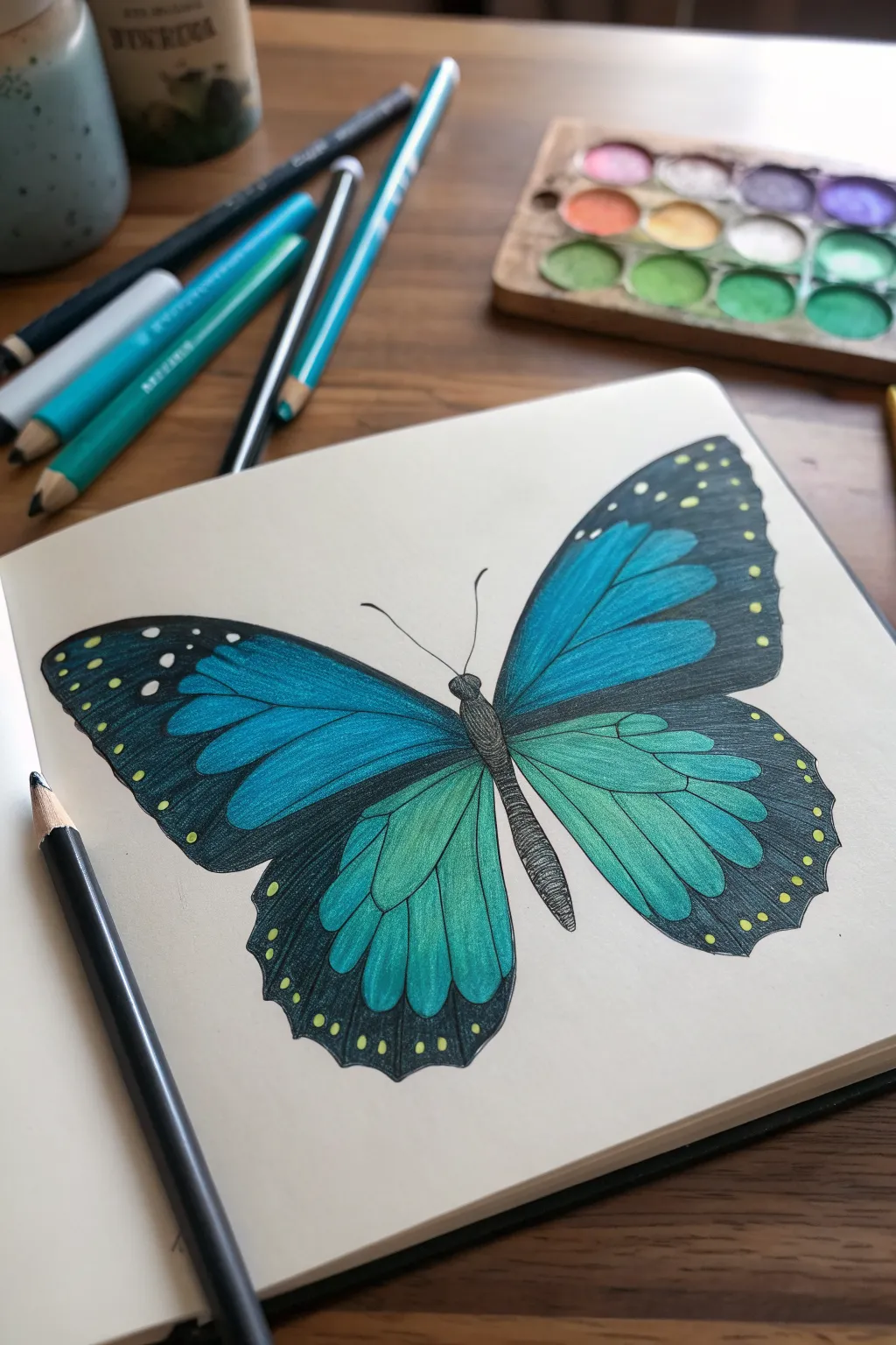
Capture the delicate beauty of a butterfly with this stunning project that blends deep blacks with vibrant oceanic teals. The striking contrast between the dark borders and the luminous inner wings creates a drawing that looks almost ready to fly off the page.
Step-by-Step Guide
Materials
- Smooth heavyweight drawing paper or sketchbook
- HB graphite pencil (for sketching)
- Eraser
- Colored pencils (Teal, light blue, turquoise, dark blue)
- Black colored pencil (wax-based preferred for opacity)
- Fine liner pen (optional, for the body)
Step 1: Sketching the Outline
-
Draw the central axis:
Begin by lightly drawing a diagonal line where the butterfly’s body will rest. This helps angle the wings naturally. -
Sketch the body:
Draw three distinct segments along your axis: a small round head, a fuzzy oval thorax, and a long, tapered abdomen. Keep lines light so they can be refined later. -
Map the forewings:
Extending from the thorax, sketch two large, triangular shapes for the upper wings. The tips should be rounded, not sharp. -
Map the hindwings:
Below the forewings, draw two rounded, teardrop-like shapes for the lower wings that curve back toward the abdomen. -
Detail the wing veins:
Lightly trace the vein patterns inside the wings. These will act as the boundaries between your black borders and colored sections. Start from the base of the wing near the body and fan outward.
Gradient Secrets
For the smoothest color transition on the wings, use small circular motions rather than back-and-forth strokes. This packs the pigment without leaving harsh directional lines.
Step 2: Coloring the Vibrant Centers
-
Base layer of light blue:
Start with your lightest blue pencil. Fill in the inner sections of the top wings (the forewings), pressing lightly to create an even base layer. -
Base layer of teal:
Switch to a teal or turquoise pencil for the lower wings (hindwings). Apply a light wash of color here as well, keeping within your vein lines. -
Deepen the forewings:
Take a medium blue pencil and shade from the body outward on the top wings. Fade this darker blue into the lighter tips to create a gradient. -
Deepen the hindwings:
Use a darker teal or green-blue shade on the lower wings. Shade heavily near the body and let it fade out as you move toward the edges. -
Blend the gradients:
Go back over the transition areas with your lightest color to smooth out the blend between the dark roots and light tips. I find using a blending stump or white pencil here helps creaminess.
Step 3: Adding Contrast and Details
-
Refine the veins:
Using a sharpened black pencil, carefully trace over the vein lines you sketched earlier. Keep them thin and crisp. -
Outline the wing shape:
Draw the thick black border around the entire perimeter of the wings. The border should be thicker at the top tips and scalloped along the bottom edges. -
Fill the dark borders:
Color in the black border completely. Use heavy pressure to ensure the black is solid and opaque, hiding the paper grain. -
Add lighter spots:
While the black borders are still fresh or if you planned ahead, leave tiny circles empty for the yellow spots. If you’ve already colored it black, use a gel pen or opaque paint marker to add the yellow dots along the edges. -
Texture the body:
Fill in the body segments with black or dark grey. Use short, horizontal strokes to simulate a fuzzy texture on the thorax and abdomen. -
Draw the antennae:
Add two long, slender antennae curving outward from the head. Keep your hand steady and lift the pencil at the end for a tapered look. -
Check contrast:
Look at where the blue meets the black veins. If needed, darken the blue right next to the black lines to make the colors pop more. -
Final polish:
Erase any stray sketching lines or smudges outside the butterfly to leave a clean, professional background.
Waxy Build-Up?
If your colored pencil layers get too waxy and slippery, lightly dab the area with a kneaded eraser to lift excess oil before adding your next layer of color.
Now you have a stunning, jewel-toned butterfly to brighten up your sketchbook page
BRUSH GUIDE
The Right Brush for Every Stroke
From clean lines to bold texture — master brush choice, stroke control, and essential techniques.
Explore the Full Guide
Night Silhouette Landscape
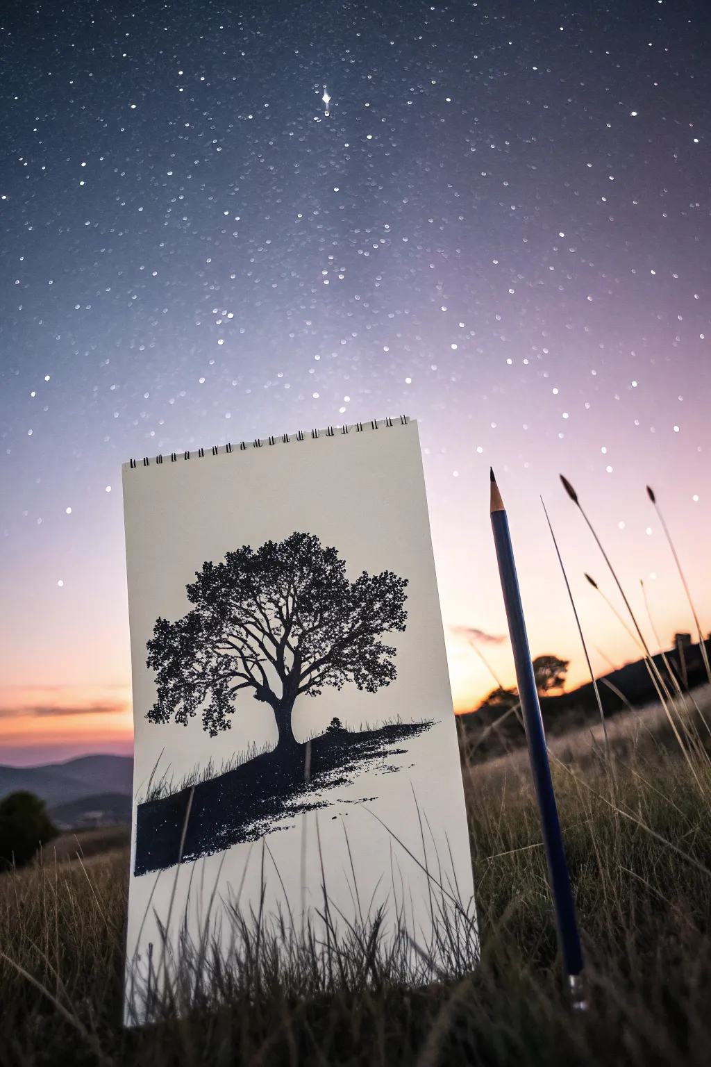
This serene sketch captures the timeless beauty of a solitary tree silhouette against a starry backdrop. Using primarily a dark pencil or charcoal, you will create a high-contrast piece that feels magical and atmospheric.
How-To Guide
Materials
- Spiral-bound sketchbook paper (medium tooth)
- Graphite pencils (HB for sketching, 4B and 6B for shading)
- Black charcoal pencil or soft black coloured pencil
- Kneaded eraser
- White gel pen or white gouache with a fine brush
- Paper blending stump or tissue
Step 1: Planning and Sketching
-
Establish the Horizon:
Start by lightly drawing a sloping horizon line about one-third of the way up from the bottom of your page. It doesn’t need to be perfectly straight; a slight unevenness adds natural realism to the hill. -
Position the Trunk:
Mark the position of your tree trunk slightly off-center. Sketch the basic width of the trunk, flaring it out at the bottom where the roots would anchor into the ground. -
Map the Main Branches:
Extend two or three primary branches upwards from the main trunk. Keep your lines loose and organic, avoiding rigid straight lines. Think of the letter ‘Y’ splitting repeatedly. -
Outline the Foliage Shape:
Very lightly sketch a rough, irregular cloud-like shape around the branches to define where the leaves will go. This acts as a boundary for your detail work later.
Uneven Coverage?
If your black silhouette looks patchy or shows pencil strokes, layer cross-hatching in opposite directions, then burnish hard to flatten the paper tooth.
Step 2: Creating the Solid Silhouette
-
Darken the Hill:
Switch to your softest pencil (6B) or black charcoal. Begin shading the ground area below the horizon line. Press firmly to create a deep, solid black. -
Texturing the Grass:
Along the top edge of your hill silhouette, flick your pencil upward in short, quick strokes. This breaks the hard line and creates the illusion of grass blades catching the last light. -
Fill the Trunk:
Use the charcoal or dark pencil to fill in the tree trunk. Ensure the edges are crisp but slightly organic, like bark texture. -
Add Secondary Branches:
Draw medium-thickness branches extending from your main ones. I find that unsteady, wiggly lines look more like real wood than perfect curves. -
Create Leaf Clusters:
Instead of drawing individual leaves, stipple or scumble (using small circular scribbles) clusters of darkness attached to the branches. Focus these clusters within the boundary you sketched earlier.
Add Realism
Use a white gel pen to add a tiny ‘rim light’ along one edge of the trunk and branches, suggesting a unseen moon or sunset glow behind the tree.
Step 3: Refining Details
-
Vary Density:
Make some leaf clusters dense and black, while leaving other areas sparser to show ‘sky holes’ where the background peeks through the canopy. -
Add Fine Twigs:
Using a sharp HB or 2B pencil, add very fine twigs reaching out from the edges of the leaf clusters. These delicate lines make the tree look mature and detailed. -
Connect the Roots:
Blend the bottom of the tree trunk seamlessly into the dark hill so it looks like it is growing out of the earth, not just sitting on top of it. -
Clean Up:
Use your kneaded eraser to lift up any graphite smudges from the sky area. The contrast between the dark tree and the clean white paper is crucial.
Step 4: The Starry Sky
-
Plan Star Placement:
Look at the empty space above the tree. Visualise a random scattering of stars—nature is never perfectly grid-like. -
Add Tiny Stars:
Using a sharp pencil, make very faint, tiny dots for distant stars. For a more magical look, you can use a white gel pen if you decide to lightly shade the background sky first, but for a pure silhouette, keep the sky white. -
Create Variation:
I like to make a few stars slightly larger or brighter than the others to create depth in the galaxy. -
Final Contrast Check:
Step back and look at the drawing. If the black areas look grey or shiny, go over them one last time with your darkest black medium to ensure a true silhouette effect.
You now have a striking, high-contrast landscape sketches ready to display
Mountains With Misty Layers
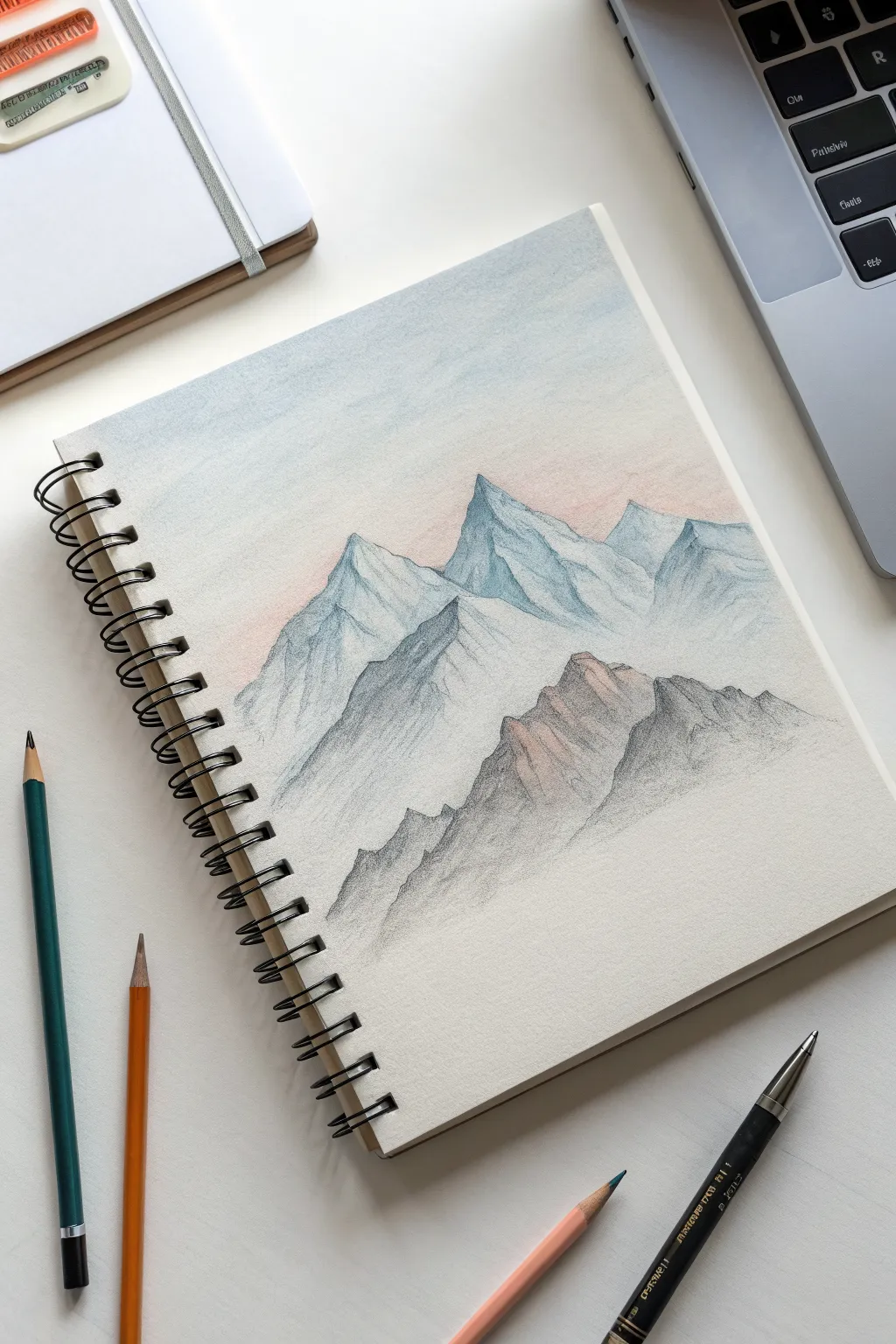
Capture the serene beauty of distant mountains with this soft, layered pencil study. This project uses a delicate gradient technique to create depth, fading from crisp, detailed foreground rocks into hazy, atmospheric peaks in the distance.
Step-by-Step
Materials
- Spiral-bound sketchbook (medium textured paper works best)
- Colored pencils: Indigo Blue, Slate Grey, Burnt Sienna (or Terracotta), Peach (or Light Pink), and White
- Graphite pencil (HB or 2H)
- Pencil sharpener
- kneaded eraser
- Blending stump or tissue
Step 1: Setting the Scene
-
Light Outline:
Begin with a very faint graphite sketch to map out your composition. Draw three distinct triangular mountain shapes: a large central peak, a slightly smaller one behind it to the right, and a jagged, lower range in the foreground. Keep your pressure extremely light so these lines don’t show through later. -
Sky Gradient:
Start coloring from the top of the page down. Turn your sketchbook so your hand doesn’t smudge the paper, and use the side of a light blue tip to create a very faint wash of sky, fading it out completely before you reach the mountain peaks. -
Sunrise Glow:
Just above the mountain line, lightly glaze a small amount of Peach or Light Pink. Blend this upward into the blue sky using a tissue to create a soft, hazy transition that mimics early morning light.
Grainy Texture?
If the paper tooth shows too much, overlay a layer of white or very light grey pencil. This ‘burnishing’ fills the paper’s texture for a smoother finish.
Step 2: The Distant Peaks
-
Background Base Tone:
For the furthest mountains (the central and right peaks), apply a base layer of Indigo Blue. Use hatching strokes that follow the slope of the mountain, but keep the pressure light to maintain a misty, distant look. -
Adding Snow Shadows:
On the right side of the central peak, deepen the blue slightly to indicate shadow. Leave the left faces of the peaks largely white (the paper color) to represent snow catching the light. -
Defining the Ridges:
Using a sharpened tip of your Indigo Blue, carefully trace the jagged ridge lines where the light meets the shadow. Keep these lines somewhat broken and organic rather than perfectly straight. -
Softening the Base:
Take your White pencil and color firmly over the blue areas of the distant mountains. This burnishing technique will blend the pigment into the paper grain and create a creamy, fog-like texture.
Go Monochromatic
Try this same composition using only graphite pencils (HB to 6B). Use a blending stump heavily for the distant peaks and sharp, dark lines for the foreground.
Step 3: The Middle Range
-
Transitioning Color:
Move to the mountain shape slightly lower and to the left. Here, mix Slate Grey with a touch of Indigo Blue. This range should look slightly darker than the peaks behind it to establish depth. -
Texture Building:
Use short, diagonal strokes to simulate rocky texture on the shadowed side of this middle peak. I find that varying the length of these strokes helps the rock face look more natural. -
Creating Mist at the Base:
As you color down toward the bottom of this middle mountain, lighten your pressure significantly. Fade the grey into white nothingness before it hits the bottom foreground rocks to simulate a layer of rolling mist.
Step 4: The Foreground Rocks
-
Warmer Tones:
For the closest jagged rocks in the bottom right, switch to your Burnt Sienna or Terracotta. Lightly sketch the craggy outlines, making these shapes sharper and more detailed than the distant mountains. -
Shadow Depth:
Layer Slate Grey over the shadowy crevices of these brown rocks. The mix of warm brown and cool grey creates a realistic ‘granite’ look that pushes these rocks visually to the front. -
Adding Contrast:
Press harder with the grey pencil in the deepest cracks of the foreground rocks. High contrast leads the eye here first. -
Highlighting:
On the sun-facing slopes of these lower rocks, lightly dust a bit of the Peach color used in the sky. This ties the lighting of the scene together beautifully.
Step 5: Final Atmosphere
-
Blending the Mist:
Use a clean blending stump or tissue to gently rub the areas where the mountains fade into white. This softens any harsh pencil strokes and enhances the foggy effect. -
Re-defining Edges:
Go back with a freshly sharpened dark grey or blue pencil and crispen up the very tips of the peaks if they got lost during blending. Sharp peaks against a soft sky make the drawing pop.
Step back and admire your atmospheric landscape, noticing how the color temperature shifts from cool distance to warm foreground


Kawaii Cat Face

This charming project captures the essence of cuteness with just a few simple lines and sweet pink accents. The dot grid paper serves as a perfect guide for keeping your proportions balanced while creating this happy kitty face.
Detailed Instructions
Materials
- Dotted grid notebook or loose dot grid paper
- HB Drawing pencil (for initial sketch)
- Black fineliner (0.5mm or similar)
- Soft pink colored pencil or pastel highlighter
- Eraser
- Ruler (optional, for checking symmetry)
Step 1: Setting up the Shape
-
Find the center:
Begin by locating the approximate center of your page. Since we are using dot grid paper, pick a specific dot that will serve as the anchor for the nose later on. -
Outline the head:
Using your pencil lightly, sketch the bottom curve of the cat’s head. Think of this as a wide, shallow ‘U’ shape. The dots help here—try to make sure the curve rises to the same height on both the left and right sides. -
Add the ears:
Draw two large triangles on top of the ‘U’ shape for the ears. They should be tall and pointed. Keep the space between the ears roughly equal to the width of one ear base. -
Refine the outline:
Once you are happy with the rough shape, go over the main head outline and ears with your black fineliner. Use a confident, steady hand, but don’t worry if the line isn’t perfectly smooth—a little wobble adds character.
Uneven Eyes?
If your curved eyes look lopsided, count the dots! Use the grid to ensure each eye arch spans the exact same number of dot squares for perfect symmetry.
Step 2: Drawing the Face
-
Draw the eyes:
Place two small arches for the closed, smiling eyes. Position them about halfway down the face, spaced widely apart. -
Create the nose and mouth:
Directly between the eyes, draw a small, filled-in heart or inverted triangle for the nose. Then, draw two curved lines coming down from the nose to form the ‘3’ shape of the mouth. -
Draw the whiskers:
Add three straight lines extending outward from each cheek. Ensure the top whisker angles up, the middle is straight, and the bottom angles down. -
Detail the forehead:
Draw three small vertical dashes or stripes at the very top of the forehead, right between the ears. This classic tabby marking helps frame the face.
Make it Yours
Change the expression by opening the eyes into large circles with highlights, or turn the tabby stripes into a different pattern like spots or a patch over one eye.
Step 3: Adding Color & Final Touches
-
Pink ear accents:
Using your pink pencil, lightly color in small triangles inside the main ear outlines. Leave a little white space around the pink for a cleaner look. -
Rosy cheeks:
Draw small pink circles on the cheeks, just below the outer corners of the eyes. I like to color these in using a small circular motion to create a soft, blush texture. -
Floating hearts:
To fill the empty space around the sketch, draw three small hearts floating above and to the sides of the cat’s head. -
Erase pencil marks:
Wait until the black ink is completely dry to avoid smudging. Then, gently erase any visible pencil guidelines from your initial sketch.
Now you have an adorable doodle ready to brighten up your bullet journal or sketchbook page
Mushroom Patch Mini Scene
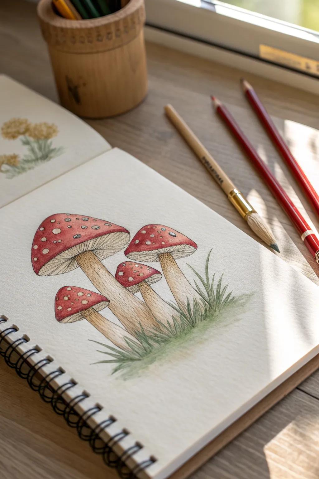
Step into a fairytale forest with this charming colored pencil study of classic Fly Agaric mushrooms. With their vibrant red caps and delicate gills, this mini scene is the perfect way to practice blending and texture techniques.
How-To Guide
Materials
- Sketchbook with textured paper (heavyweight)
- Set of colored pencils (various reds, creams, tans, browns, greens)
- Graphite pencil (HB or H)
- Kneaded eraser
- Fine liner or white gel pen (optional for highlights)
- Blending tool (paper stump or blending pencil)
Step 1: Sketching the Foundations
-
Outline the caps:
Begin with a graphite pencil, lightly sketching four rounded triangular shapes for the mushroom caps. Place the largest one on the left, a medium one on the right, and tuck two smaller ones in the middle ground to create depth. -
Add the stems:
Draw the stems extending downward from the caps. Make them slightly thick and bulbous at the base, curving them gently to give the mushrooms character rather than making them stiff and straight. -
Detail the gills and spots:
Lightly sketch curved lines underneath the caps to indicate where the gills will be. On top of the caps, draw random irregular circles for the signature white spots, varying their sizes for realism. -
Clean up the sketch:
Use a kneaded eraser to lift away excess graphite. You want the guide lines to be barely visible so they don’t muddy your colored pencil layers later.
Step 2: Coloring the Caps
-
Base layer of red:
Using a bright red pencil, gently shade the caps, carefully avoiding the circular spots you sketched earlier. Keep your pressure light to establish a smooth base layer. -
Deepen the shadows:
Layer a darker crimson or burgundy along the edges and bottom rim of the caps to create volume. This simple gradient makes the flat shapes look round and 3D. -
Define the spots:
Leave the spots the color of the paper or lightly shade them with a cream or pale yellow pencil. I like to add a tiny touch of light grey to the bottom edge of larger spots to make them look raised. -
Burnishing the red:
Go back over the red areas with medium-heavy pressure using your primary red to saturate the color and remove the grain of the paper.
Muddy colors?
If your red smudges into the white spots, use an electric eraser or a precision eraser shield to clean them up, then redefine with a white gel pen.
Step 3: Stems and Gills
-
Base tone for stems:
Color the stems and the gill area with a very light cream or beige pencil. This provides a warm undertone for the texturing work. -
Drawing the gills:
With a sharp light brown or tan pencil, draw fine, rhythmic lines radiating from the stem to the edge of the cap. These lines should curve slightly to follow the umbrella shape of the mushroom. -
Texturing the stalks:
Use a medium brown pencil to create striations on the stems. Use vertical, slightly broken strokes to mimic the fibrous texture of a mushroom stalk. -
Adding shadows:
Darken the top of the stems where they meet the cap and the bottom where they enter the grass using a sepia or dark brown pencil to ground them.
Add some magic
Draw a tiny ladybug climbing one stem or add subtle white gel pen dots floating around the grass for a magical spore effect.
Step 4: Grounding the Scene
-
Base grass layer:
Using a light olive green, flick the pencil upward from the base of the stems to start the grass. Keep your wrist loose to get tapered, natural-looking blades. -
Deepening the grass:
in the gaps between the blades and right at the base of the mushrooms, add a darker forest green. This negative space defines the lighter blades in front. -
Softening the ground:
Lightly scumble a little green pigment horizontally underneath the tufts of grass to create a misty, soft earth effect, fading it out into the white of the paper. -
Final touches:
Assess your contrast. If the red caps need more pop, add a final layer of deep red. Ensure the white spots remain crisp against the vibrant red background.
Now you have a charming little forest scene that captures the organic beauty of nature
Glass Jar of Fireflies
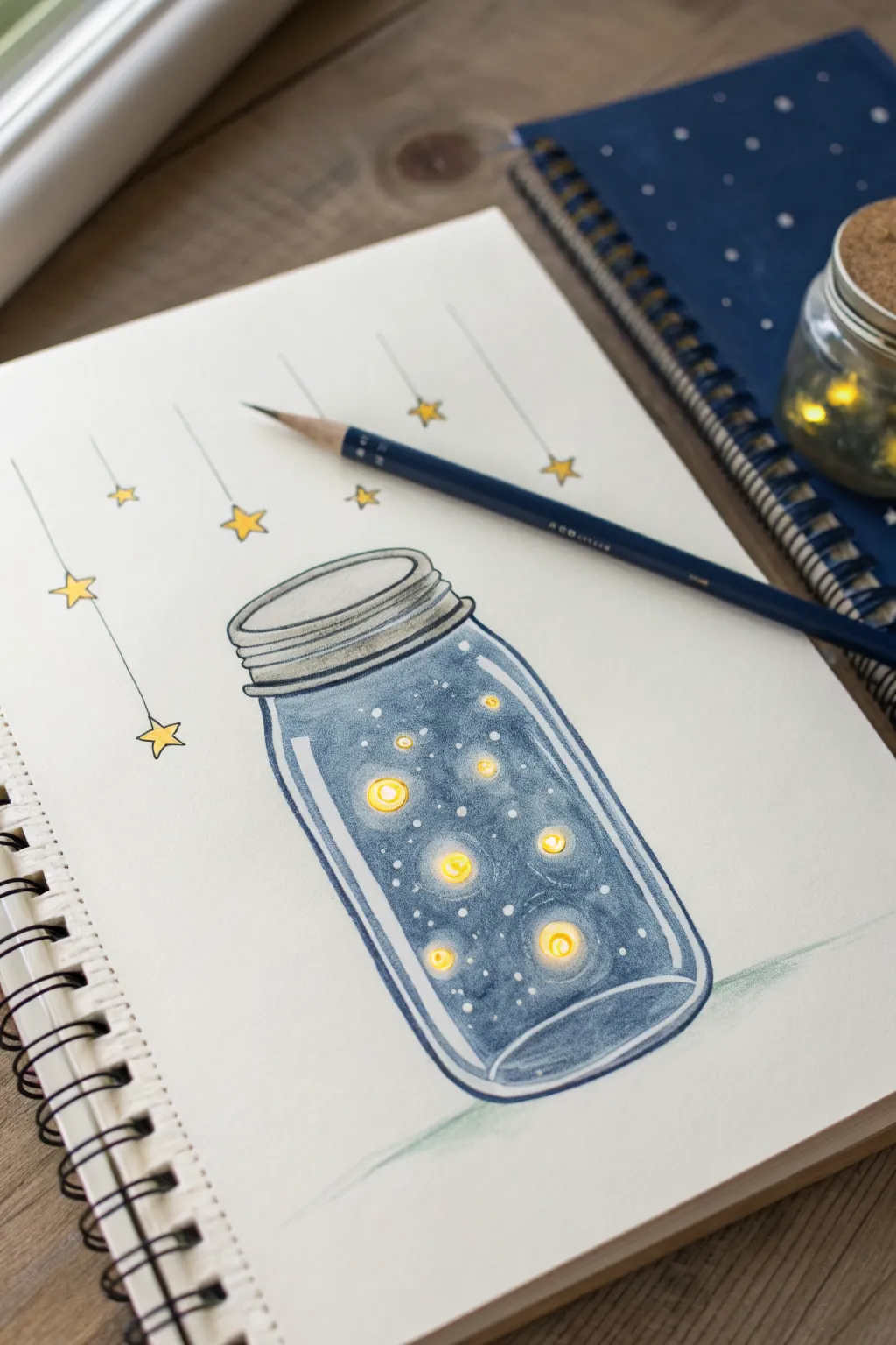
This whimsical drawing captures the magic of a summer evening in a simple mason jar. Using colored pencils, you’ll create a glowing, translucent effect that makes the fireflies look like little floating lights against the deep blue glass.
Detailed Instructions
Materials
- White sketchbook paper or drawing paper
- HB or 2B graphite pencil
- Eraser
- Colored pencils (Navy blue, medium blue, light blue, grey, vibrant yellow, light yellow)
- White gel pen (optional, for extra bright highlights)
- Ruler (optional)
Step 1: Sketching the Outline
-
Draw the rim:
Start by drawing a flattened oval near the center of your page to form the wide mouth of the jar. Add a second, slightly larger oval around it for thickness. -
Form the lid:
Draw the screw-top lid by adding two or three stacked, narrow horizontal bands just below the rim. Keep the edges slightly rounded to show the cylinder shape. -
Create the jar body:
Sketch two vertical lines coming down from the lid, curving slightly inward at the very bottom. Connect them with a curved line that mirrors the curve of the rim to create the jar’s base. -
Add floating stars:
Above the jar, draw several vertical strings of varying lengths. At the end of each string, sketch small five-pointed stars. Make them different sizes for visual interest.
Making it Glow
For an intense glow, underpaint the yellow spots with a tiny bit of white colored pencil first. This prevents the blue paper or pigment from dulling the yellow.
Step 2: Coloring the Glass
-
Base layer of blue:
Take a medium blue pencil and begin shading the inside of the jar. Apply very light pressure initially. Leave small circular areas blank where your fireflies will go—this keeps the yellow bright later. -
Deepening the shadows:
Use a navy blue pencil to darken the edges of the jar and the bottom curve. This creates the illusion of roundness. Gradate the color toward the center, leaving the middle lighter. -
Adding the liquid transition:
If you want the jar to look filled with a magical liquid or mist, create a soft horizontal gradient near the top of the body, fading the blue out as it reaches the ‘surface’ line. -
Coloring the rim:
Shade the thick glass rim with a very light blue or cool grey. Keep the top edge almost white to represent light hitting the glass. -
Defining the glass walls:
Go over the outer contour lines of the jar body with your navy pencil again to crisply define the shape.
Magical Twist
Swap the yellow fireflies for pink and purple swirls to create a ‘galaxy in a jar’ effect, or use multicolored dots for captured fairies.
Step 3: Adding the Glow
-
Filling the fireflies:
Take your vibrant yellow pencil and color in the circular empty spots you left inside the jar. Press firmly to get a solid, opaque color. -
Creating the halo effect:
With a lighter yellow or cream pencil, softly color around the bright yellow circles, blending gently into the varying blue background. This makes them appear to glow. -
Coloring hanging stars:
Color the stars hanging above the jar with the same vibrant yellow. Trace the hanging strings lightly with a grey or black pencil. -
Adding tiny sparkles:
Use a white colored pencil or a white gel pen to dot tiny specks throughout the blue background inside the jar, mimicking distant stars or dust motes.
Step 4: Finishing Details
-
Shading the lid:
Color the metal lid using grey. Add darker grey stripes between the ridges to show depth, and leave a strip of white on the top left of the lid for a metallic highlight. -
Glass reflections:
Add white streaks along the left side of the jar and the curve of the bottom to simulate glossy reflections on the glass surface. -
Grounding the jar:
Add a very faint shadow underneath the jar using grey or light blue, just to keep it from looking like it’s floating in space. -
Final touches:
Review your contrast. I usually like to go back in with the darkest blue one last time to deepen the shadows right next to the glowing yellow orbs, which makes the light pop even more.
Now you have a charming little vessel of light preserved on your page
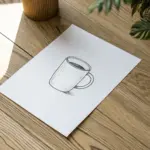
Teacup With Swirly Steam

This cozy drawing captures the comfort of a warm drink with its gently steaming curves and delicate pastel accents. It combines simple pencil shading with touches of colored pencil to create a sweet, vintage-style vignette.
Step-by-Step Guide
Materials
- Spiral-bound sketchbook (smooth or light grain)
- Graphite pencil (HB or B)
- Colored pencils (Light pink, deep brown/maroon)
- Fine-point eraser
- Pencil sharpener
Step 1: Sketching the Shape
-
Outline the bowl:
Begin by drawing a wide, open curve for the bottom of the teacup. Keep your pencil pressure very light so you can erase easily if needed. -
Add the rim:
Connect the top of the curve with a very flattened oval (ellipse). This forms the opening of the teacup. -
Draw the rim thickness:
Draw a second, slightly smaller oval inside the first one to give the china cup some thickness. -
Shape the handle:
On the right side, sketch a graceful, ear-shaped loop for the handle. Make sure to draw both the inner and outer curves so the handle has dimension. -
Create the saucer:
Beneath the cup, draw a large, flattened oval for the saucer. The cup should comfortably sit in the center, obscuring the back part of the saucer’s oval. -
Define the base:
Connect the bottom of the cup to the saucer with a small, curved foot so it doesn’t look like it’s floating.
Loose Wrist Rule
For the steam swirls, hold your pencil further back on the barrel. This forces you to draw with your arm rather than your fingers, creating smoother curves.
Step 2: Adding Details & Color
-
Fill the liquid:
Inside the cup, draw a curved line parallel to the front rim to indicate the surface of the tea or coffee. Using a brown colored pencil, lightly shade this elliptical area. -
Decorate the rim:
With a light pink colored pencil, draw a band of small, evenly spaced dots or tiny hearts just below the outer rim of the cup. -
Decorate the saucer:
Repeat this pink dotted pattern around the visible edge of the saucer to create a matching set. -
Add the tint:
Taking the pink pencil again, very lightly shade a thin band around the edge of the saucer, letting it fade into the white paper. -
Shade the cup:
Switch back to your graphite pencil. Use light, vertical hatching lines to shade the side of the cup, focusing on the left and right edges to make it look rounded. -
Shade the interior:
Add vertical shading lines inside the cup, just above the liquid line on the back wall, to show depth. -
Deepen the liquid:
I like to go back over the liquid with the graphite pencil now, adding darker scribbles near the edges for a realistic, glossy look. -
Cast a shadow:
Using horizontal hatching strokes, add a cast shadow on the table surface to the right of the saucer.
Vintage Vibes
Make the paper look aged before drawing by lightly staining it with actual tea capable of creating a parchment effect.
Step 3: The Swirly Steam
-
Start the main plume:
From the center of the cup, draw a flowing, serpentine line rising upward. Keep your wrist loose to get a natural curve. -
Add tight spirals:
Branch off from the main line with smaller curls and spirals. Think of them like fiddlehead ferns unfurling. -
Vary the line weight:
Go over your steam lines, making some parts thicker and darker and others wispy and light to suggest movement. -
Add floating bubbles:
Draw three or four tiny circles near the steam swirls to add a touch of whimsy to the vapor. -
Final Outline:
Sharpen your graphite pencil and go over the main structural lines of the cup and saucer one last time to make the drawing pop.
Now you have a charming little sketch perfect for a journaling page or a greeting card
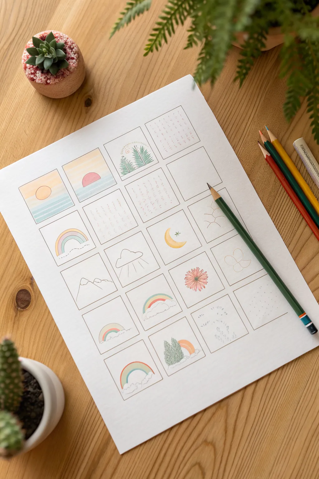
Tiny Stamp-Size Color Scenes

Capture fleeting moments of beauty by creating a grid of tiny, stamp-sized landscapes and symbols. This project combines simple line drawing with soft color pencil shading for a clean, minimalist aesthetic that feels like a visual diary.
Detailed Instructions
Materials
- White mixed-media or drawing paper (A4 size)
- Ruler
- Fine liner pen (0.1mm or 0.3mm, black or sepia)
- Colored pencils (soft core preferred)
- Pencil (HB for sketching grid)
- Eraser
Step 1: Setting the Structure
-
Measure margins:
Start with your sheet of A4 paper vertically aligned. Use your ruler to mark a uniform margin around the edges, leaving plenty of white space for a framed look. -
Calculate the grid:
Plan a grid layout of neat squares. Based on the image, aim for 4 columns and roughly 6 rows of squares. Each square should be approximately 3×3 cm or 4×4 cm. -
Draw the grid lines:
Lightly sketch the grid using your HB pencil. Ensure the spacing between squares is consistent—about 0.5 cm works well to keep them distinct. -
Ink the frames:
Once you are happy with the layout, go over your pencil grid lines with a fine liner pen. Use a ruler to keep lines crisp, but don’t worry if corners aren’t perfectly joined; it adds character. -
Erase guidelines:
Wait a moment for the ink to dry completely, then gently erase the underlying pencil marks to reveal clean, empty boxes.
Step 2: Sketching the Miniatures
-
Plan your subjects:
Think of simple nature themes for your squares: sunrises, rainbows, clouds, mountains, and flowers. Leave a few squares blank for text later. -
Sketch the sunrises:
In the top left squares, lightly sketch a horizon line and a simple semicircle sun. Vary the height of the horizon to create interest. -
Add nature elements:
Moving down the grid, sketch a simple cloud with rain lines, a crescent moon, and a minimalist mountain range using jagged lines. -
Draw the rainbows:
Create several variations of rainbows in the lower squares. Some can be full arches, while others can peek out from behind puffy clouds at the bottom. -
Incorporate botanicals:
Sketch a single daisy-like flower head in one square and a pair of pine trees in another. Keep details minimal; the small size means less is more.
Keep it Sharp
A freshly sharpened colored pencil is crucial here. The blunt tip of a dull pencil makes it impossible to color inside such tiny lines without smudging.
Step 3: Adding Color & Detail
-
Color the suns:
Use a warm yellow for the sun and soft oranges or pinks for the sky bands above it. Apply the pencil lightly to keep the colors pastel. -
Fill the water:
For the sea beneath the sun, use light teal or aquamarine. Shade horizontally to mimic calm water. -
Rainbow stripes:
Color your rainbows using a limited palette—yellow, soft teal, and salmon pink create a cohesive, vintage look rather than a bright primary rainbow. -
Detail the trees:
Use a dark green for the pine trees. Instead of coloring solid, use short, quick strokes to mimic pine needles and texture. -
Shade the clouds:
Leave the clouds mostly white, but add a very faint grey or light blue shadow along the bottom curves to give them volume. -
Texturize blank spaces:
In one or two squares, use your pencil to add subtle textures like small dots or tiny grass strokes instead of a full drawing. -
Ink the drawings:
Go over your main pencil sketches with the fine liner using a very delicate touch. You don’t need to outline everything colors; leaving some edges (like clouds) soft looks nice. -
Add written notes:
In the reserved blank squares, write short notes or quotes in vertical or horizontal lines using a small, neat handwriting style to mimic the image’s journal aesthetic.
Theme Your Grid
Instead of random nature items, dedicate a whole page to one subject, like ‘Types of Leaves,’ ‘Phases of the Moon,’ or ‘Morning Coffee Mugs.’
Now you have a charming collection of miniature scenes that celebrates the small details of daily life

Have a question or want to share your own experience? I'd love to hear from you in the comments below!